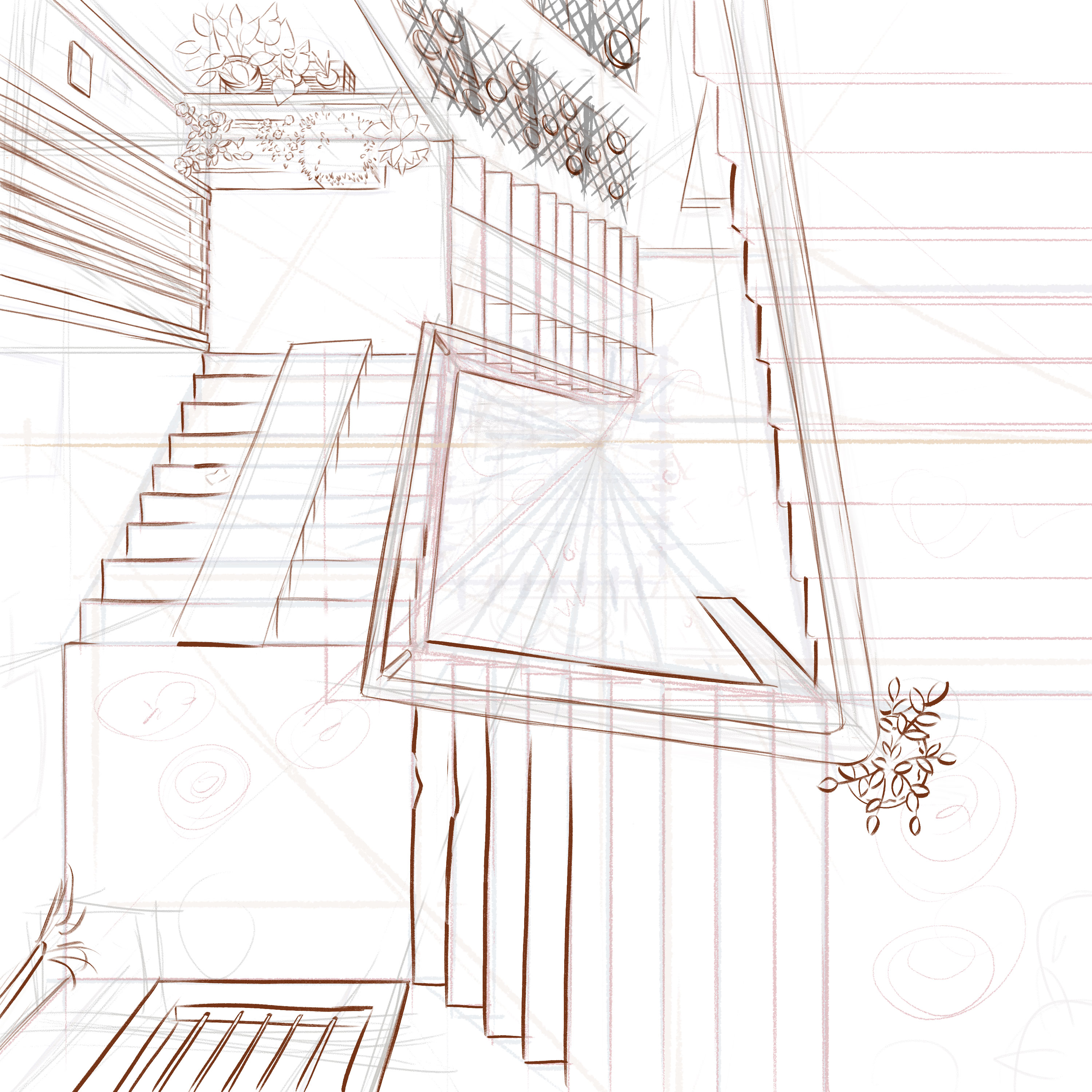
This is not a difficult illustration in terms of techniques. The perspective is tricky, but once I got the guides set up, I just need to follow the lines.
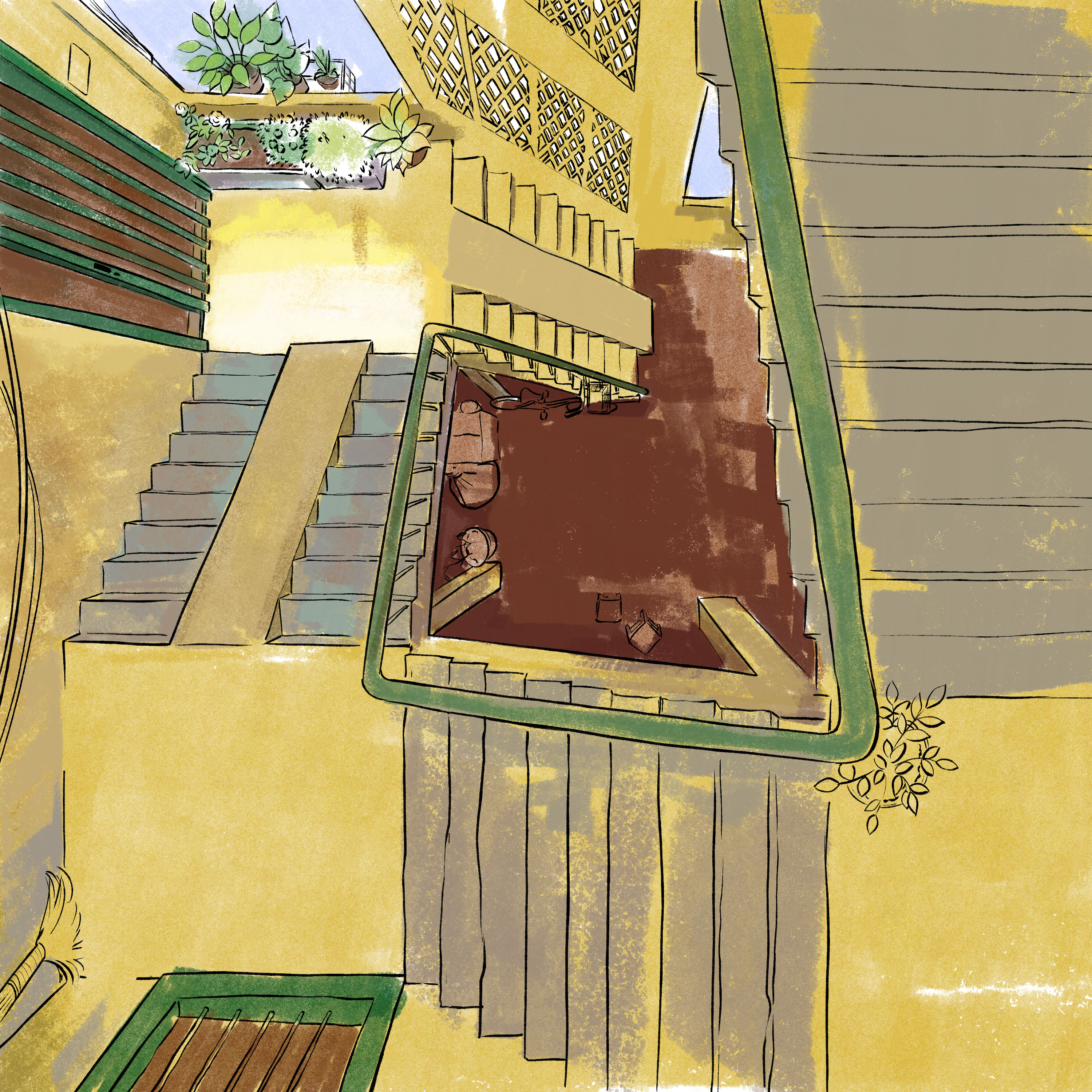
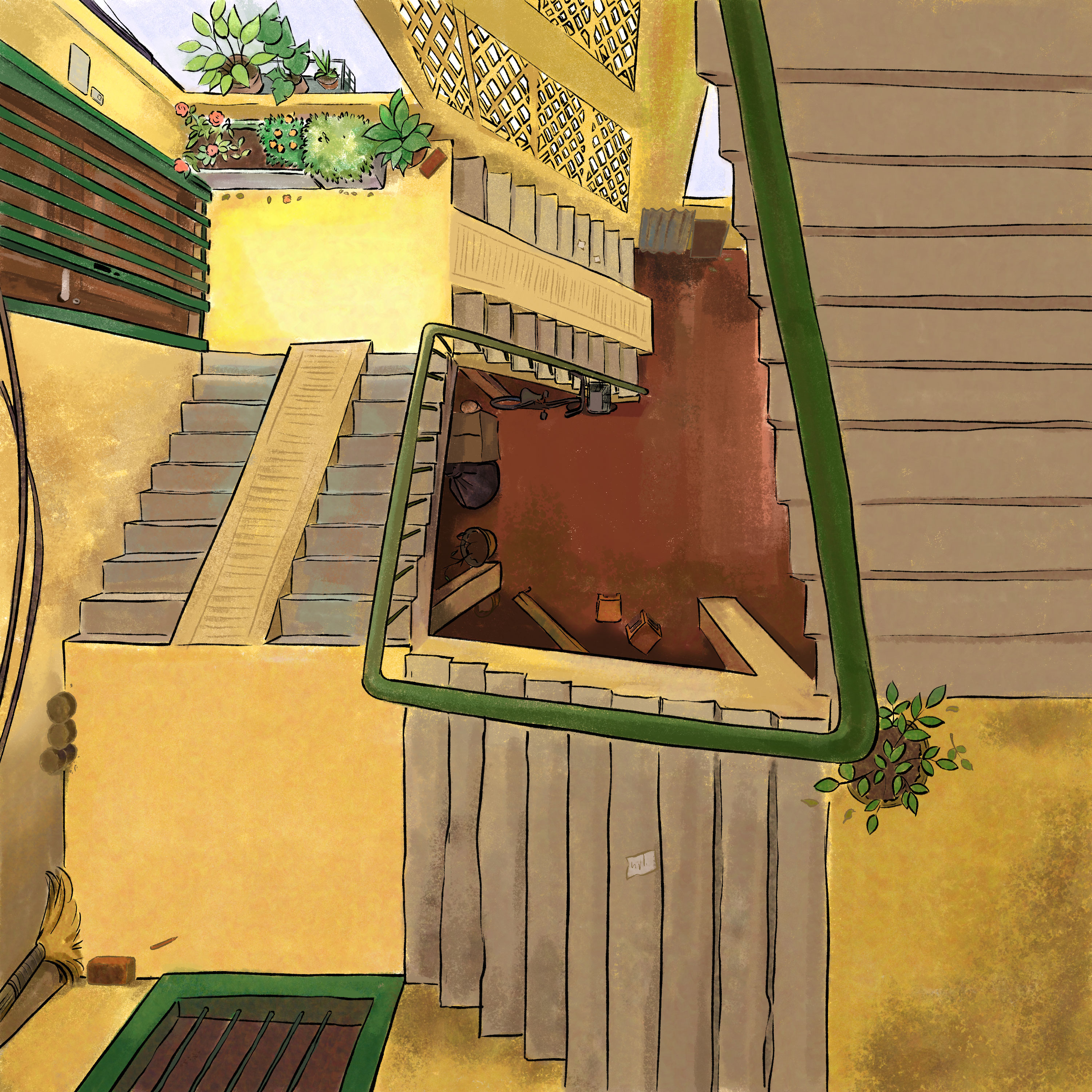
The more challenging stages are about colors: how to pick colors to show that this is not a realistic scene but more of a place in memory? I always know yellow is the main color, so I start with it first.
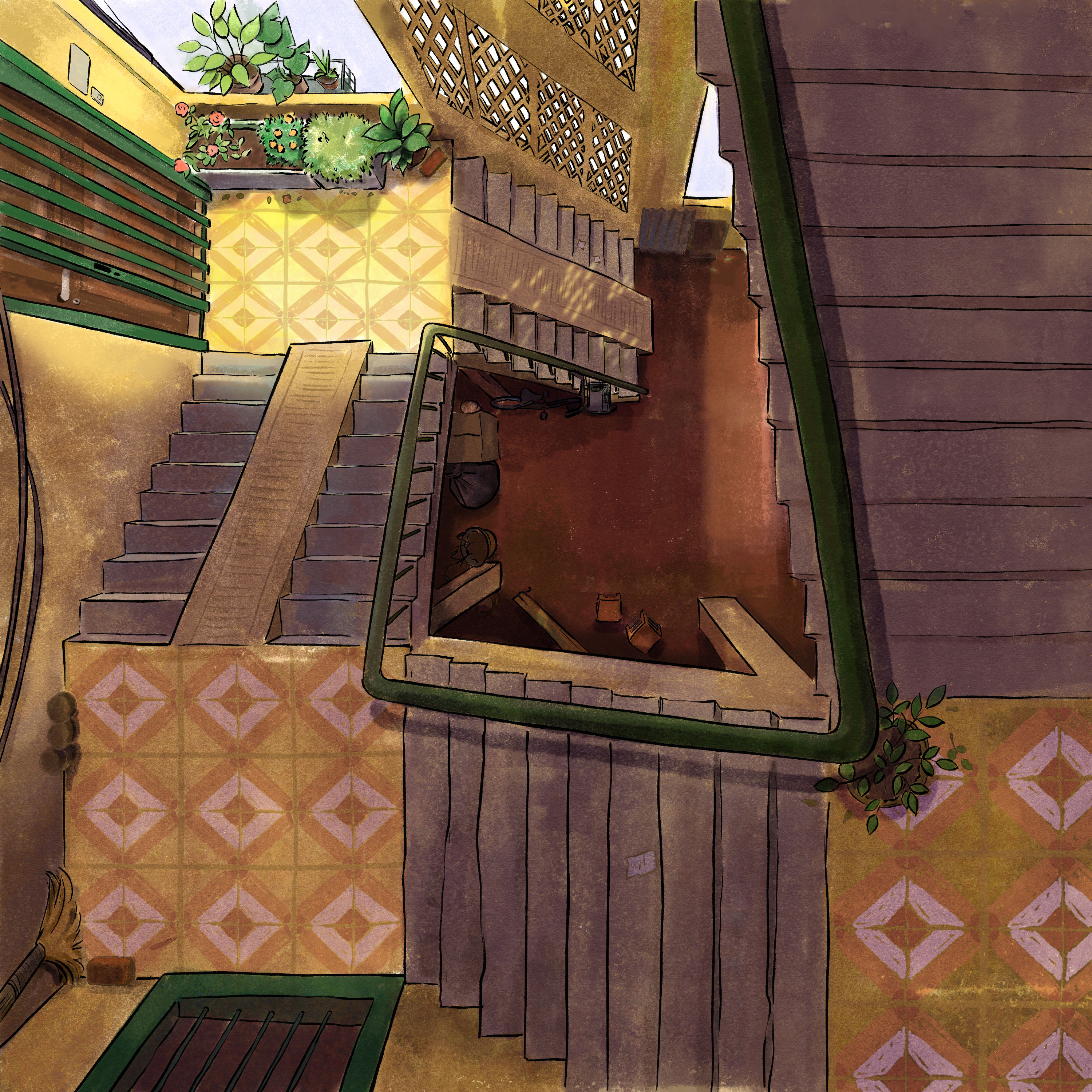
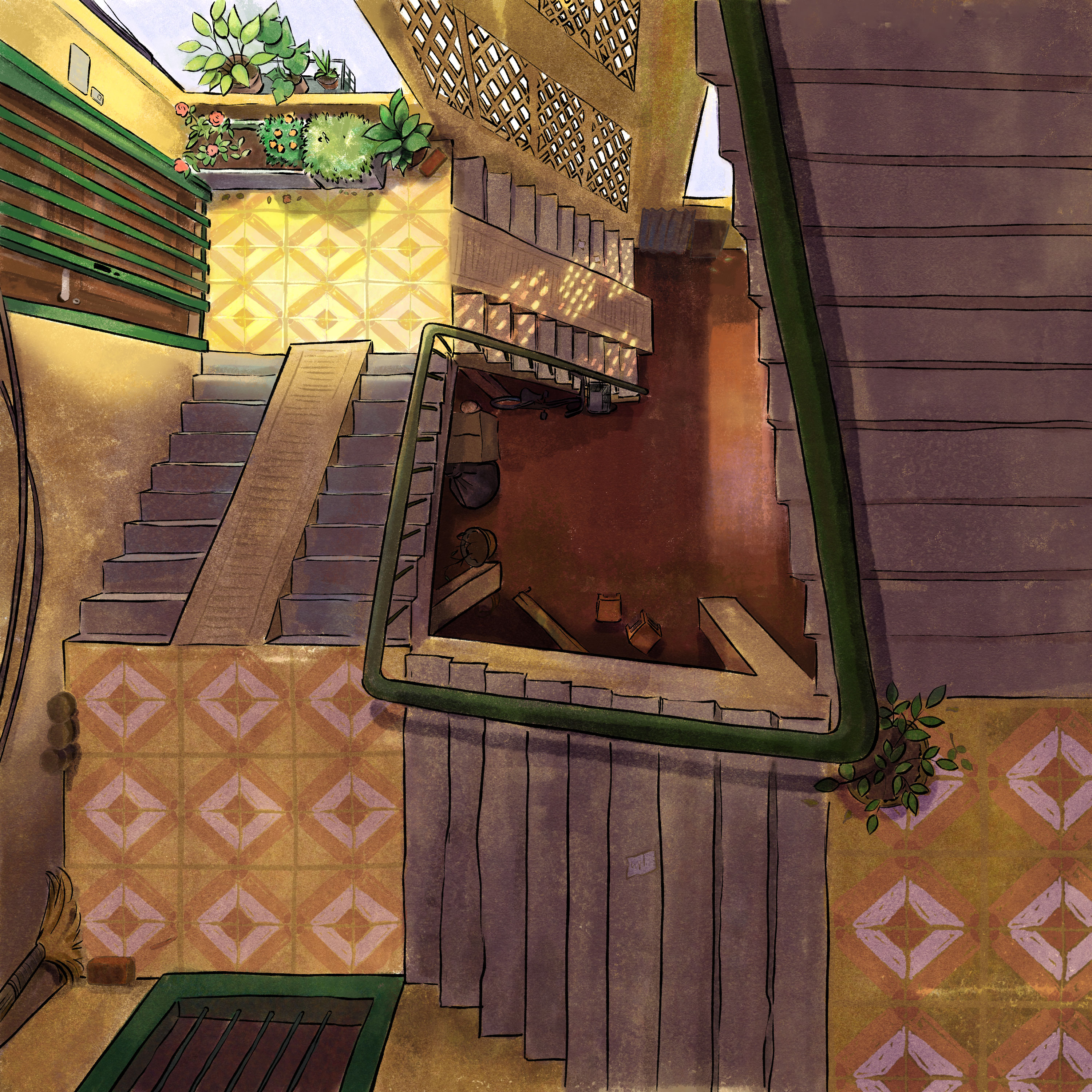
The purple and earth tone works together unexpectedly. The minor green tones help leading the viewers to the focus. All the colors sit nicely with each other, and the more wonderful thing is they are true to a certain level with the place I grew up.
Discover more from Jeanne Lolness
Subscribe to get the latest posts sent to your email.

