
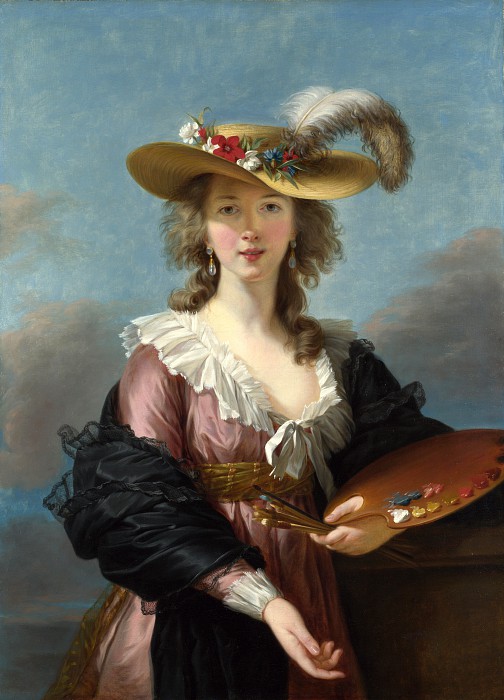
I’m pretty sure you have seen her works somewhere, the blooming flowers painting with a brownish tone background. If you tried searching her name on any search engine, tons of flower paintings will show up – don’t be surprised, because she actually left a legacy of about 250 still life paintings.
Family background: A genius born in a supportive environment
Rachel Ruysch, born in Amsterdam, is the daughter of Antony Fredericus, Professor of Anatomy, and Maria, daughter of an architect Pieter Post. Her talent was discovered from early age and her father let her study under Willem van Aelst, a talented painter of flowers in Delft. She quickly surpassed her teacher, and her talent became known in the highest circles. She was invited to German Courts before she was of middle age. She became the first female artist to enter artist society in The Hague in 1701.
In her personal life: she got married with Juriaen Pool (1666-1745), an excellent painter of portraits and a colleague in the Court Paintership of the Elector Palatine in 1693. She must have a happy marriage with him, since they had ten kids together and she was fully supported by her husband to keep painting with her maiden name.
While we can’t deny her talent and hard work, it’s important to note that her success is powered by other males in a patriarchy: her father and her husband. Her father is a renowned scientist specializing in anatomy and botany, and also an amateur painter. His cabinet, a huge collection of anatomical collection, attracted visitors from all over Europe, including Tsar Peter the Great. His collection was one of the earliest fluid-preserved specimens, making he himself an interest subject to study from the point of view of a scientist as well. He himself was featured in painting by Jan van Neck. (Dam, n.d)
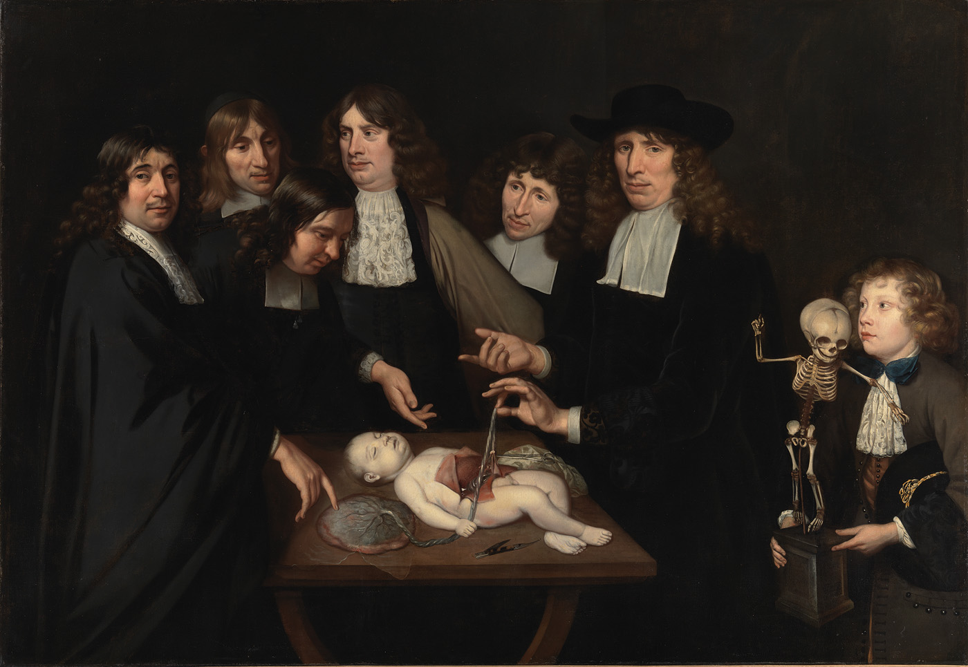
As an artistic person, Frederick Ruysch added a touch of decorative to his preservation, making his specimens an art collection to an extent. He was obsessed with the concept of ‘vanitas’ – the transcience of life and death. ‘Vanitas’ – Latin for ‘vanity’, means pointlessness and futility of pleasure, ambition and all worldly desires (Dam, n.d). This topic is explored by artists during Baroque period, belonging to allegorical art (arts representing a higher ideal). Frederick probably passed on his interest to Rachel while she helped him with his collection; not to mention, she had access to the greatest library of reference for flowers, plants and insects. In addition, she has other family members interested in arts: her grandfather was an architect, his brother and uncle also drew and painted well.
Less is known about her husband, Juriaen Pool; however, his love and support for her can be seen in his painting of the family. He is a court painter, a portraitist and a printmaker.
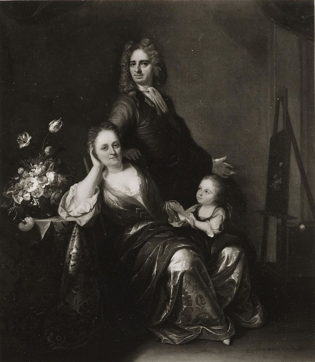
The only version from online resources is monochrome, but it’s obvious on the left of the painting is a bouquet of flowers, a familiar subject in Rachel’s artworks. She was ‘in the spotlight’ of the painting, indicating his admiration for her. She also used her maiden name through her whole career and her husband was likely to support instead of eclipse her talent.
In 1750, the state honored Ruysch with the publication of Dichtlovers voor de uitmuntende schilderessen Mejufvrouwe Rachel Ruisch (‘Poems for the Excellent Painter Mistress Rachel Ruysch’) (The Art Story,n.d). This anthology, the first of its kind for a Dutch artist, featured poems by eleven contemporary poets and scholars who celebrated her life and work. Rachel Ruysch passed away later that year at the age of 85.
Analysis on her style: highly detailed and scientific based botanical painting
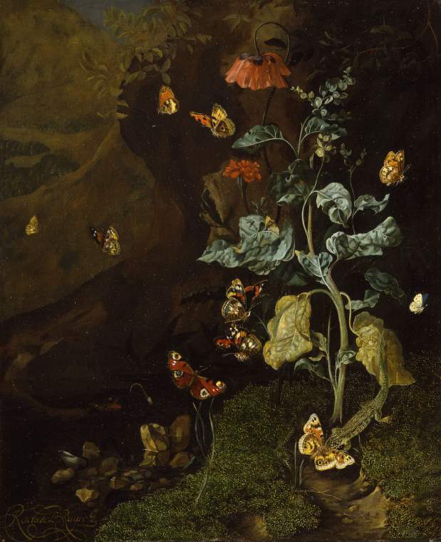
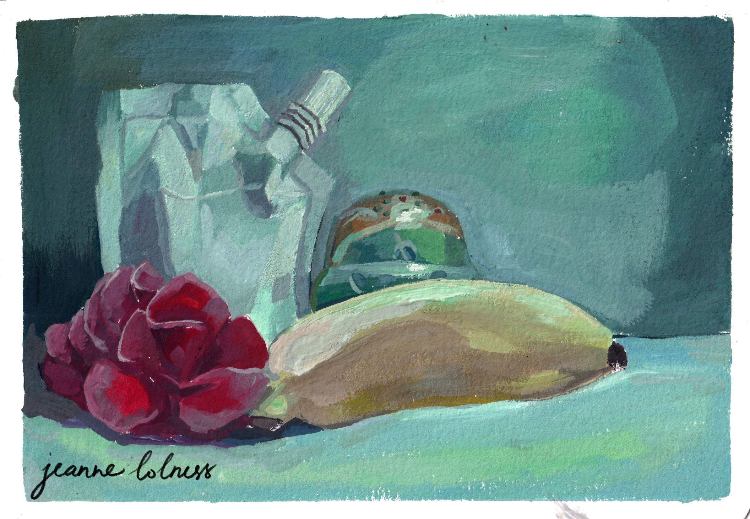
(The Fitzwilliam Museum, 2025). An early work.
One important detail is that the bouquets Rachel painted never existed, but an assortment of fruits, flowers and insects from the artist’s imagination. That showcases her adept understanding of nature, especially botany and anatomy of insects as well as compositional skills of arranging the details to attract the viewers. She put together flowers from different seasons as well as from overseas, which, somehow reflected the development of Dutch horticultural industry as well as international trade, not to mention the “Tulip Mania” – the first recorded economic bubbles (Smarthistory (n.d.) One more thing to notice is that she used asymmetrical composition, emphasizing the natural bloom and droop of the flower – this was an ‘informal’ choice compared to other contemporary painters.
Her process often started with main lines of a composition, then she rendered details with the goal of being as true-to-life as possible. Different texture, from the soft silky petals to the rough leaves, were accurately painted. Arts writer Alexxa Gotthardt highlights that Ruysch “swiftly gained a reputation across Amsterdam for the enchanting realism of the plants and insects in her paintings. Her works weren’t merely idealized depictions but subtly alluded to themes of mortality and the life cycle.” (The Art Story,n.d)
In early works, she often painted woodland scenes “sottobosco” (forest floor), being inspired from Otto Marseus van Schrieck, Abraham Mignon, and her teacher, Willem van Aelst (The Art Story,n.d). A special technique she learned from her master, Willem van Aelst, was imprinting. She sometimes used real moss and real butterfly wings as imprints in her early painting. The scenes were often dramatically lit – one feature that stayed consistent in all her paintings. Later, her style reflected more of Baroque art style – a movement against Mannerist style, an intricate and formulaic approach. She often painted a bouquet, depicting flowers at various stages of life, capturing their journey from vibrant bloom to graceful decay. They were paired with a wide range of insects and animals – she created an ecosystem in her painting.
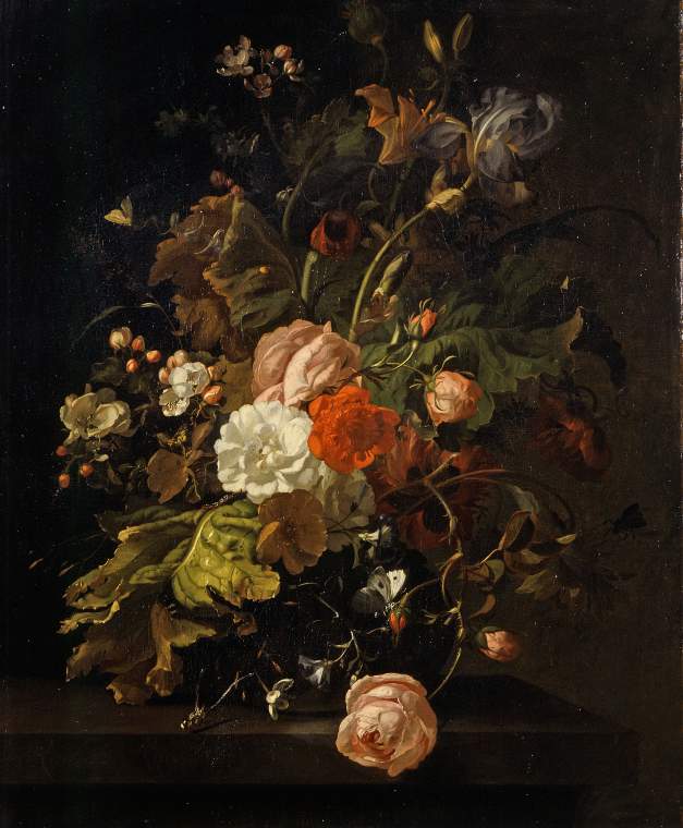
As she grew older, her compositions feature more open, expansive arrangements that fill the frame, evoking a rich sense of atmosphere and subtle humidity. She used bold diagonals and fluid curves to guide the viewer’s eye effortlessly across the composition. The central group of flowers were often the lightest and brightest, insects were arranged unexpectedly evoking a sense of curiosity in viewers.
Her paintings were often termed with ‘vanitas’ or ‘memento mori’ (Latin for ‘remember you must die’) since it was her father’s obsession. It’s a popular genre in Dutch during the seventeenth century, using still-life form to provoke thoughts about the fleeting life (Hibbitt, 2020). It’s the most common idea associated with her flowers painting, that all beauty fades and that all life, in the end, must die while celebrating the beauty of nature. Her painting may serve as a moral value to live thoughfully, prioritizing what truly matters over transient worldly matters.
References
Dam, A. (n.d). Death re-enlightened: Conservation of Frederik Ruysch’s wet anatomical preparations—The Rembrandts of fluid-preserved specimens [PDF]. ResearchGate. https://www.researchgate.net/publication/376812311
Hibbitt, F. (2020, July 14). Vanitas: Dutch master paintings explained. The Collector. https://www.thecollector.com/vanitas-dutch-master-paintings/
Huygens ING. (n.d.). Rachel Ruysch. Vrouwenlexicon. Retrieved January 6, 2025, from https://resources.huygens.knaw.nl/vrouwenlexicon/lemmata/data/Ruysch,%20Rachel/en
Pinakothek Museums (n.d.). Real or not? Rachel Ruysch and her butterflies. Retrieved January 6, 2025, from https://www.pinakothek.de/en/blog/real-or-not-rachel-ruysch-and-her-butterflies
The Fitzwilliam Museum. (2025). A still life with flowers, butterflies and a lizard in a dell [Web page]. https://collection.beta.fitz.ms/id/object/1906
The Art Story. (n.d.). Rachel Ruysch: Legacy. The Art Story. Retrieved January 8, 2025, from https://www.theartstory.org/artist/ruysch-rachel/
Smarthistory. (n.d.). Rachel Ruysch, Flower still-life. Retrieved January 6, 2025, from https://smarthistory.org/ruysch-flower-still-life/


