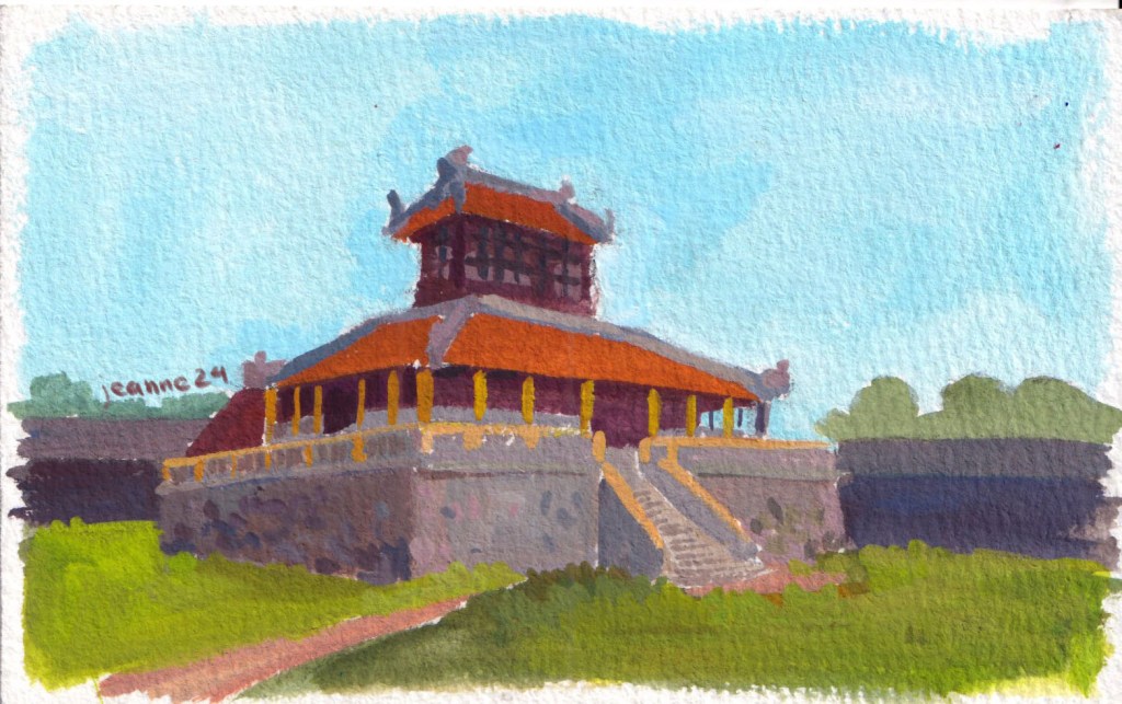
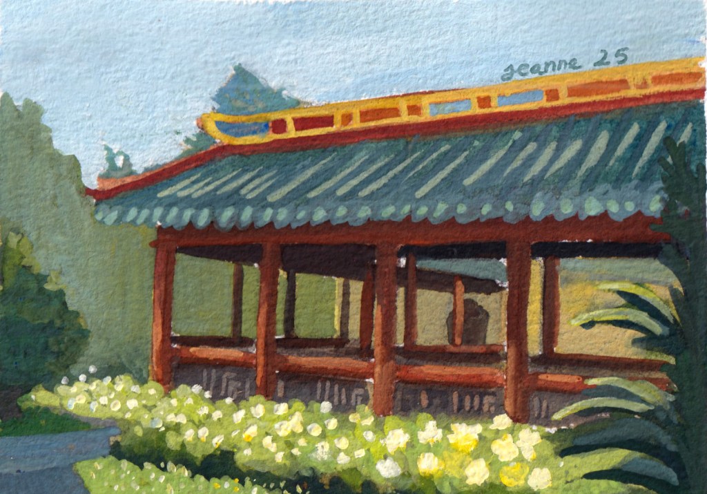
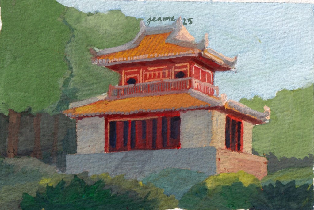
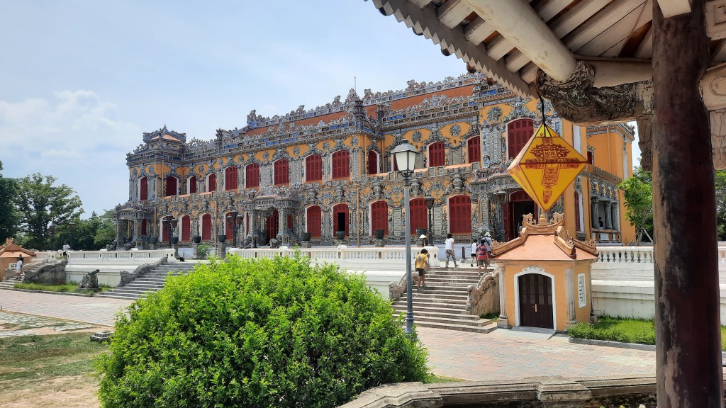
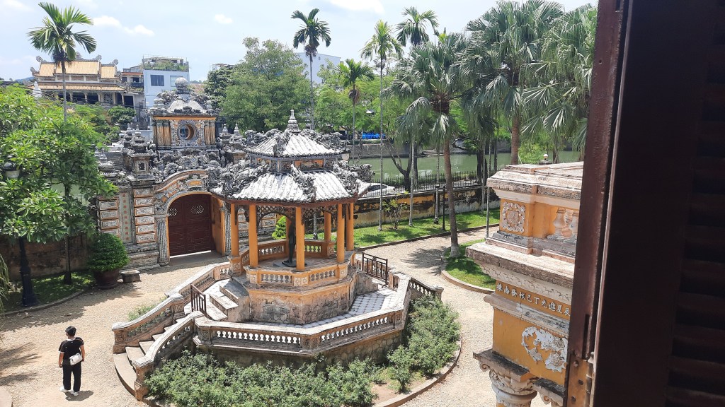
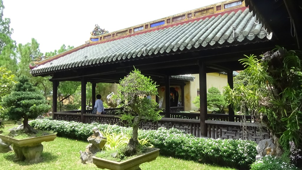
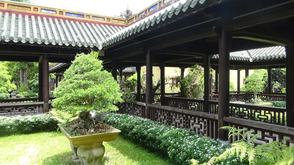
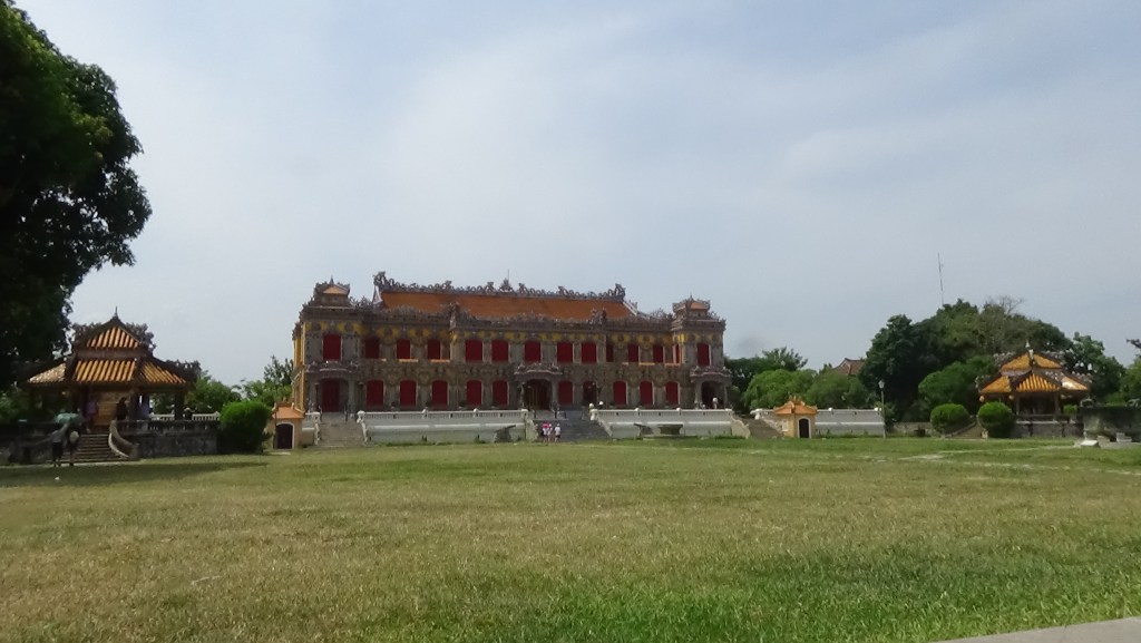
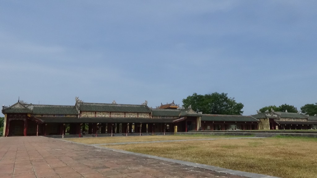
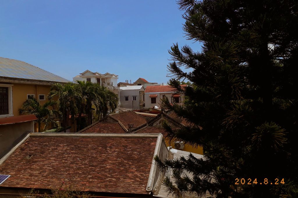
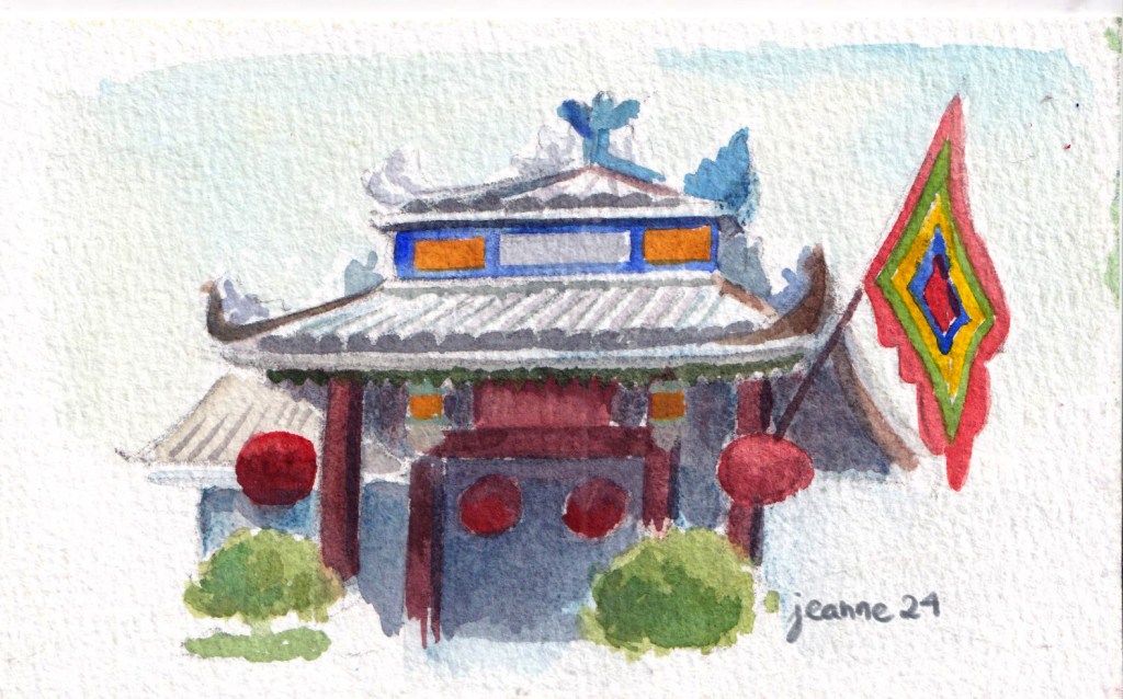
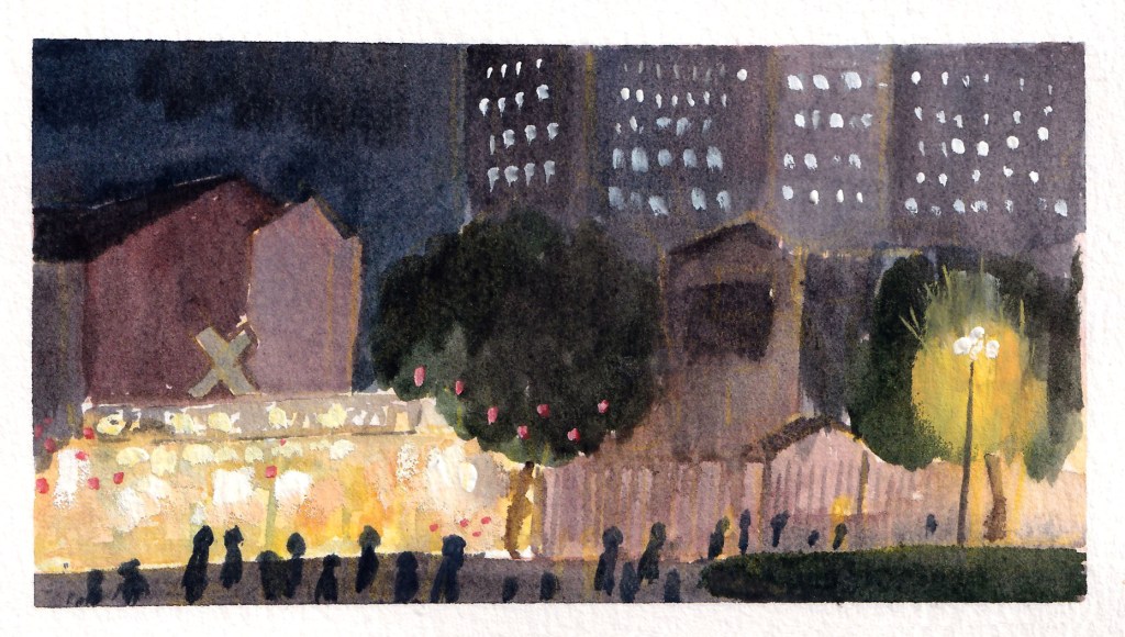
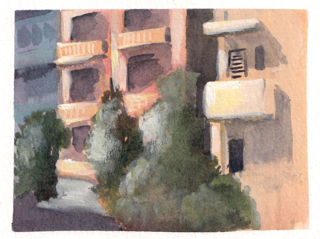
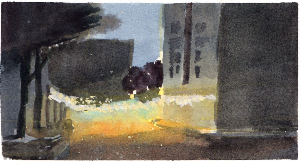
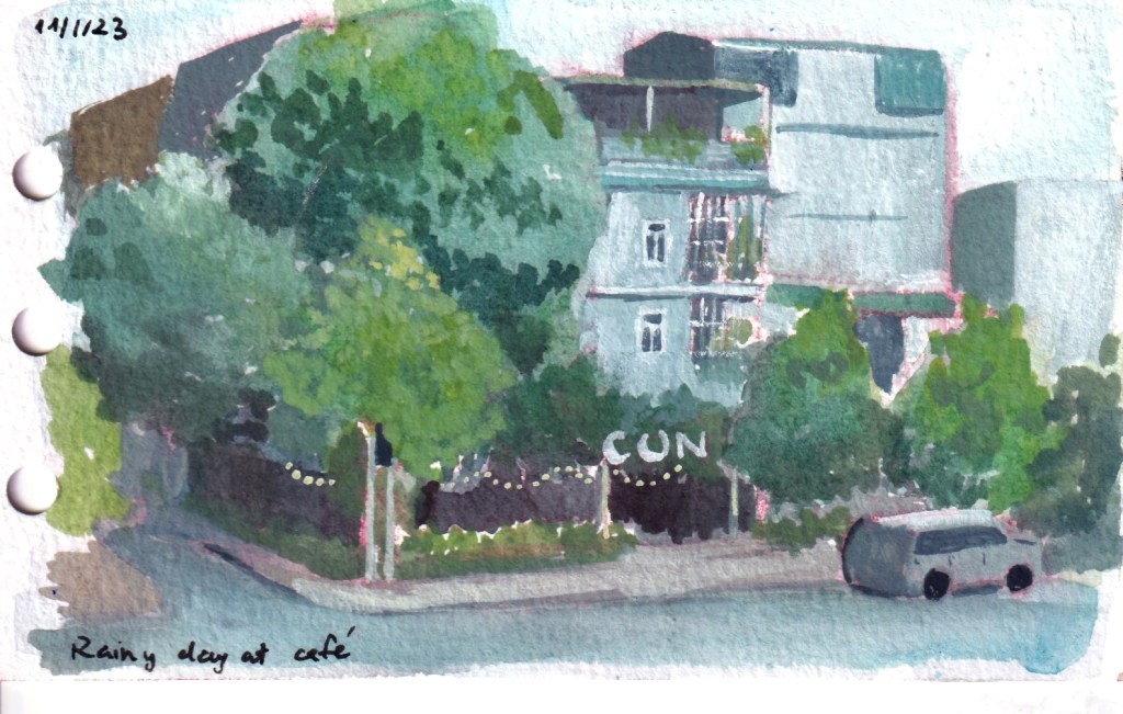
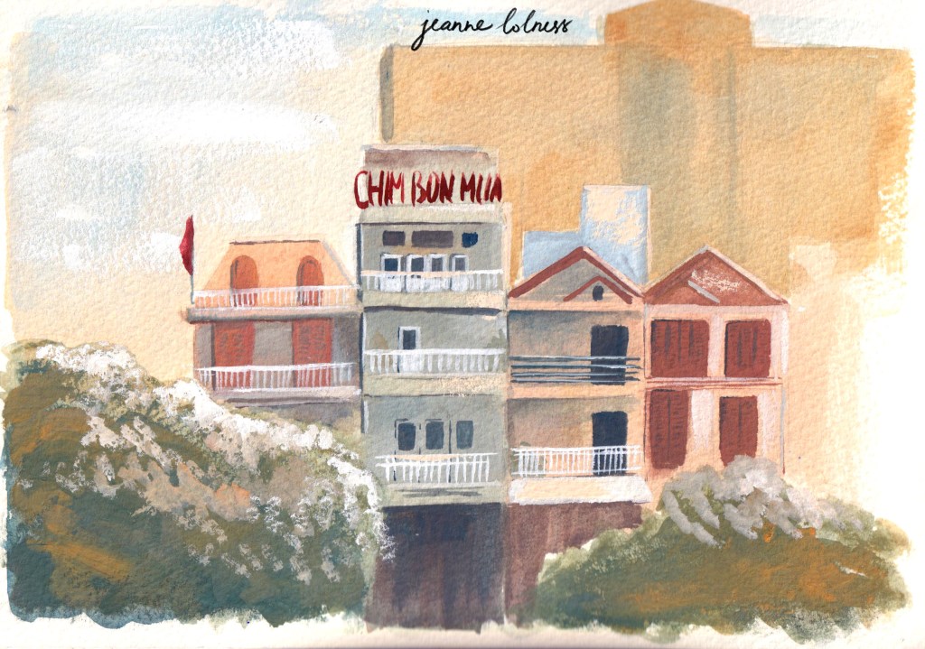
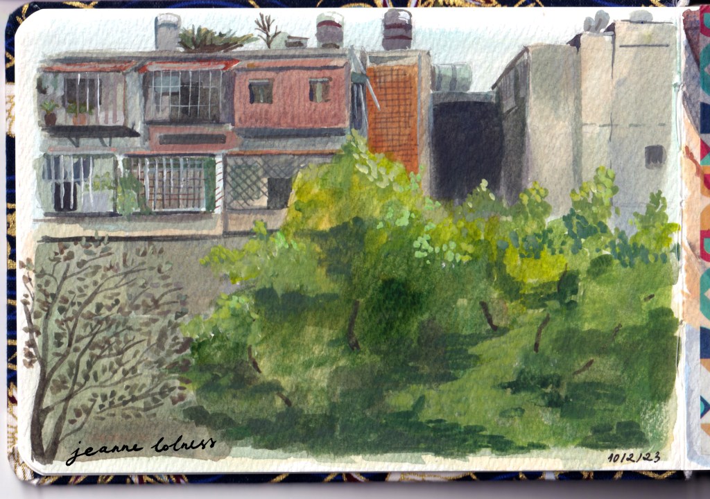
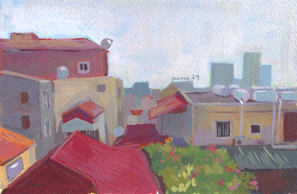
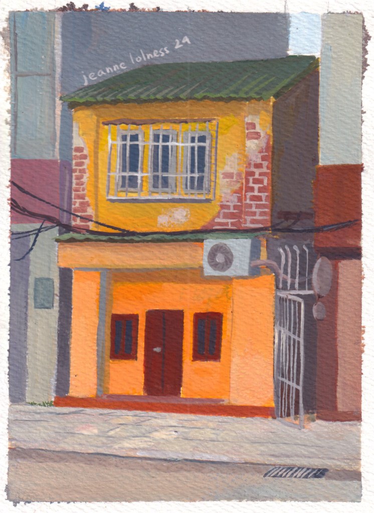
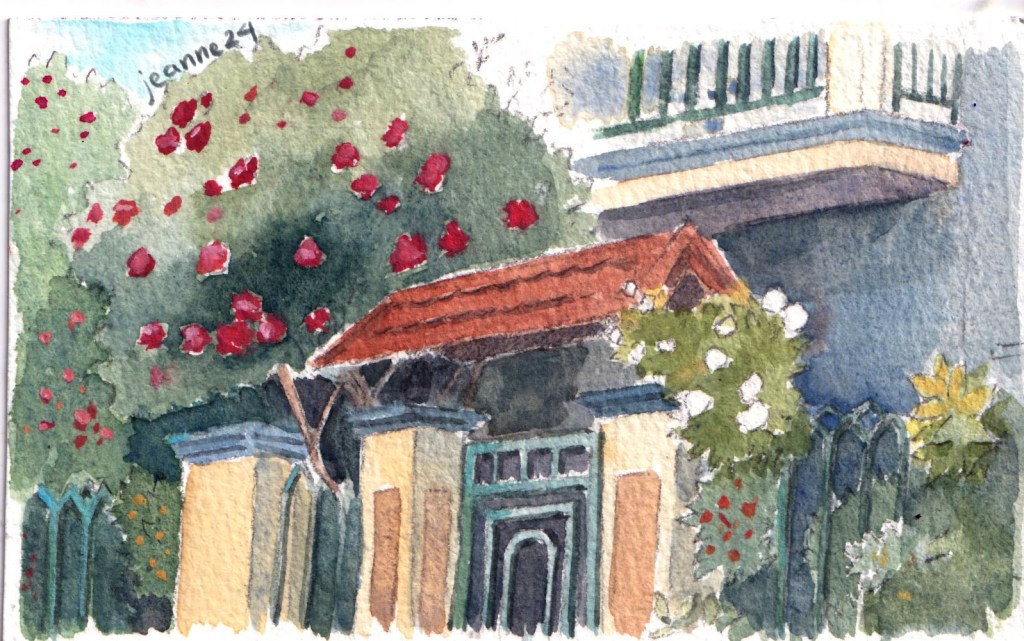
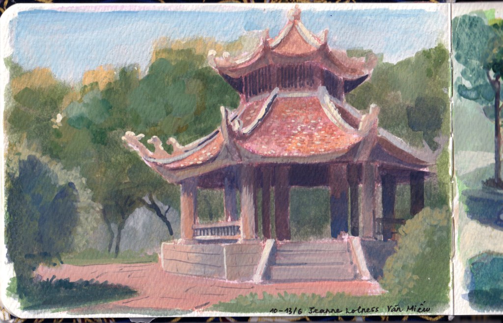
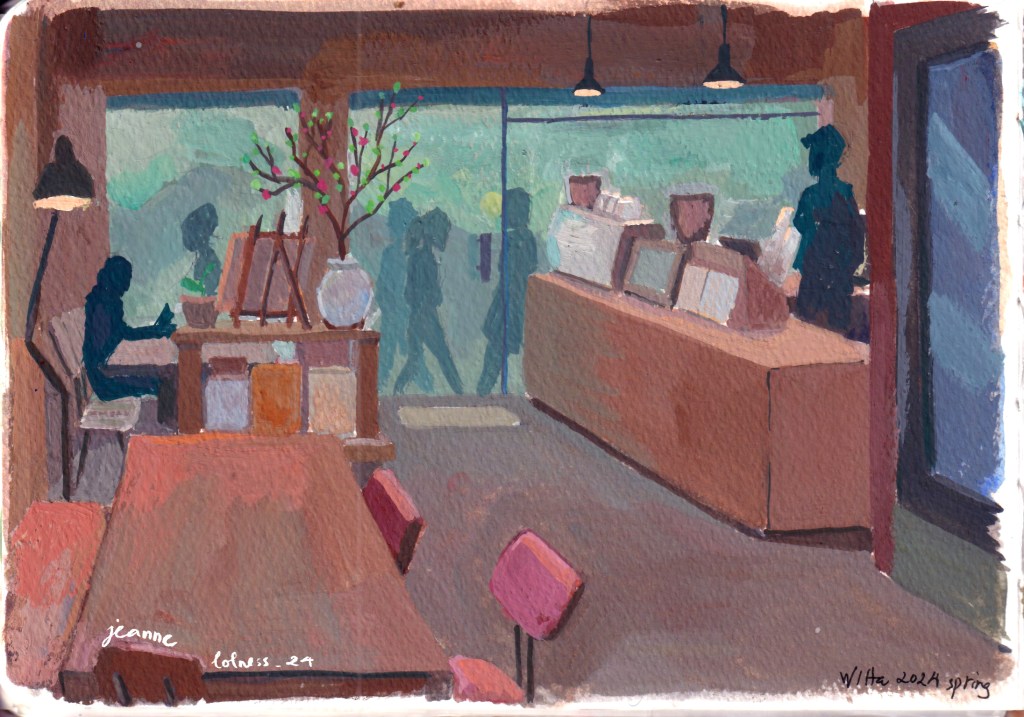
In the summer of 2024, I spent two sunny days exploring Huế – the place holding memories of a bygone era: Nguyễn dynasty. It was the final medieval dynasty before Vietnam became a colony of France and experienced warfare to the extreme in WW1, 2 and the Cold War.
Despite bombings and destruction, Huế and the Imperial City still maintained a variety of structures and monuments with their intricate details.
I had been longing to visit Huế for a long time and finally I got to enjoy this little peaceful city.
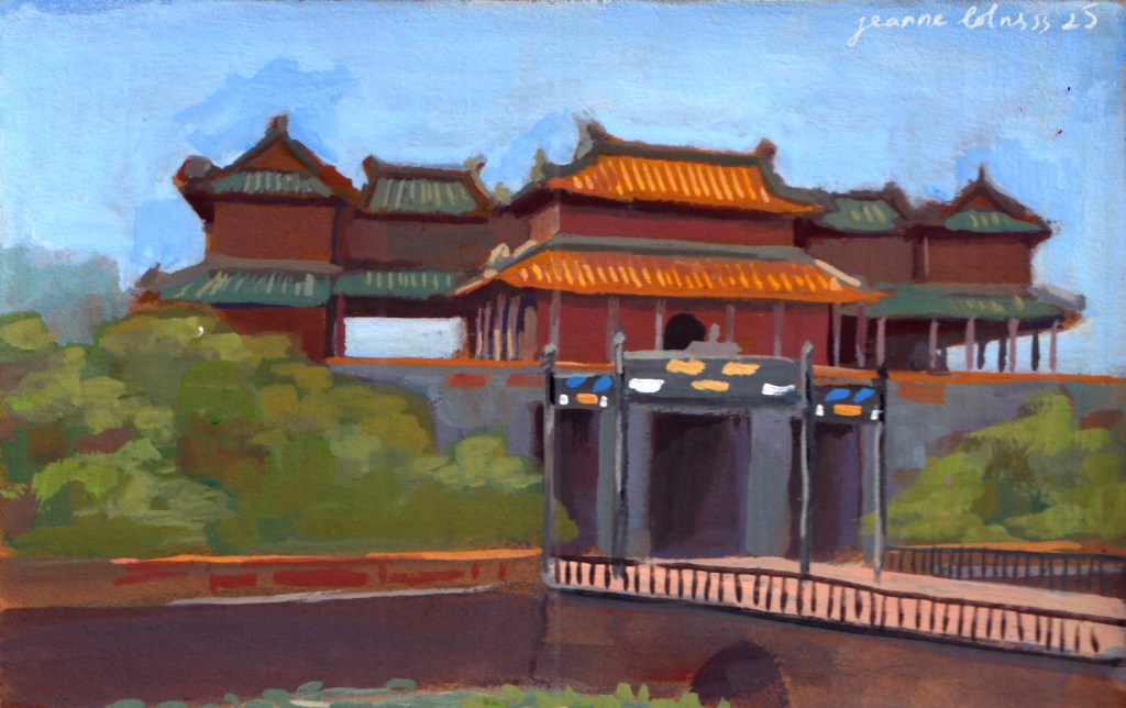
Nhật Thành Lâu Cổng Ngọ Môn
It was a sunny and hot day, and there were swarms of people visiting the citadel: foreigners, local people, Vietnamese travelers. The entrance (Cổng Ngọ Môn) was the most crowded spot, afterwards, people started wandering to different areas. It was understandable, because the entrance was built to impress anyone coming, foreshadowing normal people to pay respect to the king. My little painting can’t capture all the details of the entrance, many decorative elements were made by skilled craftsmen from all across Vietnam.
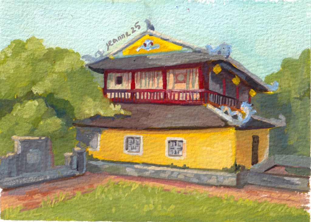
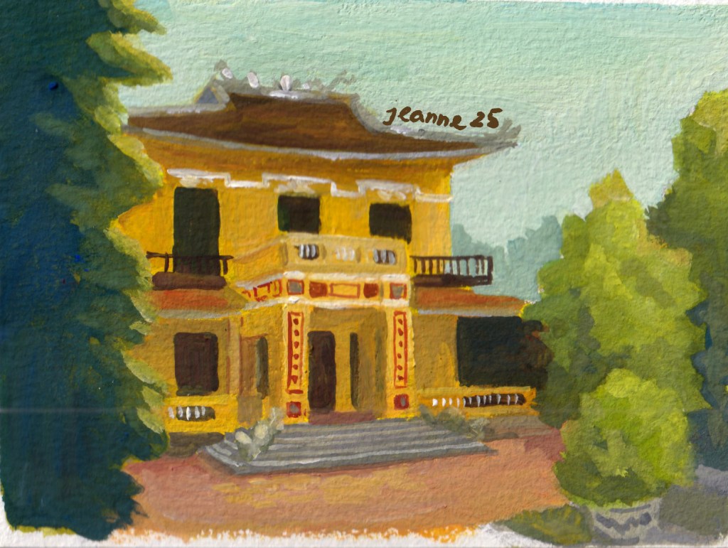
Phước Thọ Am Lầu Tịnh Minh
These two places (Phước Thọ Am, Lầu Tịnh Minh) were built much later, reflecting the changes coming from the outer world. Lầu Tịnh Minh was built in 1927, featuring a higher ceiling, a larger balcony and many other elements from Western, particularly French architecture; but still keeping the traditional roof and decorative tiles of Vietnam.
Vườn Thiệu PhươngLăng Minh Mạng
There are many places that I haven’t painted and I’m still excited to paint them, even after a year. There are still so many things I want to learn about Hue architecture and history.
You can use some of my images below to paint if you are interested in Vietnamese medieval architecture! Share with me if you can.
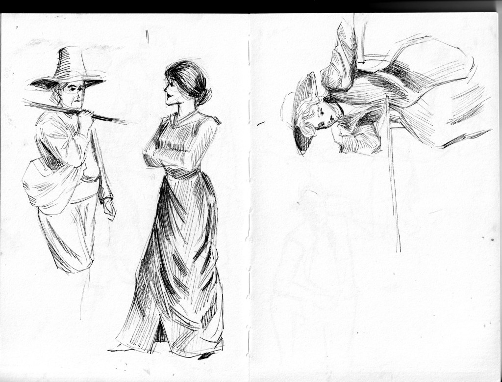
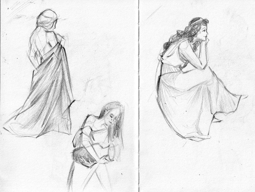
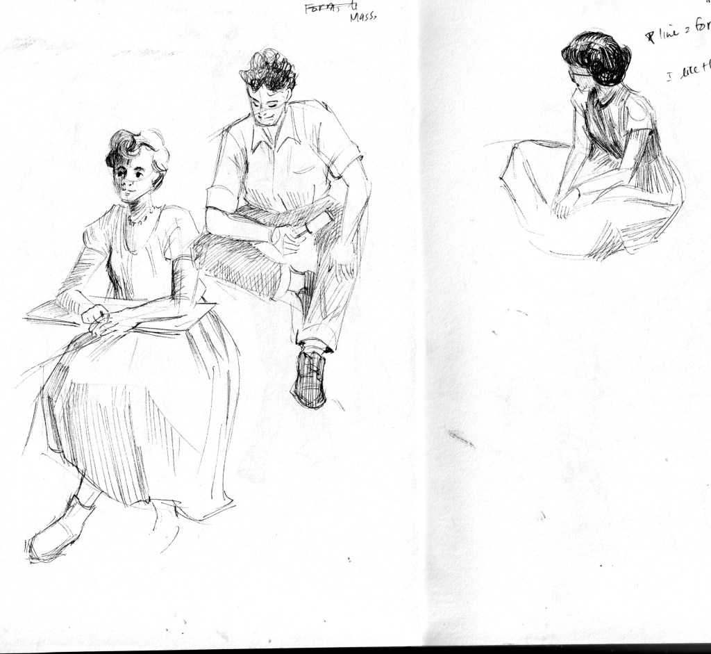
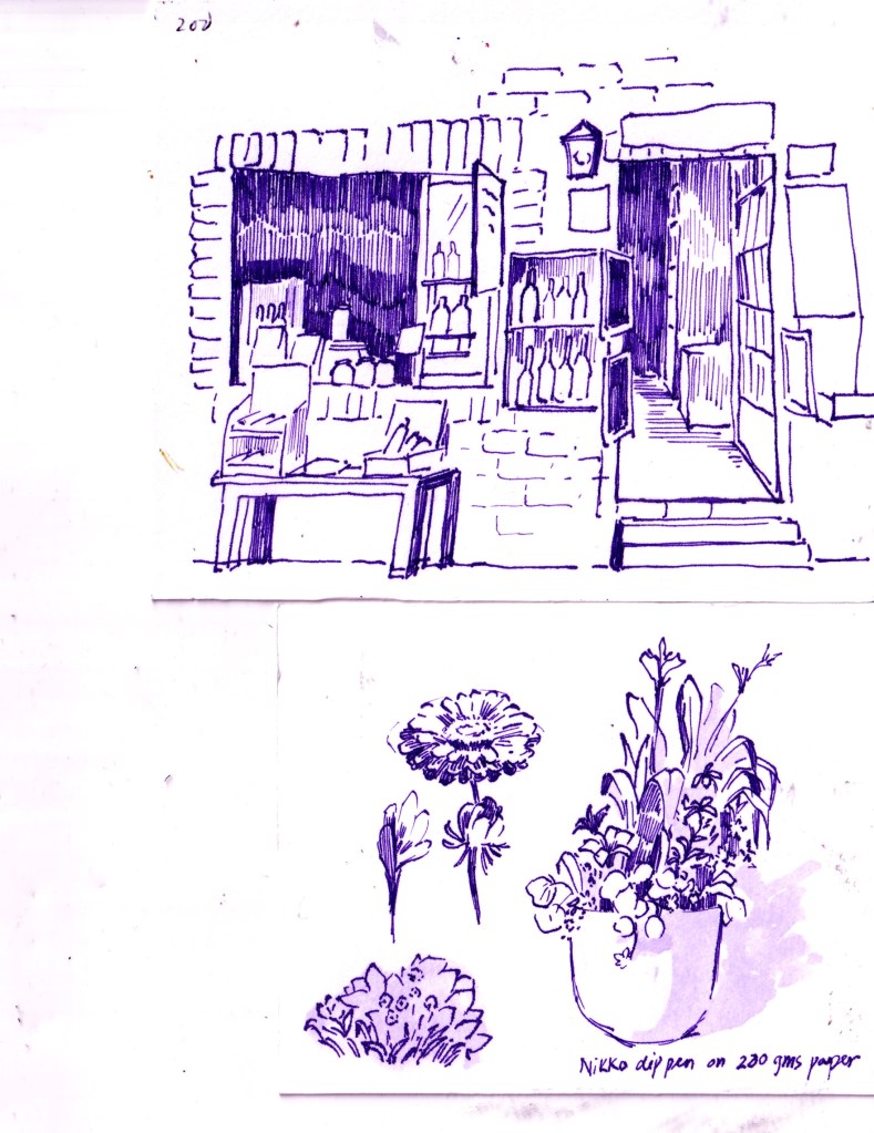
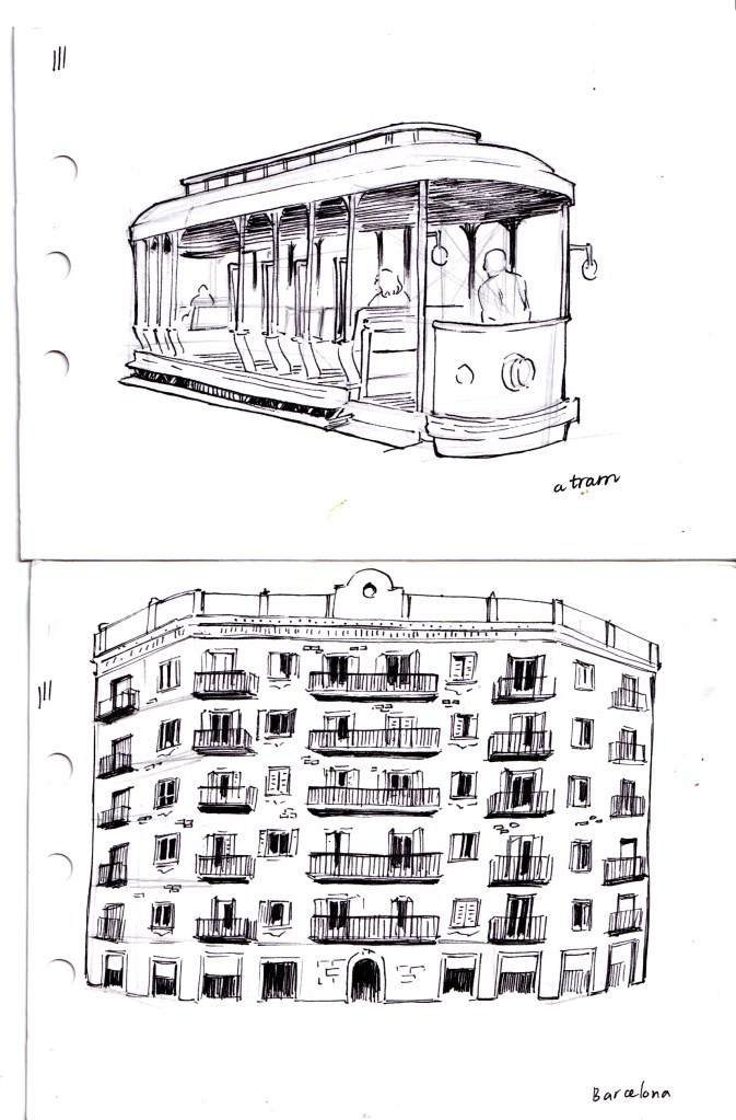
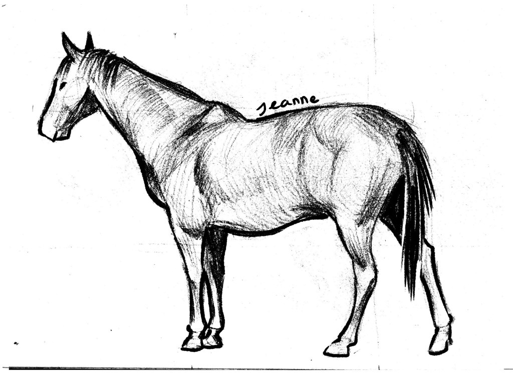
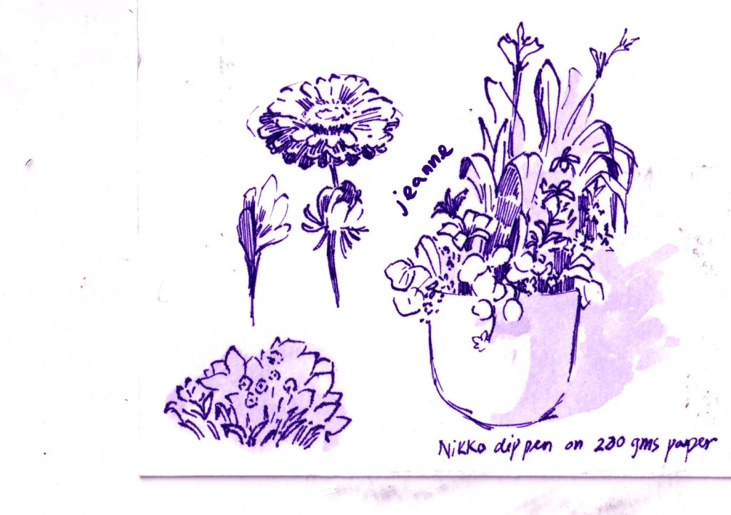
I tried my best to stay consistent with filling in sketchbooks, daily sketching for practicing techniques, as well as, … keeping me sane from my turbulent life. Here comes some of the best pages in my sketchbook in 2024.
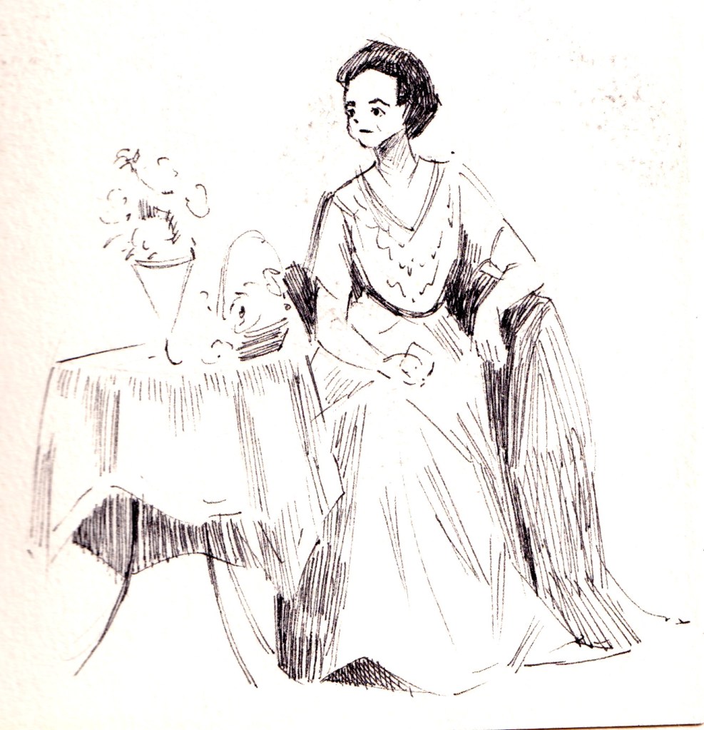
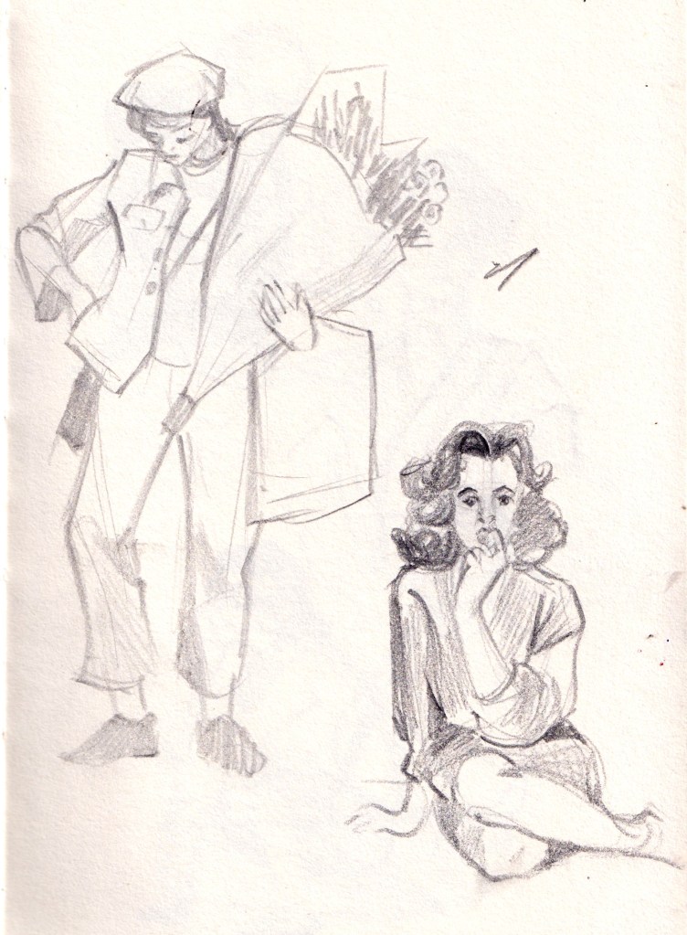
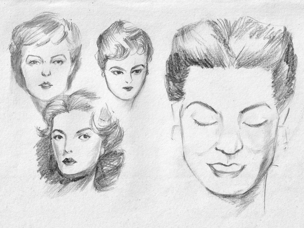
I found joy in learning to sketch costumes, starting with historical dresses and gowns from history since they were layered or made of different textiles allowing movements to be subtly depicted. Or maybe I’m biased towards modern fashion, particularly mass-produced and fast fashion.
These sketches are copies of works by Charles Dana Gibson, who created the “Gibson Girl” – an iconic representation of American woman in 20th century. His sketches were lively, comical yet with a sense of reality, I find him a great source to learn sketch costumes.
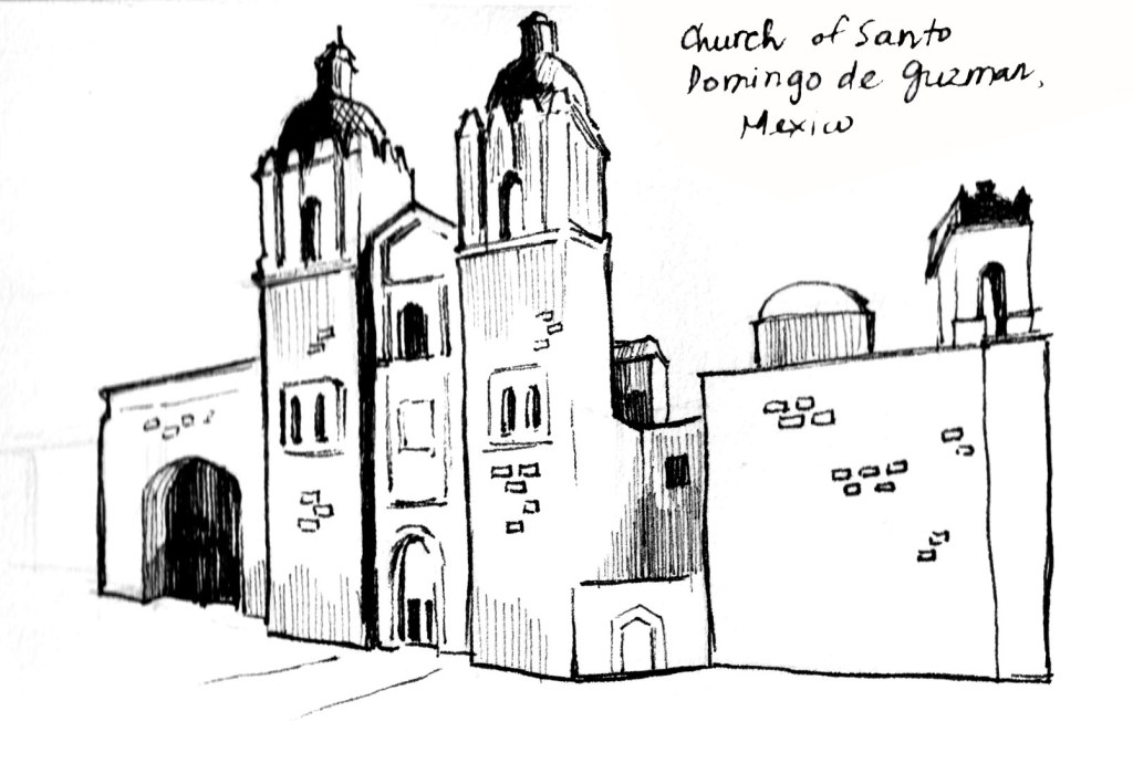
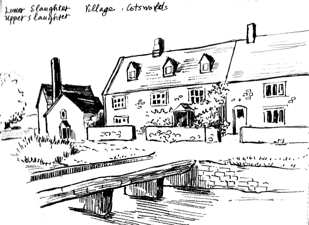
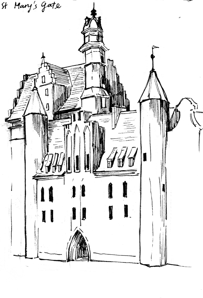
Together with new interest in costumes, I still find sketch houses, churches, etc basically everything architecture relaxing. Perspective used to be a huge obstacle, but but I get loose with it now, just eyeball every detail. Of course, for professional works, I still create a perspective grid to make sure things fall in their places; but with sketching, I think it’s better to distort, twist and play with it.
Mostly of my sketches are done with black and purple ink, but I’m slowly get familiar with all medium as well. With that being said, ink forces me to think and plan in my head before letting the ink reach the paper, because, whatever mistakes I make, the marks will stay permanent on the paper.
I’m still figuring things out, still experimenting with different mediums, and still making plenty of mistakes , but that’s part of the fun. So, here’s to more sketchbooks, more messy lines, and more moments of getting lost in drawing.
2024 saw me going up and down with painting, beginning with an intensive period of doing portraits and then a loose period of painting random things to find out: what do I want to paint? Some context: for the past 2-3 years, I have been allocating my efforts on the technical side rather than idea sites; since I often stuck by techniques. Sometimes, it was confusion while mixing colors, other times, it was problems about anatomy, perspective, etc.
My belief is that I would perfect my techniques or style to some point before thinking about what I want to express with my works. Well, it turns out that arts doesn’t work like that, and I get annoyed by endless practice and studying sessions.
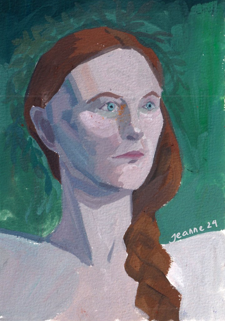
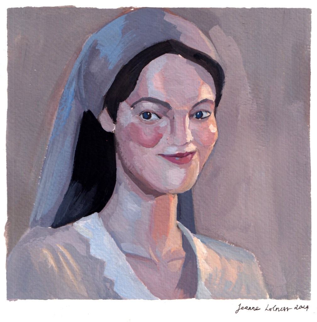
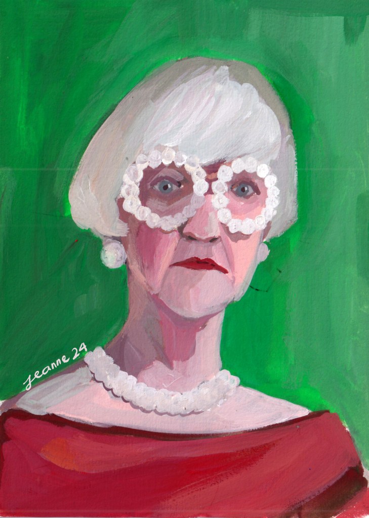
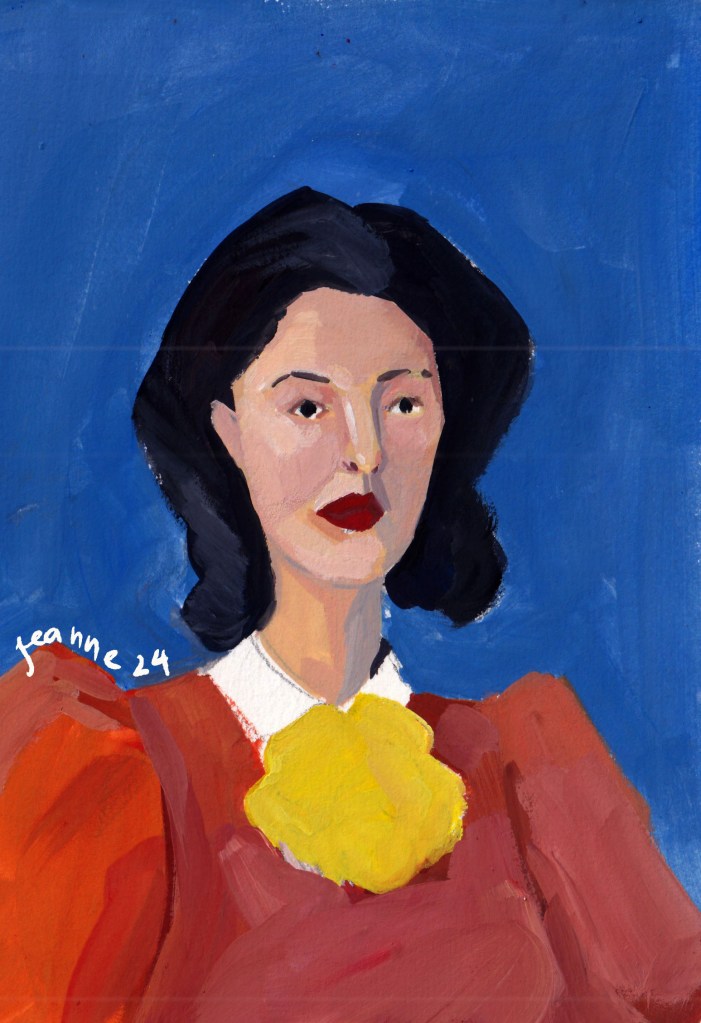
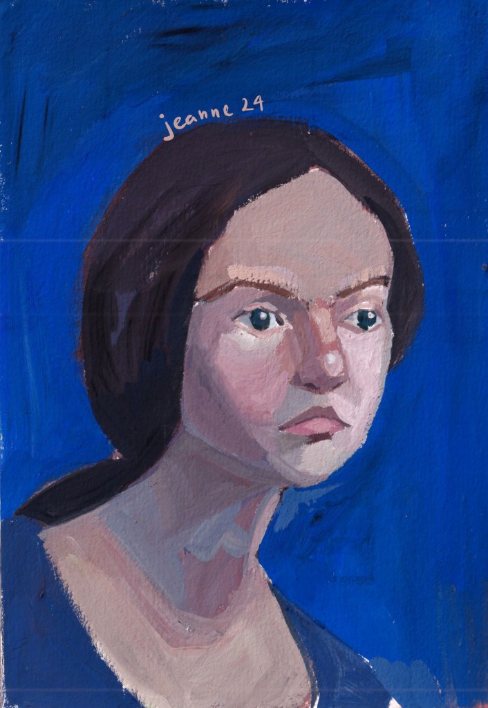
But let the story begin with the first few months. I was into learning about colors (again) and portraits. Portrait paintings were to recall my anatomical knowledge and to boost my color skills. Mixing skin tones is still something I need to work on.
This is my favorite portrait of the whole year.
One big shift in my color usage is towards a brighter palette with bolder color choice. It possibly coincided with my switch to Holbein acrylic gouache, but also my slight change from just painting from dark to light or reverse to painting from the boldest color to neutral tones. It’s not an intentional thing, it’s more about keeping my palette organized so that I can avoid over mixing.
One thing I have been thinking about is how to add “life” into my paintings, or to be more specific, movement. My paintings use to have a nostalgia vibe, because I mostly painted the places I visited, the places that I met someone and talked with someone. The later paintings of 2024 has something else with bolder and brighter colors.
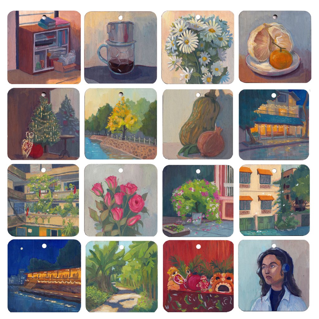
My summer trip to Quang Binh (Phong Nha), Hue, Da Nang (Hoi An) deepened my interest in painting traditional architecture. My only regret is that I should have taken many more reference images.
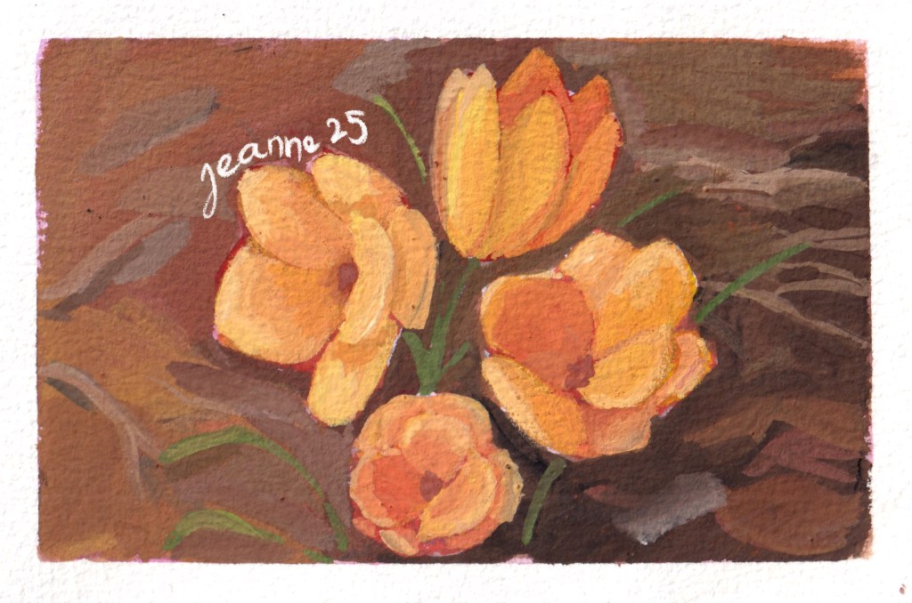
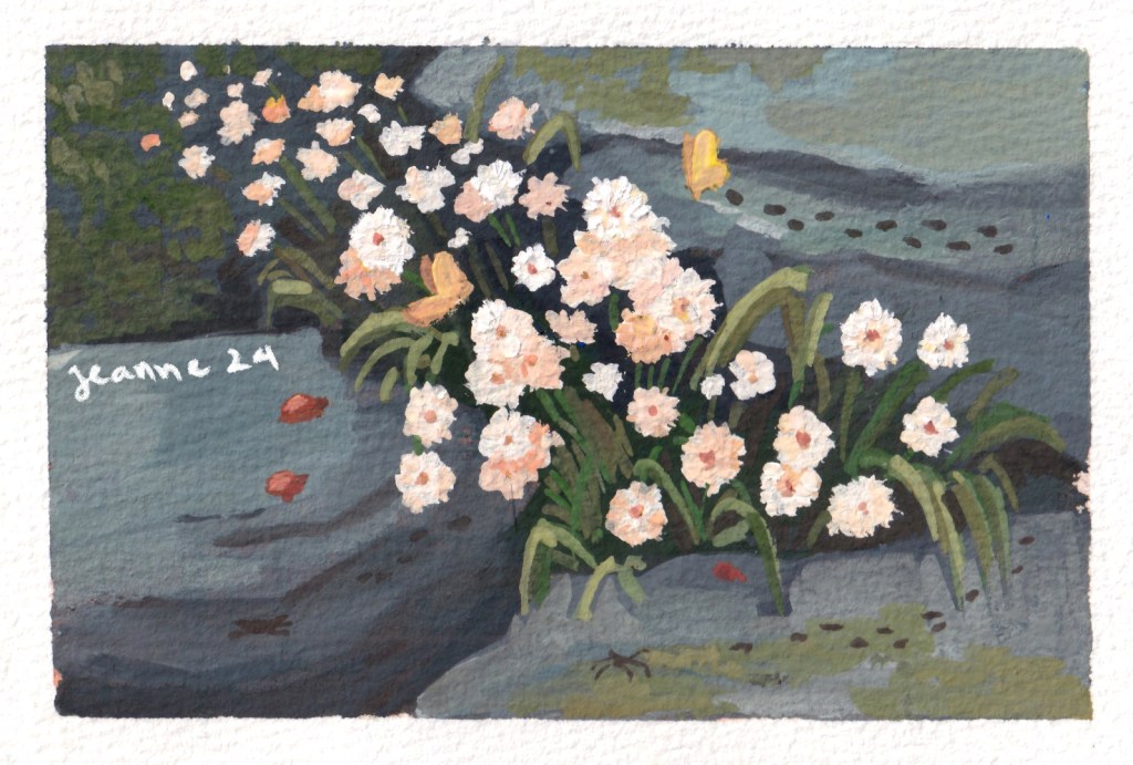
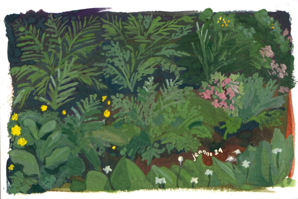
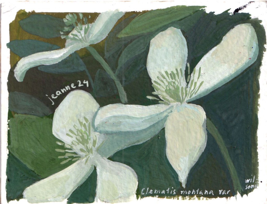
In the last months of 2024, I turned to painting nature, flowers and gardens in particular, as a method to relax. It’s also under the influence of writing about female artists, Rachel Ruysch, Élisabeth Vigée Le Brun, etc who use flowers as a subject and a recurring symbol of femininity. They allows me to work quickly with not-so-bad results, work freely wihout a reference image and can be used as gifts in rushed events.
Looking back, 2024 was a year of shifting perspectives—from focusing solely on technique to questioning how I want to express my ideas. While I haven’t found all the answers, I’ve discovered new directions, from bold color choices to the love for life and nature in my paintings.
Over the past few years, I have received numerous requests for couple illustrations for a variety of purposes—weddings, anniversaries, personal gifts, and even editorial use. The style preferences vary widely, from cartoony and humorous to deeply emotional, as well as partially colored sketches to fully painted pieces.
Here are some illustrations are allowed to publish for my personal promotions.
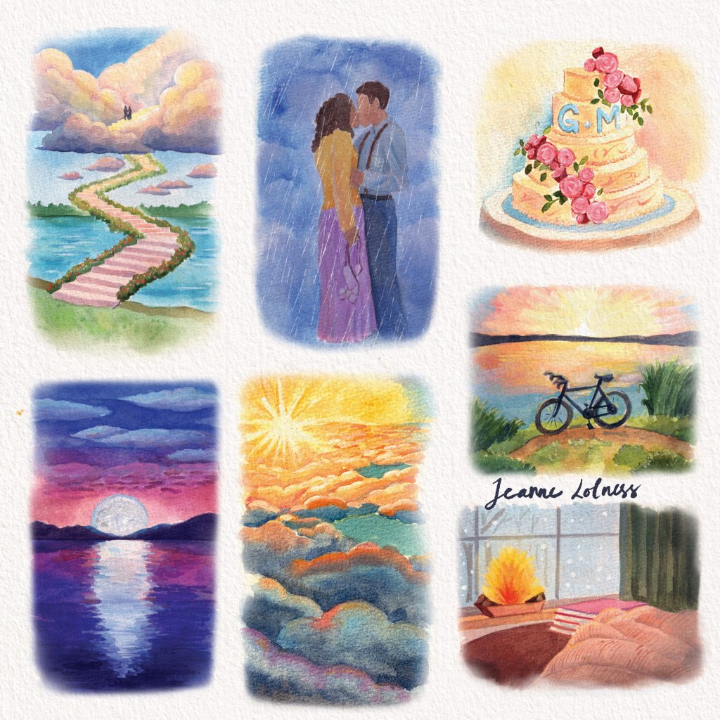
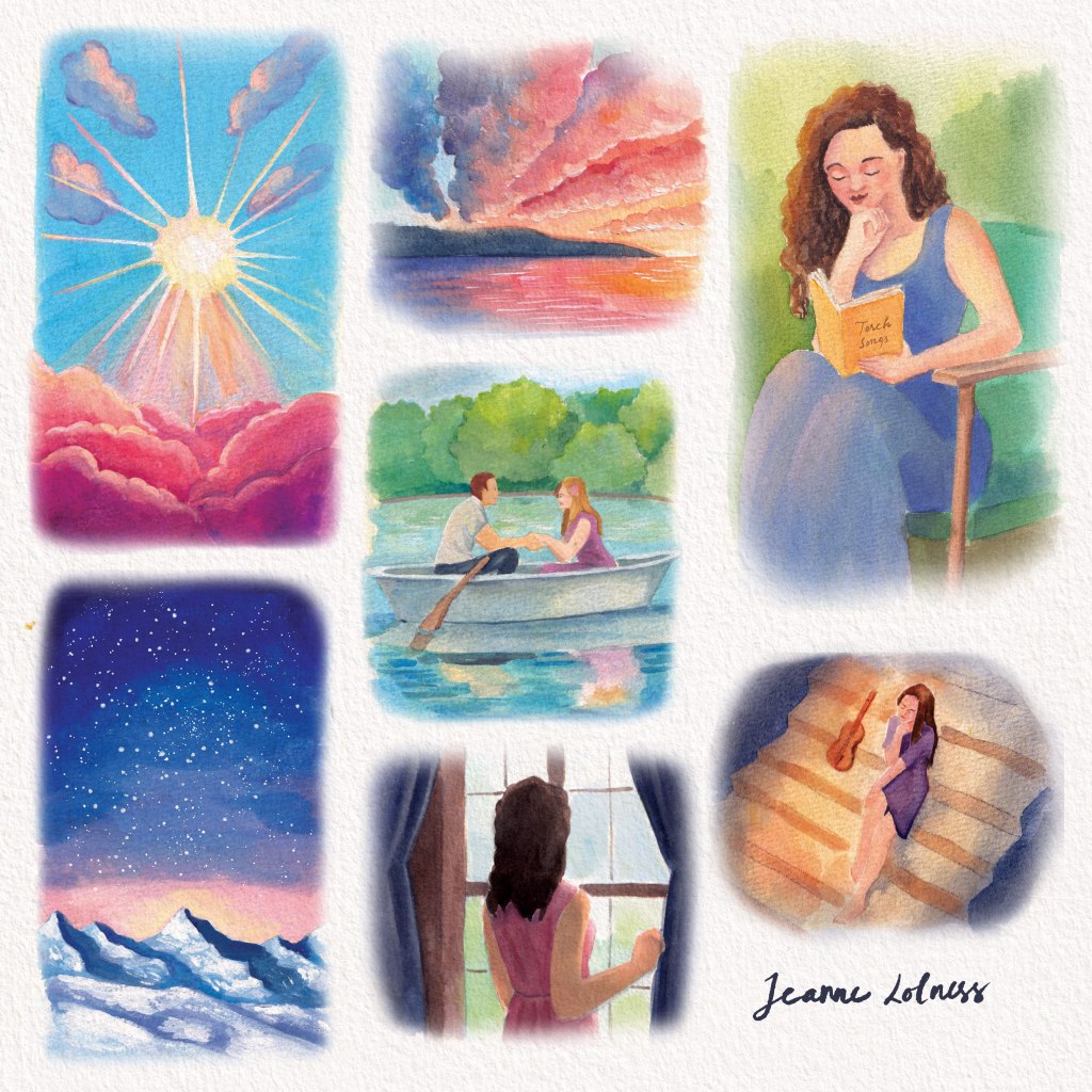
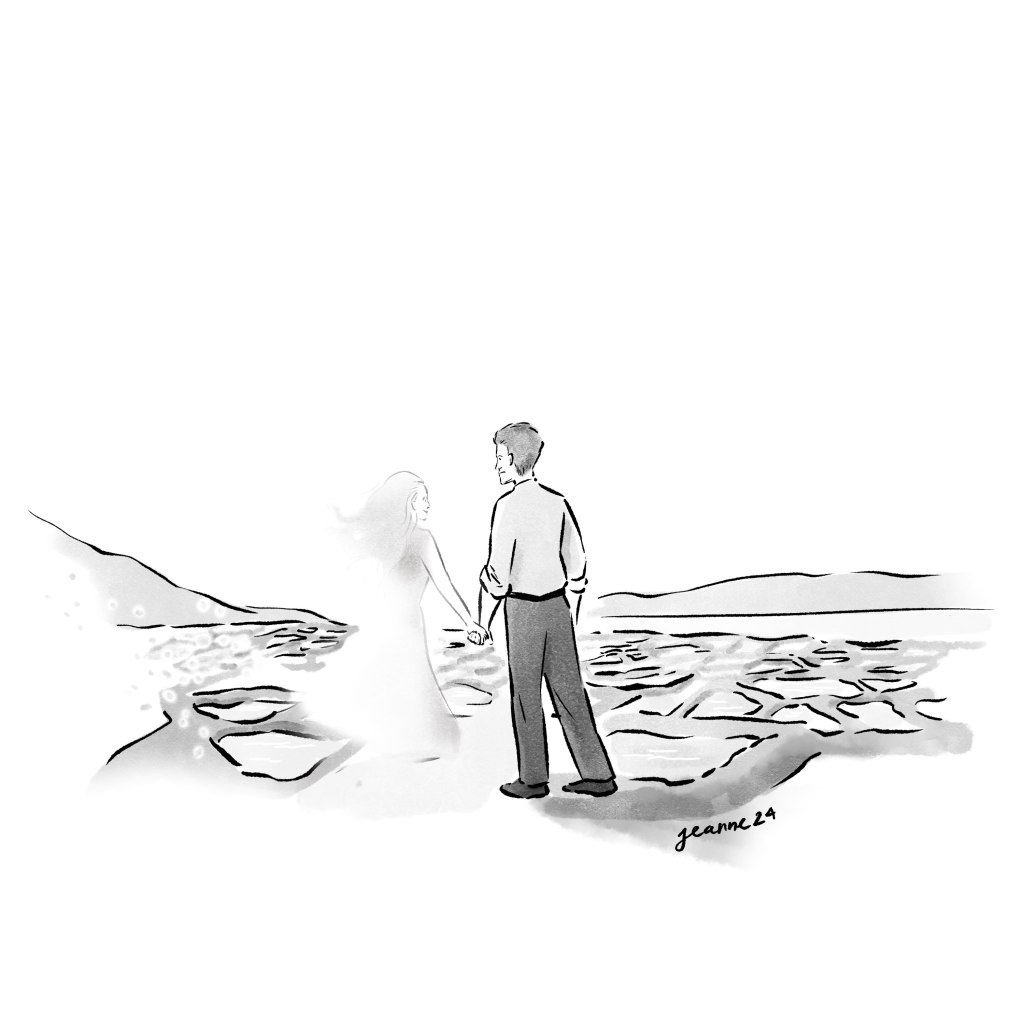
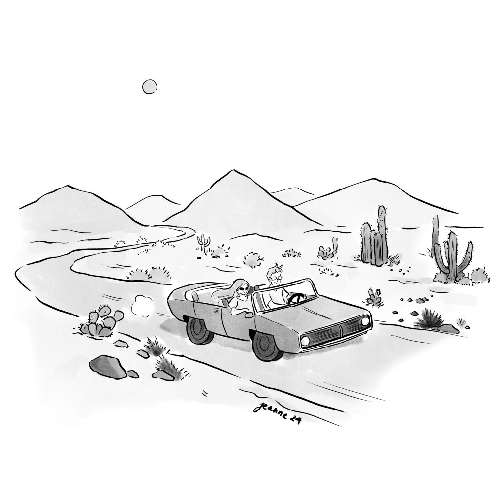
Above are a few monochrome drawings in a series of illustrations for a poetry book about love.
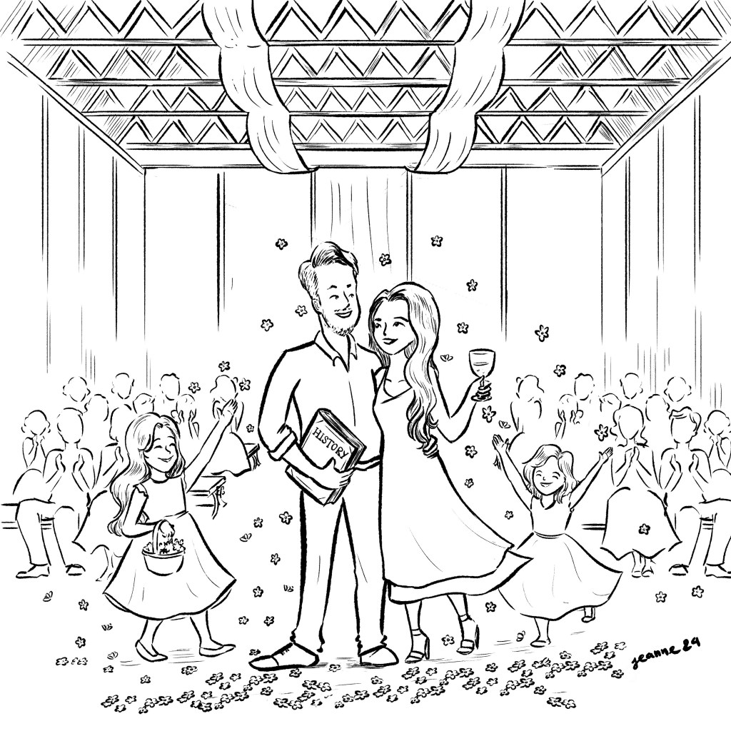
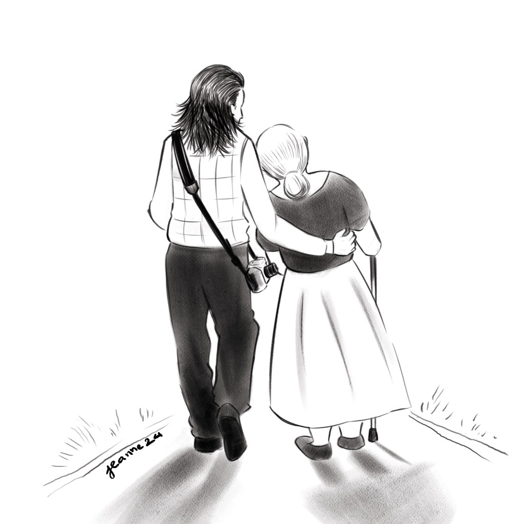
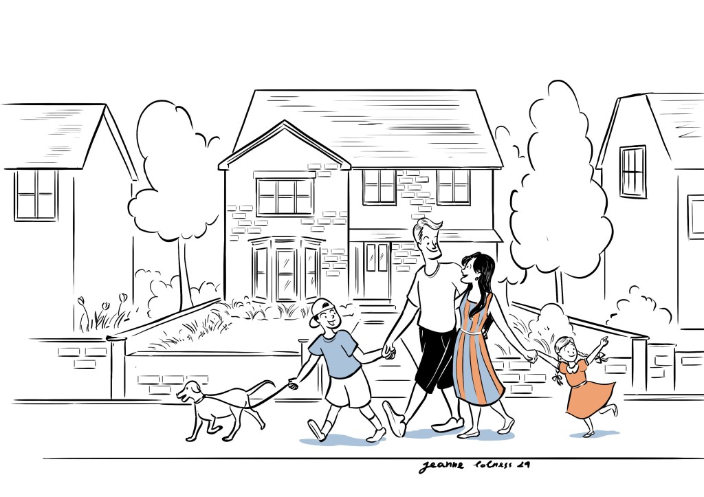
A couple married with two daughtersAn old couple, commissioned by their granddaughter
Here are some illustrations that I’m allowed to share for personal promotion. One of the biggest challenges in depicting love and affection is avoiding clichés. The most common pose—standing close with hands around each other’s waists—is often requested, so I strive to add a unique touch to each piece. Personalization is key: incorporating meaningful details from a couple’s memories, such as a special place, a significant object, or a shared symbol, can add layers of meaning that only they can truly appreciate.
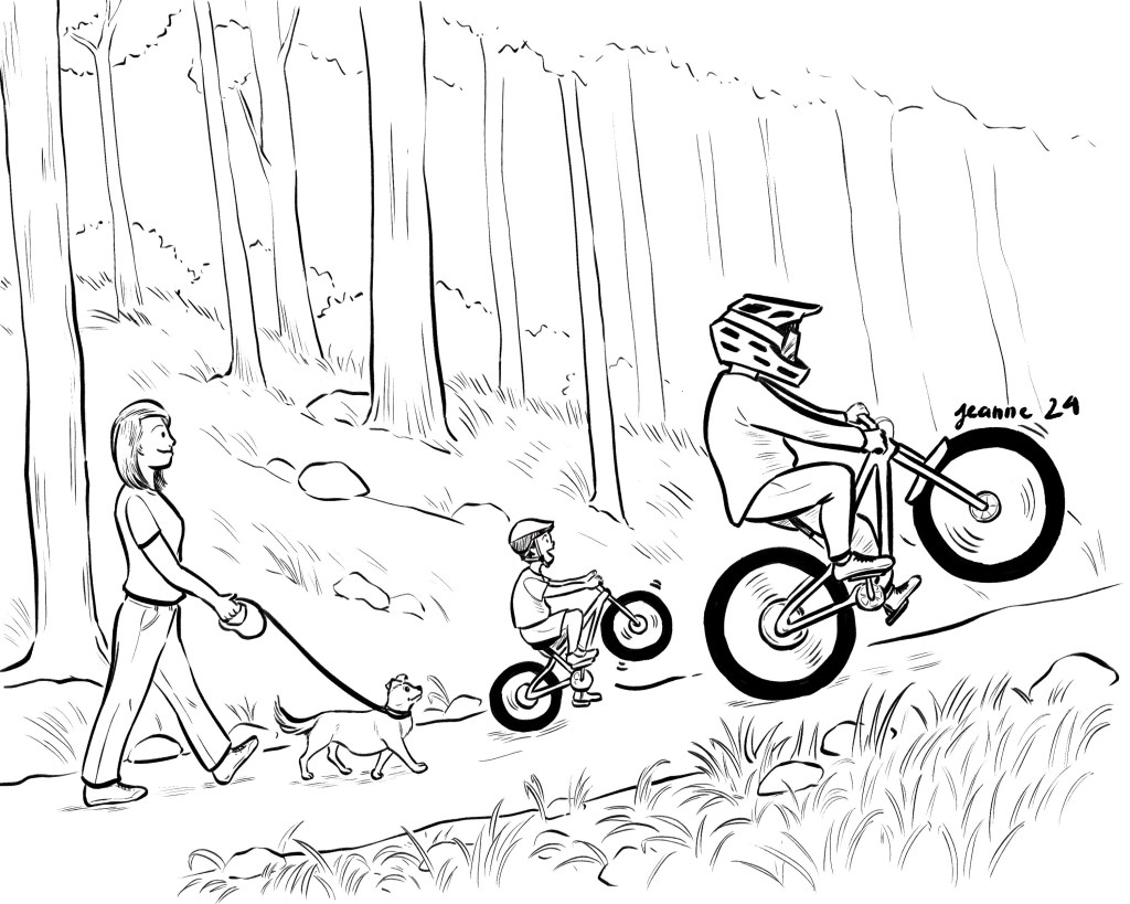
An illustration to show the family’s hobby timeAn editorial illustration
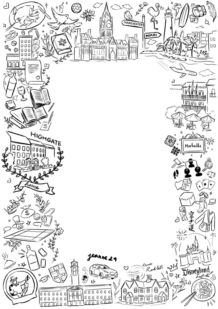
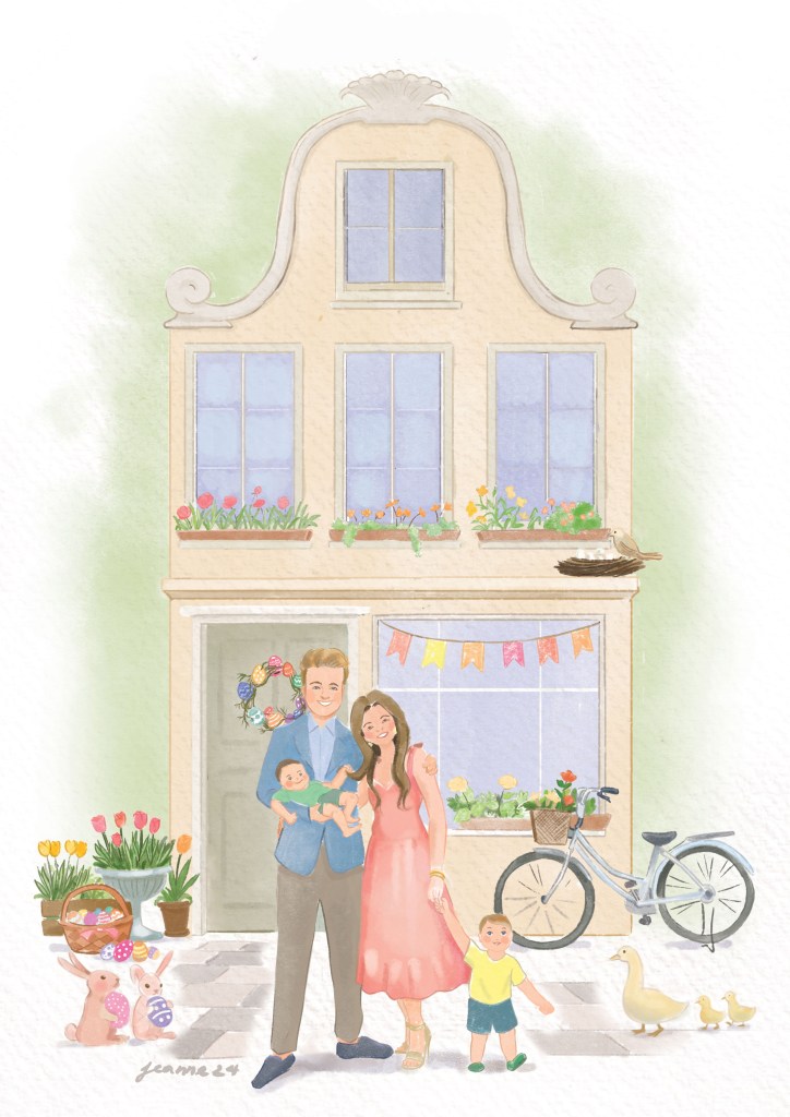
A doodle design for a wedding invitation, all the drawings are based on the couple’s memoriesA couple commission for a coming child with Easter theme
Couple illustrations are one of the most challenging commissions I take on. They require not only technical skills but also strong communication and an in-depth creative process—analyzing details, categorizing ideas, and translating emotions into visual elements.
Despite the challenges, creating couple illustrations is always a special experience. It’s rewarding to see how these artworks hold special meaning for each couple. I hope these illustrations bring joy and lasting memories to those who receive them.
It all started when I watched videos by James Gurney. I was amazed by how much fun it looked to explore the world through an artist’s eyes, and how urban sketching could really improve my art skills. James went into detail about his process, from choosing materials to picking subjects and actually painting. His videos inspired me – a homebody by nature – to get outside and work on my observation and on-the-spot painting skills, instead of always sticking to my desk.
I grew up in Hanoi, where the streets are full of houses from all kinds of different eras. They’re old and diverse, definitely not your typical urban design, but perfect for painting.
I thought I knew all about these houses until I started sketching them. That’s when I began noticing details I’d never paid attention to before. Questions started popping up in my mind: Why does this window look strange? Is it uncomfortable living in these houses? And so on.
My Medium: Watercolor vs Gouache
I started with watercolor because it was the most convenient and readily available option. I could use pans or different sizes of boxes depending on where I was painting. It reminded me of the old-school watercolor techniques I admired.
Gouache, on the other hand, was messier for me at first. I had bought a set of bottles, which weren’t as portable as tubes for outdoor painting. It might sound like a small detail, but the difference in storage was significant—paints in tubes are far more convenient. Since paint tubes were first introduced in the early 19th century, around 1841, by American artist John G. Rand; it has got easier for artists to travel and work en plein air (outdoors), which became especially important during the rise of Impressionism.
Once I switched my gouache to tubes, it became my favorite medium. I enjoy painting opaquely, except when I have a specific idea that requires transparency. Gouache is more forgiving than watercolor, and it’s easier to define both large areas and fine details.
I started by painting my own neighborhood since I was already familiar with it from my daily life. It felt like a chance to rediscover my surroundings in a new way. I’m especially drawn to houses with plants, those that have a nostalgic vibe, or those that clearly show signs of someone’s life lived there.
For watercolor, there’s a wide range of pans available, which allows me to create a personalized palette. With the help of adhesive putty, I can make my own compact watercolor box to carry around. My favorite brush is the waterbrush, as it has a reservoir for water built into the handle, making it super convenient. Travel brushes are also great, though I’ve found that investing in good-quality brushes and a durable case is more worthwhile in the long run.
Hanoi’s streets stand out from other cities due to the rich history shaped by major influences from nations such as China, France, and the US. Tourist areas often showcase French architecture, which can be explored further in my blog about Hanoi, including detailed sketches of house facades.
Before the French Revolution, the architecture in Northern Vietnam was deeply influenced by Chinese culture. Buildings often featured intricate decorations, from the roof to the walls, with wooden, symmetric designs. This style can still be seen today in temples and other historical structures.
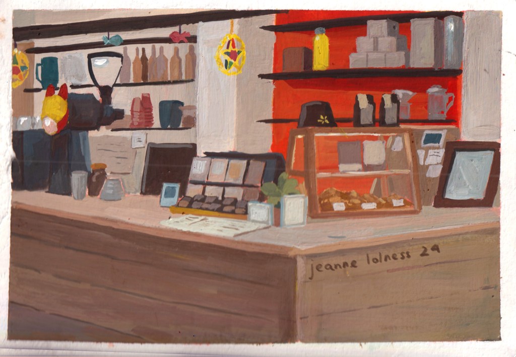
Hanoi’s vibrant coffee culture also provides ample opportunities for me to do studies. Many coffee shops are renovated from traditional architecture, while others embrace modern styles with clean lines and ambient lighting. Coffee shops in Hanoi serve as a melting pot for conversations, offering a perfect setting to observe and study people in real life.
To sum up
In wrapping up my journey of urban sketching in Hanoi, I’ve realized how much this experience has enriched my view of the city. Sketching outdoors has helped me capture the lively streets, stunning architecture, and everyday moments that often go unnoticed.
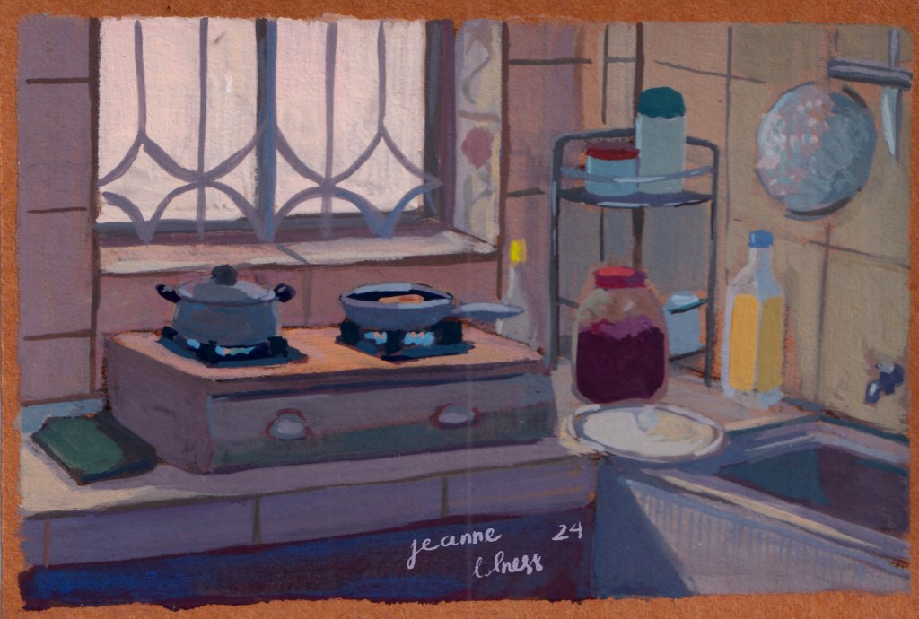
I encourage others to grab a sketchbook and explore their own surroundings. There are so many stories and details in our daily lives waiting to be captured. Each sketch not only reflects a scene but also our personal growth as artists. So, let’s keep sketching, observing, and enjoying the world around us!
I use daily life as my resource for sketching, naturally, Vietnamese culture is a recurring topic. Keep scrolling to be excited by my culture!
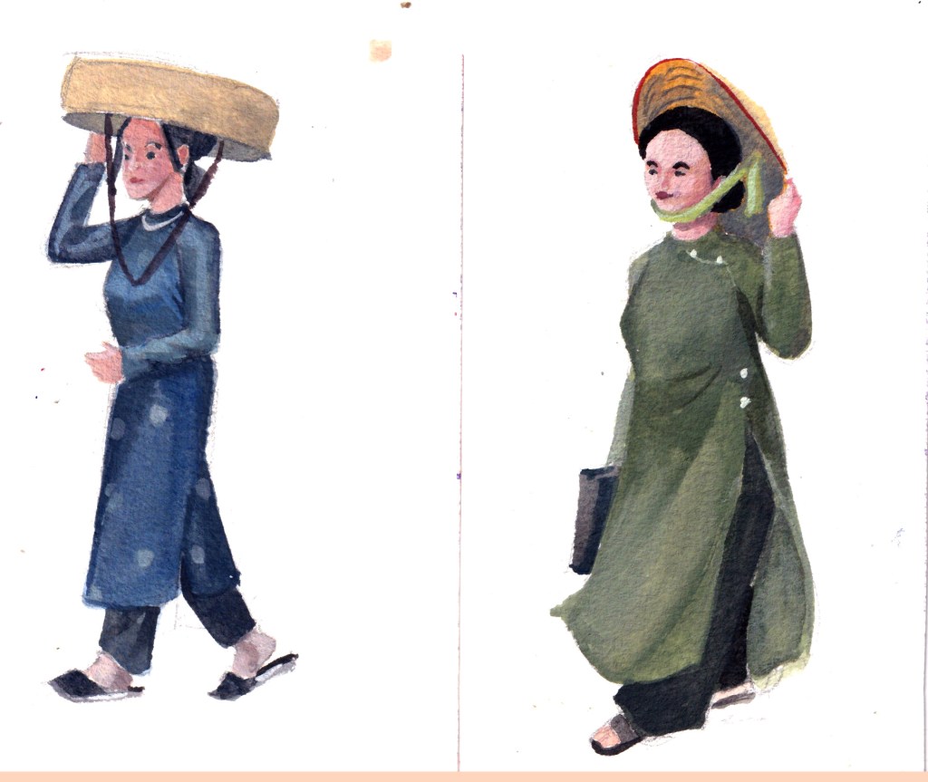
“ Áo Dài” (loosly translated to English: Long Dress) is the Vietnamese traditional attire now, in fact, it’s the result of an evolving history of costumes. The version of the Áo Dài commonly seen on Vietnamese streets today is a modern adaptation from the 20th century. Vietnamese traditional costumes are an extensive and fascinating topic, one that I’d love to explore in greater depth later.
Male versions: Left: A medieval soldier; Right: A groom
Female versions: Left: áo ngũ thân tay chẽn (a predecessor to Ao Dai); Right: Ao Dai (popular for daily wear in 20th century)
These little sketches were painted after I attended an event celebrating the history of Áo Dài in Hanoi, in which multiple versions were showcased.
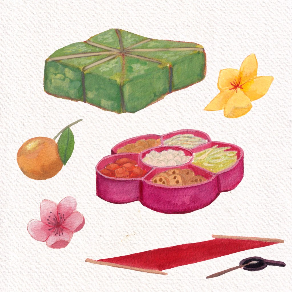
Tết holiday (Lunar New Year) is the time to watch bustling streets, enjoy traditional cuisine and appreciate the beginning of a new year. Not every Asian country celebrate Lunar New Year the same way and equally important. Simply explained, Tết holiday for Vietnamese is on the same level of importance as Christmas holiday for Westerners, Chuseok for Korean, Songkran for Thais, Diwali for Indians or Ramadan for Muslims.
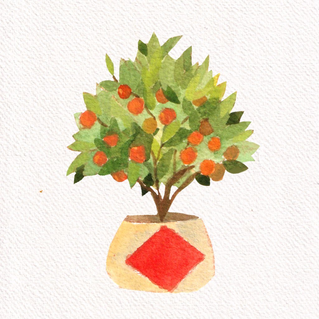
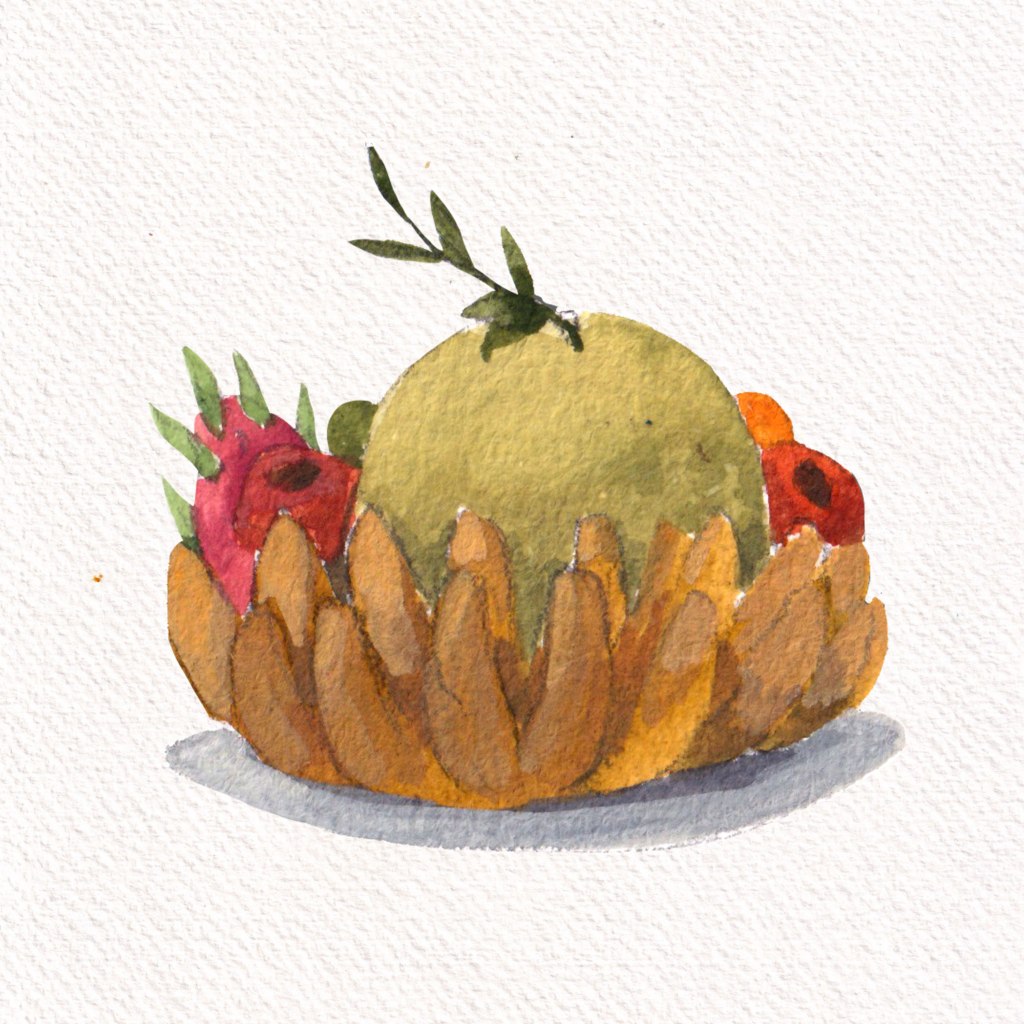
Bánh Chưng (sticky rice, pork, mung beans wrapped in Dong leaves) in green; Mứt (Candied Fruits) organized in traditional boxes; traditional calligraphy; Hoa Đào – Hoa Mai – Quất (3 types of essential plants for Tết)
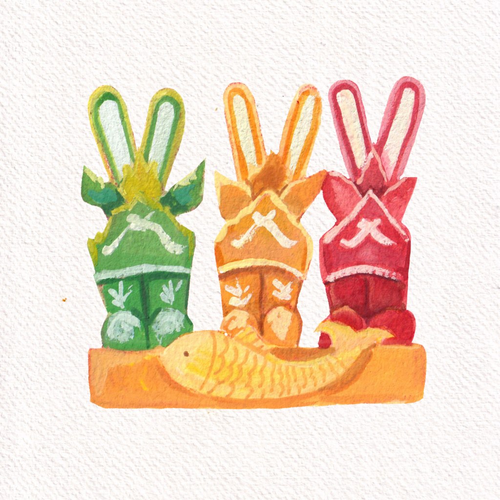
Joss paper models of boots and fishesA full plant Quất
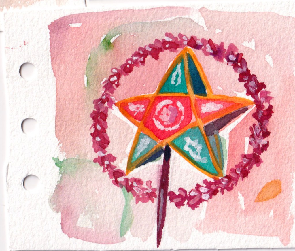
Mid-Fall festival or Moon Festival (Tết Trung Thu/ Tết Trông Trăng) is another major holiday for Vietnamese. It takes place on the 15th day of the 8th lunar month, typically around September or October. Children are especially excited during this festival, as they carry colorful lanterns, traditional toys and participate in fun parades. Mooncakes, filled with lotus seed paste or red bean, are shared among family members and friends as a symbol of unity and prosperity.
As I think about the colorful and lively culture of Vietnam, I’m reminded of how our traditions come to life through art, festivals, and our clothing. The Áo Dài, with its deep history, isn’t just a beautiful outfit—it’s a link to our past. Festivals like Tết and the Mid-Fall Festival bring us together, sharing happiness, food, and a sense of community. Every sketch and note I make is a way to celebrate these special moments.
It’s the time of the year when you look back over the past twelve months to see what you have accomplished. In retrospect, 2024 to me was struggle after struggle, from arts to personal life.
A year of failed and rejected projects
Overall this year I worked more on series rather than individual commissions, especially since the introduction of generative images in the first few months of the year. The new exciting AI interests people with an illusion of getting good artworks for free. However, the flow of personal commissions starts again from October, which is not so surprising to me at all. The basic brick of generative image is data, not creativity or emotion. Personal commissions do not only need likeness, but also personal touches and modifications from both the artist and the ones being portrayed.
Series illustrations does provide a better and more stable income than personal commissions. However, to prove that you are able to complete a large amount of work with consistency in quality, it takes much more efforts. Truthfully, I failed in a few significant chances that stays in my mind longer than I expect.
A rejected piece in a project for a Chinese museum
A year of stagnancy in learning
I also failed in my learning goals this year. It feels like I have arrived at the stagnant part of the learning curve. My self-set up curriculum started falling part in June, I felt stuck in learning Storyboard. After procrastinating for a month, I decided to drop this subject and maybe come back to it again. Other studying goals felt frozen, and I couldn’t see any improvements except from sketchbooks piling over in the corner of my room. I must have passed the exciting beginner phase of learning arts now, no subject seems completely new now. It’s now the phase of repetition and patience.
My whole system of working and studying became too much for me to handle at certain points. I set up a complex Notion dashboard in January, and after a period of complex projects requiring quick turnarounds, the whole system started crumbling. The daily to do list of Notion was unlimited, which gave me a false idea of my capability. Furthermore, I missed using papers, the idea of ticking done to a task and how my pen moved across the papers. I’m still using it as store some lists and resources for blogging, and happy to be back with my handmade A6 notebooks.
I forced myself to learn things I don’t really like, hoping to cultivate a new aspect in my arts. In the first few months, I learned animal anatomy and started reviewing human anatomy in the later part of the year. These new knowledge doesn’t show up right away in my paintings, even the personal pieces. It only came to the surface after a long time brewing, it started with my realization that my artworks lack spirits or liveliness. I’m starting with small animals and human silhouettes.
I started to feel the urge to add more details, every now and then when I looked back some old pieces, I felt I could have added more characters to the scene instead of going the easy way. Of course, this led to less paintings done and a major portion of each need to be done at home instead of at the place. Being a quantity person, I can’t help thinking “I’m doing less this year”.
I overworked this one – I kept changing and adding objects
A year of resilience
A few sentences I often tell myself this year is “hang in a bit more”, “I can tolerate this a bit more” and “be resilient”. These reminders come from a podcast story I hold close to my heart—the story of Abigail May Alcott Nieriker. She was the inspiration for the character Amy in Little Women, but her real-life journey is even more inspiring. Abigail didn’t give up her dream of becoming an artist to marry a wealthy man; instead, she achieved recognition by exhibiting her work (of a black female!) at the prestigious Salon in France. She did marry eventually, but it was for love and much later in her life. (Interestingly, Laurie was entirely fictional and not based on any real person.) Her story is a true testament to perseverance and determination. She is a hard-working artist, passionate painter and devoted educator -I deeply relate to her journey—I sympathize with her struggles, feel inspired by her resilience, and see her as a role model.
Another source of strength and motivation for me is literature. I read many novels by Kazuo Ishiguro this year: An Artist of the Floating World, Klara and the Sun, Never let me go (a re-read), and Annie Ernaux: A girl’s story, Shame, A Woman’s story. The most interesting novel is The Bathroom by Jean-Philippe Toussaint, weirdly writing about almost the same thing I wrote in my journal but in a more beautiful way. Here are a few passages that I love:
70) But when I thought more deeply, and after I hadfound the cause for all our distress, I wanted to discover its reason. I found out there was a valid one, which consists in the natural distress of our weakand mortal condition, and so miserable that nothing can console us, when we think it over (Pascal, Pensees).
49) Seated on the edge of the bathtub, I explained to Edmondsson that perhaps it was not very healthy, at age twenty-seven going on twenty-nine, to live more or less shut up in a bathtub. I ought to take some risk, I said, looking down and stroking the enamel of the bathtub, the risk of compromising the quietude of my abstract life for … I did not finish my sentence.
50) The next day, I left the bathroom.
Literature consoles me differently from social media or modern psychology. Instead of labelling, it just describes. It tells a story of thoughts, emotions and imaginations. How do I feel this year? I feel like a caterpillar slowly breaking my cocoon to realize that I’m still a caterpillar. At least, I’m still crawling forwards.
I received the request for this project when I was so confused about what direction to go with my life. I was already working on some small commissions, but things was going nowhere.
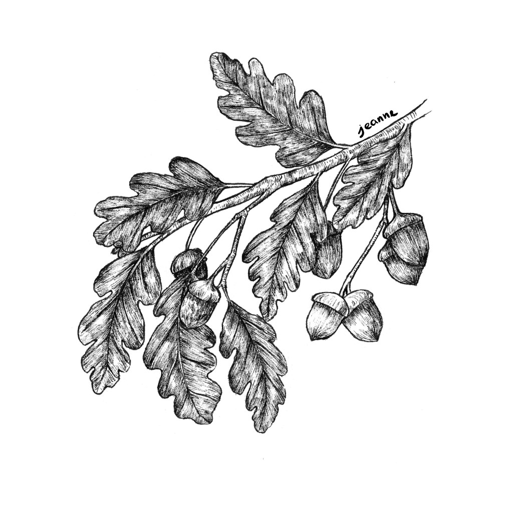
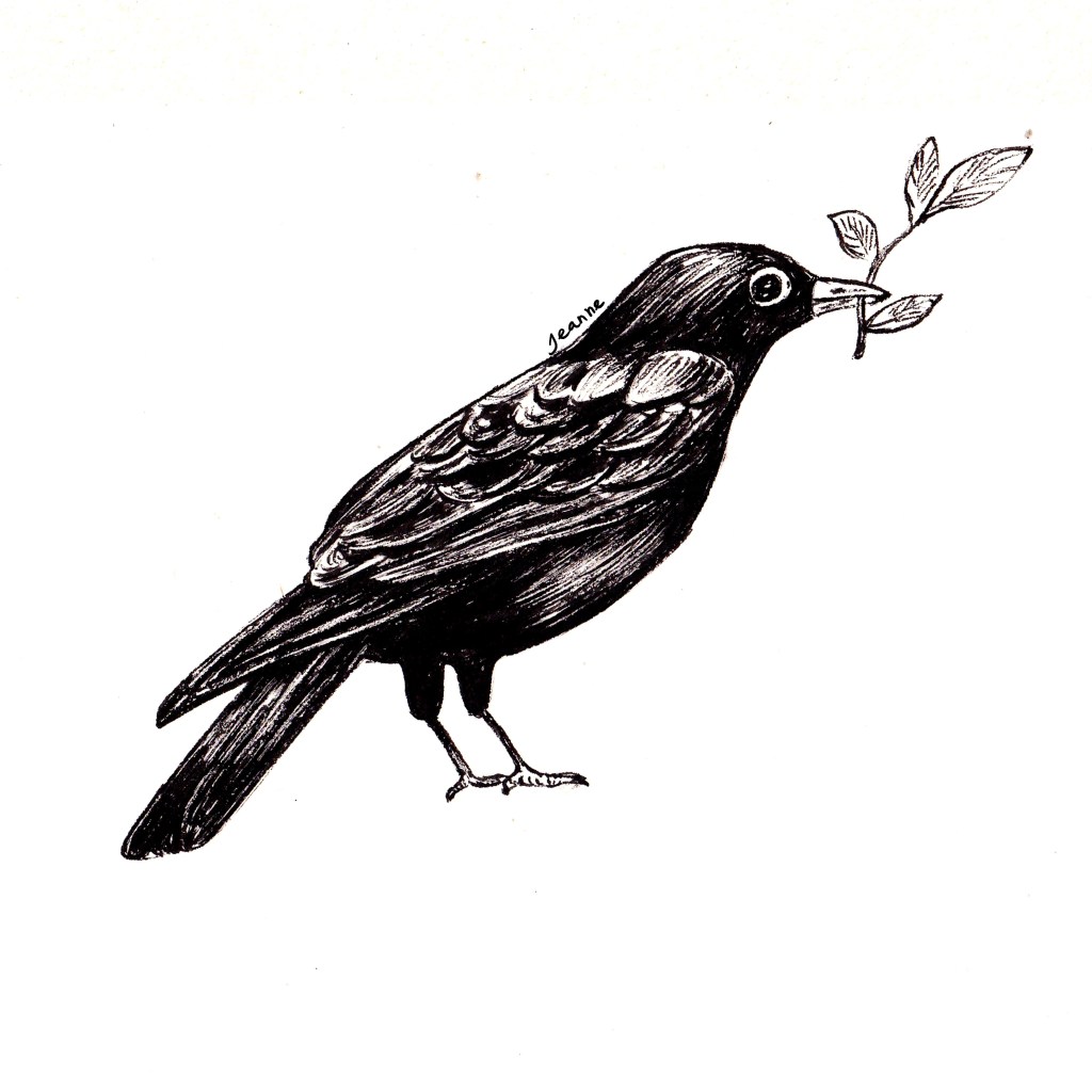
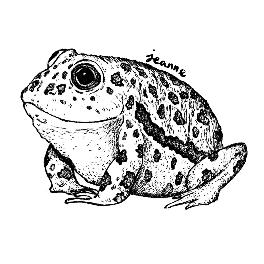
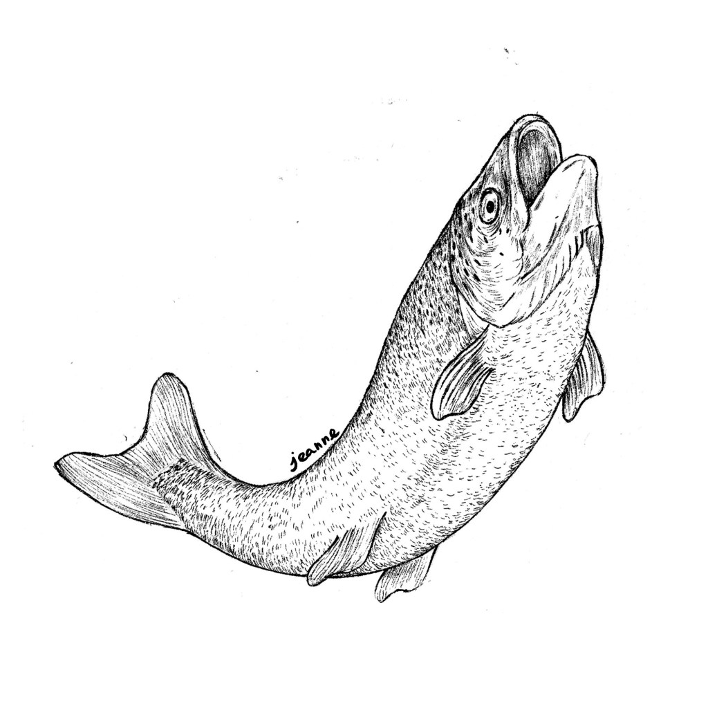
For this project, I actually offer to do the first sketch for free since I wasn’t sure about myself on how to draw the whole series. The author was asking for a series of detailed ink drawings for leaves and animals. I’m still amazed now by how much trust the author had in me and how smooth things went.
I based many details on botanical illustrations from old books, which I dug up from Internet Archives. I do use photos from Google and other stocks sites, yet they tend to be not as useful. What I look for is an image showing the full branch or plant in clear lighting, and online images tend to be either close-up shots of just the flowers or have a strong contrast.
This project consists of about 30 ink illustrations for 30 poems about nature. It came like a magic touch, and kept me afloat for a whole three months to be able to receive more commission request.
I don’t do much these ink commissions anymore, since I’m working more with colors and full scene illustrations. I still look back this project dearly, since the payment helped supported me in those early days and I had a collection of animal and botanical illustrations in my portfolio.
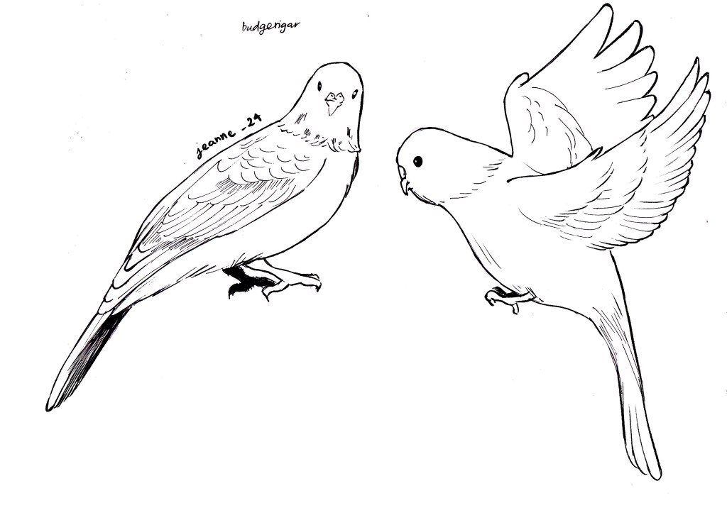
Yet, birds, animals and plants are still my favorite topics to sketch with ink particularly, I have loosened my grip more, creating an impression rather than detailed inking. I have been taken up with studying animal anatomy carefully to be correct – a small anatomical mistake can make the whole drawing look off!
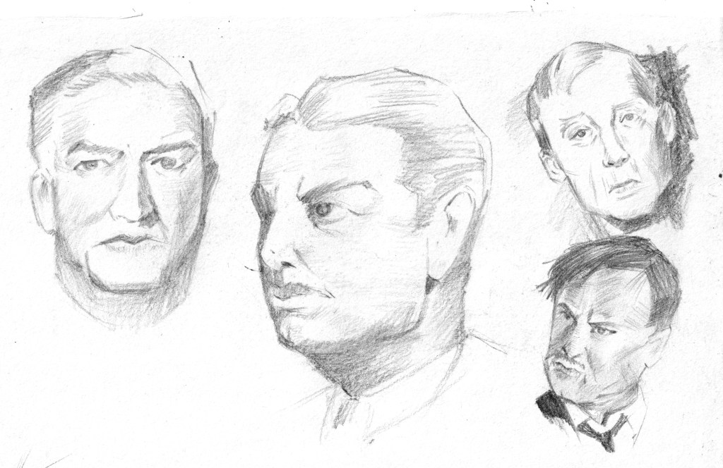
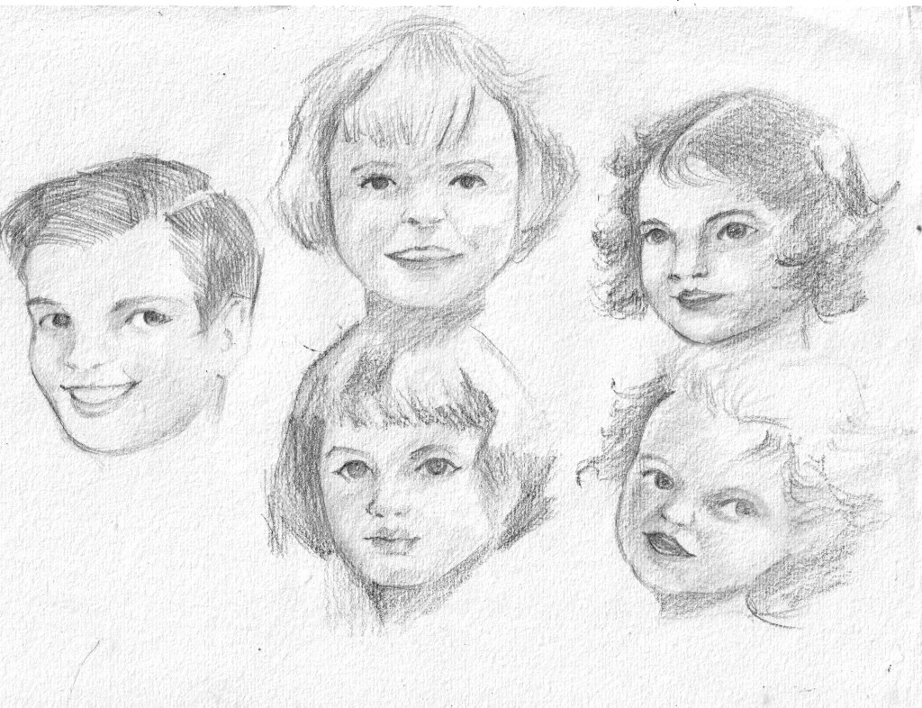
Human face is always a hard subject for me, since it’s easy to draw it ‘wrong’ and hard to fix it ‘right’. The annoying thing is even if I realize the face is ‘off balance’, sometimes I can’t point out which part need fixing or how should I re-draw it later.
That’s why it takes a long time for me to be able to draw a face that I can feel satisfied with.
My start
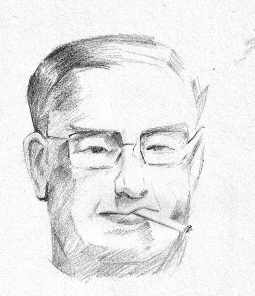
My first proper learning would be Proko’s drawing face videos, which is based on Andrew Loomis method. Later, I discovered Andrew Loomis wrote a whole series of books about arts, especially about figure drawings and portraits. The book I read, “Drawing the Face and Hands” was published in 1956, yet it’s still useful in learning the general structure of the face. The books were divided into male, female, teenager, kids and a small section at the end about hands. He often began with building the blocks first, then slowly adding features. The proportion of human face is similar among all people, yet, age and gender make the main difference.
I tried copying the sketches in the book
The only few drawbacks of the book are it don’t have any exercise or suggestion about practices and it was written in 50s language, which is lengthy and flattering for me. However, I can still feel the warmth and efforts of Andrew Loomis in his first few words opening the books “Now let’s get to work in earnest”.
The first course
Later, when I took the course “Deconstructed: Drawing People” by Viktor Kalvachev, he shared his method learned from a criminology professor to recognize faces based on basic shapes. Actually, you can see that section free on Schoolism channel.
Together, I found it easier to draw faces from images and came up with my own design for commissions.
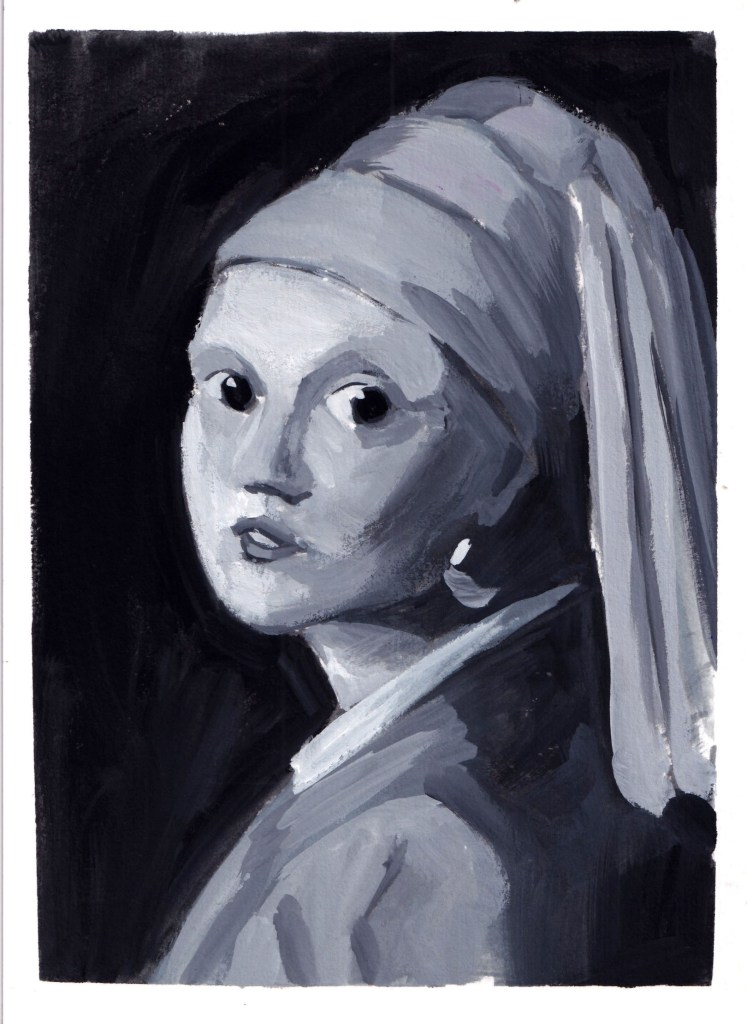
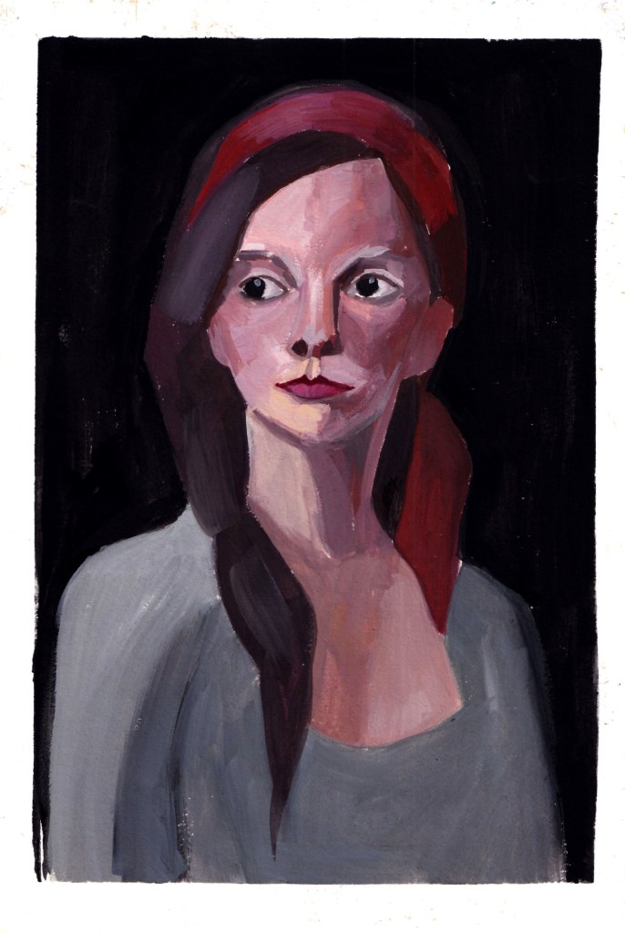
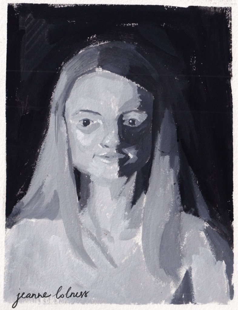
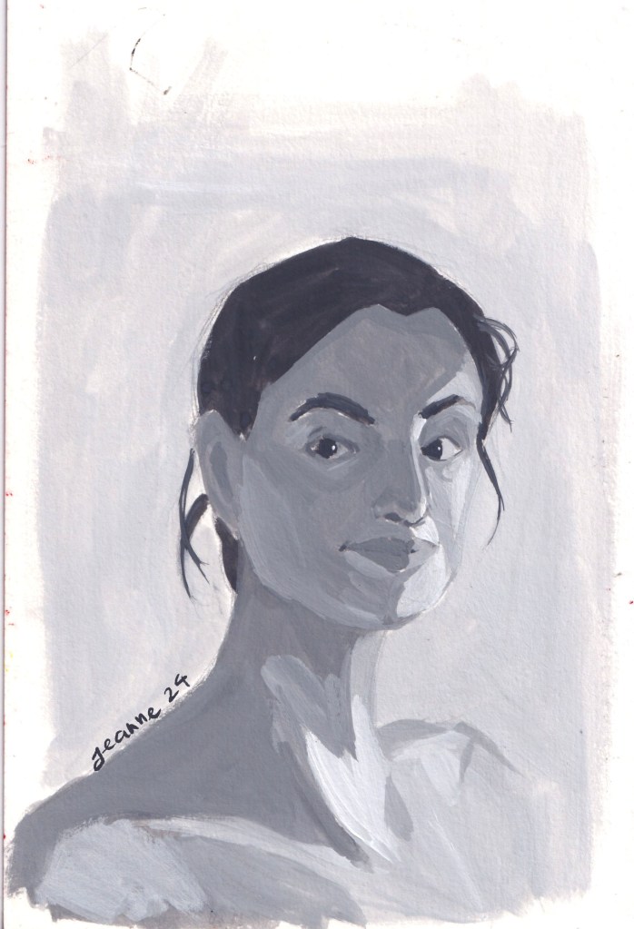
A 60-day portrait painting challenge
Feeling okay with my line drawing/sketch, I start to look for more ways to paint the face. There are realistic approach and stylish approach, color and lighting setup are also considered. I want a bit of fun so I try the Digital Painting Workout by Woulter Tulp (also a course on Schoolism). The course’s main purpose was to practice digital painting, yet the instructor prioritized portraits because they are subjects that can be tackled in 30 minutes or so. For each day in 2 months, I spared 30-40 minutes to paint an image based on the instructor’s guidance. Each painting focus on one goal only: value or color or rendering, etc.
The useful side of this workout is that it allows me to learn painting both way: realistically and stylishly. I learned that there’s endless possibilities about painting a person, the important point is to paint how I feel about the person.
The most recent course I took is about color, and the subjects used were also portraits. This time I used gouache for the whole course, trying to mix color traditionally. The side effect of this course is that my portrait skill improved a lot as well.
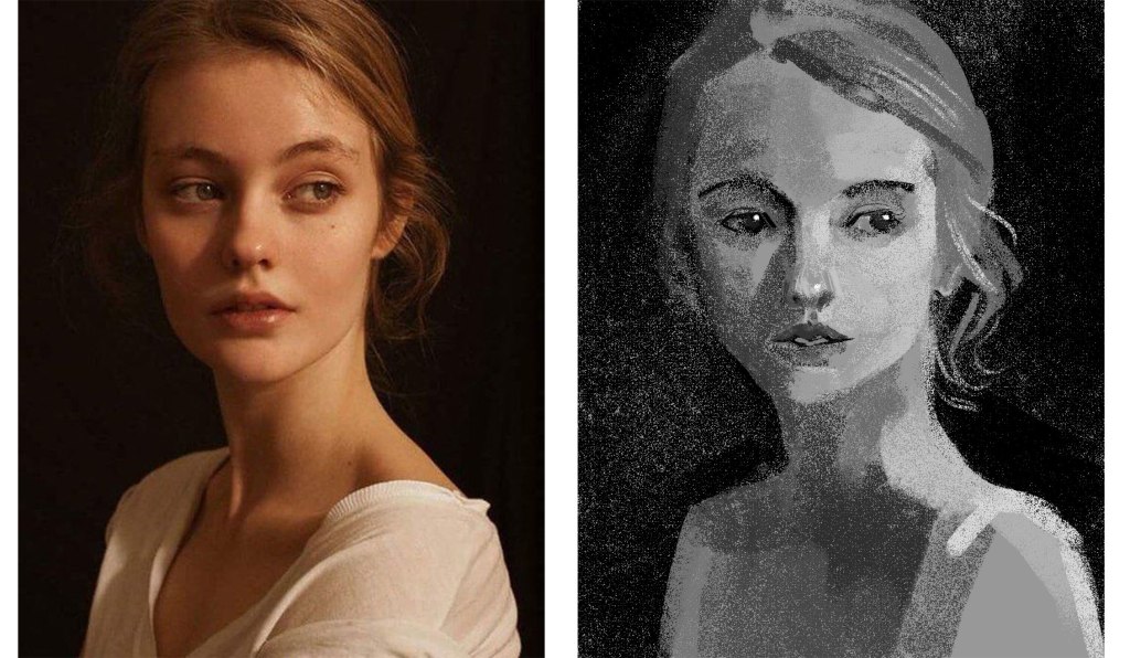
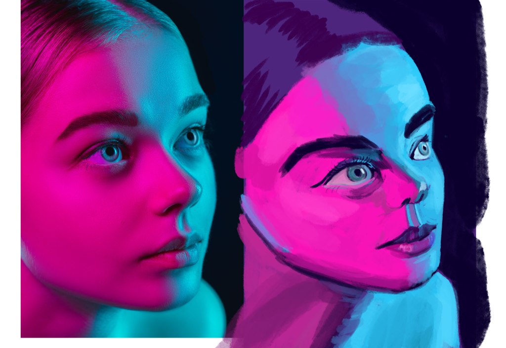
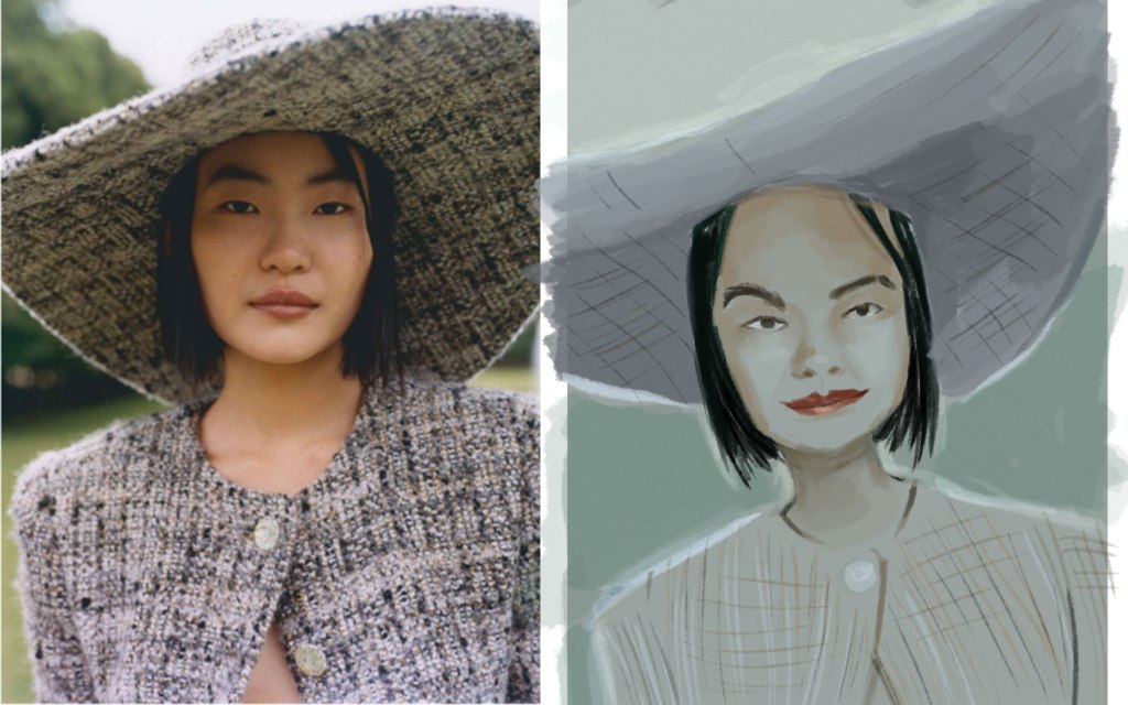
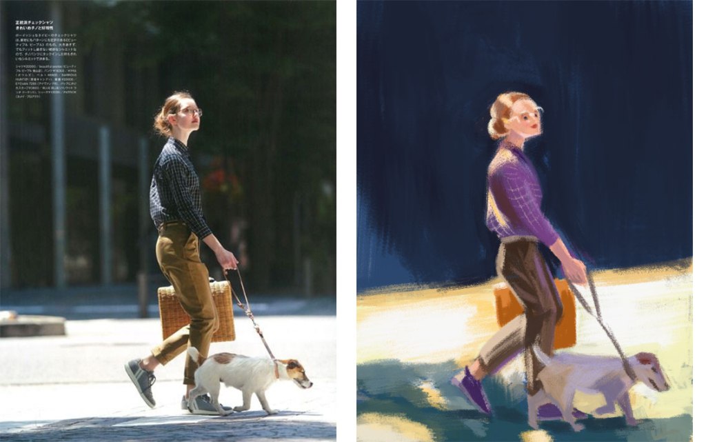
Credit: @Lee Avision/ Trevillion ImageActress Pınar Deniz
Model: Jessica from Croquis CafePhotographs by Paolo Verzone, Egyptologist Monica Hanna, from National Geographic
These paintings aren’t used for commercial purposes, just for education and promotion only.
I aim to use realistically but not in order to copy the image exactly, the important is to paint how I feel about the model, how I think about her, what’s the real or the imagined story I could tell with her eyes, her skin, etc.
What’s next?
I want to learn more about human expressions and experiment with specific lighting, especially dramatic/ theatrical set up to tell a story. And I will need to revisit the face structure to keep my knowledge fresh, but with a different approach/method to keep the art as fun as I originally started it.
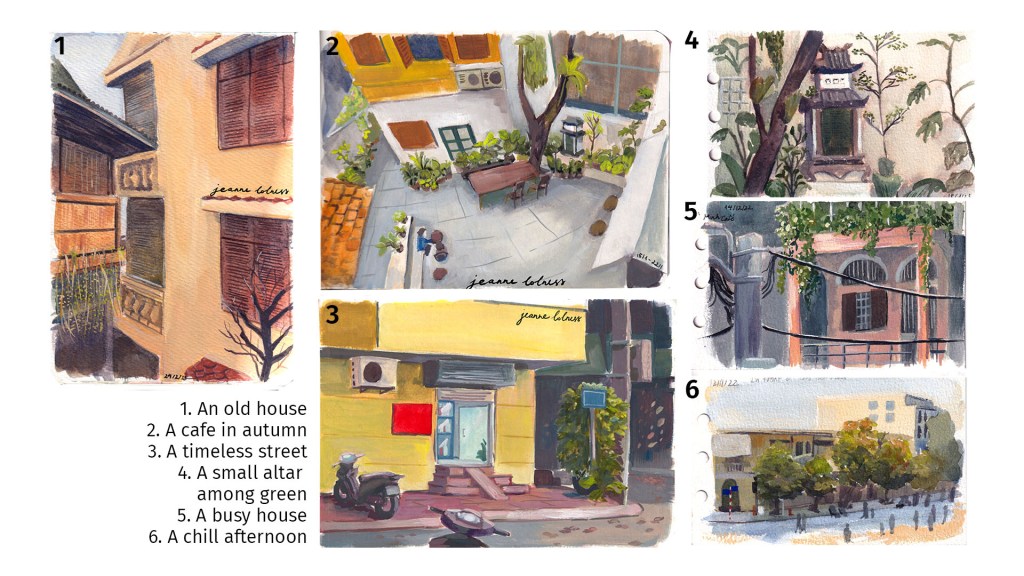
Growing up in Hanoi, I have an affection to every cornet of this city. Especially those are less known with tourists, because these places feel more authentic to me. When sitting in a cafe painting these scenes, I feel like capturing a moment of this city, a moment that will be gone with unavoidable modern development.
That’s why I tend to chose old houses or historic structures, so that theirs stories can live on through my paintings.
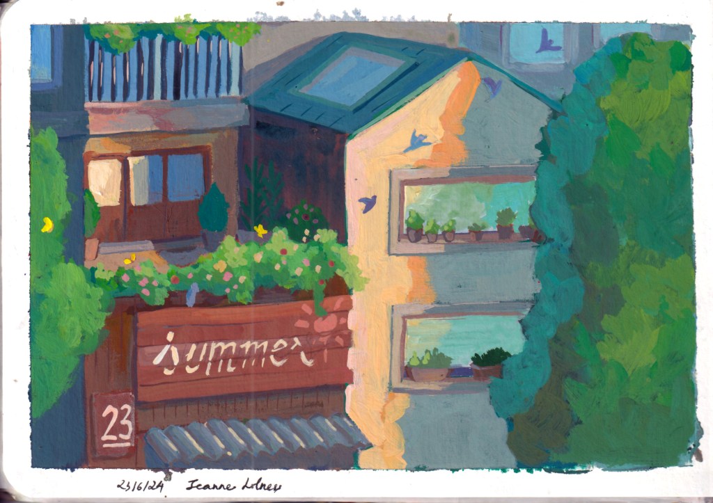
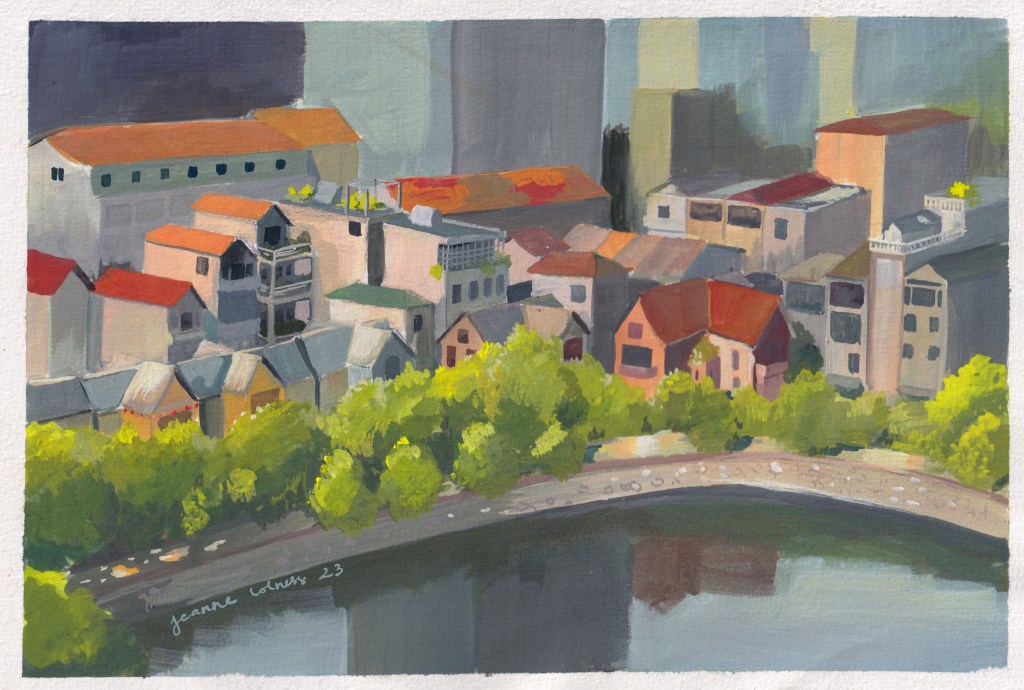
Below is my favorite painting of 2023 – this captures idyllically the area I grew up in, a very ordinary area with no tourist attractions. I’ve walked pass these houses hundreds and hundreds time.
I know that one day I will miss this scene dearly.
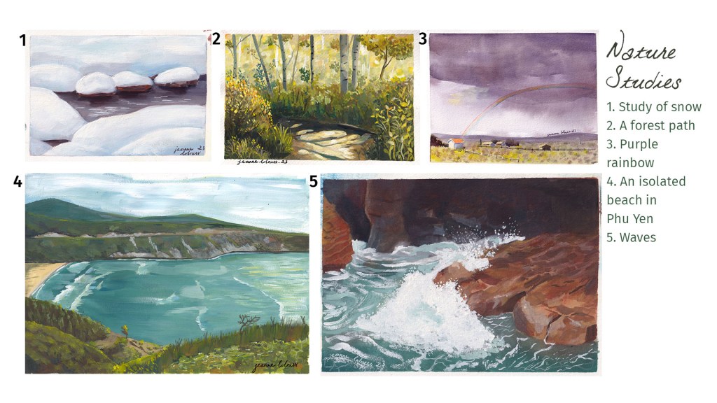
2. Studies of nature
One big drawback of growing and living in a big city is that I rarely get to see a scene just full of nature. All these studies were based on photos.
I personally love scenes of tree and water, both allows me to play with color and reflection. Painting nature is also more liberating since it seems like I’m having a secondary experience with these scenes, an escape from my bustling city.
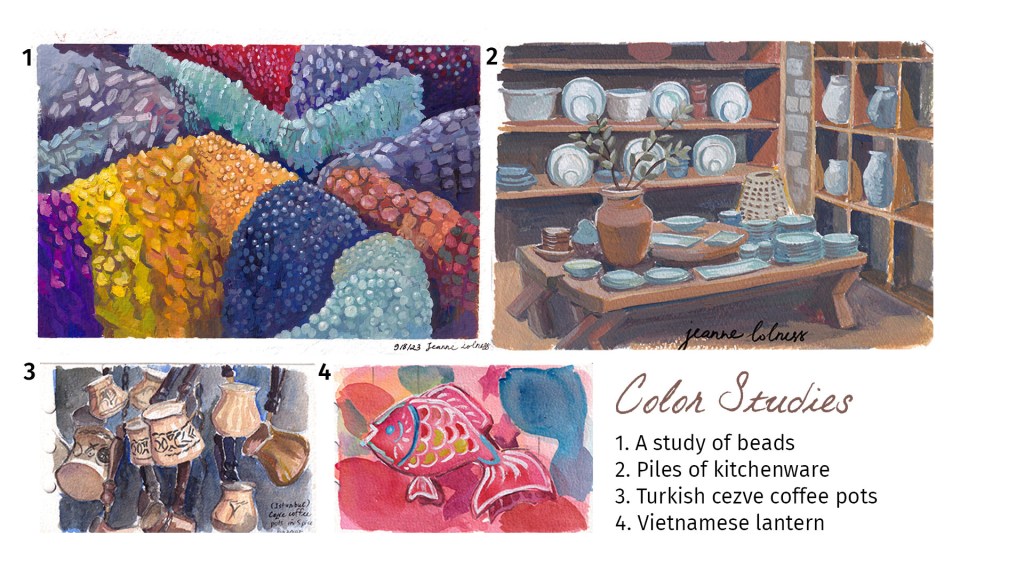
3. Studies of color
I find it still life studies useful but a bit boring, so I often paint scene with lots of similar objects to practice instead. These objects sitting together show contrast in colors and interesting negative space.
Below is the collection of character designs from my 2023 projects. Some are commercial and some are personal. 2023 is the year I challenged myself to get out of my comfort zone and stop caring about styles.
I focus on using the characters as tools for the story, the story will decide the level of exaggeration, use of colors (strong/ soft), level of facial details, etc.
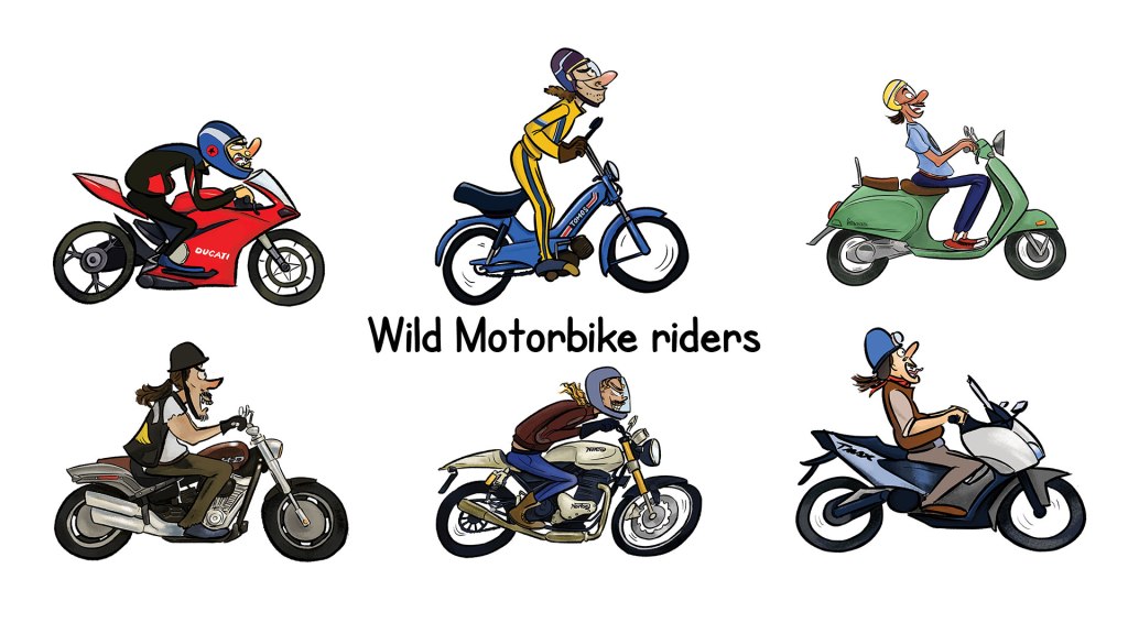
1. Dramatic motorbike riders
Designs for client @gasparevic on Fiverr to show off his motorbike shop.
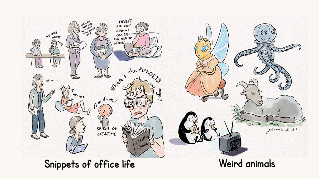
2. Collection of comic characters
I decided to re draw the characters from past projects to see how far I’ve gone and add a new vibe to the character. I like to add a touch of comic and fun to my characters, no matter they are human, animals or objects.
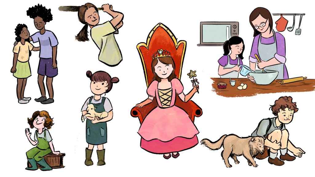
3. A collection of kid illustrations
In 2023, I had the chances to work on many small children’s book and kid-friendly illustrations.
The ones below are not the original designs, but rather an updated version. I chose this particular coloring style recalling gouache paintings, which are my favorite medium.