I usually update portfolio at the end of a year, as a way to look back on what I have done and celebrate small milestones in my artistic journey. However, 2025 was a tough year for me in every aspect so you are reading what should be posted 3 months ago.
This year I was under heavy influence of AI. The number of commissions has reduced by about 60%, and even though I had a backup plan, I still felt terrible with the whole world. Even though I believe arts cannot die here and there are still people making arts, I can’t help the anger rising in me when a client asked me: “Can you fix this AI-generated image for me?”.
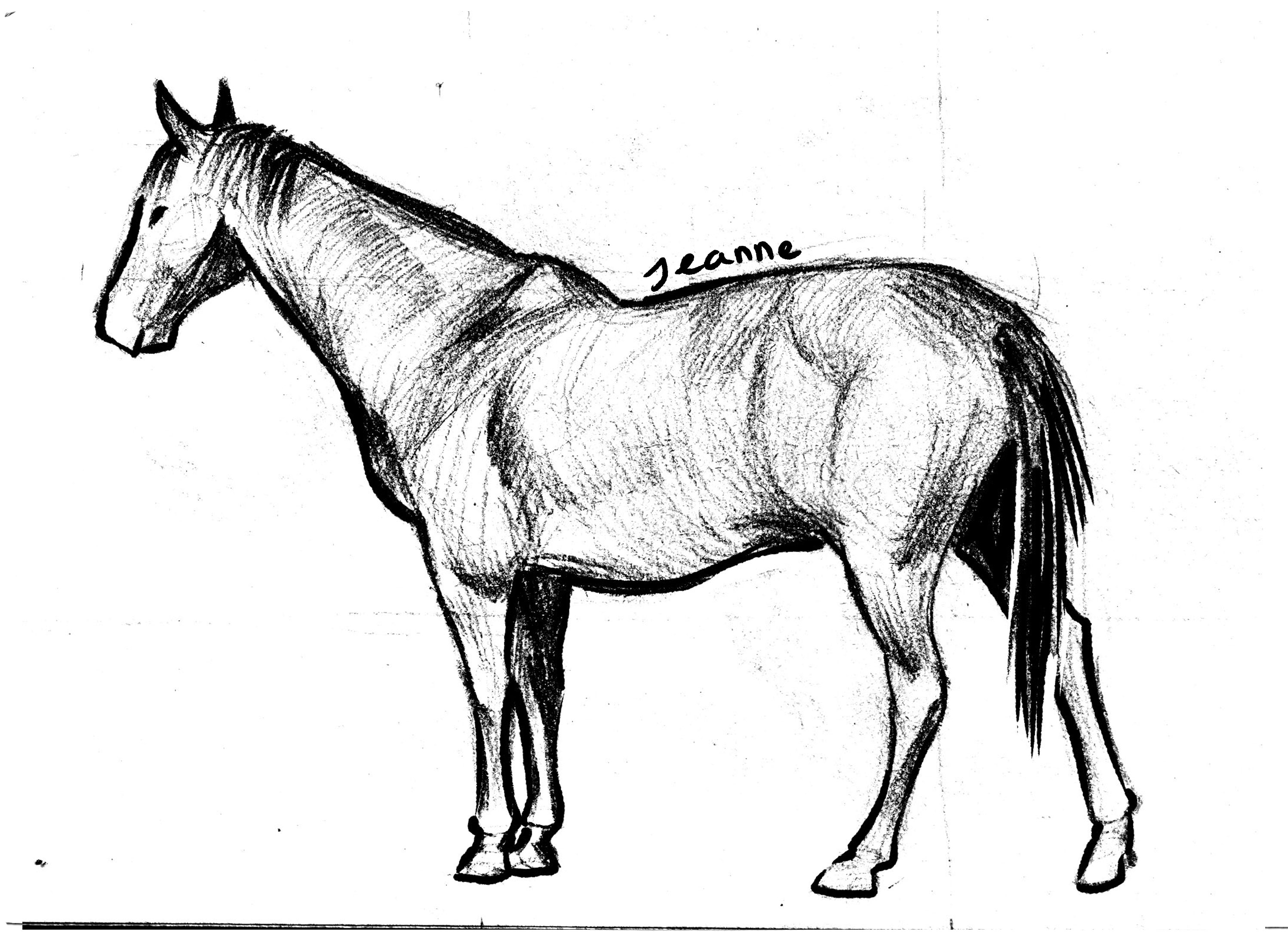
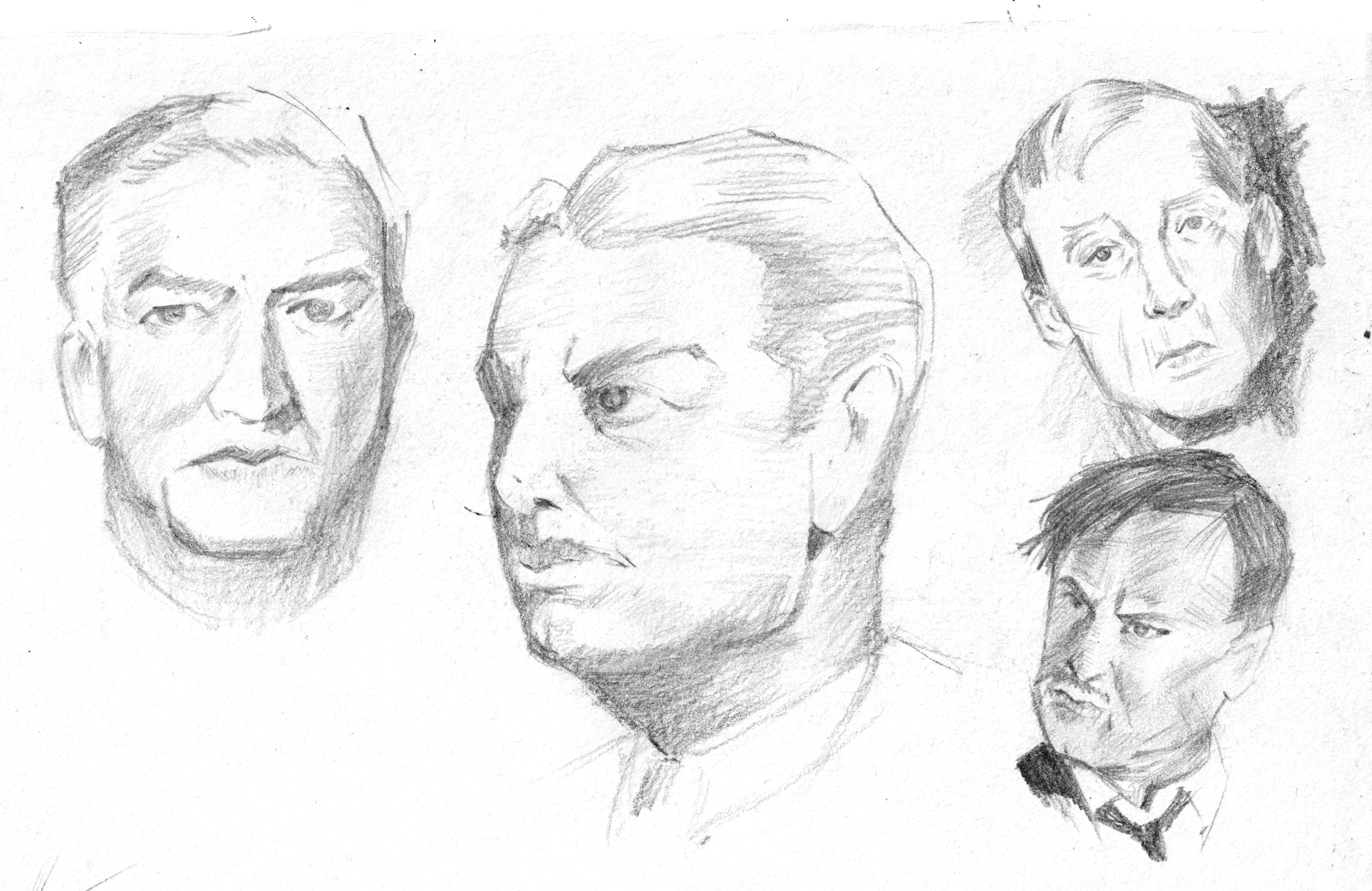
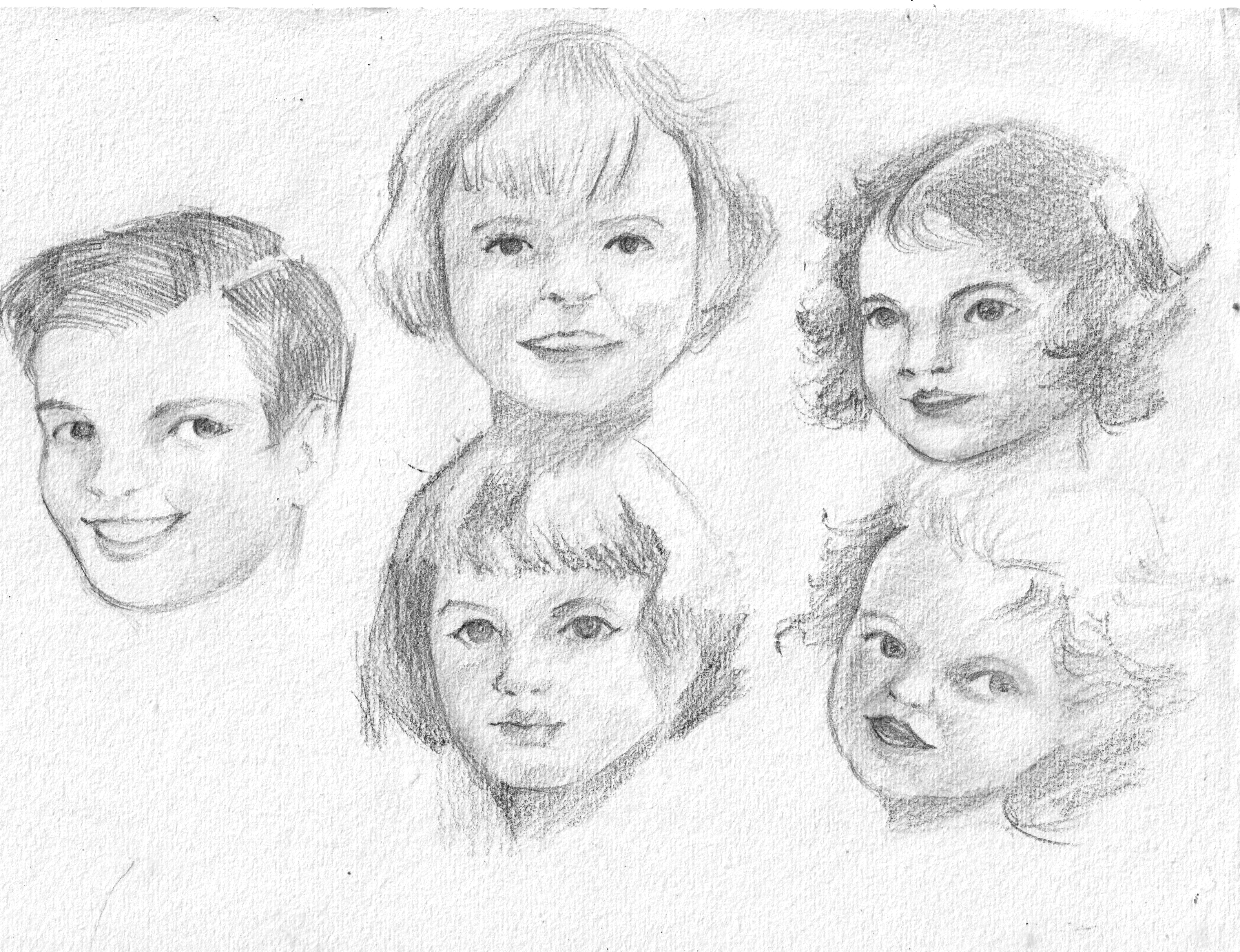
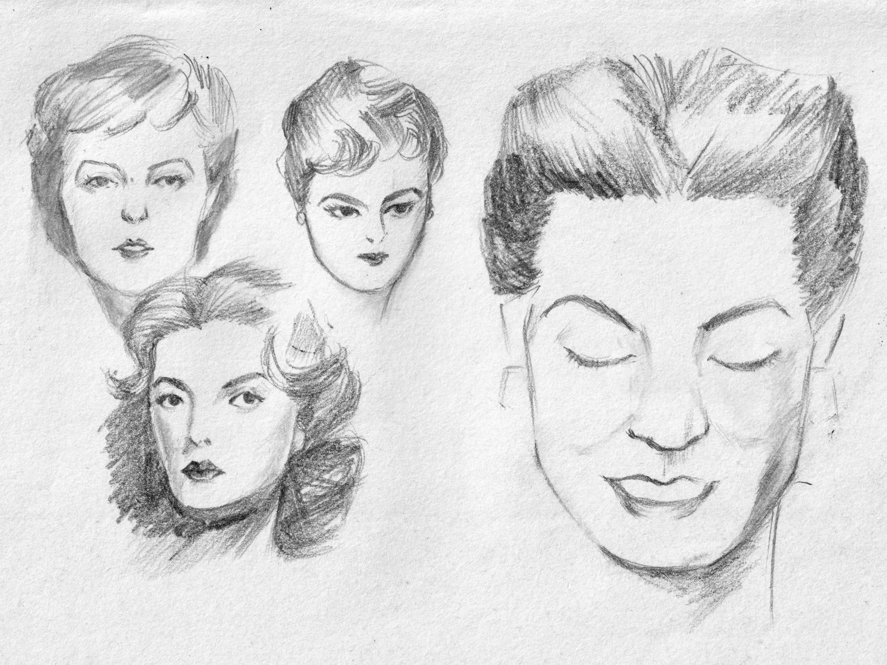
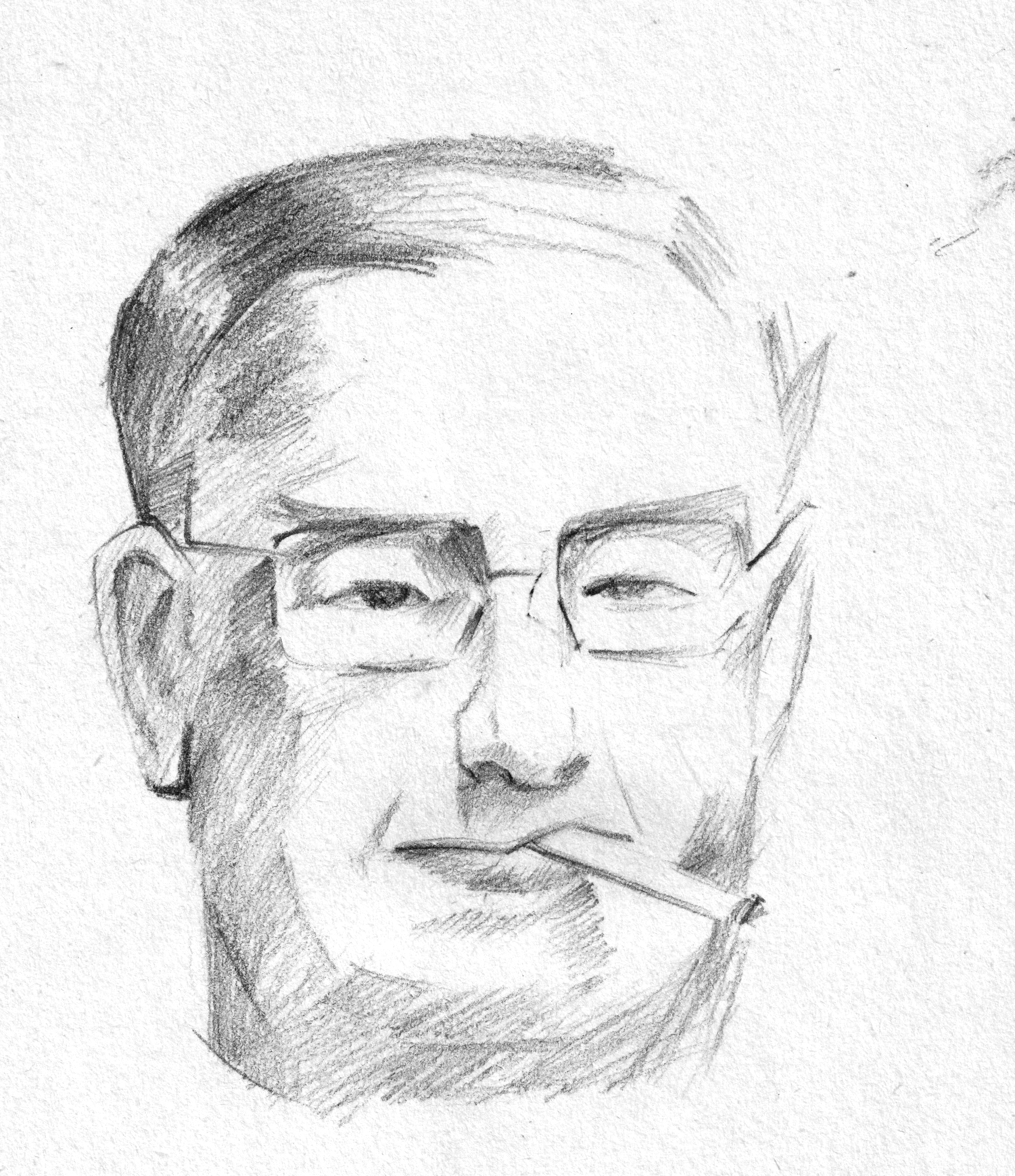
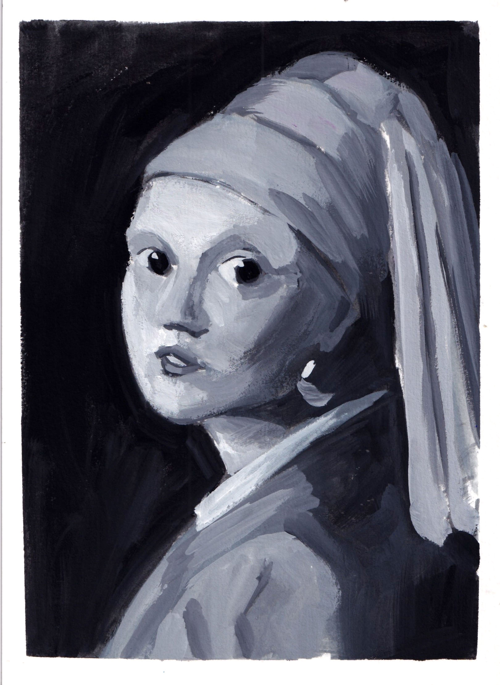
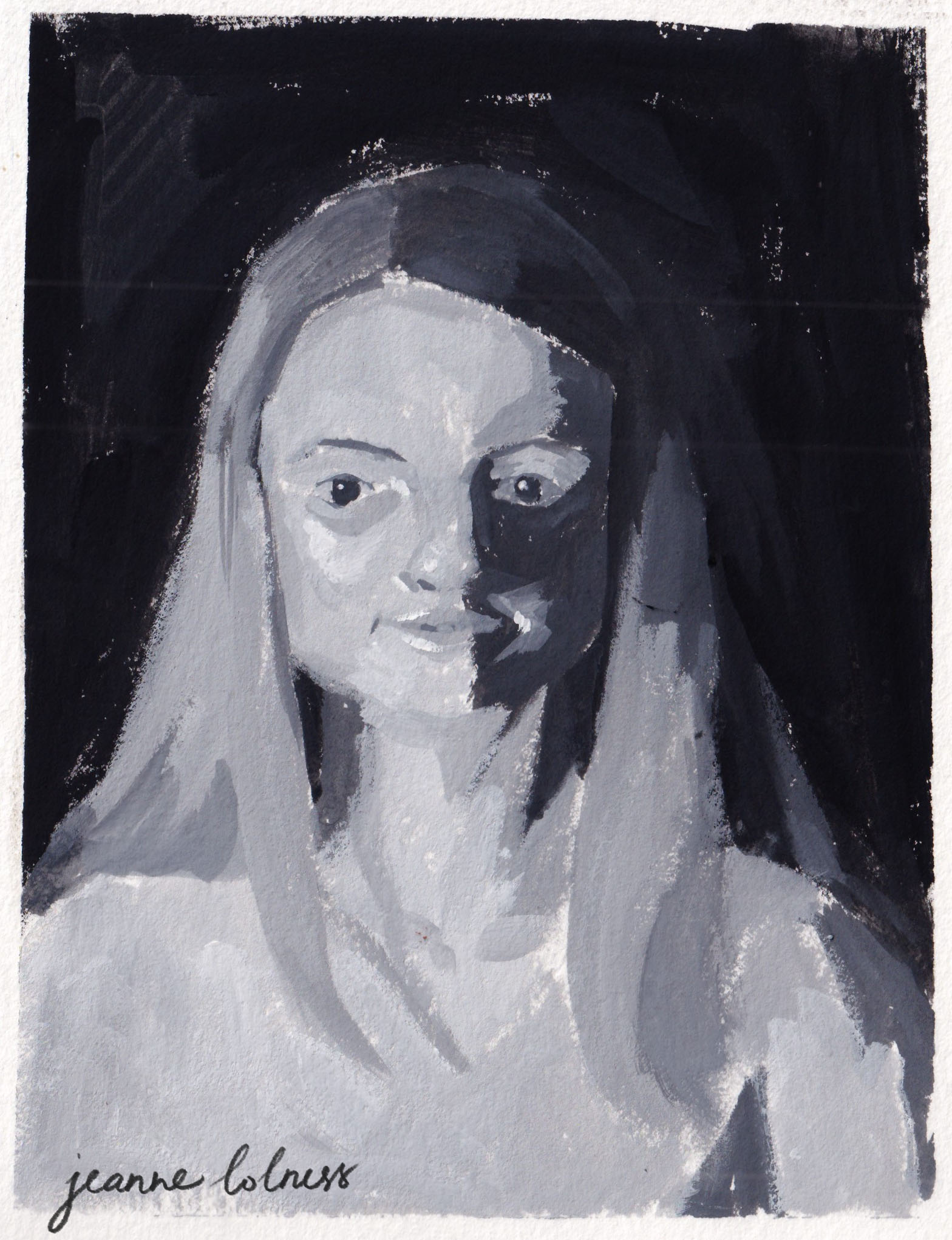
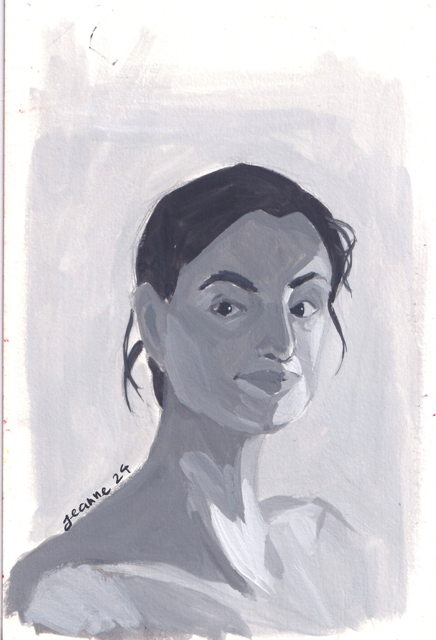
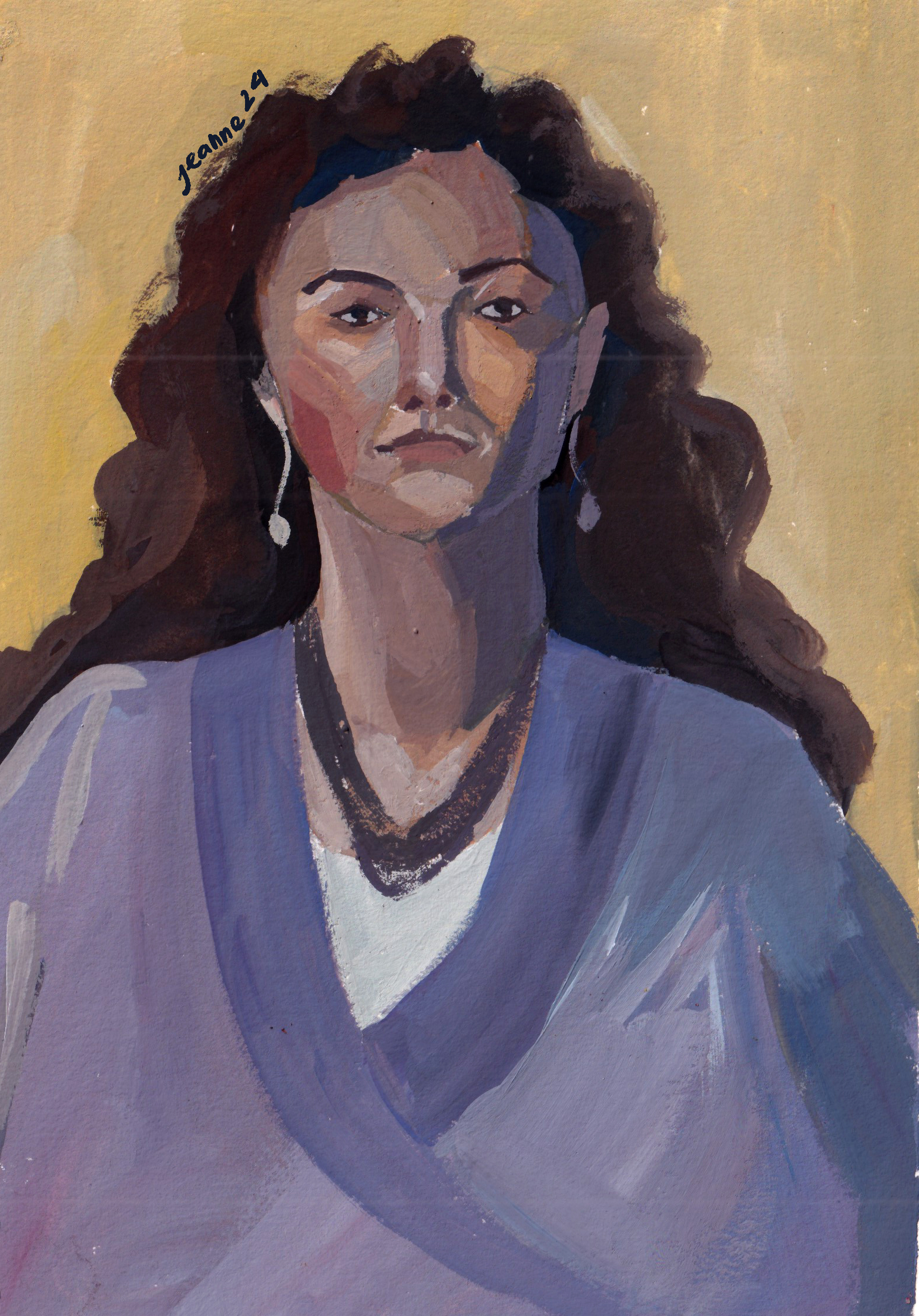
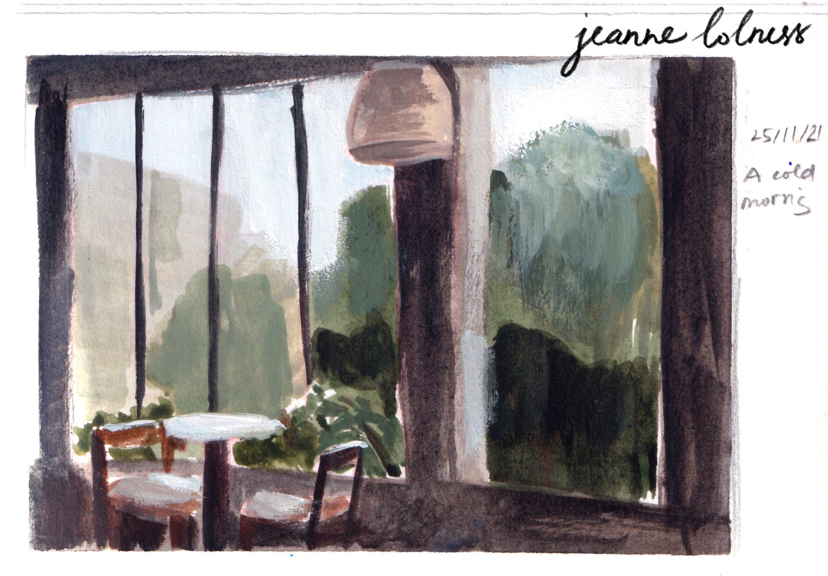
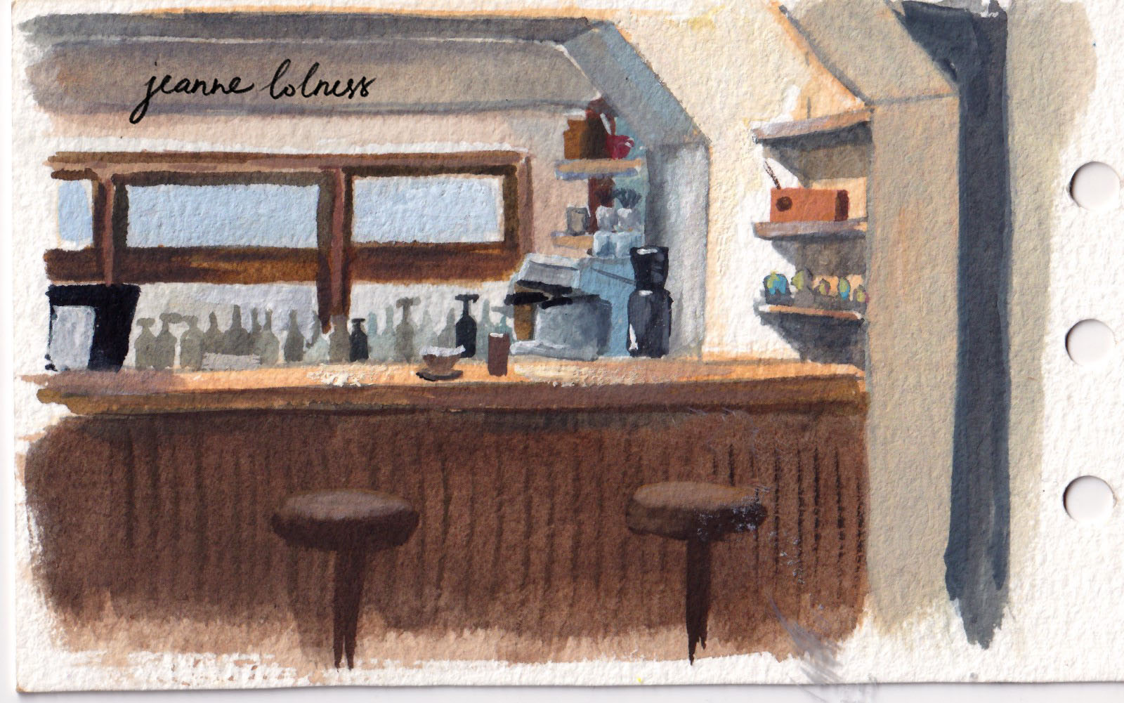
That’s possibly why my favourite pieces of the year are mostly hand drawn. Maybe in the dark moments of being invaded by vague feelings and fears, holding onto physical things comforts me and gives me hopes.
Anyway, life needs to go on and I need to keep painting. I do paint for a living, but I realize I must keep painting for me, or my sanity.
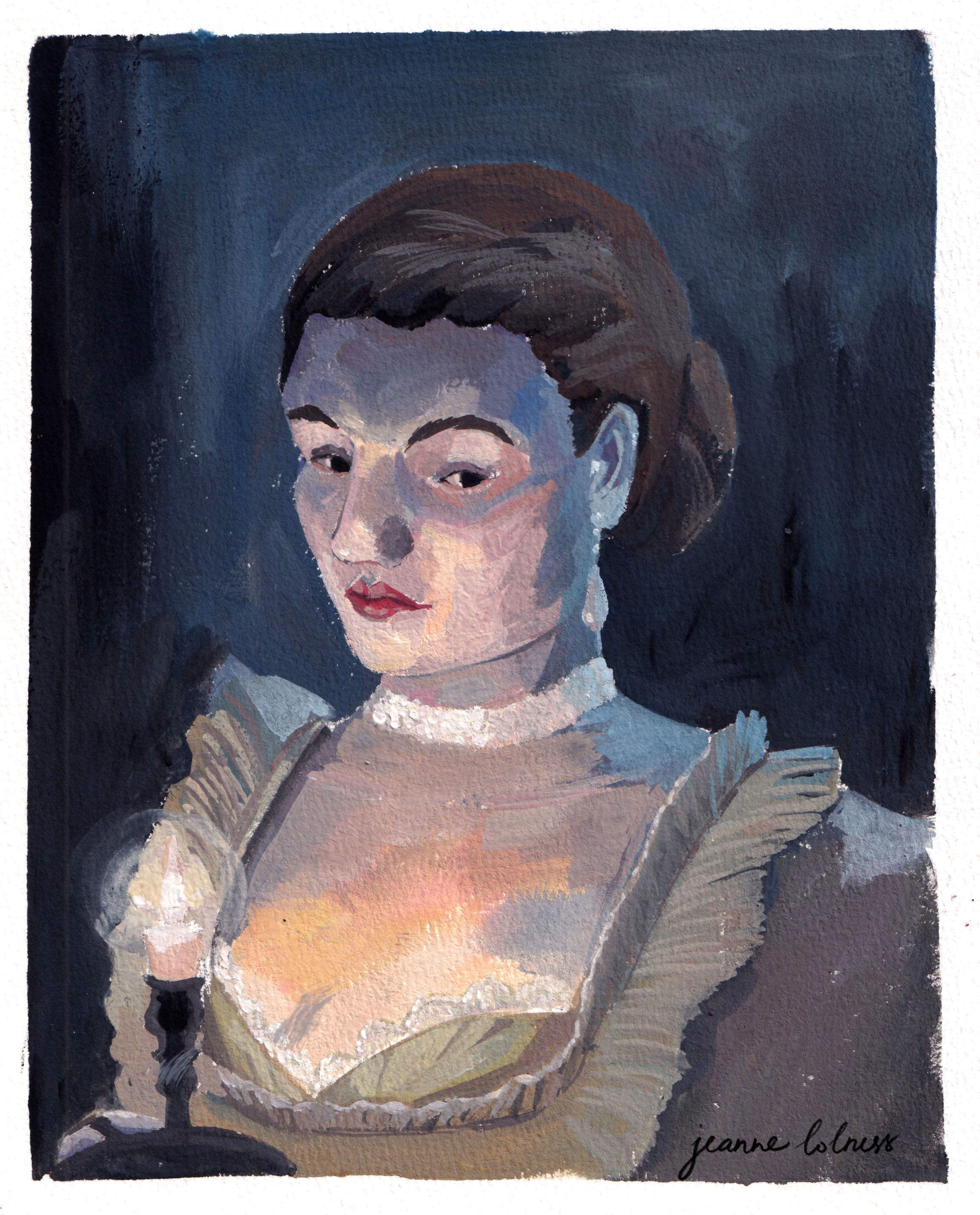
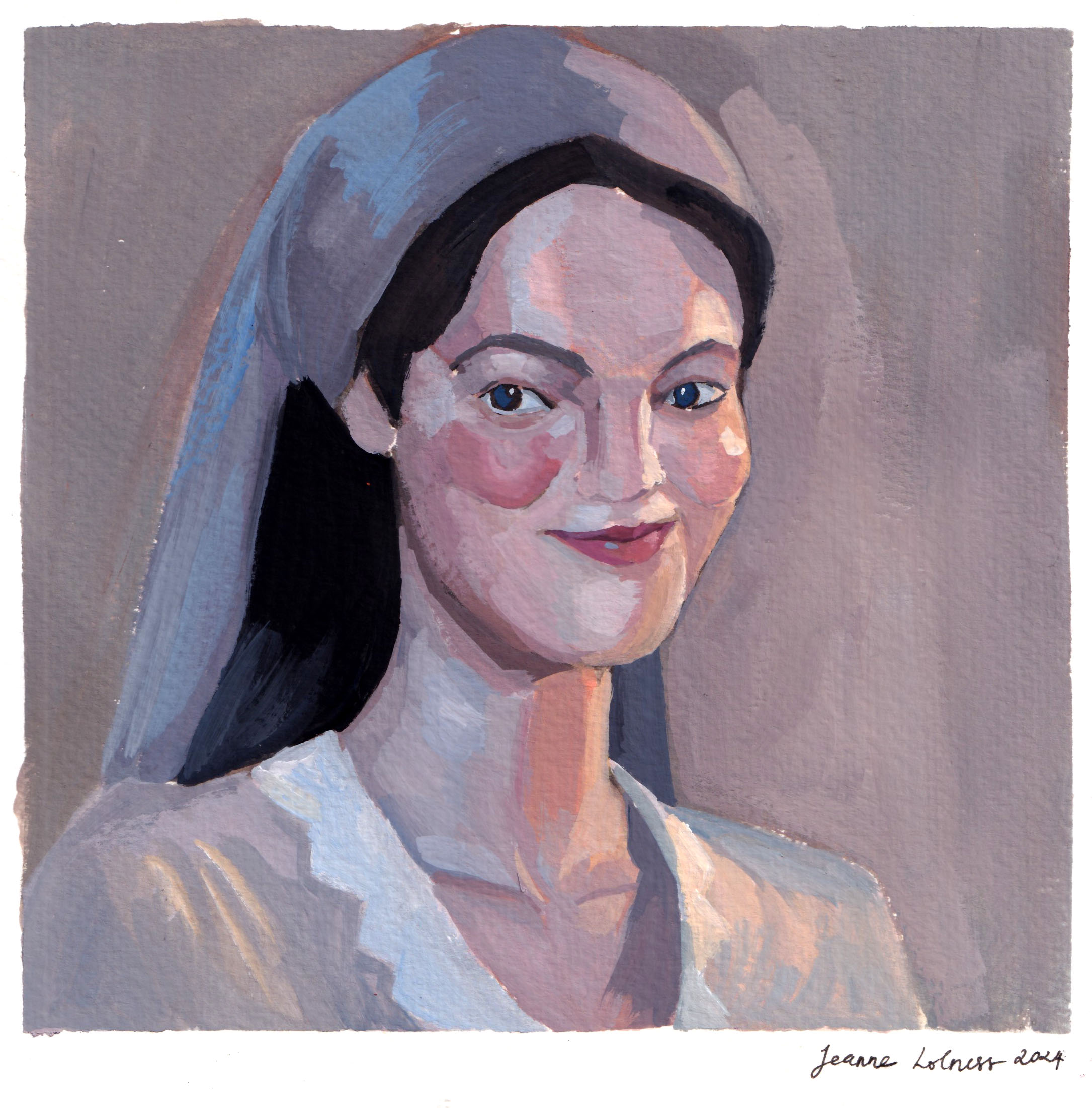
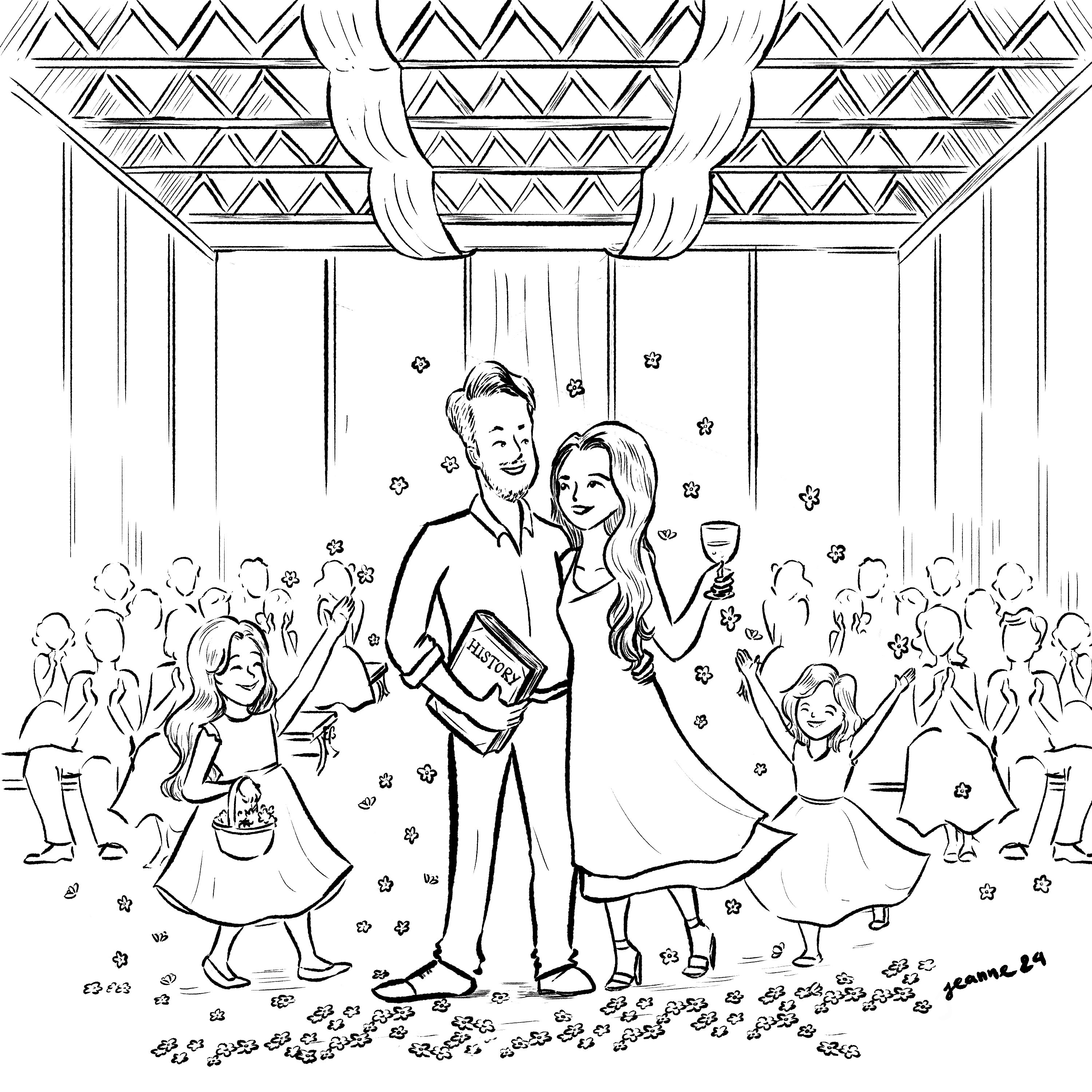
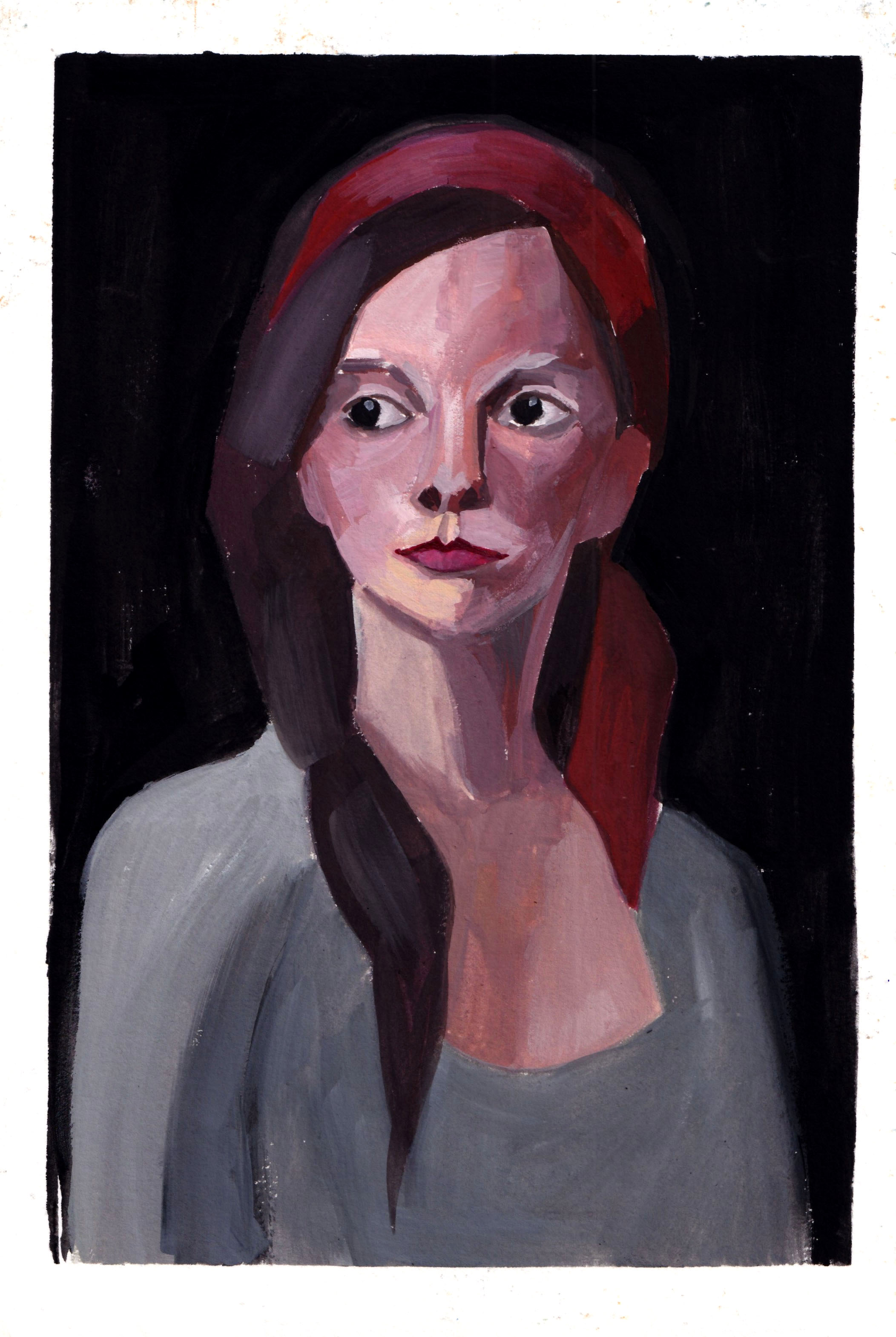
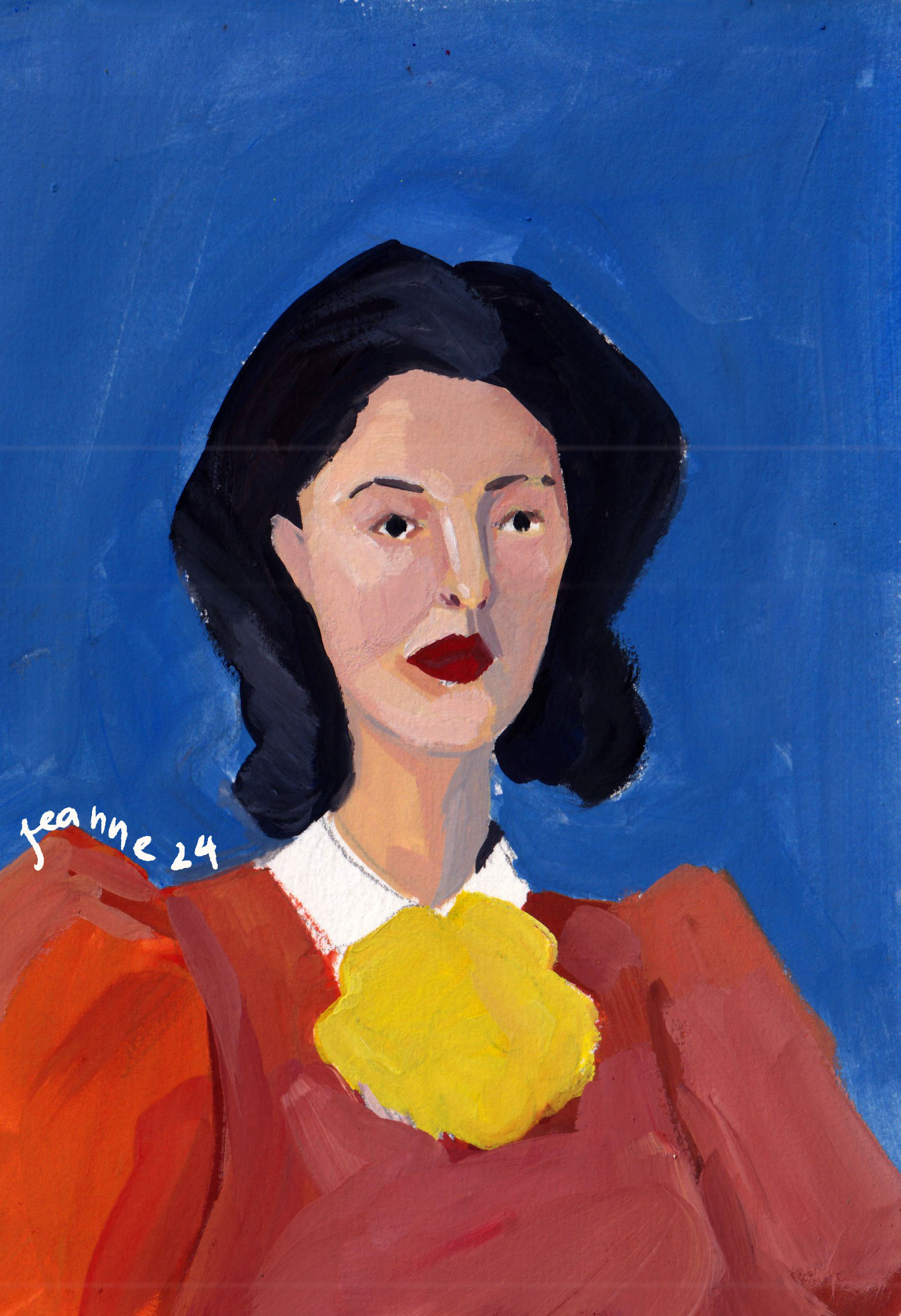
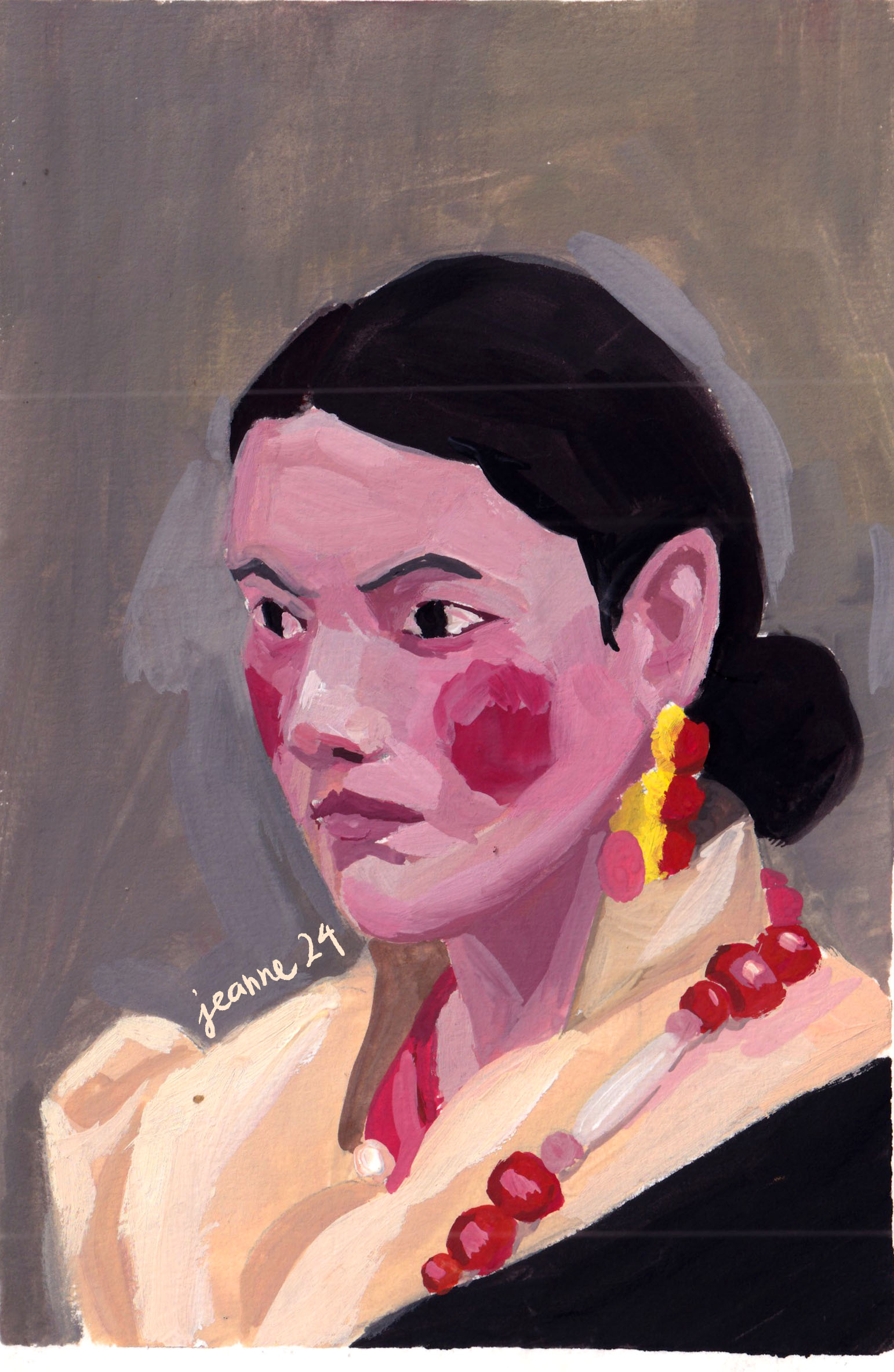
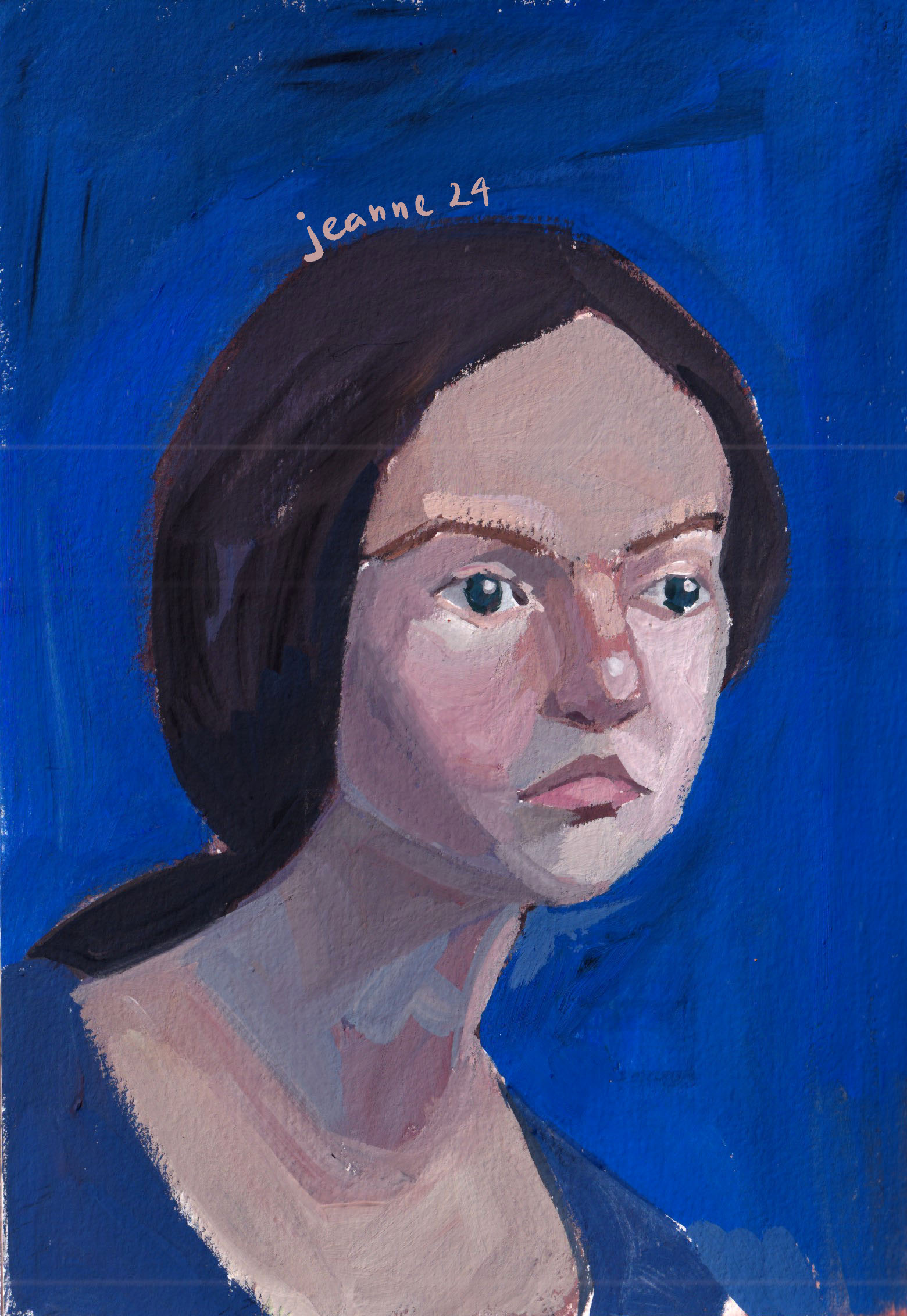
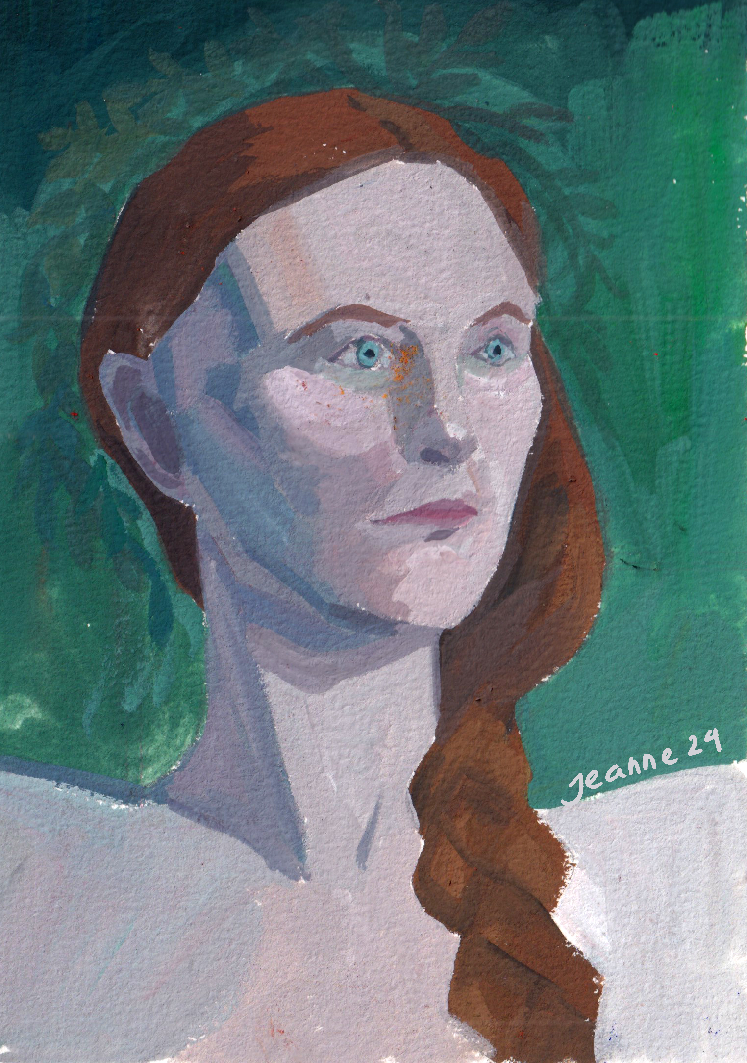
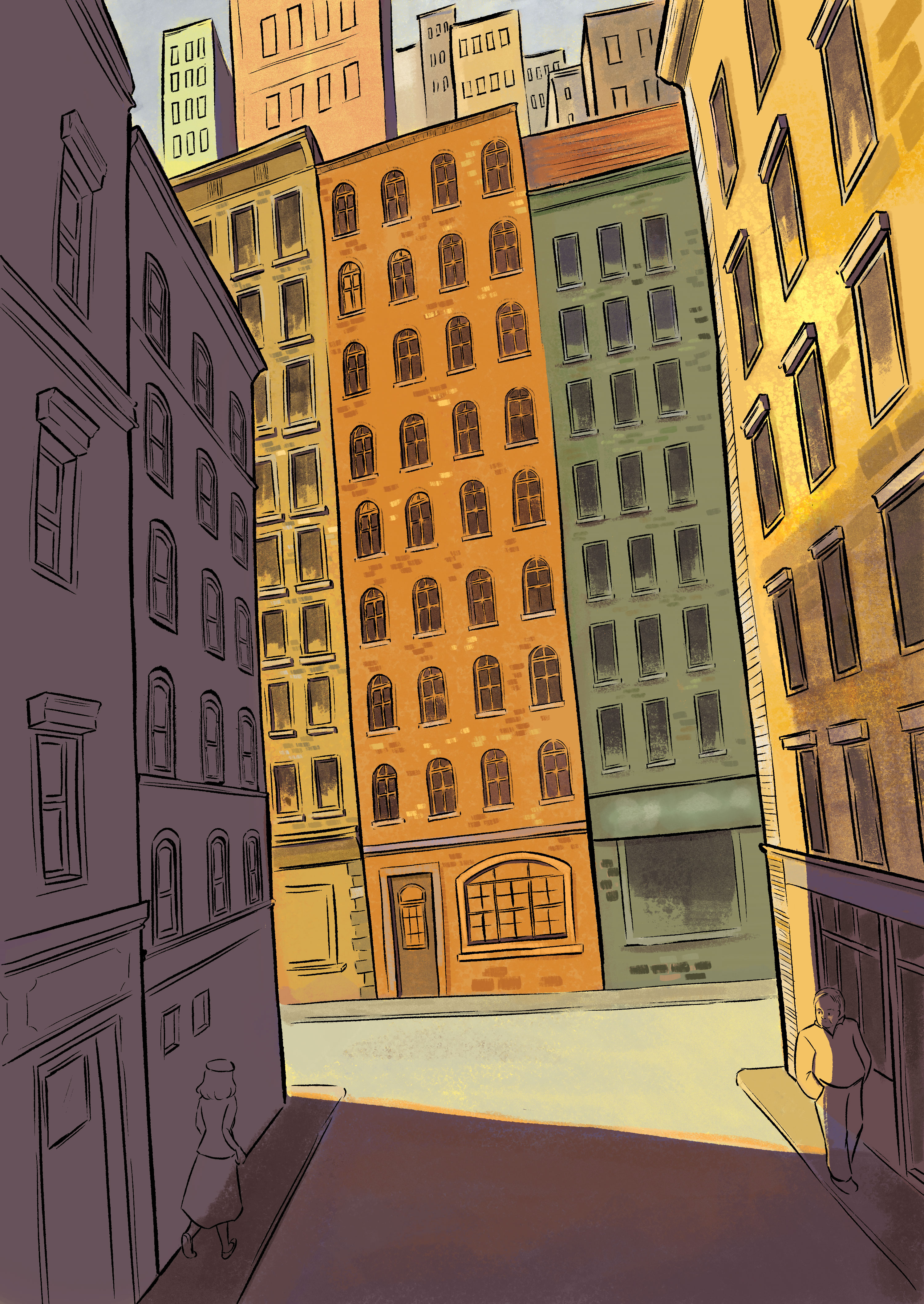
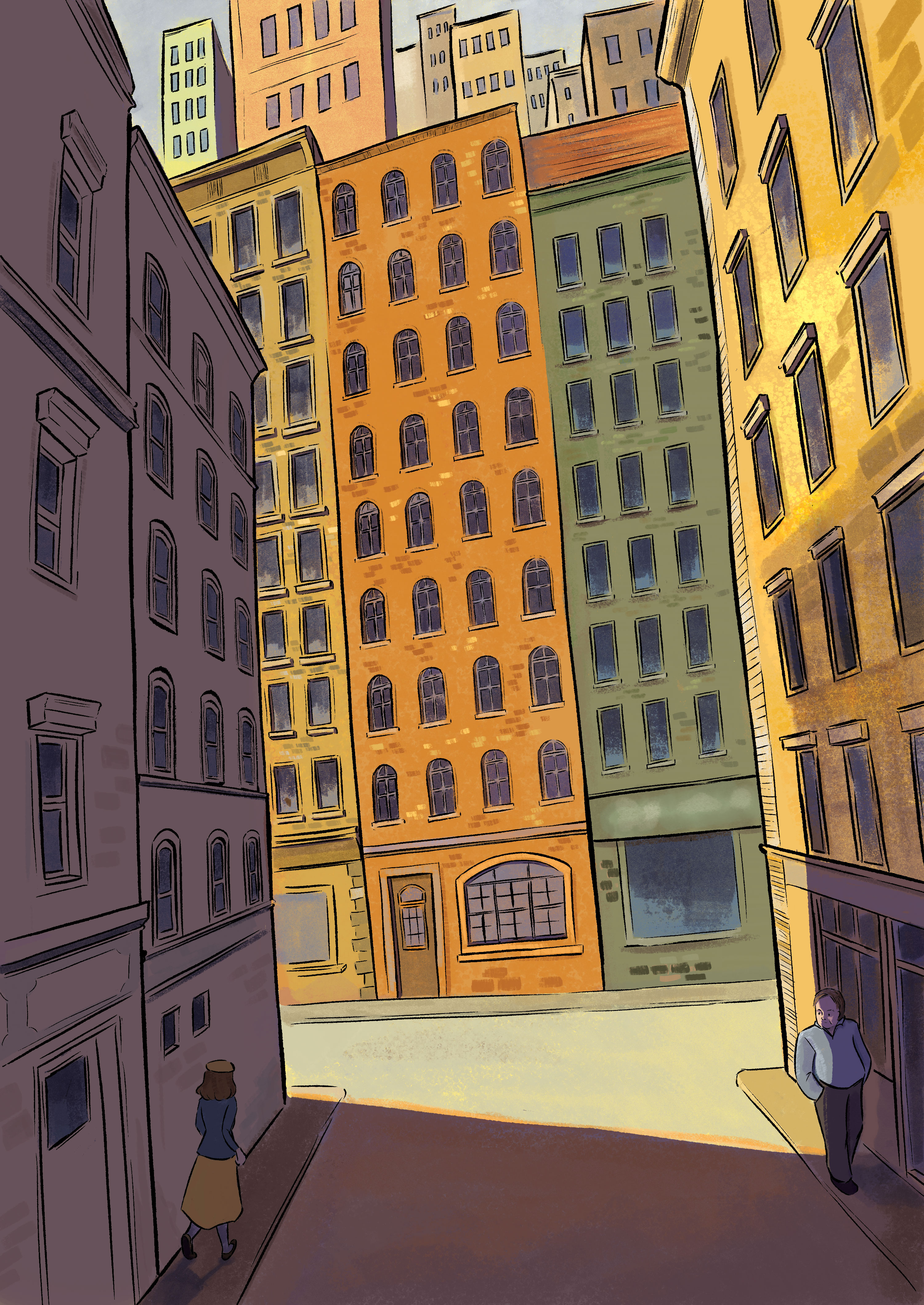
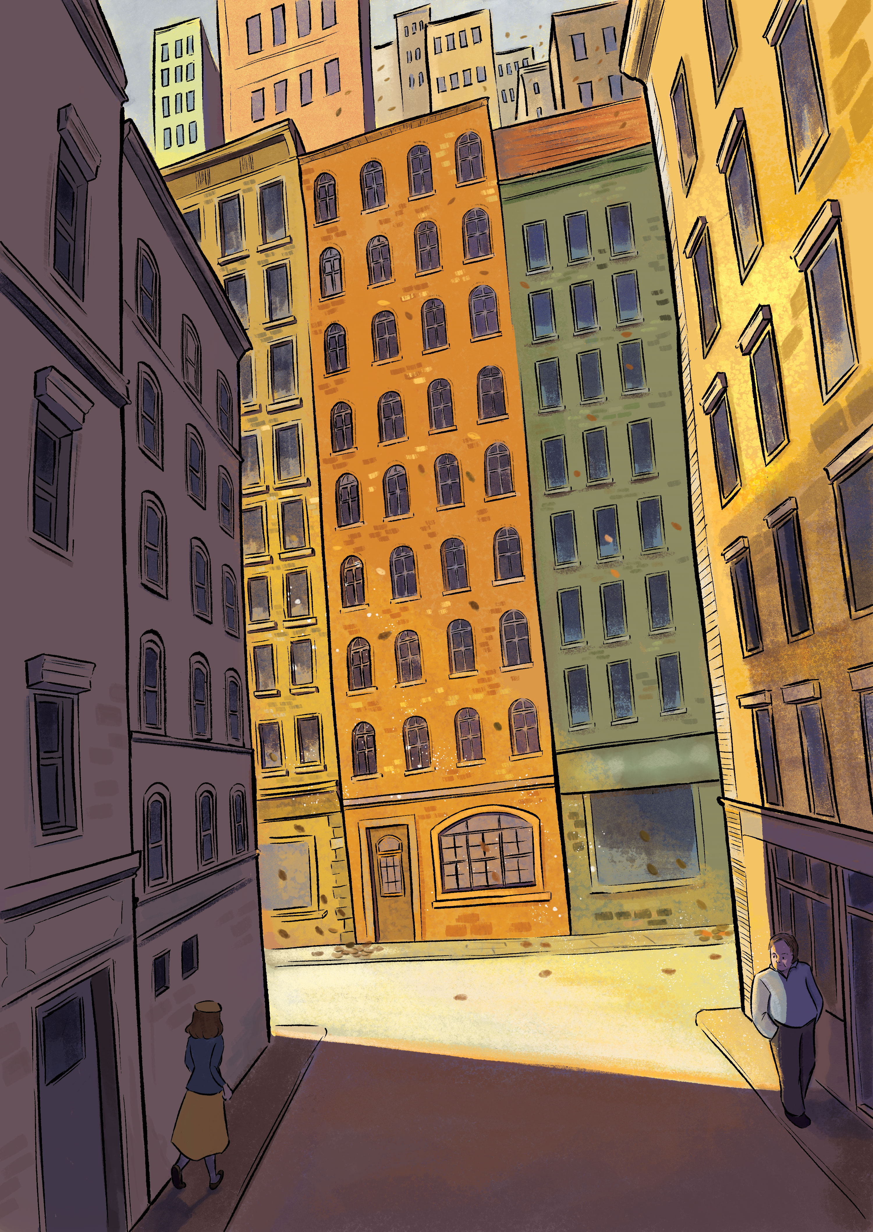
Poetry illustrations
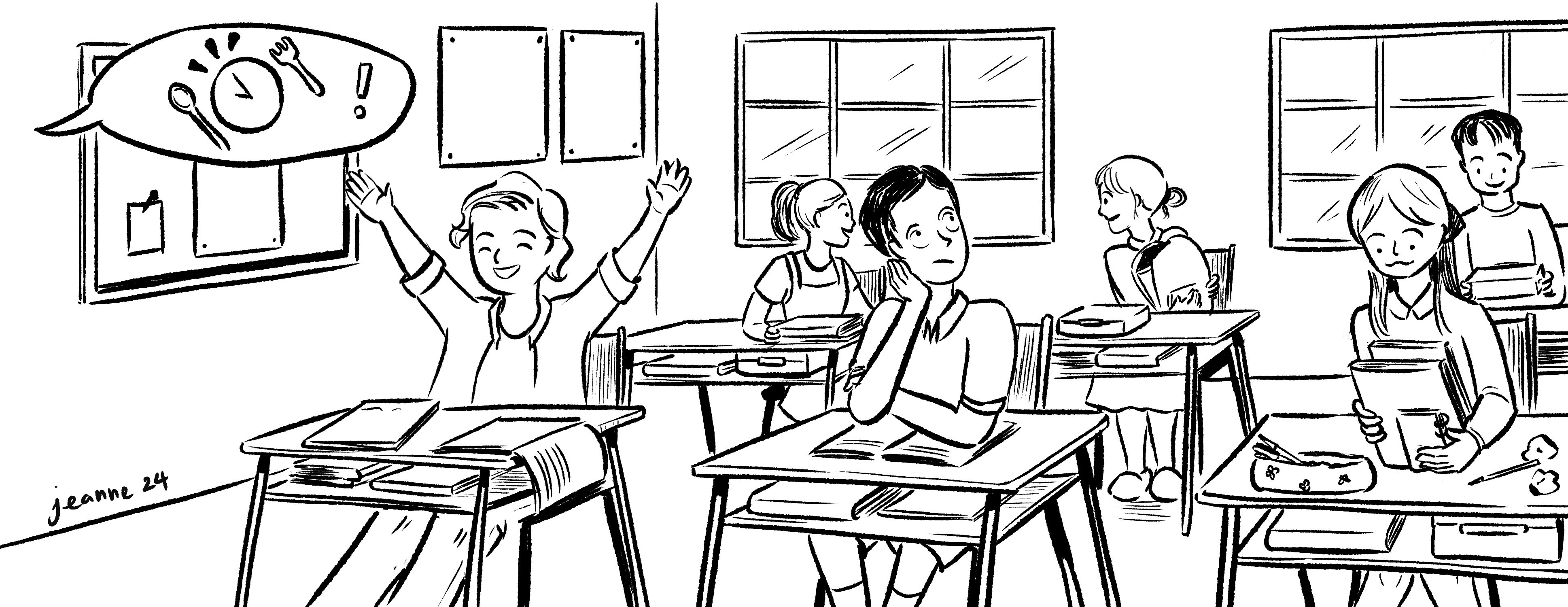
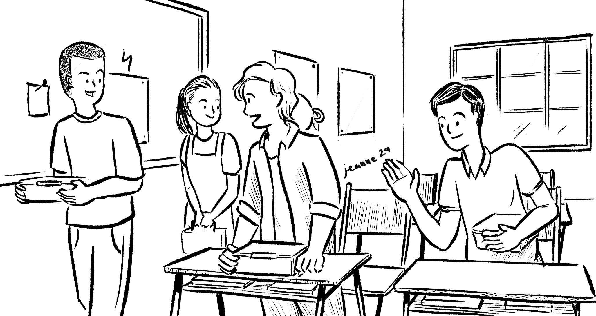
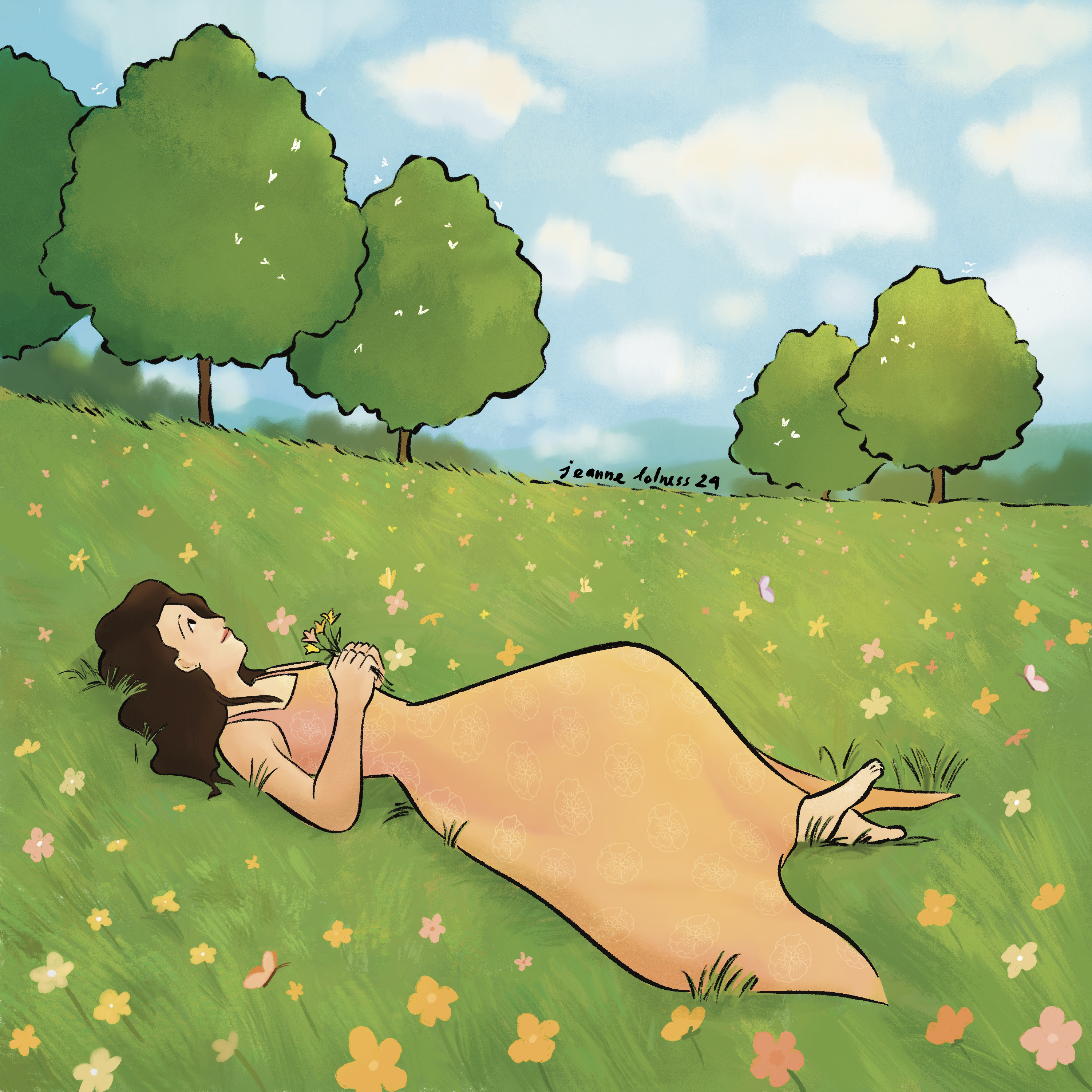
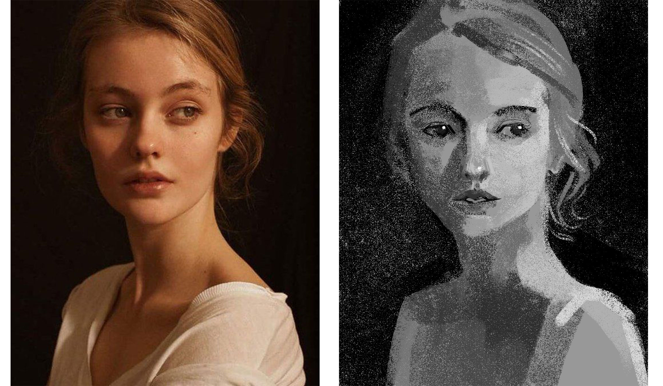
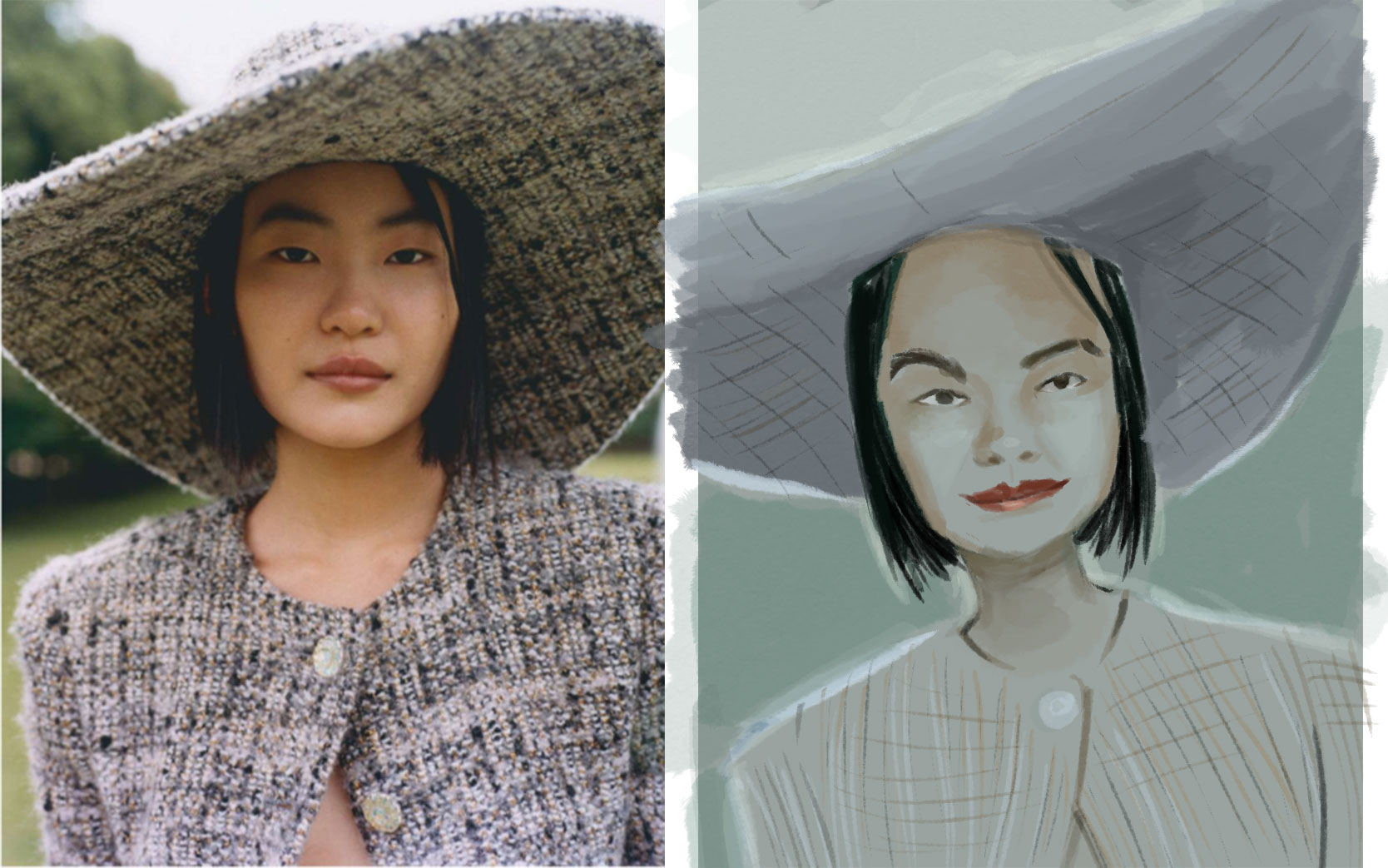
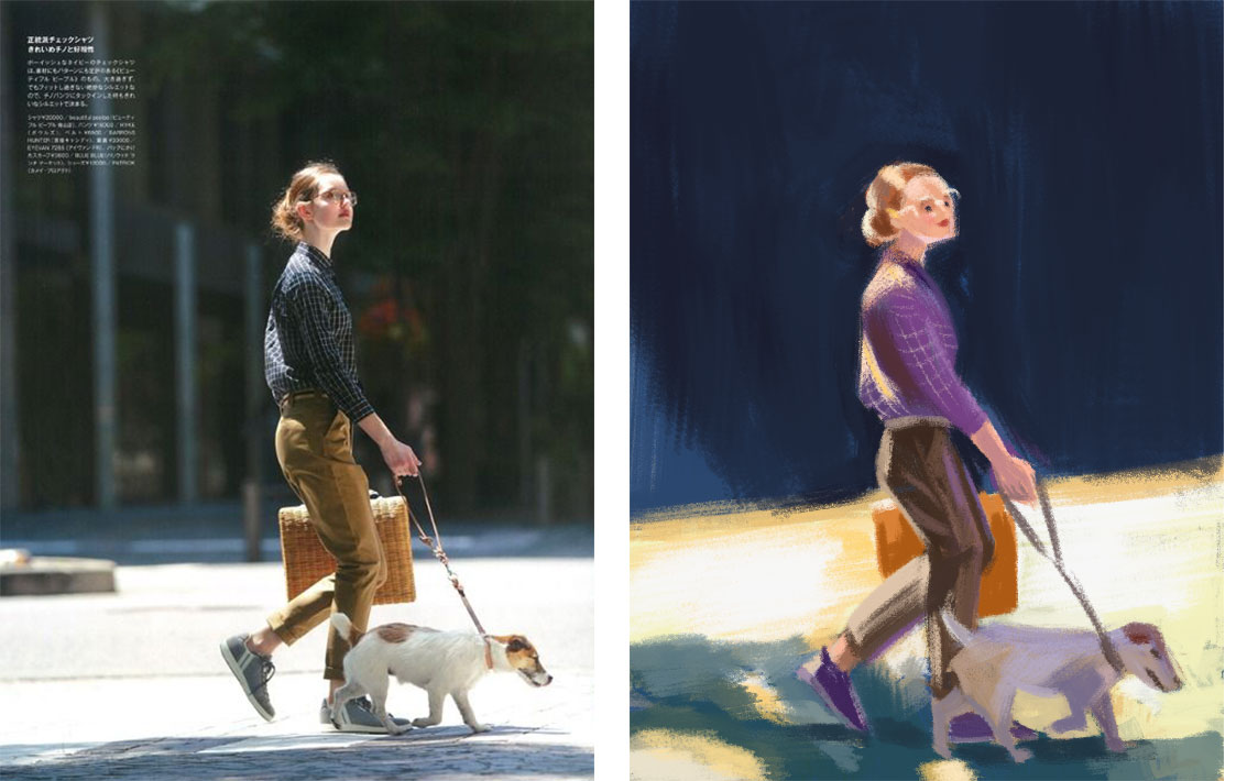
This is the only series/ book project I worked in 2025. Or the only one that left any positive impressions. I got to paint a wide variety of subjects, mostly romantic vibe. The subjects were actually chosen before the project, so my main responsibility was coloring. I have no idea whether this book is published yet, all my clients seem to disappear mysteriously.
These paintings are actually small, they are made to put together with poems. I completed the series bit by bit in 3 months or so, before I started my second job in June.
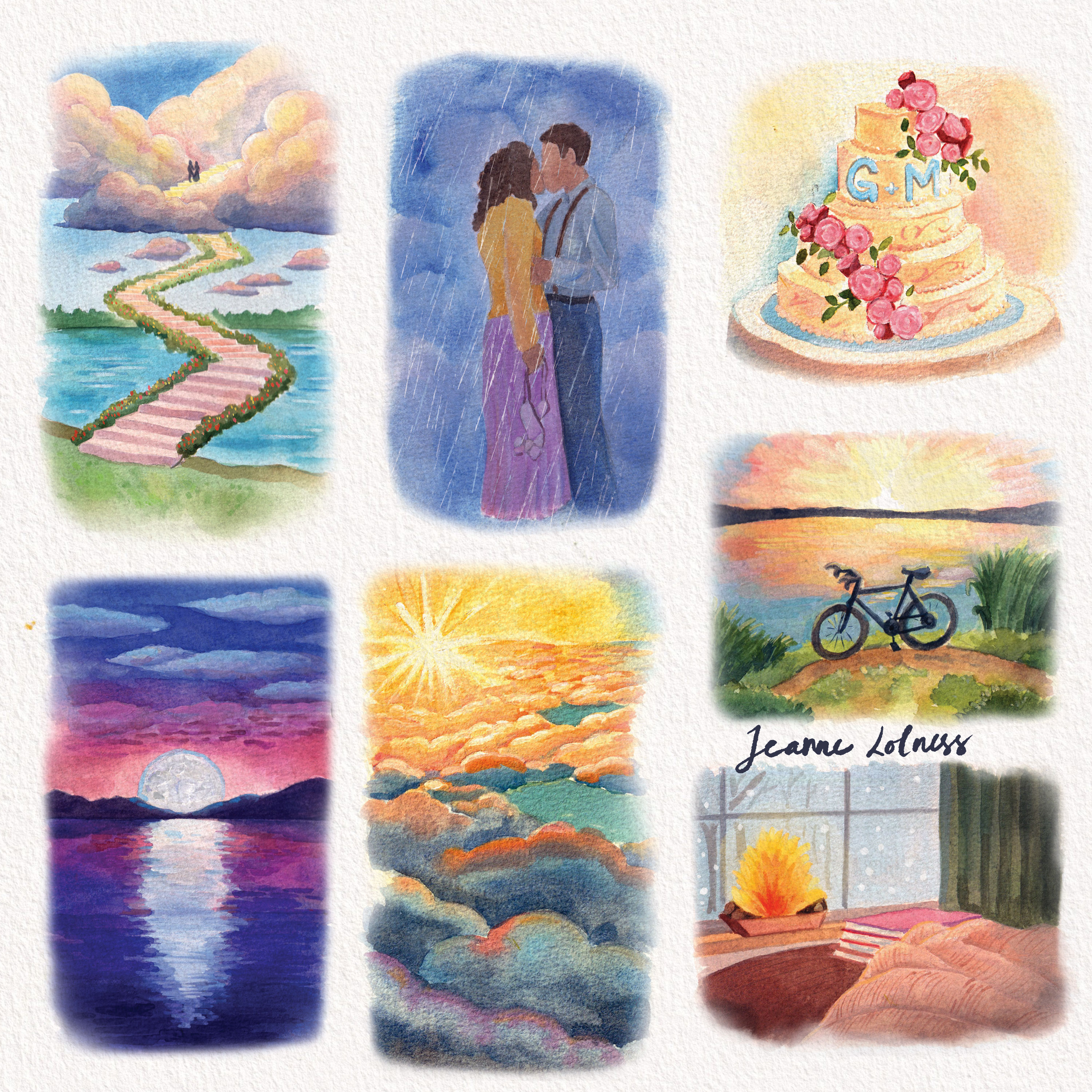
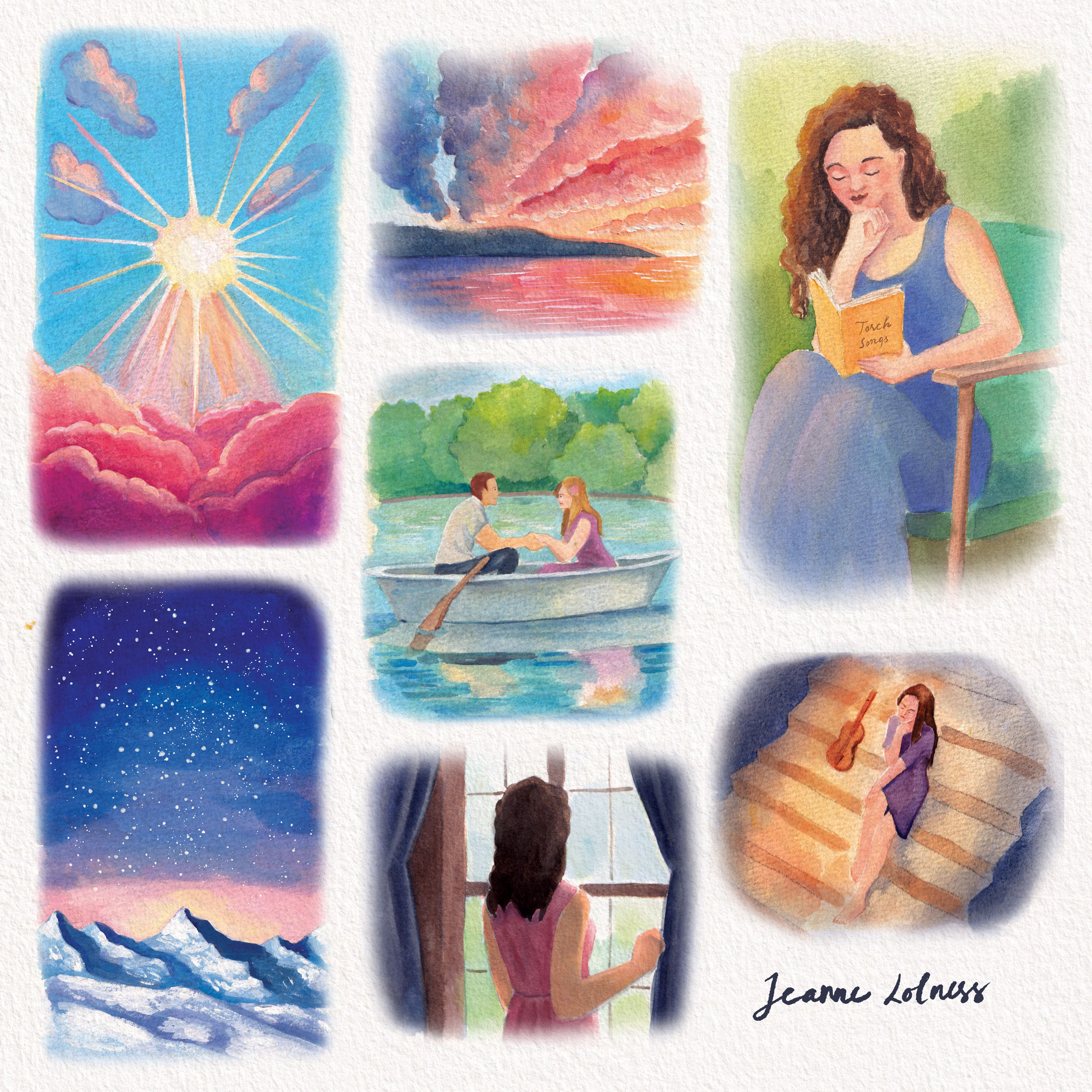
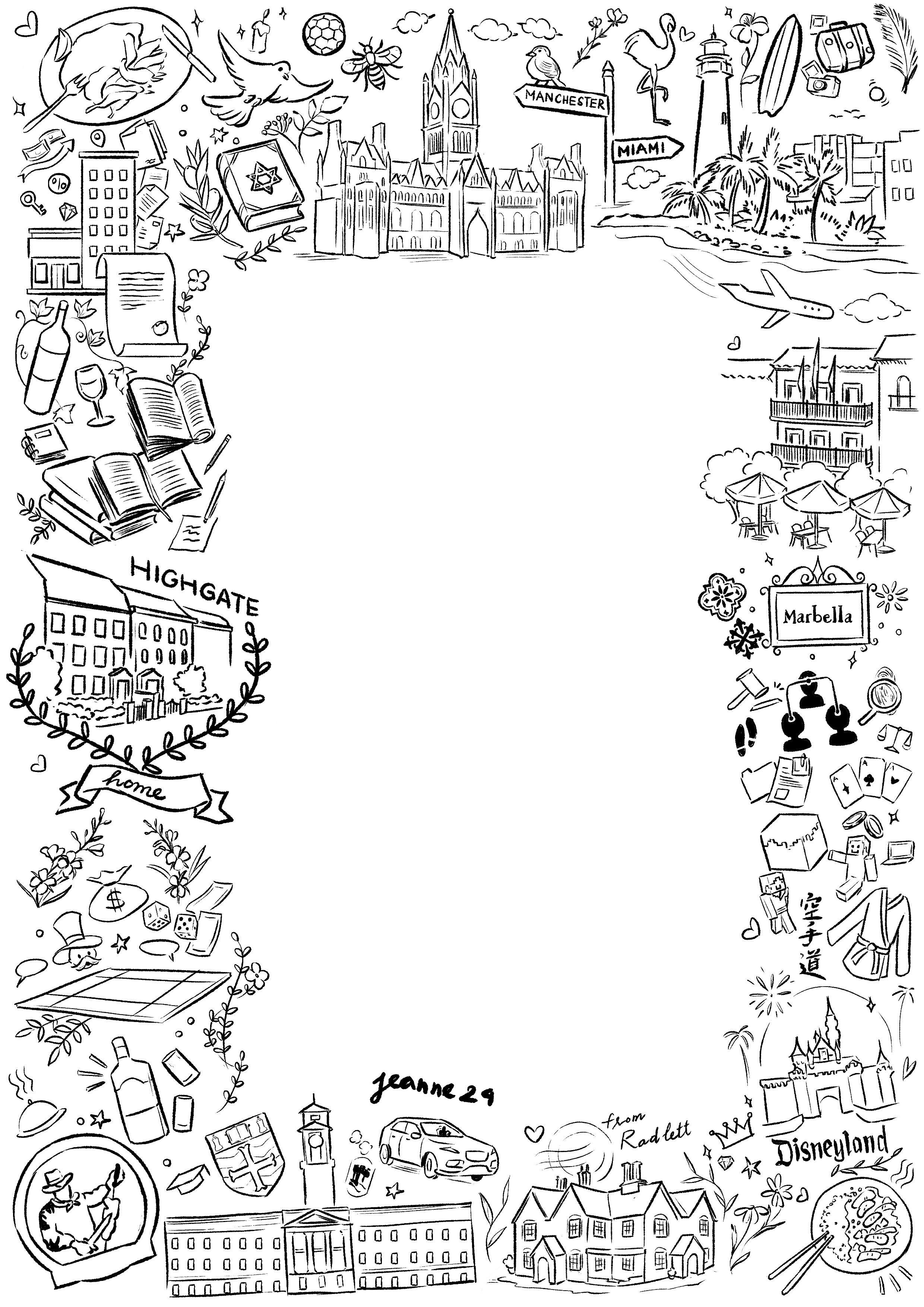
One thing I have decided this year is to slowly say goodbye with Fiverr account. This was a difficult decision although projects there didn’t interest me as before. Truth to be told, not all projects or commissions I got were my strengths or something I wanted to develop skills on, yet, at the time I believed I could stick together until something better came. My original plan was to build a strong website with other connects to keep the flow of work, but life needed me quicker than I thought. This project was possibly a nice goodbye to my 5-year freelance journey, which was also started with a poetry book.
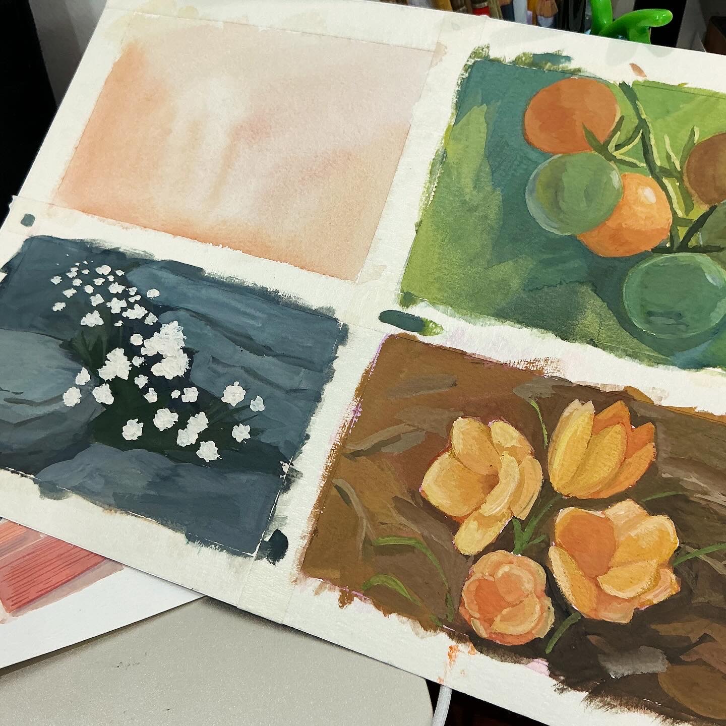
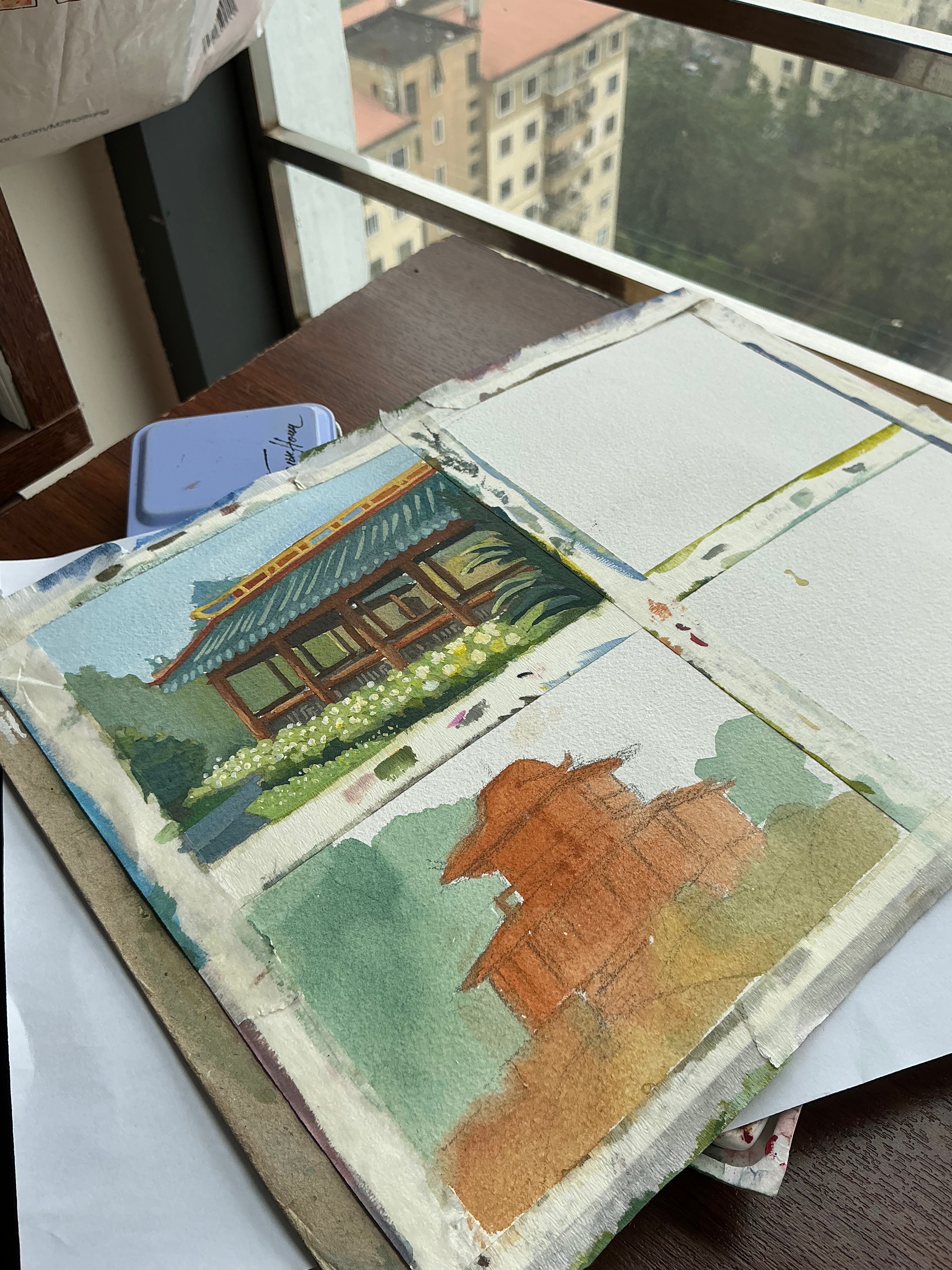
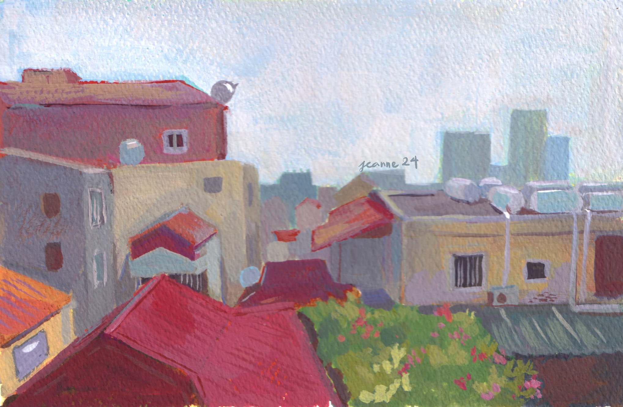
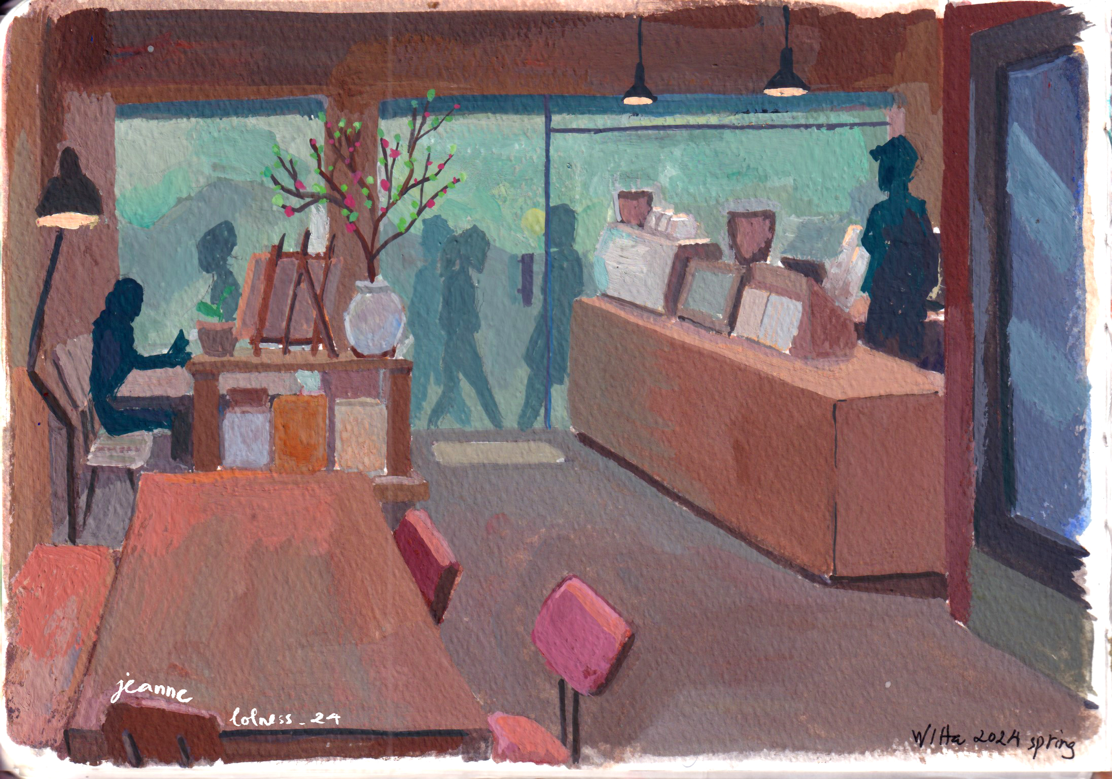
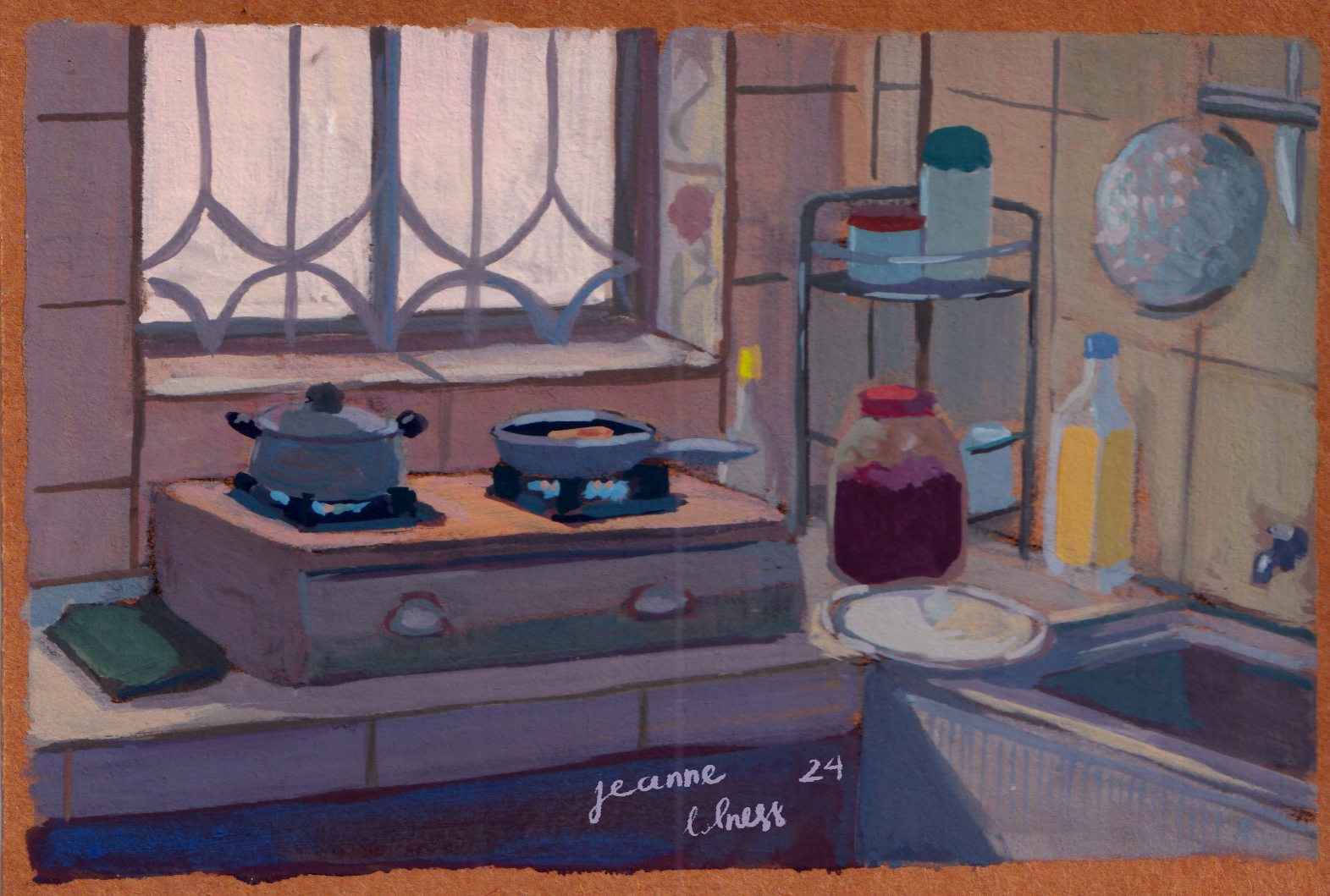
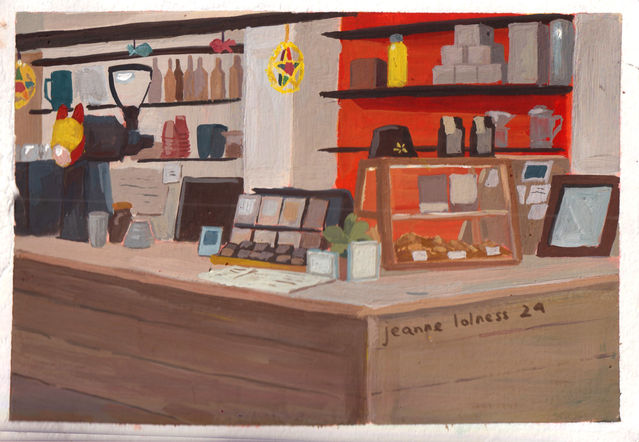
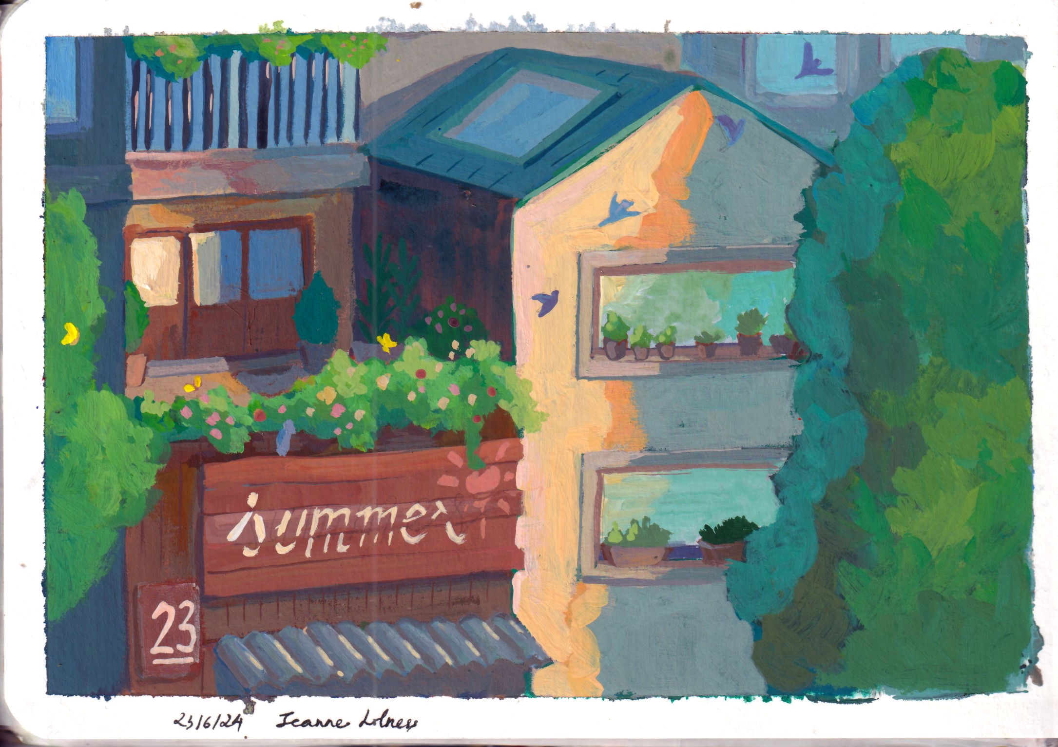
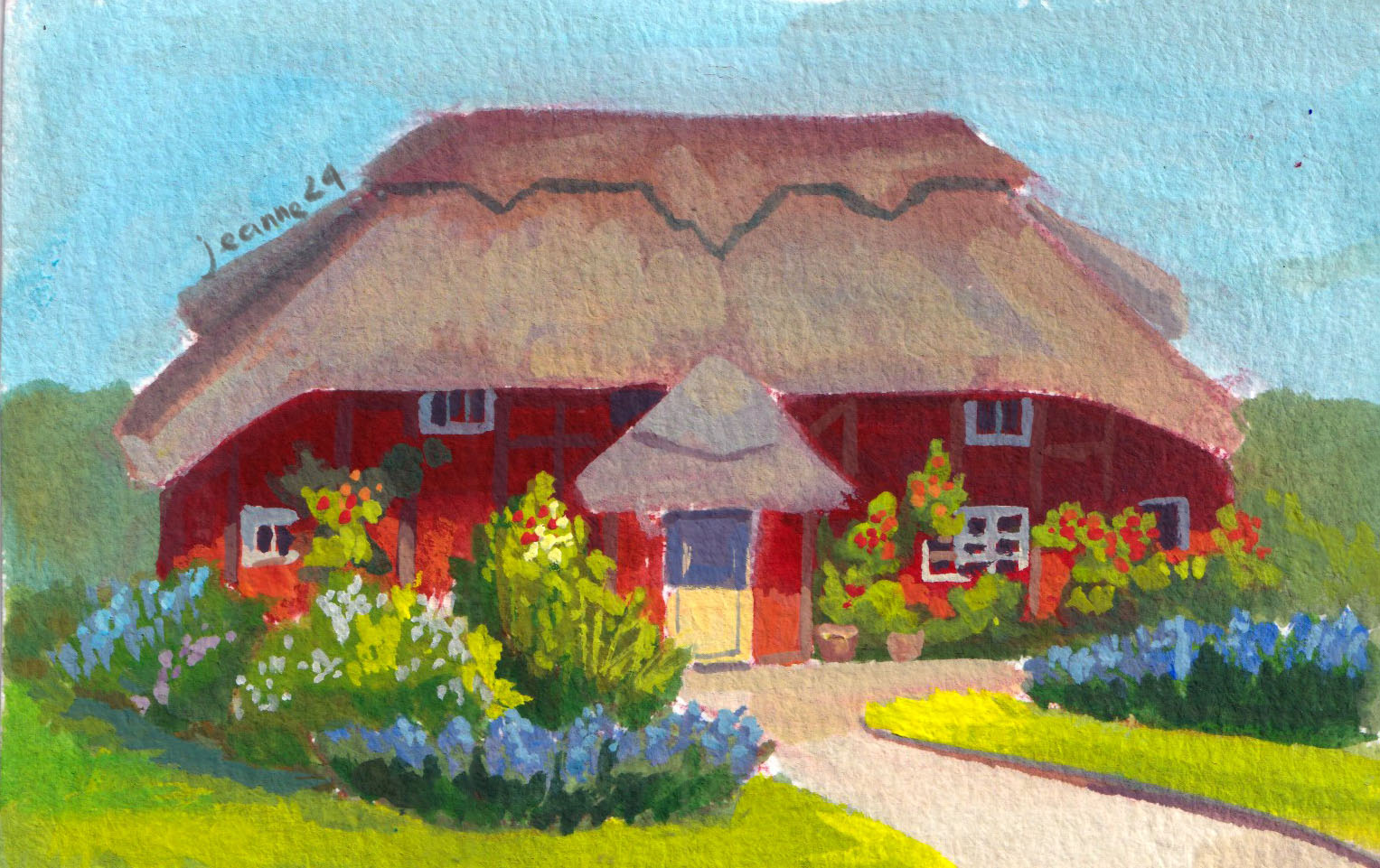
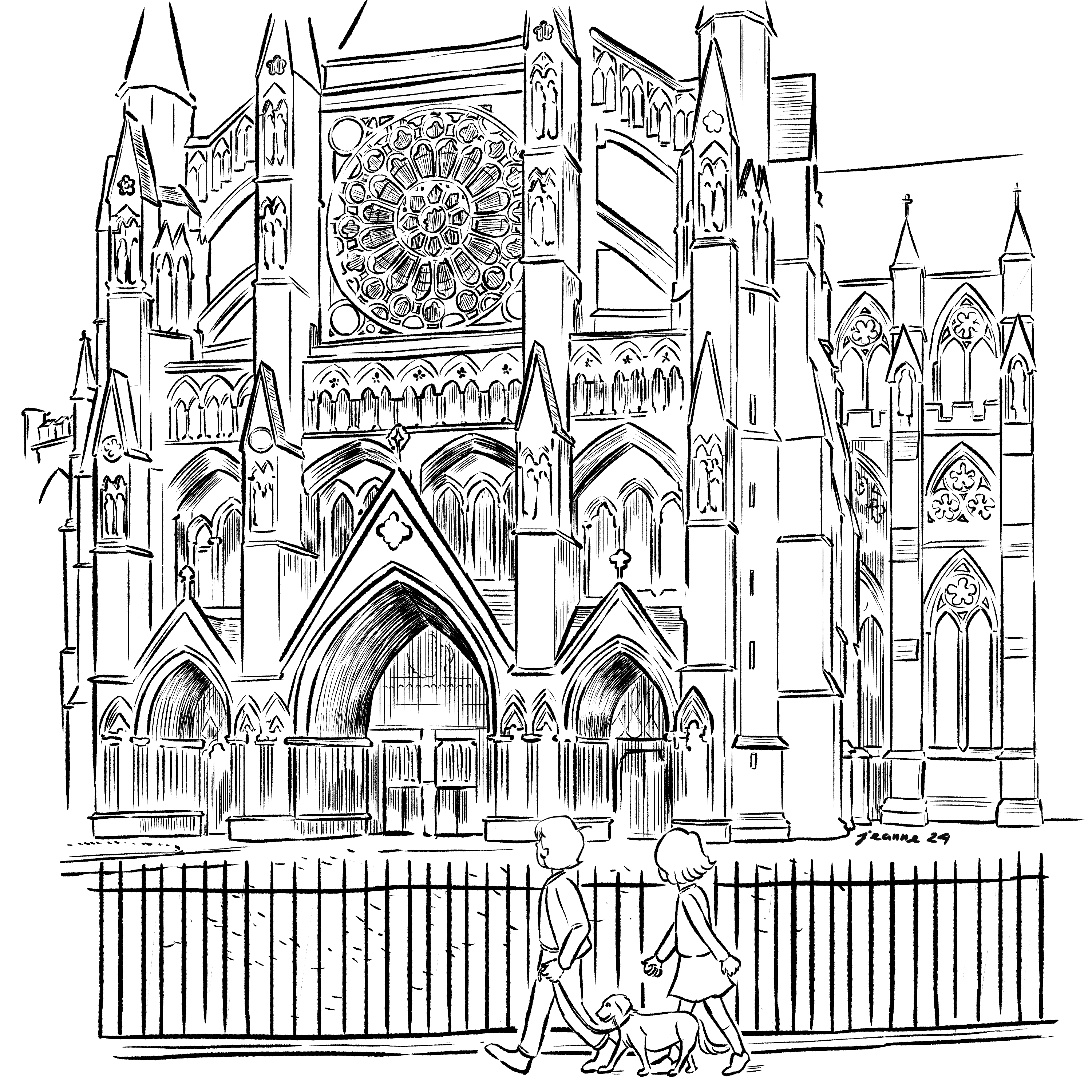
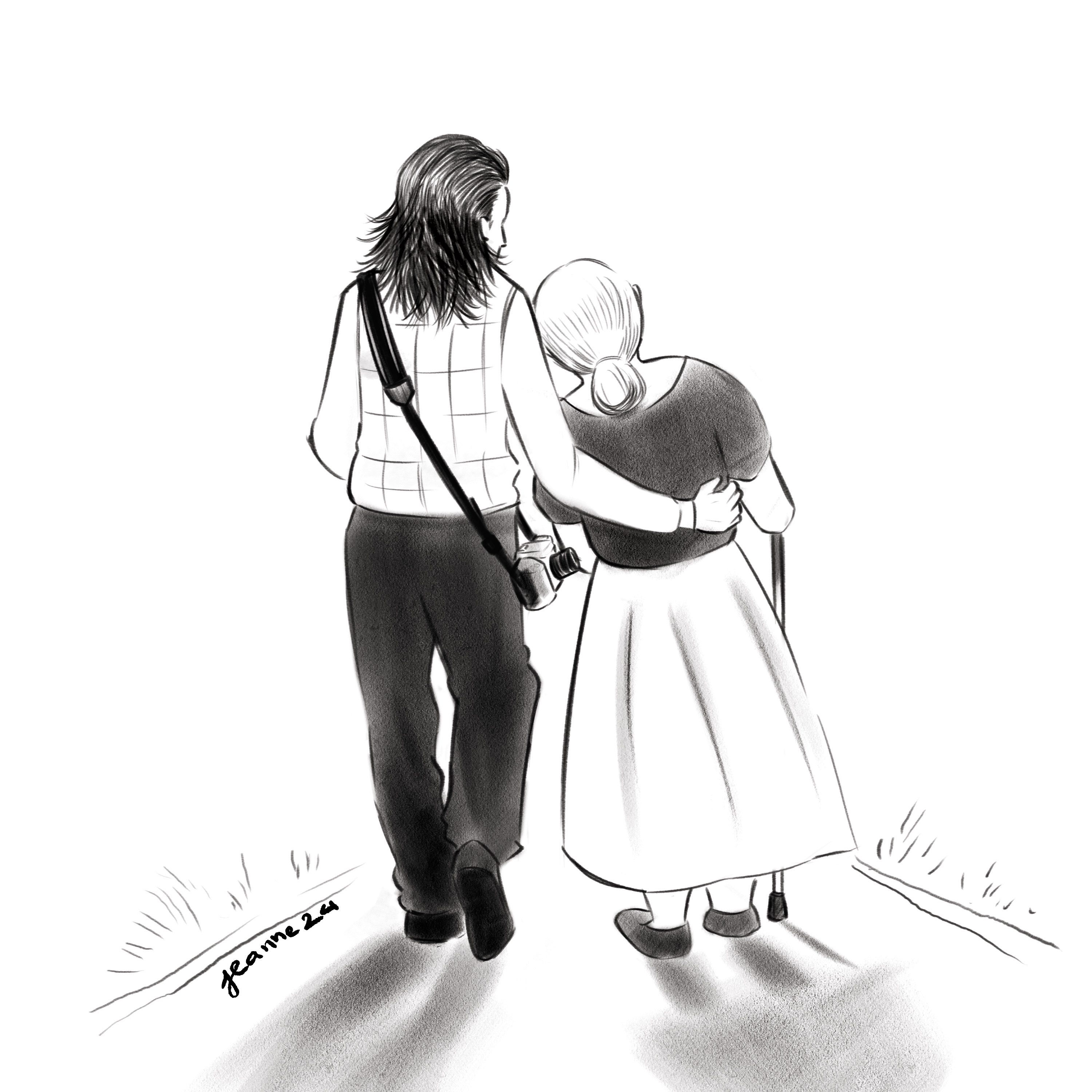
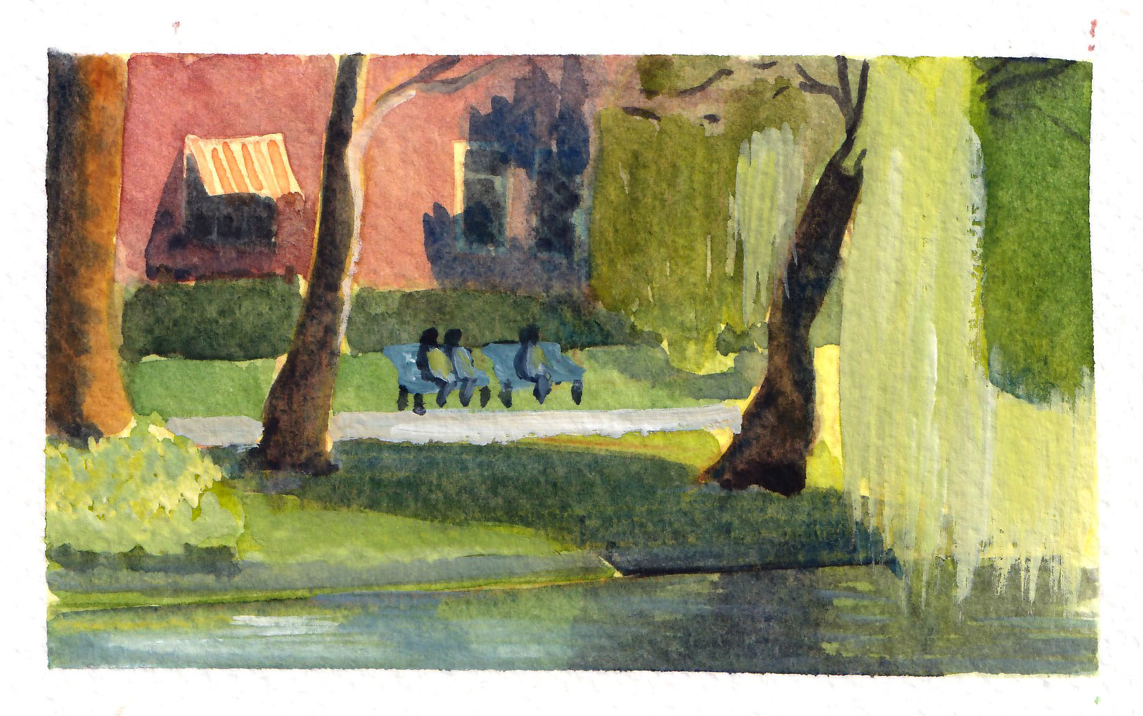
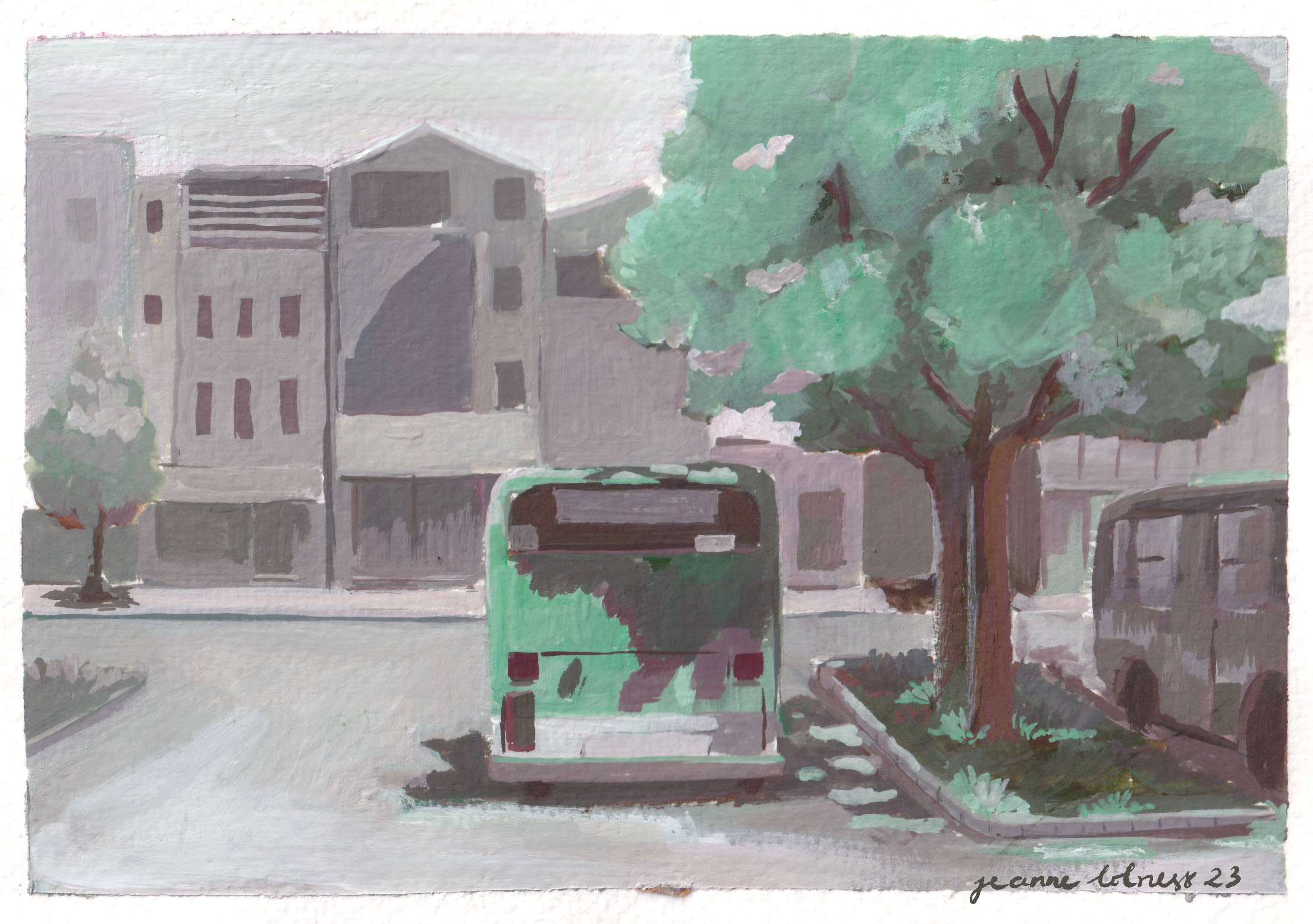
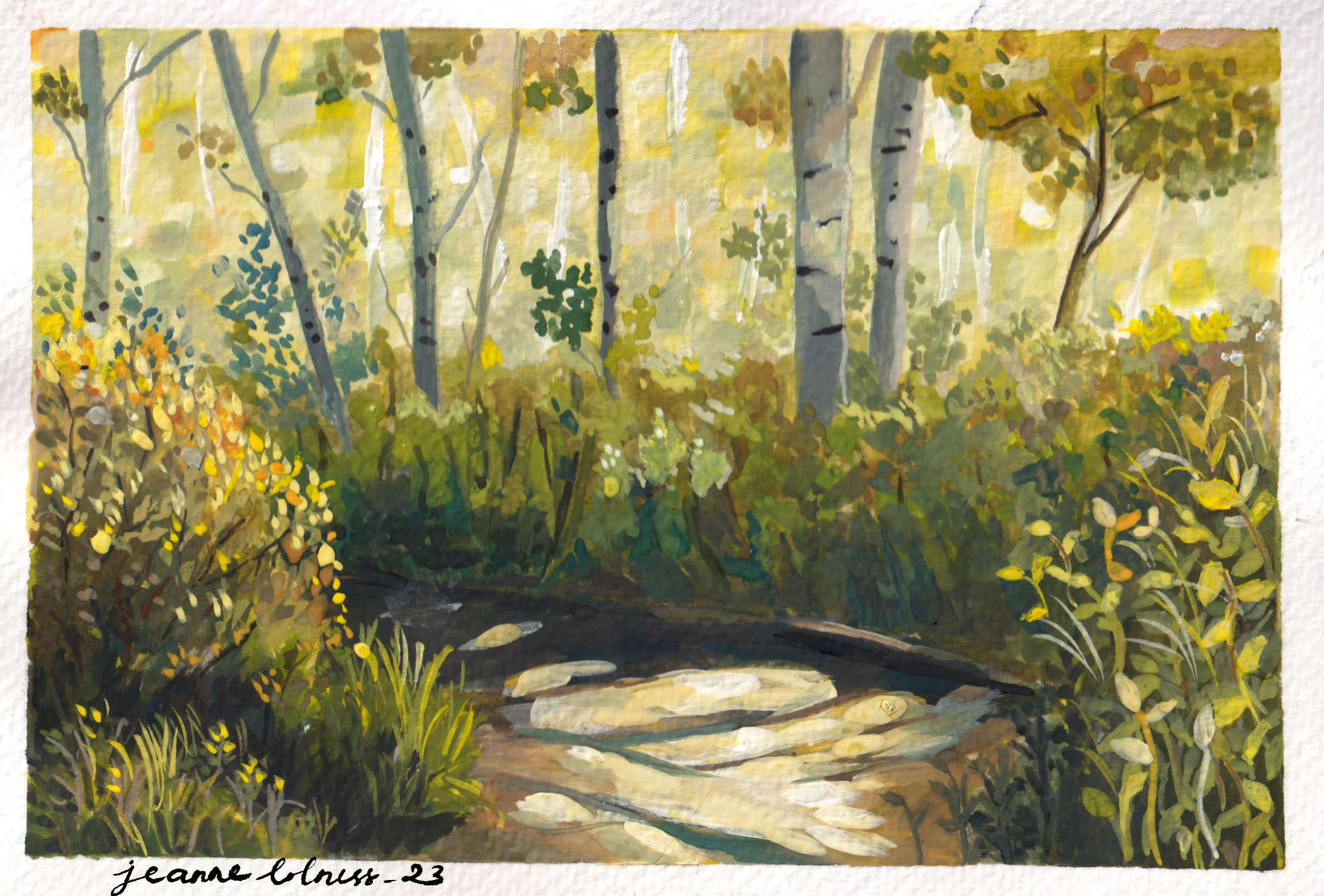
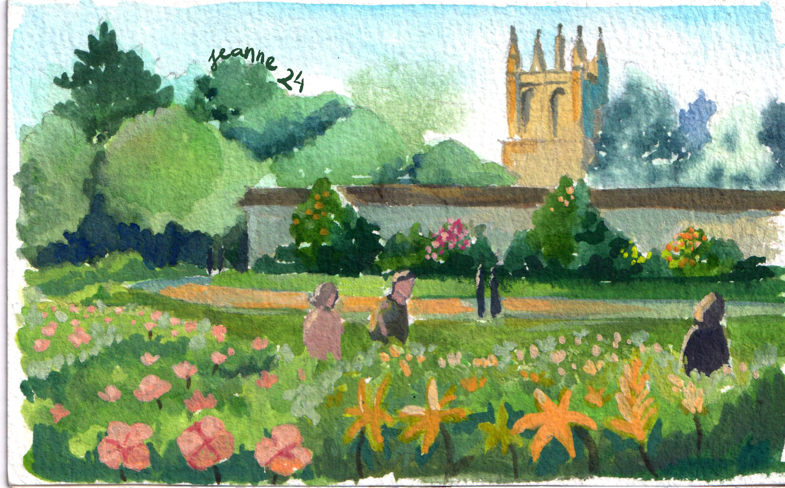
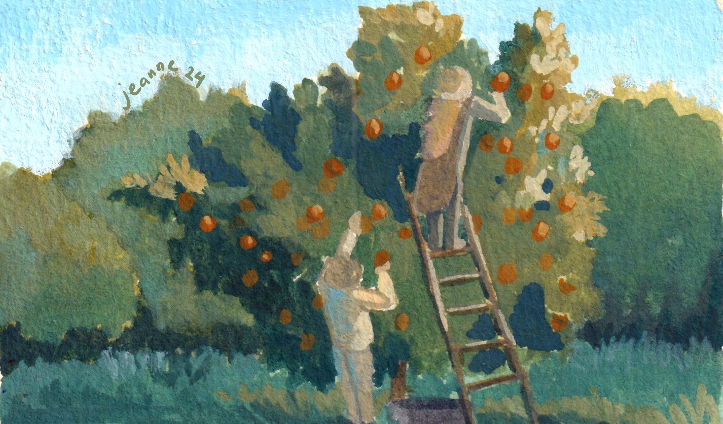
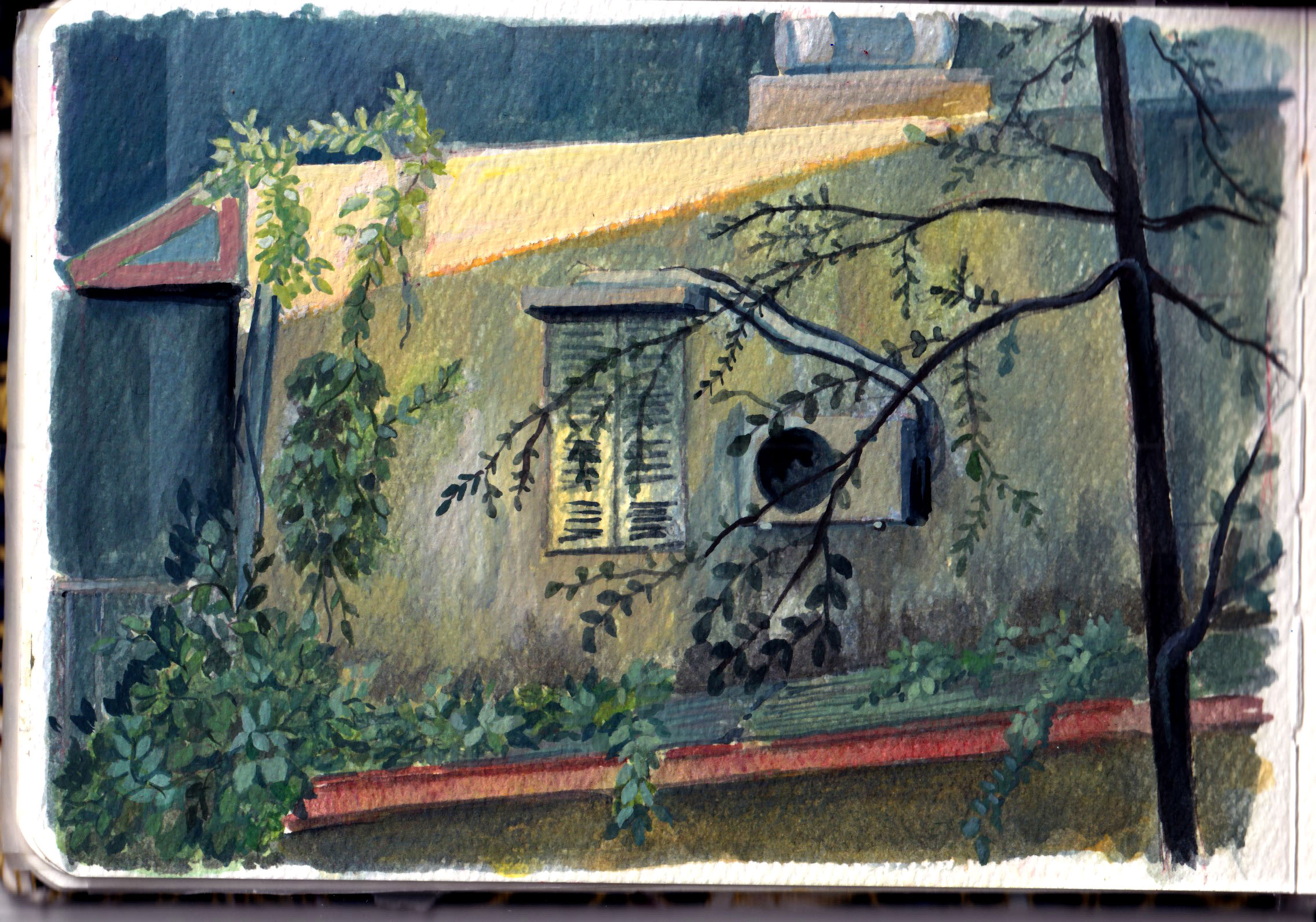
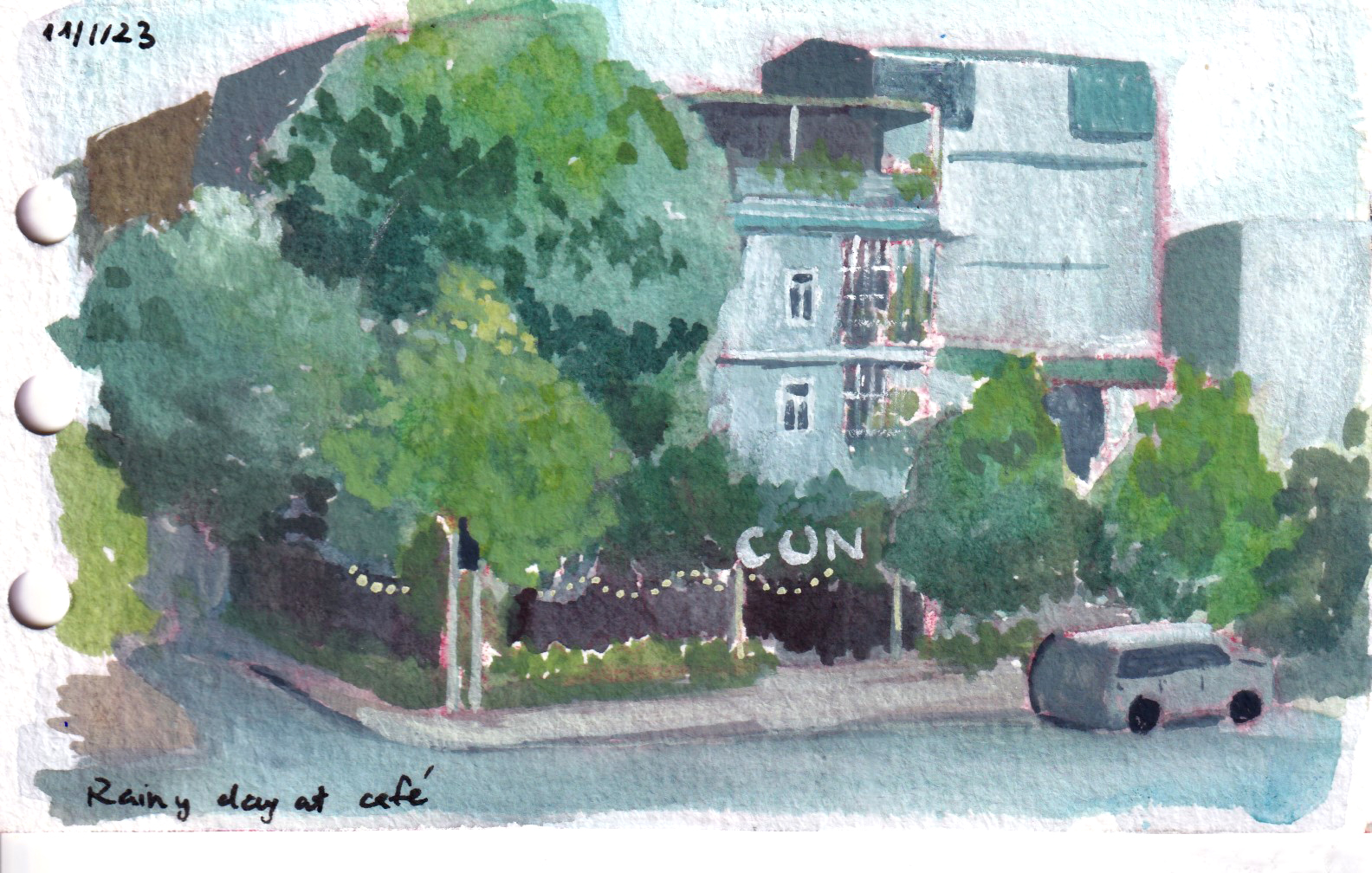
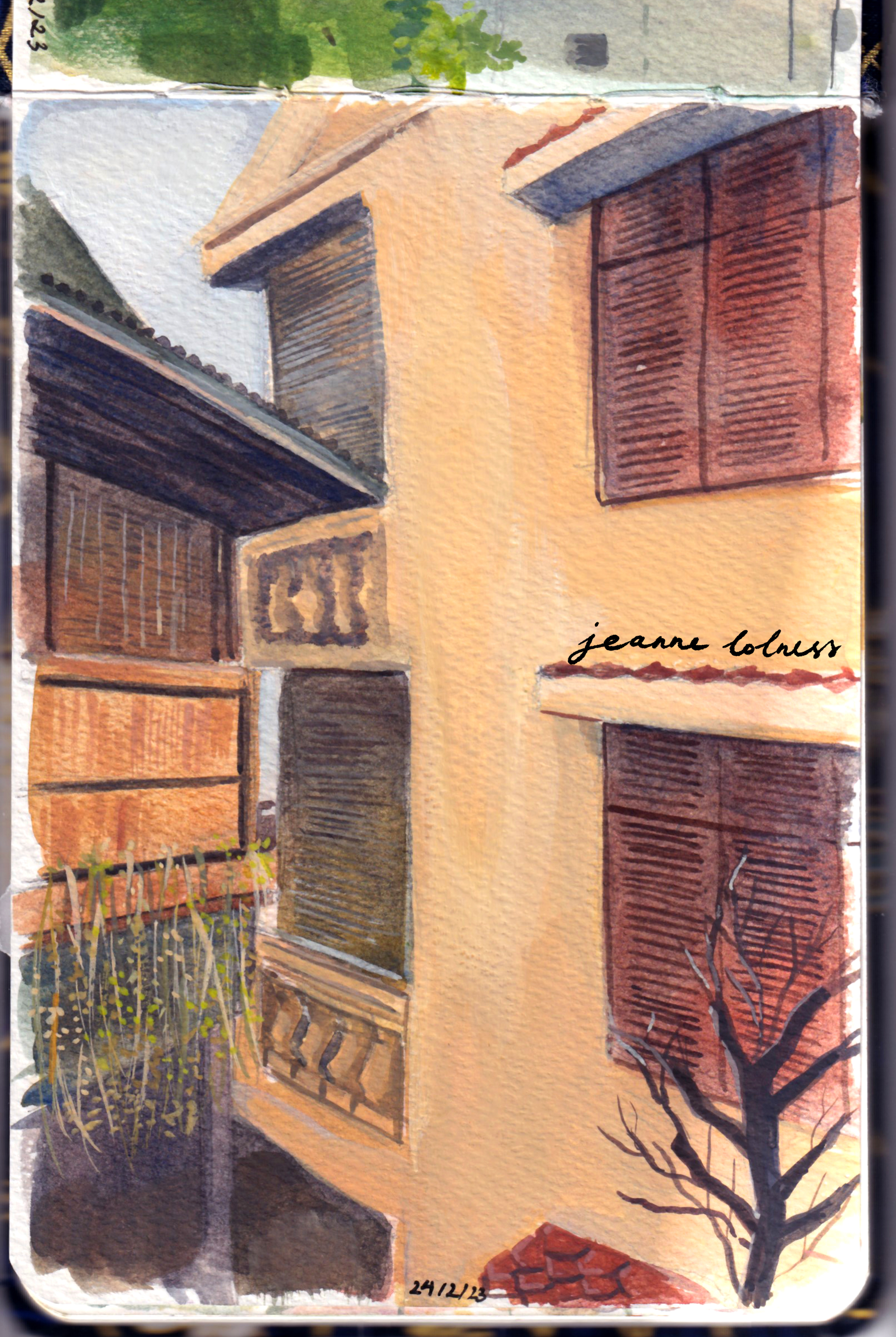
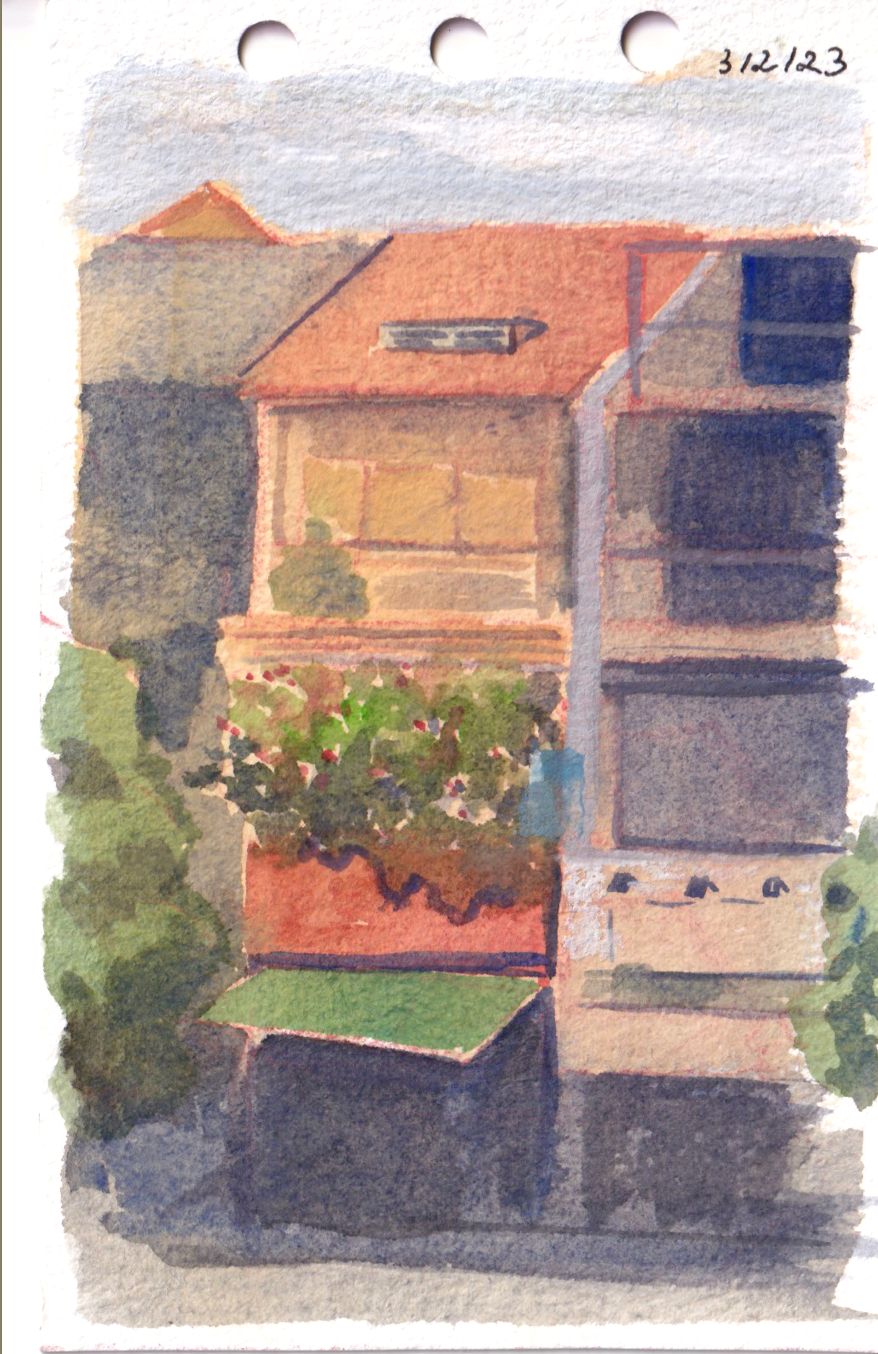
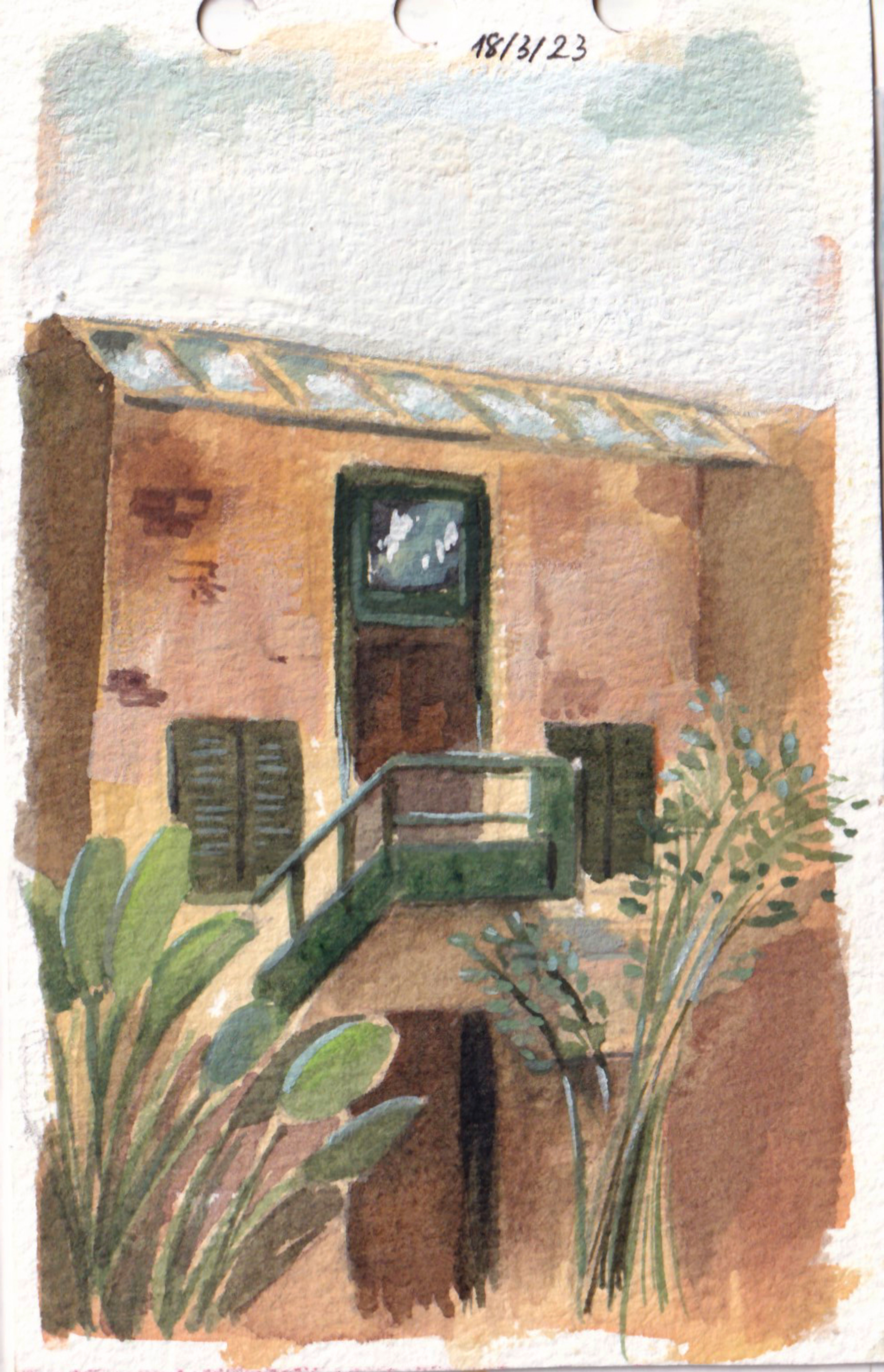
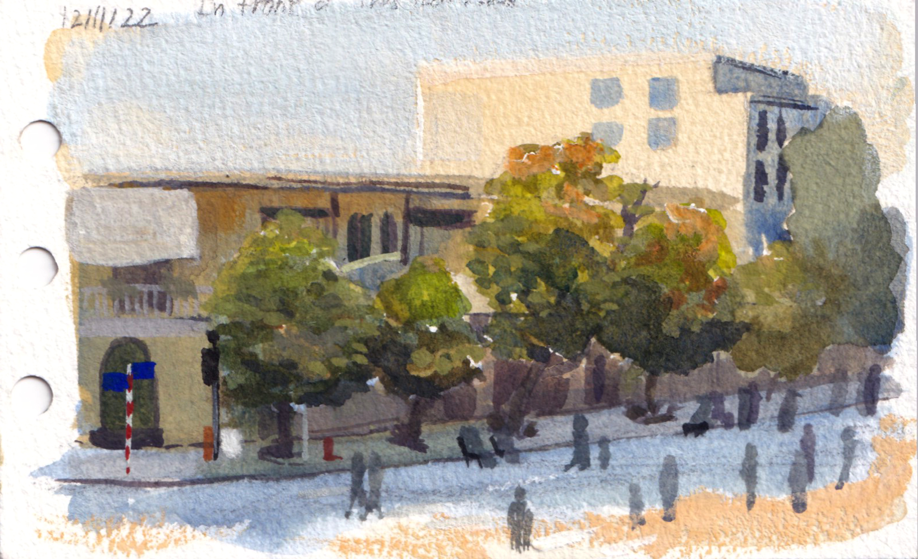
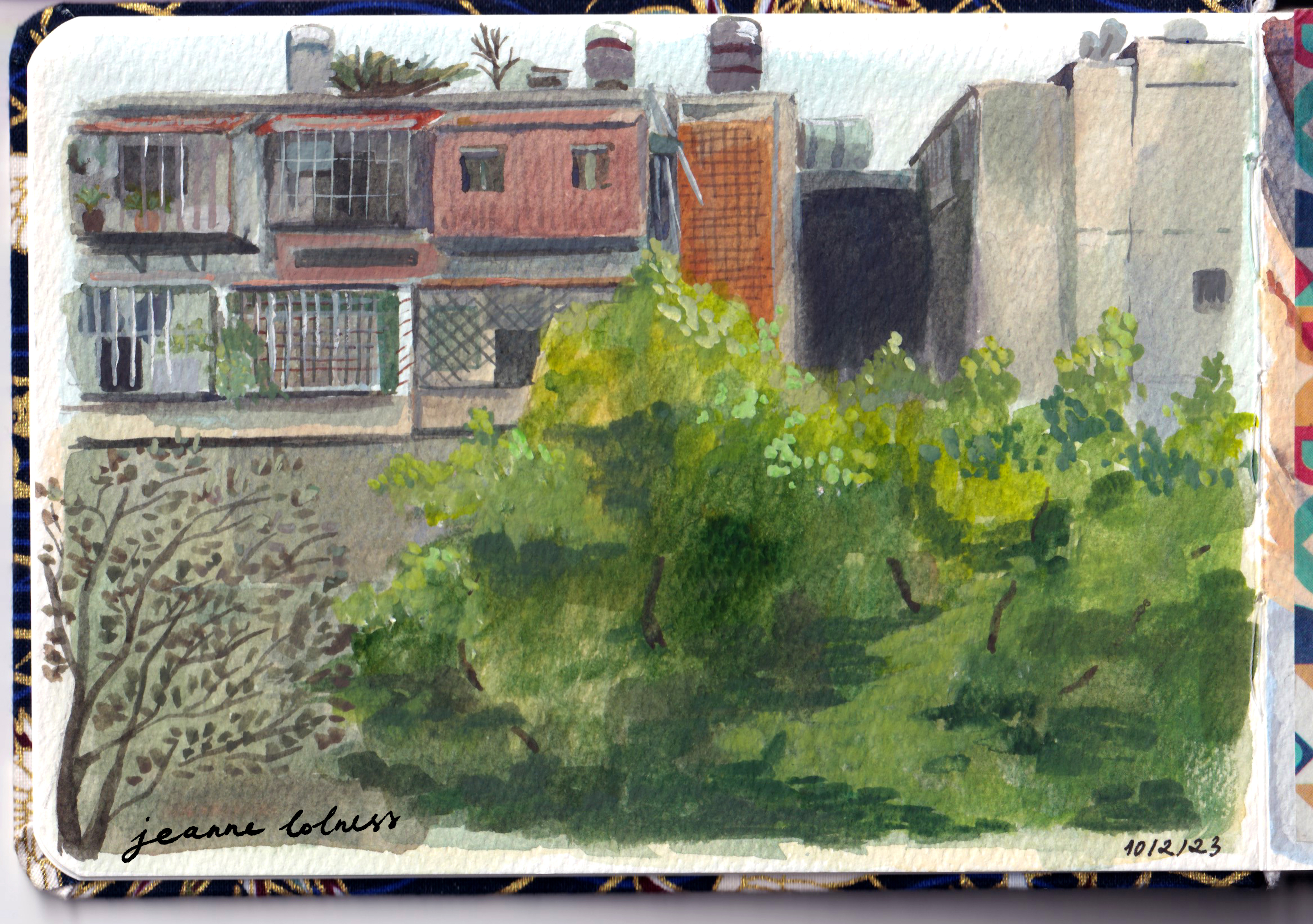
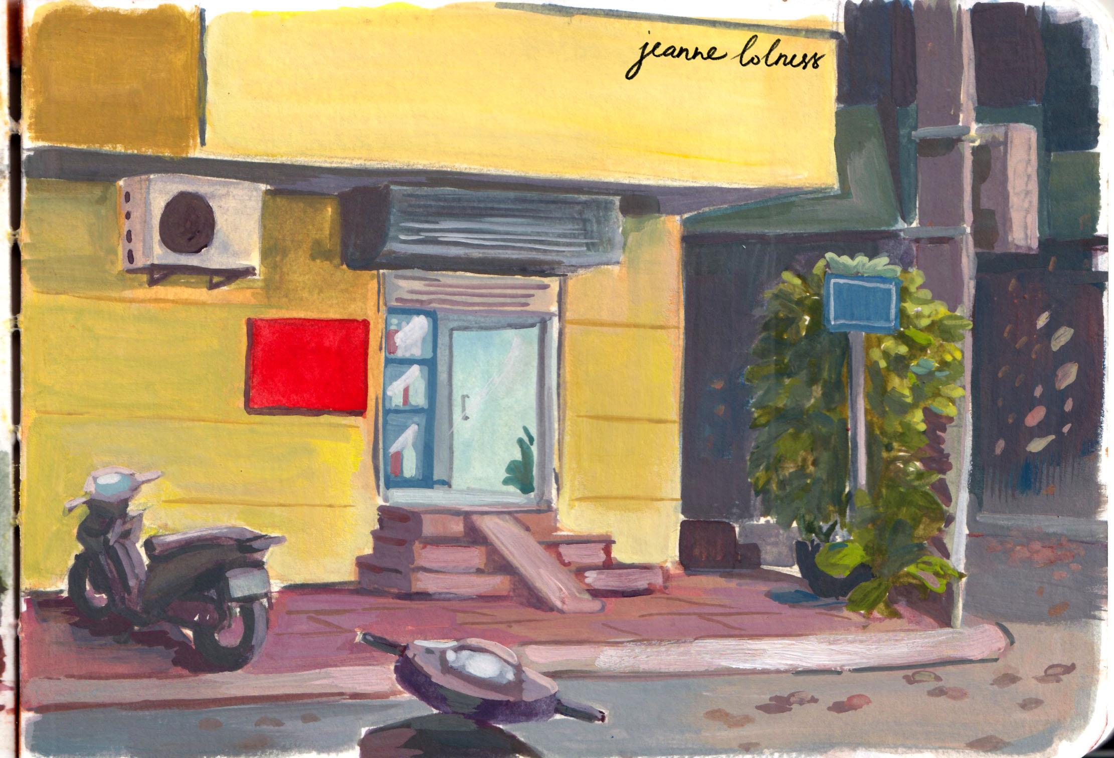
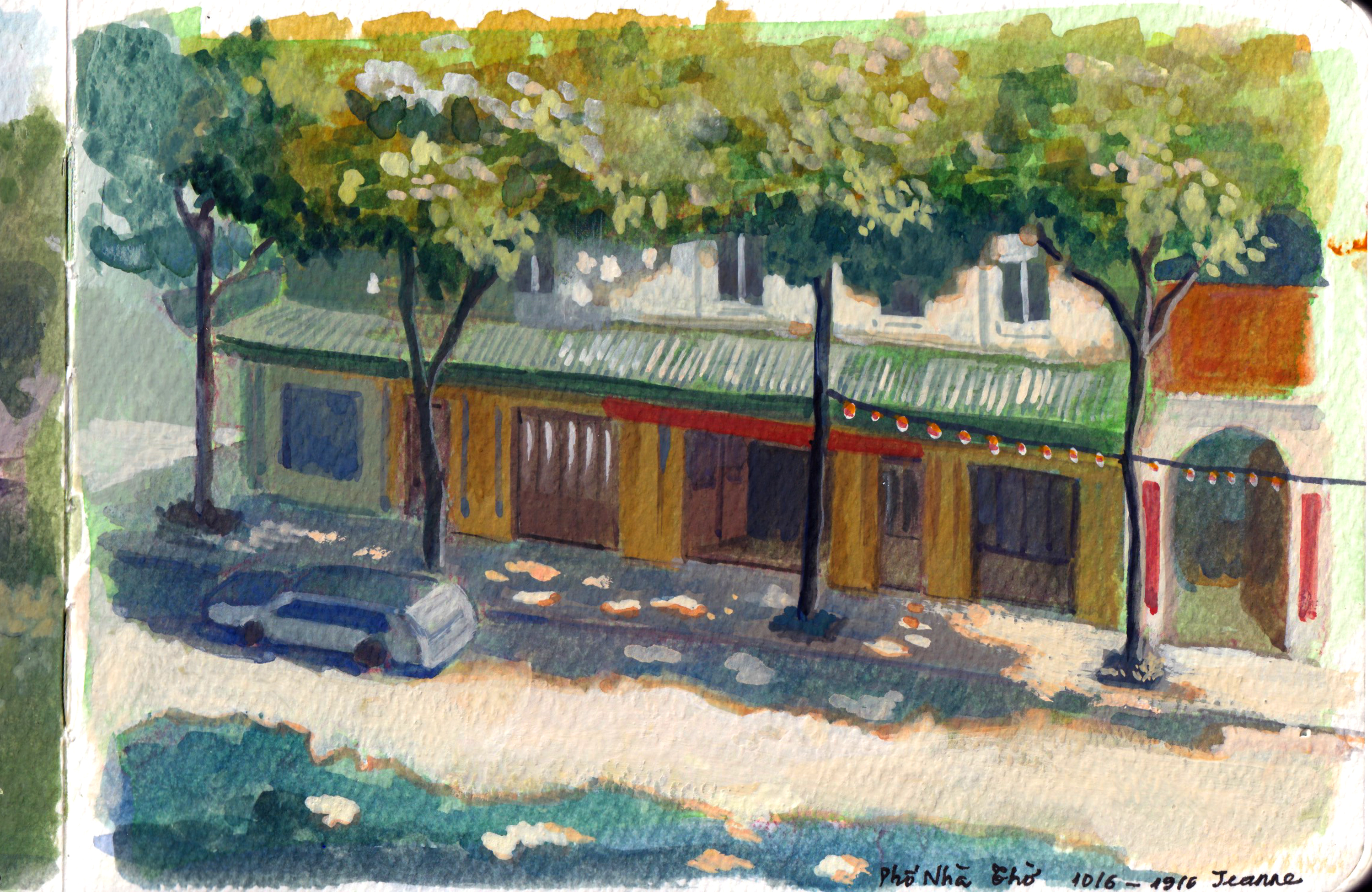
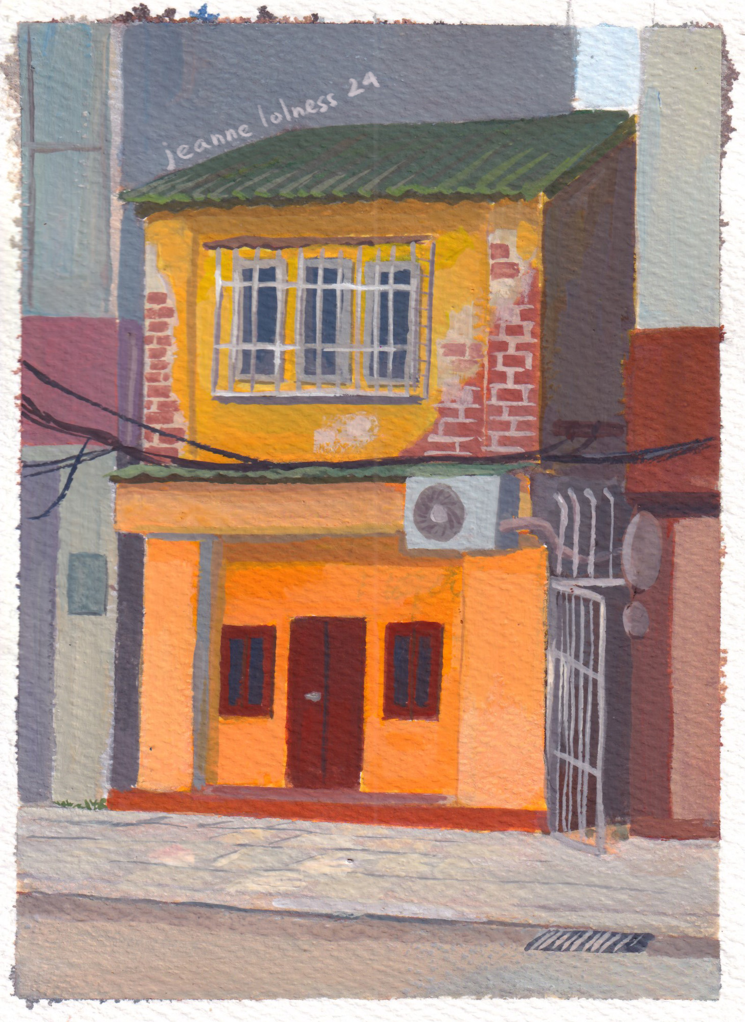
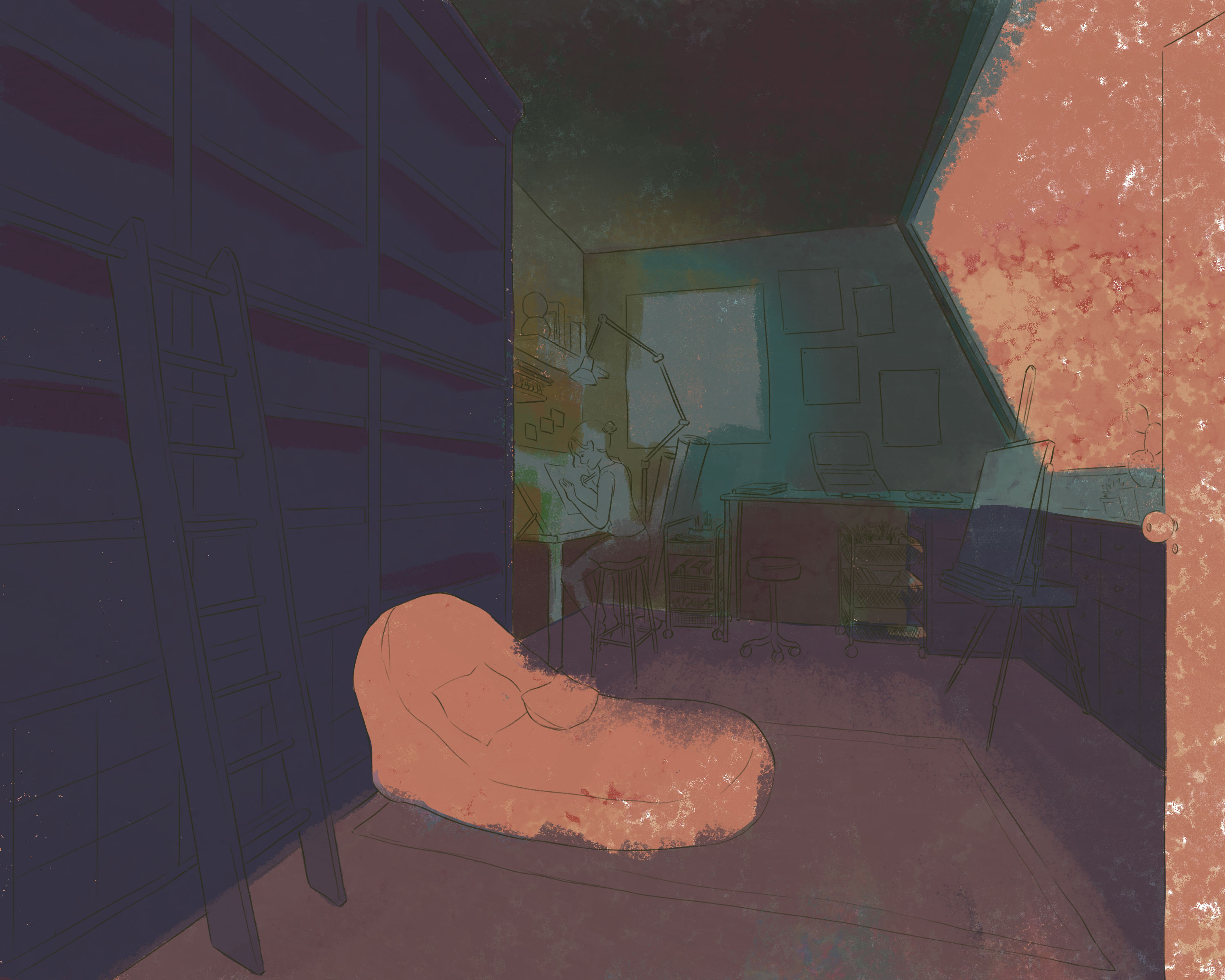
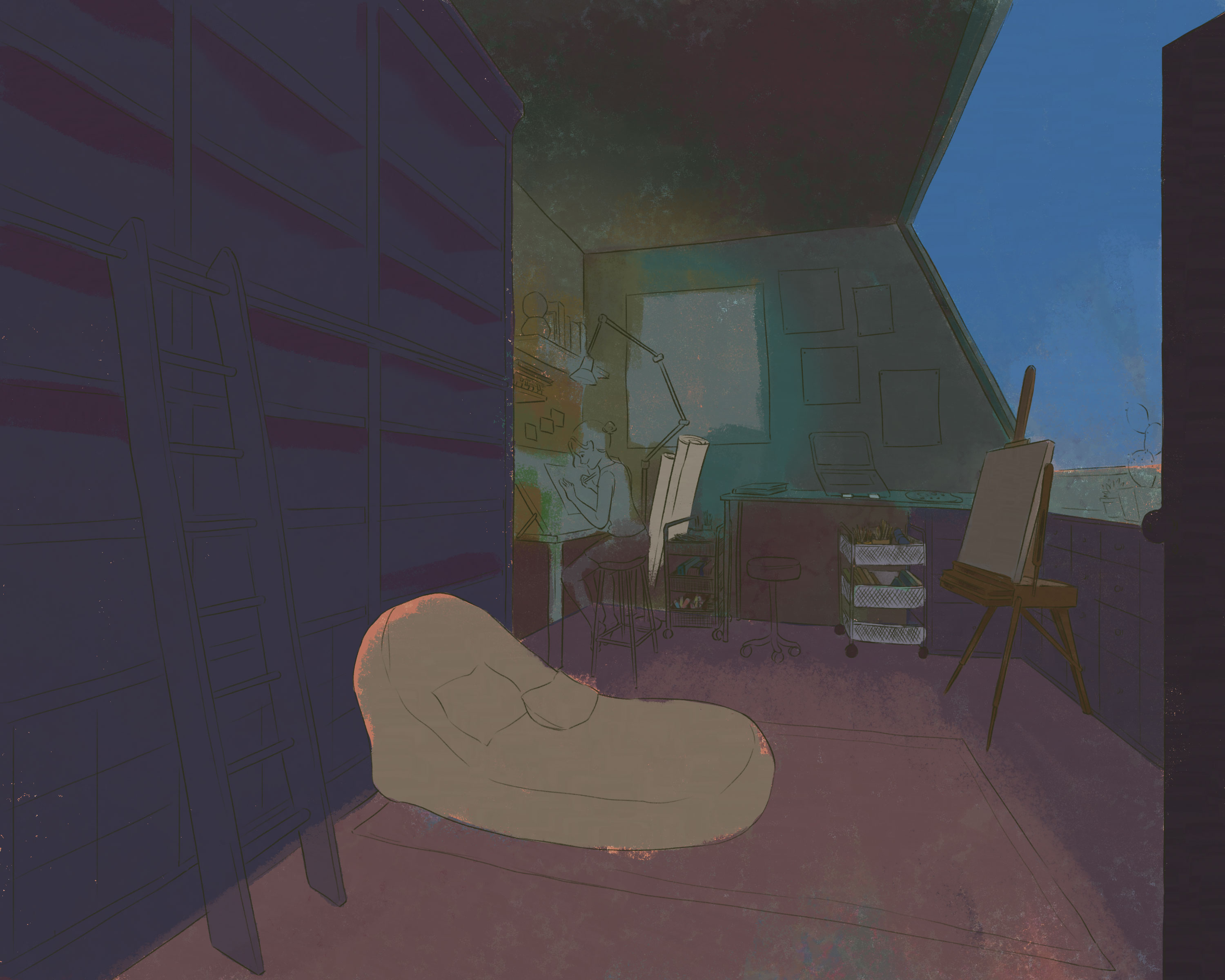
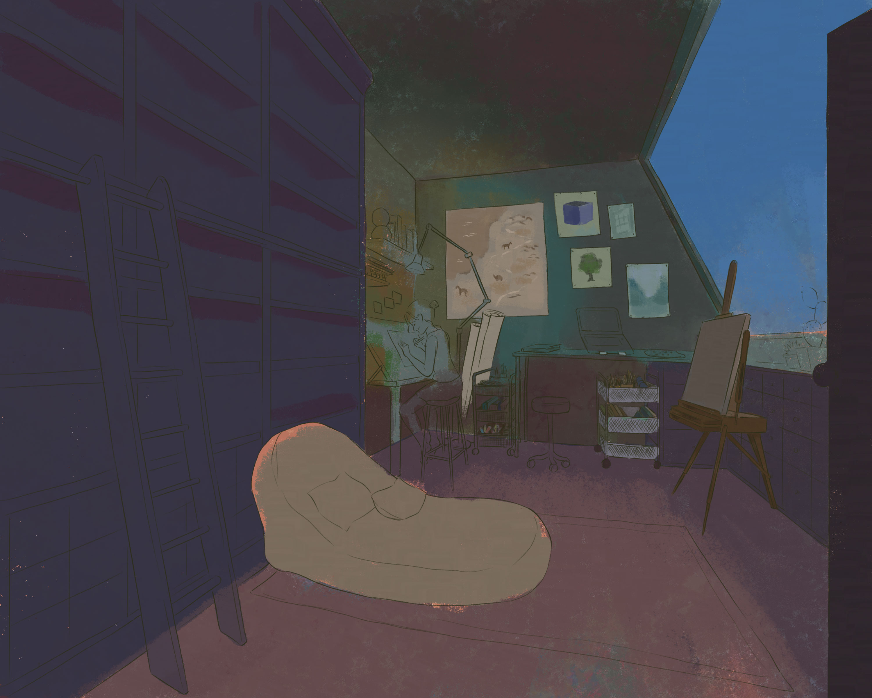
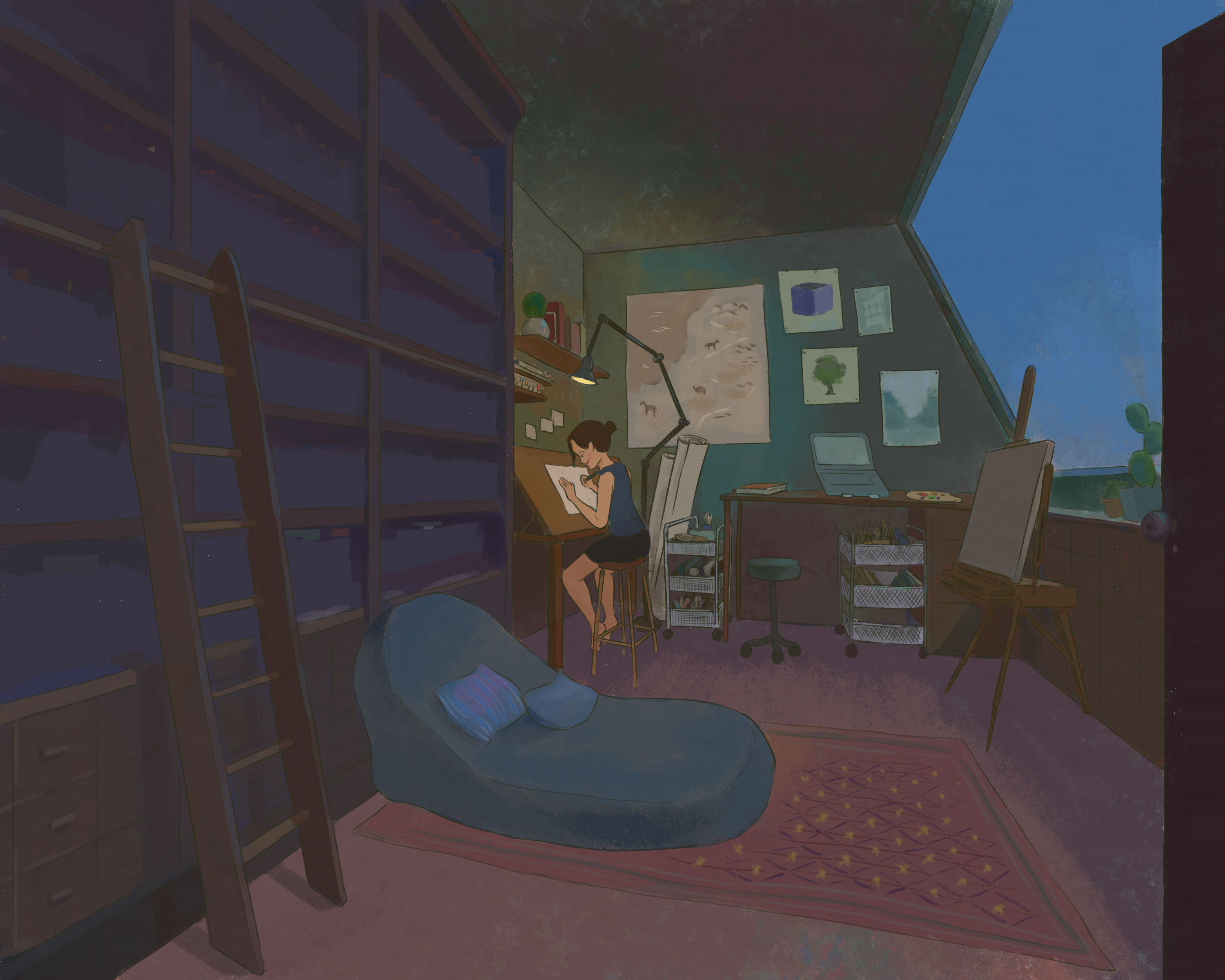
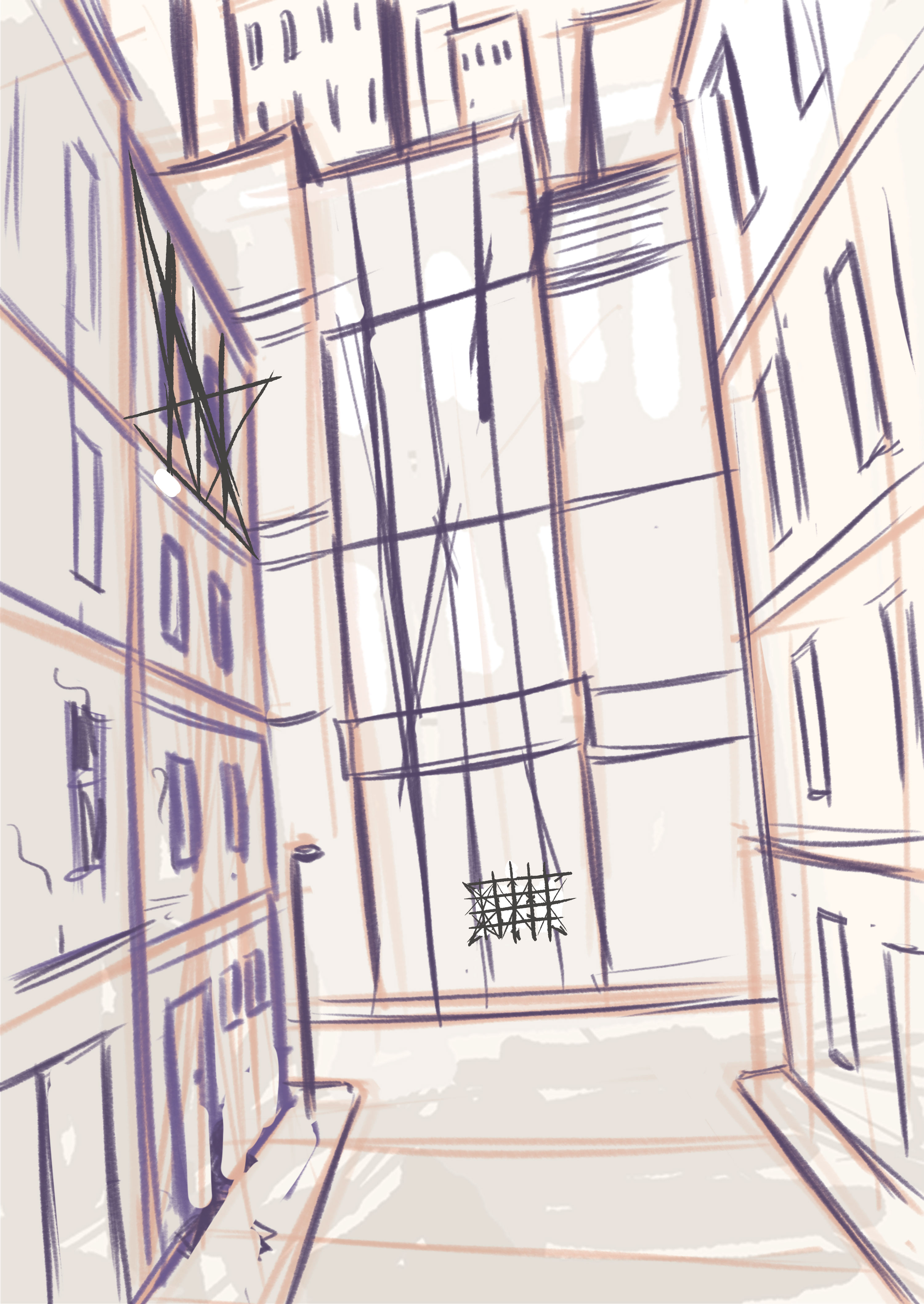
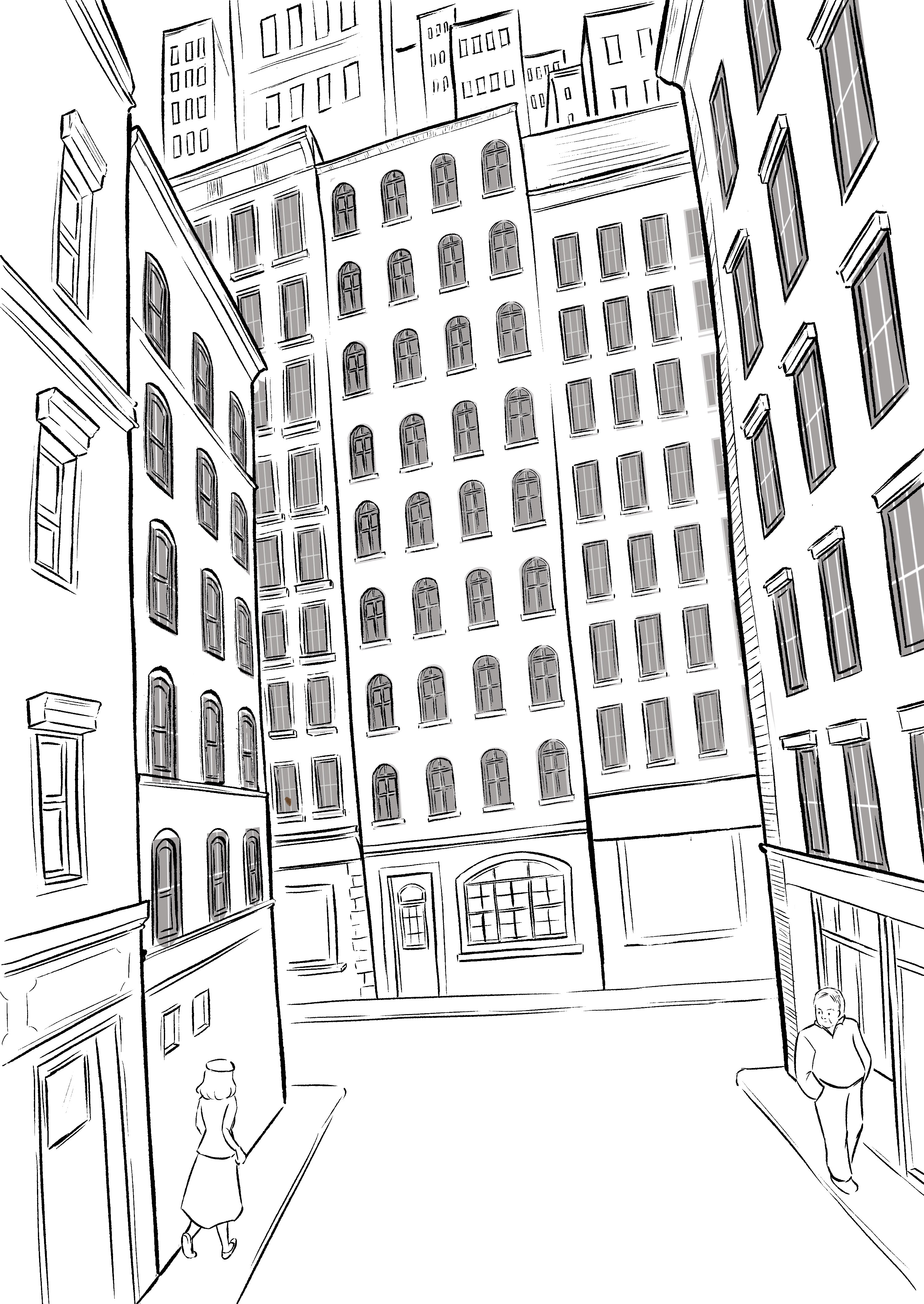
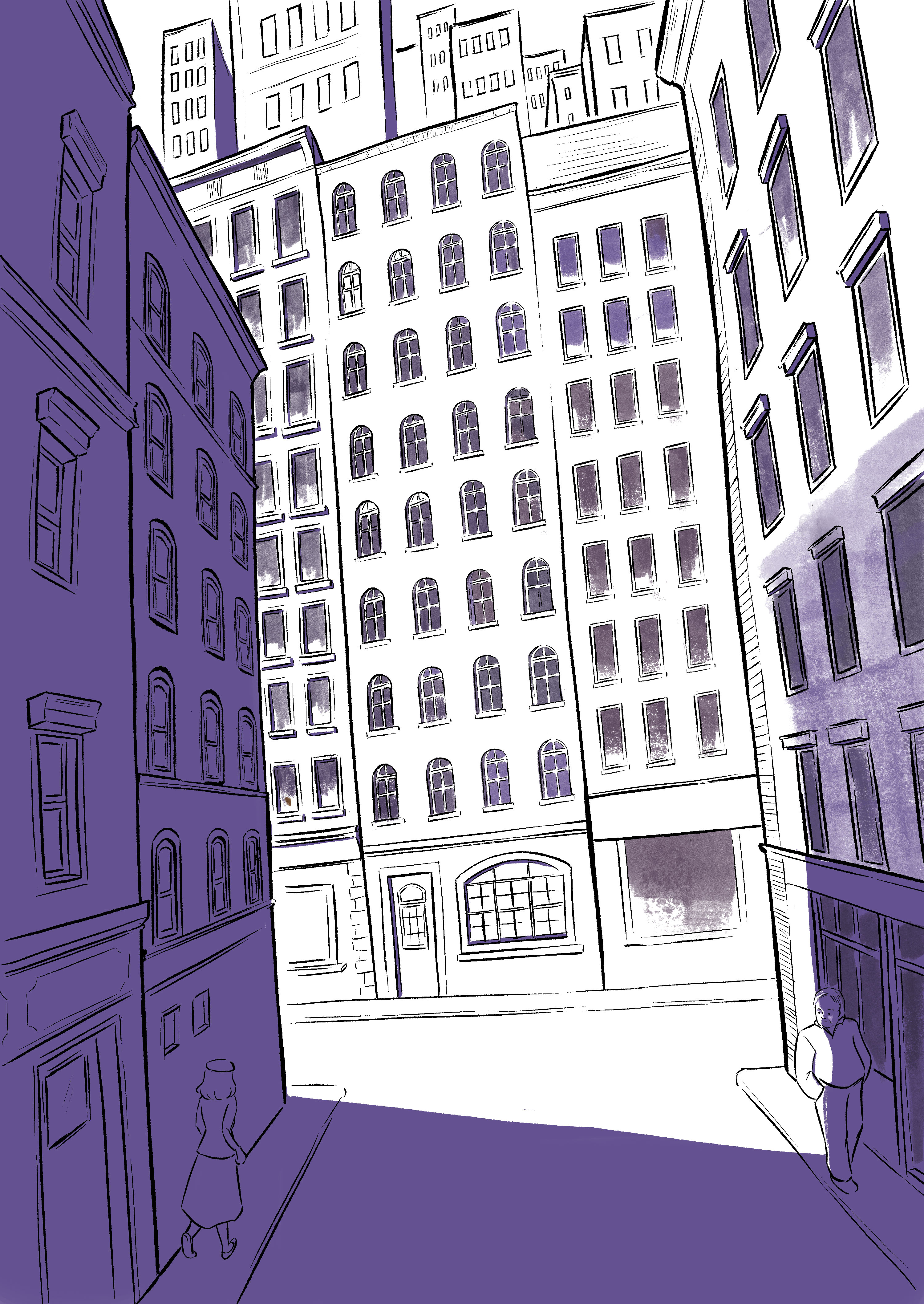
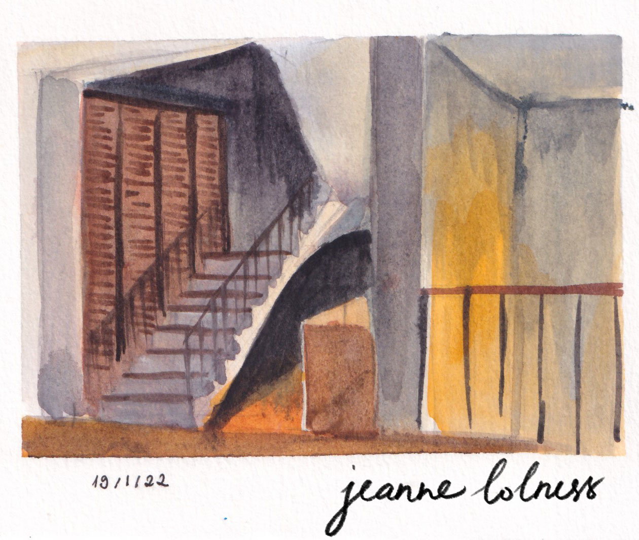
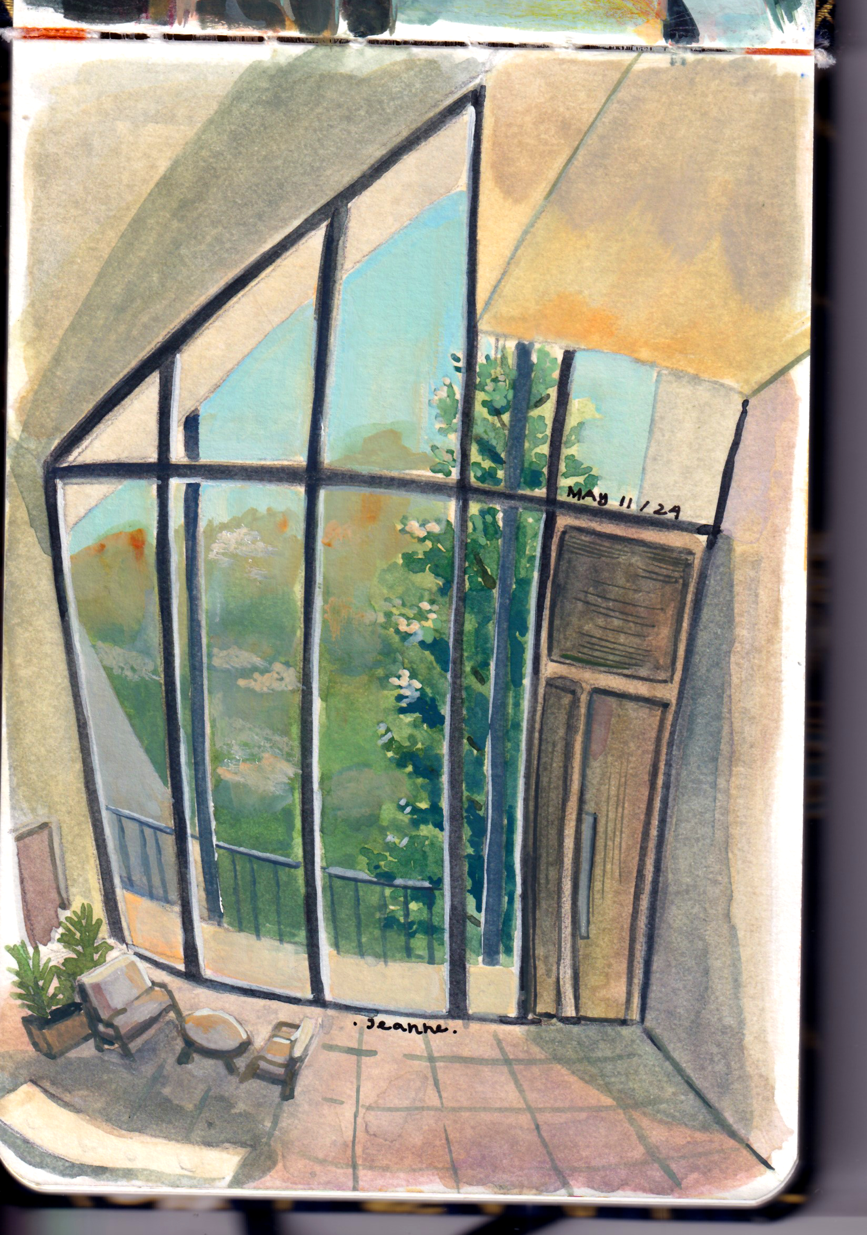
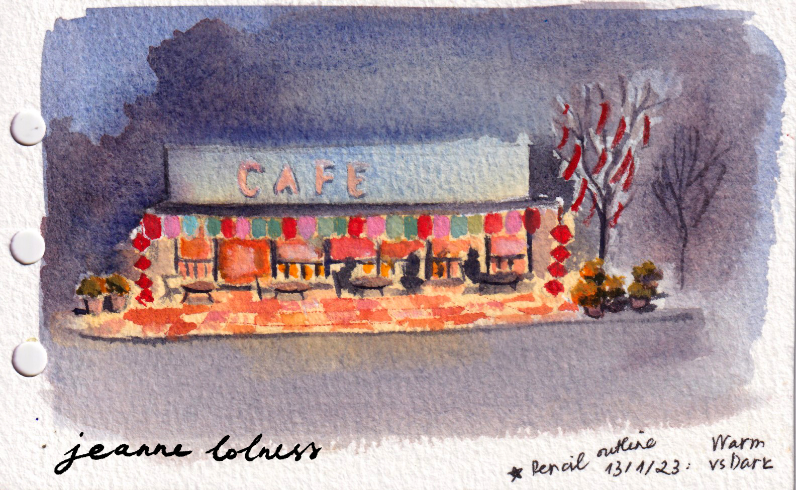
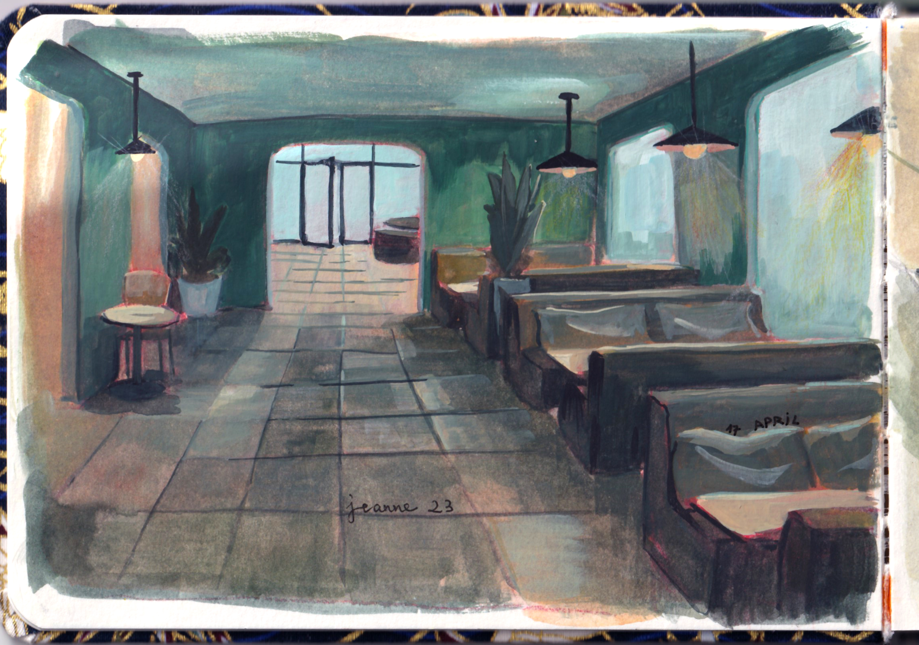
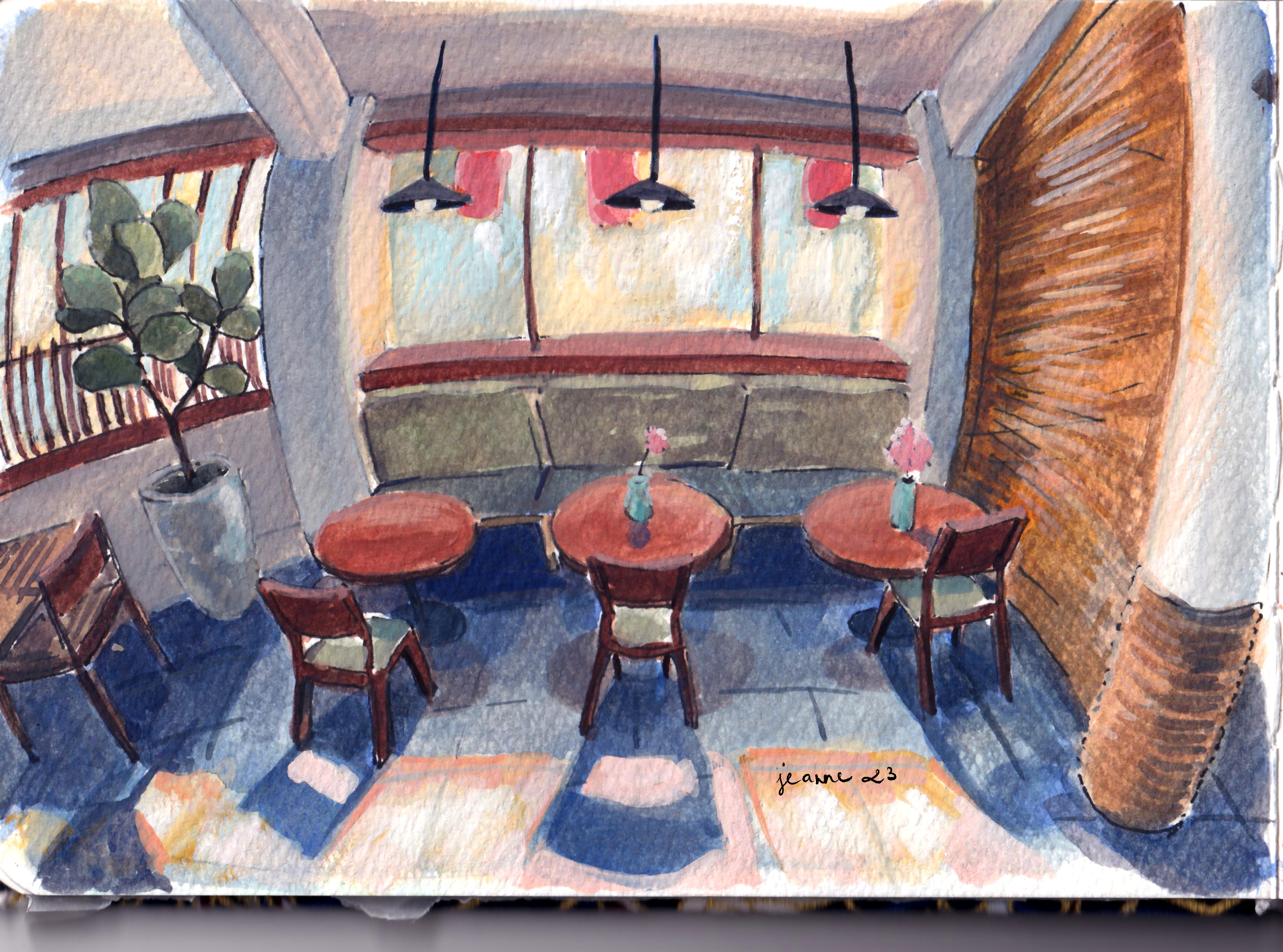
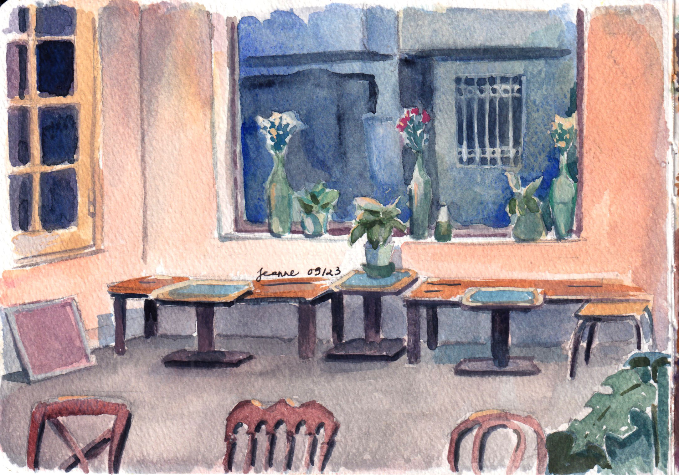
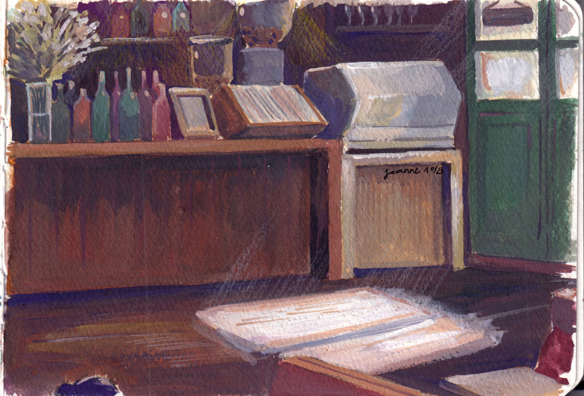
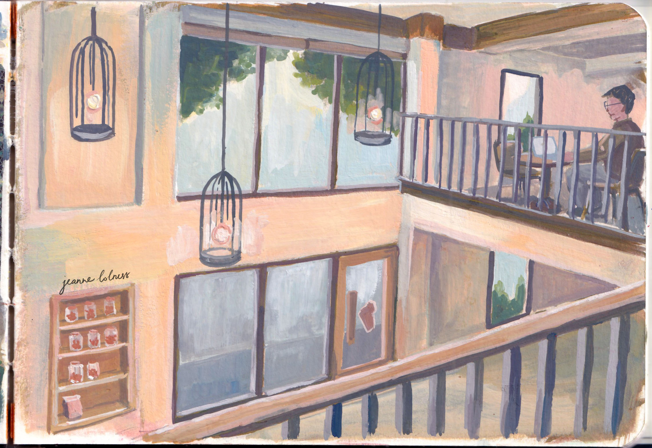
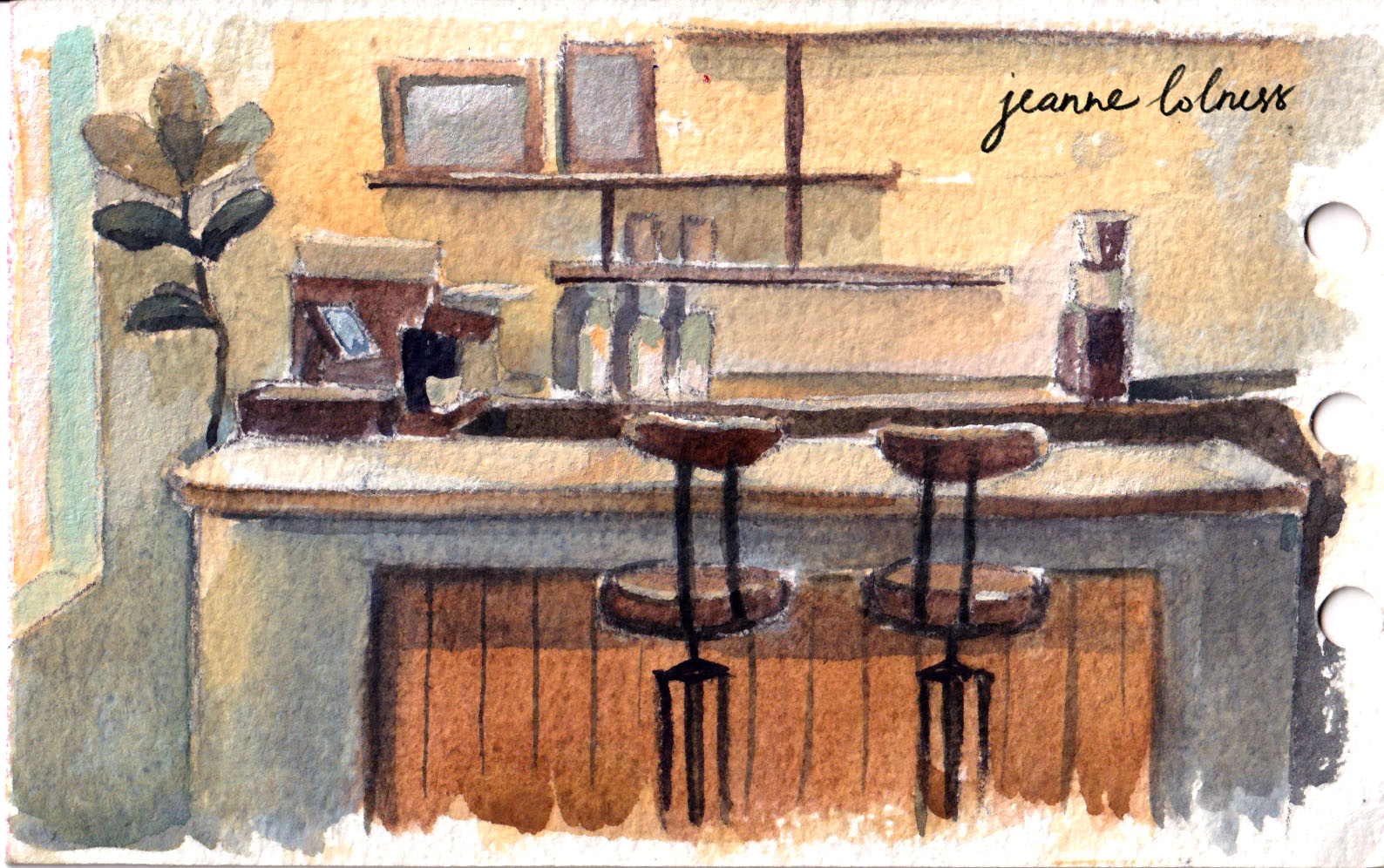
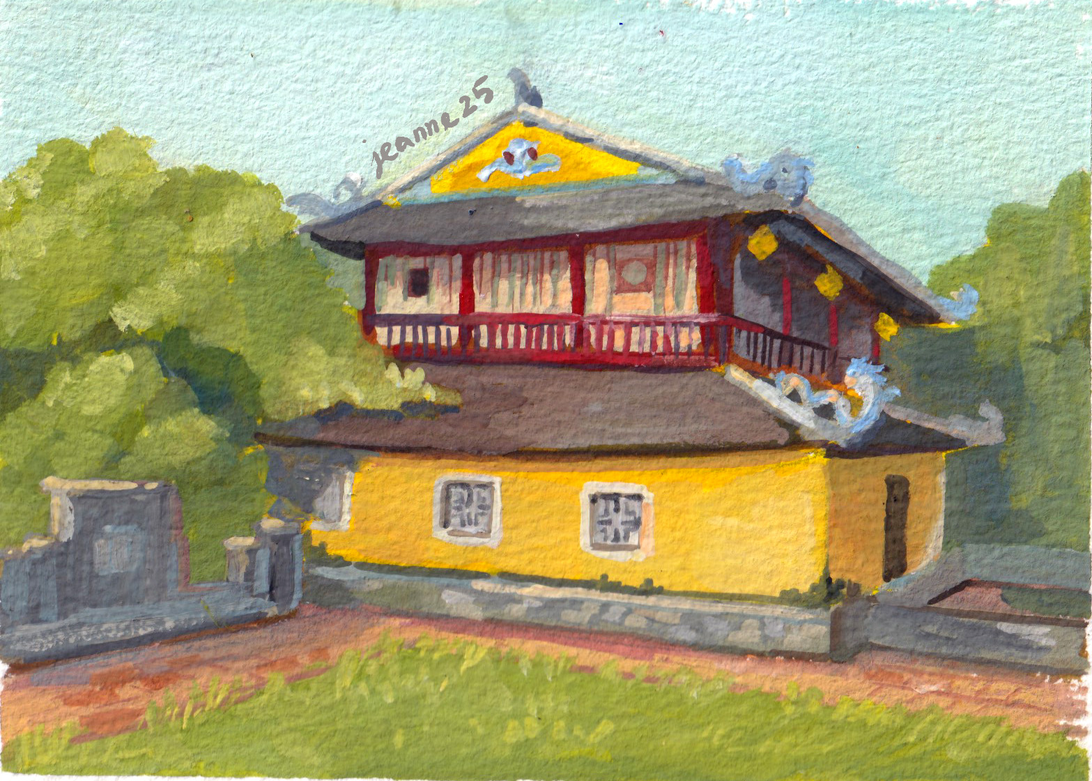
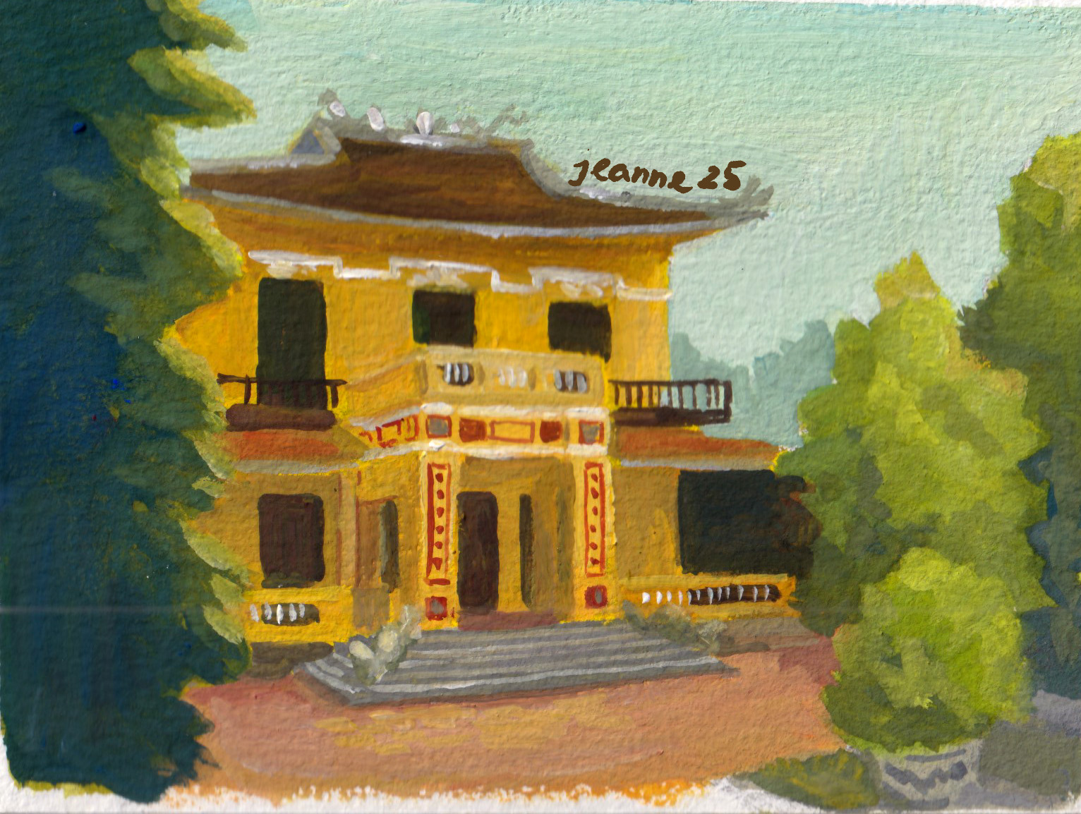
Painting old houses and nature
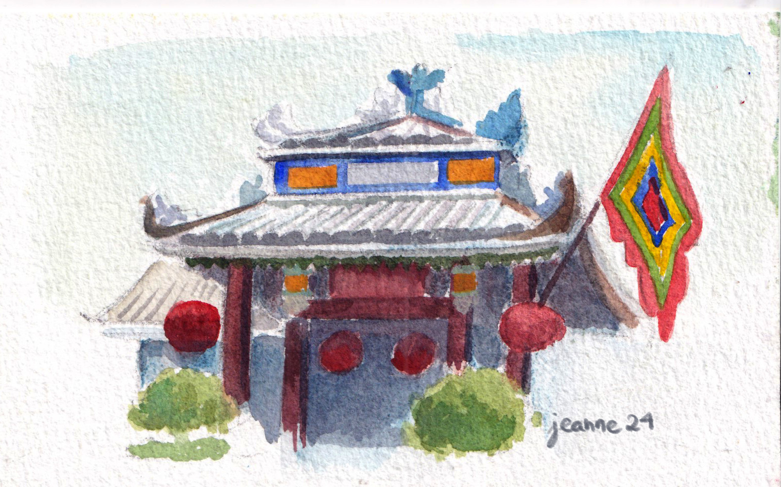
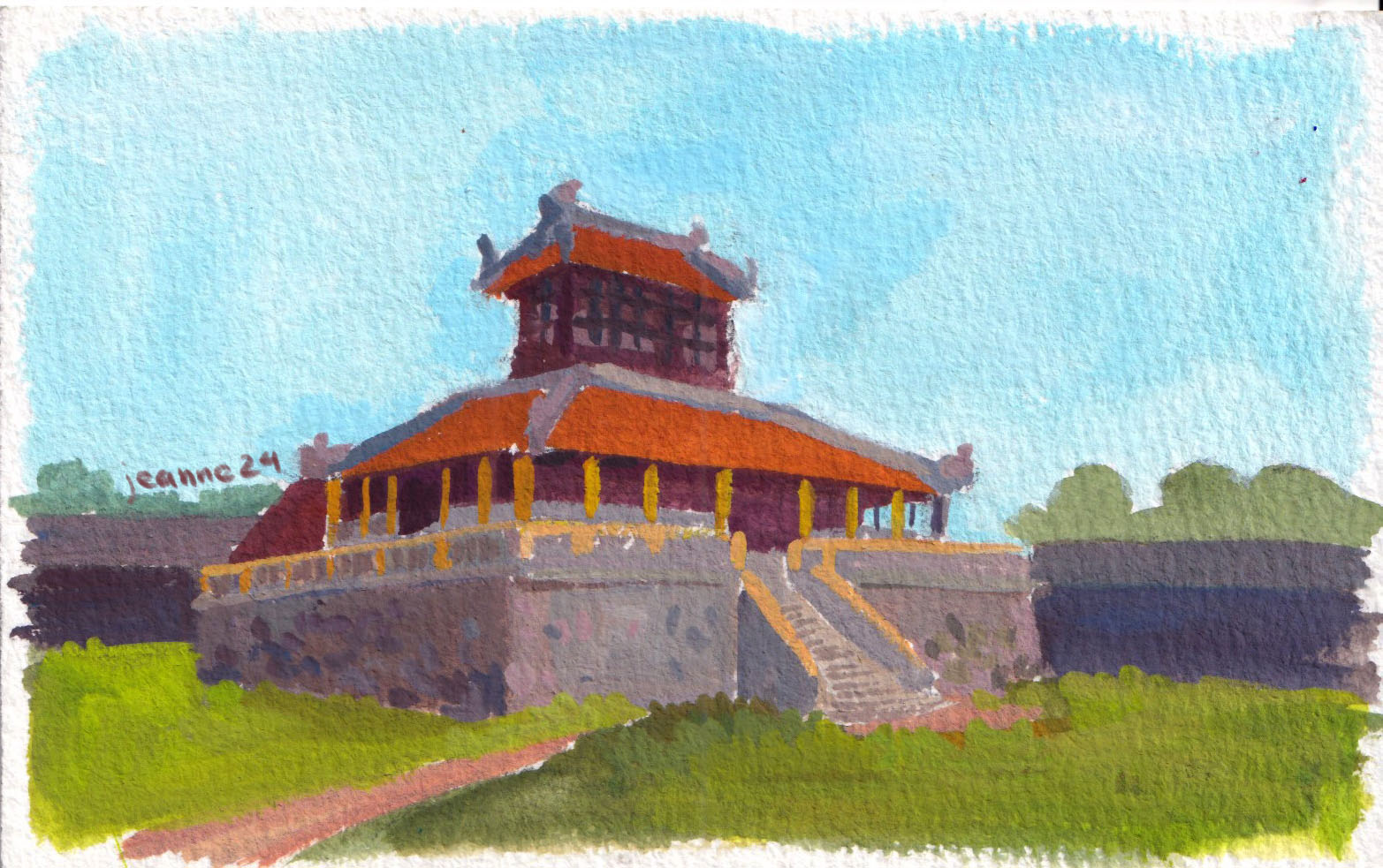
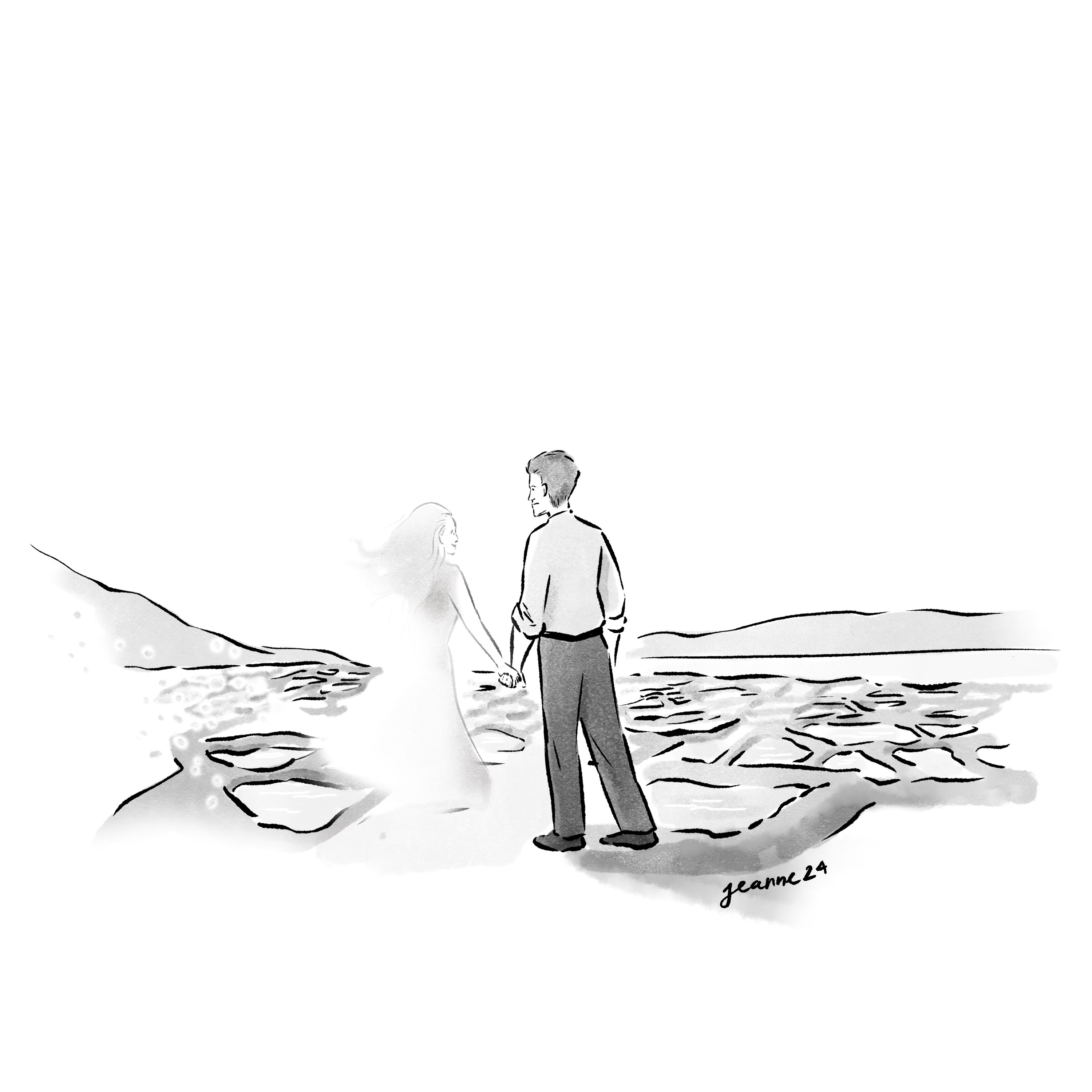
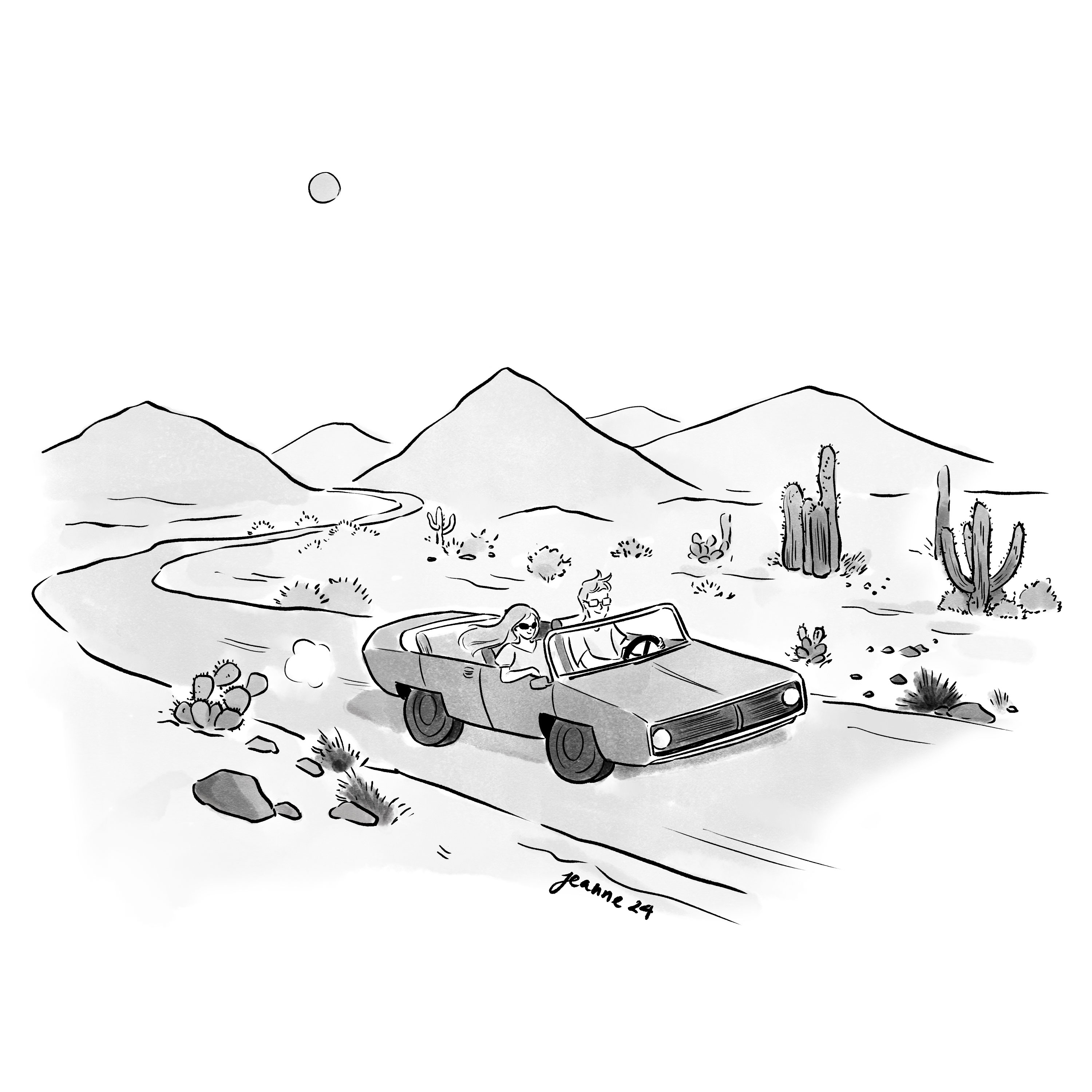
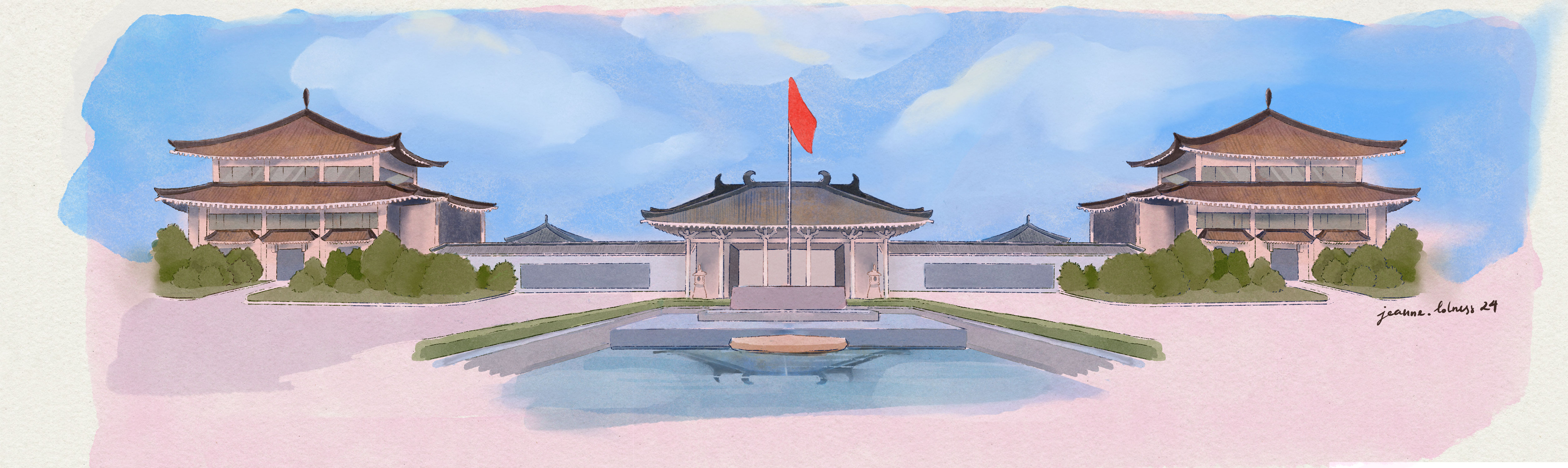
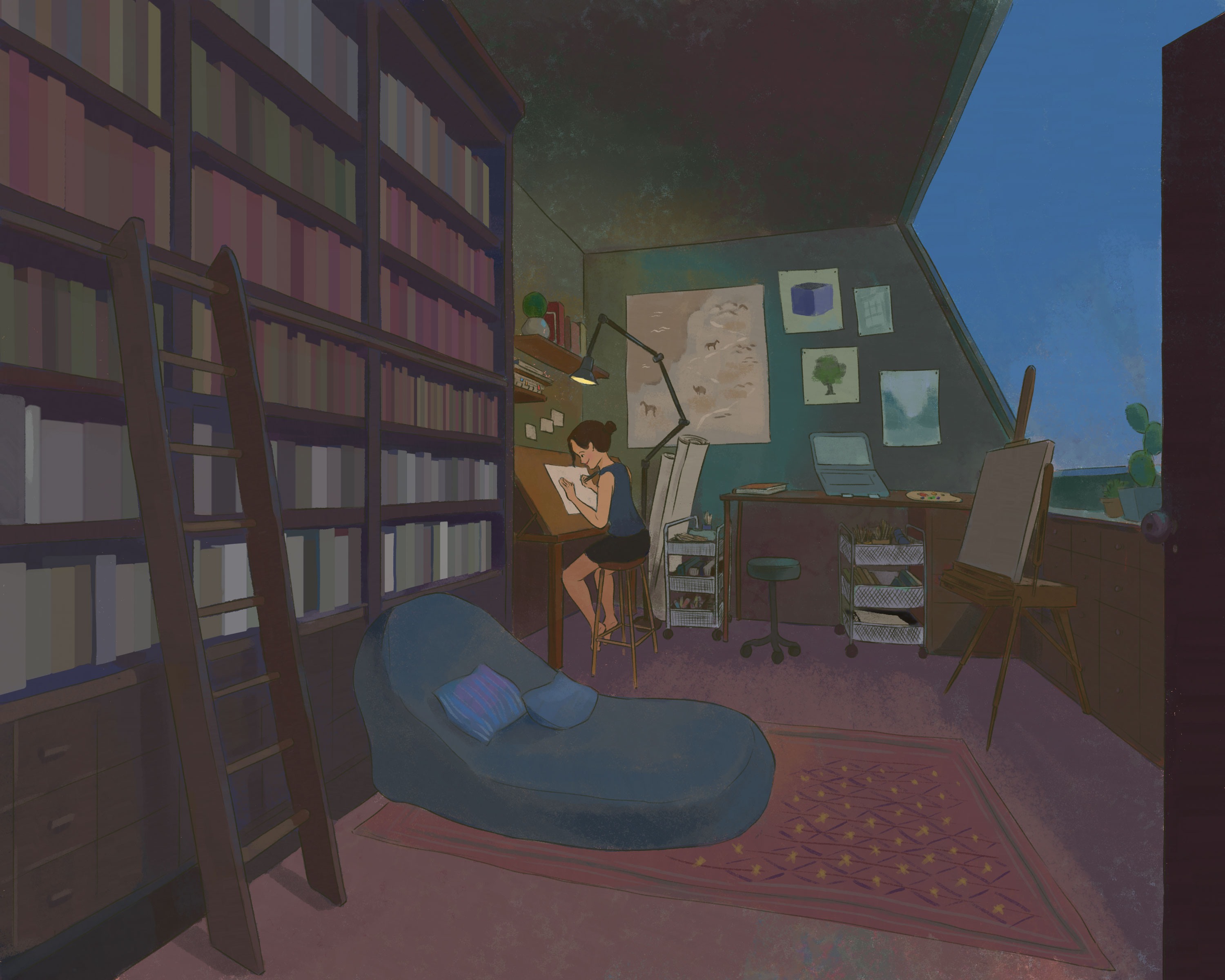
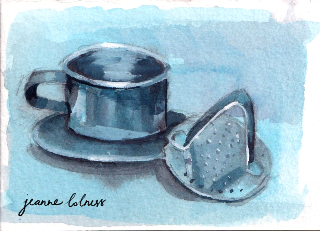
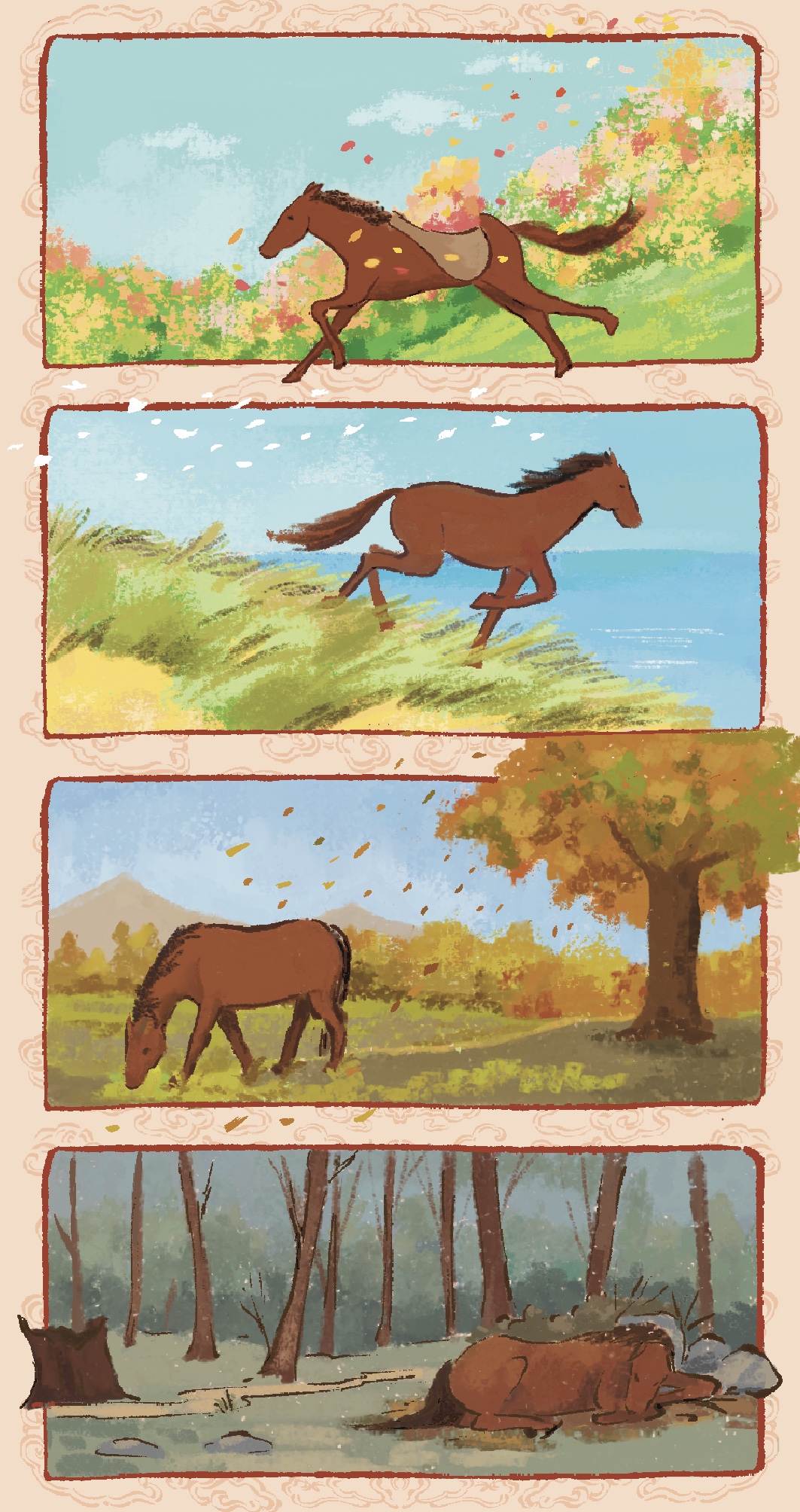
So far, you might have noticed that the tone of this post is pretty negative. I just can’t help it – my mental health went straight off the cliff this year. That’s why I didn’t learn anything new, despite having a list of new skills I want to add (animation, composition, anatomy, etc – I even set up an Excel sheet for the courses I wanted to take). This year I spent time just painting spontaneously, scrolling the images from old trips or old days – the good old days. I have a whole post for Huế , from my trip in 2004.
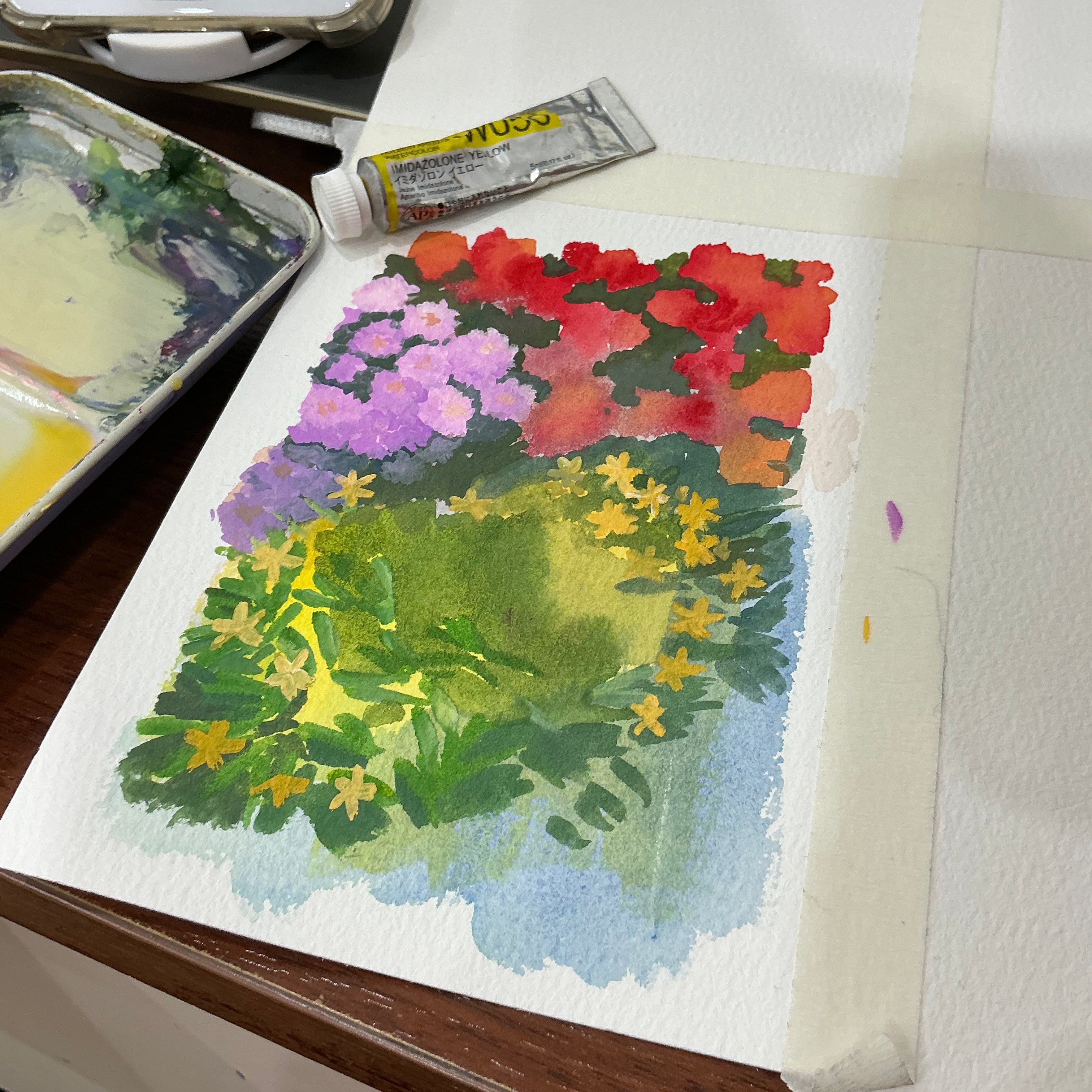
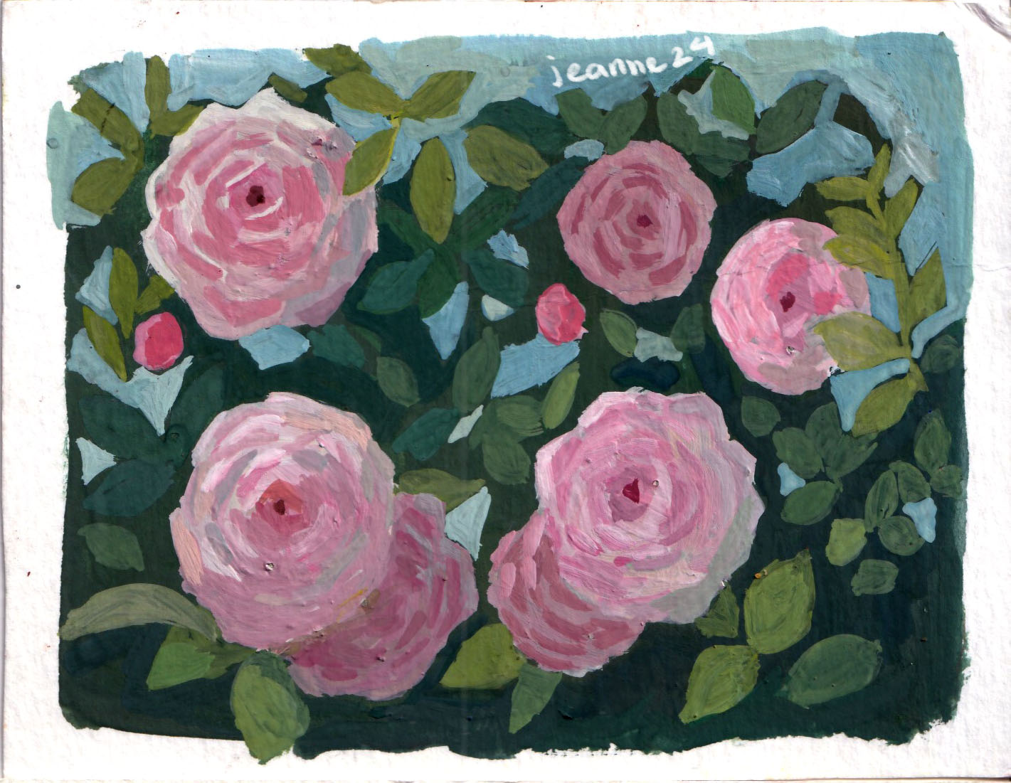
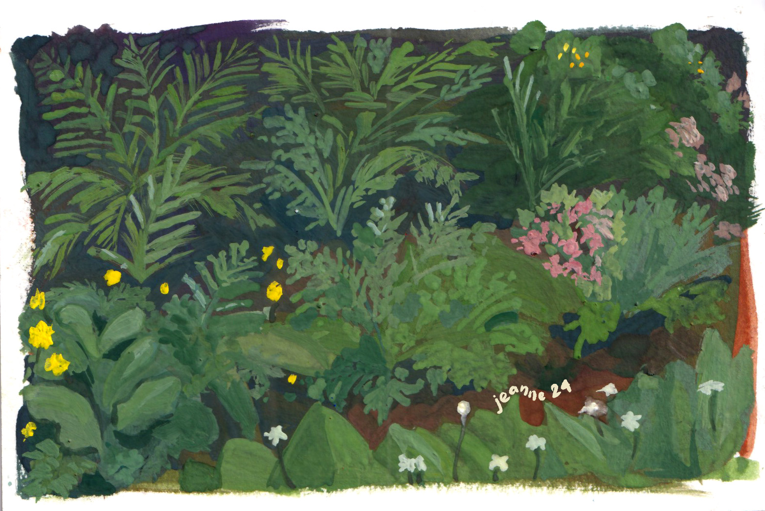
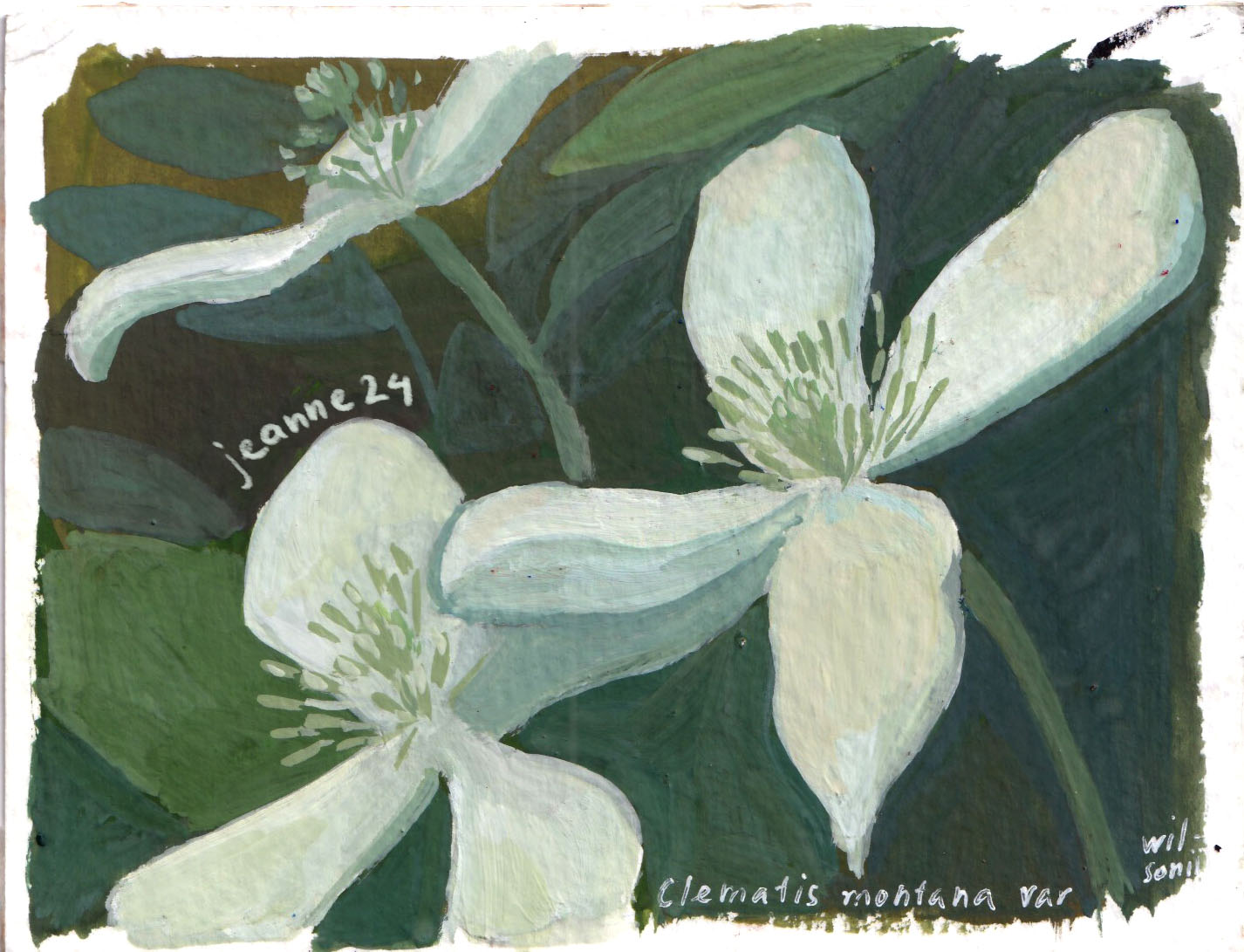
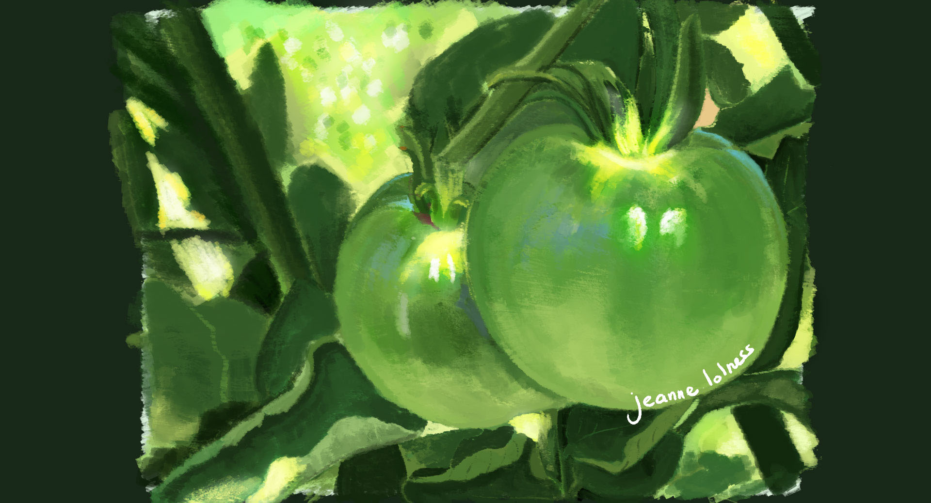
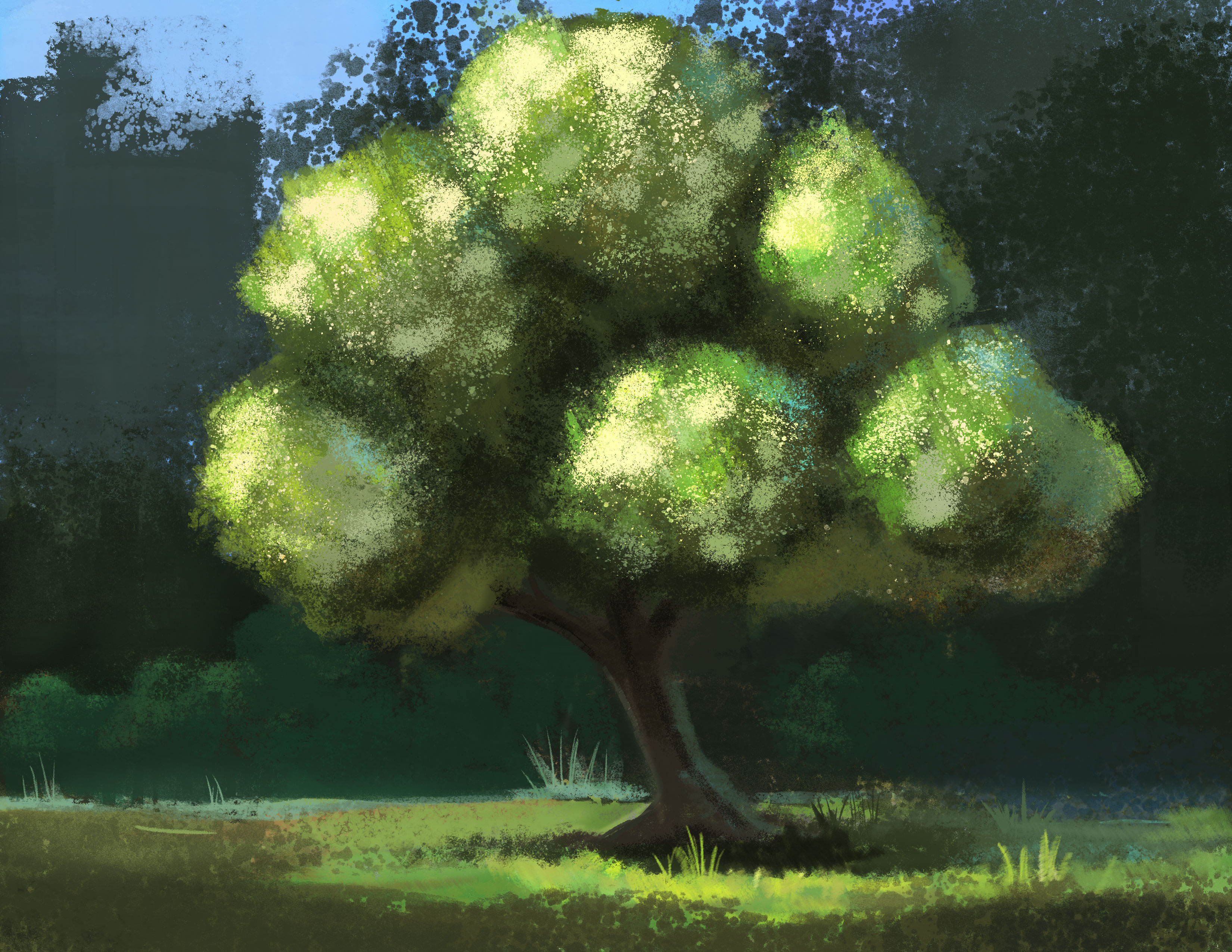
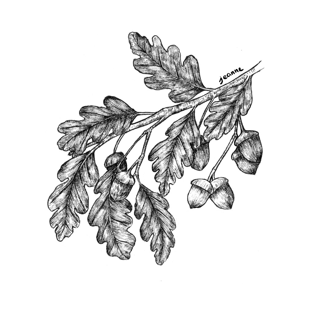
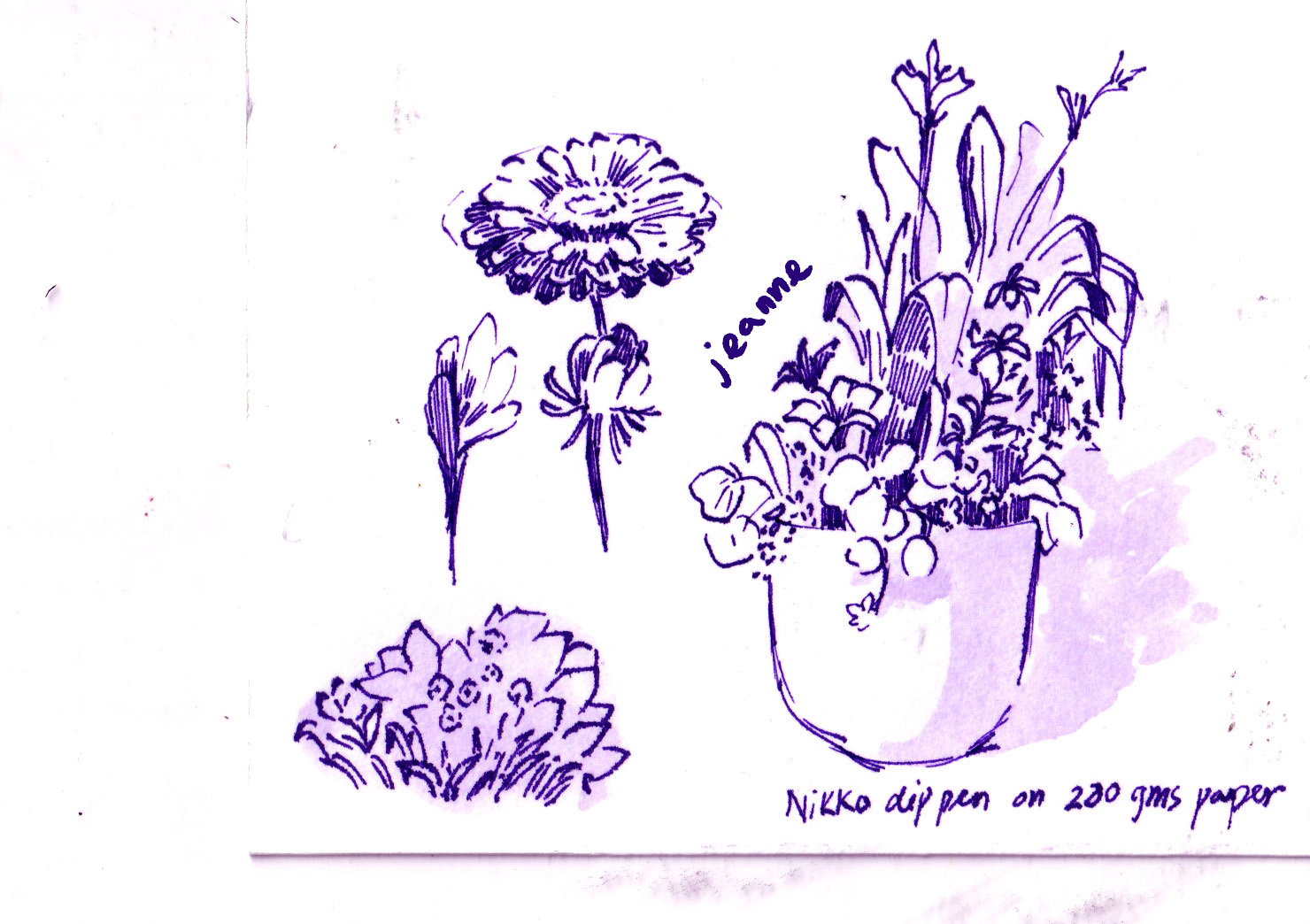
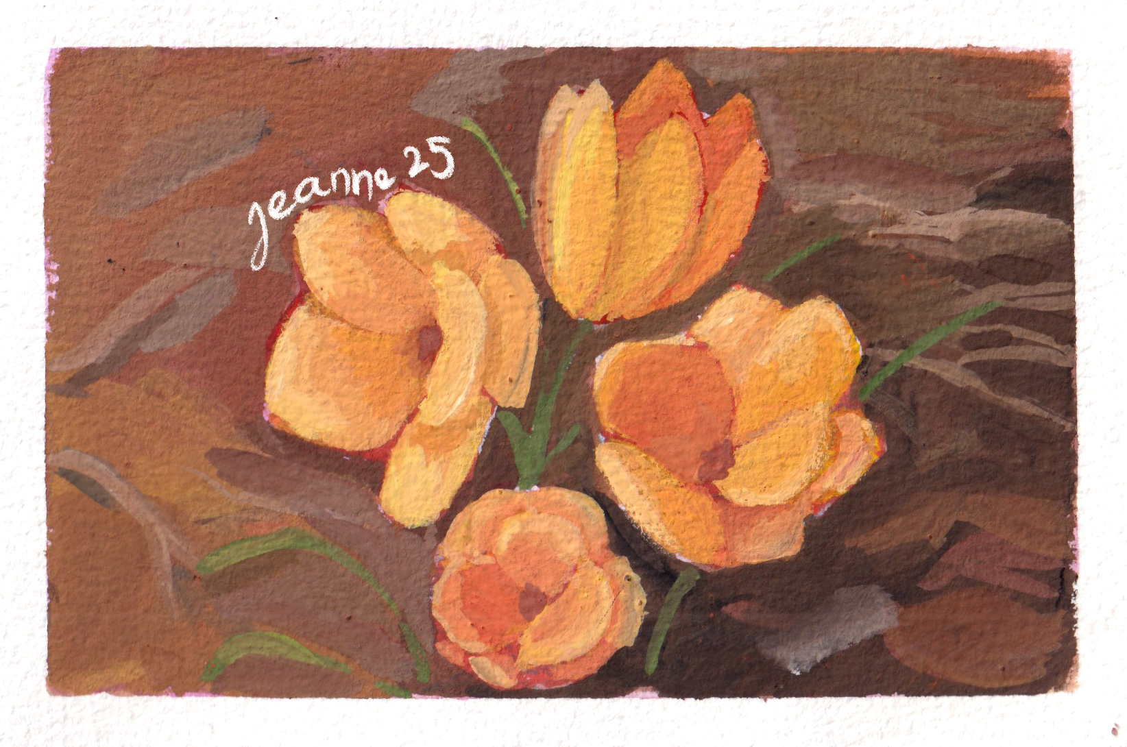
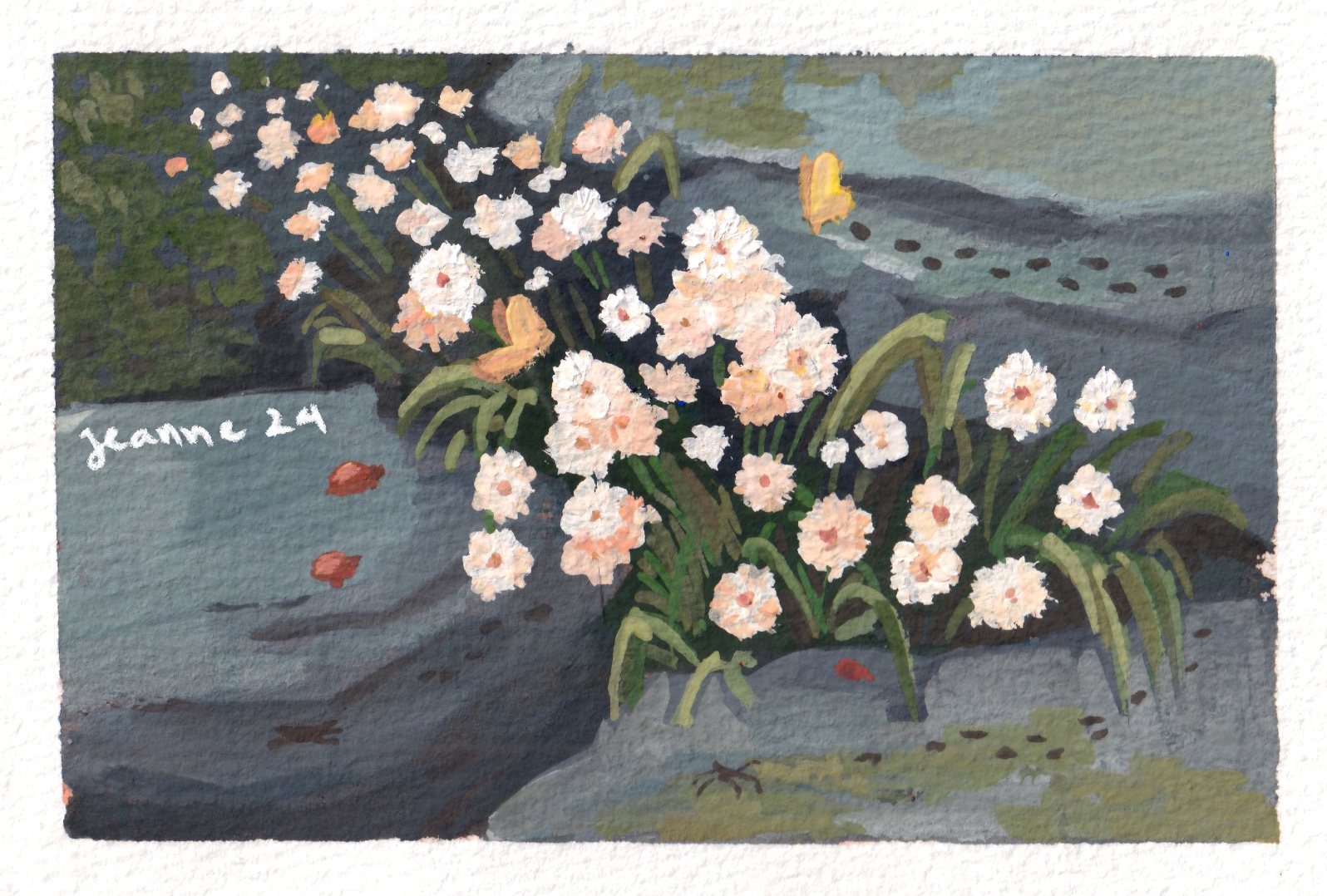
Another topic I love to pain is painting nature, flowers, grasses, etc. Touching grass does help with mentality 🙂
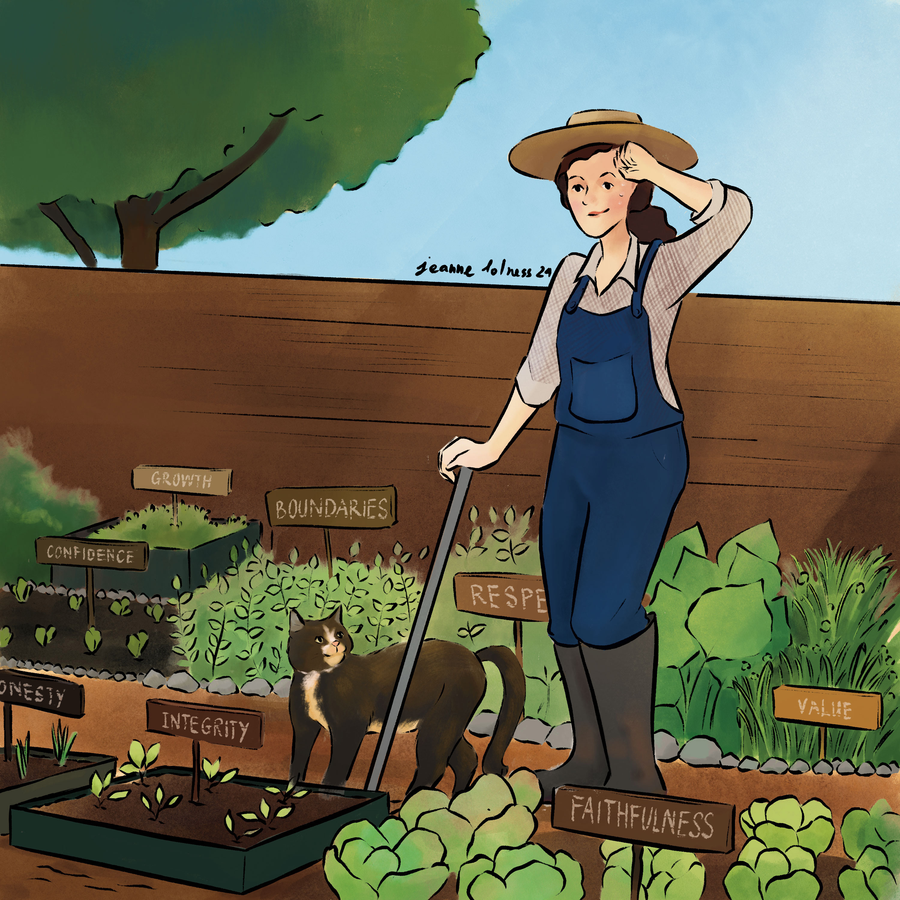
This low period makes me wonder a lot about what is my purpose in this career and how to sustain it in this world, even if AI does not steal my job. I wonder whether other occupations require as much the amount of mentality as being an artist. I wonder whether I’m trading my mental health for a dream job. Don’t get me wrong, painting is my favourite thing to do, and it’s the best way to appreciate life. It’s just that working as an artist requires much more than just making art, particularly working alone.
I feel like I should have known all of these things right from the start. Or I did such a good job of blinding myself because it felt so good making your childhood dream coming true?
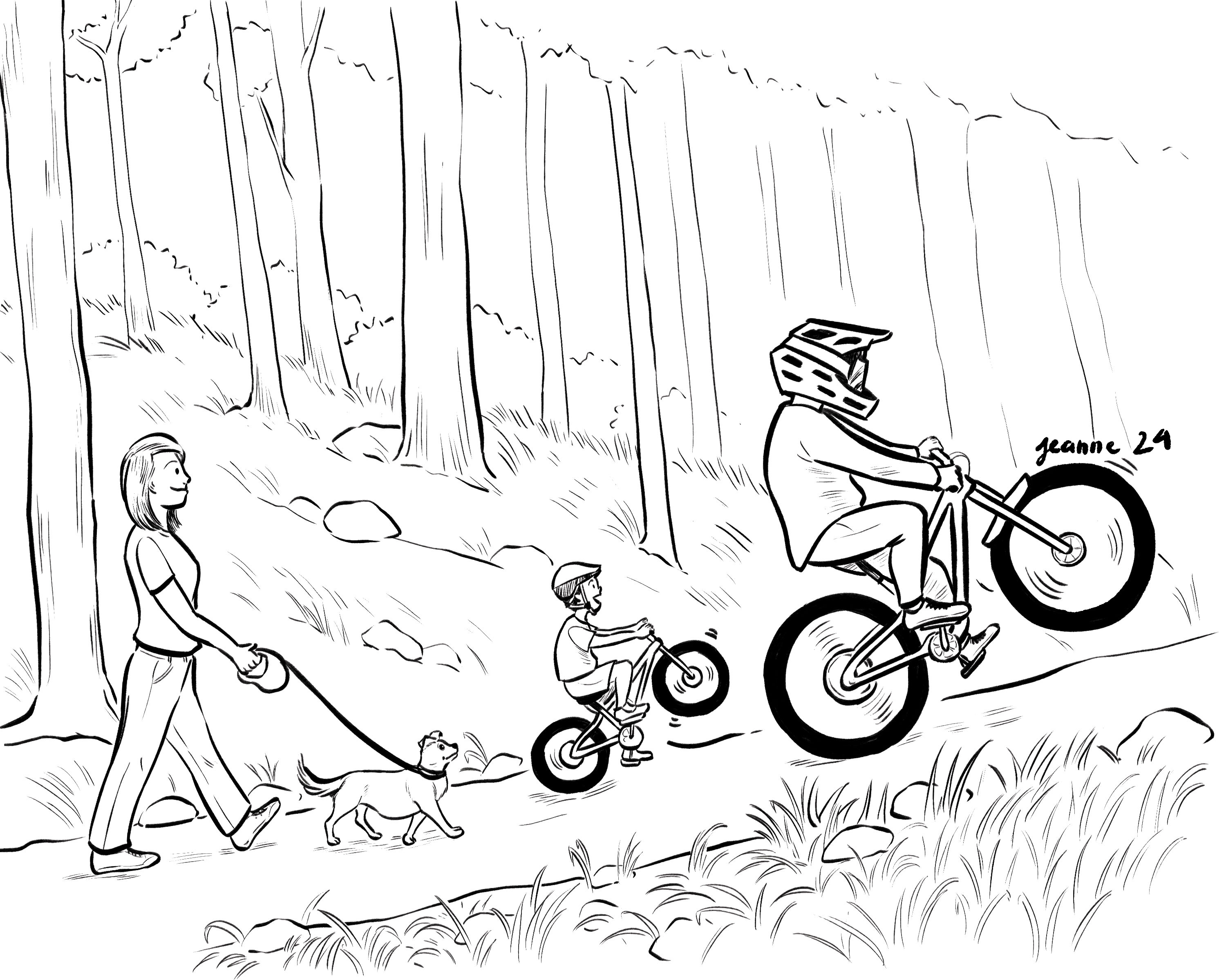
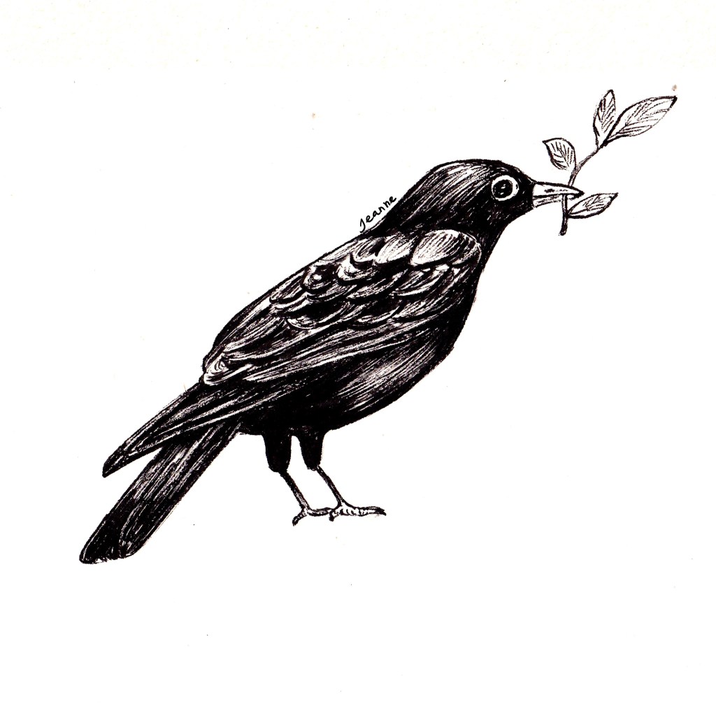
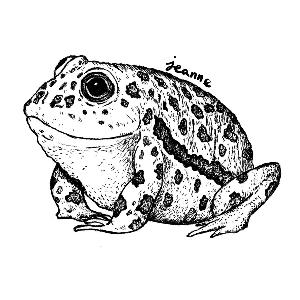
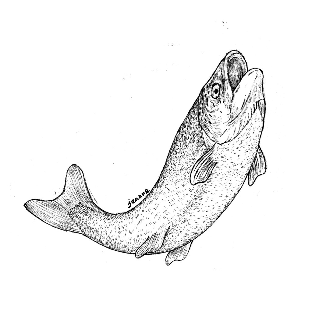
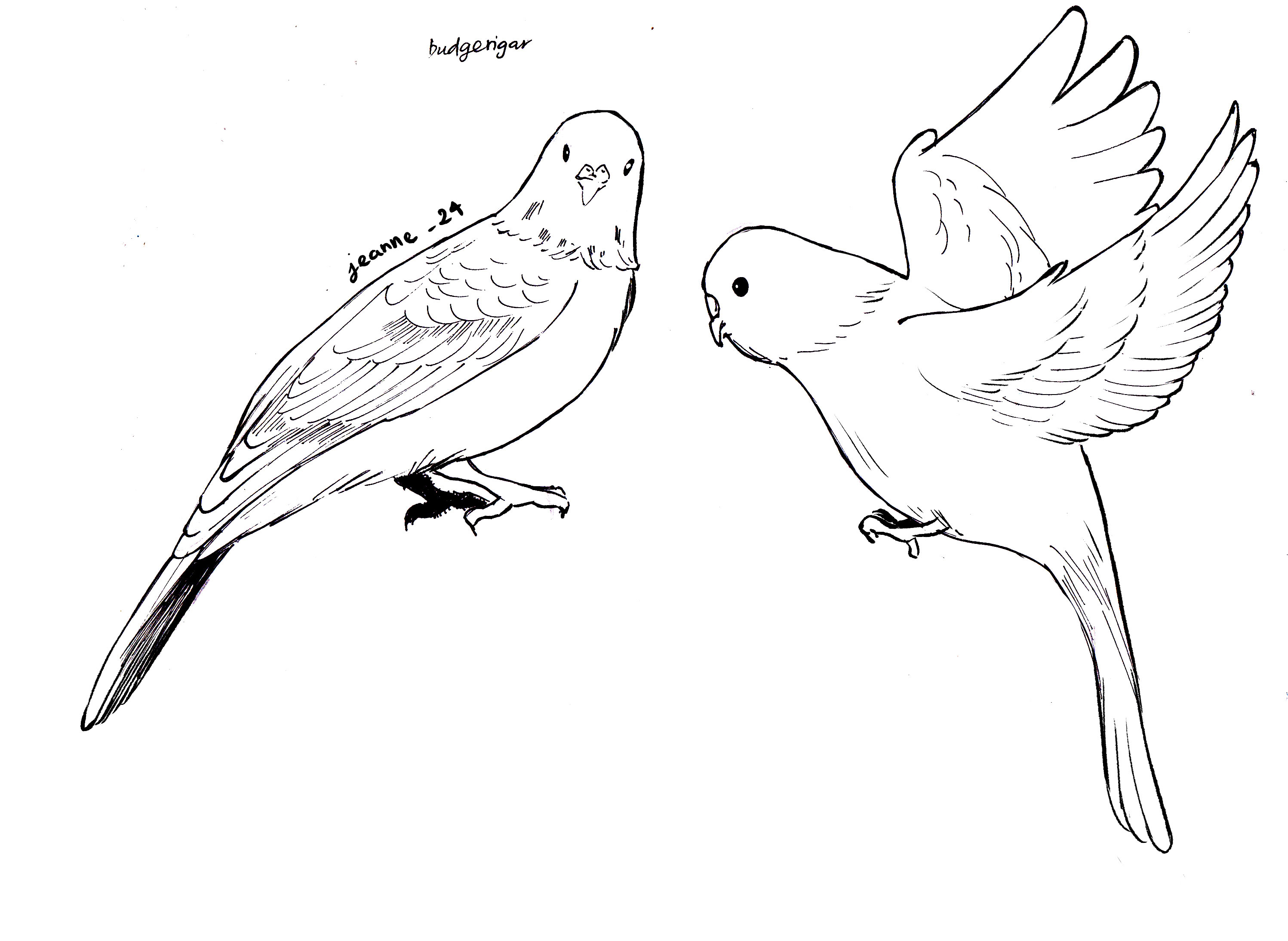
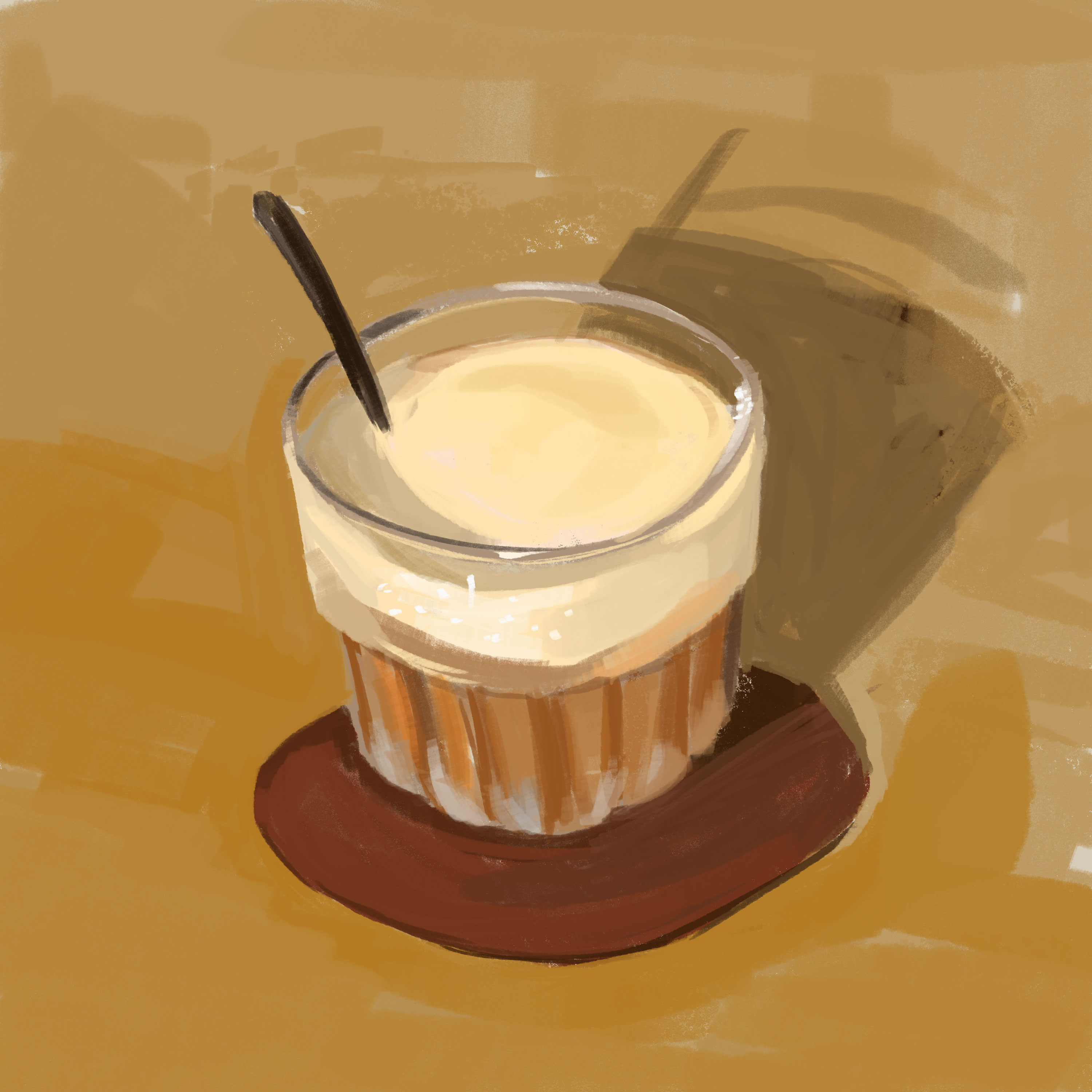
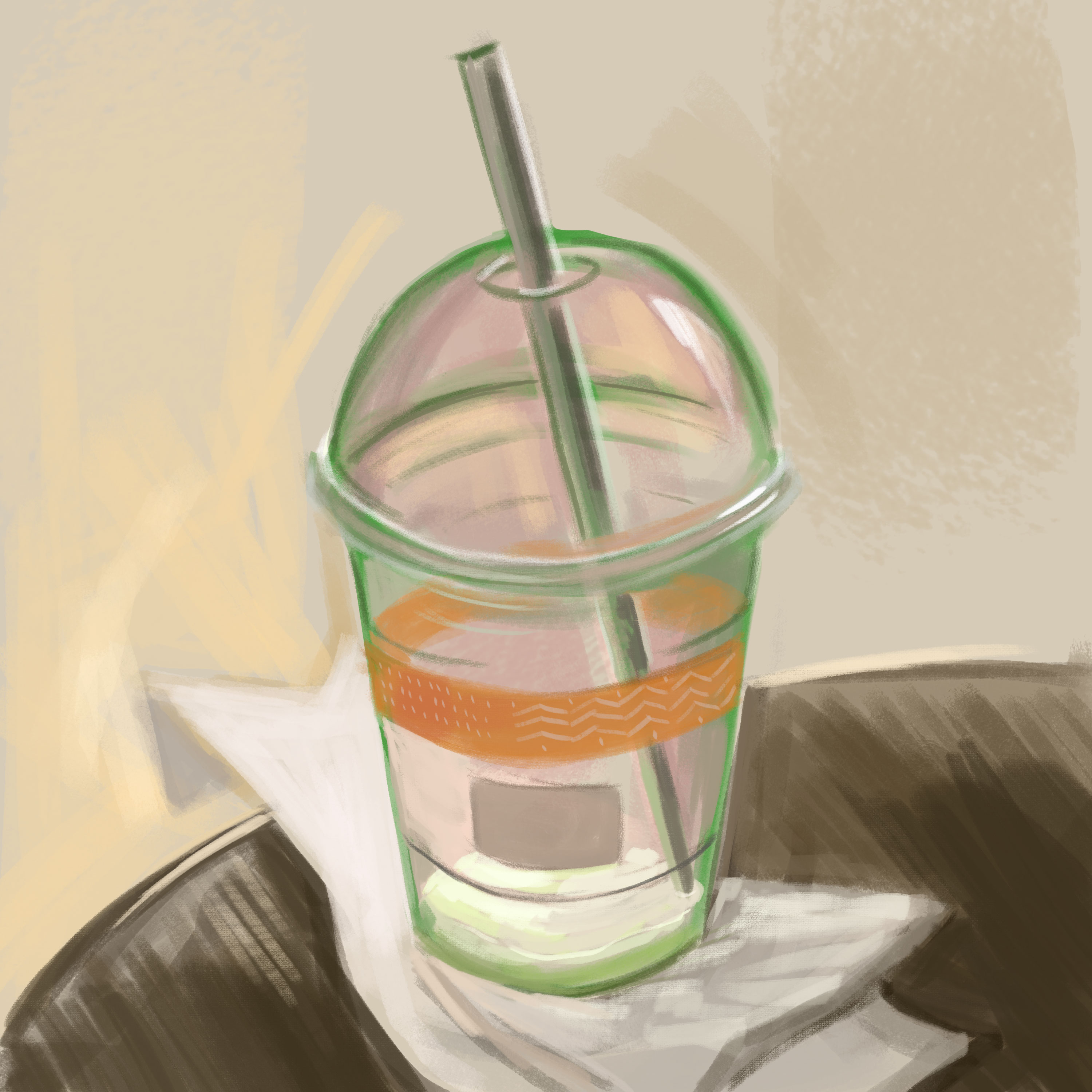
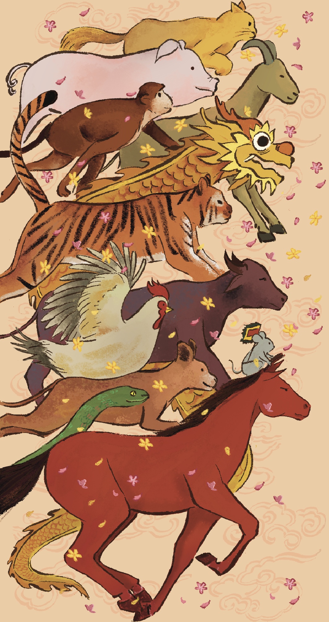
Challenges
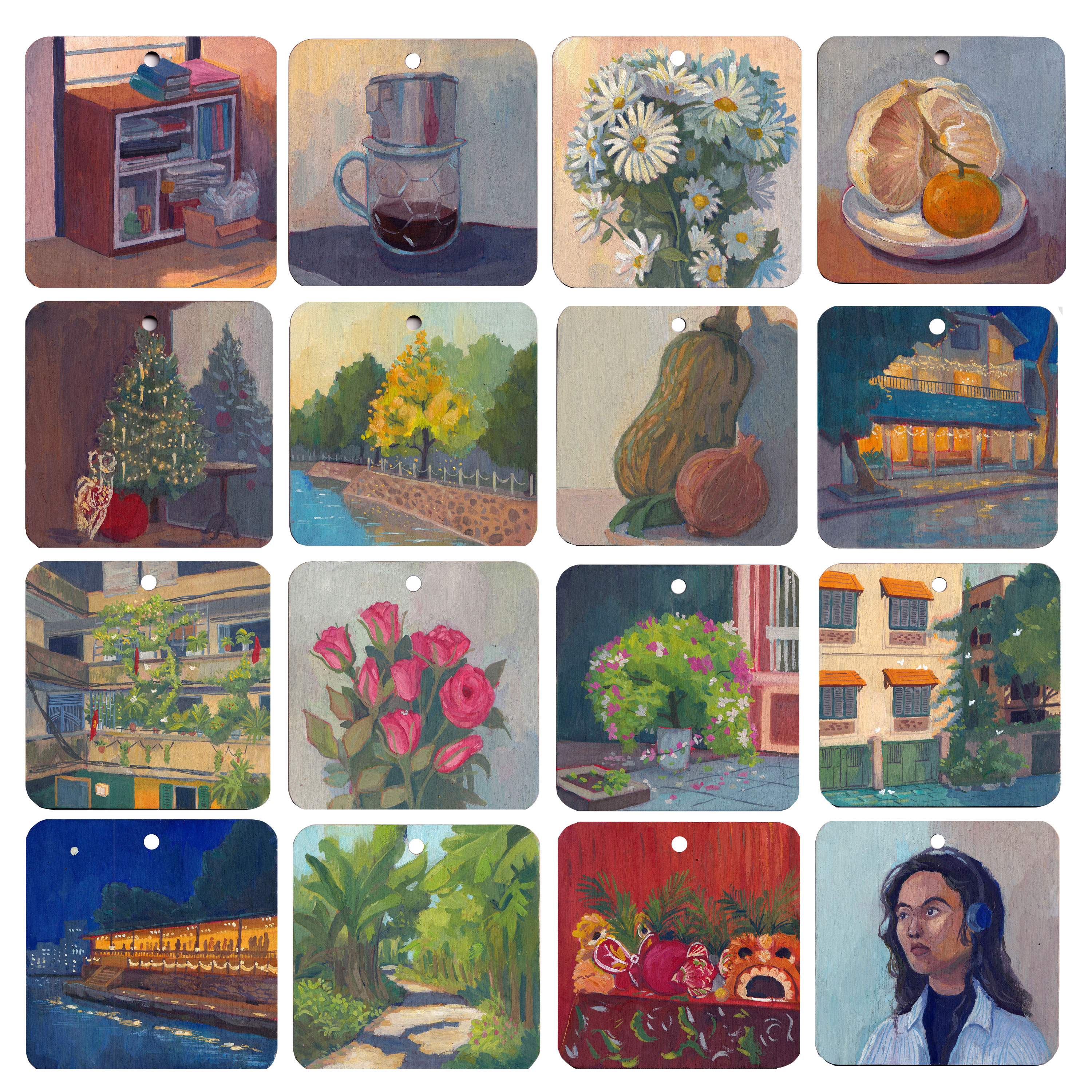
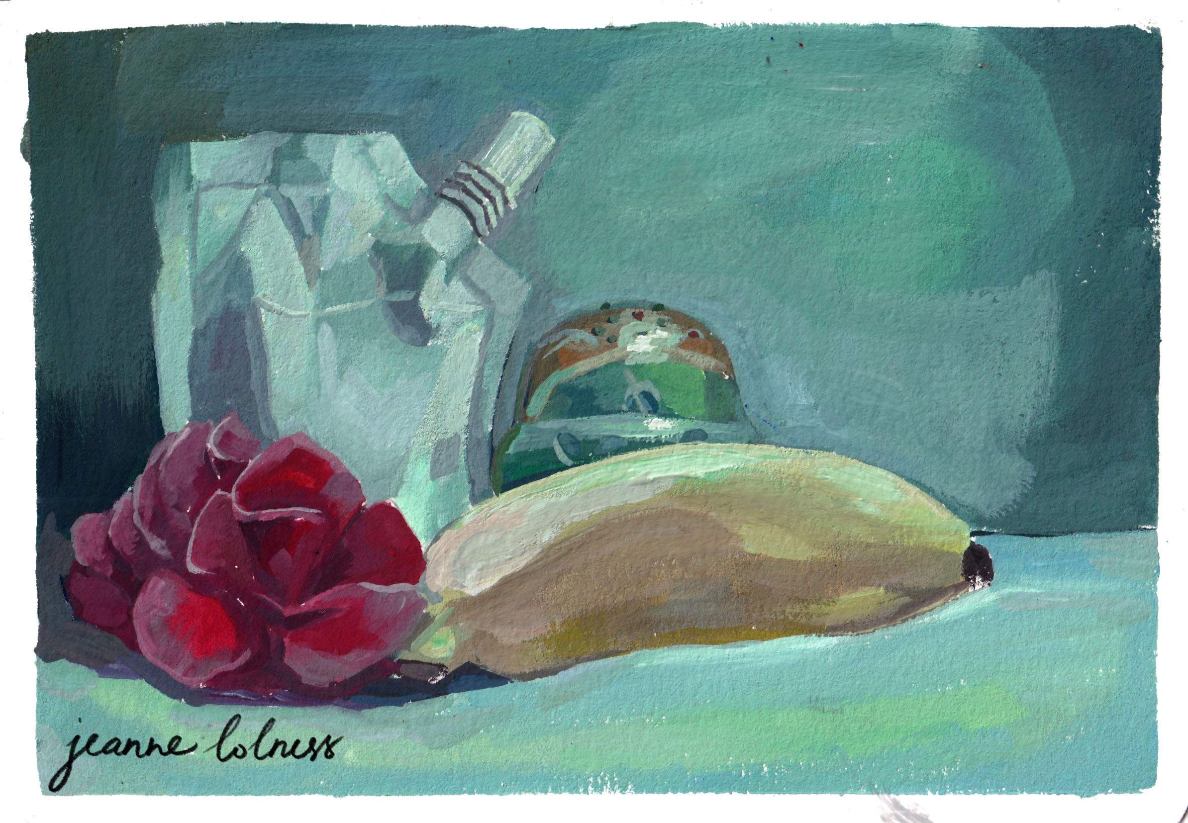
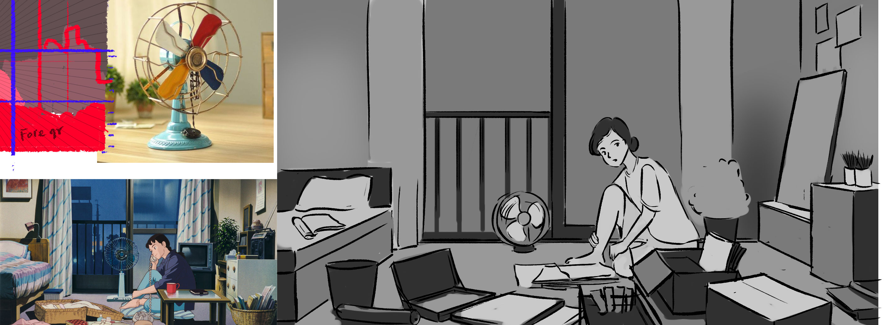
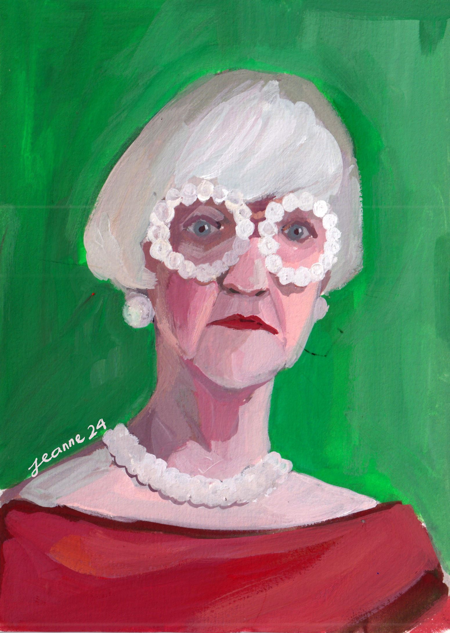
Another thing to keep me on track this year is doing challenges, 30 days of painting something by a rule. It aligns with my principle of “painting for the sake of painting” for 2026. It gave me a sense of purpose everyday or a kind of ritual when my days felt like falling apart.
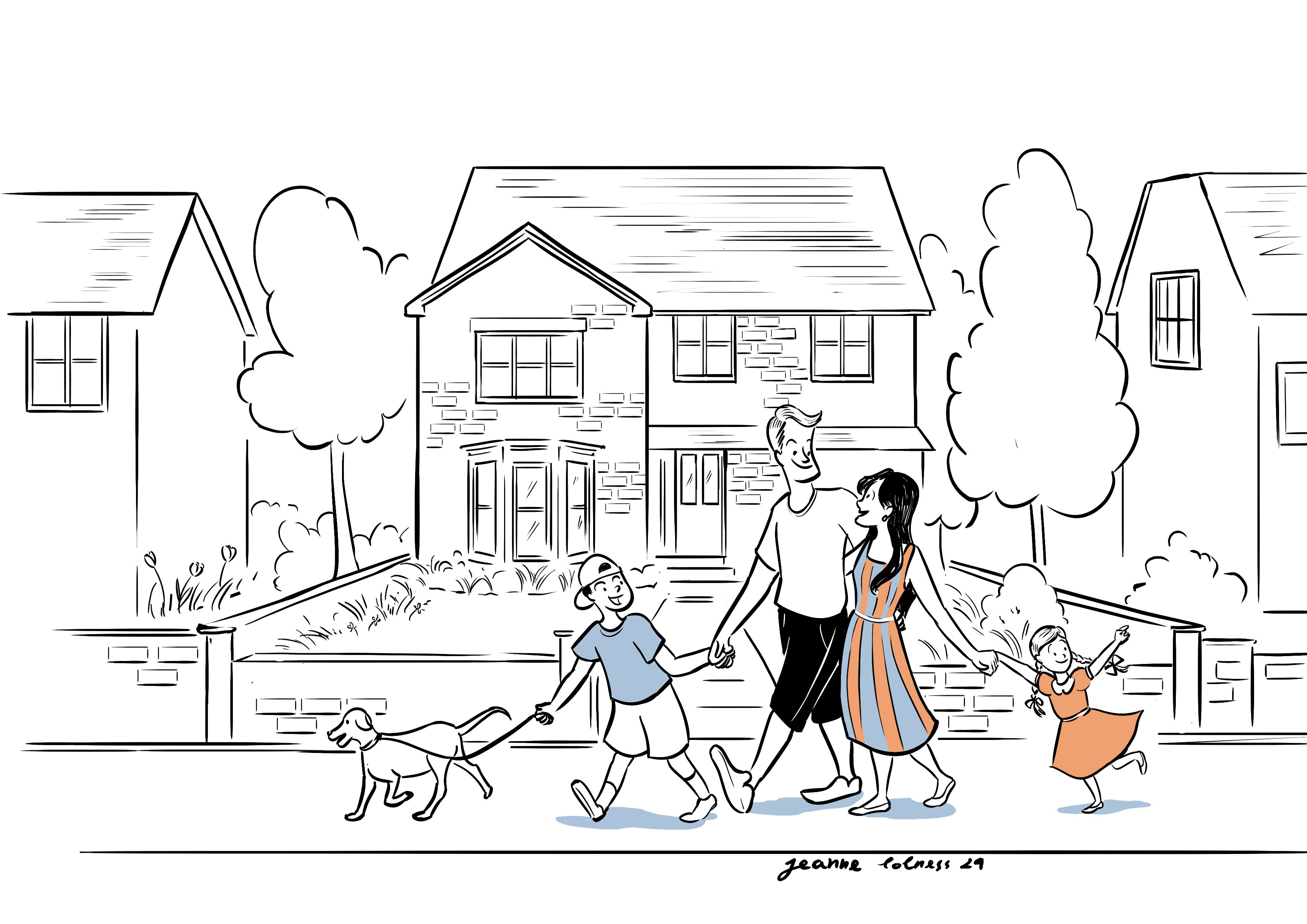
Art shop
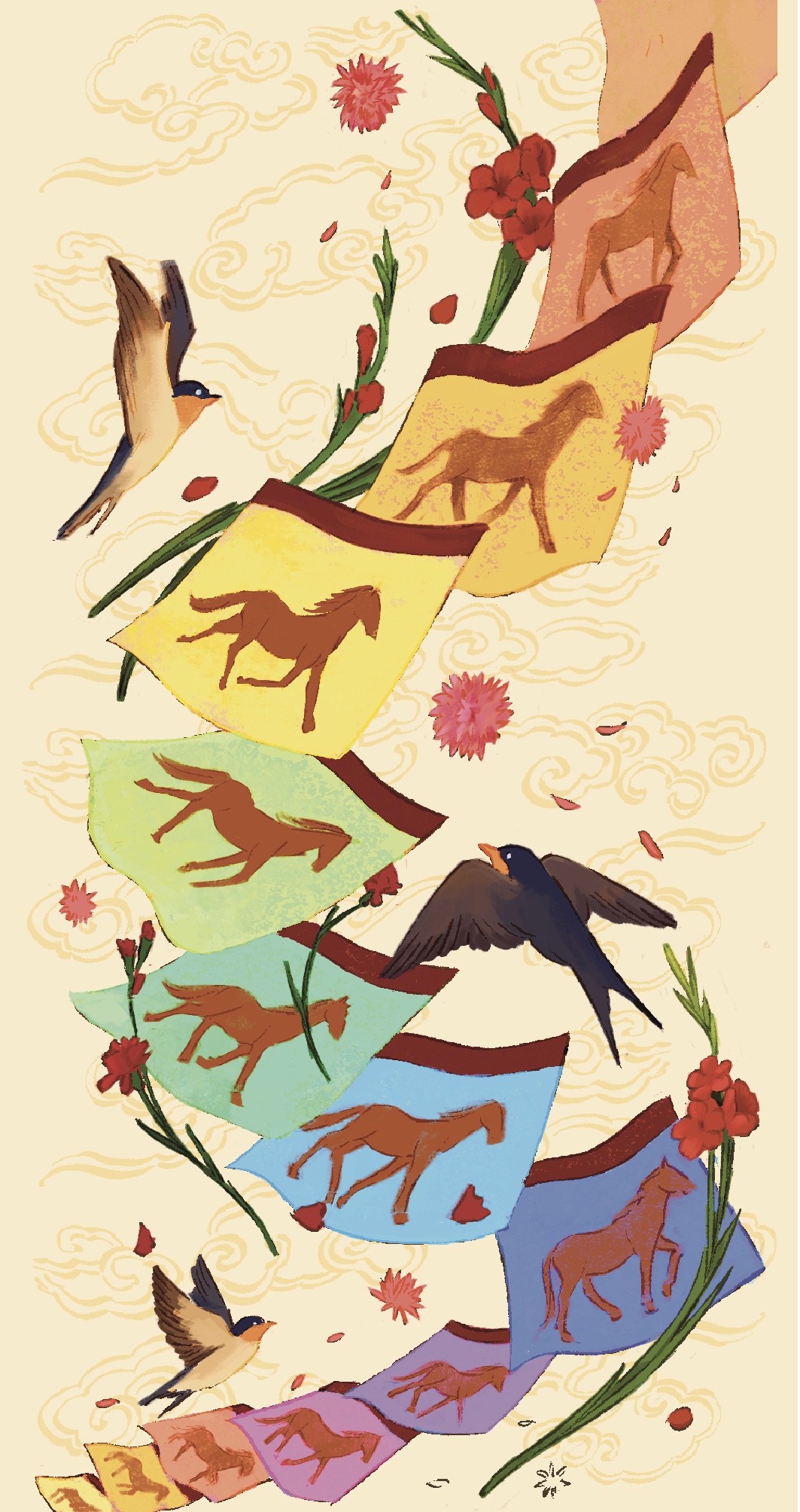
Anyway, with the support of friends, I made another effort of making a living on my arts by open a shop selling stationary in Vietnam. There’s a lot to learn about running a shop with physical products, and working with others over long distance. Again, I feel this is something I should have known and thought about before opening the shop. But operating this shop allows me to hold my digital arts in a physical form, which I rarely get to do. I hope to keep it running, even without profit, as a passion project.
After all, what’s now?
You may ask how’s everything after 2025. The answer is, well, I still paint and draw as much as I could. But I feel exhausted holding onto a career that means a lot to me and nothing to others (not including friends, of course). Maybe my beginner’s luck has run out, maybe I’m not as strong and hard-working as my expectation, maybe there’s a reason behind all of these struggles. Or maybe not 🙂
Honestly, I don’t know. I wish someone would tell me what to do, but deeply, I know I should solve this mess by myself. After all, I did make some beautiful things, show parts of my mind to the world and have some good times. All parties and all nightmares have an end.