Blue is a primary color that often goes unnoticed in its significance. Yet, historically, it was one of the most expensive and revered hues. Ultramarine blue, in particular, was as valuable as gold because it was derived from finely ground lapis lazuli stones, sourced primarily from Afghanistan and transported to Europe. Its use can be traced back to the Indus Valley Civilization and then to the creation of the funeral mask of Tutankhamun.
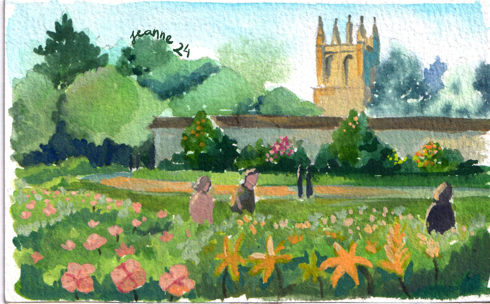
For me, ultramarine blue is my favourite, though I rarely use it straight from the tube. A touch of blue in a mix lowers the value of colors without losing their vibrancy. It’s also my go-to for creating shadow tones. In this series, you’ll see paintings dominated by blue (both ultramarine and azure). From blue skies and seas to nocturnal scenes, portraits, and still life, this color is the centre.
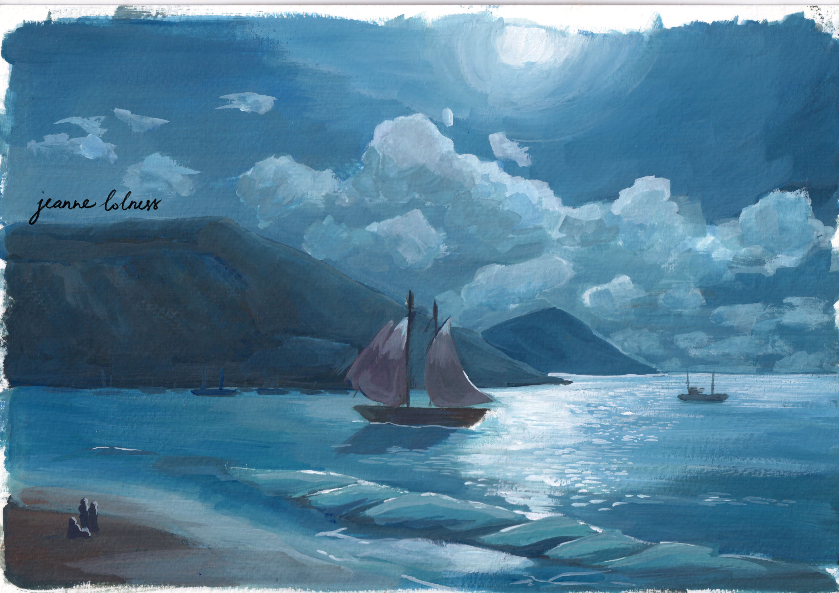
A study from a master painting by Kalmykov Grigory Odysseevich – a Russian master in painting sea scenes
Egyptian blue, the first blue ever made, was produced in the third millennium BC in ancient Egypt. It was synthesized from silica, lime, copper and an alkali. Its blue color comes from a substance that is identical to a rare, naturally occurring mineral made of copper and silicate.
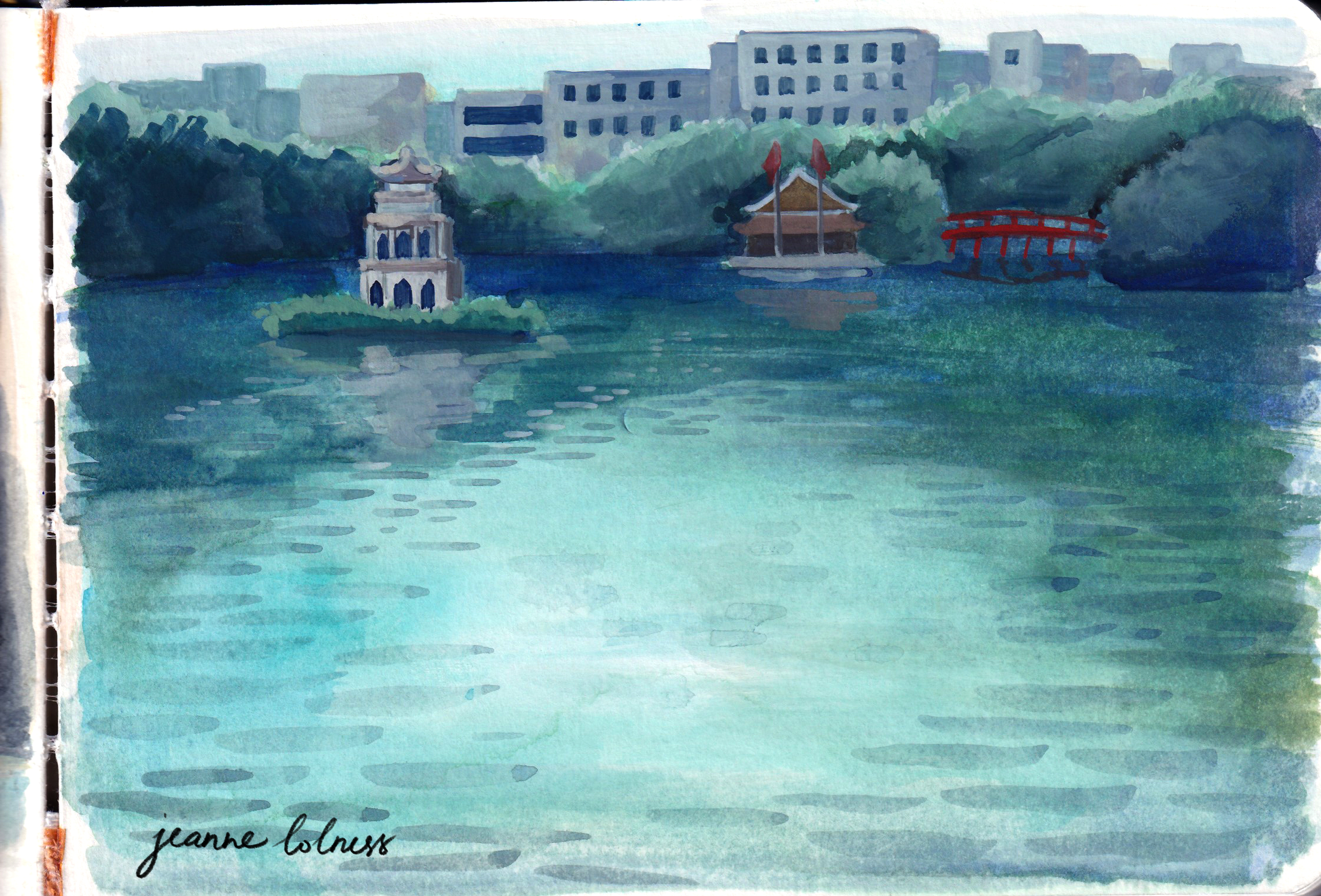
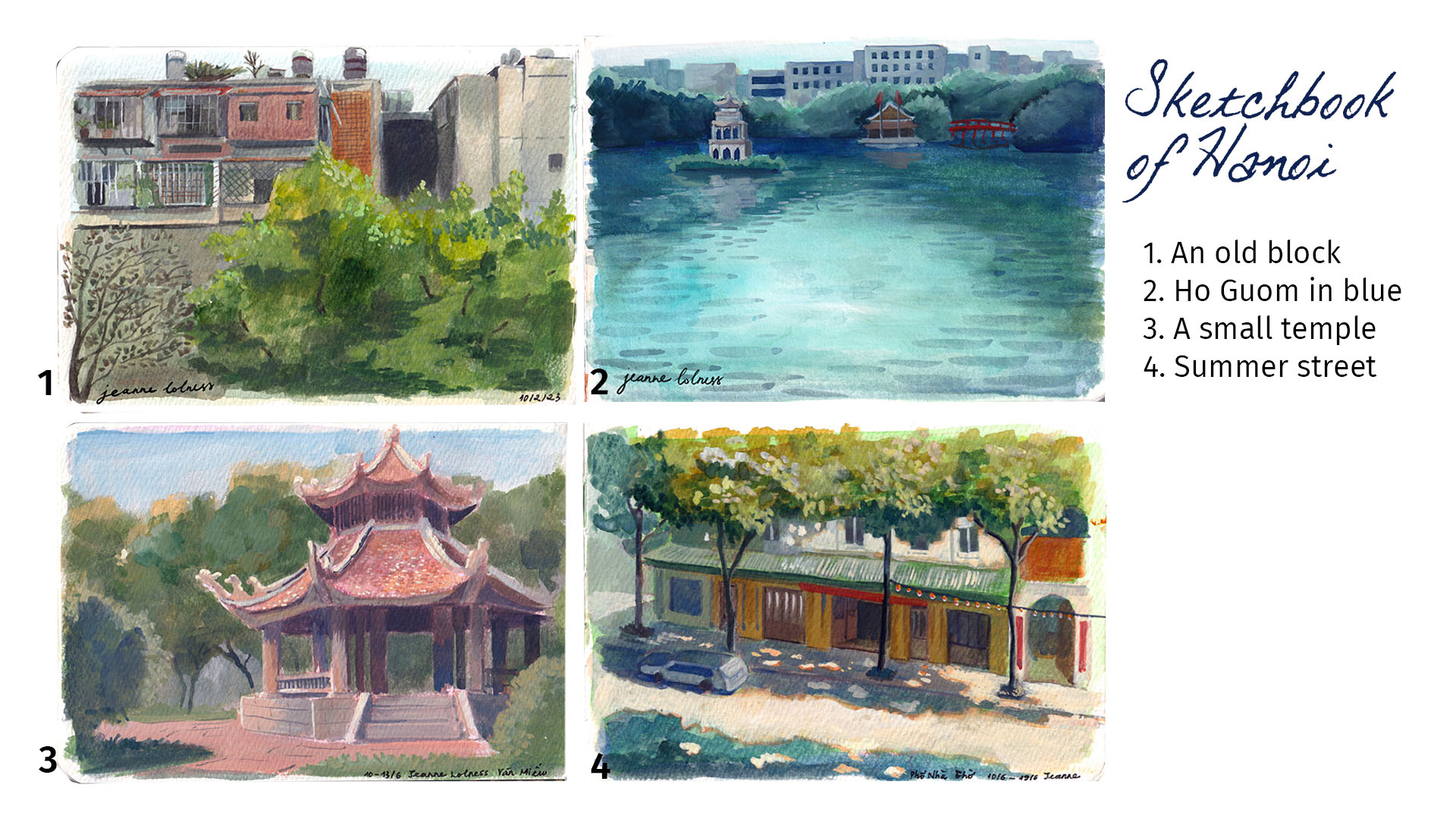
A painting of Hồ Gươm – a famous lake in Hanoi
Until 1700s, blue was mainly made from lapis lazuli and the related mineral ultramarine. In 1709, a big discovery happened when German chemist Johann Jacob Diesbach created Prussian blue. He accidentally made it while experimenting with dried blood and iron sulphides. At first, it was called Berliner Blau. By 1710, the French painter Antoine Watteau started using it, and later his student Nicolas Lancret did too. It quickly became popular for making wallpaper, and in the 1800s, French Impressionist artists also loved using it in their paintings.
Blue has a special meaning in many cultures around the world. In some places, it’s seen as a symbol of peace and calm, while in others, it represents strength and protection. Blue was chosen for the army in many countries, in fact the term ‘navy blue’ comes from Royal Navy adoption of blue informs for its officers. In the Torah, Israelites were instructed to add a blue thread, called tekhelet, to the fringes of their garments, made from dye extracted from a Mediterranean snail. This blue was seen as a symbol of God’s Glory, and meditating on it was believed to help connect with the divine, representing purity and the Throne of God.
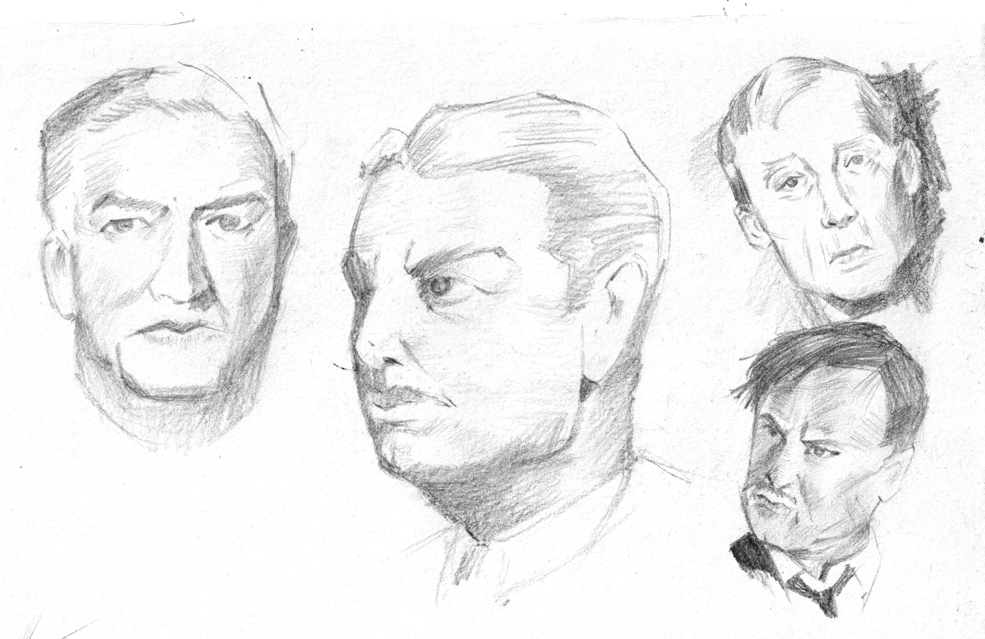
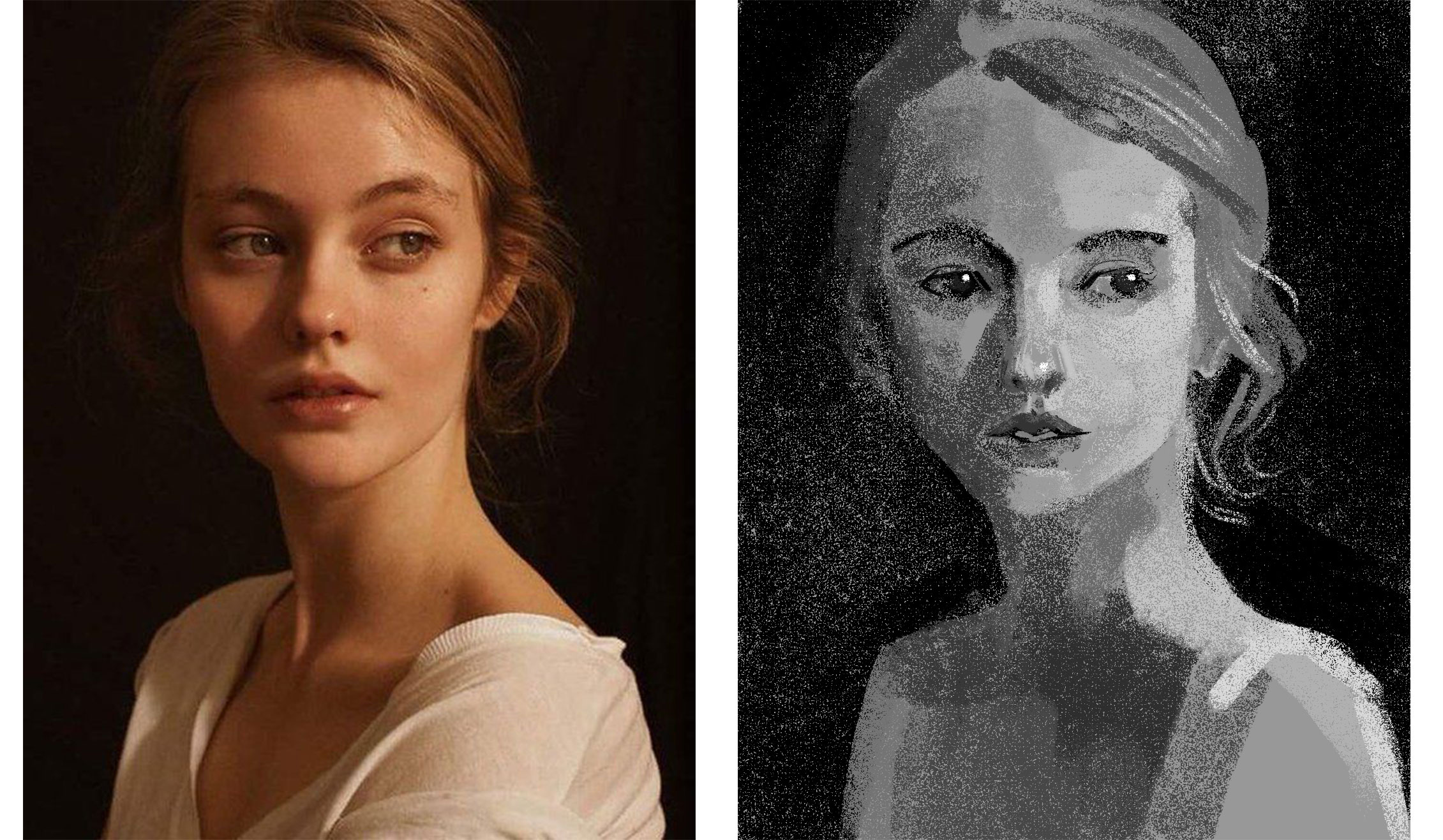
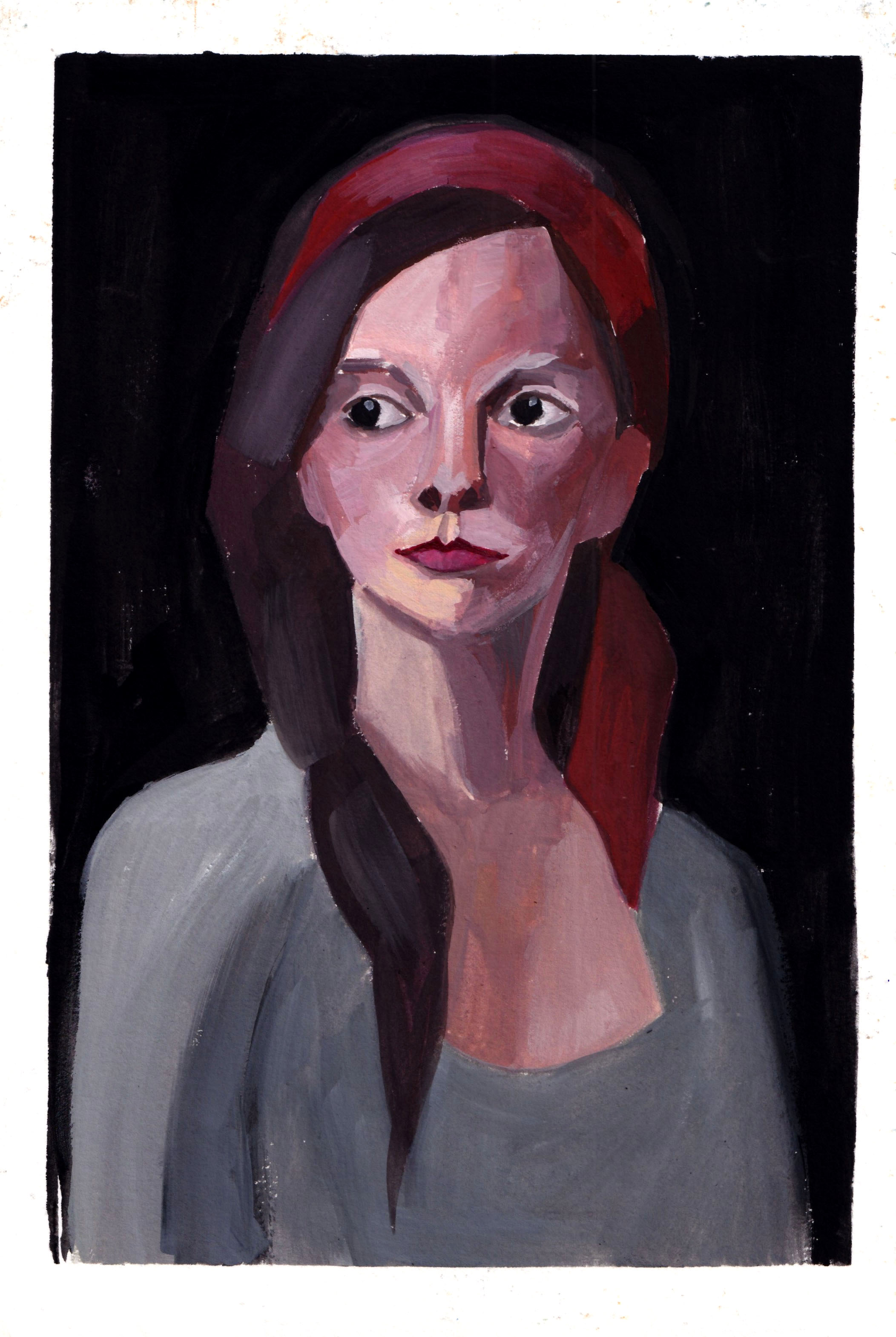
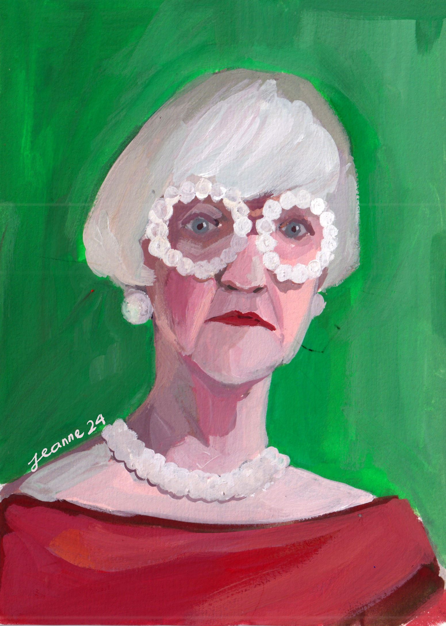
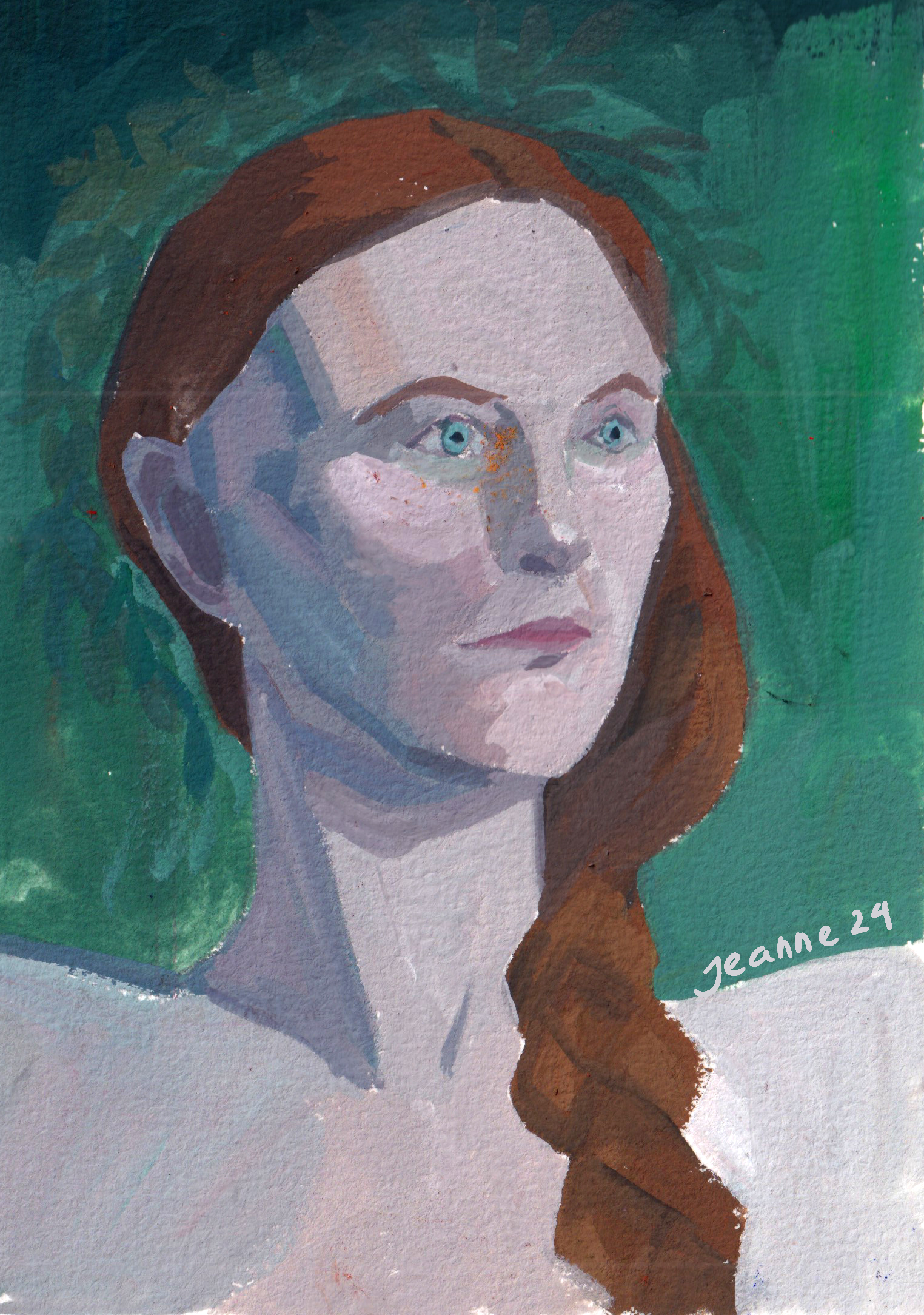
A portrait using ultramarine blue as the main color
During the Dutch Golden Age, artists like Johannes Vermeer used blue to add depth and realism to their paintings, as seen in his famous “Girl with a Pearl Earring,” where the blue attire of the subject stands out beautifully against the background. Blue became an essential color for capturing both beauty and spirituality in art.
In the above portrait, I realized that blue can sometimes appear warmer than the skin tone, particularly when it’s saturated.
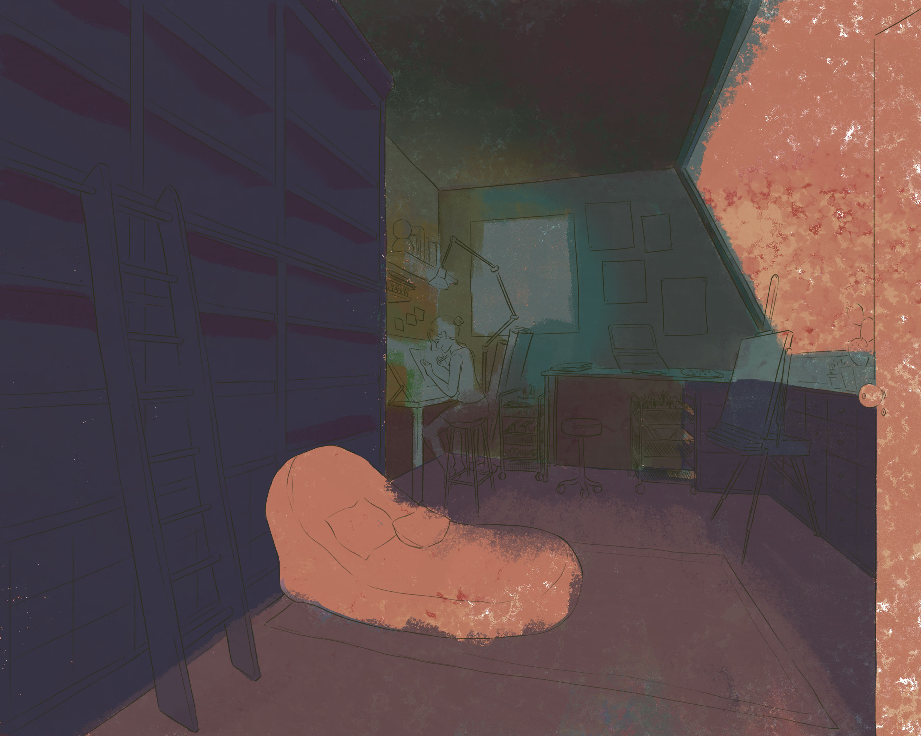
Above is a quick break-down of my digital painting of a night working in my dream studio. A tip I have learned is that you can use a warm underpainting to keep the blue “warm”. This is also true in real life observations: outside light often has a cool tone while interior objects, made of wood, are “warm”.
I use blue as the shadow here – it’s a real phenomenon in sunny days with clear blue sky
Soft blue often appears on the sky in sunny days due to a phenomenon called Rayleigh scattering. When sunlight enters Earth’s atmosphere, it is made up of different colors of light, each with a different wavelength. Blue light has shorter wavelengths and is scattered in all directions by the gases and particles in the air.
When painting blue sky in a sunny day, I often lay down a soft yellow first and use the same blue to create shadows. This shadow can be seen most clearly with a bright object such as white walls.
Similarly, the sea appears blue due to the way light interacts with water. Water absorbs colors with longer wavelengths, like red, orange, and yellow, more easily, while blue light with shorter wavelengths is scattered and reflected back to our eyes. This makes the sea look blue, especially when the water is deep.
Painting skies or seas is a chance to observe how different tones of blue go with each other to create movement and life.
I hope this collection helps you discover something new and exciting about this color!
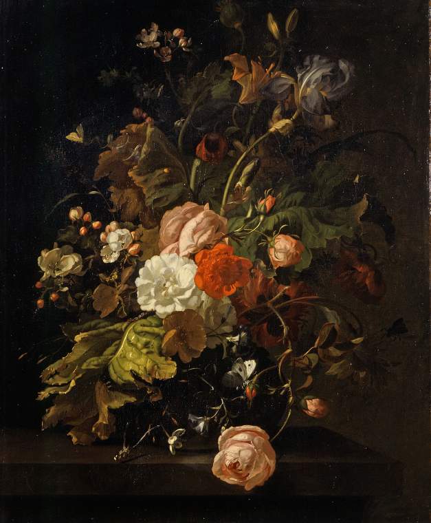
I’m pretty sure you have seen her works somewhere, the blooming flowers painting with a brownish tone background. If you tried searching her name on any search engine, tons of flower paintings will show up – don’t be surprised, because she actually left a legacy of about 250 still life paintings.
Family background: A genius born in a supportive environment
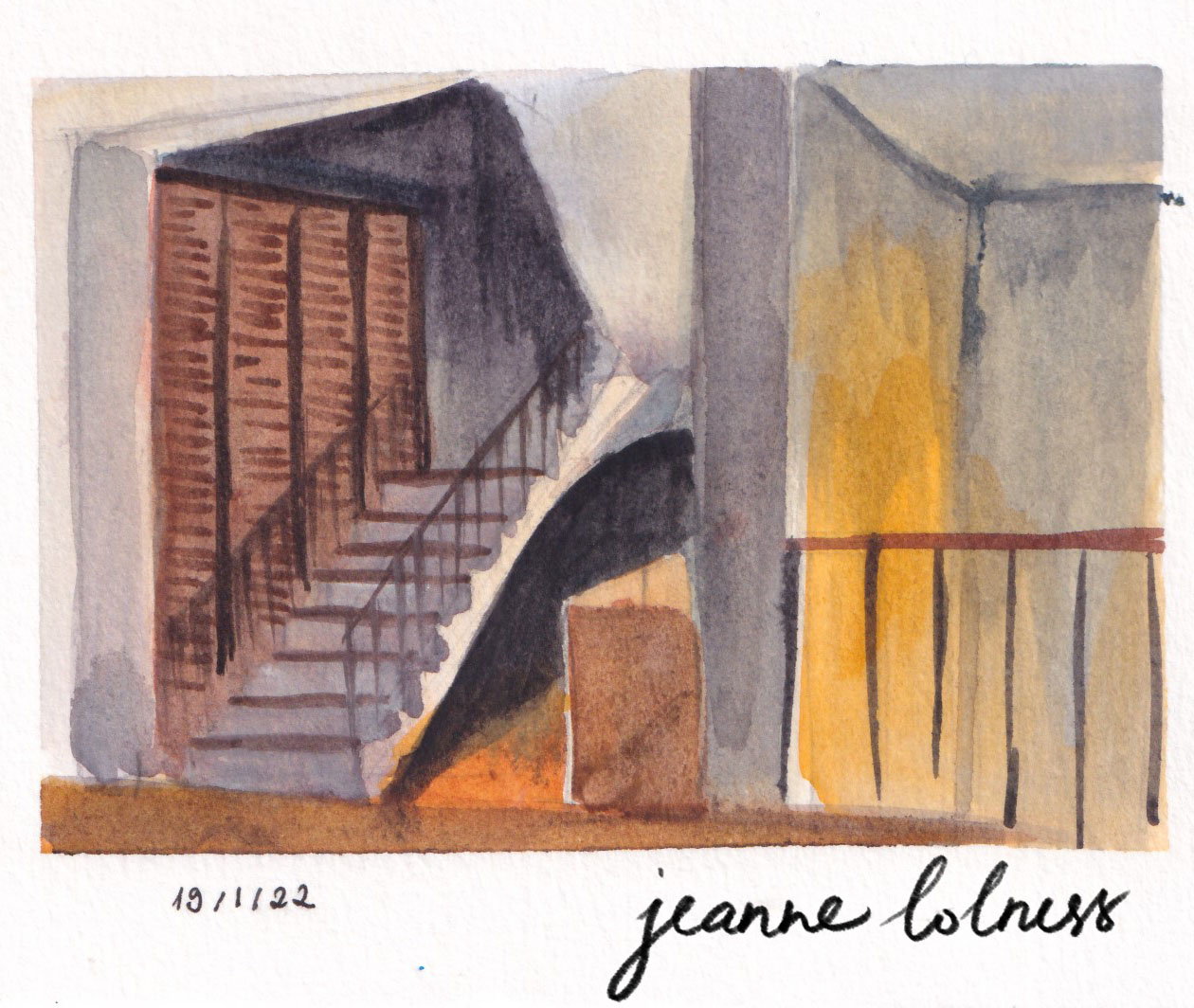
Rachel Ruysch, born in Amsterdam, is the daughter of Antony Fredericus, Professor of Anatomy, and Maria, daughter of an architect Pieter Post. Her talent was discovered from early age and her father let her study under Willem van Aelst, a talented painter of flowers in Delft. She quickly surpassed her teacher, and her talent became known in the highest circles. She was invited to German Courts before she was of middle age. She became the first female artist to enter artist society in The Hague in 1701.
In her personal life: she got married with Juriaen Pool (1666-1745), an excellent painter of portraits and a colleague in the Court Paintership of the Elector Palatine in 1693. She must have a happy marriage with him, since they had ten kids together and she was fully supported by her husband to keep painting with her maiden name.
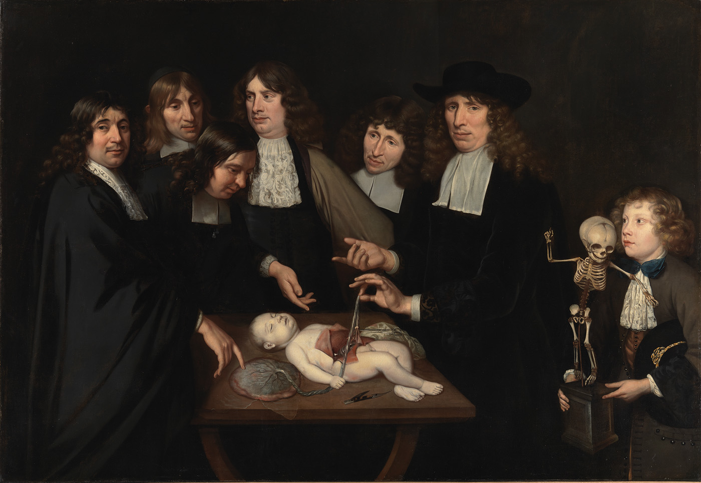
While we can’t deny her talent and hard work, it’s important to note that her success is powered by other males in a patriarchy: her father and her husband. Her father is a renowned scientist specializing in anatomy and botany, and also an amateur painter. His cabinet, a huge collection of anatomical collection, attracted visitors from all over Europe, including Tsar Peter the Great. His collection was one of the earliest fluid-preserved specimens, making he himself an interest subject to study from the point of view of a scientist as well. He himself was featured in painting by Jan van Neck. (Dam, n.d)
Van Neck, J. (1683). The Anatomy Lesson of Dr. Frederik Ruysch [Oil on canvas].
As an artistic person, Frederick Ruysch added a touch of decorative to his preservation, making his specimens an art collection to an extent. He was obsessed with the concept of ‘vanitas’ – the transcience of life and death. ‘Vanitas’ – Latin for ‘vanity’, means pointlessness and futility of pleasure, ambition and all worldly desires (Dam, n.d). This topic is explored by artists during Baroque period, belonging to allegorical art (arts representing a higher ideal). Frederick probably passed on his interest to Rachel while she helped him with his collection; not to mention, she had access to the greatest library of reference for flowers, plants and insects. In addition, she has other family members interested in arts: her grandfather was an architect, his brother and uncle also drew and painted well. Less is known about her husband, Juriaen Pool; however, his love and support for her can be seen in his painting of the family. He is a court painter, a portraitist and a printmaker.
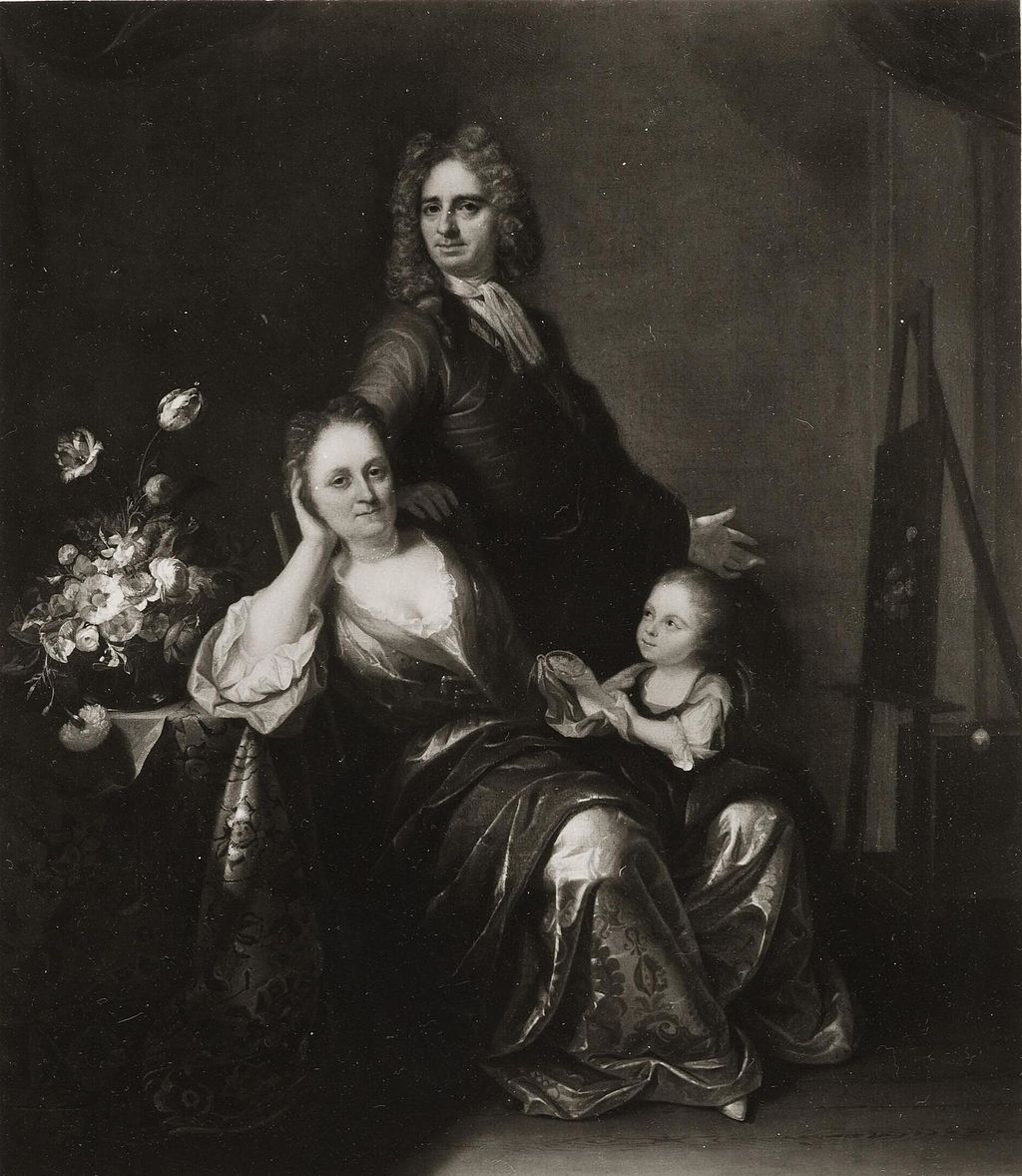
Pool, J., & Ruysch, R. (1716). Family portrait with flower still life in the making [Painting].
The only version from online resources is monochrome, but it’s obvious on the left of the painting is a bouquet of flowers, a familiar subject in Rachel’s artworks. She was ‘in the spotlight’ of the painting, indicating his admiration for her. She also used her maiden name through her whole career and her husband was likely to support instead of eclipse her talent.
In 1750, the state honored Ruysch with the publication of Dichtlovers voor de uitmuntende schilderessen Mejufvrouwe Rachel Ruisch (‘Poems for the Excellent Painter Mistress Rachel Ruysch’) (The Art Story,n.d). This anthology, the first of its kind for a Dutch artist, featured poems by eleven contemporary poets and scholars who celebrated her life and work. Rachel Ruysch passed away later that year at the age of 85.
Analysis on her style: highly detailed and scientific based botanical painting
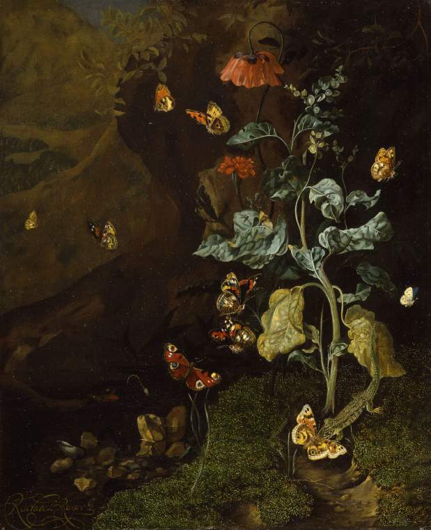
A still life with flowers, butterflies and a lizard in a dell: PD.87-1973 (The Fitzwilliam Museum, 2025). An early work.
One important detail is that the bouquets Rachel painted never existed, but an assortment of fruits, flowers and insects from the artist’s imagination. That showcases her adept understanding of nature, especially botany and anatomy of insects as well as compositional skills of arranging the details to attract the viewers. She put together flowers from different seasons as well as from overseas, which, somehow reflected the development of Dutch horticultural industry as well as international trade, not to mention the “Tulip Mania” – the first recorded economic bubbles (Smarthistory (n.d.) One more thing to notice is that she used asymmetrical composition, emphasizing the natural bloom and droop of the flower – this was an ‘informal’ choice compared to other contemporary painters.
Her process often started with main lines of a composition, then she rendered details with the goal of being as true-to-life as possible. Different texture, from the soft silky petals to the rough leaves, were accurately painted. Arts writer Alexxa Gotthardt highlights that Ruysch “swiftly gained a reputation across Amsterdam for the enchanting realism of the plants and insects in her paintings. Her works weren’t merely idealized depictions but subtly alluded to themes of mortality and the life cycle.” (The Art Story,n.d)
In early works, she often painted woodland scenes “sottobosco” (forest floor), being inspired from Otto Marseus van Schrieck, Abraham Mignon, and her teacher, Willem van Aelst (The Art Story,n.d). A special technique she learned from her master, Willem van Aelst, was imprinting. She sometimes used real moss and real butterfly wings as imprints in her early painting. The scenes were often dramatically lit – one feature that stayed consistent in all her paintings. Later, her style reflected more of Baroque art style – a movement against Mannerist style, an intricate and formulaic approach. She often painted a bouquet, depicting flowers at various stages of life, capturing their journey from vibrant bloom to graceful decay. They were paired with a wide range of insects and animals – she created an ecosystem in her painting.
A vase of flowers (The Fitzwilliam Museum, 2025)
As she grew older, her compositions feature more open, expansive arrangements that fill the frame, evoking a rich sense of atmosphere and subtle humidity. She used bold diagonals and fluid curves to guide the viewer’s eye effortlessly across the composition. The central group of flowers were often the lightest and brightest, insects were arranged unexpectedly evoking a sense of curiosity in viewers.
Her paintings were often termed with ‘vanitas’ or ‘memento mori’ (Latin for ‘remember you must die’) since it was her father’s obsession. It’s a popular genre in Dutch during the seventeenth century, using still-life form to provoke thoughts about the fleeting life (Hibbitt, 2020). It’s the most common idea associated with her flowers painting, that all beauty fades and that all life, in the end, must die while celebrating the beauty of nature. Her painting may serve as a moral value to live thoughfully, prioritizing what truly matters over transient worldly matters.
References
Dam, A. (n.d). Death re-enlightened: Conservation of Frederik Ruysch’s wet anatomical preparations—The Rembrandts of fluid-preserved specimens [PDF]. ResearchGate. https://www.researchgate.net/publication/376812311
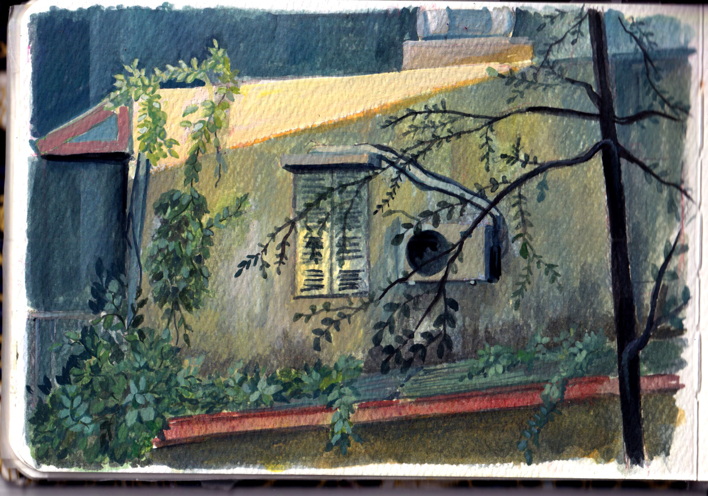
Welcome to my little collection of green colors. Green is hard to get it ‘right’ because the fresh paint from the tube always feel artificial. Green is often used to paint nature, especially trees. Trees, bushes, plants are not solid objects, they don’t have distinguished planes that we know for sure light is hitting on. They are made of thousands of leaves, each reflecting light in a different direction.
If nature is just a factor in the painting, I can rely on the texture of the paper to do the trick and just put a few layers for wide range of green tones.
Sometimes I try painting green in weird combinations. In this painting below, I try a combination of burnt sienna, green and purple – it turned out not good, but it was a fun experiment.
In this painting below, I actually use yellow and white more than green. Titanium white mixed yellow can create a cooler yellow suitable for the background.
In this sketch below, I use a few green paint (permanent green, leaf green) mixing with yellow, red, blue or brown sienna to create a wide range of tones so that I can imply that there are multiple types of plants.
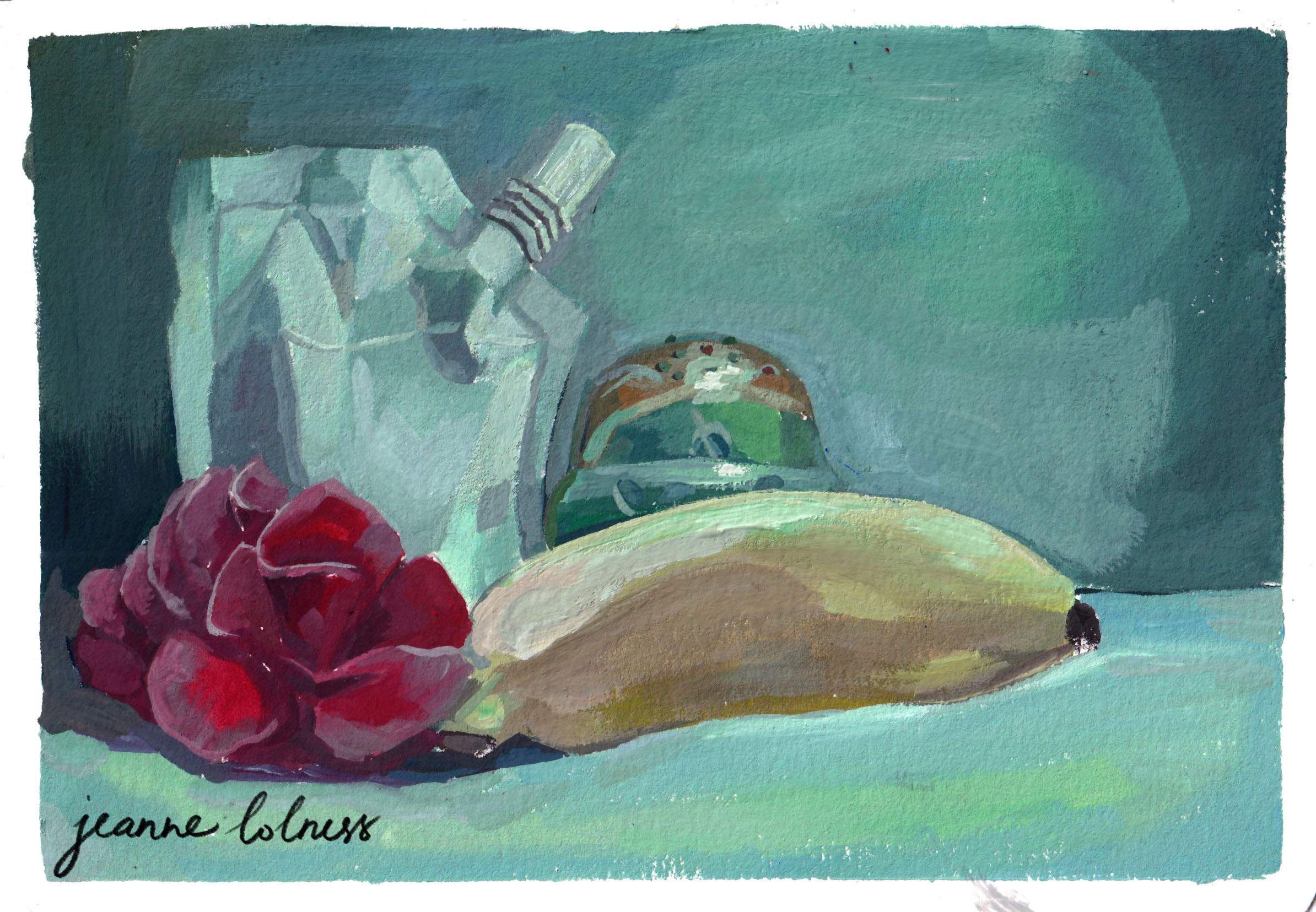
This is a fun experiment with green lighting over different objects. The green Russian doll and the white paint package have the most range of colors since they are made of reflective material. In contrast, the flower and banana tend to lose their saturation and doesn’t reflect as much.
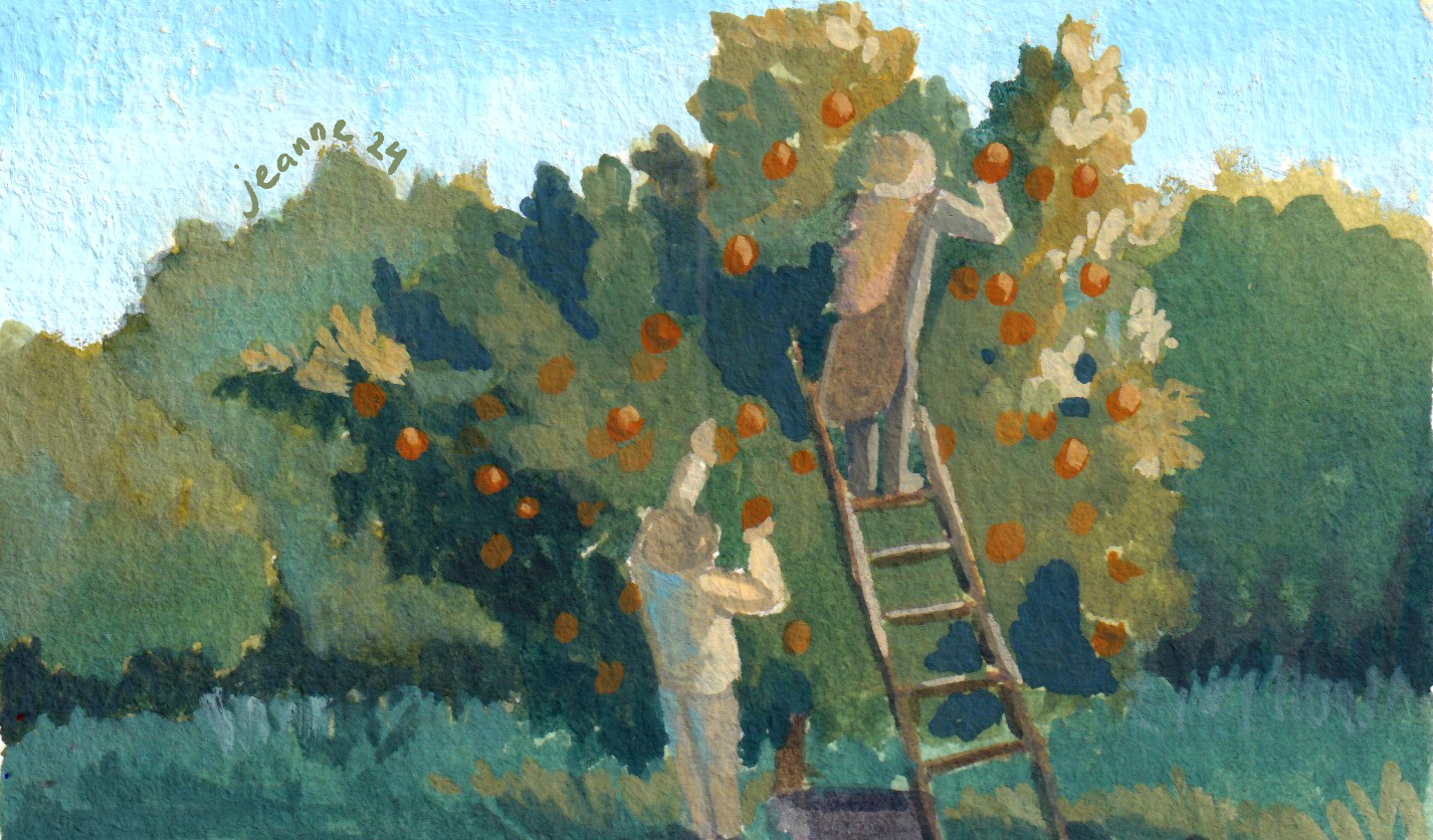
In the painting below, I added ultramarine blue when I mixed the dark tones for the trees, so that the oranges can stand out more. I also add horizon blue to the background trees to differentiate the main one.
This one is to play with the green in the shadow and in highlight. The yellow house and the red roof made the process simpler with just three main basic color: yellow, blue, red.
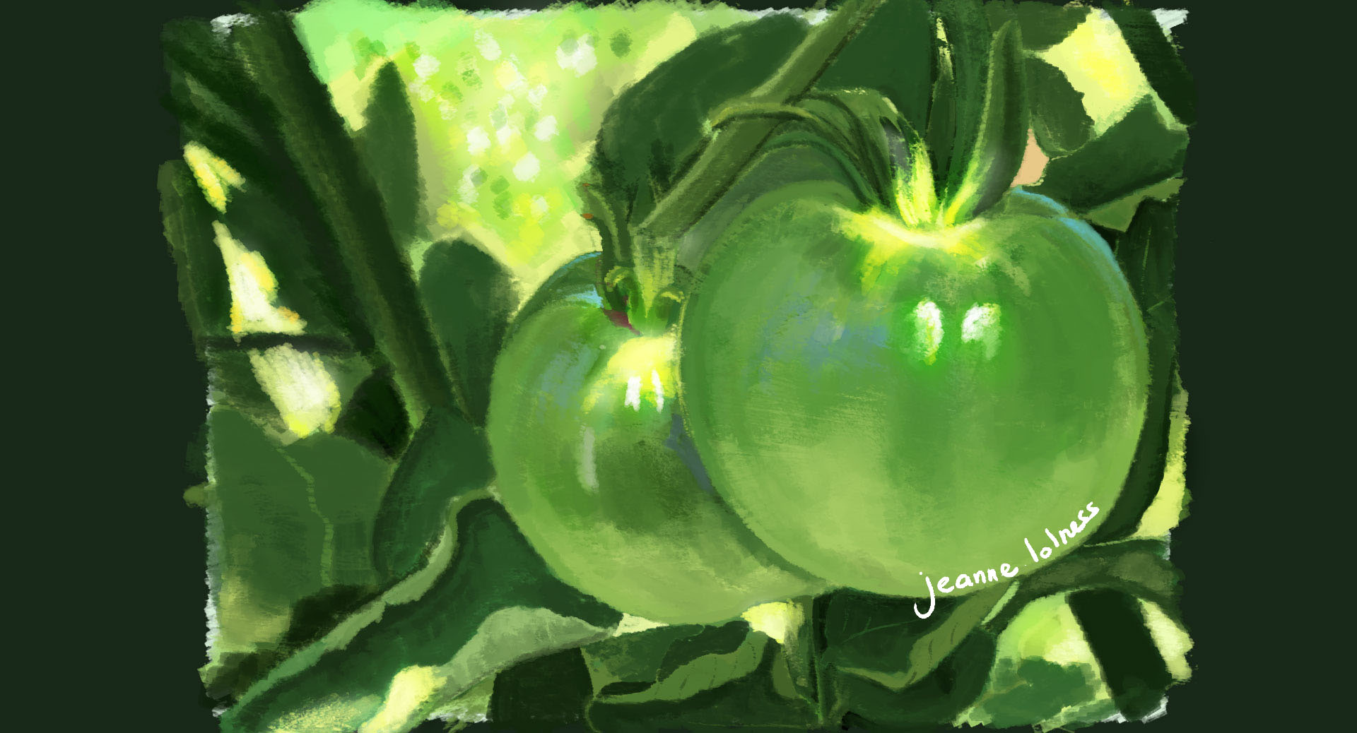
Here are a few pieces painting digitally. Apart from the highlight created by sunlight, other parts of the fruits have some blue since they are in the middle of branches and leaves.
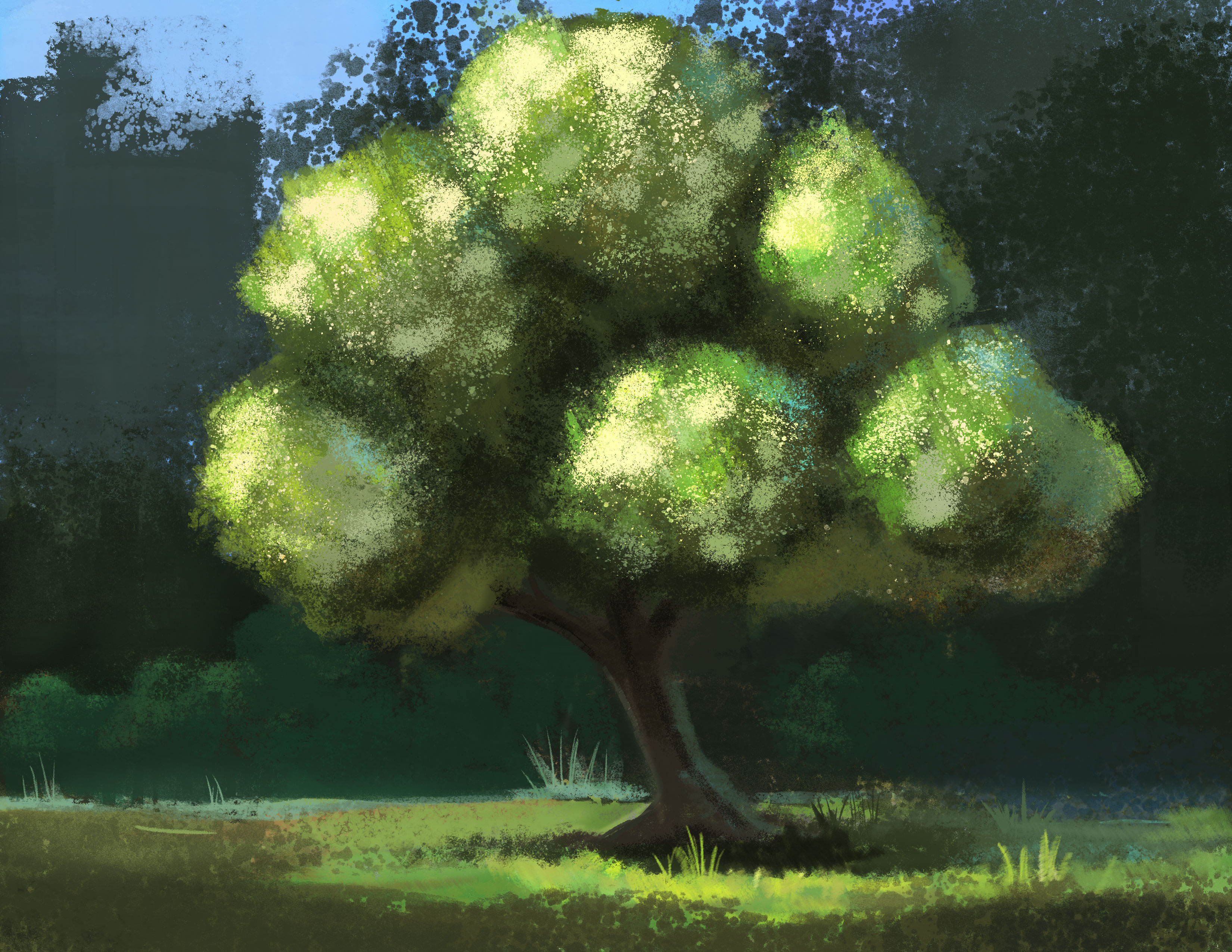
I try to think of the trees as made of multiple balls and add scattered highlights to show the texture of the tree.
As we wrap up this collection of green-themed paintings, I hope you’ve enjoyed exploring the shades of green with me. There’s still room to explore with green in particular and expressing nature for me, see you again in another collection in the future!
Painting a full scene always feels overwhelming at first. When I lay out a big blank piece of paper or set up a canvas, I often imagine something is look back at me. Particularly when I was a beginner, I made the mistake of buying A3 paper stack to save and it was a bad choice. Some of my watercolor papers become buckled due to humidity and I had to get another stack.
It turned out that I overate myself and the simple solution is painting on a smaller size.
The case for a small painting
Starting with multiple thumbnail sketches actually saves much more time rather than going directly onto a big canvas. It helps capturing the idea at the rawest stage, then allowing me to explore different compositions, details and ideas. It works the same way as the outline for a book: you need to have a rough image of the end before starting with each chapter.
It also reduces the guilt of commitment: an idea may sound brilliant when it first comes into our head, but maybe not so when it is laid out on paper. It’s easier to give up a small sketch than a big painting. It doesn’t have to ‘good’, ‘excellent’ or ‘the masterpiece’; it can be anything attracting your attention.
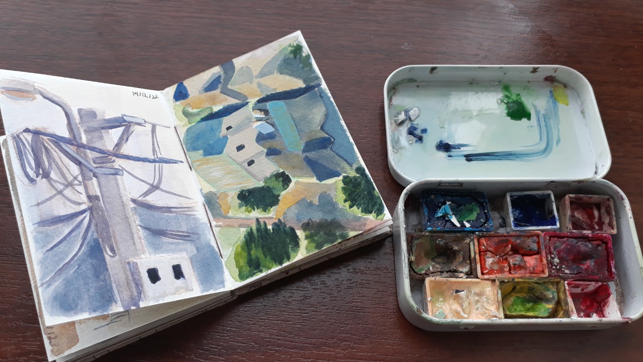
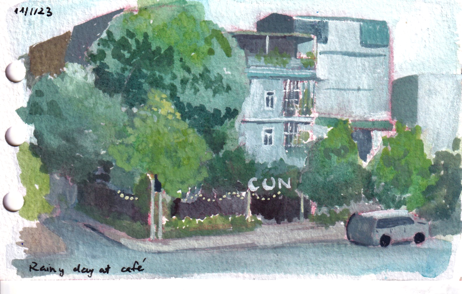
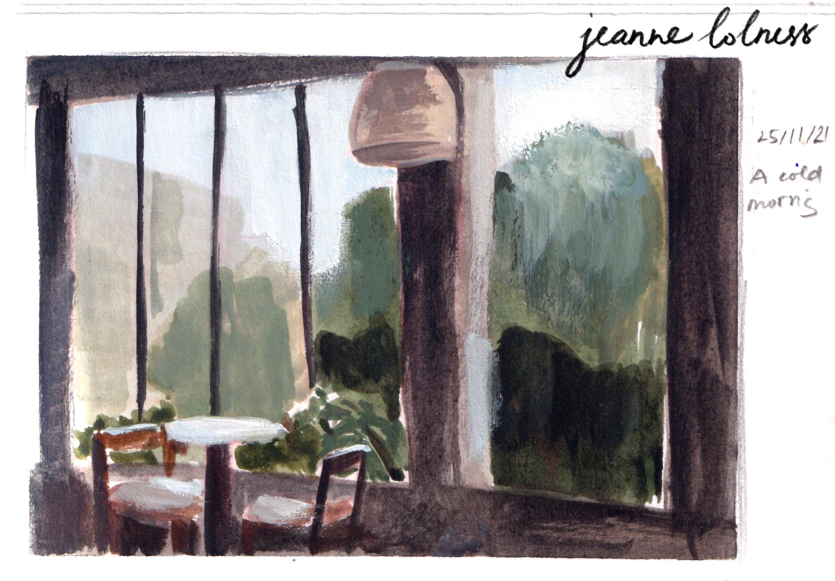
Small size sketchbooks work better when you try to paint outside as well. Pairing with watercolor, it becomes my essential kit whenever I go outside.
The mini sketchbook and mini palette I often carry around
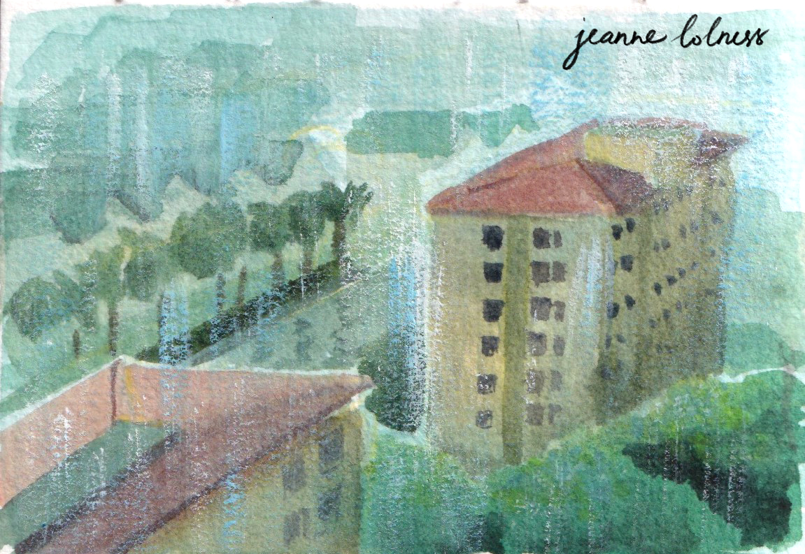
One page from the above sketchbook
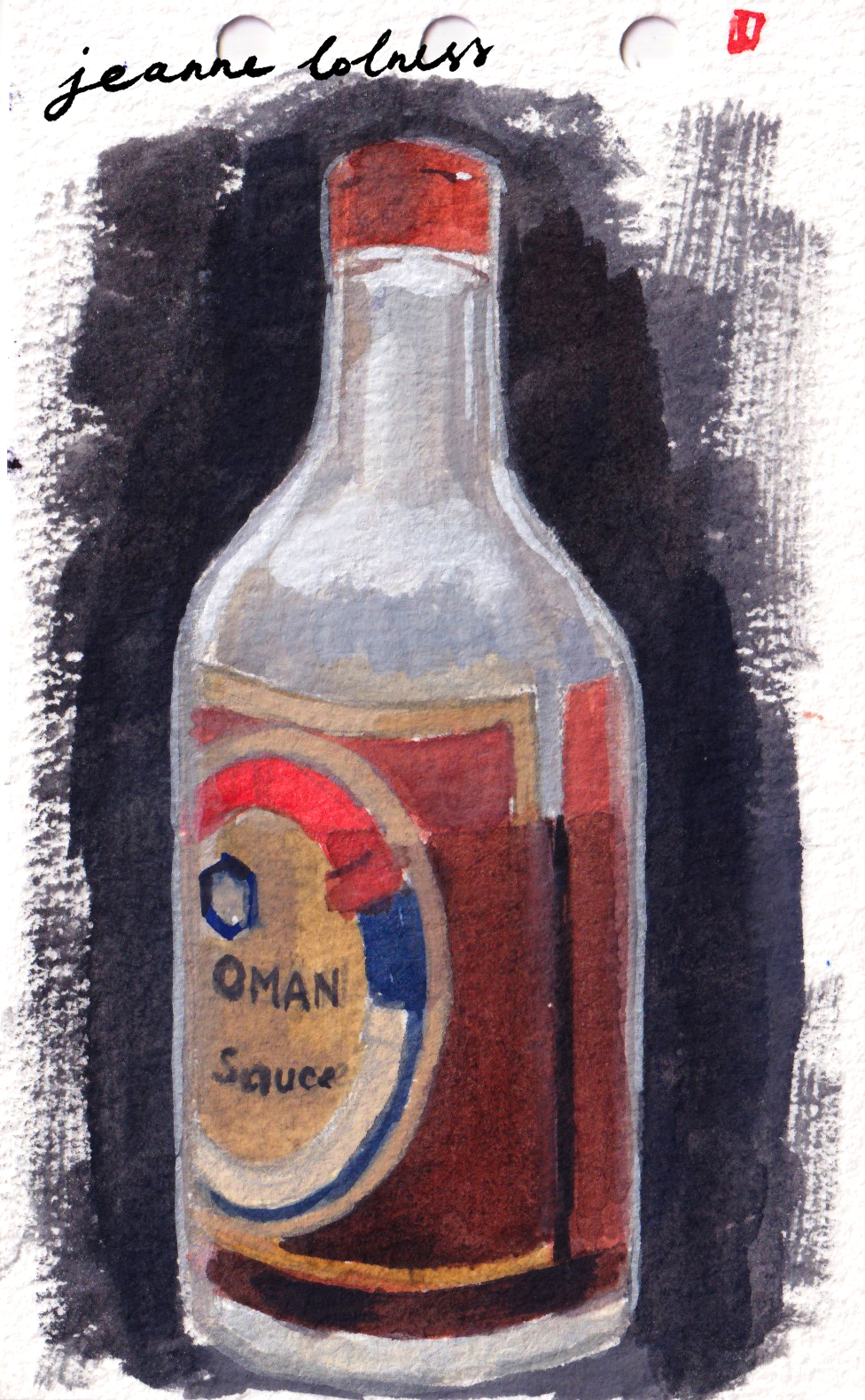
The size of the above sketch of my sauce bottle is 13 x 8cm. You can see a bit of the process here.
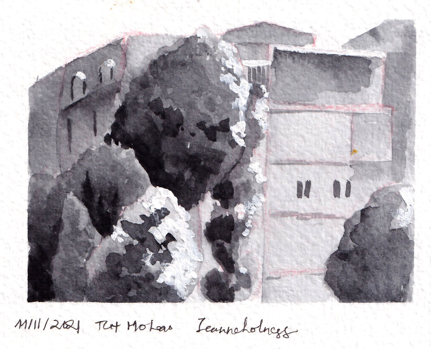
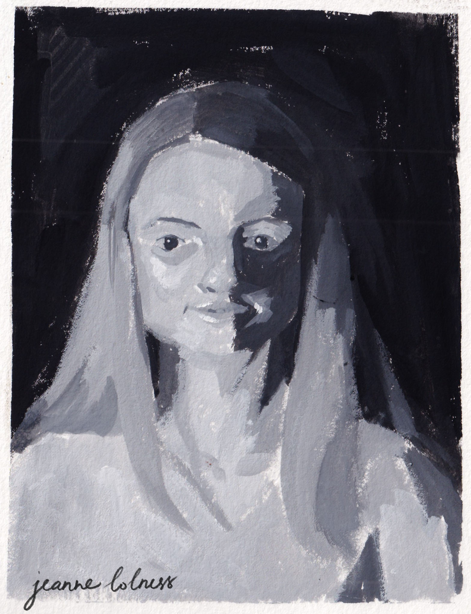
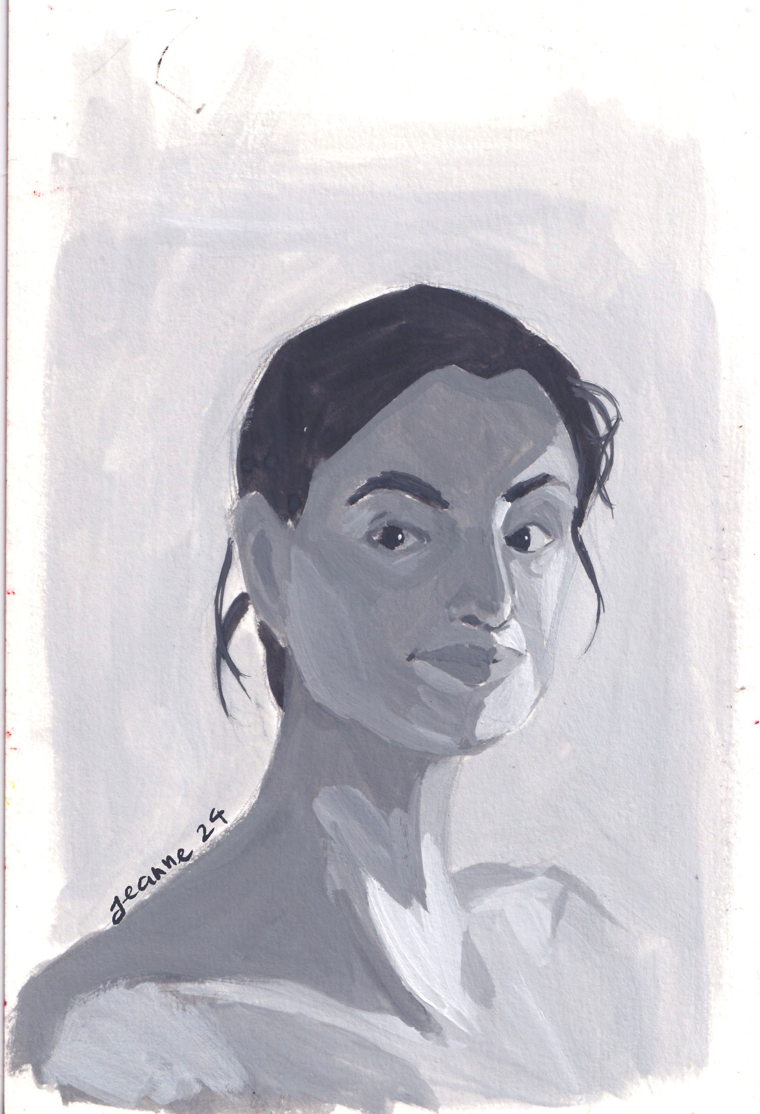
You don’t even need to use color for a thumbnail sketch: you can start with painting value scale first and then color later. When I started painting outdoors, I mostly painted in grayscale with black and white only. The above two are of the same view, with a 2-year gap in between.
Tips to work with small sketches
1. Experiment with the size
You can still buy a big paper stack, just cut them into different sizes to see how it feels to you. A6 size is my favorite size, it looks like a postcard and it fits with my A6 planner. I can just shove them in between the pages and I’m ready to go anytime anywhere.
2. Experiment with the tools
I found ink, dark pencils (6B – 8B) and watercolor more suitable for sketching small. But many artists prefer soft pencils, gouache and digital painting better.
3. Focus on the mass and perspective first
I layout a simple perspective and opt to the biggest mass in the composition. If you struggle with background and landscape illustration, learning to be comfortable with perspective first and trying to see the world in grid is my advice.
4. Break down process and have fun
It’s challenging to complete a full illustration, particularly a landscape one. That’s why I often divide it in parts. Of course, when the surge of excitement comes, just go with it ; but it’s unrealistic to be ecstatic everyday. I often have a few projects running over the same time to switch when I’m bored.
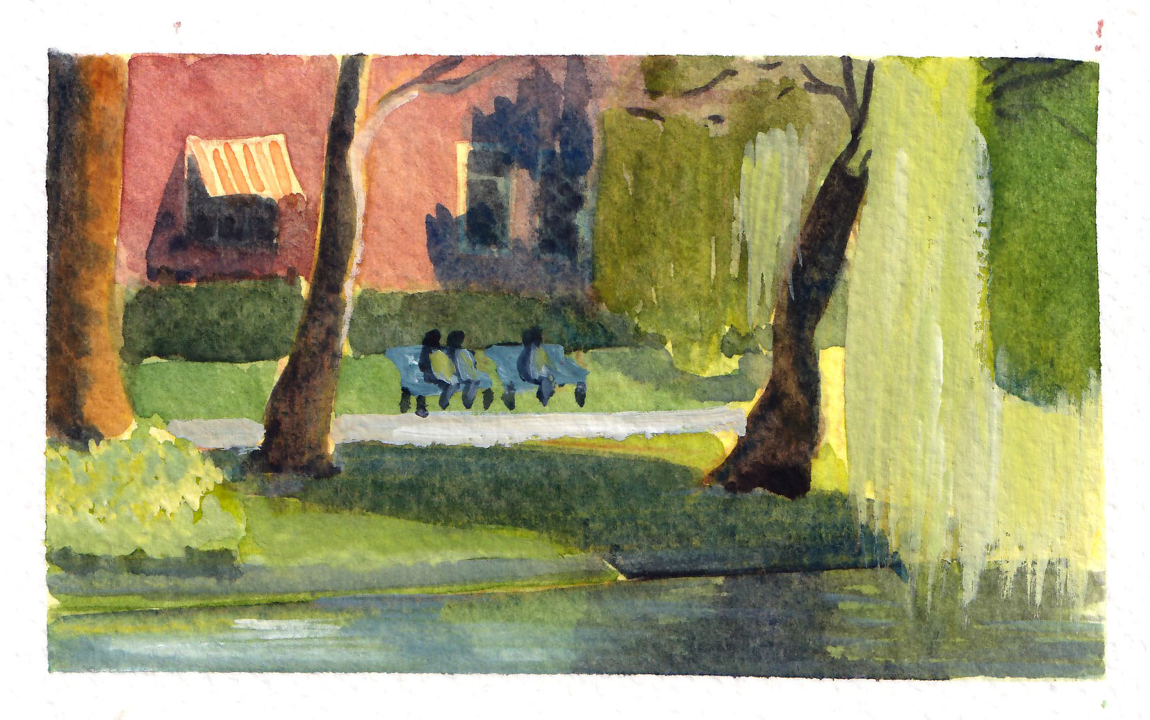
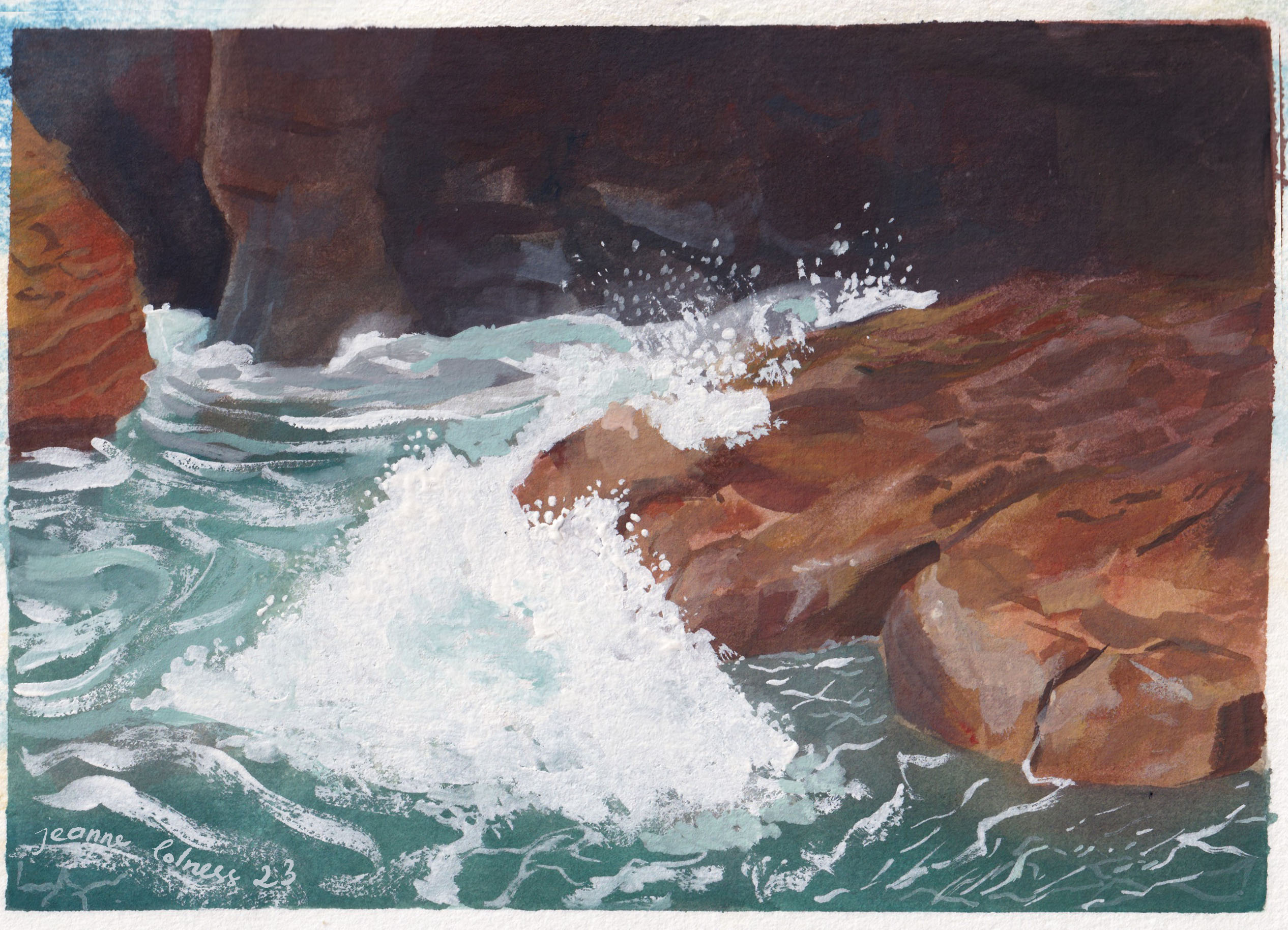
A painting capturing closely how waves crash with the rocks
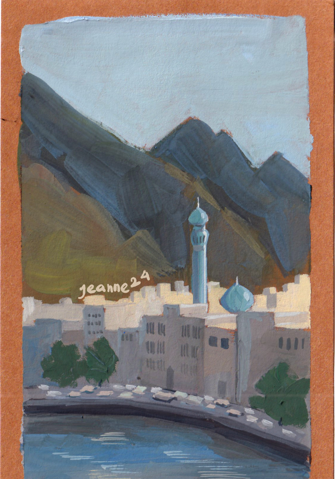
A painting of a view from my apartment
Above are some the largest painting I have ever done, roughly A4 size. It’s tough to paint big, but the joy of completing one big illustration is too great to miss!
I spent most of my life in Hanoi. When I was a kid living in my grandparent’s house, I was surrounded by copies of Bùi Xuân Phái, a Vietnamese artist famous for painting Hanoi houses in the 20th century. It was probably the first seed in my affection for this city.
A rainy street
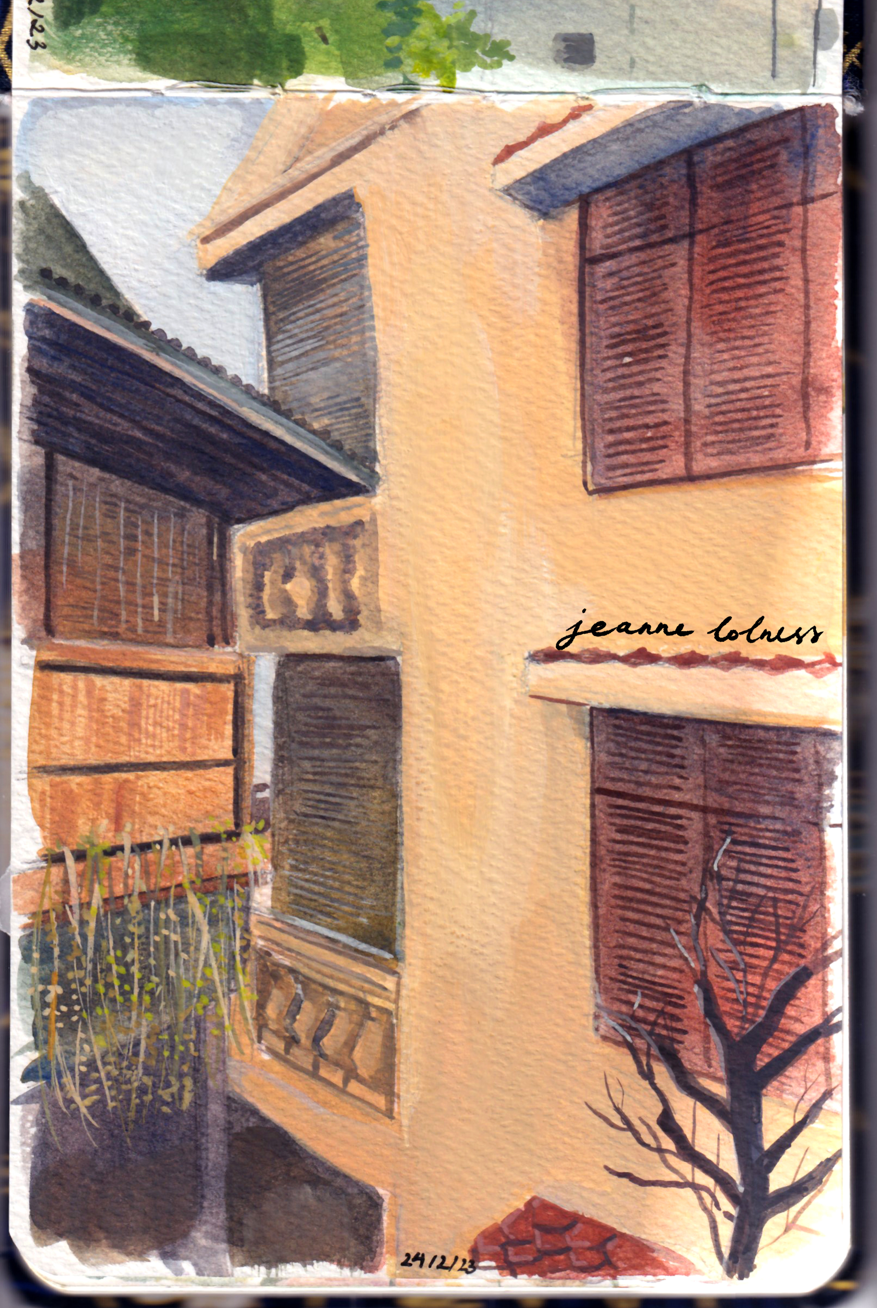
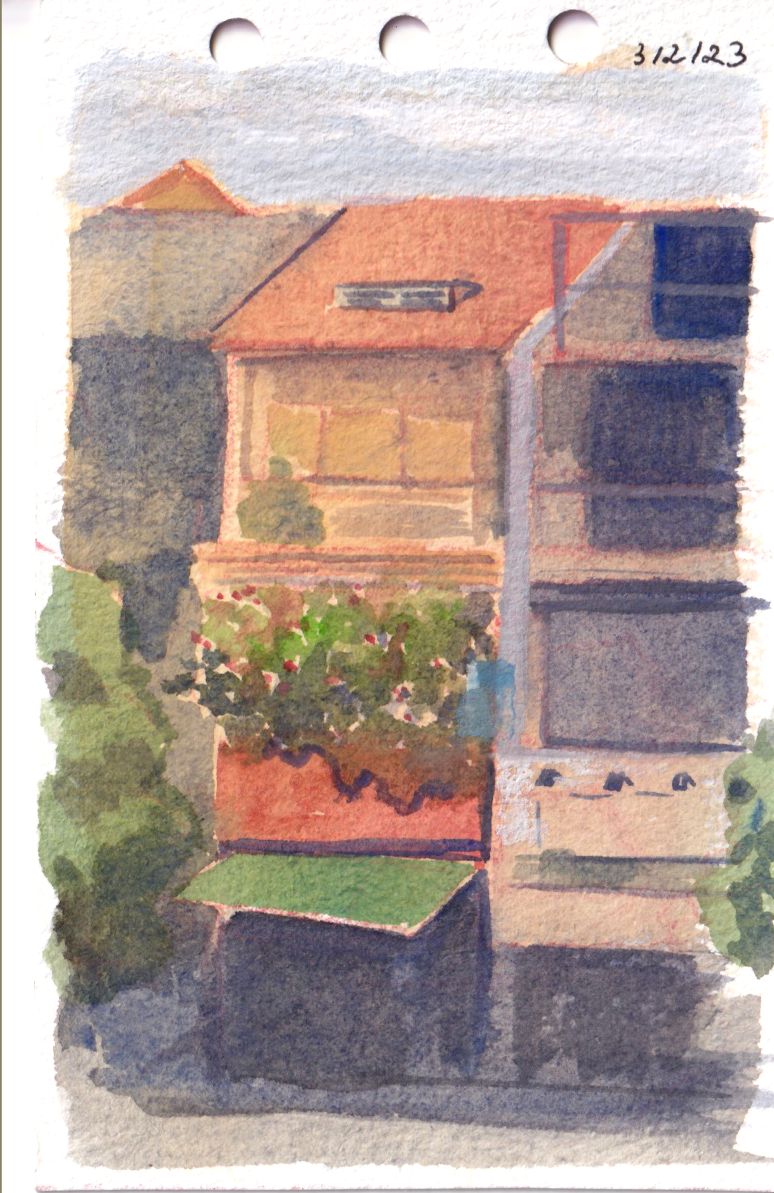
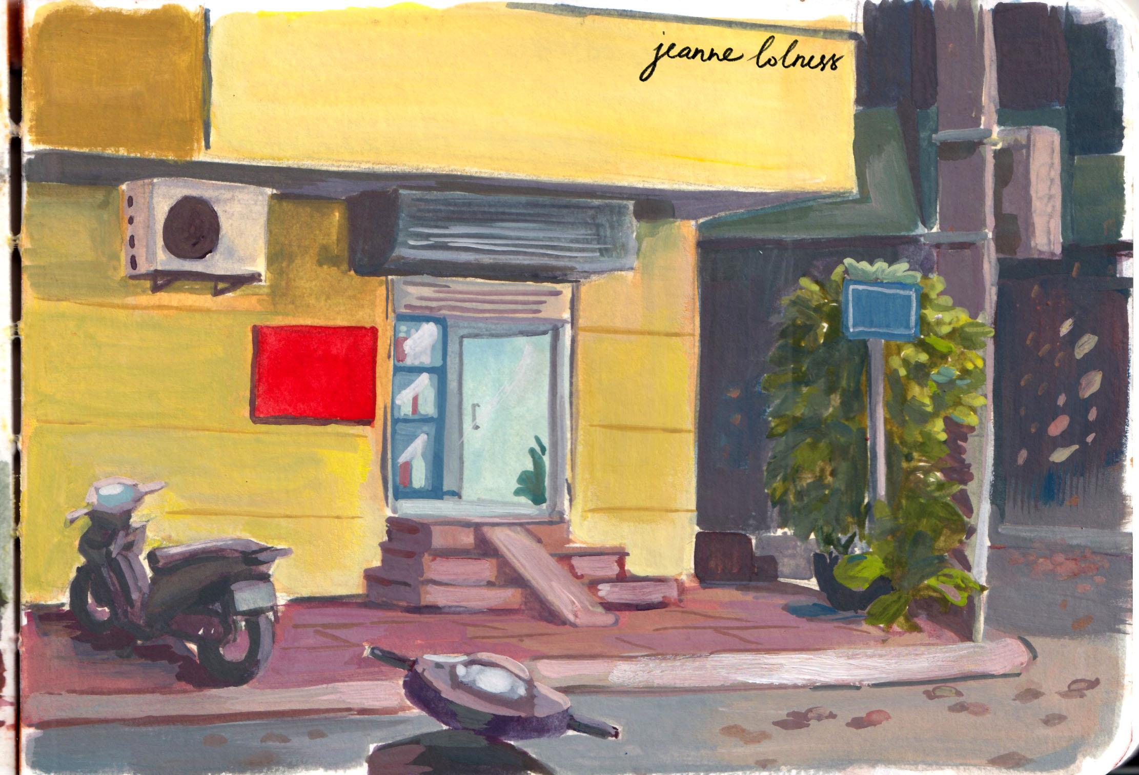
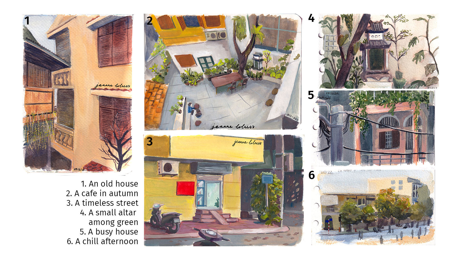
A typical Hanoi houseA summer streetA small house
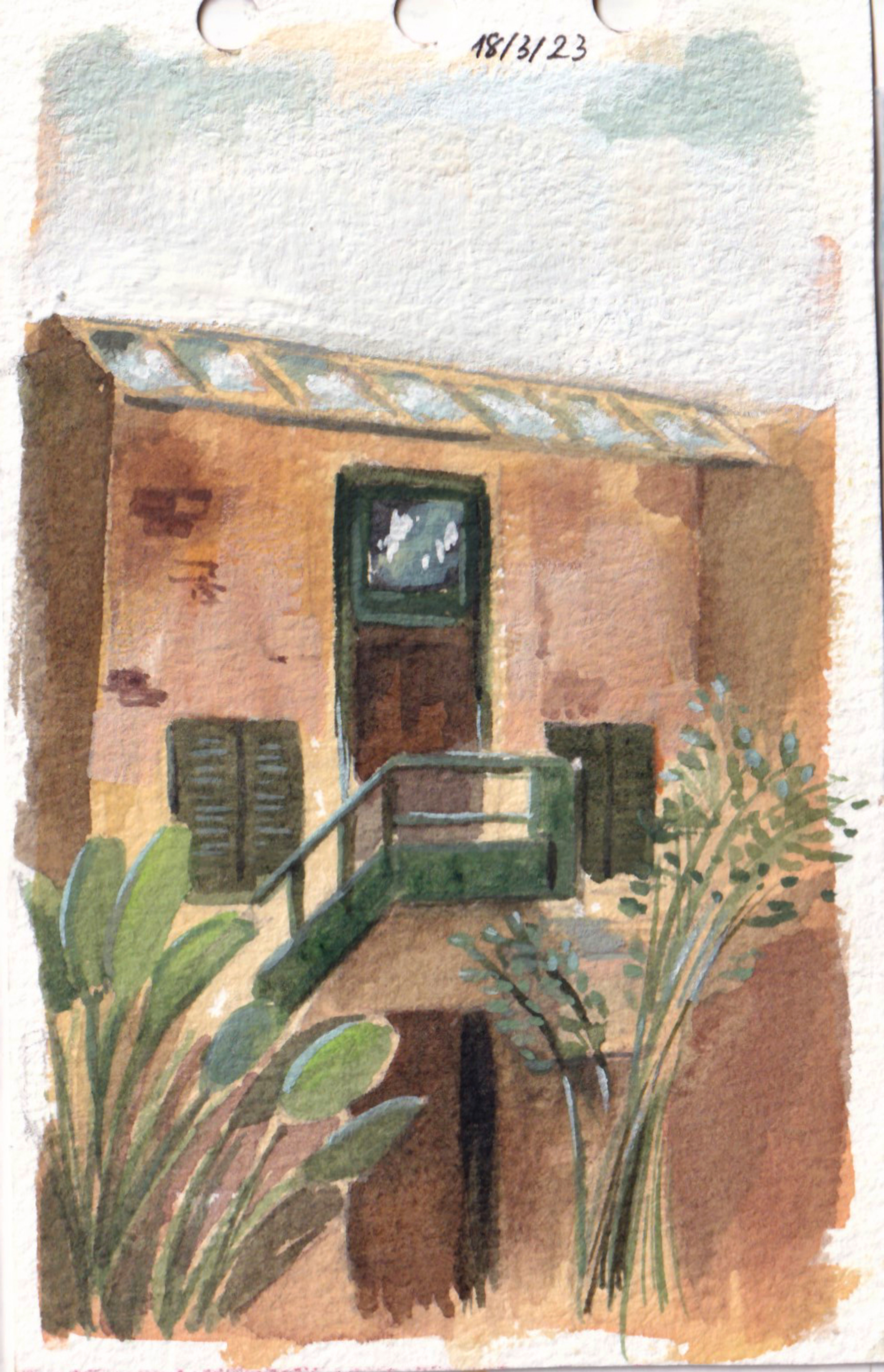
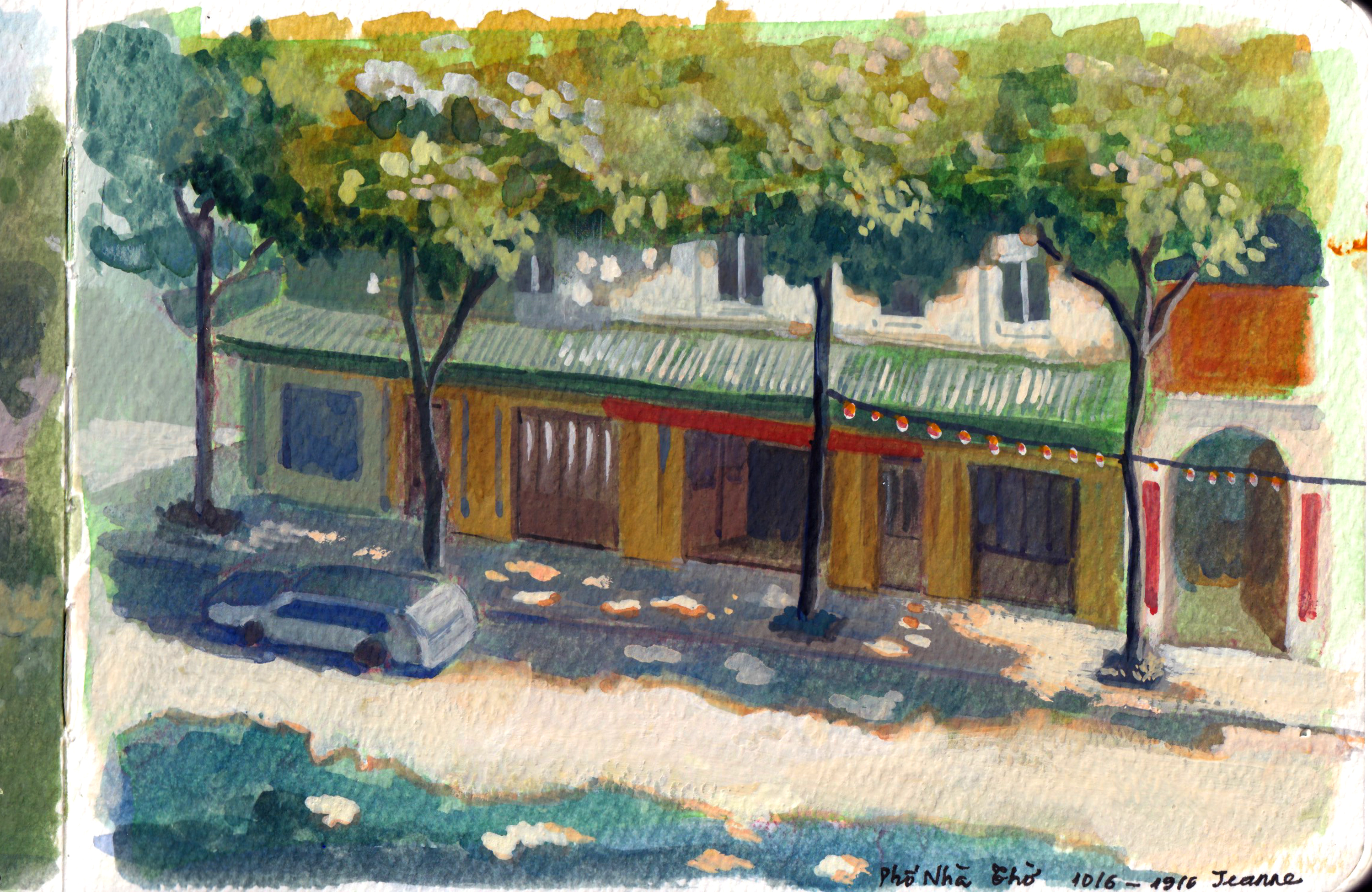
My affection goes to old houses, mostly those with cracks and weird innovations. They are the witnesses of Hanoi history and my own life. Now I live in a modern apartment with elevators, but I still remember running down the stairs full of plants pot, old furniture and and beehive coals.
Trang Tien Street
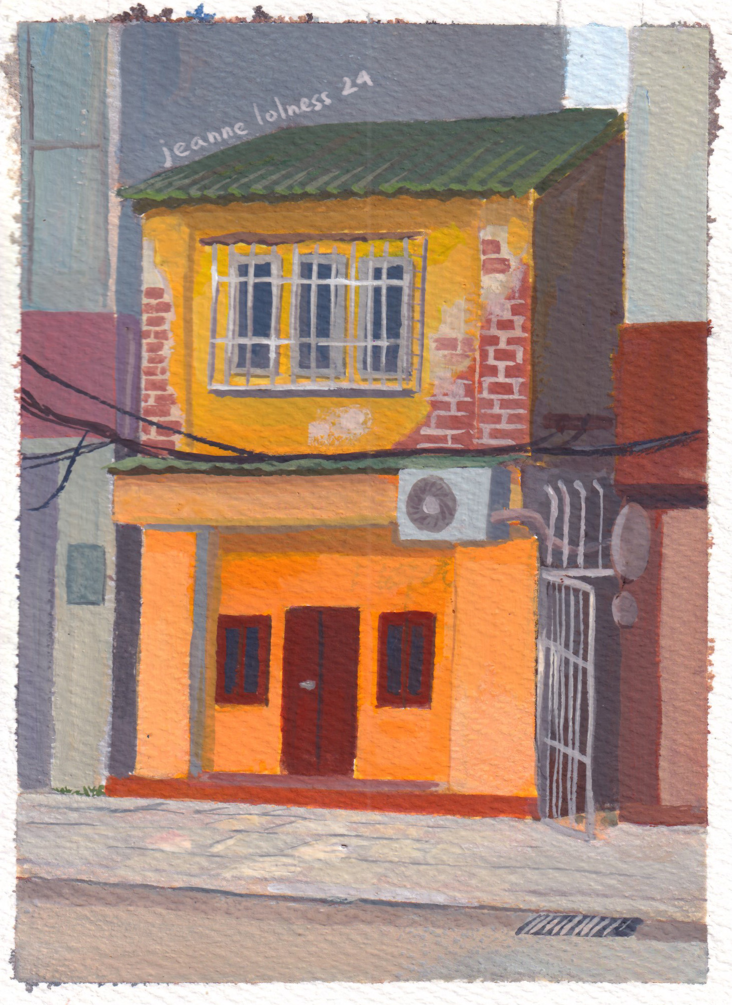
The street where I grew up
A silent corner in autumn
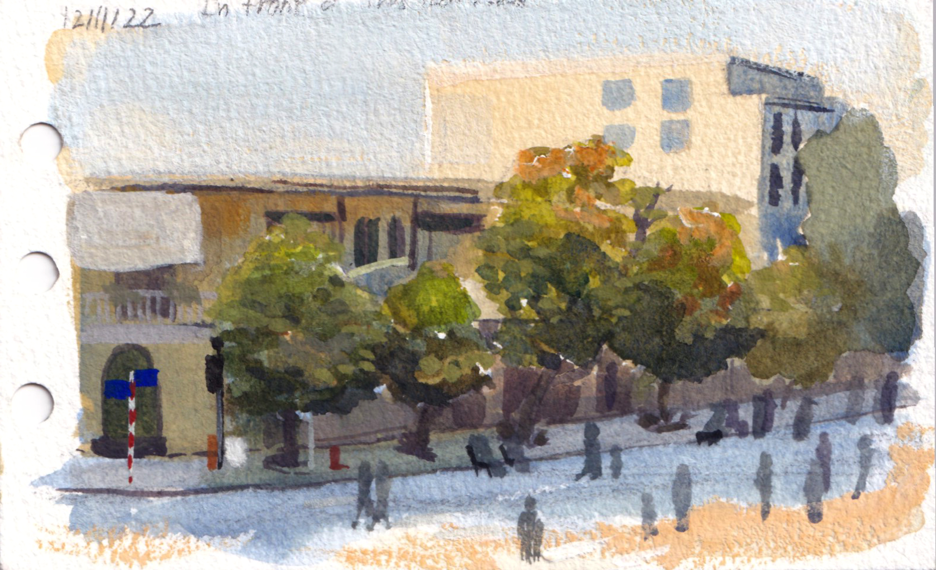
A street at noon
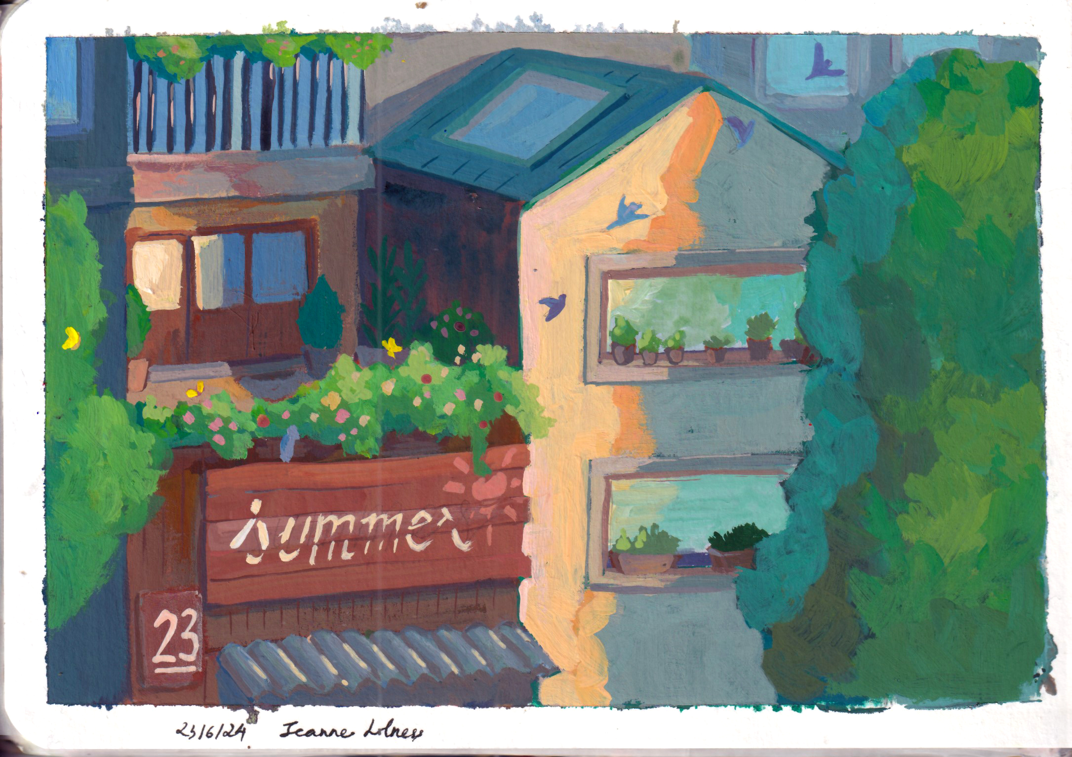
Many old houses in Hanoi are painted in yellow, which is a reminiscence of French colonization period. French often painted important buildings in yellow, and the reason is still unknown. It could have a symbolic meaning of an upper class, but yellow paint was also a cheap option at that time. Even after the war, there are still many houses and buildings painted in the similar yellow tones.
An old house covered in ivies
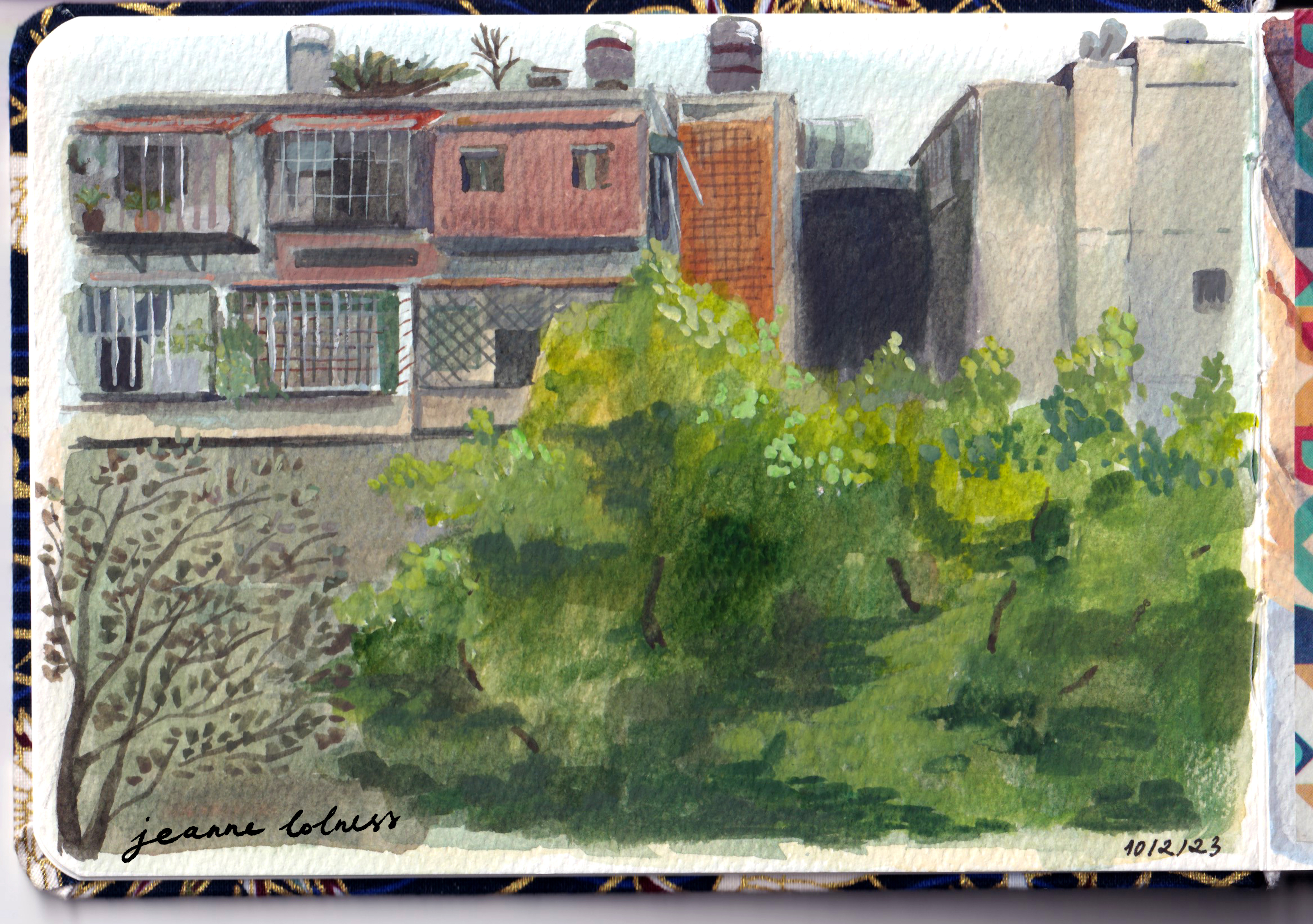
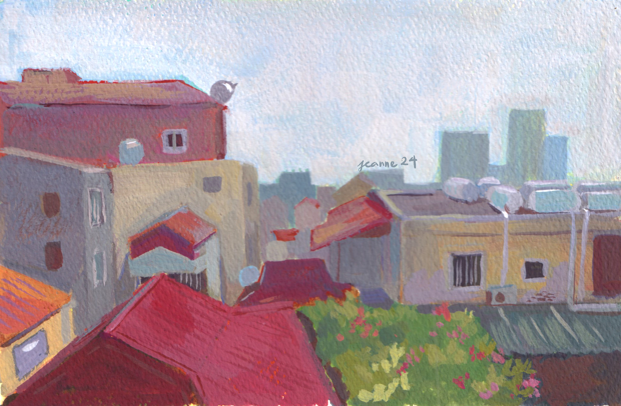
From my grandparent’s house window
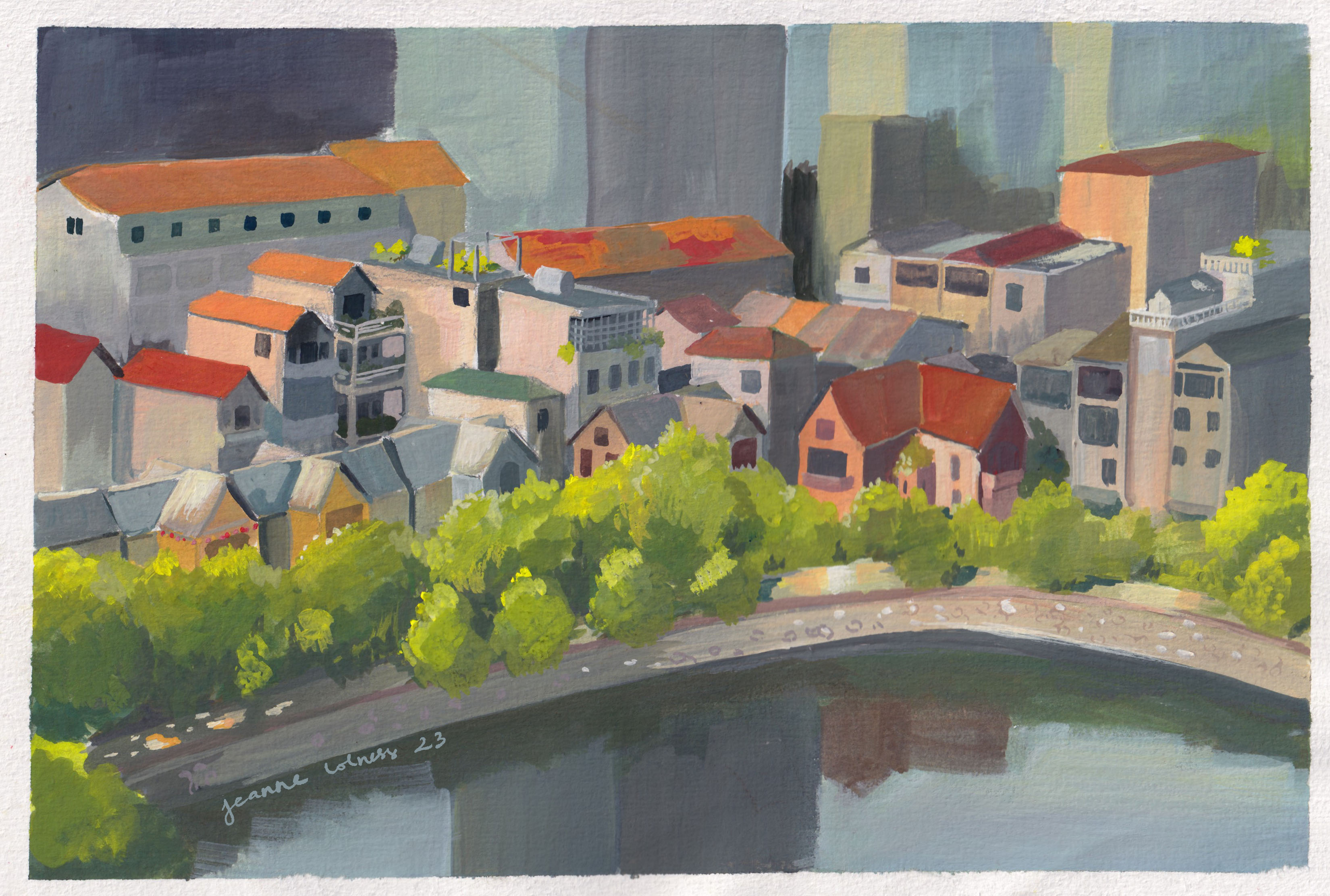
I left my grandparent’s house when I was was ten. Many areas of the city are being upgraded with modern architecture, yet, the street where I grew up remained almost the same. I don’t know how long they will stay the same, but I’m grateful for that.
Luckily, even though old houses are being pulled down due to safety reasons, Hanoians don’t have less love for our history of architecture. There are cafes being built resembling houses from the last century, furniture being kept from generation to generation, exhibition showcasing how and why these houses were built and loved and artists incorporating elements from childhood into artworks.
If you ever come to visit Vietnam, let’s stop for a second to watch these small houses stacking next to each other on the streets. It’s possible that many generations have lived in these houses and new hopes are being created despite two wars, economic downturns and most recently, an international disease.
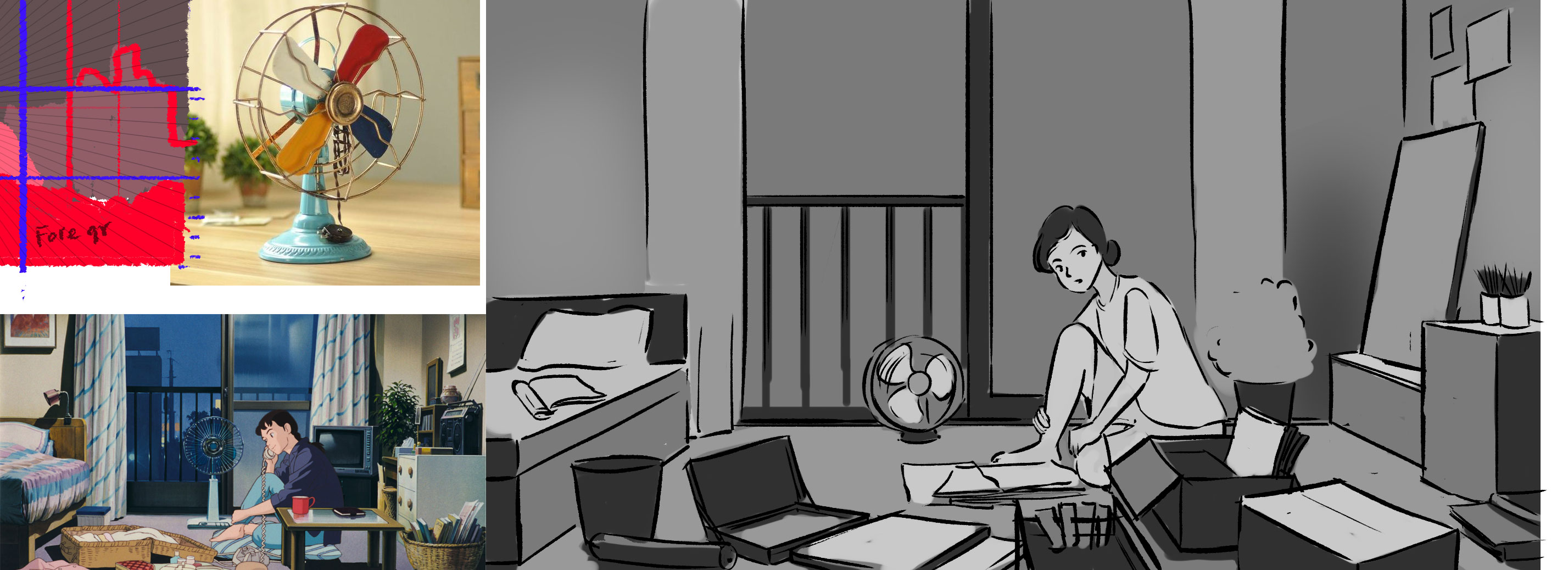
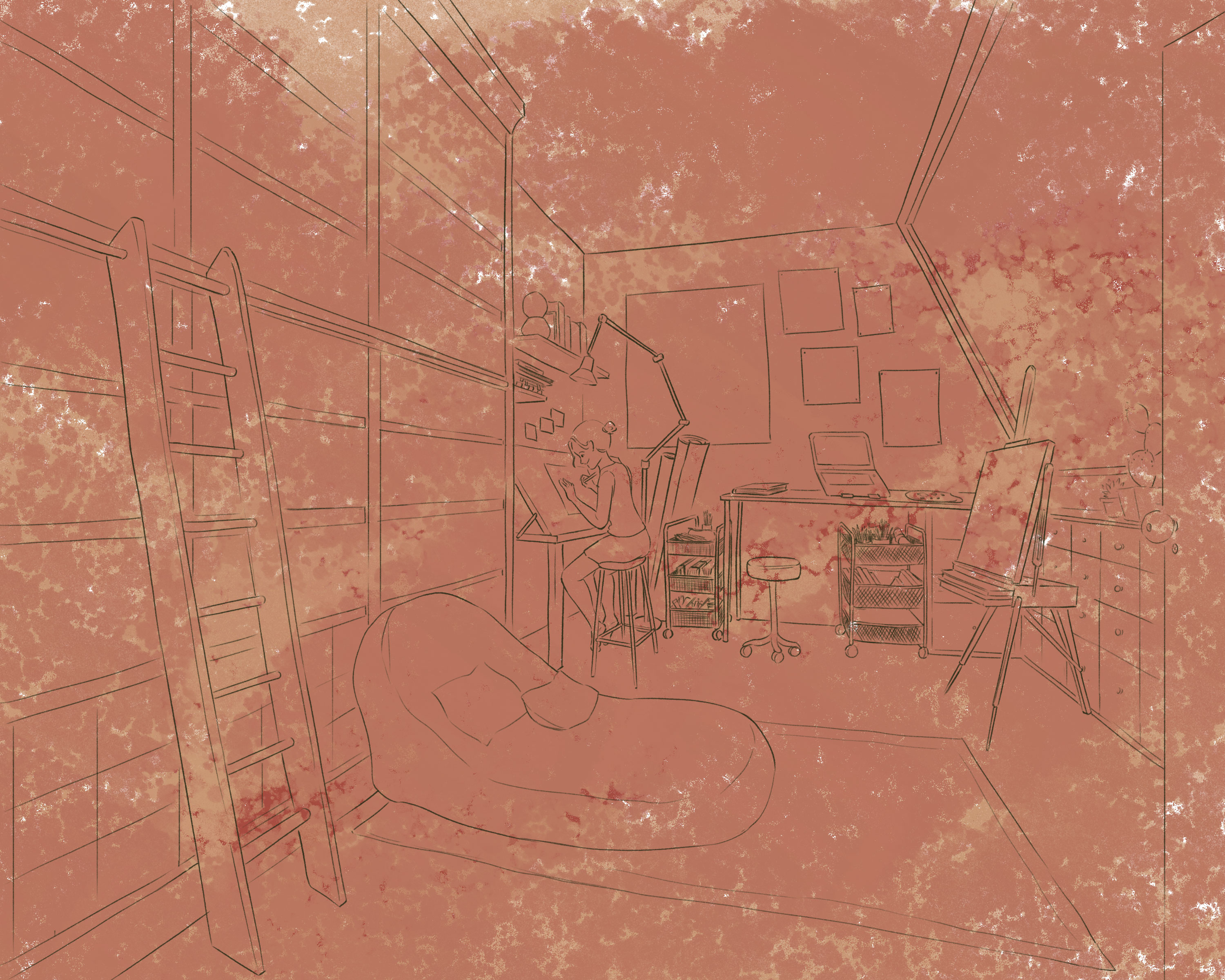
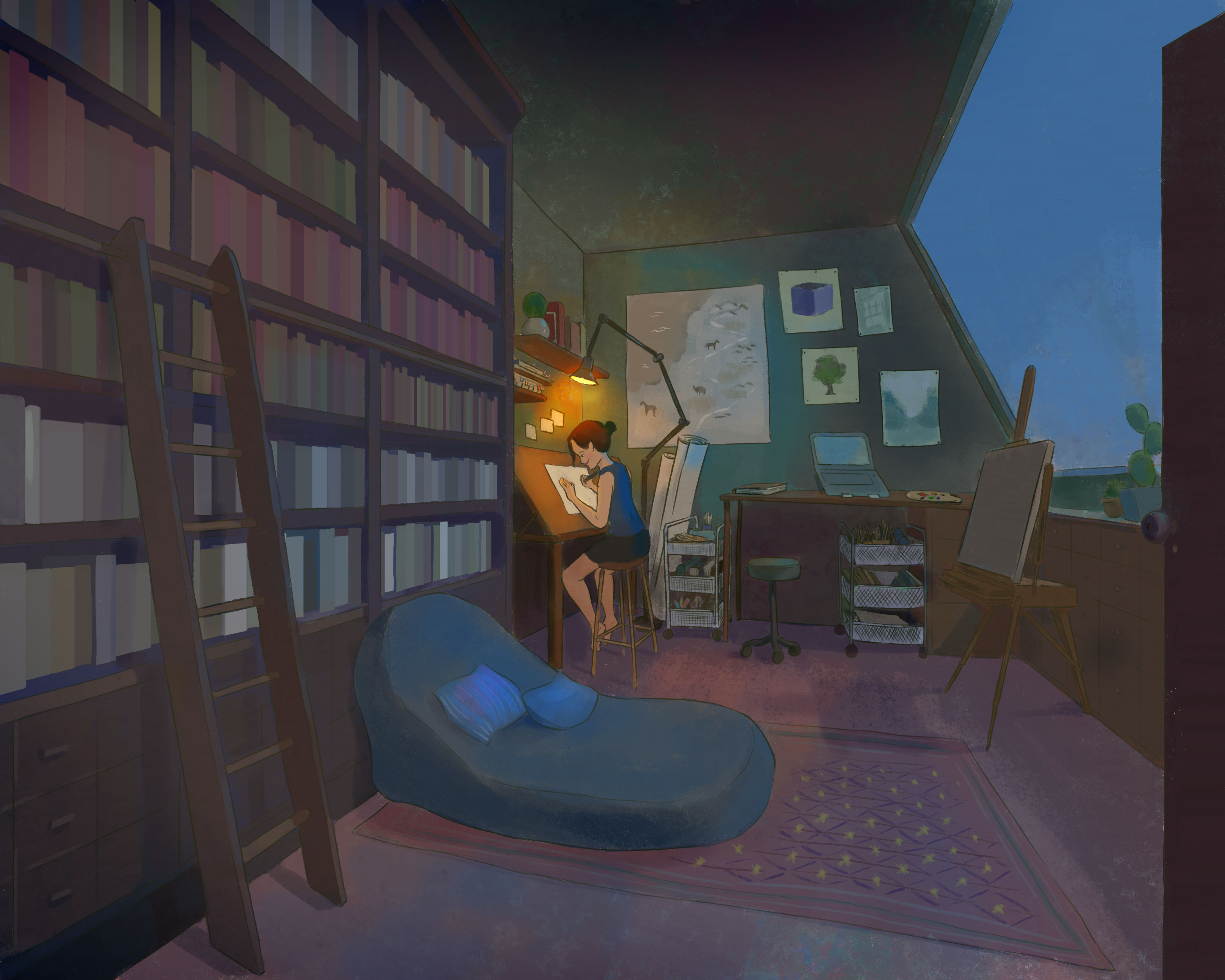
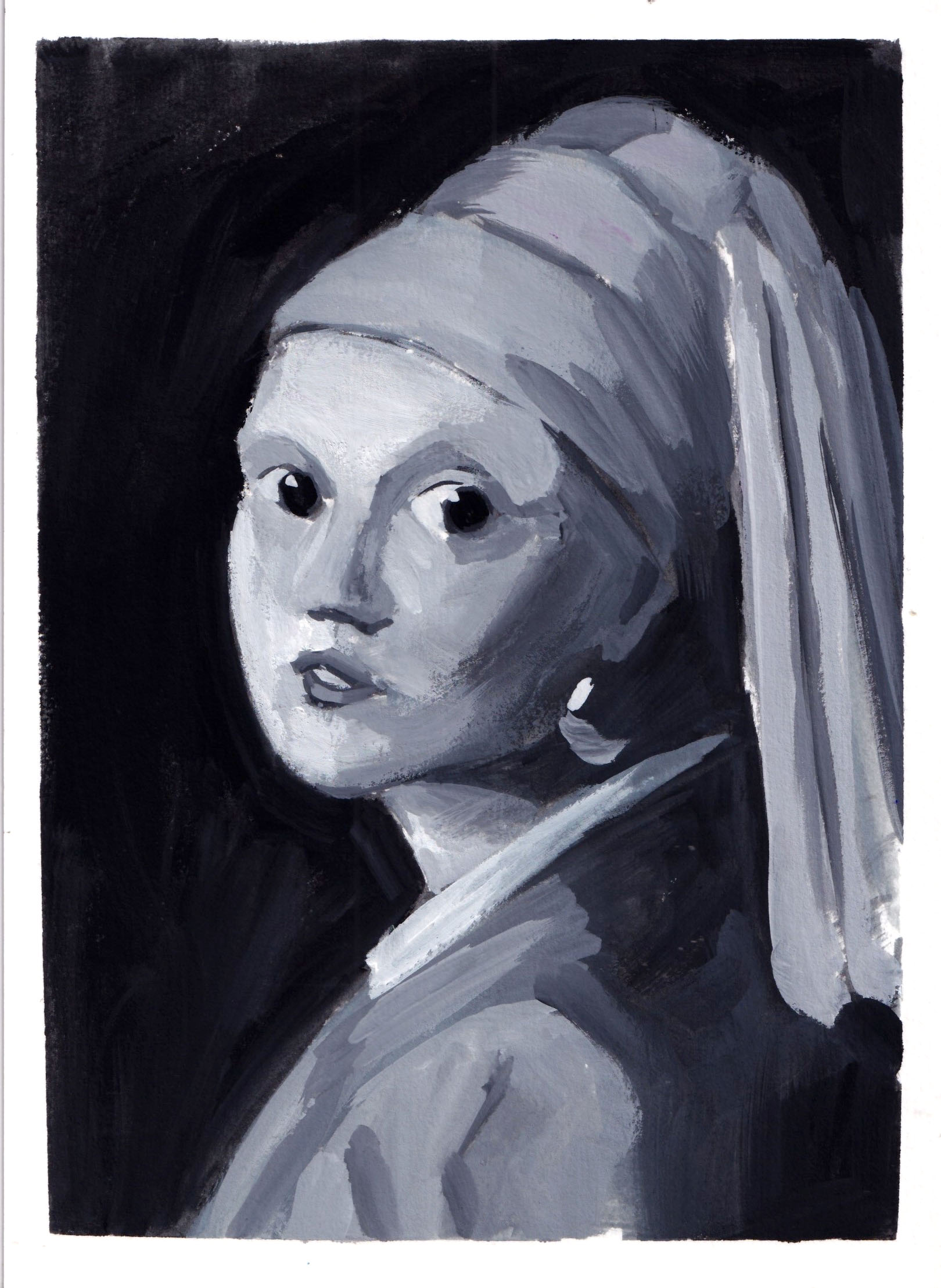
I took a class about composition and one of the homework was to copy and get creative from the arts that I need in grayscale.
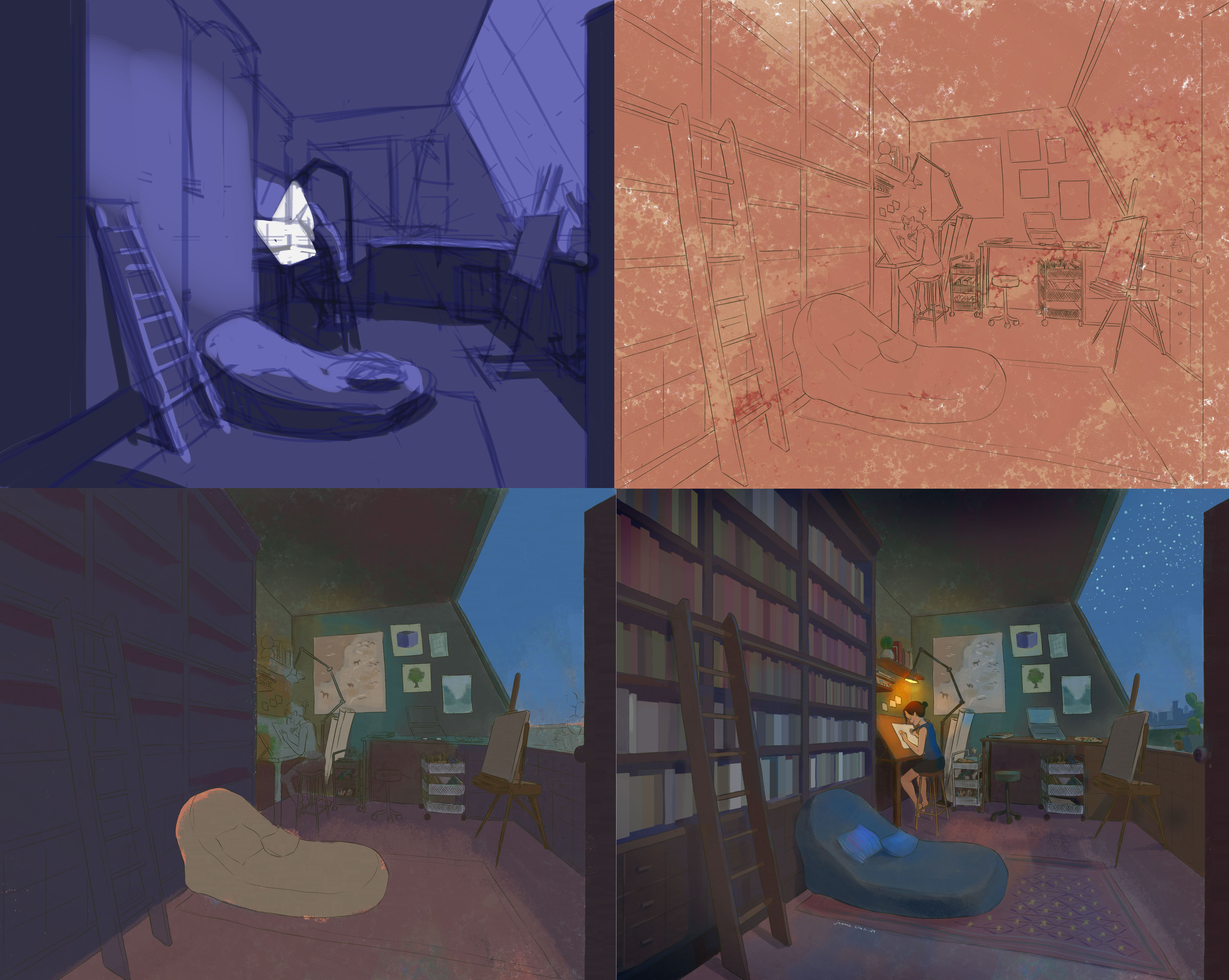
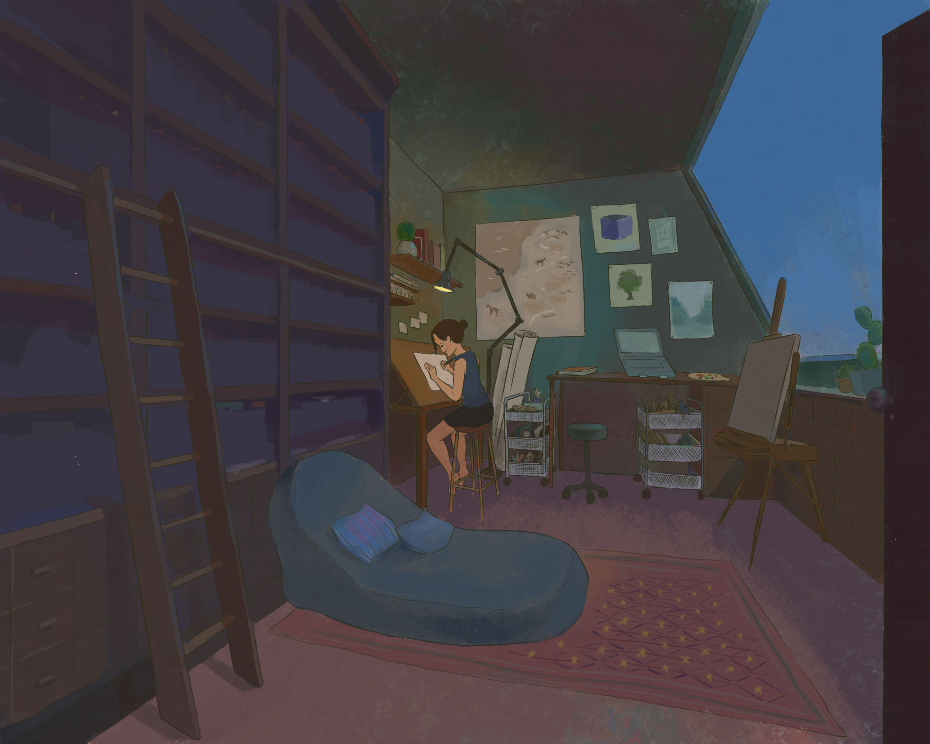
I chose this scene in the movie ‘Only Yesterday’ from Ghibli because it feels intimate, it can be the room of anyone and I just need to step over the frame to be in the same room.
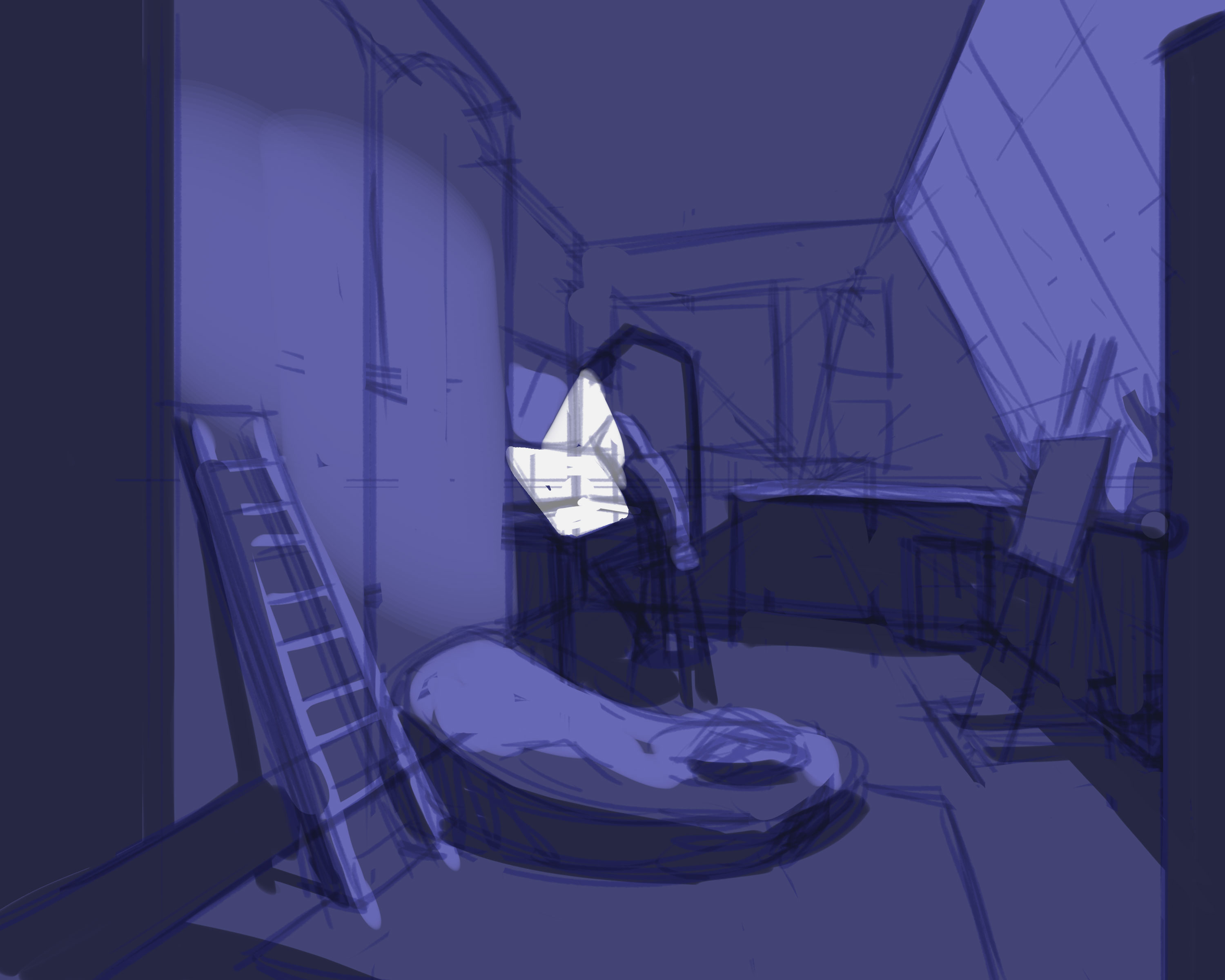
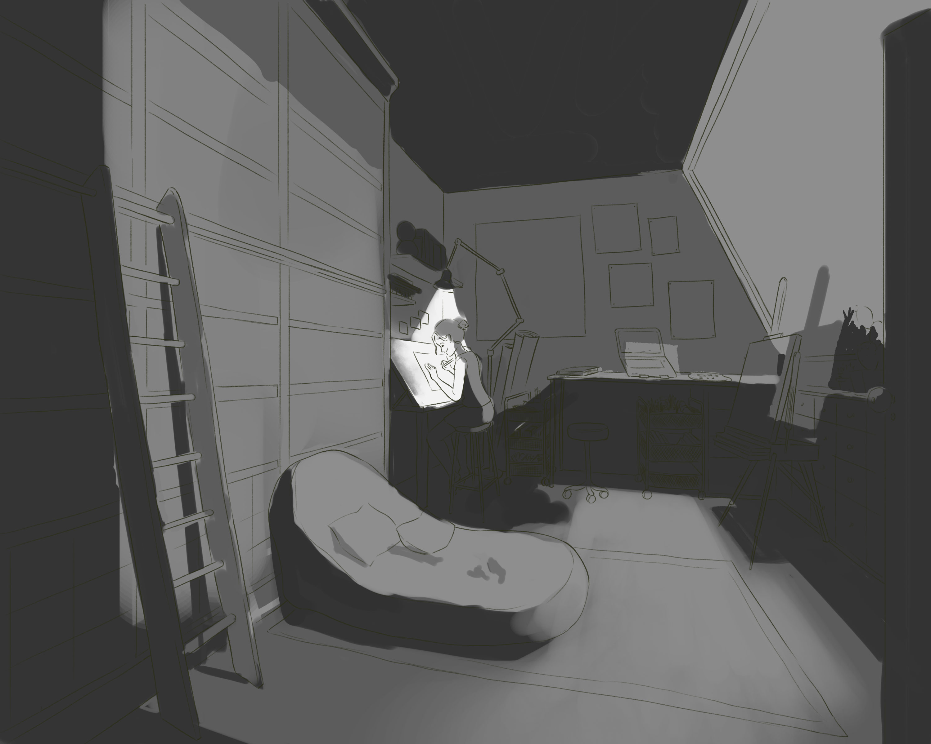
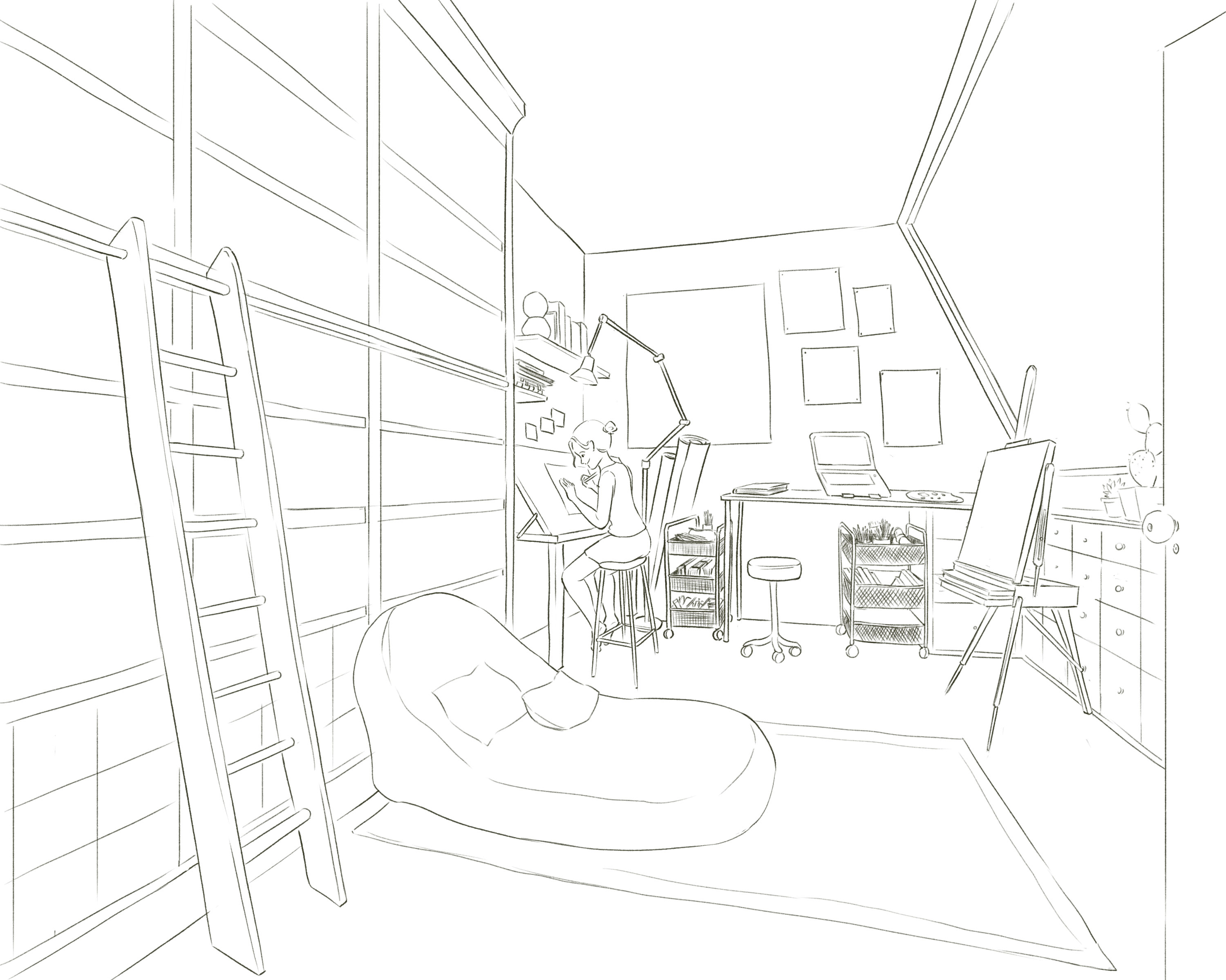
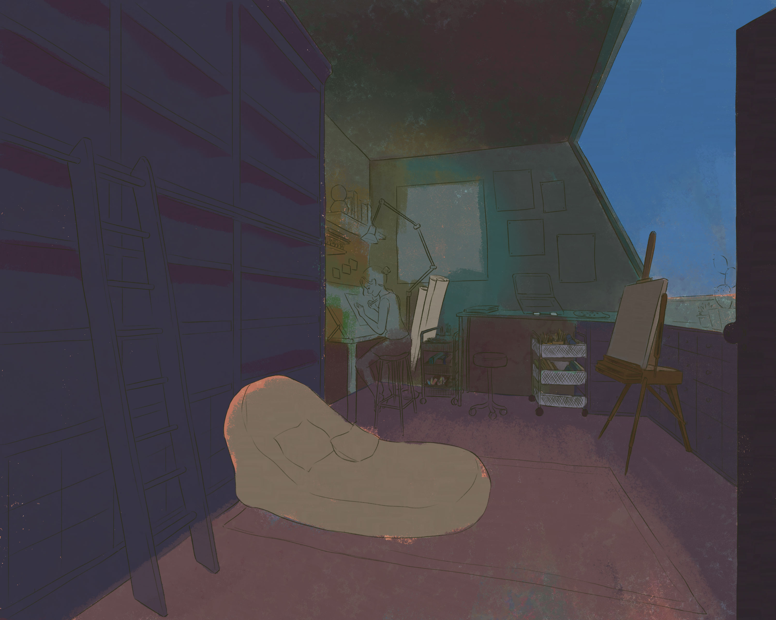
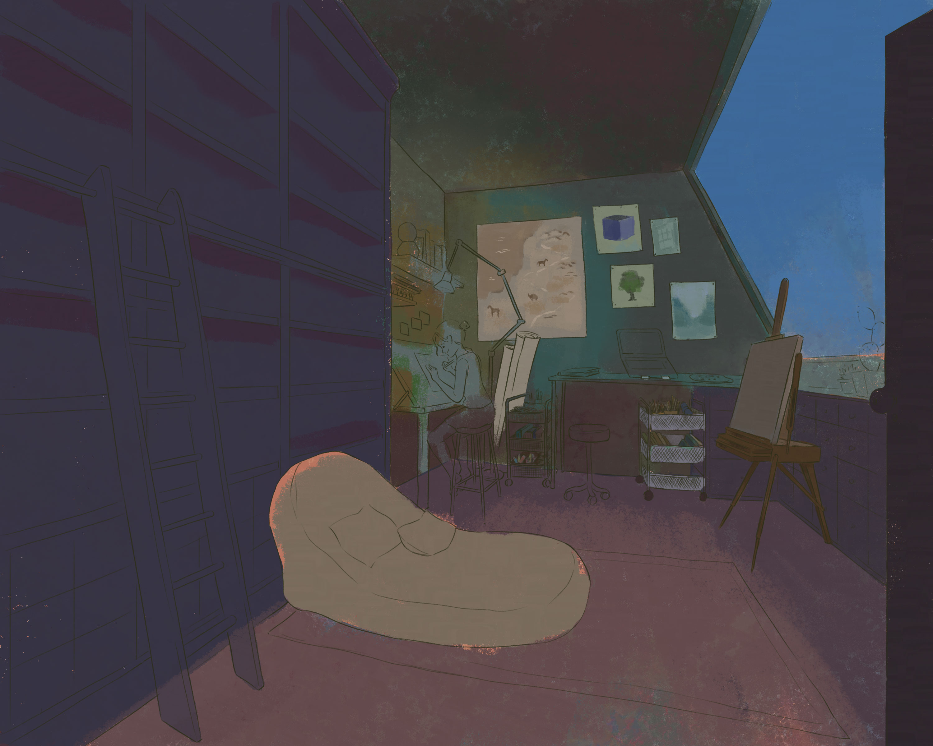
Inspired from that, I want to paint an arts room, a room that I would build if I have all the money I could.
I want to use night ambient light, a kind of soft light going with a strong light, light from the bulb. In that way, I could light up the whole room, yet still keep the focus on the main character (me :))
I first knew about Élisabeth Vigée Le Brun from a video by National Gallery. My first impression is that this women is a bold yet feminine painter. She rose from a modest background, and painted without academic training or public acknowledgement and became a kind of ‘celebrity’ artist. To me, she is a true feminist: she never stopped embracing her tender, maternal character in her painting; yet in real life, she fought in her own way to be able to do the things she loved.
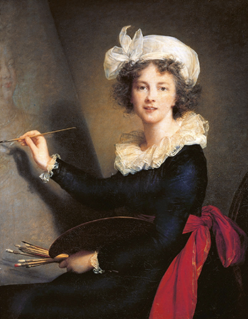
Élisabeth Louise Vigée-LeBrun, Self-Portrait, 1790, oil on canvas, 100 x 81 cm (Galleria degli Uffizi, Florence)
She wrote about her youth in her autobiography and her love for arts started from when she was a schoolgirl. Her father had always seen something in her and let her play with his crayon pastels all days. She never admitted she was gifted to be painter, but declared “what an inborn passion for the art I possessed. Nor has that passion ever diminished; it seems to me that it has even gone on growing with time, for to-day I feel under the spell of it as much as ever, and shall, I hope, until the hour of death.” (1)
This passion never left her for all her life. She painted portraits professionally from early teens without a license from the Académie Royale de Peinture et de Sculpture (Academie for short). This was not a surprise, considering the Académie’s position of monopoly on the art market. A female artist wasn’t allowed to attend figures classes with naked models. Élisabeth wasn’t trained formally, mostly self-taught and guided by mentors who were friends of her father: Hubert Robert, Joseph Vernet, etc.
She rose to be the favorite court painter of Marie Antoinette, Queen of France, wife of Louis XVIII. The queen, with the king, intervened to help Élisabeth get a license. She developed a friendship with the queen, which was unusual considering their classes. In her memoir, Élisabeth shared about the kindness she was given by the queen and their mutual interest in music. (1) The life of the two women paralleled and contrasted in a curious way, pairing with the fluctuations of French politics.
She was friends and acquaintances with many aristocrats, and she became a salonnière, simply explained, she hosted social gatherings for people to talk about arts, literature, history, politics, etc. Salons were mainly hosted by women, namely Madame de Tencin, Madame du Deffand (friend of Voltaire), Madame Necker (wife of Louis XVI’s director of finances). Still, Élisabeth painted furiously at day and hosted sessions of poetry readings or musical recitals at night. She never wanted to be known as a salonnière, the point of opening a salon was to support her passion and her husband’s career as an arts dealer.
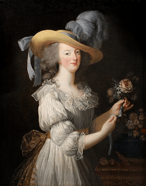
She reached her peak from 1783 till 1789, after she received official admission from the Academie. In 1783, she also finished the painting known as “Marie-Antoinette en gaulle”, in which she depicted the queen in a close and intimate point of view. Élisabeth wanted to represent the queen not just as a queen but a women “in all her appealing and vulnerable femininity”. (2) In 1783, 1785, 1787, and 1789 Salons, she achieved great success with her portraits of royal members and her own family. In total, she submitted more than fifty pictures. (3)
Marie-Antoinette en gaulle (1783) (Luxembourg Museum, Paris)
These glamourous days ended in 1789, the outbreak of French evolution. Her most important patron and friend, Marie Antoinette was executed in 1793. Élisabeth fled to Rome, Italy and then Saint Petersburg, Russia. She was patronized by royal members and kept painting them to support herself and her daughter, Julie. Her financial situation was bad despite her success. The money she earned in her teen years was used up by her step father, and the money she earn after marriage was used up by her husband (2). She returned to Paris in 1802, officially separated from Le Brun in 1805, and he passed away in 1813.
She continued to paint until the day she died in 1842, as she hoped in her youth. In 1835, Vigée Le Brun published her memoirs titled “Souvenirs,” which told the story of her life from very early days until the last moment.
What’s admirable about Élisabeth Vigée Le Brun is her hard-working and brave attitude to stick to her passion. She is the true definition of “pursuing passion” and her love for arts became what kept her alive in difficult times. She was a protégée, but as a women, she had to overcome many more obstacles just to be recognized. Her hard-working attitude shines from her memoir.
She experienced ups and downs in both her social and private life. She became the most sought for-female portraitist in Paris, yet she was forced to get married and didn’t have a happy personal life. She lived a long life (she passed away at 86 years old) and her admirers surrounded her till the end, yet she suffered the loss of her only daughter, her close brother, her friends. She witnessed the monarchy reaching its peaks and collapsing to dust. Her portraits, her memoir are now evidences of a remarkable era of French history.
Human face is always a hard subject for me, since it’s easy to draw it ‘wrong’ and hard to fix it ‘right’. The annoying thing is even if I realize the face is ‘off balance’, sometimes I can’t point out which part need fixing or how should I re-draw it later.
That’s why it takes a long time for me to be able to draw a face that I can feel satisfied with.
My start
My first proper learning would be Proko’s drawing face videos, which is based on Andrew Loomis method. Later, I discovered Andrew Loomis wrote a whole series of books about arts, especially about figure drawings and portraits. The book I read, “Drawing the Face and Hands” was published in 1956, yet it’s still useful in learning the general structure of the face. The books were divided into male, female, teenager, kids and a small section at the end about hands. He often began with building the blocks first, then slowly adding features. The proportion of human face is similar among all people, yet, age and gender make the main difference.
I tried copying the sketches in the book
The only few drawbacks of the book are it don’t have any exercise or suggestion about practices and it was written in 50s language, which is lengthy and flattering for me. However, I can still feel the warmth and efforts of Andrew Loomis in his first few words opening the books “Now let’s get to work in earnest”.
The first course
Later, when I took the course “Deconstructed: Drawing People” by Viktor Kalvachev, he shared his method learned from a criminology professor to recognize faces based on basic shapes. Actually, you can see that section free on Schoolism channel.
Together, I found it easier to draw faces from images and came up with my own design for commissions.
A 60-day portrait painting challenge
Feeling okay with my line drawing/sketch, I start to look for more ways to paint the face. There are realistic approach and stylish approach, color and lighting setup are also considered. I want a bit of fun so I try the Digital Painting Workout by Woulter Tulp (also a course on Schoolism). The course’s main purpose was to practice digital painting, yet the instructor prioritized portraits because they are subjects that can be tackled in 30 minutes or so. For each day in 2 months, I spared 30-40 minutes to paint an image based on the instructor’s guidance. Each painting focus on one goal only: value or color or rendering, etc.
The useful side of this workout is that it allows me to learn painting both way: realistically and stylishly. I learned that there’s endless possibilities about painting a person, the important point is to paint how I feel about the person.
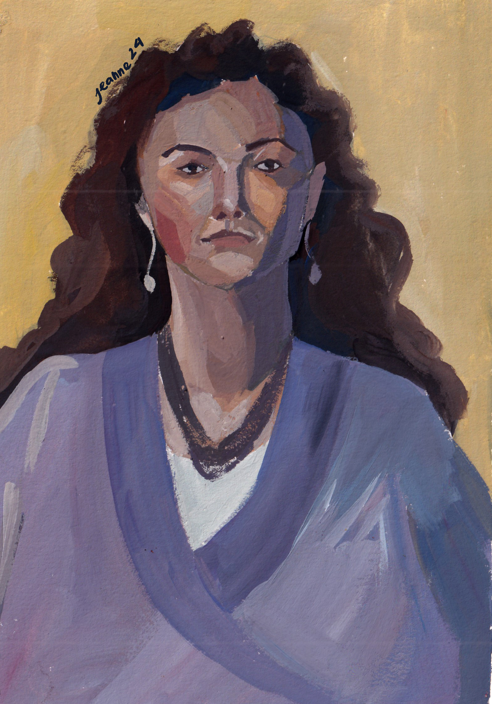
The most recent course I took is about color, and the subjects used were also portraits. This time I used gouache for the whole course, trying to mix color traditionally. The side effect of this course is that my portrait skill improved a lot as well.
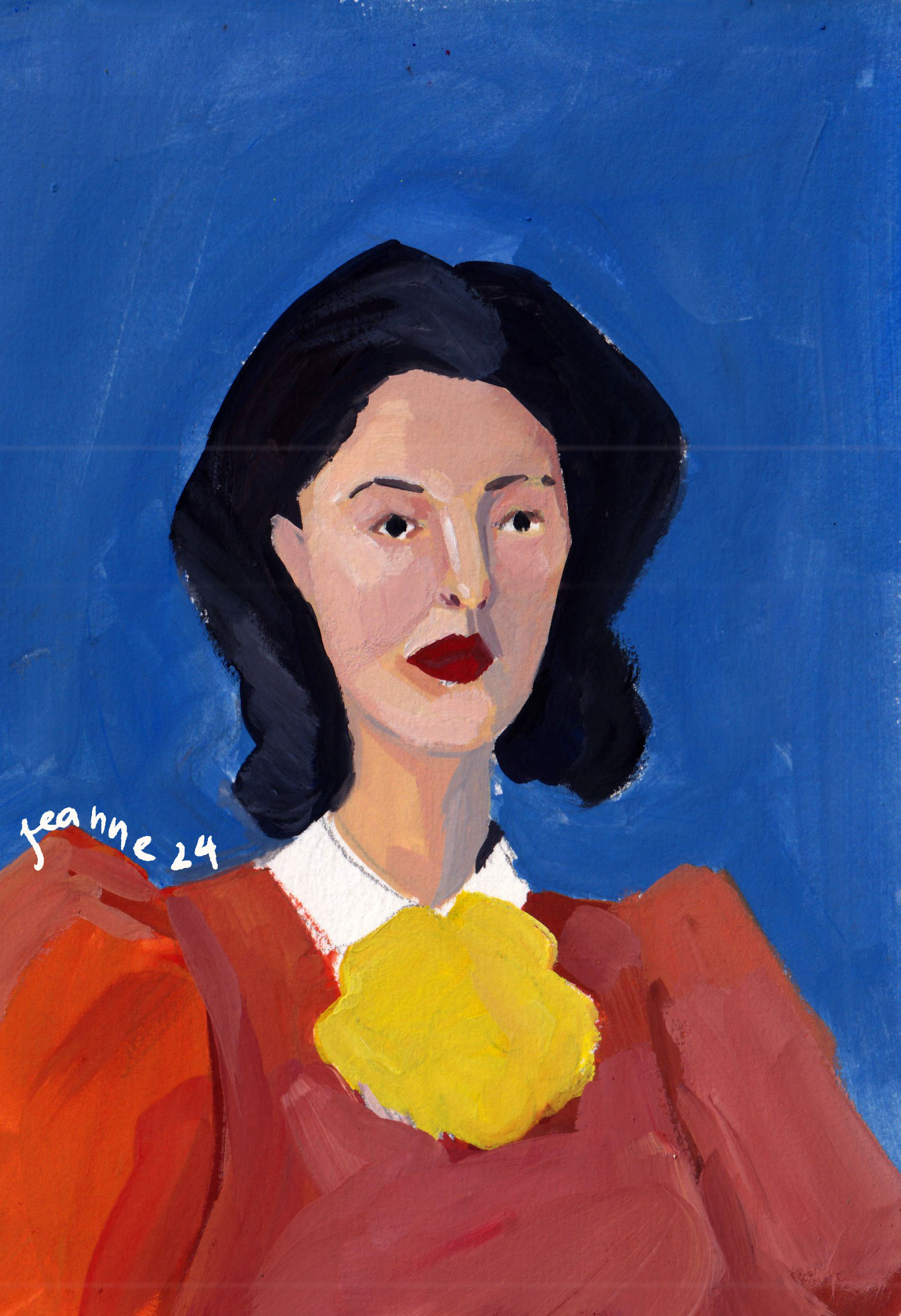
Credit: @Lee Avision/ Trevillion ImageActress Pınar Deniz
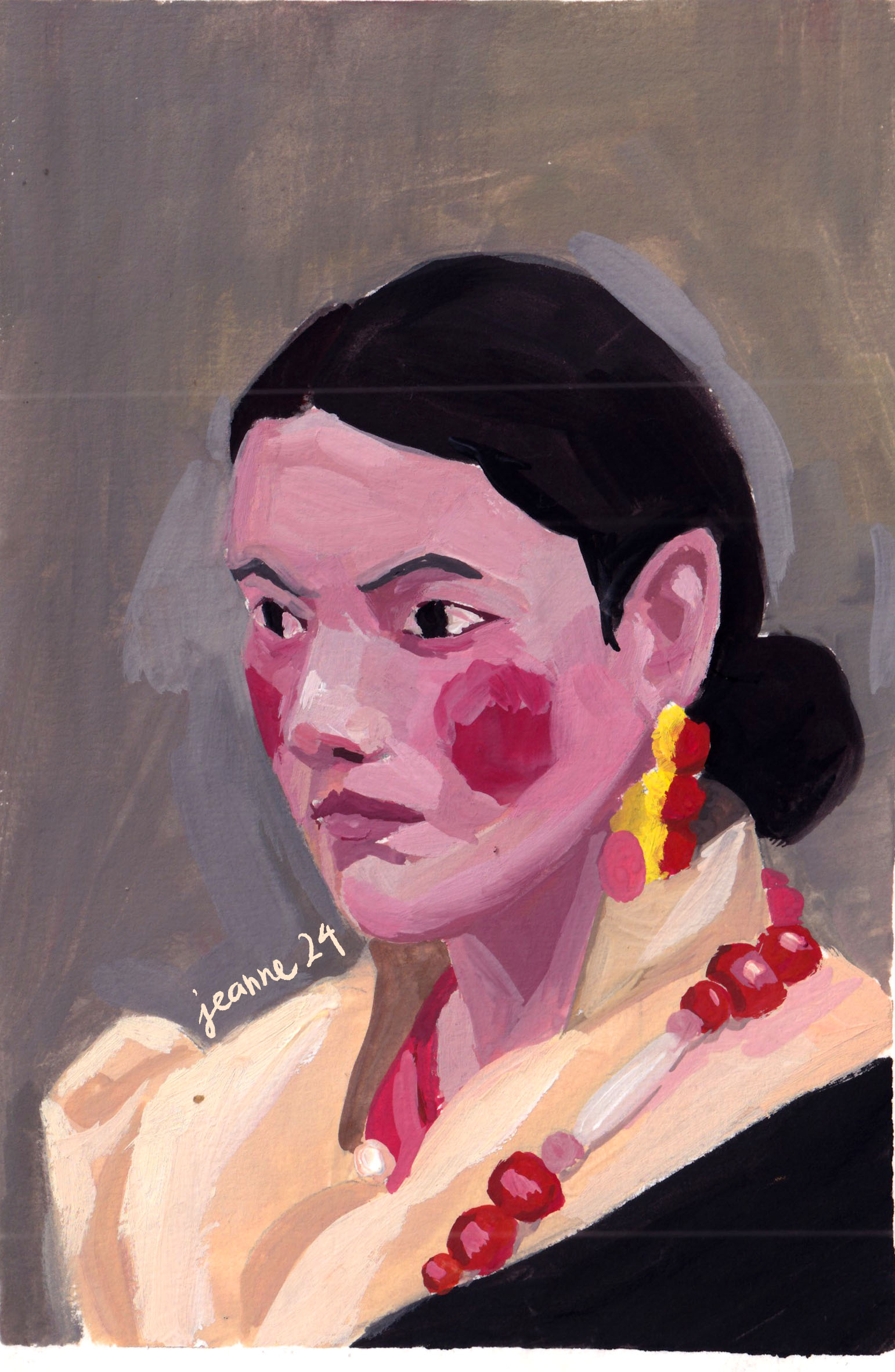
Model: Jessica from Croquis CafePhotographs by Paolo Verzone, Egyptologist Monica Hanna, from National Geographic
These paintings aren’t used for commercial purposes, just for education and promotion only.
I aim to use realistically but not in order to copy the image exactly, the important is to paint how I feel about the model, how I think about her, what’s the real or the imagined story I could tell with her eyes, her skin, etc.
What’s next?
I want to learn more about human expressions and experiment with specific lighting, especially dramatic/ theatrical set up to tell a story. And I will need to revisit the face structure to keep my knowledge fresh, but with a different approach/method to keep the art as fun as I originally started it.
My grandparents are big fans of coffee, growing up with them, I always smelled coffee in the house. Though I didn’t take to drinking coffee until my twenty-something, the smell of coffee is something I associate with a shelter and a cozy place.
A winter dayA gray cafe
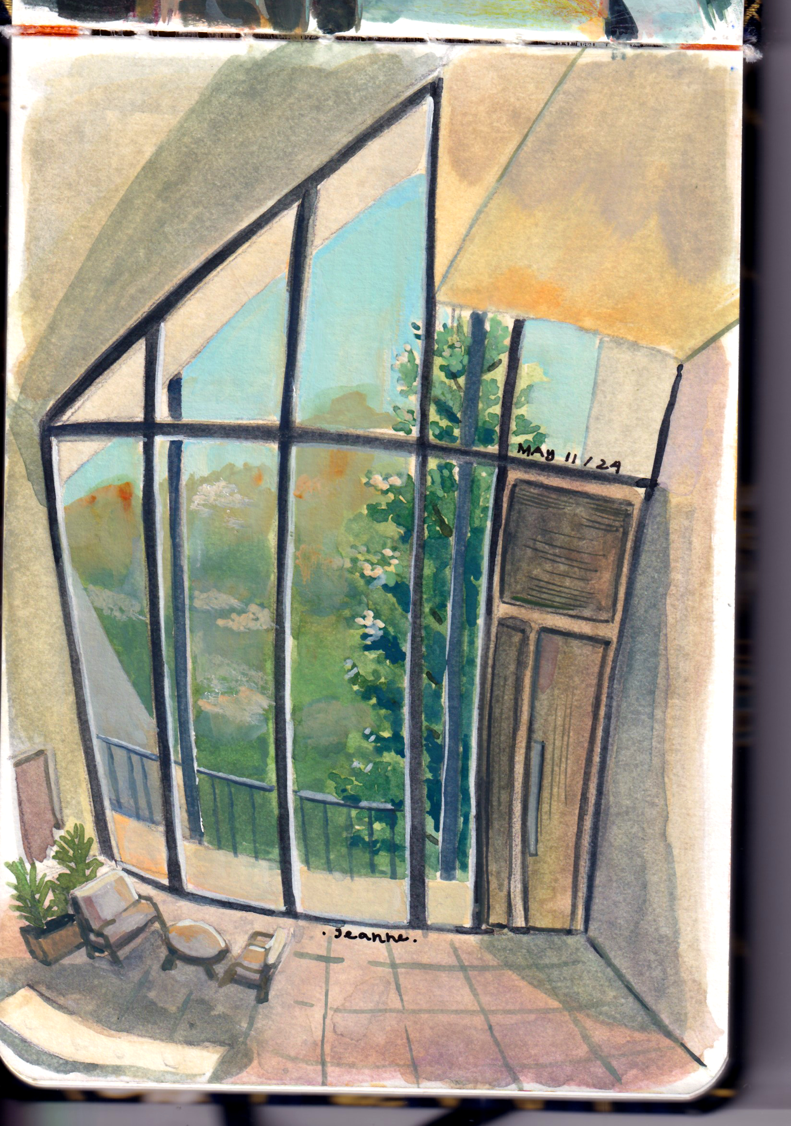
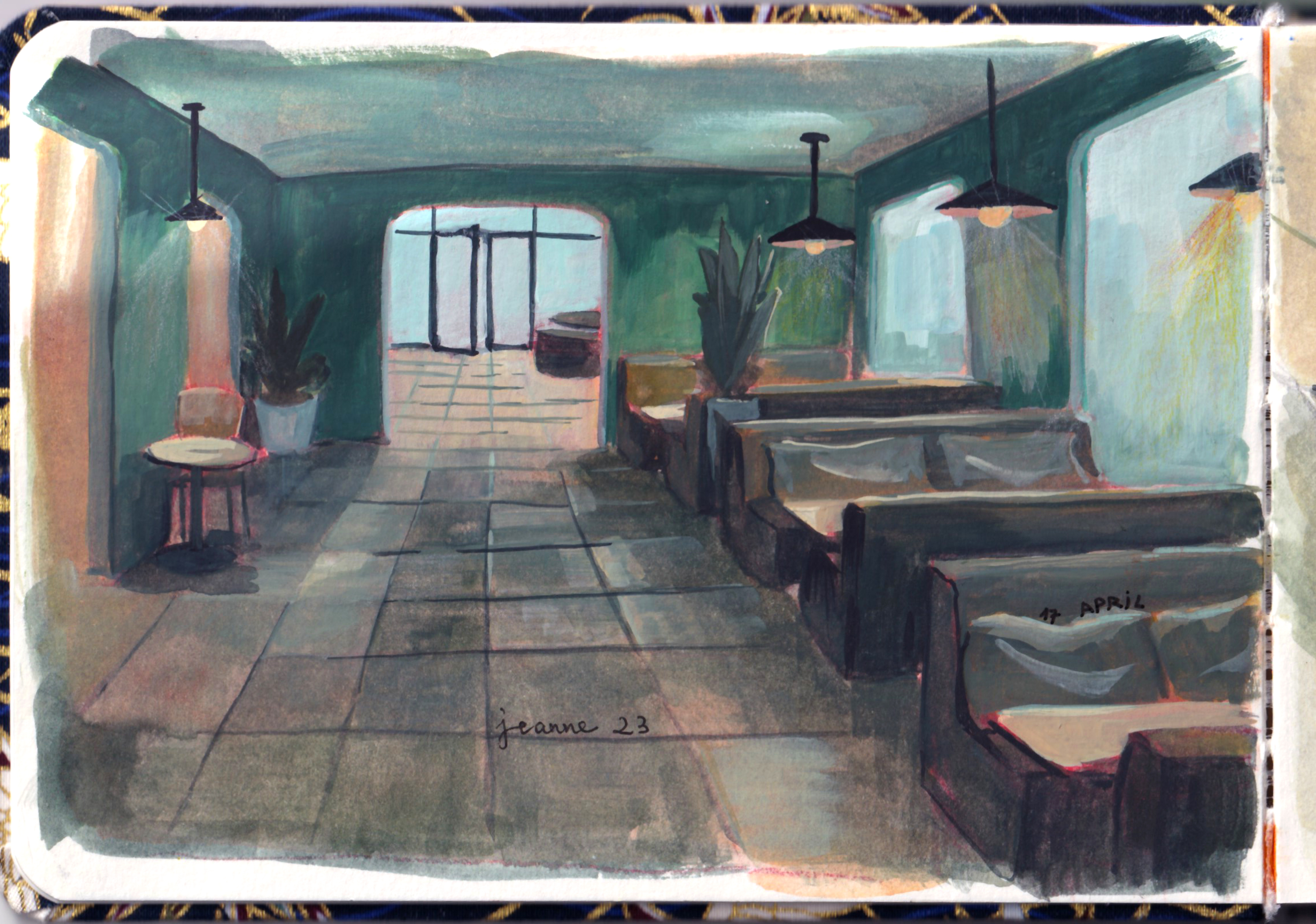
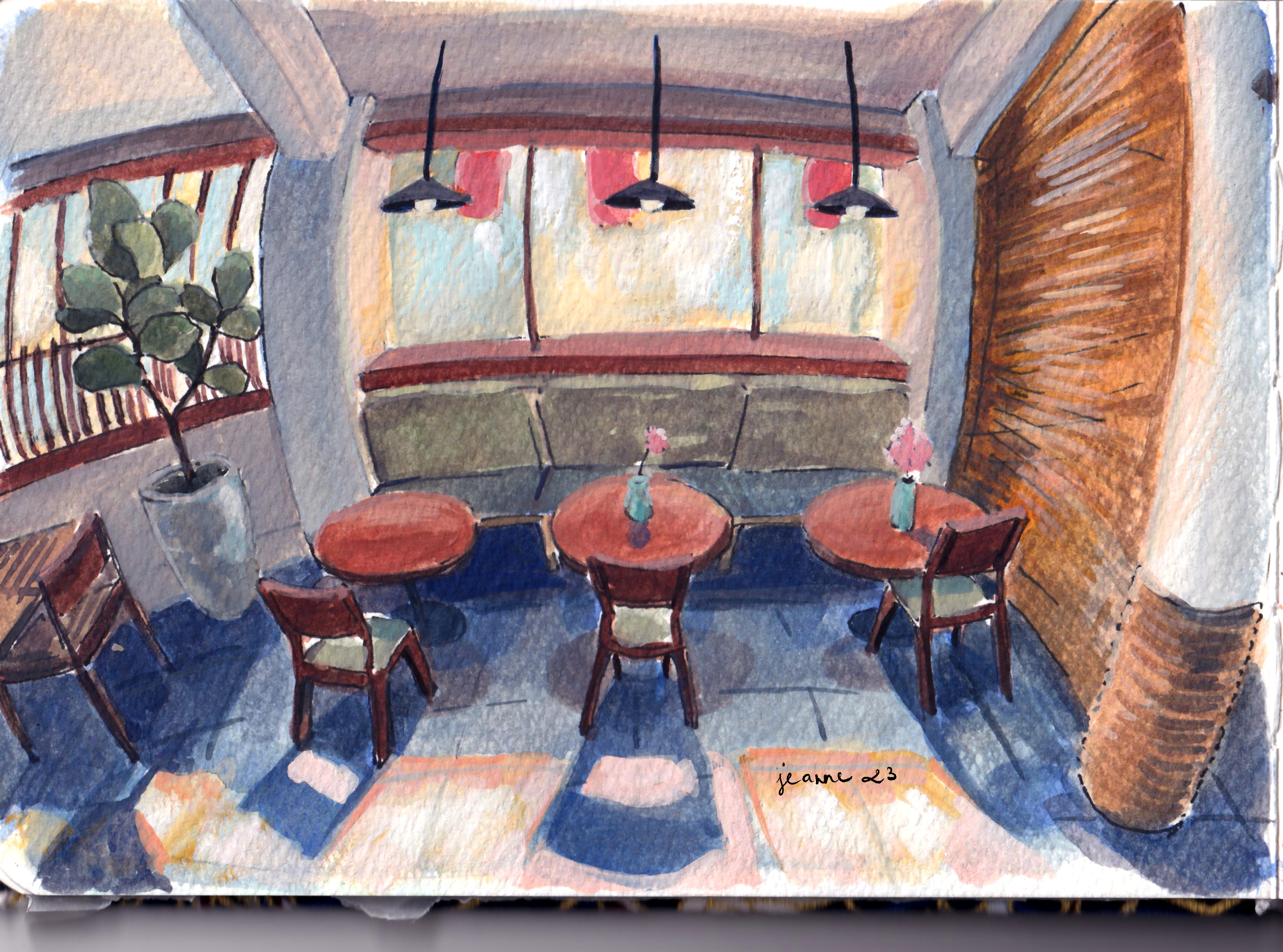
And there is a cafe for every single need of people in Vietnam, as long as I could specify how I feel and what I want. Most of the times, I prefer a quiet working cafe with a few floors, high desks and chairs, with bright lighting and lots of windows.
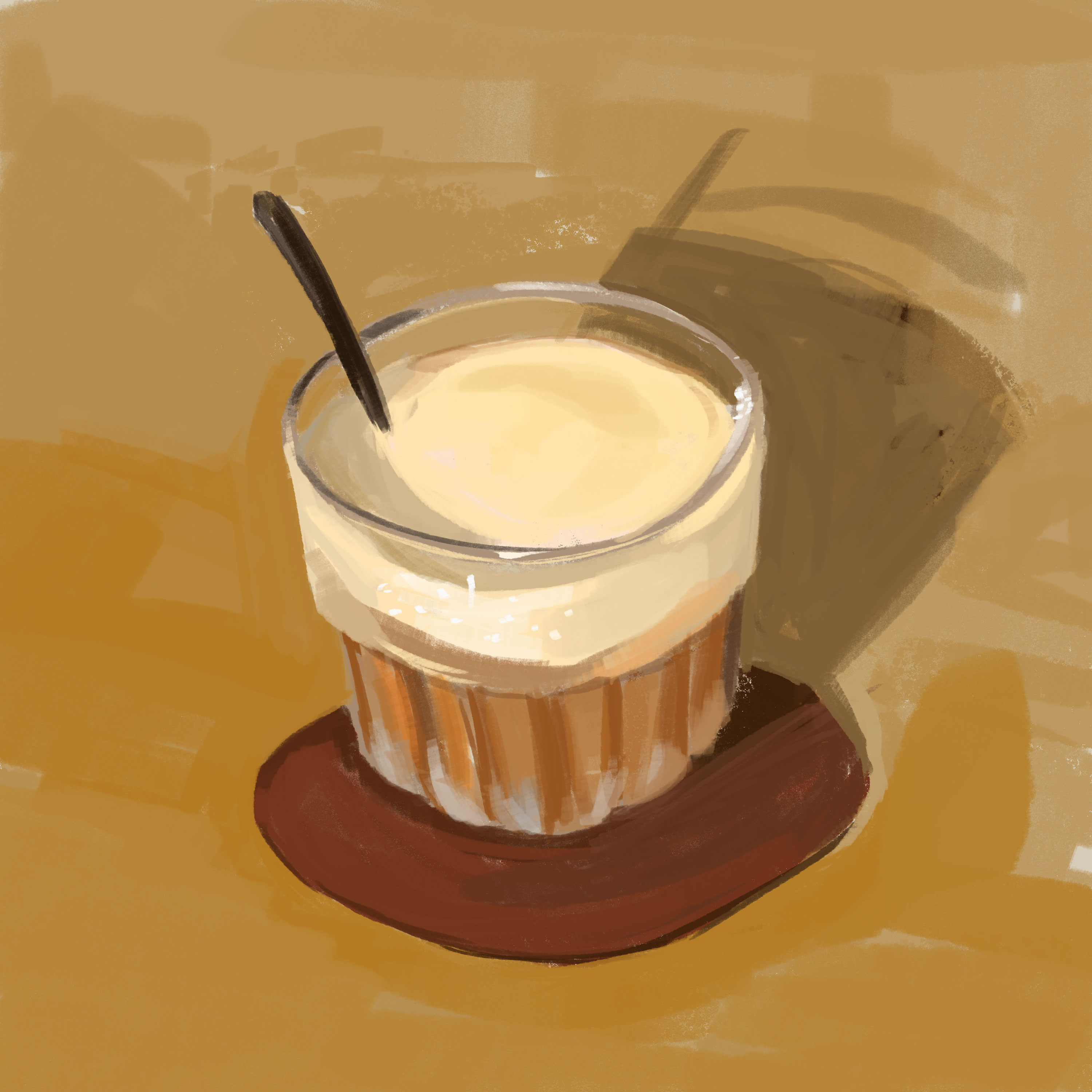
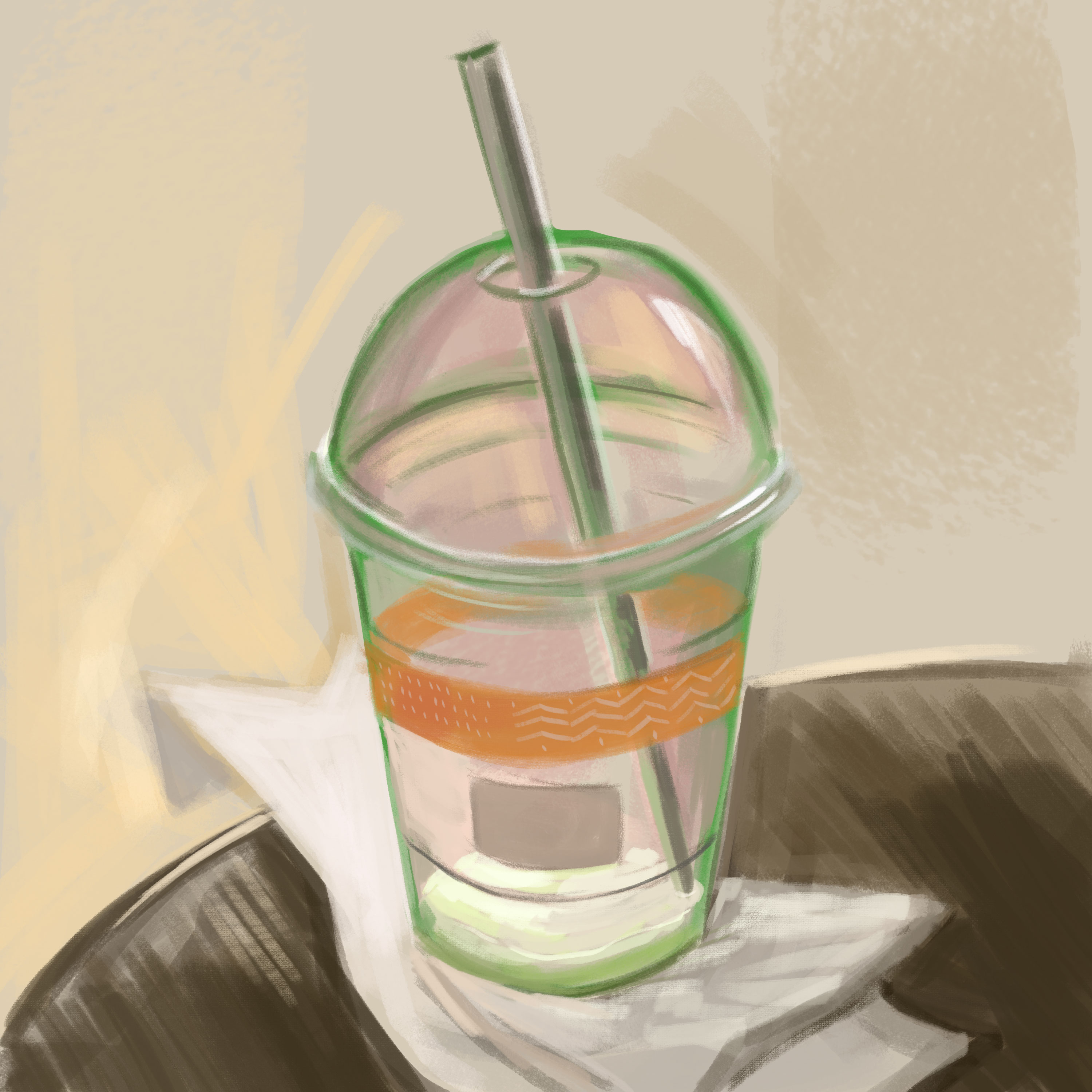
I like to do still life studies with coffee glasses and cups as well.
A modern asymmetric cafe
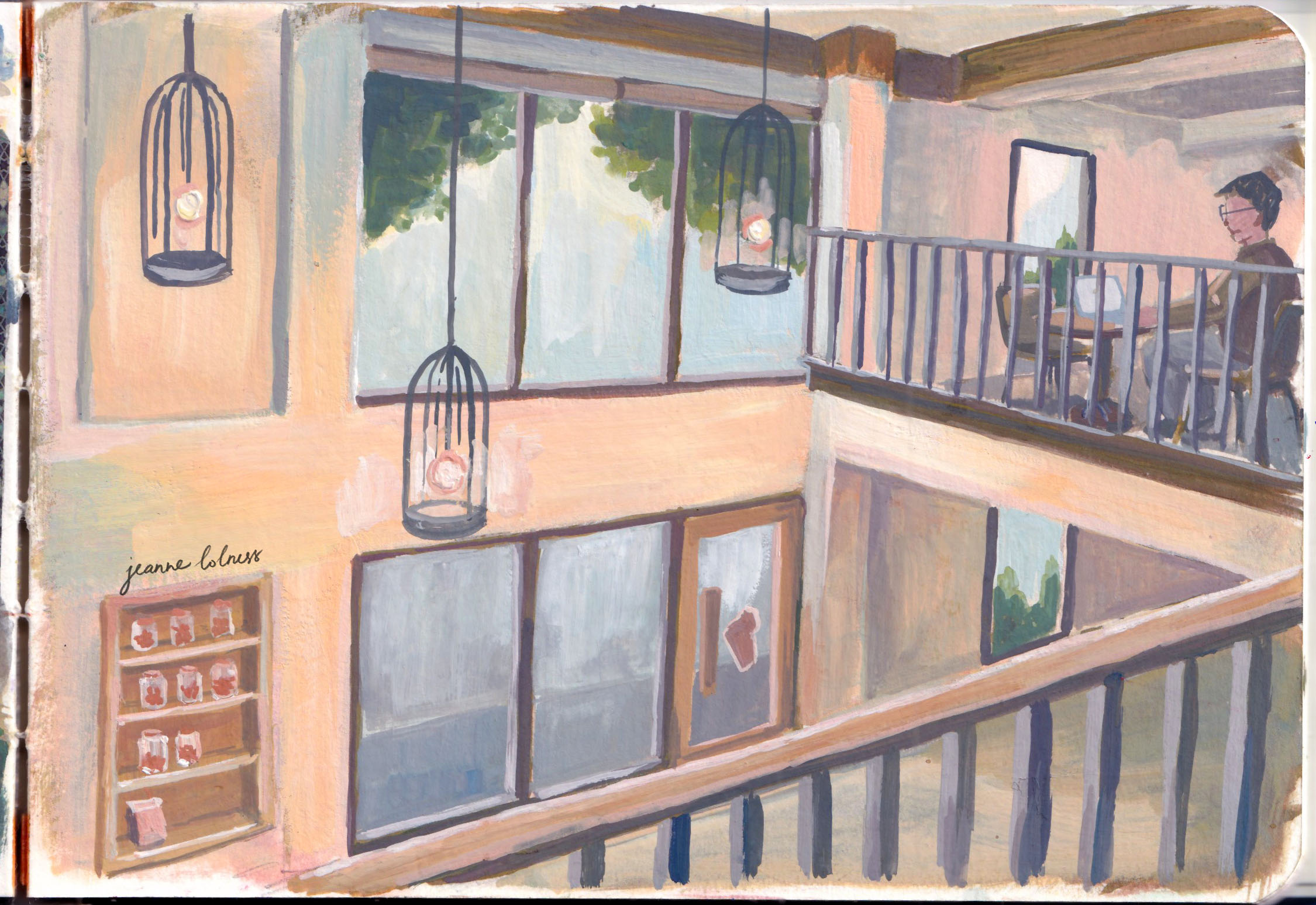
With the growth of social media and online reviewing, coffee shops start investing in interior design, good-quality chairs and tables. They become great subjects for me to paint as I observe how interior design affects how people talks and moves. Lovers meet, friends gather, strangers look at each other. All happens at a coffee shop.
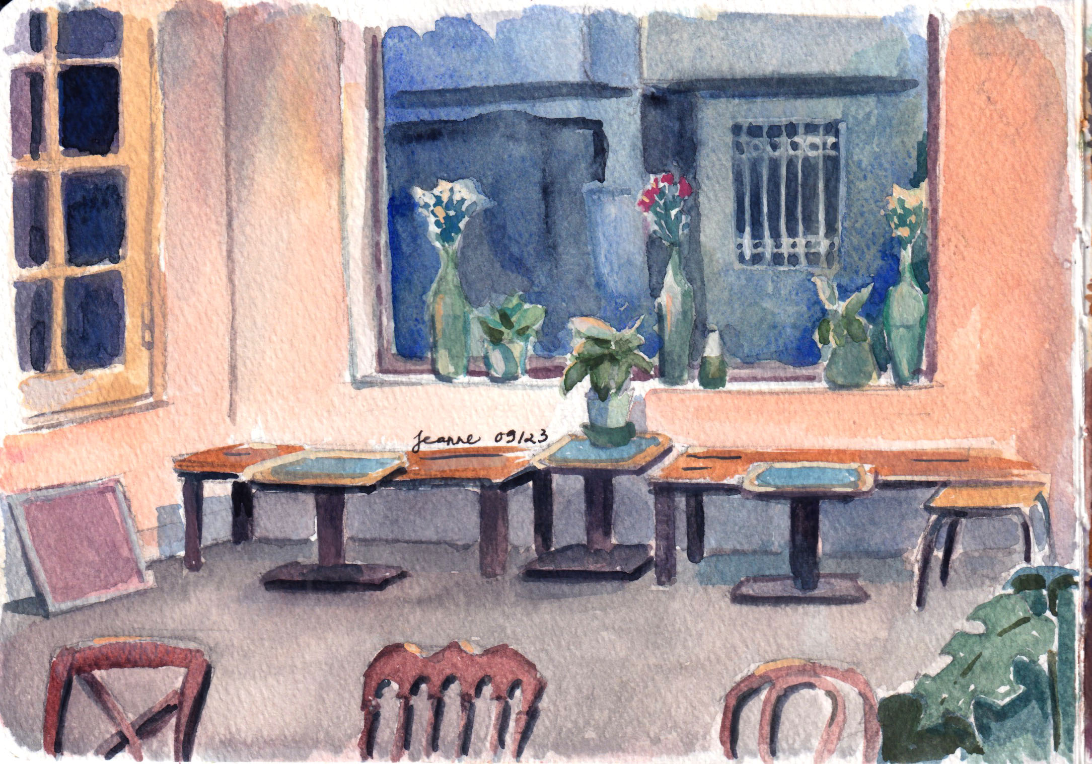
A cafe with Tet decorTraditional Vietnamese coffee phin (filters)
What’s my favourite type of coffee? “Bac xiu”- coffee with lots of milk. It usually has a warm brown color due to the milk. It tastes moderately sweet with a strong aroma from Robusta coffee beans.
A lazy coffee at noon
I usually go to a coffee shop in the mornings, the silent period. Most people would just get a takeaway before rushing to their workplaces and for more than once, I’m the only customer sitting. I don’t mind the baristas taking their time to make my drink and sometimes they have time to bring the cup to the table for me even though they don’t have to.
A summer day
There are people in my life I label: ‘coffee people’. They are the ones I never talk with but know the faces, and they know mine. It’s weird I never find the attraction to start a conversation, but they become part of the coffee shop. If anyone creates a cafe theme theater stage, ‘coffee people’ must be there. They have no lines but they have to be there.
I went to coffee shops even on rainy days. It takes more efforts but it’s another kind of experience when it rains heavily outside and you are in the warm lighting indoors sipping a warm coffee cup. The coffee shops becomes a valid shelter.
Morning light in a cafe
There’s always a compelling collision of light at a cafe. Light shines through windows, light reflects from glasses and cups, polished coffee machine, light specially made to make you feel attracted to more coffee. We are put under the spell of designed space and light.
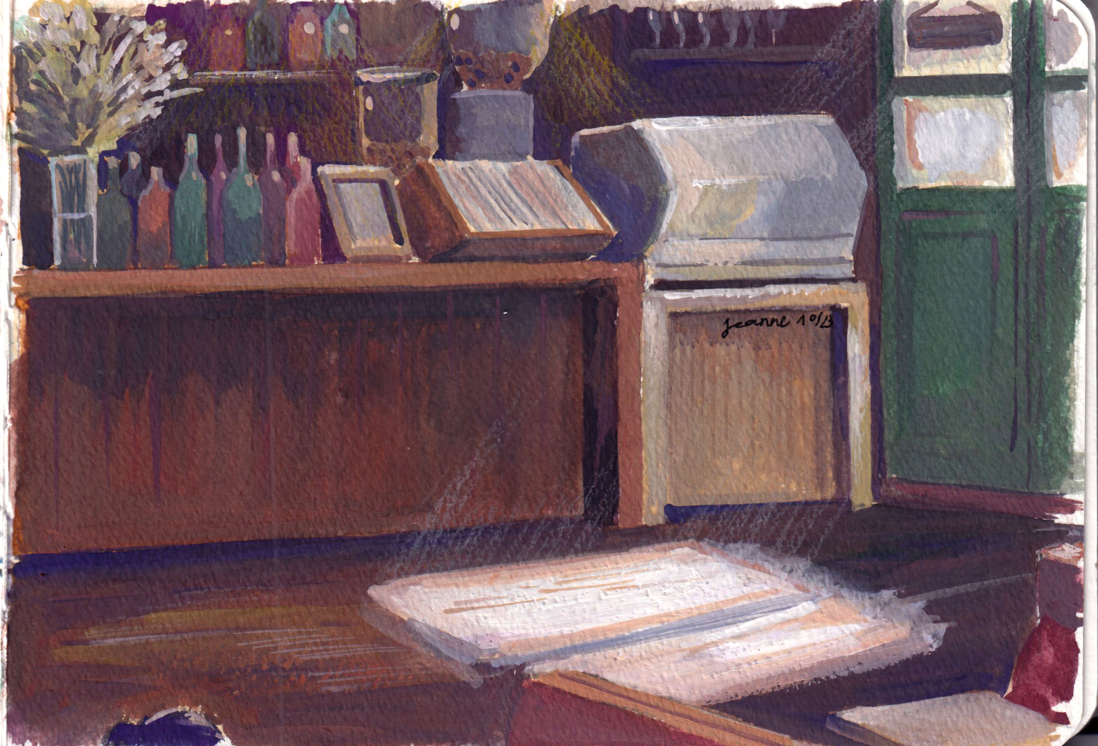
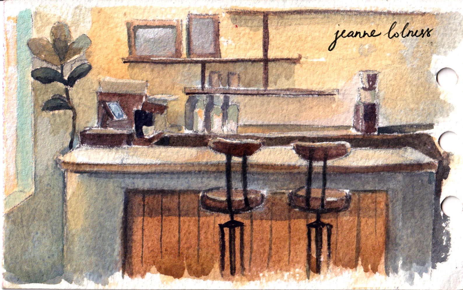
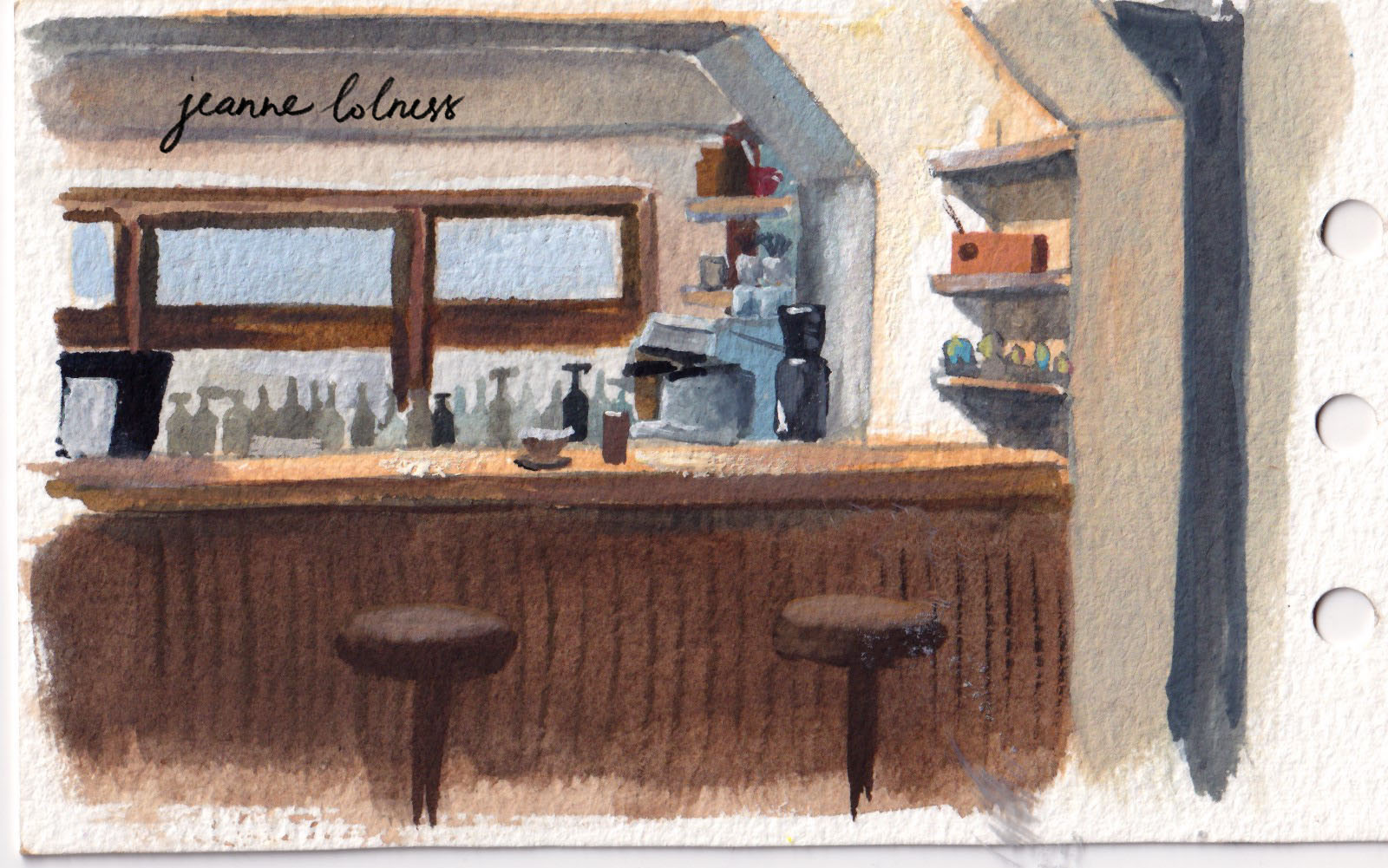
Coffee counters is a source of inspiration as well, with lots of objects and activities going around them. And the design may be similar but this counter just feels different from the other one.
Let’s take a break here and enjoy our first (or last) cup of coffee for today, shall we?
I will be exactly 26 in a few days and I often find myself dwelling on the past, not necessarily my childhood or adolescence, but the years after graduating from university. Though I kept a big journal, I still wonder how I have got over all of these things. I don’t share my journal, because it’s very personal and I mostly wrote about my relationship with people rather with arts. But I think a journal about arts could be shared, hopefully helping anyone reading get over the feeling of being lost in our 20s.
As a freelance illustrator, summer is often the slow season. People go on holiday, there are no big celebrations and this year, with generative images and recession all over the globe, it’s even a slower summer for me.
I tried to take this as an opportunity to improve my skills and were ambitious when I plan for the summer. I was already ambitious when I wrote down my new year resolutions, even though I have never completely achieve them. I want to continue paint landscape and improve my portrait, storyboard, people in drapery and animals skills.
It was smooth with animals and portraits because I started practicing with them already in spring, I just need to finish them as I go. Storyboarding is surprisingly hard because there are not much to remember, it’s more about imagining a camera running around in space and merge them with your perspective skill. It starts growing too hard and I have to decide to delay learning it, trying another source of book and lectures.
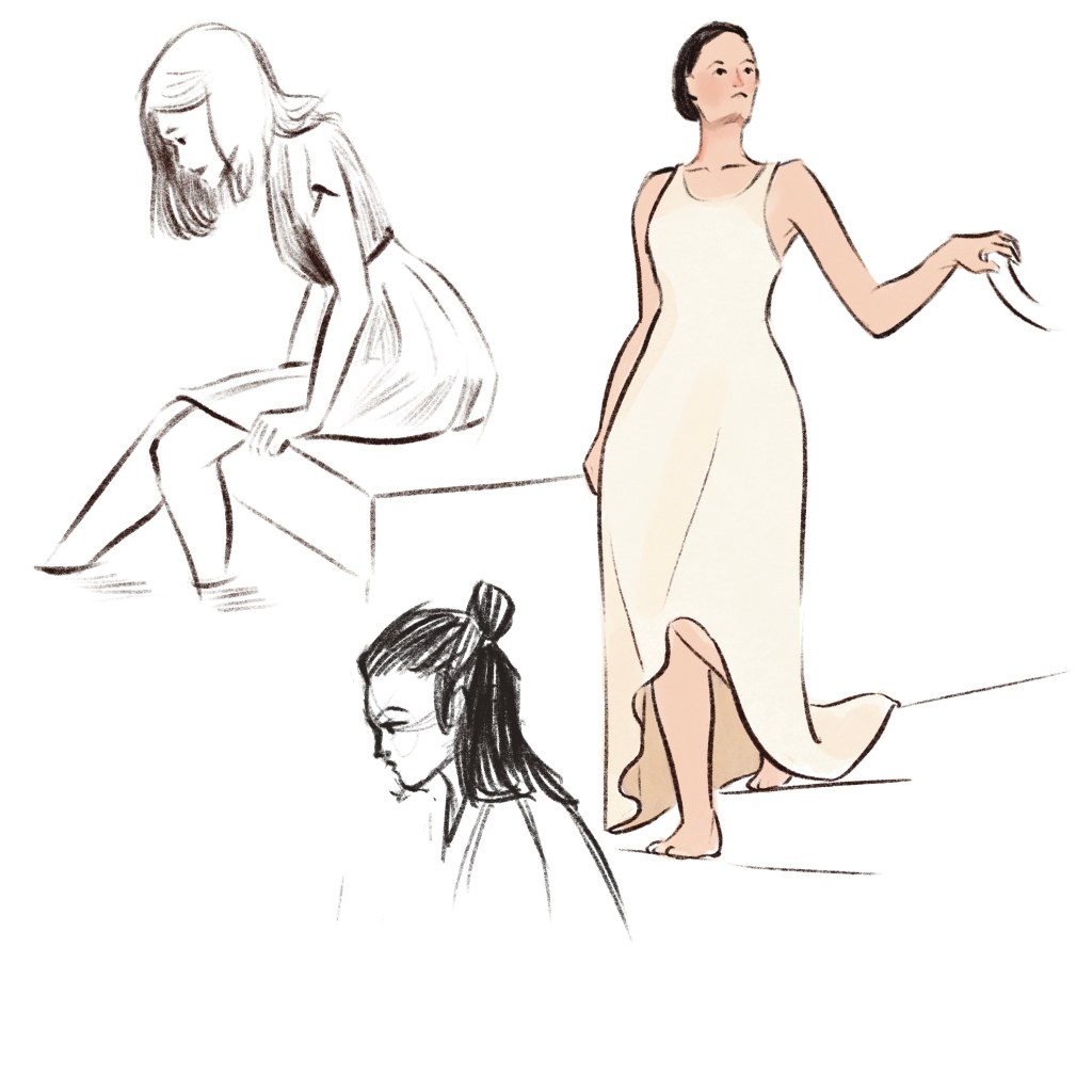
Sketching people in drapery is figure sketching but a new level. I practiced figure sketching with nude models or minimal dressed models so when the big challenge is to imagine how their arms and legs move under the fabric. And choosing what folds to tell the story; there will be folds that can be memorized and folds you just add because of a specific pose.
What I didn’t plan to study is learning to use Procreate, because I’m still not sure whether to get an Ipad or a new laptop. But I decided to get an Ipad, because I prefer something lightweight and minimal. I never fully use and understand Photoshop and it’s too heavy, Procreate works much better for me, it’s just drawing.
Some Procreate sketches
Apart from new skills, I still try to paint landscape both outdoors and with images I gather myself. This summer I painted a lot with my Holbein Acrylic Gouache, which has brighter tones compared to my old Nevskaya Palitra gouache.
It sounds like I have learned and done a lot of things, but actually I felt like a crap all the time. When I started freelancing and studying arts on my own, I believed after a few years, things would get easier and even if I’m not a genius, I must have gather skills and projects along the way. I did gather new skills and projects, but the feeling of having nothing and being nobody is still the same. I guess that the curse of being an artist.
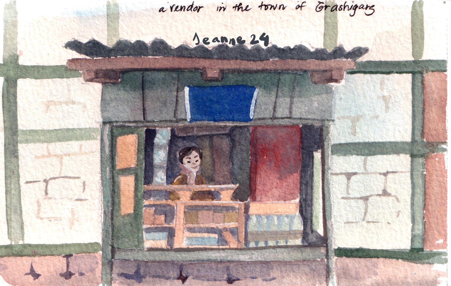
Growing up in Hanoi, I have an affection to every cornet of this city. Especially those are less known with tourists, because these places feel more authentic to me. When sitting in a cafe painting these scenes, I feel like capturing a moment of this city, a moment that will be gone with unavoidable modern development.
That’s why I tend to chose old houses or historic structures, so that theirs stories can live on through my paintings.
Below is my favorite painting of 2023 – this captures idyllically the area I grew up in, a very ordinary area with no tourist attractions. I’ve walked pass these houses hundreds and hundreds time.
I know that one day I will miss this scene dearly.
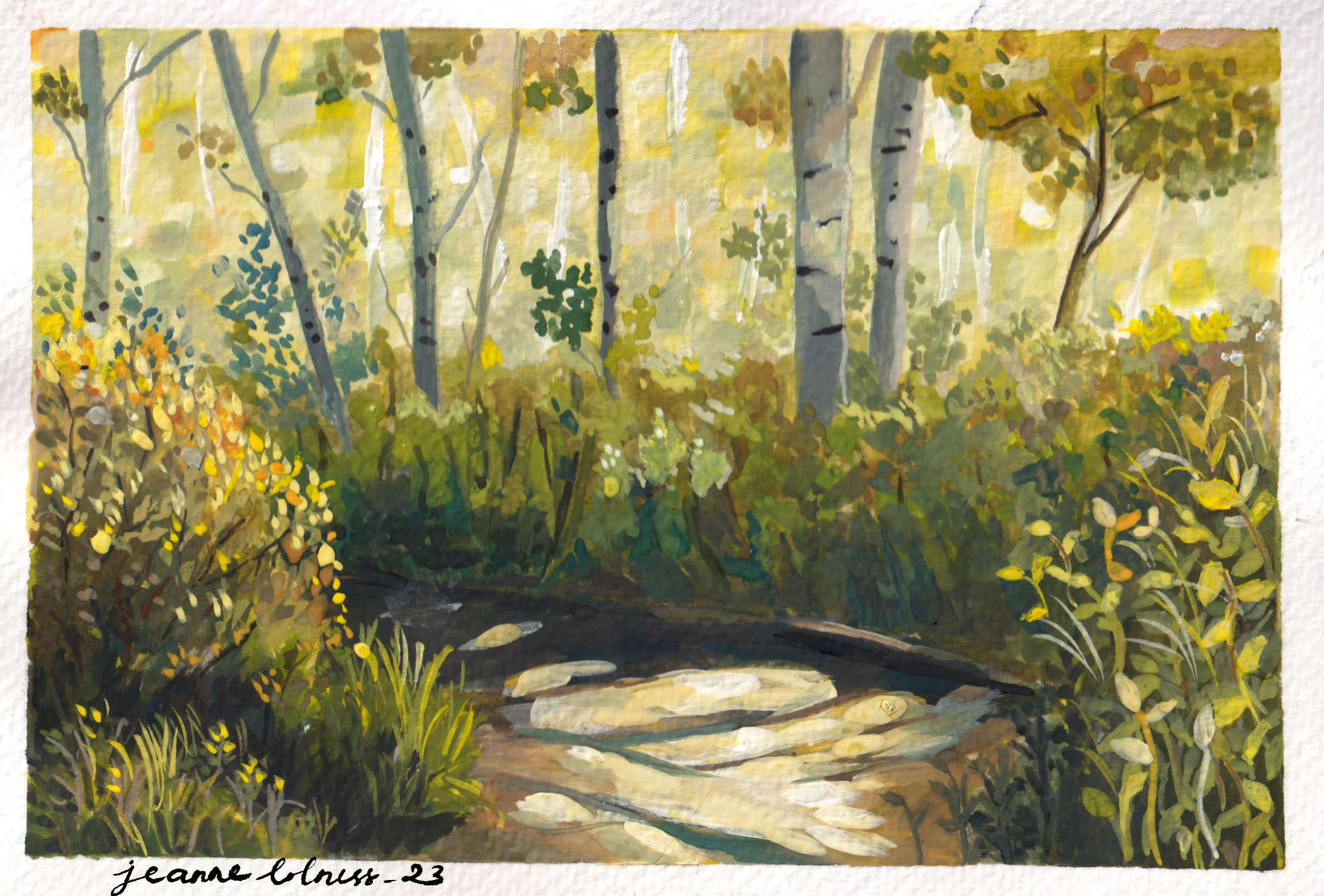
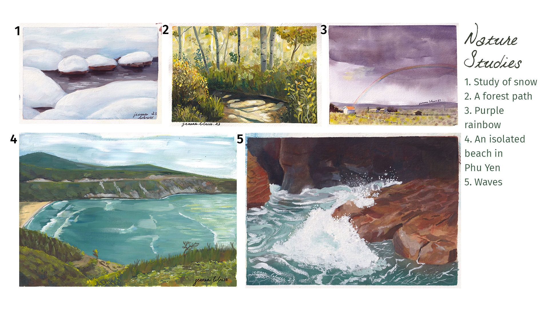
2. Studies of nature
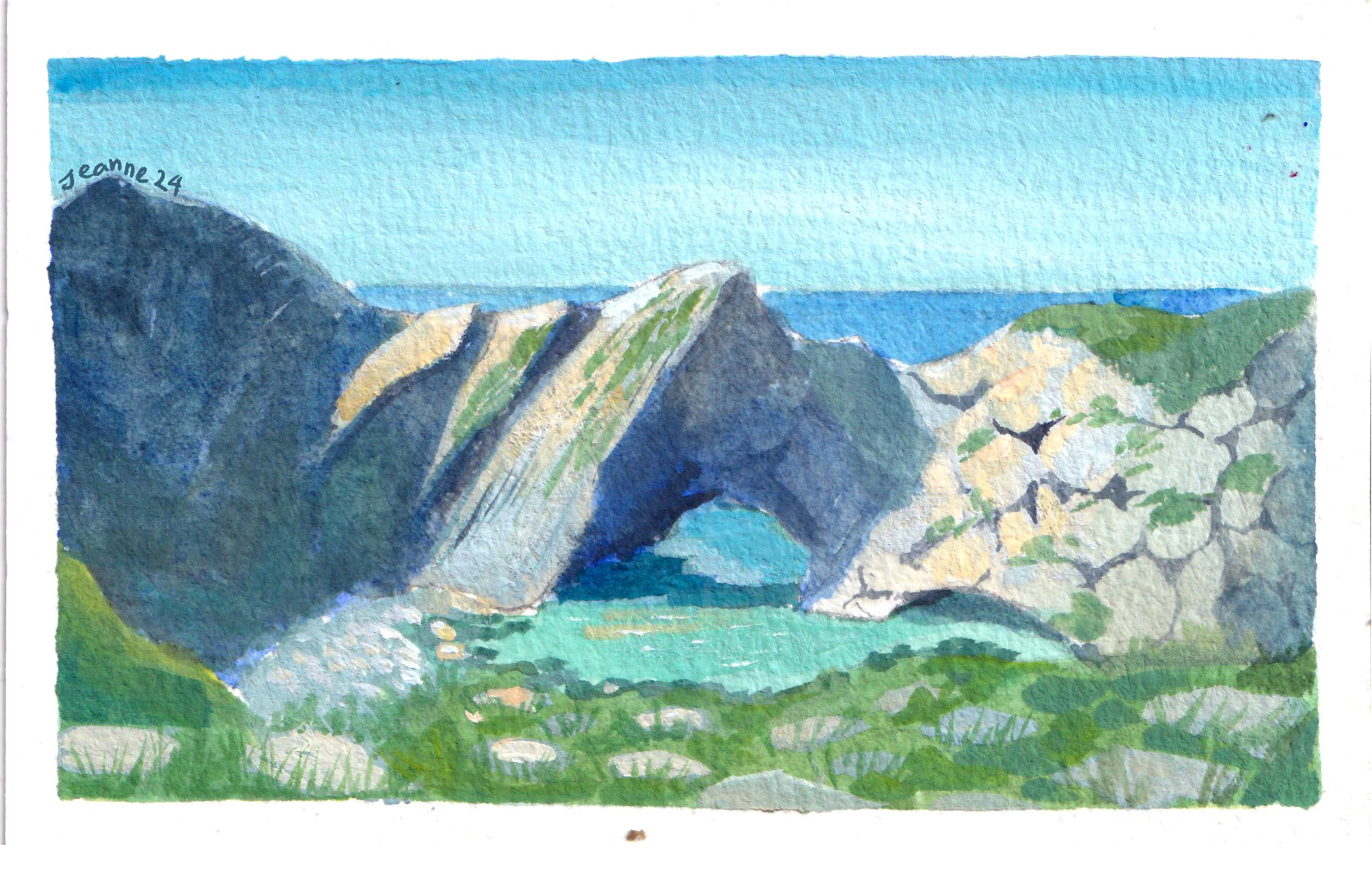
One big drawback of growing and living in a big city is that I rarely get to see a scene just full of nature. All these studies were based on photos.
I personally love scenes of tree and water, both allows me to play with color and reflection. Painting nature is also more liberating since it seems like I’m having a secondary experience with these scenes, an escape from my bustling city.
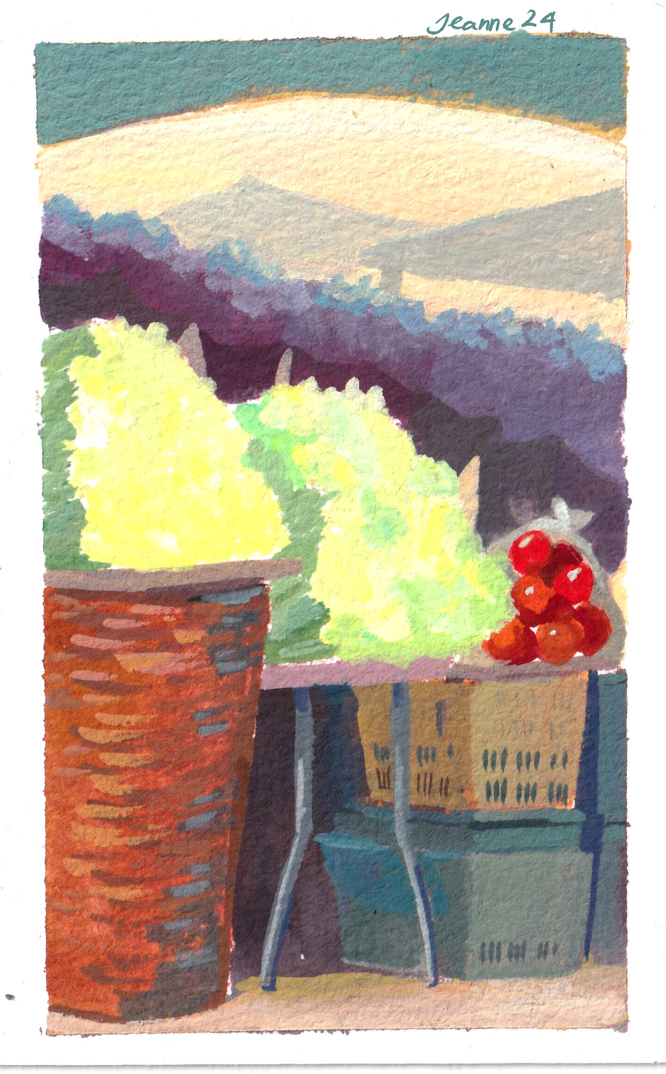
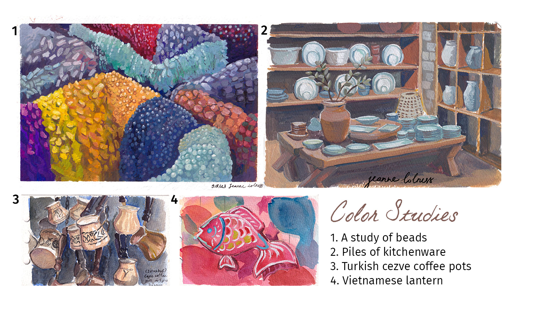
3. Studies of color
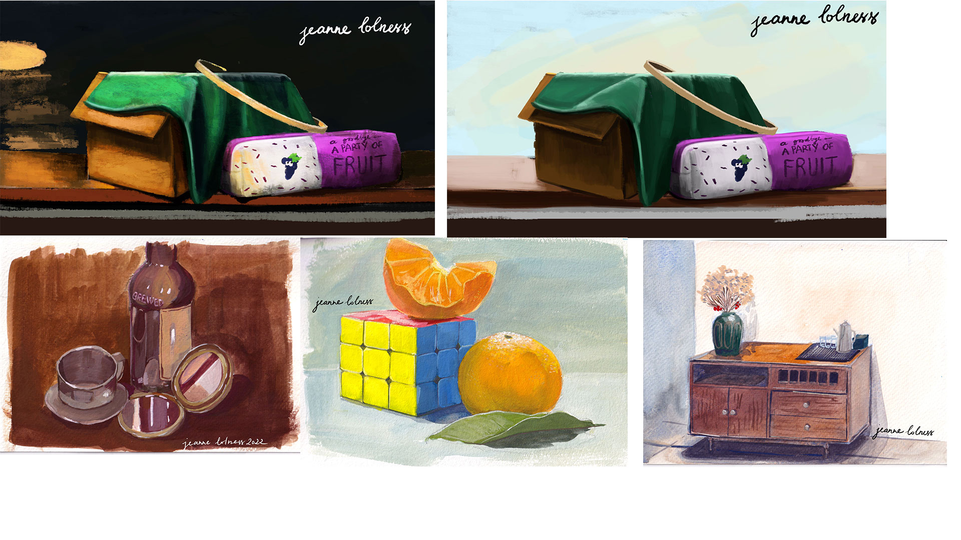
I find it still life studies useful but a bit boring, so I often paint scene with lots of similar objects to practice instead. These objects sitting together show contrast in colors and interesting negative space.
Painting traditionally (or trying to mimic traditional painting on digital tools) always excites me, I can’t control what will happen. Mixing color in a palette creates harmony in the painting that can’t be achieved in digital painting.
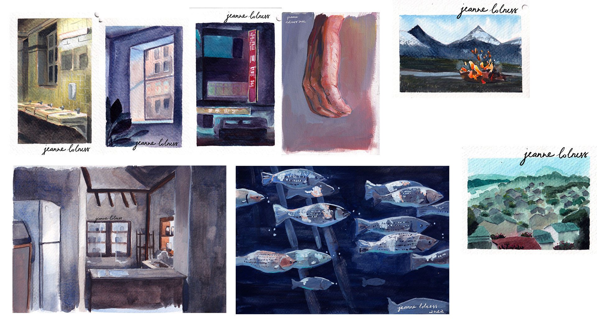
1. Color and Light studies
In these paintings below, I embraced on how the light reaches different surfaces in a wide range of situation.
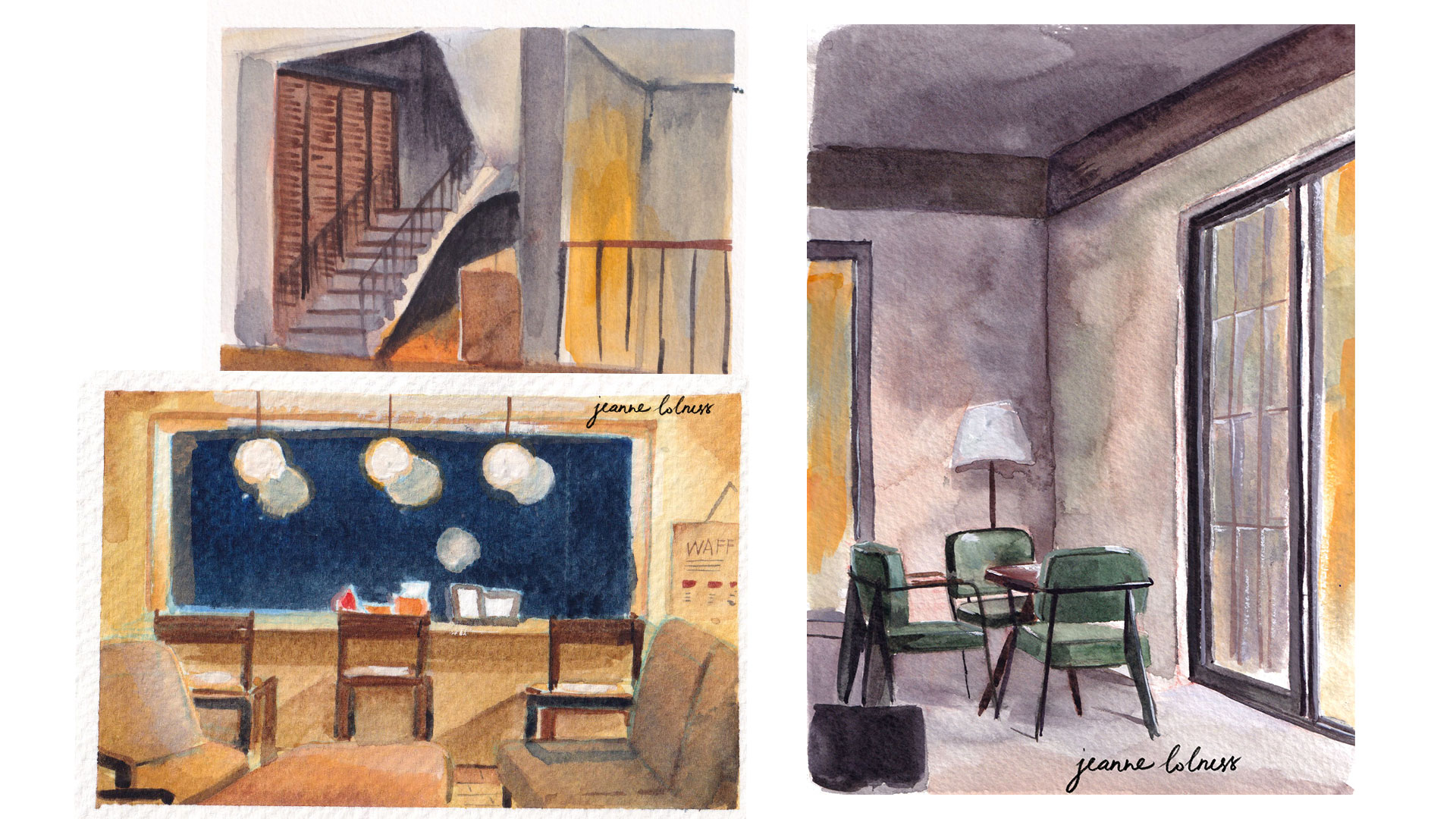
2. Cafe studies
I spent lots of time painting and working in cafes. I enjoy finding and keeping a favorite place for quiet alone time as well as exploring new gems in my city.
3. Still life studies
Still life studies are also part of learning about how color and light works. In these studies, I learned about the smallest reaction between different surfaces and objects.
I tried to set up objects myself using things in my home, but sometimes I do use images as references.


