Blue is a primary color that often goes unnoticed in its significance. Yet, historically, it was one of the most expensive and revered hues. Ultramarine blue, in particular, was as valuable as gold because it was derived from finely ground lapis lazuli stones, sourced primarily from Afghanistan and transported to Europe. Its use can be traced back to the Indus Valley Civilization and then to the creation of the funeral mask of Tutankhamun.
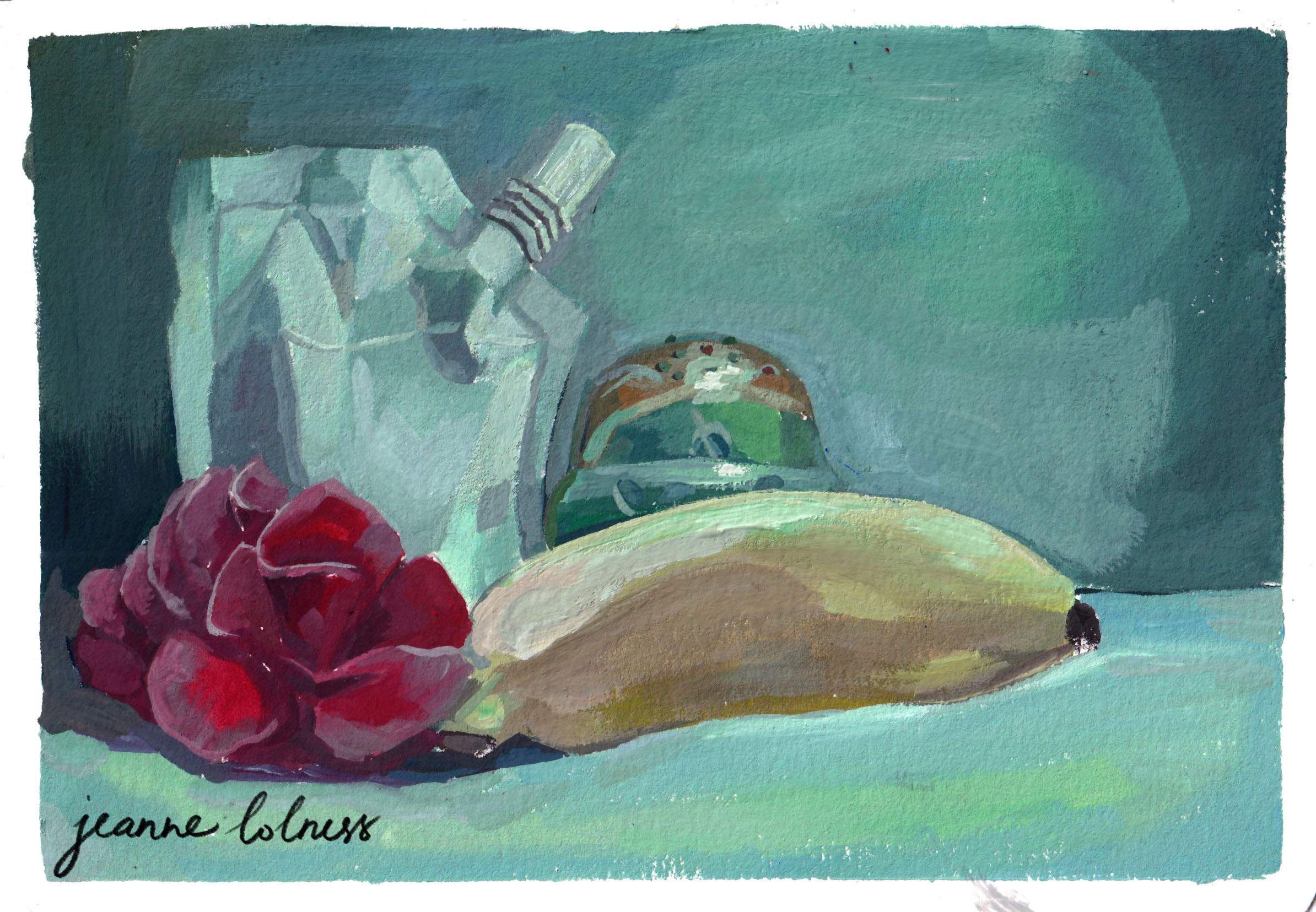
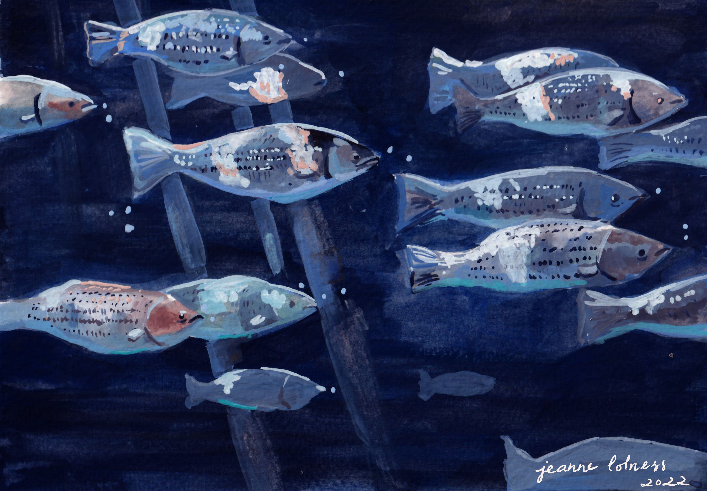
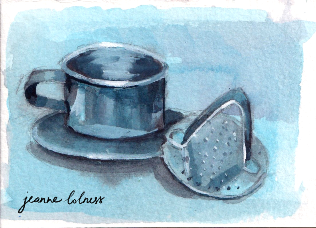
For me, ultramarine blue is my favourite, though I rarely use it straight from the tube. A touch of blue in a mix lowers the value of colors without losing their vibrancy. It’s also my go-to for creating shadow tones. In this series, you’ll see paintings dominated by blue (both ultramarine and azure). From blue skies and seas to nocturnal scenes, portraits, and still life, this color is the centre.
Egyptian blue, the first blue ever made, was produced in the third millennium BC in ancient Egypt. It was synthesized from silica, lime, copper and an alkali. Its blue color comes from a substance that is identical to a rare, naturally occurring mineral made of copper and silicate.
Until 1700s, blue was mainly made from lapis lazuli and the related mineral ultramarine. In 1709, a big discovery happened when German chemist Johann Jacob Diesbach created Prussian blue. He accidentally made it while experimenting with dried blood and iron sulphides. At first, it was called Berliner Blau. By 1710, the French painter Antoine Watteau started using it, and later his student Nicolas Lancret did too. It quickly became popular for making wallpaper, and in the 1800s, French Impressionist artists also loved using it in their paintings.
Blue has a special meaning in many cultures around the world. In some places, it’s seen as a symbol of peace and calm, while in others, it represents strength and protection. Blue was chosen for the army in many countries, in fact the term ‘navy blue’ comes from Royal Navy adoption of blue informs for its officers. In the Torah, Israelites were instructed to add a blue thread, called tekhelet, to the fringes of their garments, made from dye extracted from a Mediterranean snail. This blue was seen as a symbol of God’s Glory, and meditating on it was believed to help connect with the divine, representing purity and the Throne of God.
During the Dutch Golden Age, artists like Johannes Vermeer used blue to add depth and realism to their paintings, as seen in his famous “Girl with a Pearl Earring,” where the blue attire of the subject stands out beautifully against the background. Blue became an essential color for capturing both beauty and spirituality in art.
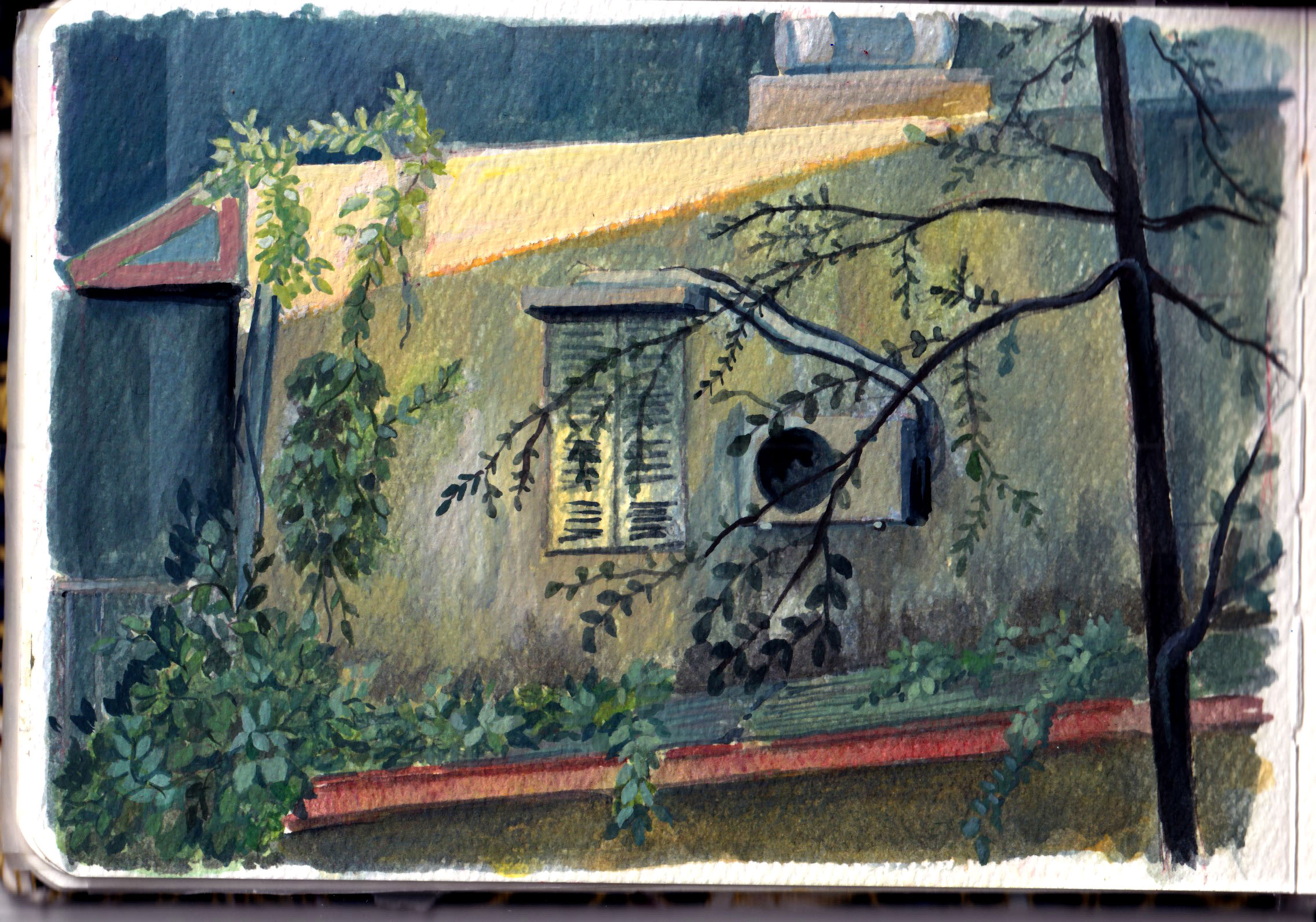
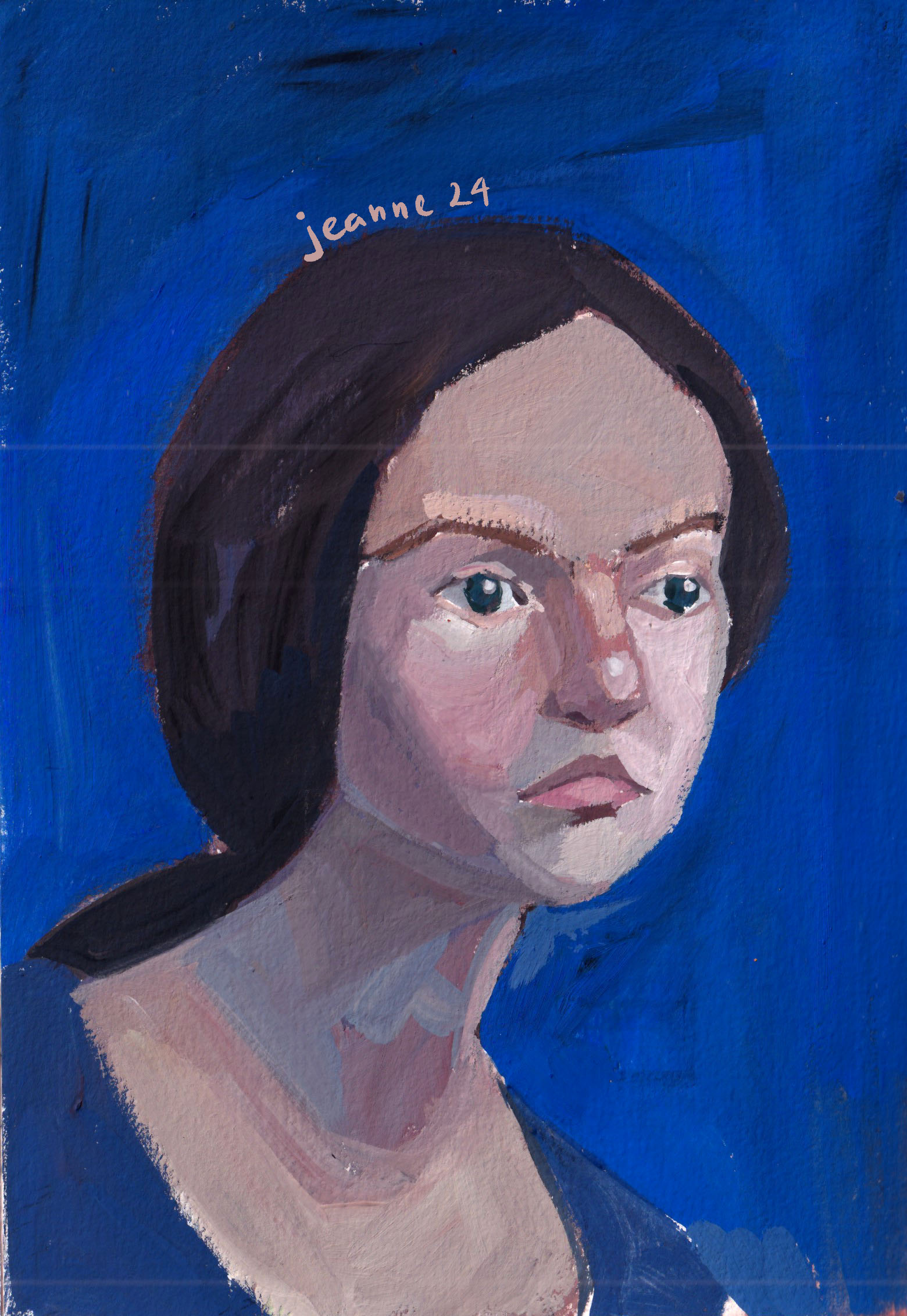
In the above portrait, I realized that blue can sometimes appear warmer than the skin tone, particularly when it’s saturated.
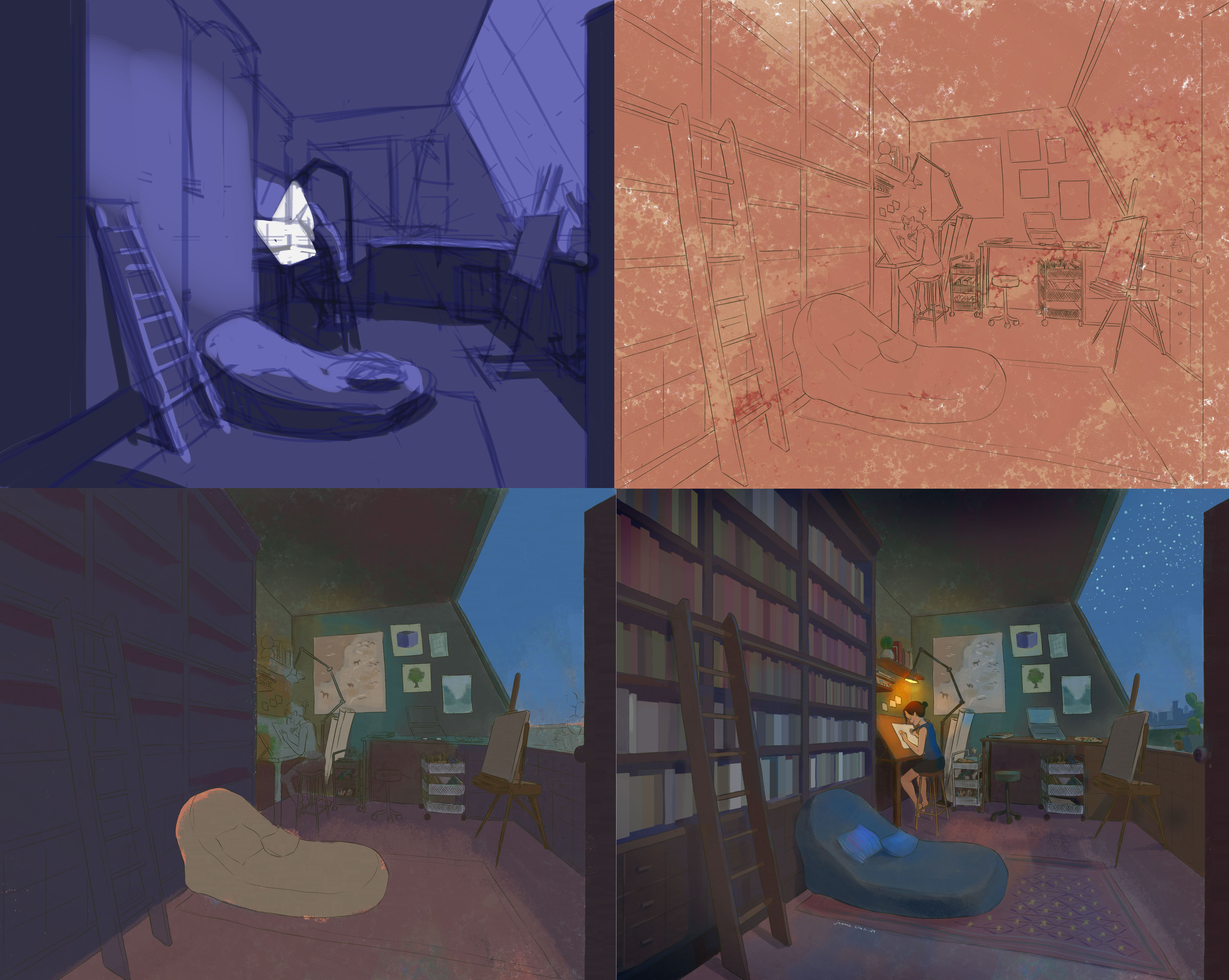
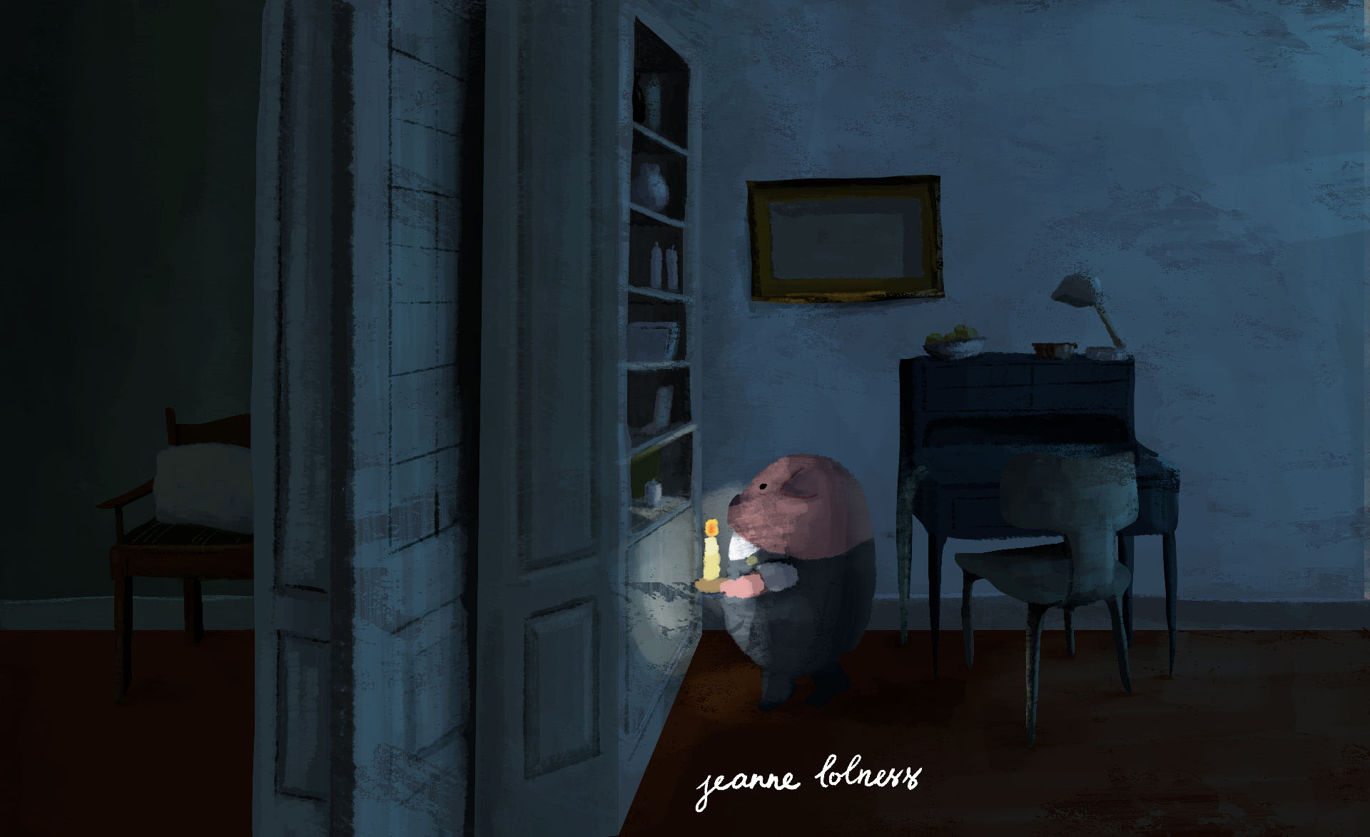
Above is a quick break-down of my digital painting of a night working in my dream studio. A tip I have learned is that you can use a warm underpainting to keep the blue “warm”. This is also true in real life observations: outside light often has a cool tone while interior objects, made of wood, are “warm”.
Soft blue often appears on the sky in sunny days due to a phenomenon called Rayleigh scattering. When sunlight enters Earth’s atmosphere, it is made up of different colors of light, each with a different wavelength. Blue light has shorter wavelengths and is scattered in all directions by the gases and particles in the air.
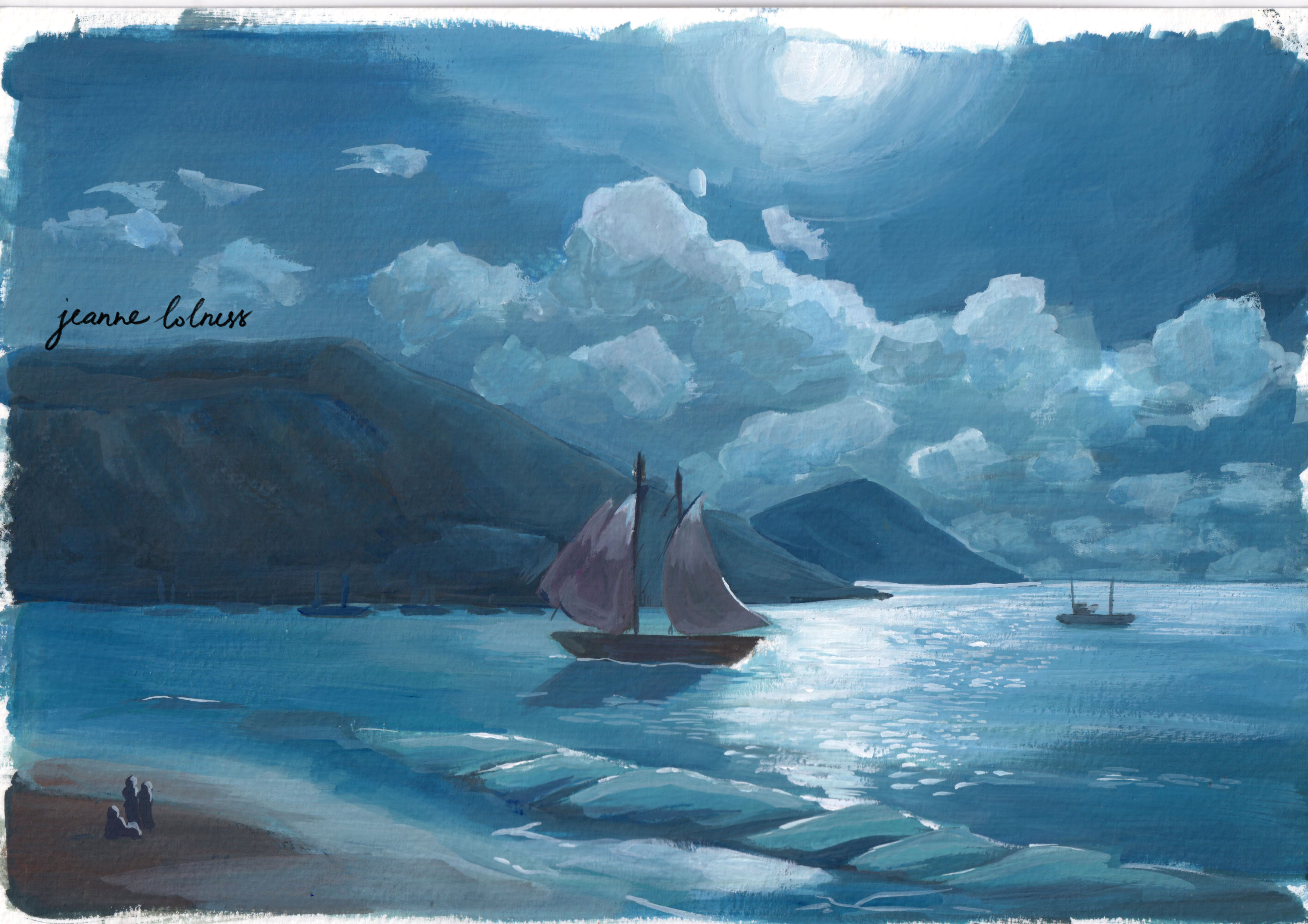
When painting blue sky in a sunny day, I often lay down a soft yellow first and use the same blue to create shadows. This shadow can be seen most clearly with a bright object such as white walls.

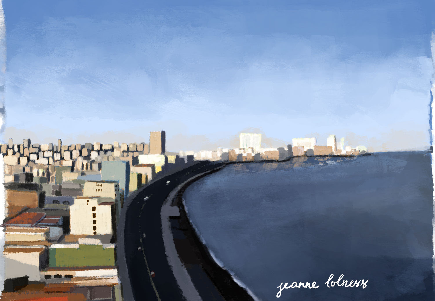
Similarly, the sea appears blue due to the way light interacts with water. Water absorbs colors with longer wavelengths, like red, orange, and yellow, more easily, while blue light with shorter wavelengths is scattered and reflected back to our eyes. This makes the sea look blue, especially when the water is deep.
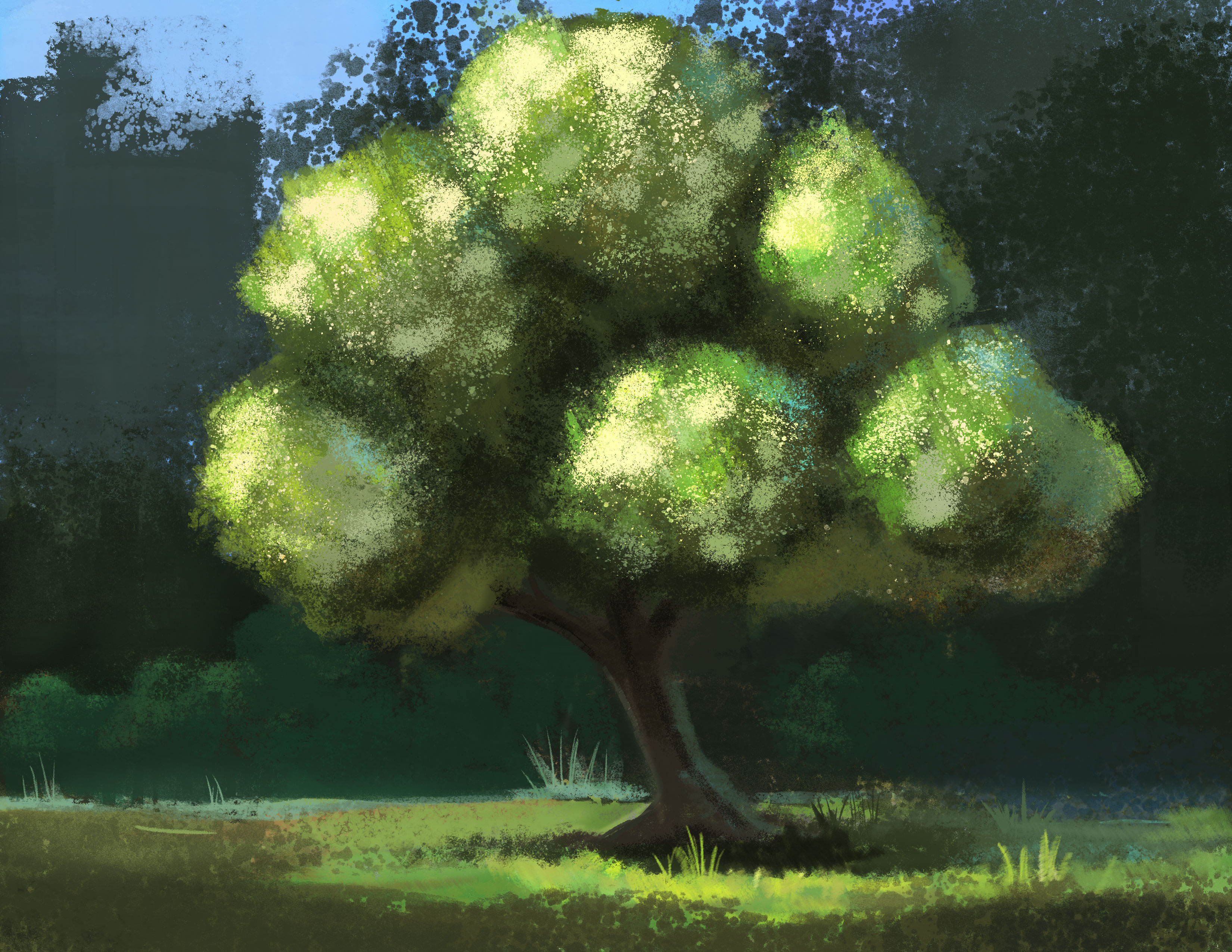
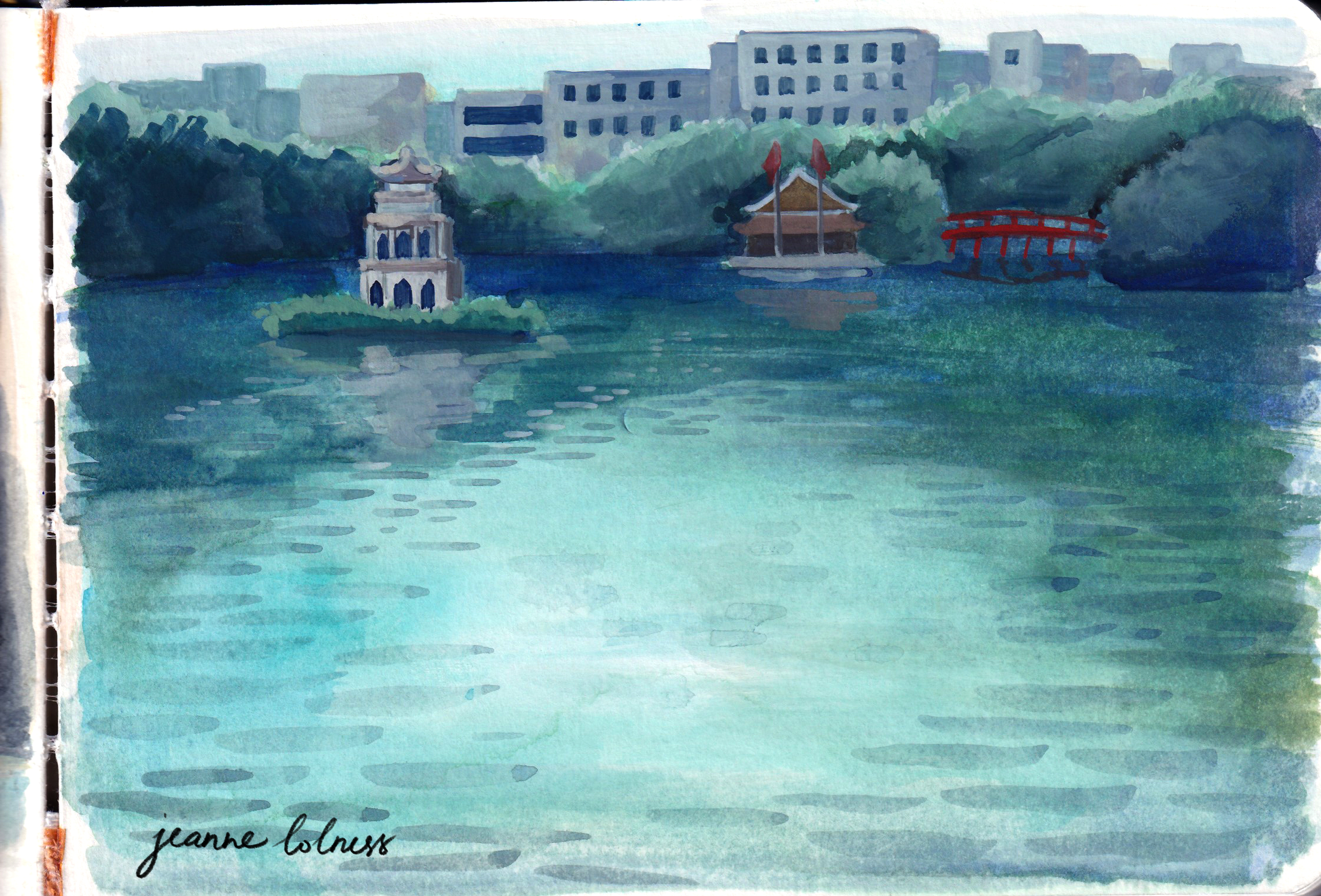
Painting skies or seas is a chance to observe how different tones of blue go with each other to create movement and life.
I hope this collection helps you discover something new and exciting about this color!