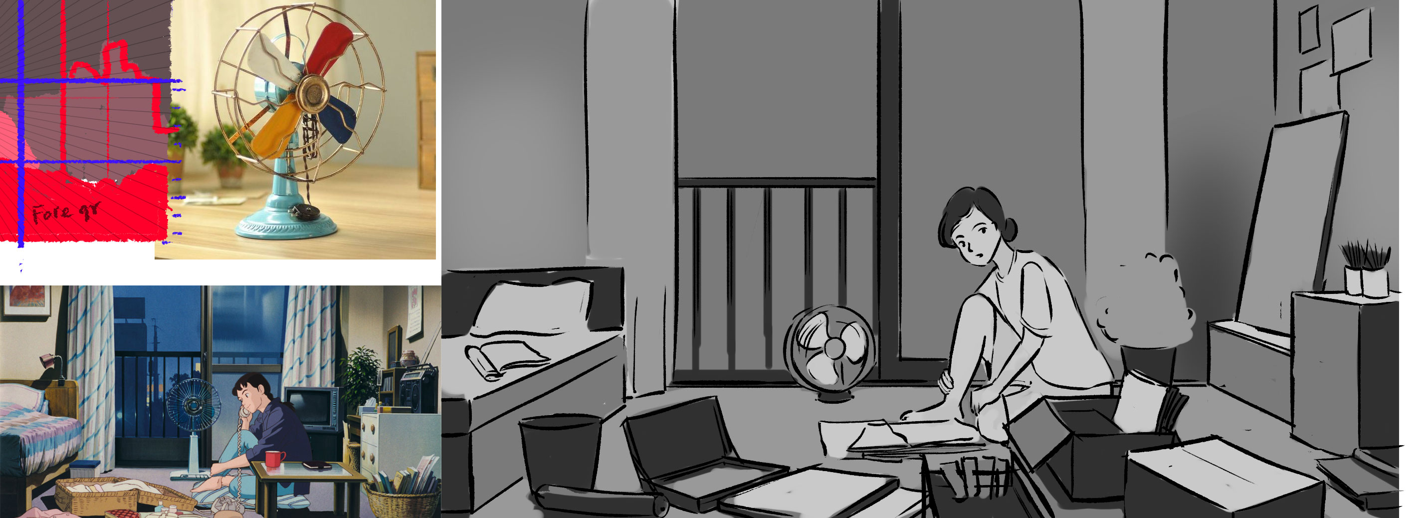
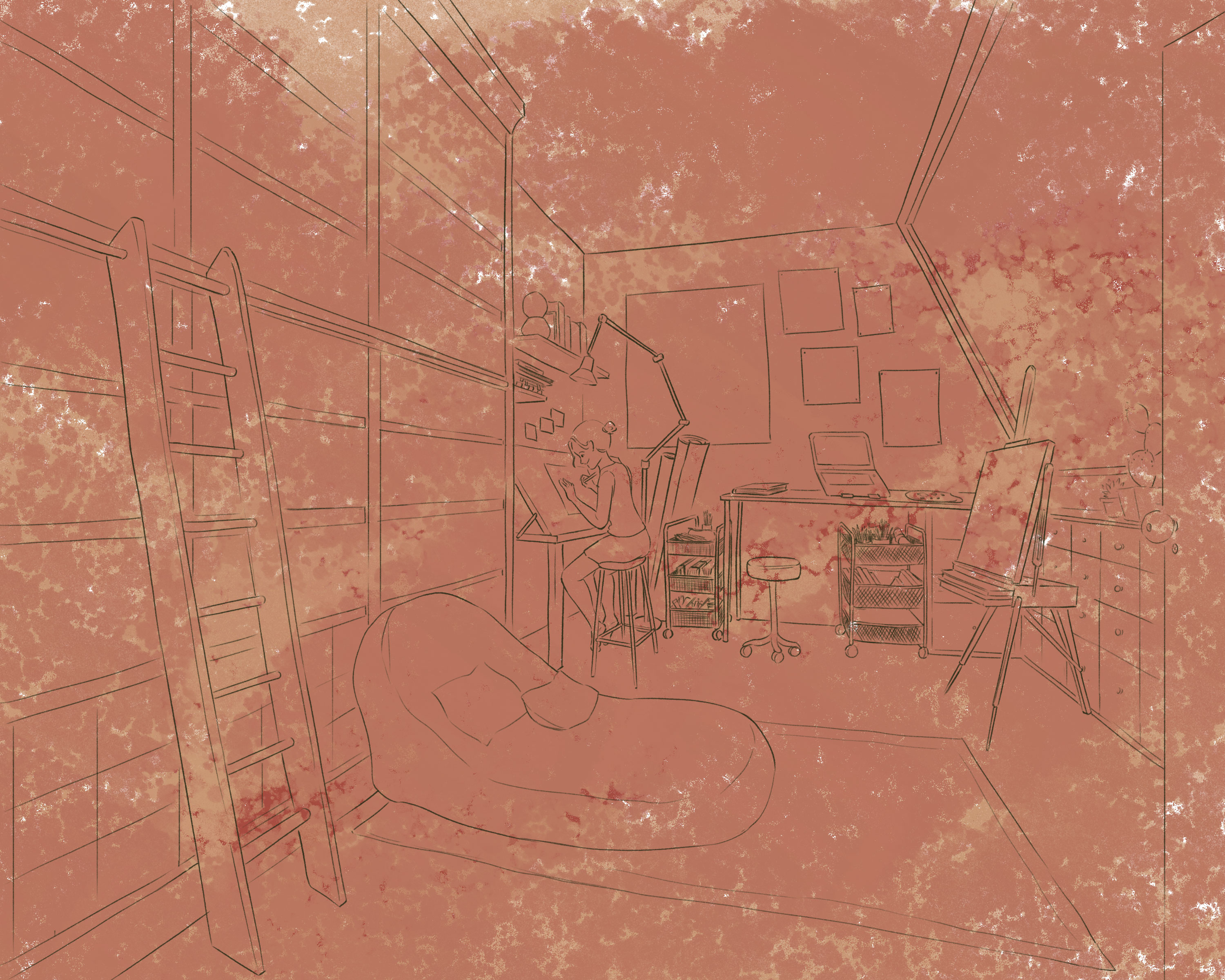
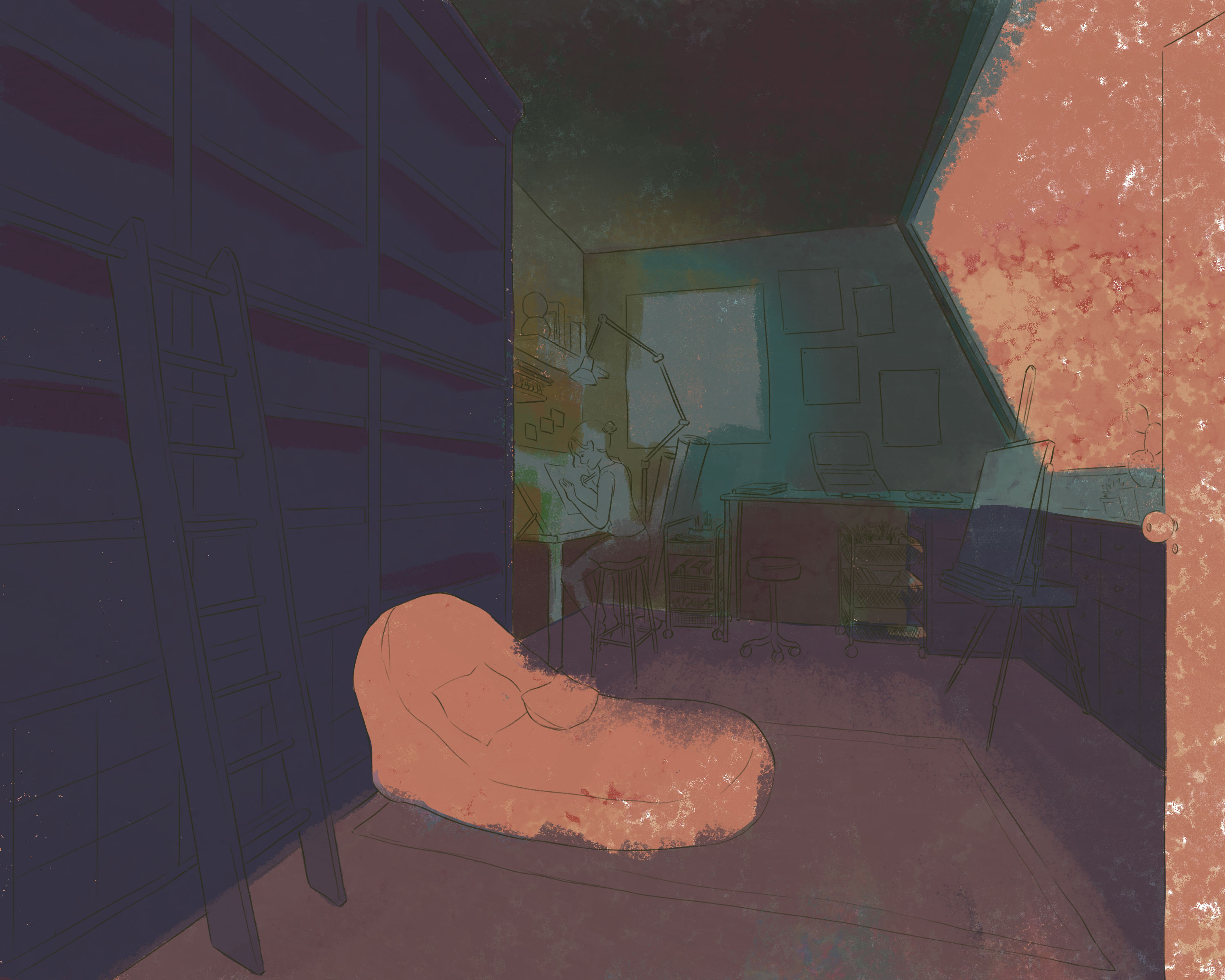
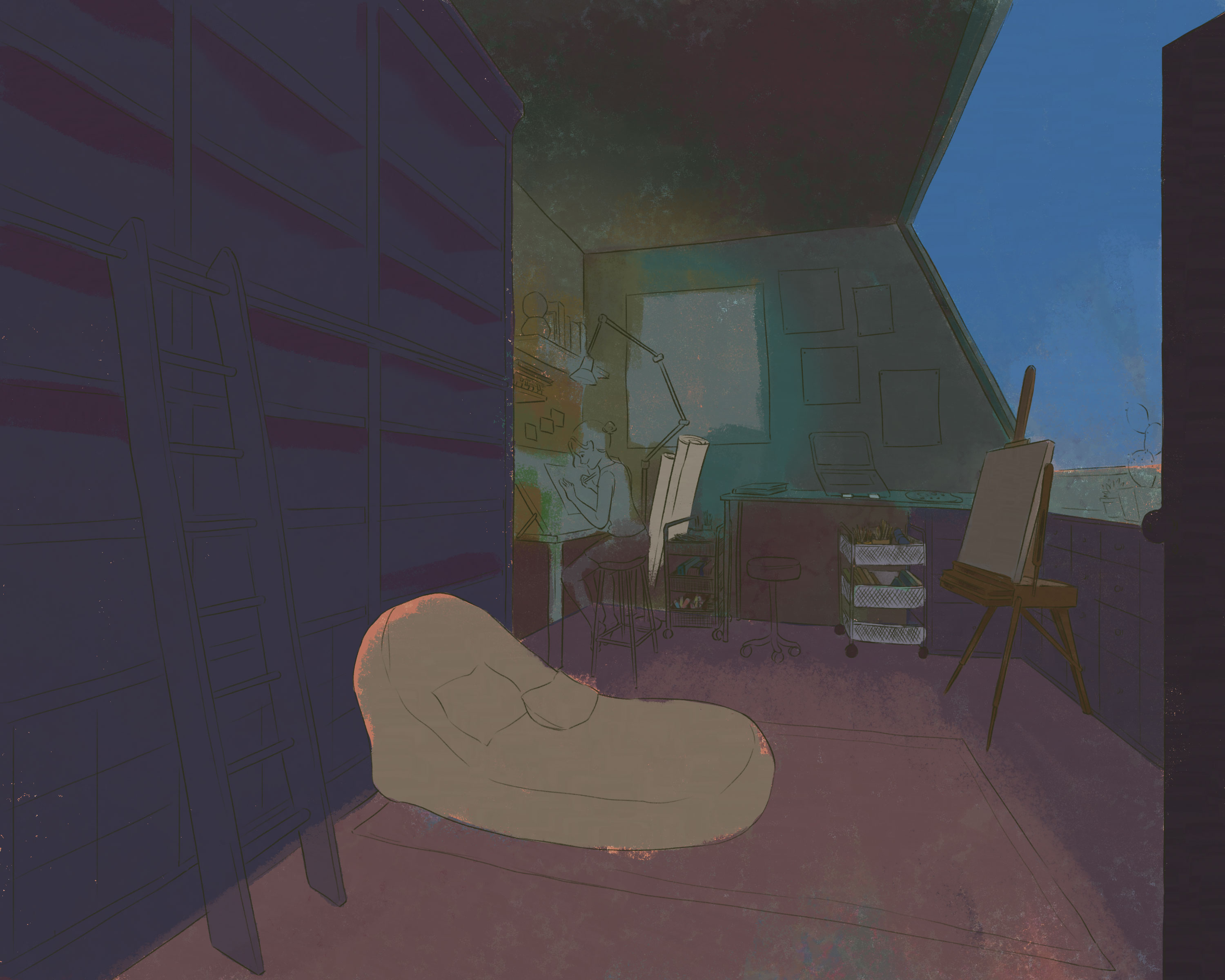
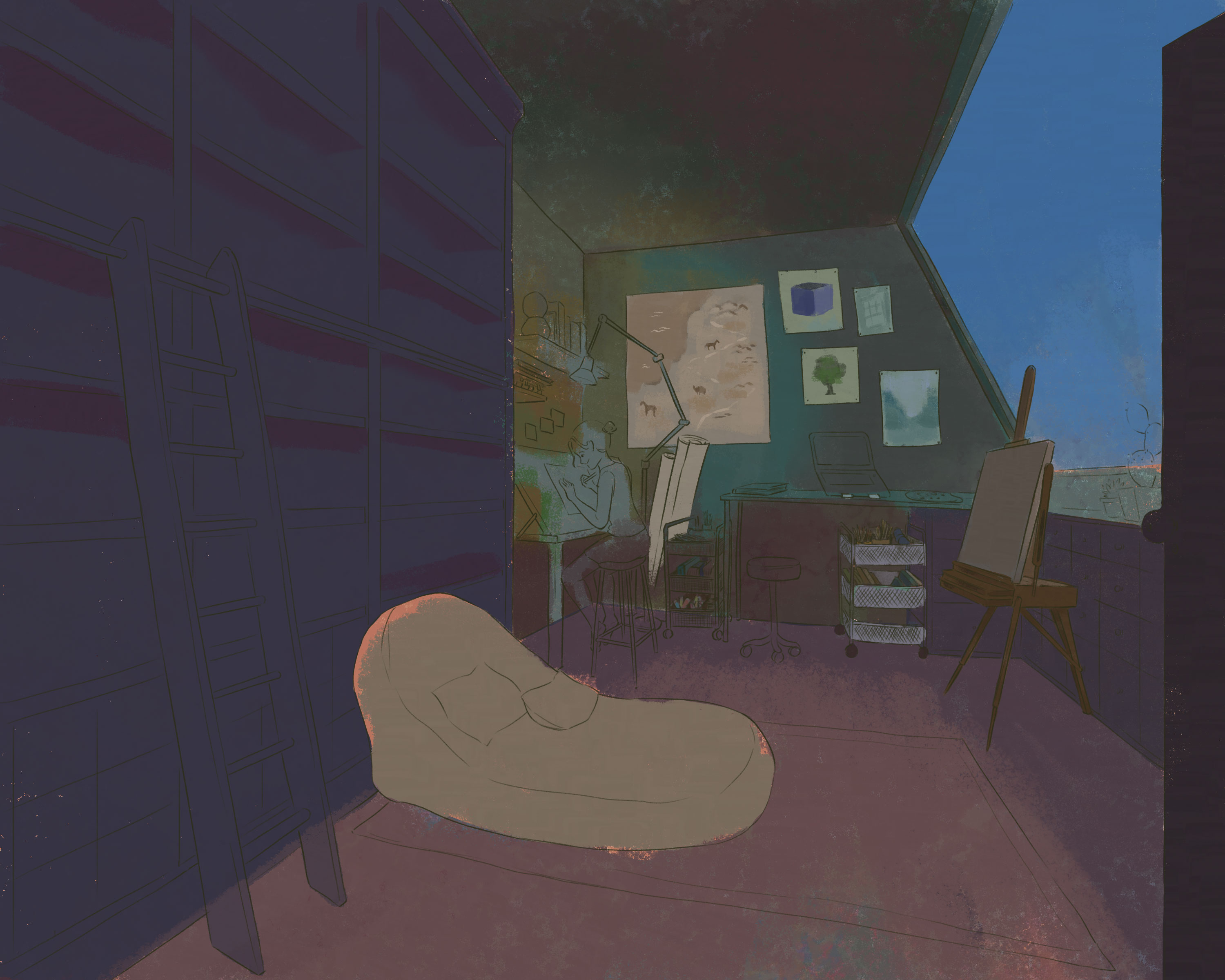
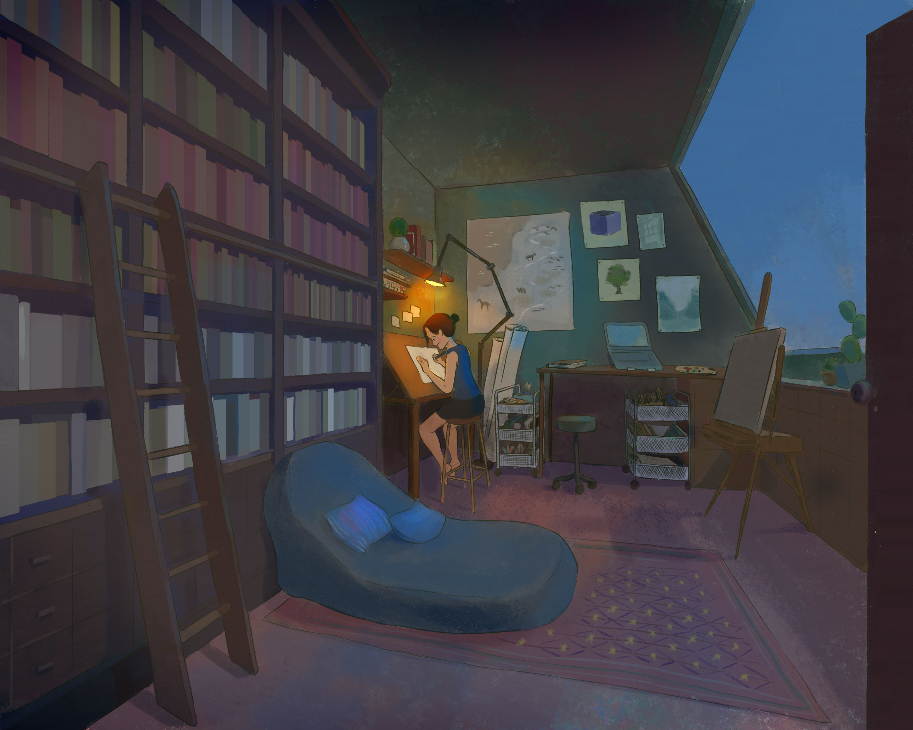
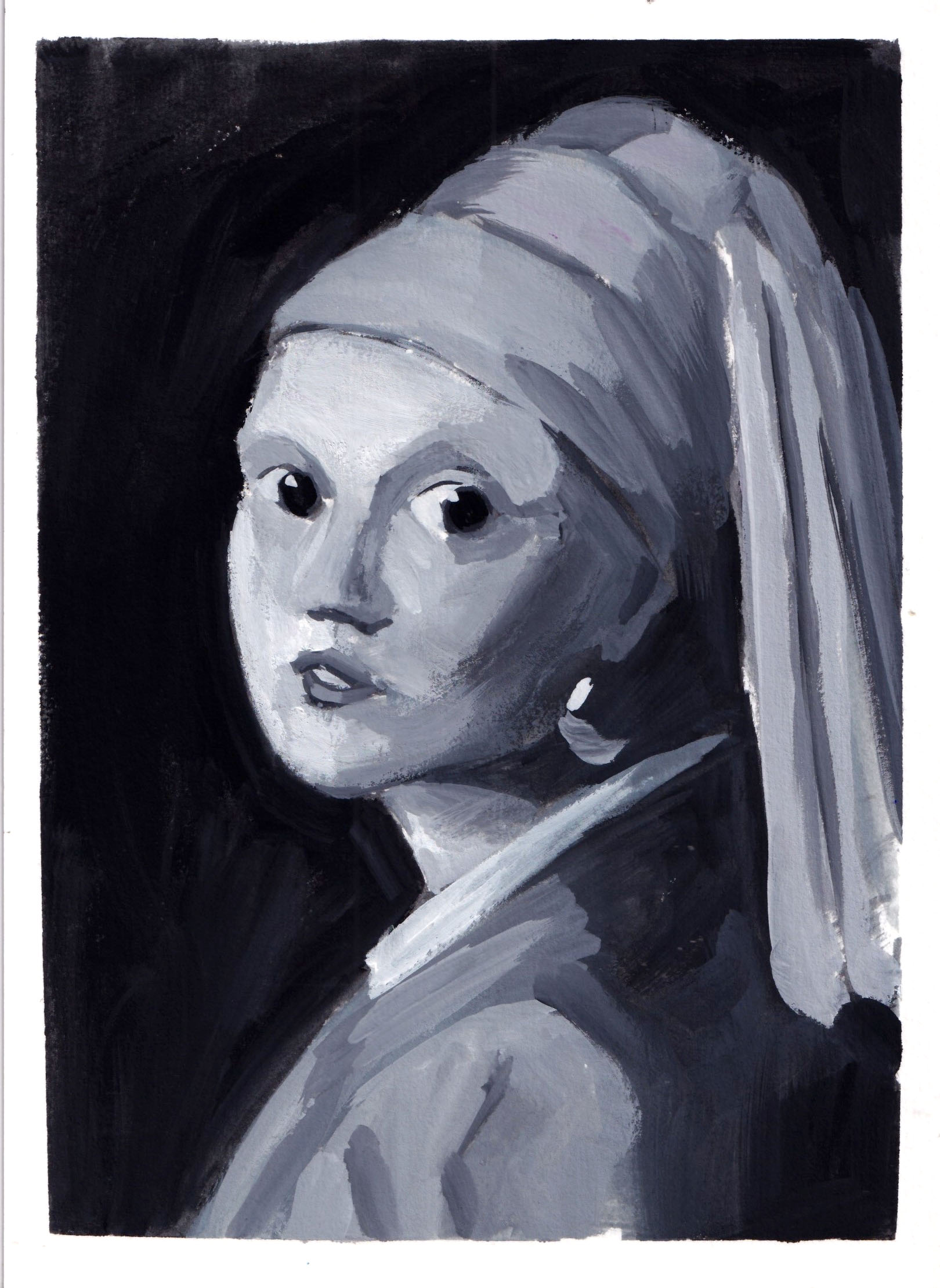
I took a class about composition and one of the homework was to copy and get creative from the arts that I need in grayscale.
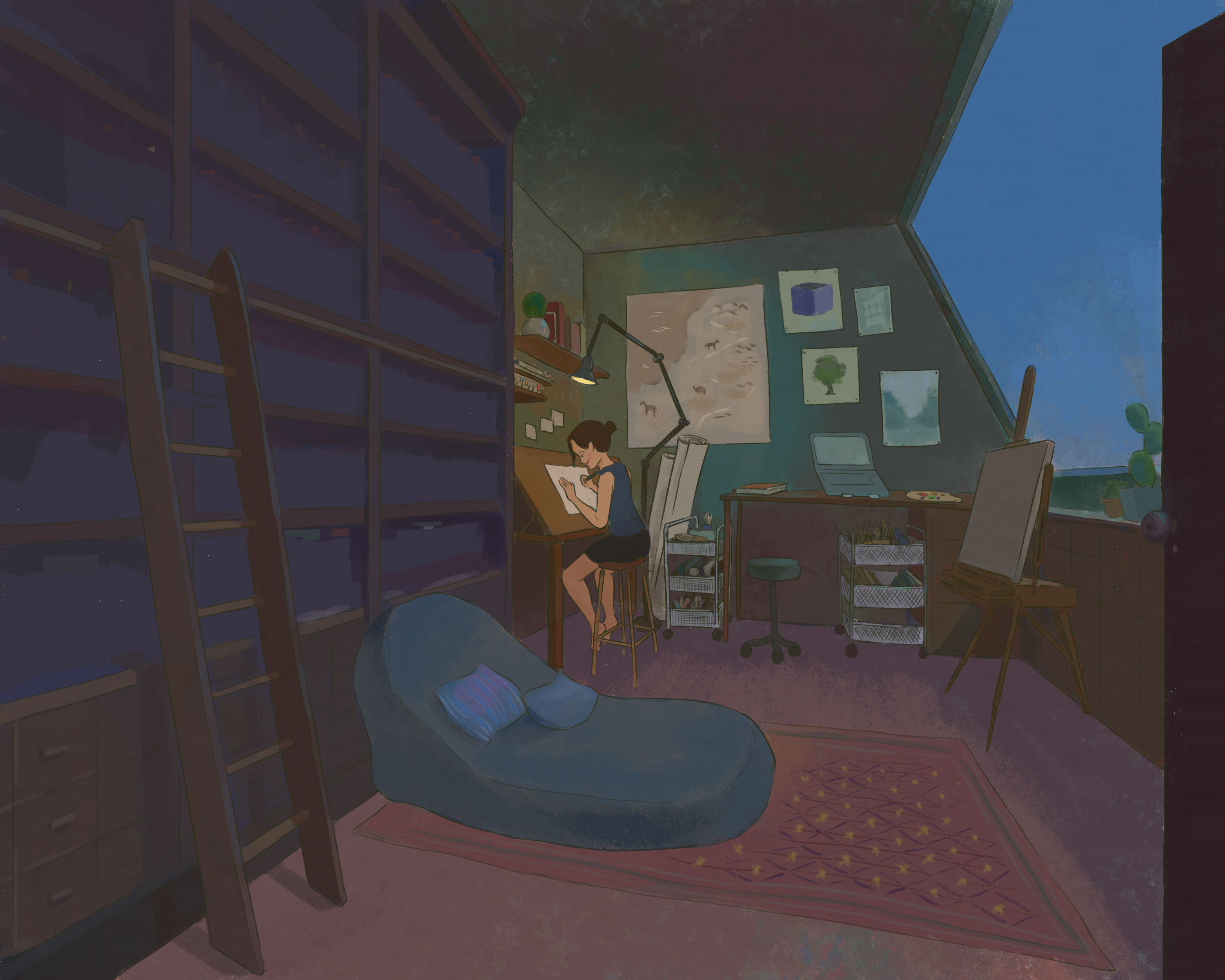
I chose this scene in the movie ‘Only Yesterday’ from Ghibli because it feels intimate, it can be the room of anyone and I just need to step over the frame to be in the same room.
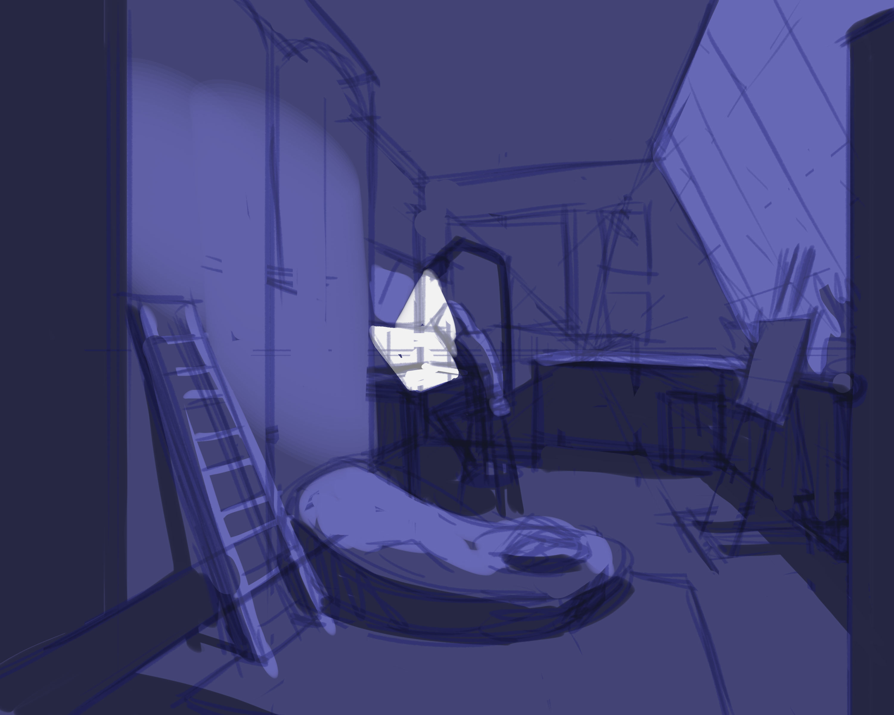
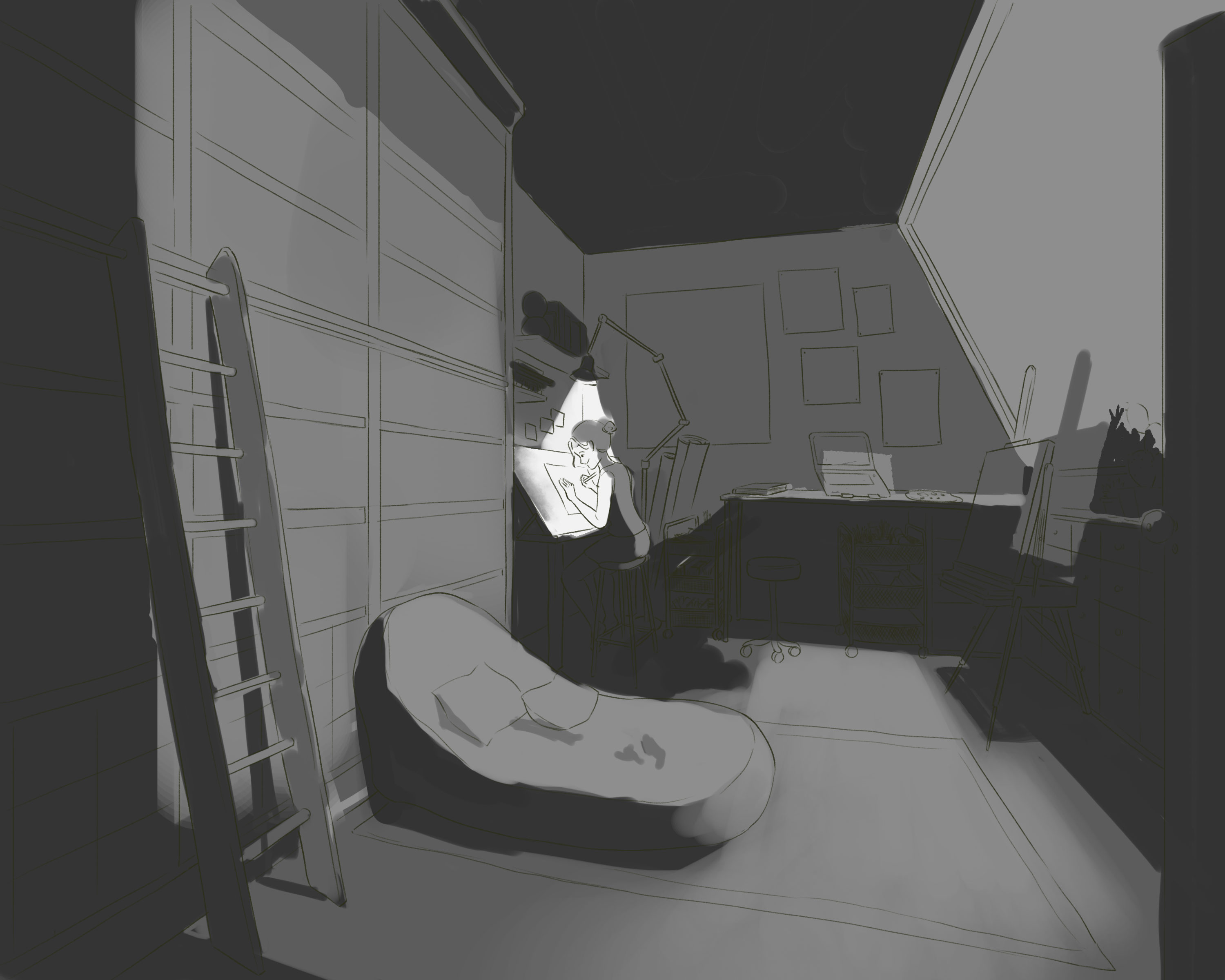
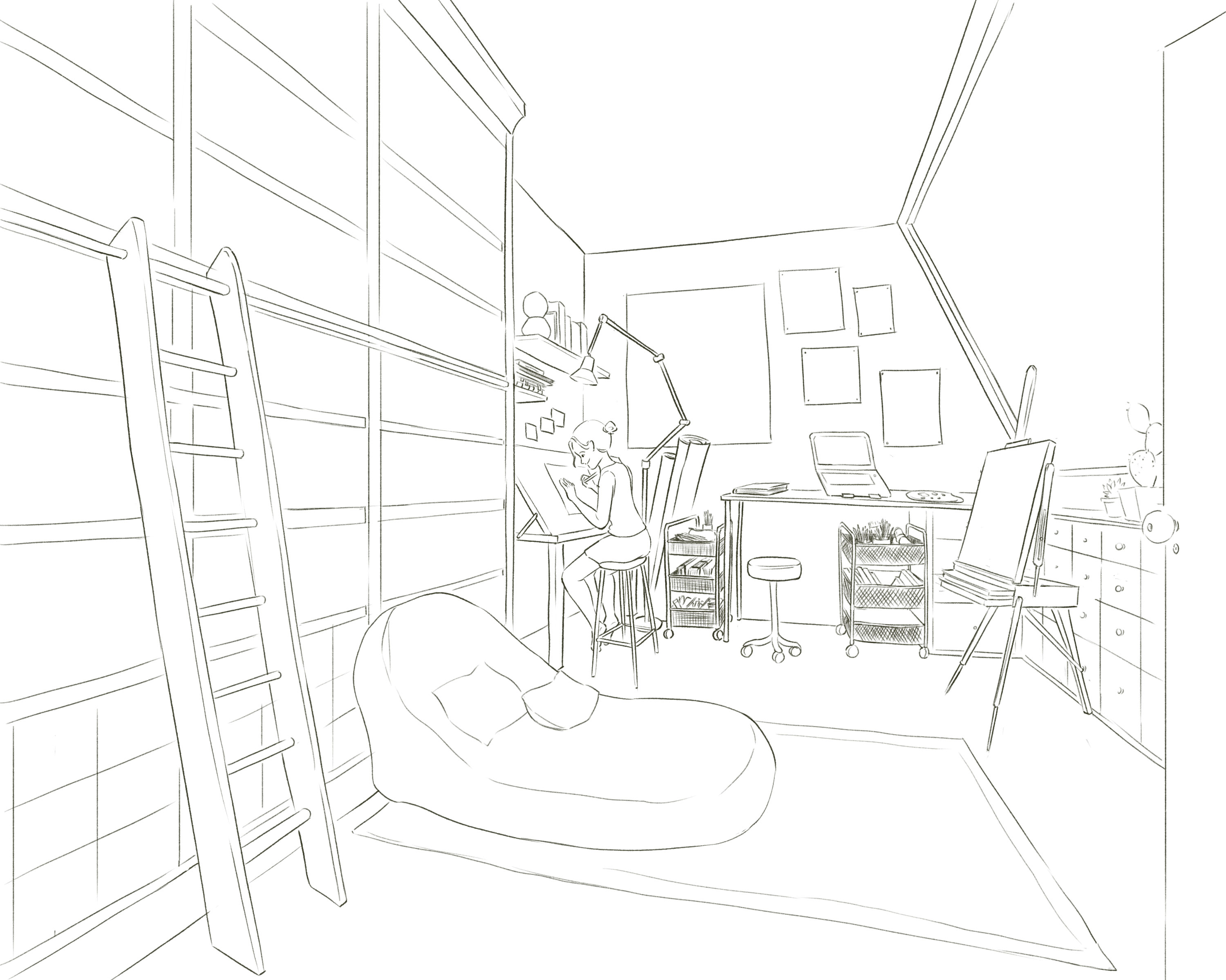
Inspired from that, I want to paint an arts room, a room that I would build if I have all the money I could.
I want to use night ambient light, a kind of soft light going with a strong light, light from the bulb. In that way, I could light up the whole room, yet still keep the focus on the main character (me :))
Human face is always a hard subject for me, since it’s easy to draw it ‘wrong’ and hard to fix it ‘right’. The annoying thing is even if I realize the face is ‘off balance’, sometimes I can’t point out which part need fixing or how should I re-draw it later.
That’s why it takes a long time for me to be able to draw a face that I can feel satisfied with.
My start
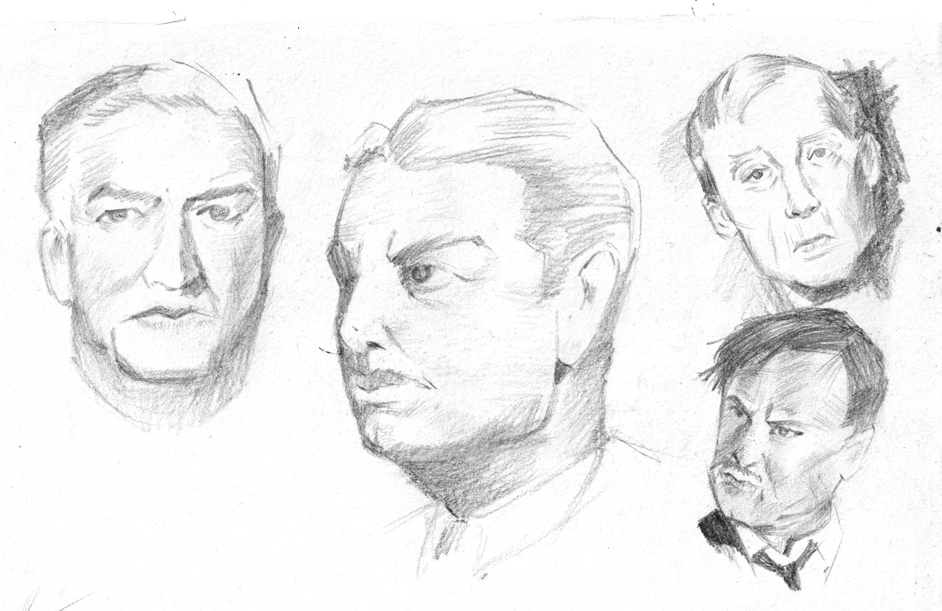
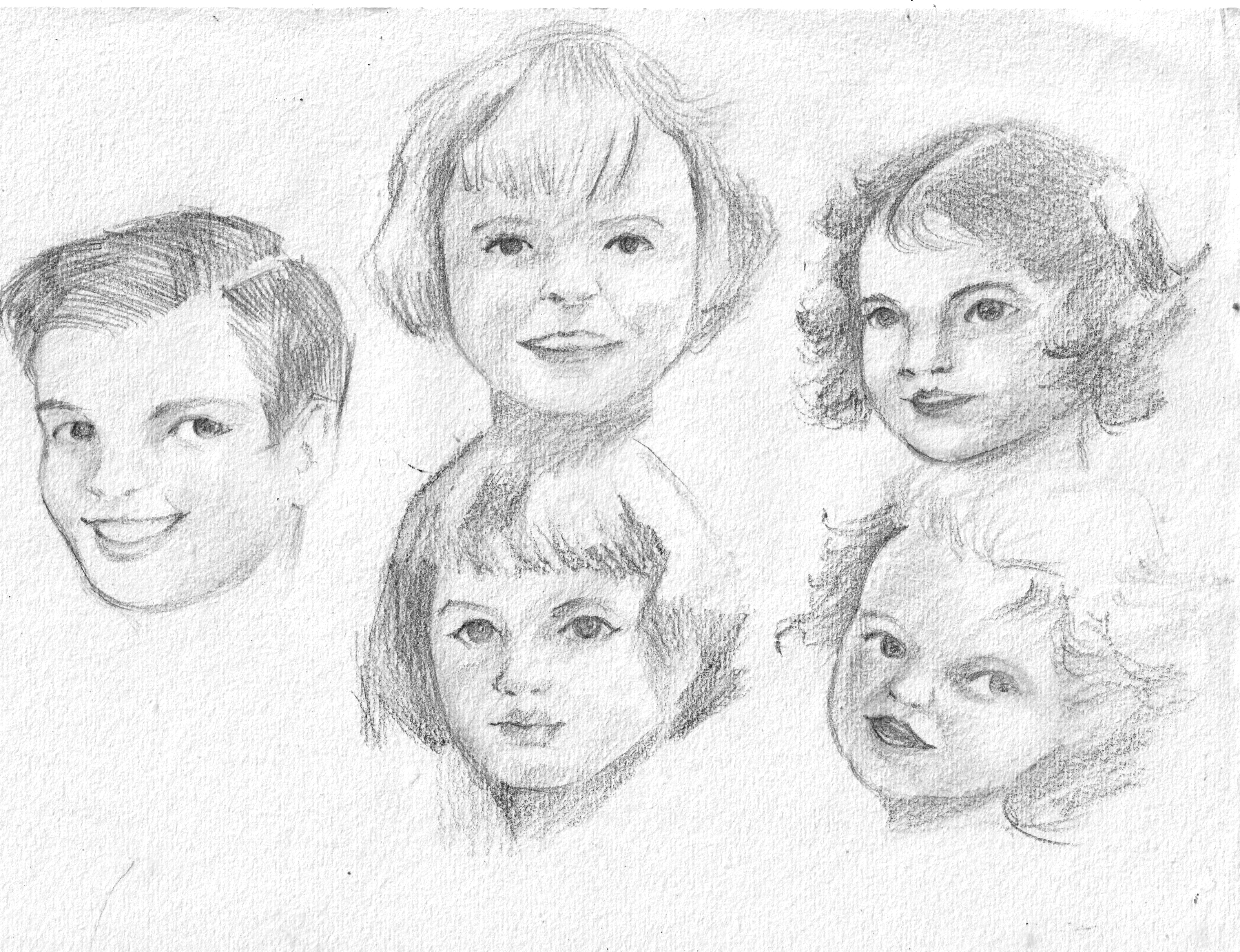
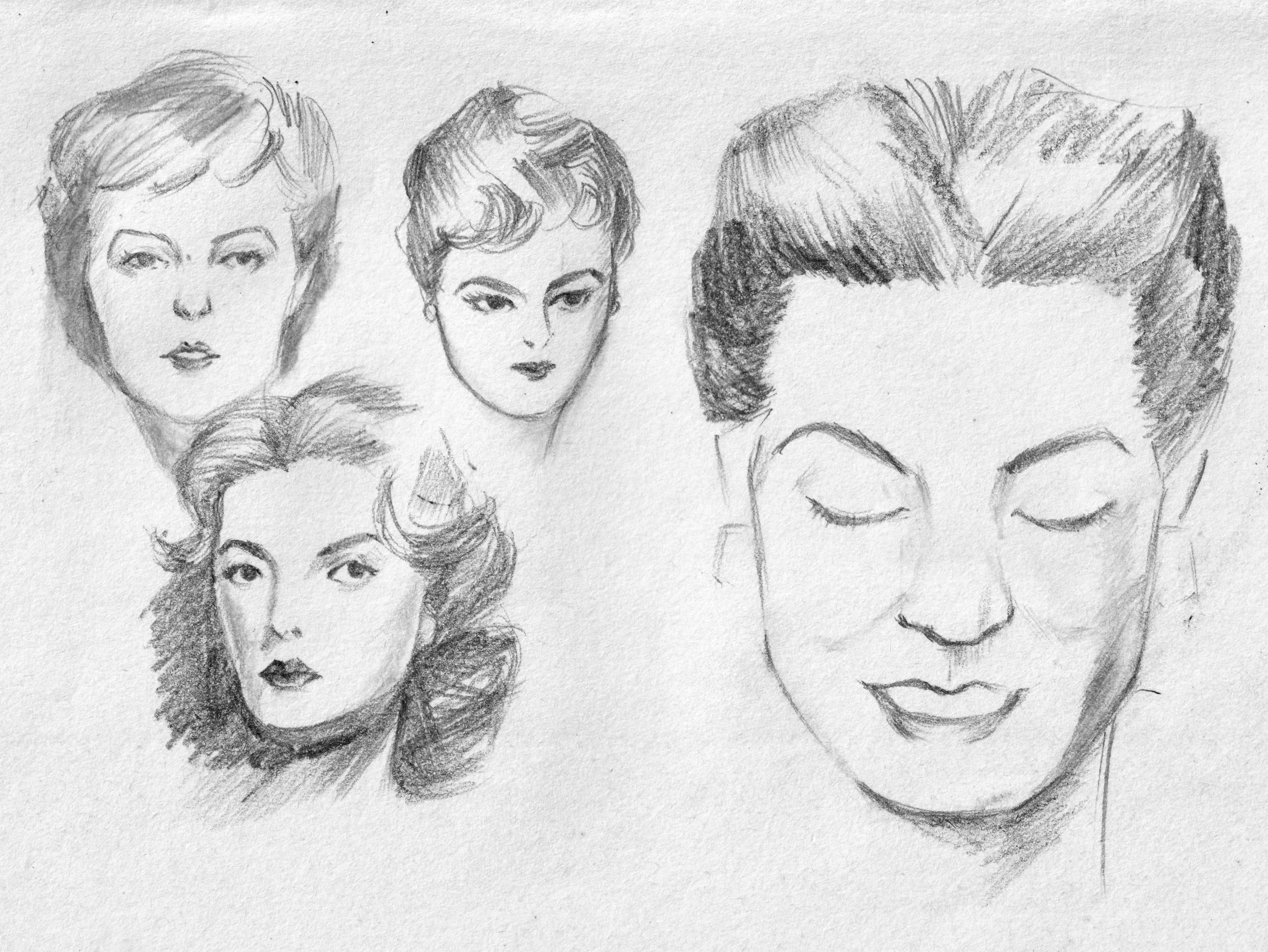
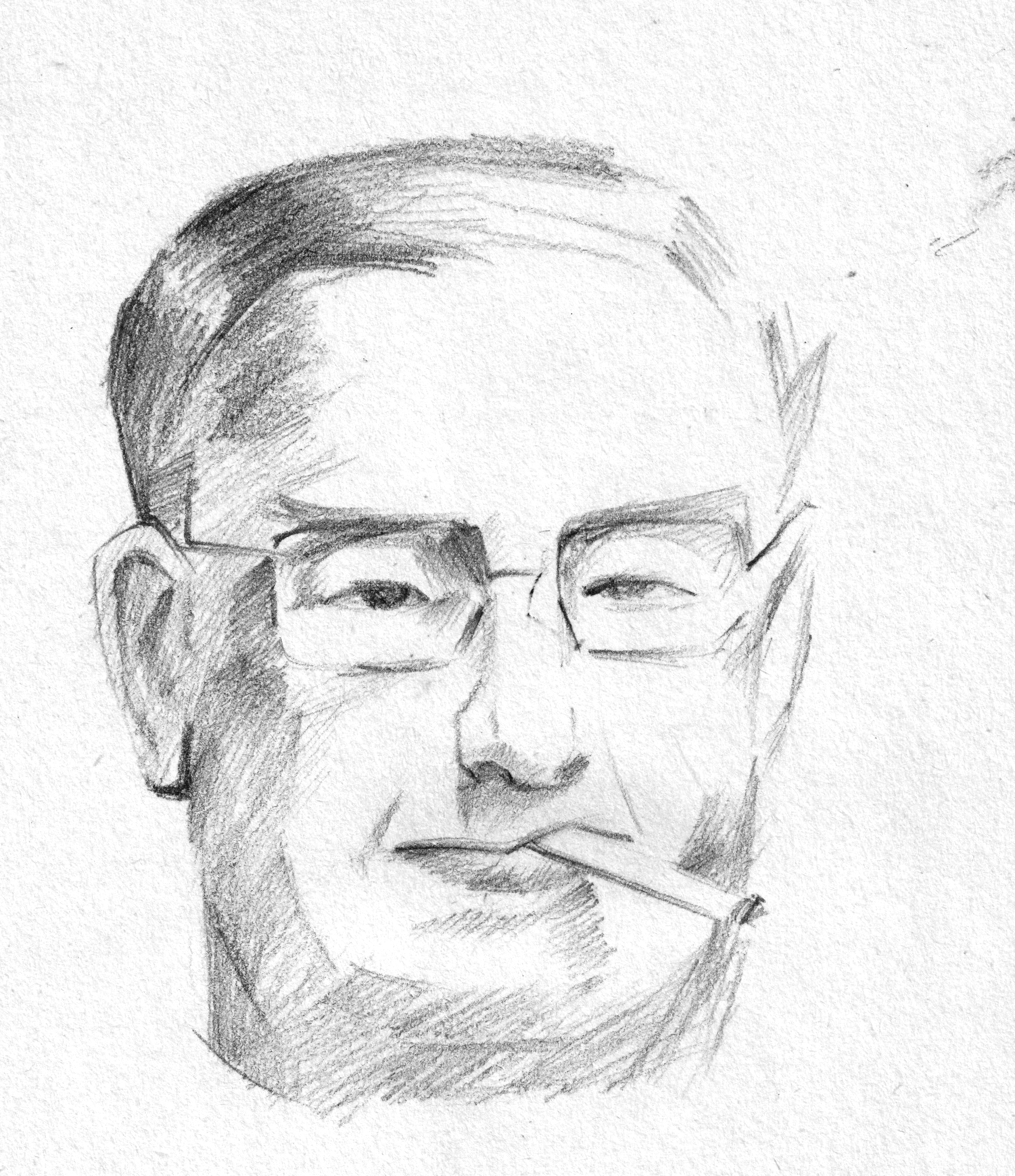
My first proper learning would be Proko’s drawing face videos, which is based on Andrew Loomis method. Later, I discovered Andrew Loomis wrote a whole series of books about arts, especially about figure drawings and portraits. The book I read, “Drawing the Face and Hands” was published in 1956, yet it’s still useful in learning the general structure of the face. The books were divided into male, female, teenager, kids and a small section at the end about hands. He often began with building the blocks first, then slowly adding features. The proportion of human face is similar among all people, yet, age and gender make the main difference.
I tried copying the sketches in the book
The only few drawbacks of the book are it don’t have any exercise or suggestion about practices and it was written in 50s language, which is lengthy and flattering for me. However, I can still feel the warmth and efforts of Andrew Loomis in his first few words opening the books “Now let’s get to work in earnest”.
The first course
Later, when I took the course “Deconstructed: Drawing People” by Viktor Kalvachev, he shared his method learned from a criminology professor to recognize faces based on basic shapes. Actually, you can see that section free on Schoolism channel.
Together, I found it easier to draw faces from images and came up with my own design for commissions.
A 60-day portrait painting challenge
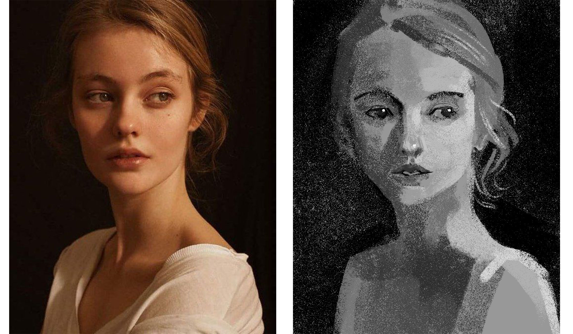
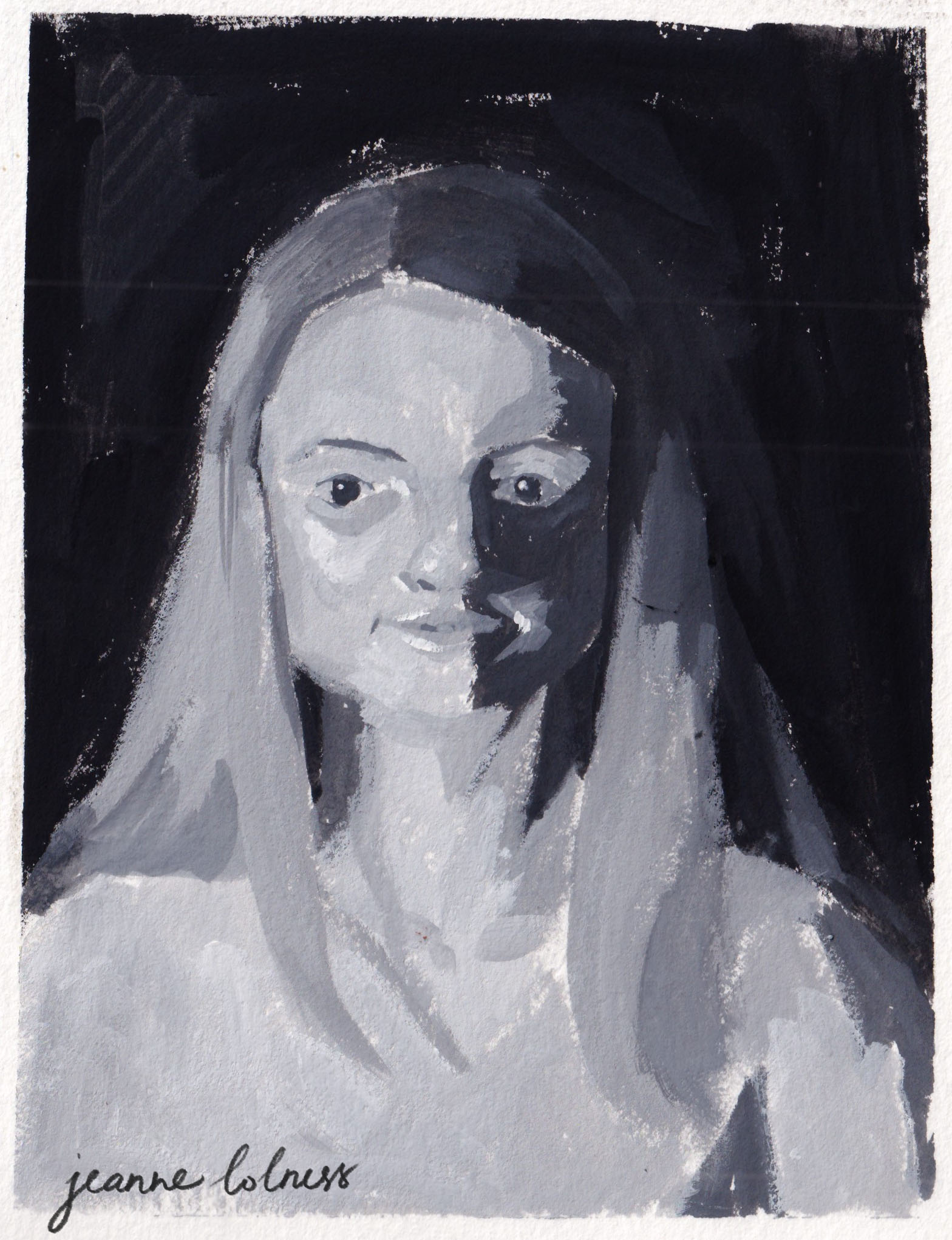
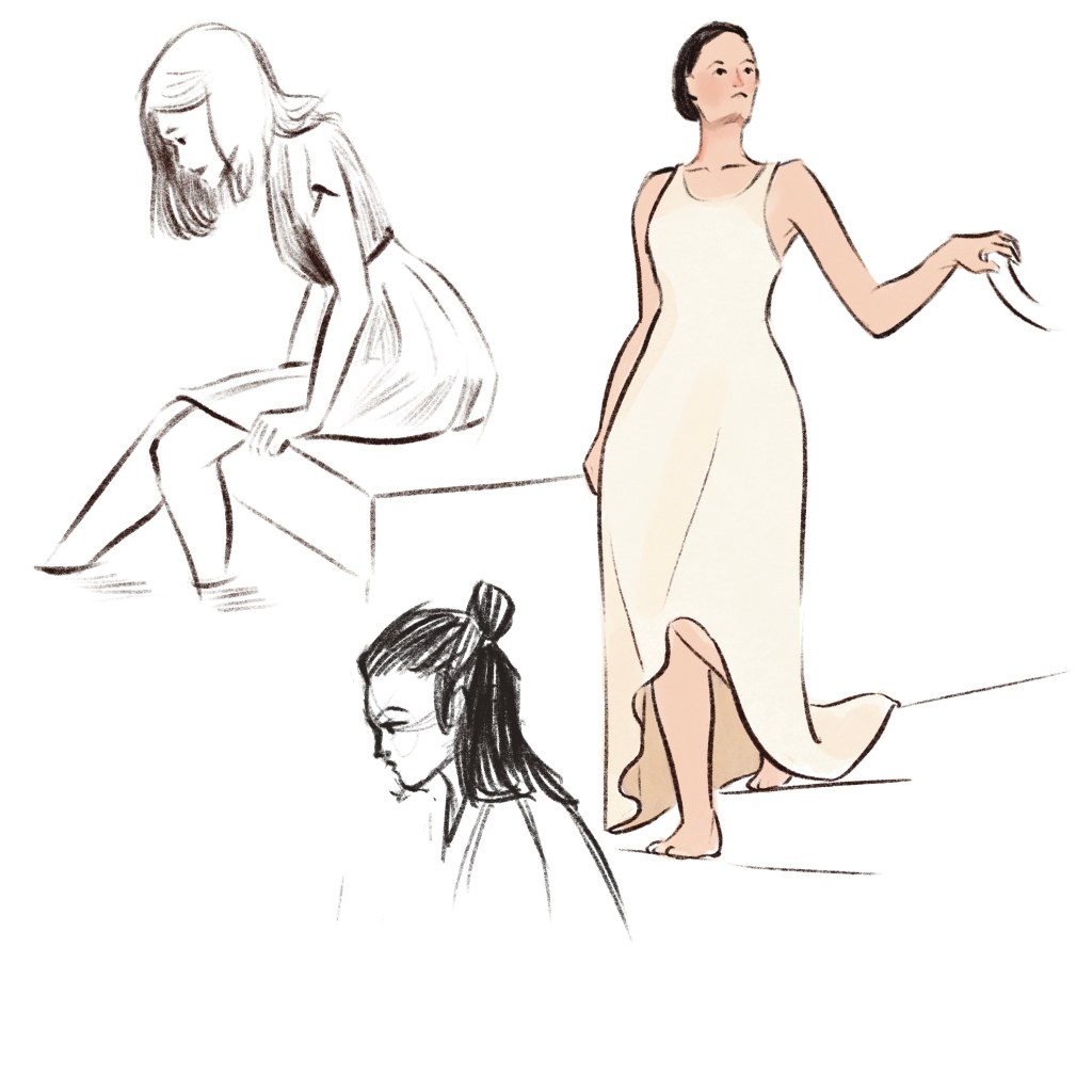
Feeling okay with my line drawing/sketch, I start to look for more ways to paint the face. There are realistic approach and stylish approach, color and lighting setup are also considered. I want a bit of fun so I try the Digital Painting Workout by Woulter Tulp (also a course on Schoolism). The course’s main purpose was to practice digital painting, yet the instructor prioritized portraits because they are subjects that can be tackled in 30 minutes or so. For each day in 2 months, I spared 30-40 minutes to paint an image based on the instructor’s guidance. Each painting focus on one goal only: value or color or rendering, etc.
The useful side of this workout is that it allows me to learn painting both way: realistically and stylishly. I learned that there’s endless possibilities about painting a person, the important point is to paint how I feel about the person.
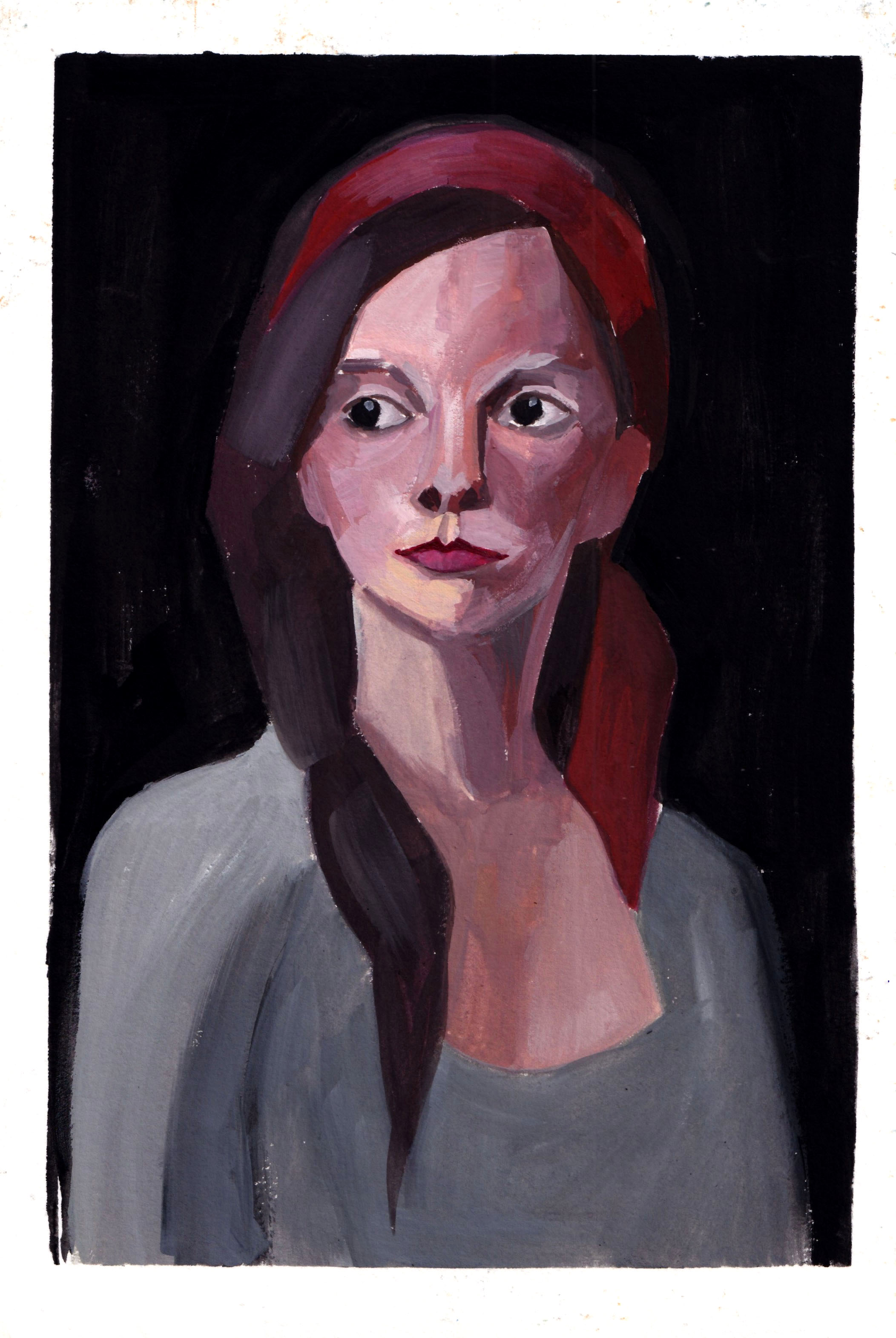
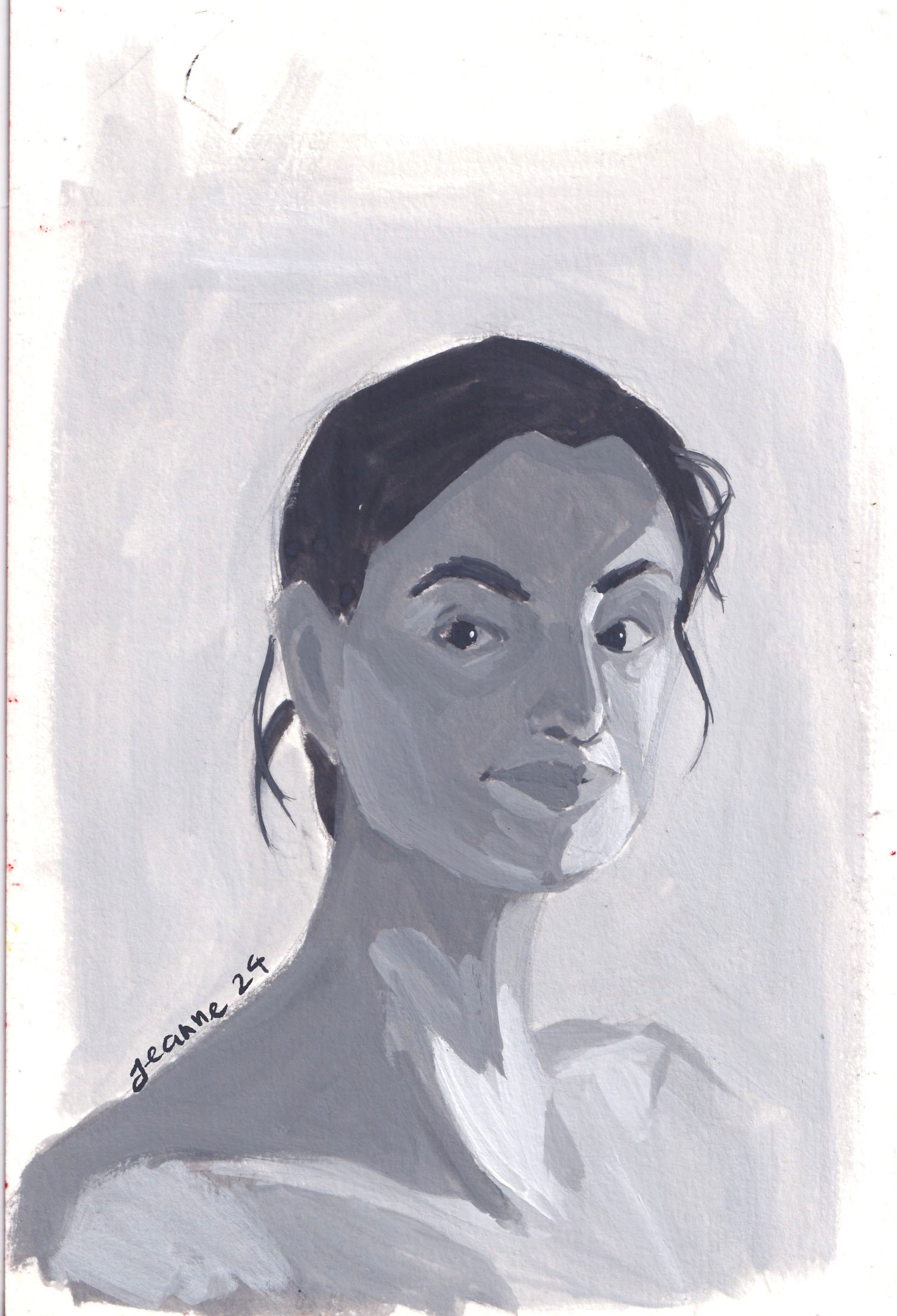
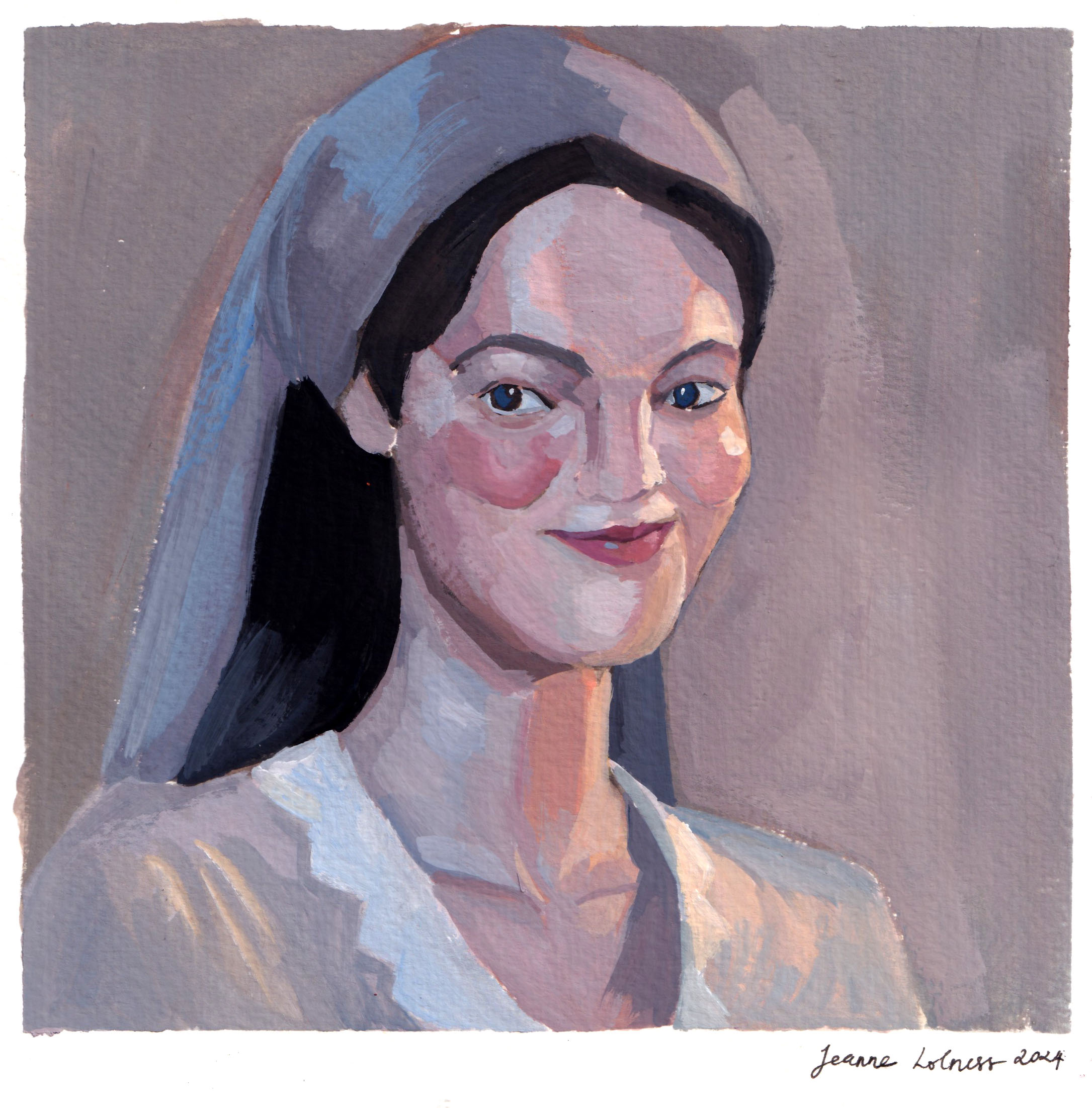
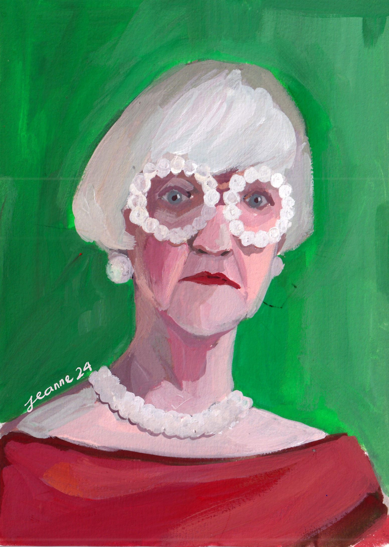
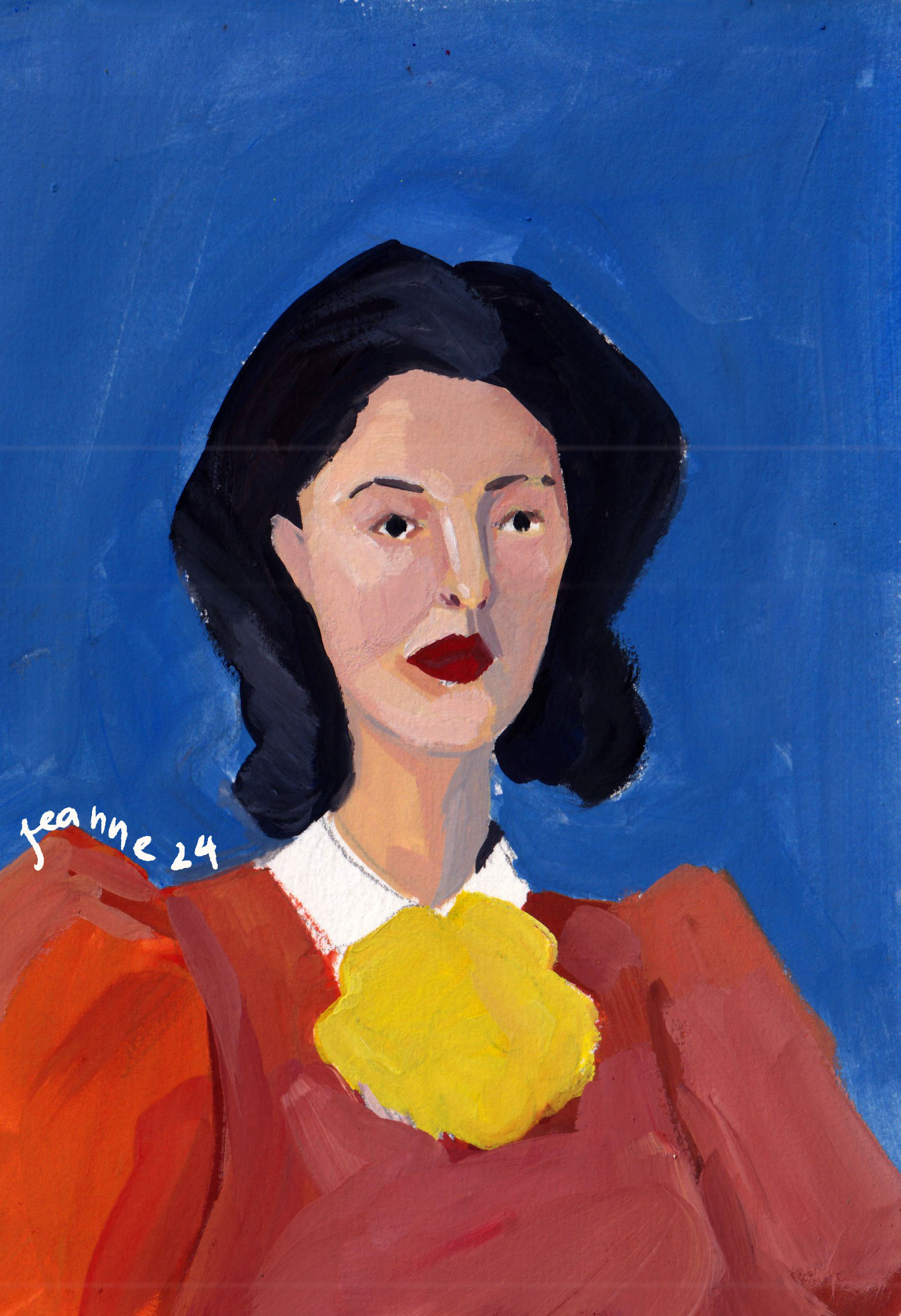
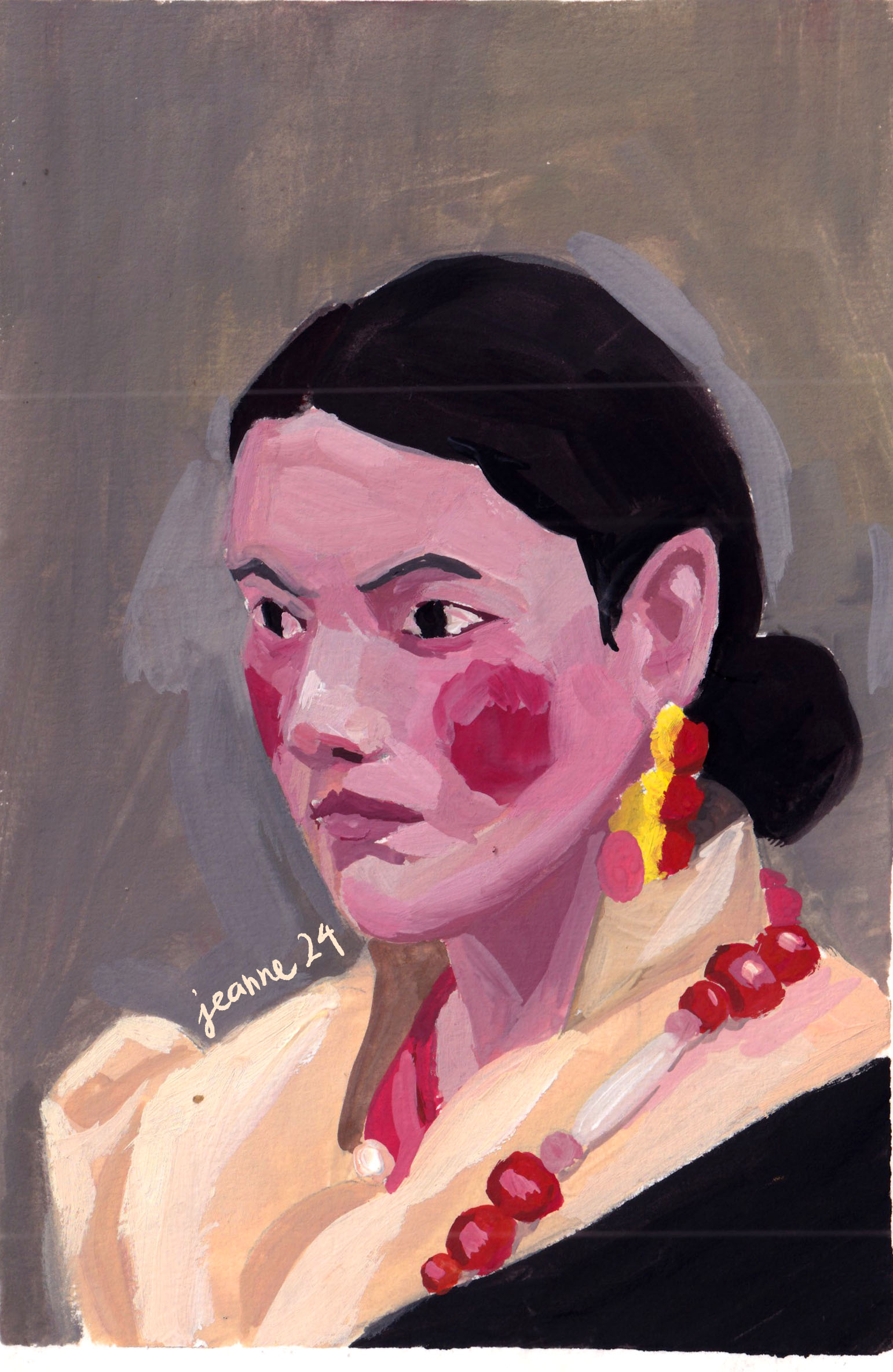
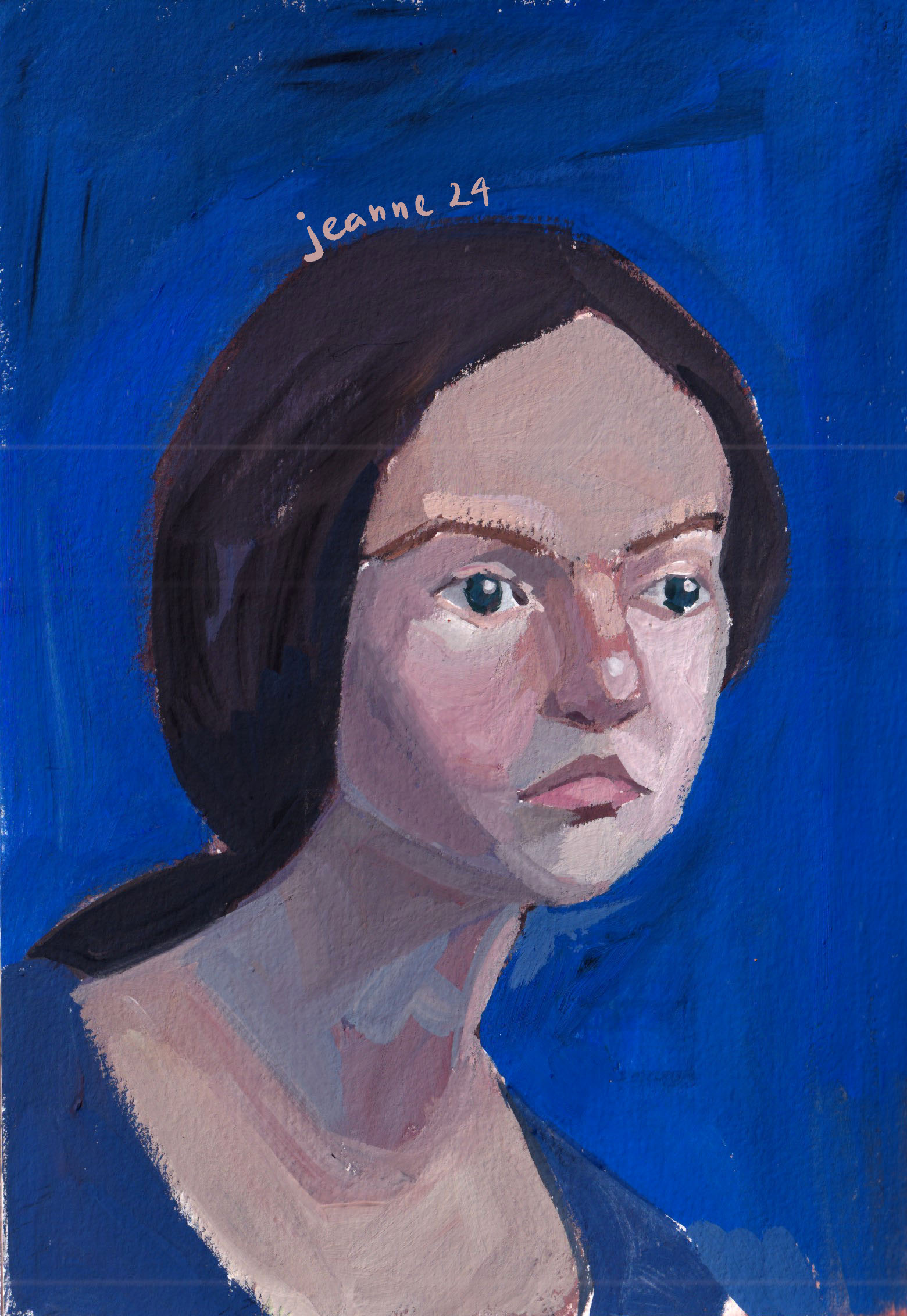
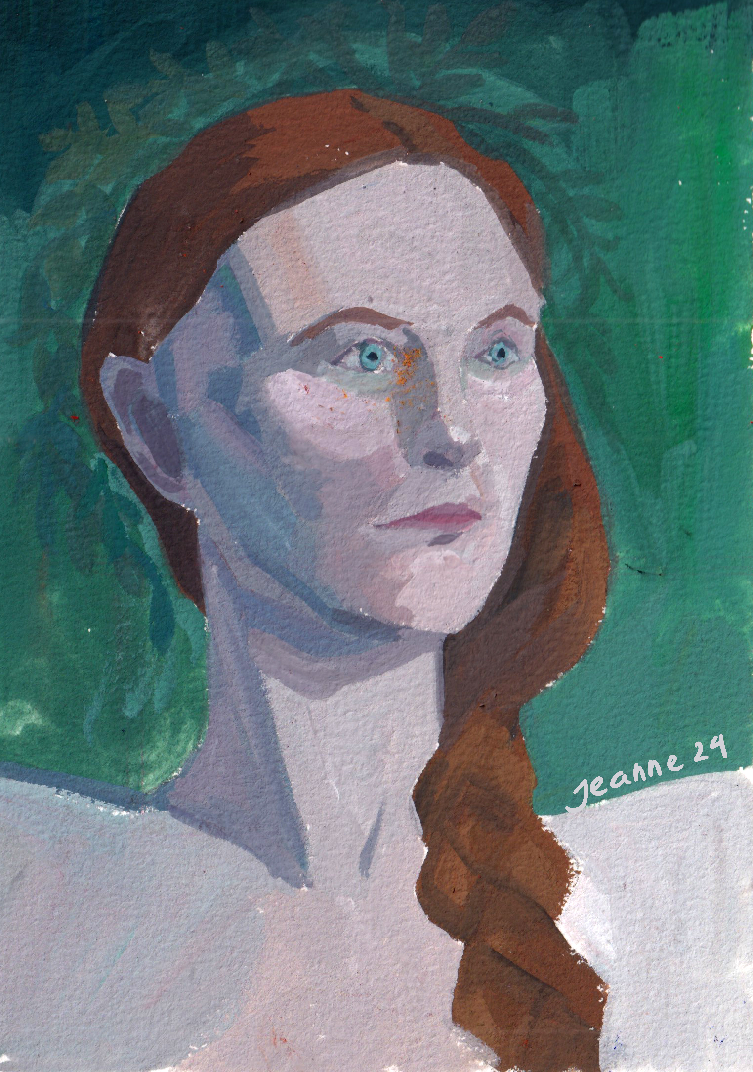
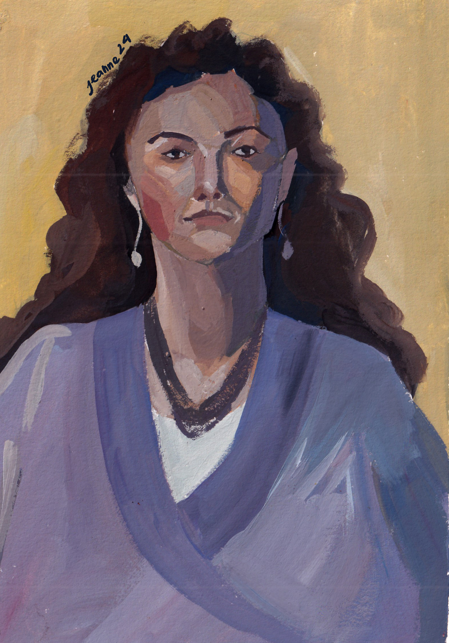
The most recent course I took is about color, and the subjects used were also portraits. This time I used gouache for the whole course, trying to mix color traditionally. The side effect of this course is that my portrait skill improved a lot as well.
Credit: @Lee Avision/ Trevillion ImageActress Pınar Deniz
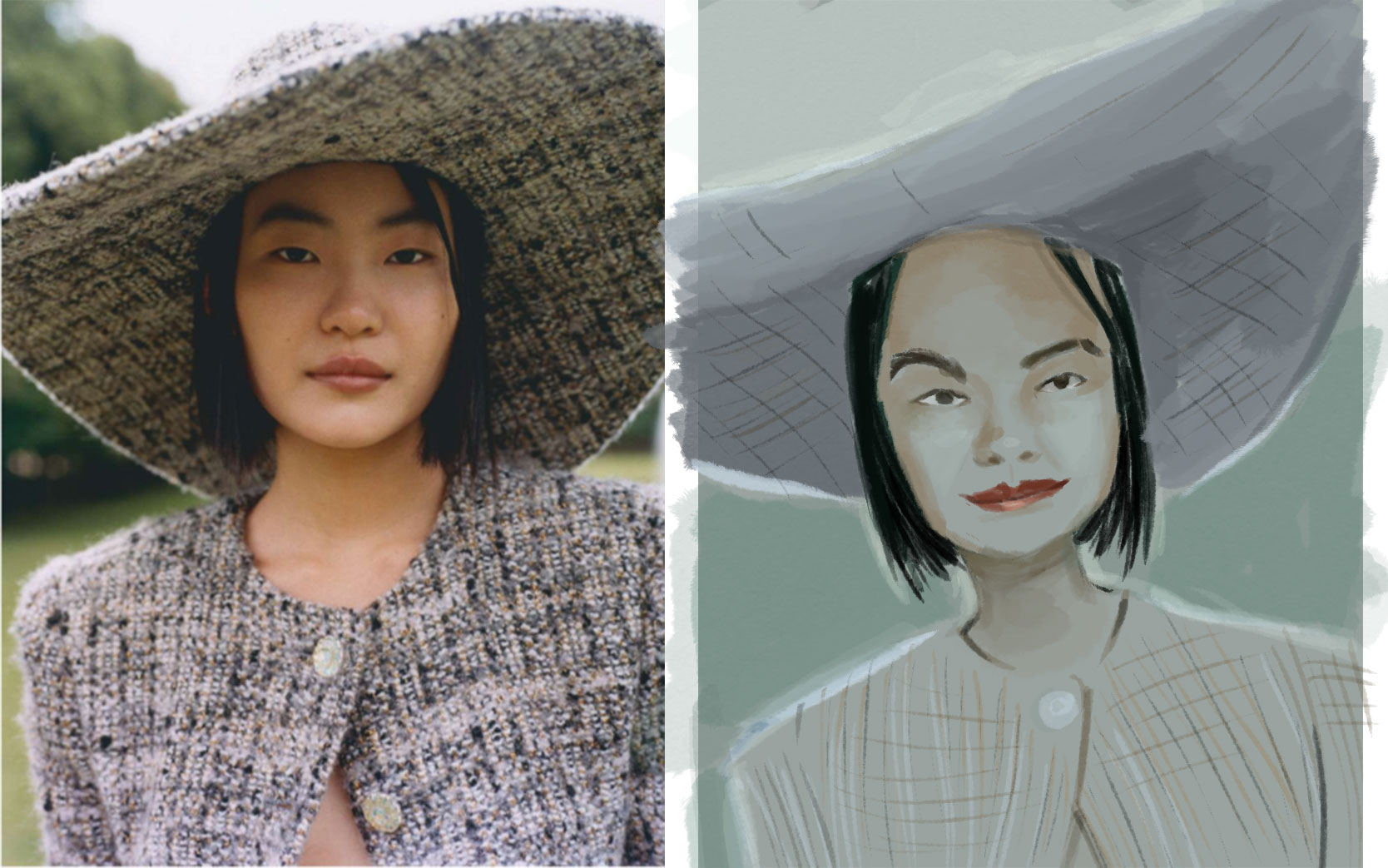
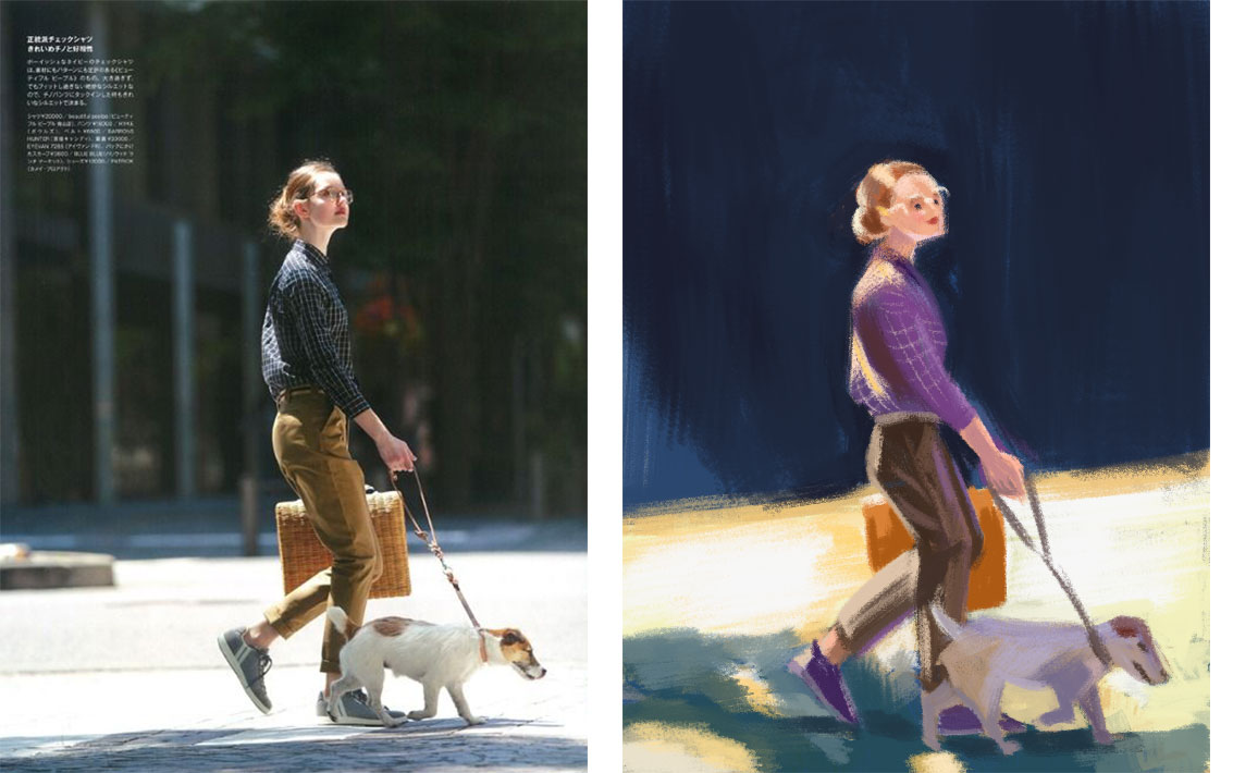
Model: Jessica from Croquis CafePhotographs by Paolo Verzone, Egyptologist Monica Hanna, from National Geographic
These paintings aren’t used for commercial purposes, just for education and promotion only.
I aim to use realistically but not in order to copy the image exactly, the important is to paint how I feel about the model, how I think about her, what’s the real or the imagined story I could tell with her eyes, her skin, etc.
What’s next?
I want to learn more about human expressions and experiment with specific lighting, especially dramatic/ theatrical set up to tell a story. And I will need to revisit the face structure to keep my knowledge fresh, but with a different approach/method to keep the art as fun as I originally started it.
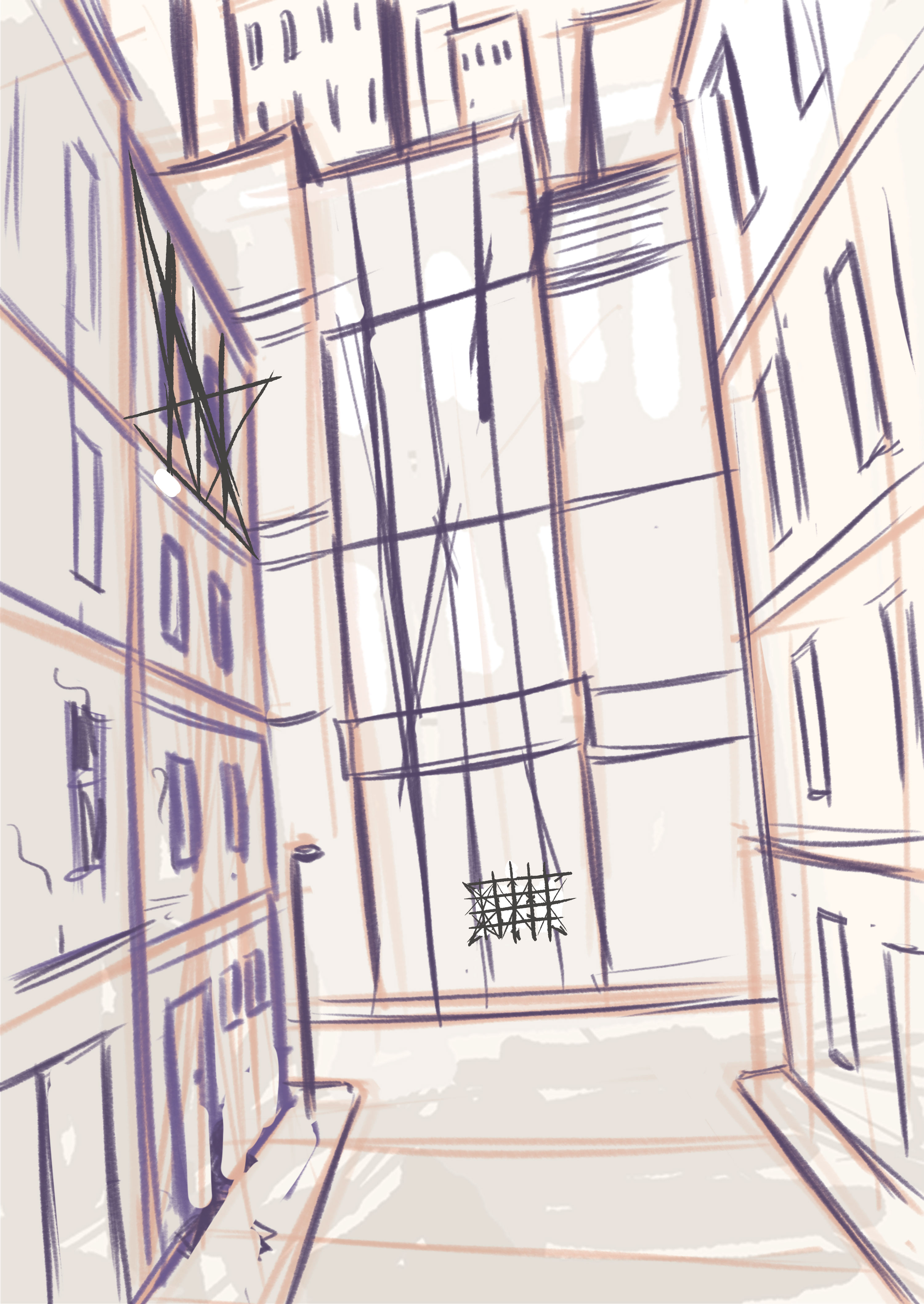
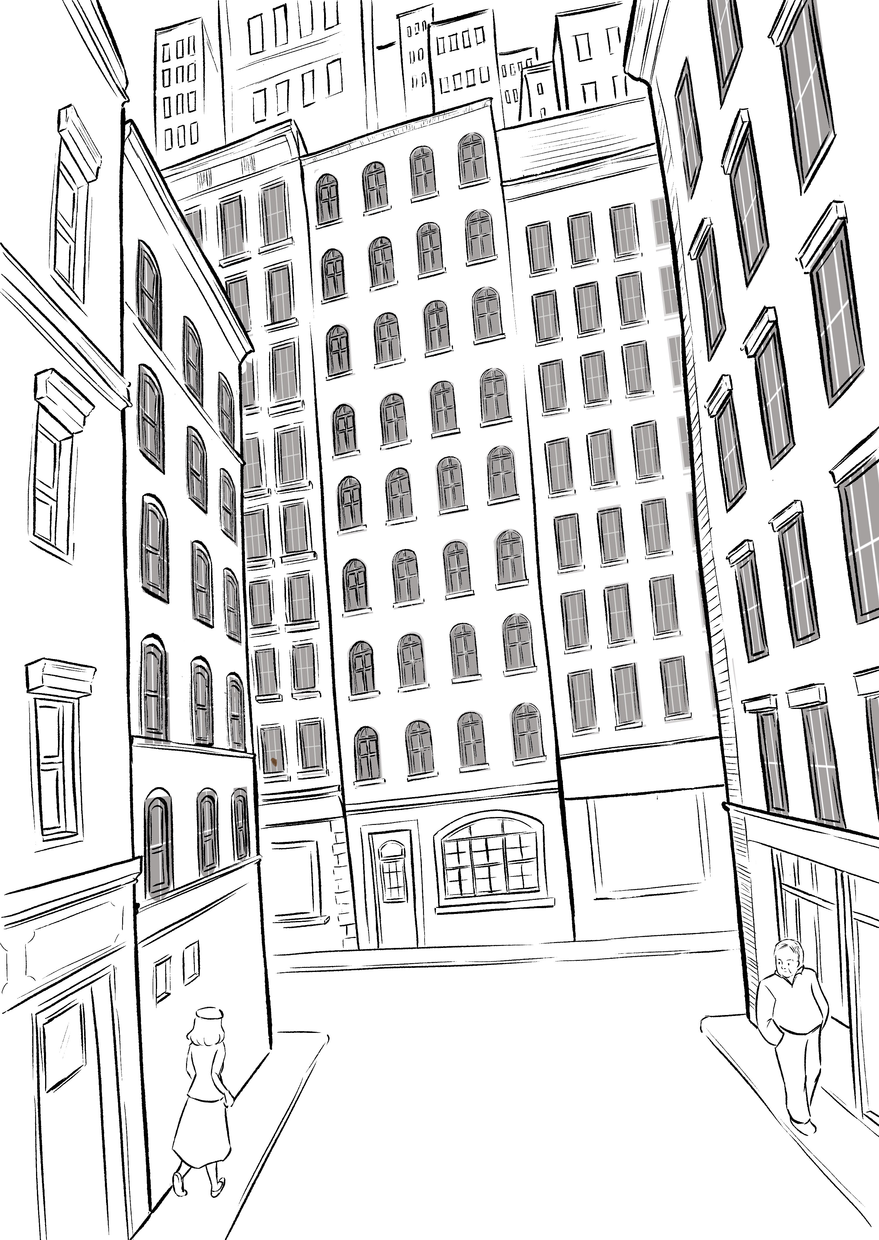
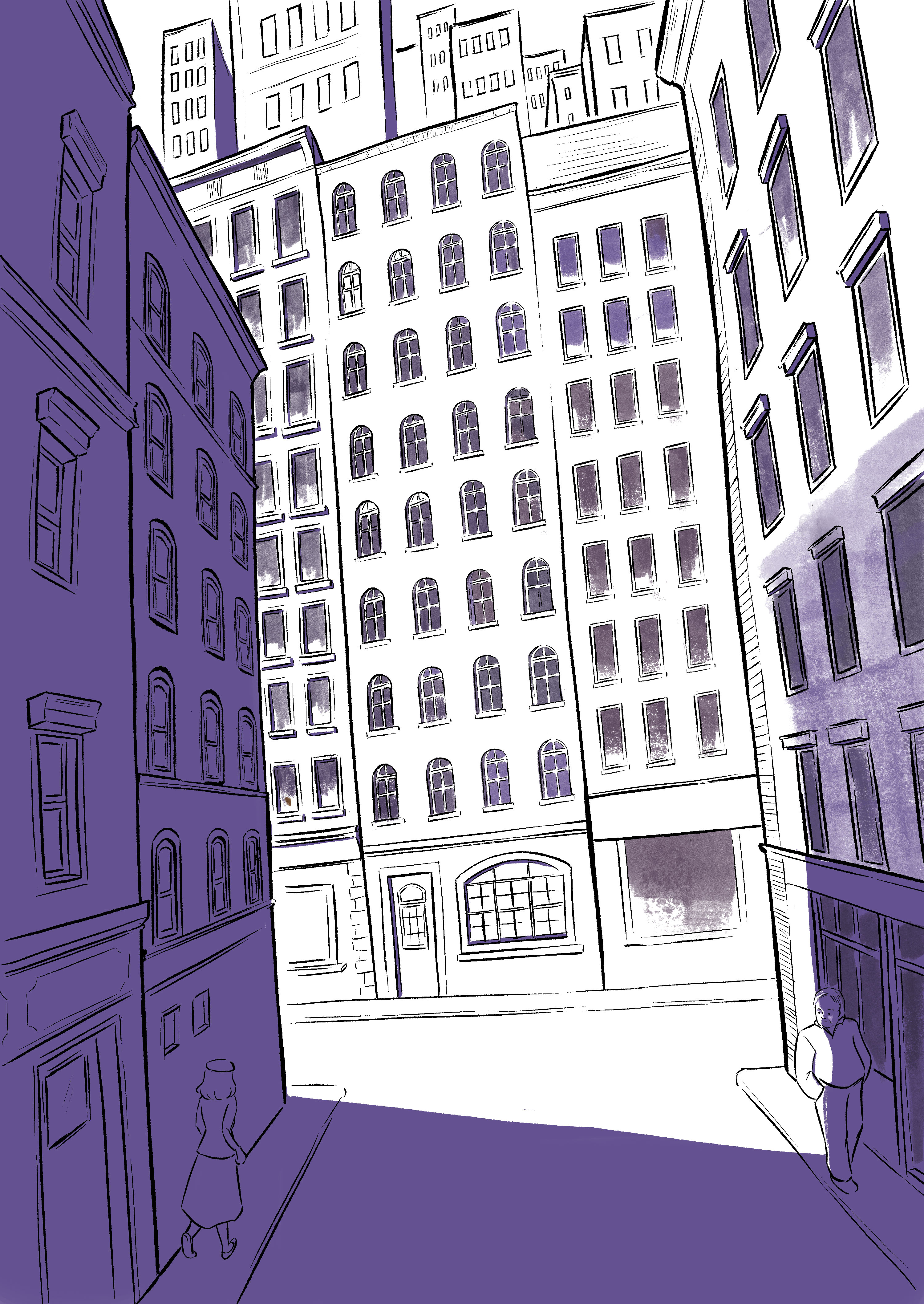
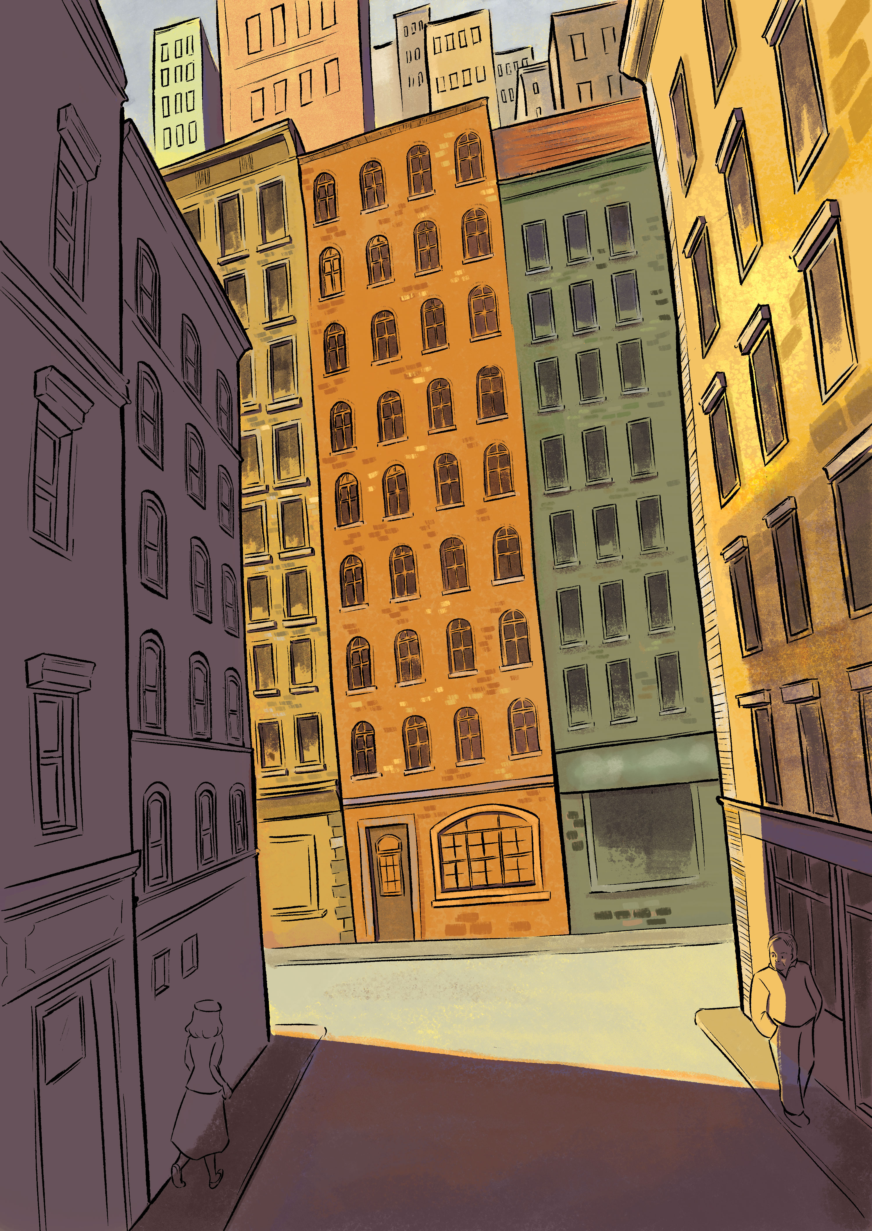
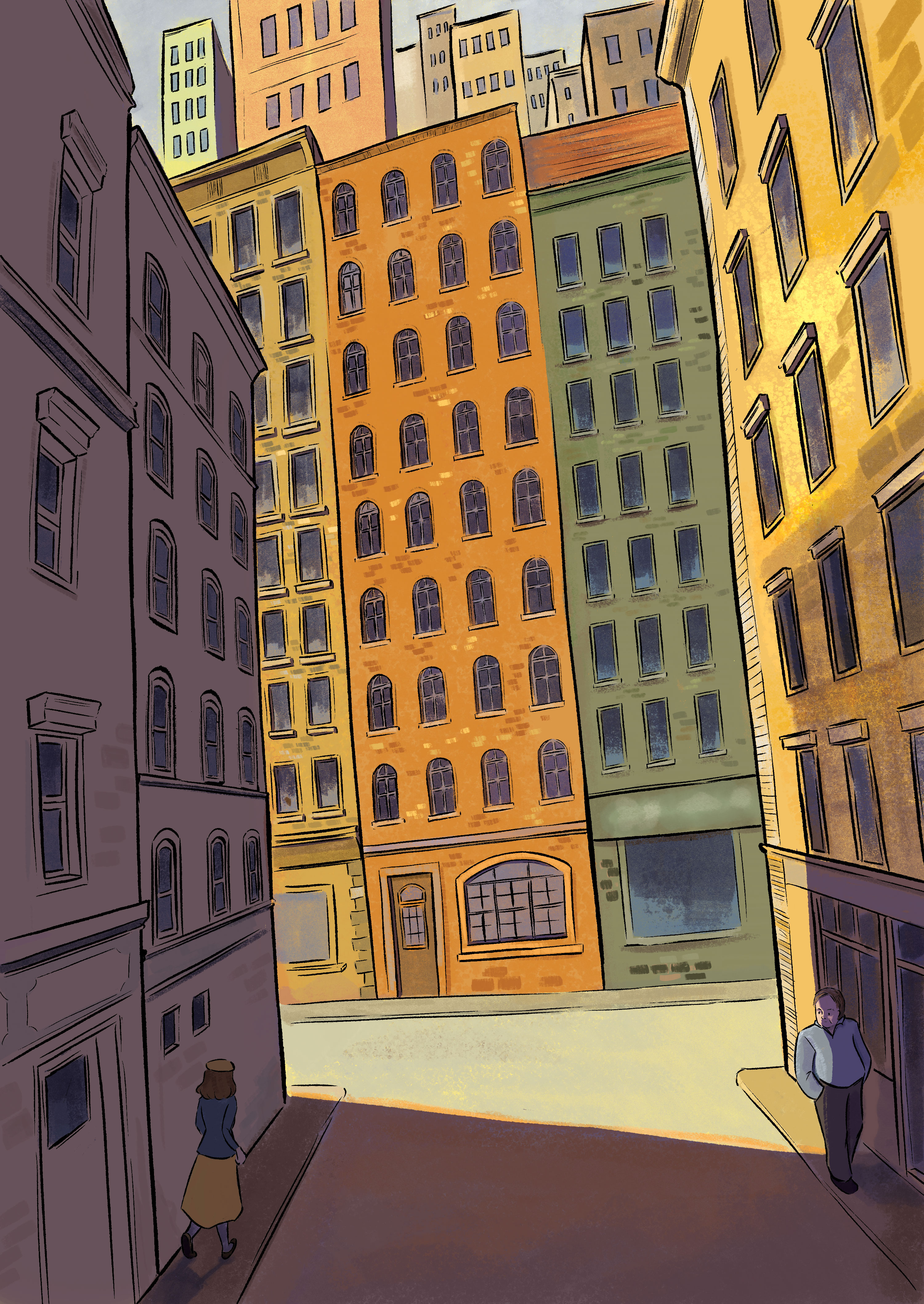
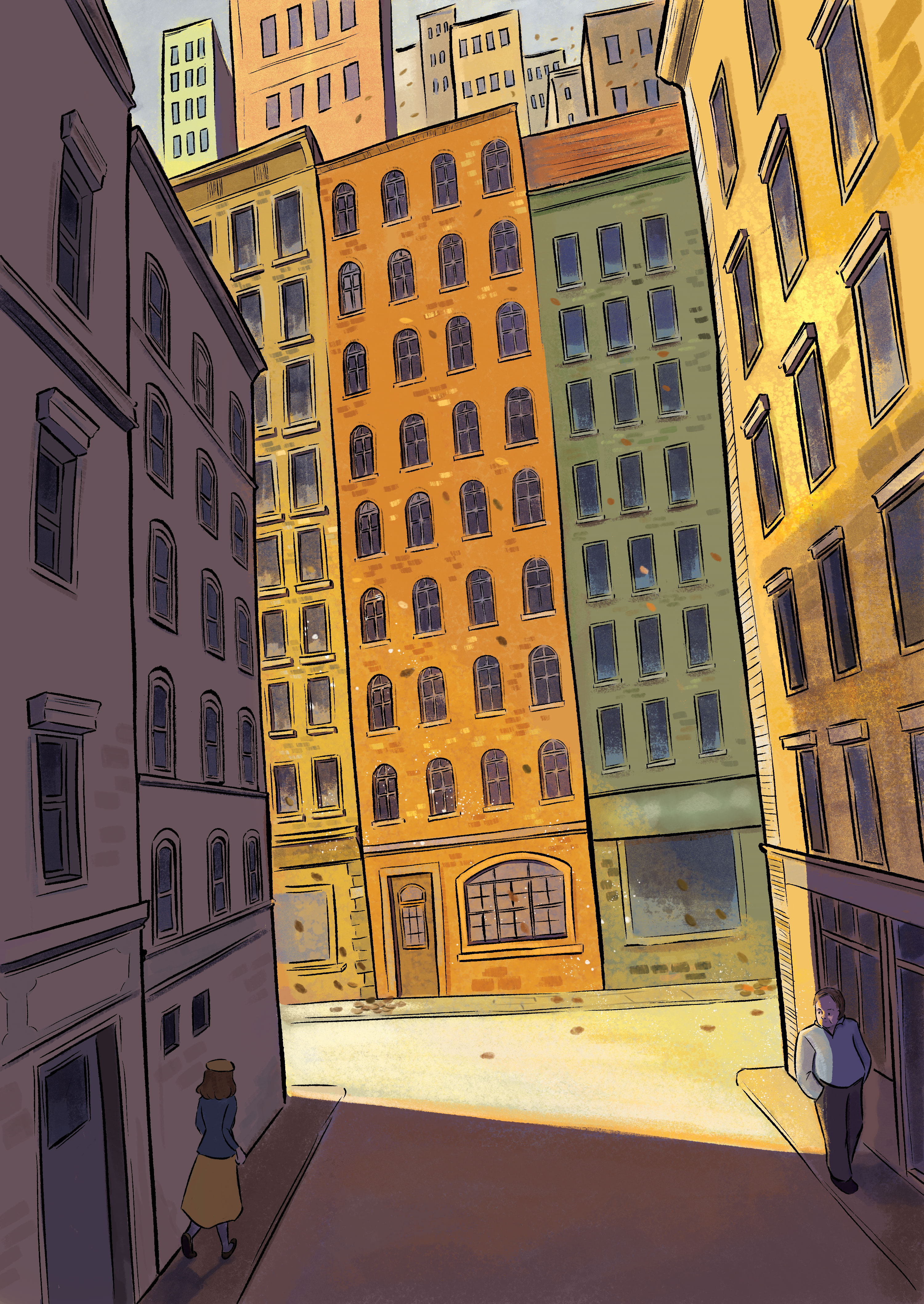
As person growing up in a city with buildings, sometimes I feel lost and falling behind. Buildings, though they are frigid structure, get taller every year. They get pulled down to be built taller and taller; while human, or me, doesn’t. I can’t break myself down to rebuild me to a better person.
Together with the book “Dora Bruder” by Patrick Modiano, I come up with this idea of a girl getting lost in a city, a crowd of cold blocks stacking over each other.
The sketching for this illustration actually took longer than the painting. There are a lot of windows to draw and I have to make sure the perspectives are distorted out of reality. About color, I already have the idea of using orange-yellow tone for a nostalgia vibe, which indirectly determined my choice of shadow (purple).
That’s it! I love this illustration because I love the book and I’m proud of me taking time with all these windows.
I will be exactly 26 in a few days and I often find myself dwelling on the past, not necessarily my childhood or adolescence, but the years after graduating from university. Though I kept a big journal, I still wonder how I have got over all of these things. I don’t share my journal, because it’s very personal and I mostly wrote about my relationship with people rather with arts. But I think a journal about arts could be shared, hopefully helping anyone reading get over the feeling of being lost in our 20s.
As a freelance illustrator, summer is often the slow season. People go on holiday, there are no big celebrations and this year, with generative images and recession all over the globe, it’s even a slower summer for me.
I tried to take this as an opportunity to improve my skills and were ambitious when I plan for the summer. I was already ambitious when I wrote down my new year resolutions, even though I have never completely achieve them. I want to continue paint landscape and improve my portrait, storyboard, people in drapery and animals skills.
It was smooth with animals and portraits because I started practicing with them already in spring, I just need to finish them as I go. Storyboarding is surprisingly hard because there are not much to remember, it’s more about imagining a camera running around in space and merge them with your perspective skill. It starts growing too hard and I have to decide to delay learning it, trying another source of book and lectures.
Sketching people in drapery is figure sketching but a new level. I practiced figure sketching with nude models or minimal dressed models so when the big challenge is to imagine how their arms and legs move under the fabric. And choosing what folds to tell the story; there will be folds that can be memorized and folds you just add because of a specific pose.
What I didn’t plan to study is learning to use Procreate, because I’m still not sure whether to get an Ipad or a new laptop. But I decided to get an Ipad, because I prefer something lightweight and minimal. I never fully use and understand Photoshop and it’s too heavy, Procreate works much better for me, it’s just drawing.
Some Procreate sketches
Apart from new skills, I still try to paint landscape both outdoors and with images I gather myself. This summer I painted a lot with my Holbein Acrylic Gouache, which has brighter tones compared to my old Nevskaya Palitra gouache.
It sounds like I have learned and done a lot of things, but actually I felt like a crap all the time. When I started freelancing and studying arts on my own, I believed after a few years, things would get easier and even if I’m not a genius, I must have gather skills and projects along the way. I did gather new skills and projects, but the feeling of having nothing and being nobody is still the same. I guess that the curse of being an artist.
I’m a mixed media artist, I just have lots of tools, maybe not as much as a professional-trained artist, but enough to keep me messy.
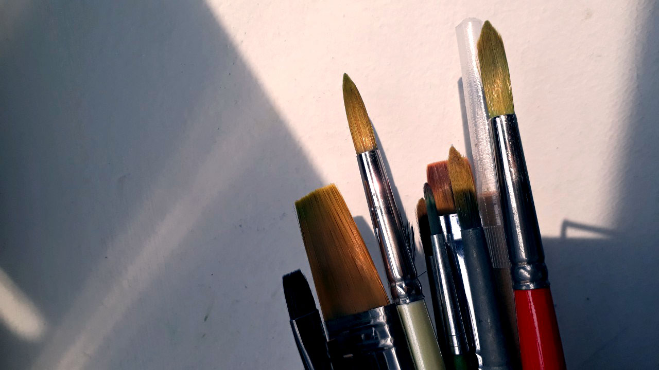
Brushes
flat brushed introduced by James Gurney. I noticed for round brushes, the more expensive the brush, the better it feels. However, it’s not the same with flat short brushes; price difference doesn’t mean much.
Flat brushes are easier to control and lasts a bit longer than round brushes to me. The tips of round brushes often wear off after a few months, as early as 3 months, the bristles start getting spread out. Short flat brushes preserve their original tip for a longer time and the bristles stay together even with minimal care.
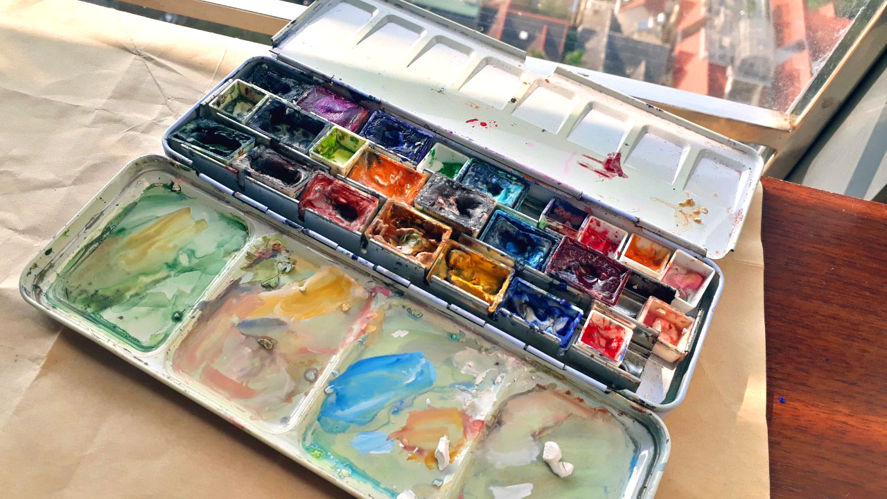
Watercolor
Japanese and Russian brands are the most affordable ones. Hayao Miyaki used Holbein – a pretty commonplace brand. His method is direct, simple and adventurous. Personally, I’m influenced by Nathan Fowkes and James Gurney method: mixing a bit of gouache with watercolor to fix the details that didn’t go as I want. Adding white gouache instead of diluting the color with water will create a smoother painterly effect, and white gouache saves me when I forgot or mixed up my plan with the highlights. I get a separate pack of white gouache from Himi, a brand famous for their jelly paints.
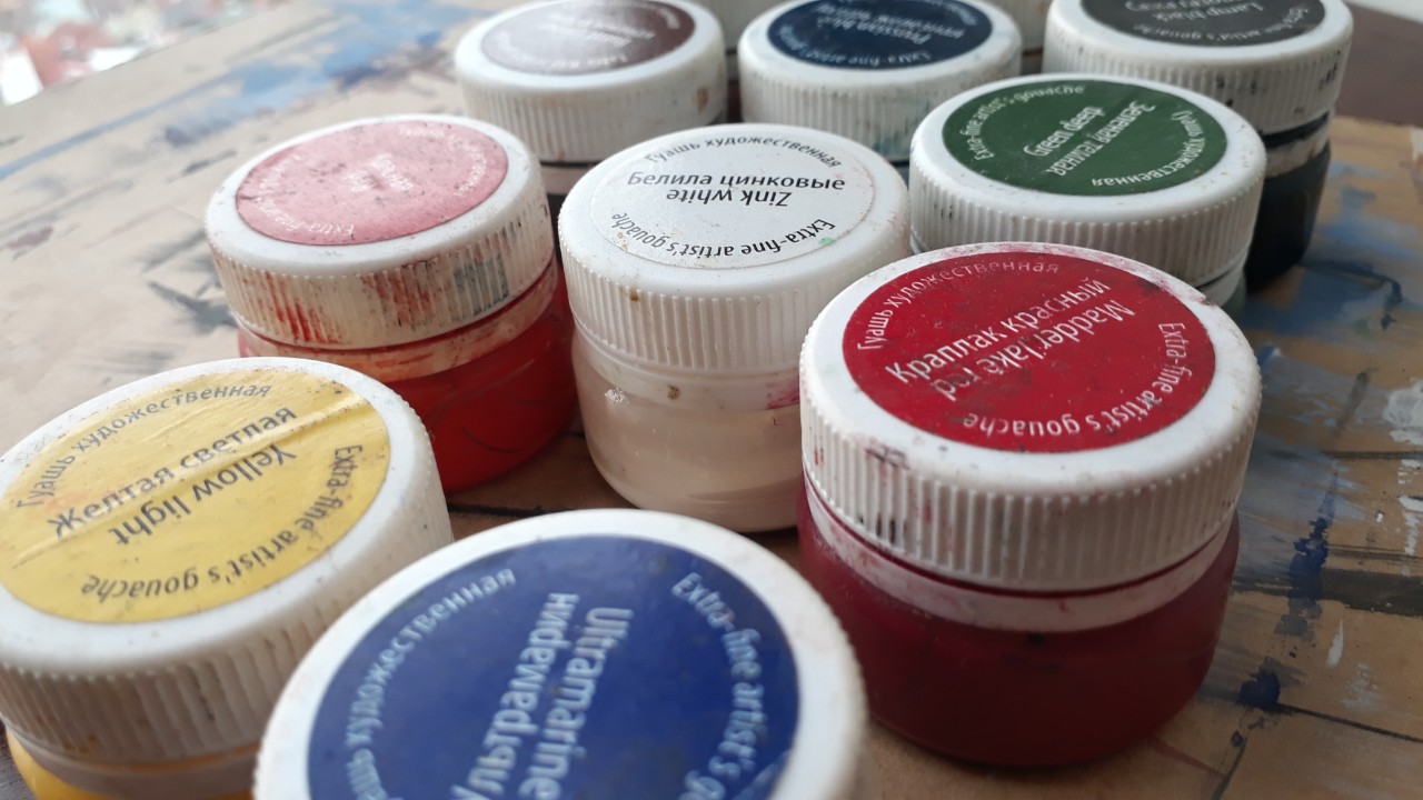
Gouache
I have used only one brand of gouache only, from Russia. It’s challenging at first because it doesn’t have color codes, which often shown on America, English and other western brands. Being an artist doesn’t mean I can spot color with my eyes, color codes are there to standardize among different brands.
Paper and Sketchbooks
I often purchase watercolor paper in a large pack and cut it into the sizes depending on my use. I often paint small, (size) from (size). I will use cold press paper for more texture, and hot press when I need a smooth surface.
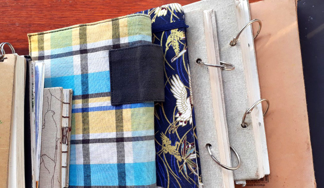
I like to have sketchbooks of different sizes, especially small to medium-sized to carry them around and sketch when I’m free.
I like to make my own sketchbooks so as to avoid the fear of ruining a fancy sketchbook. I only have one “fancy” sketchbook, and the progress of completing it is much slower than others. It’s the one used for social media promotion.
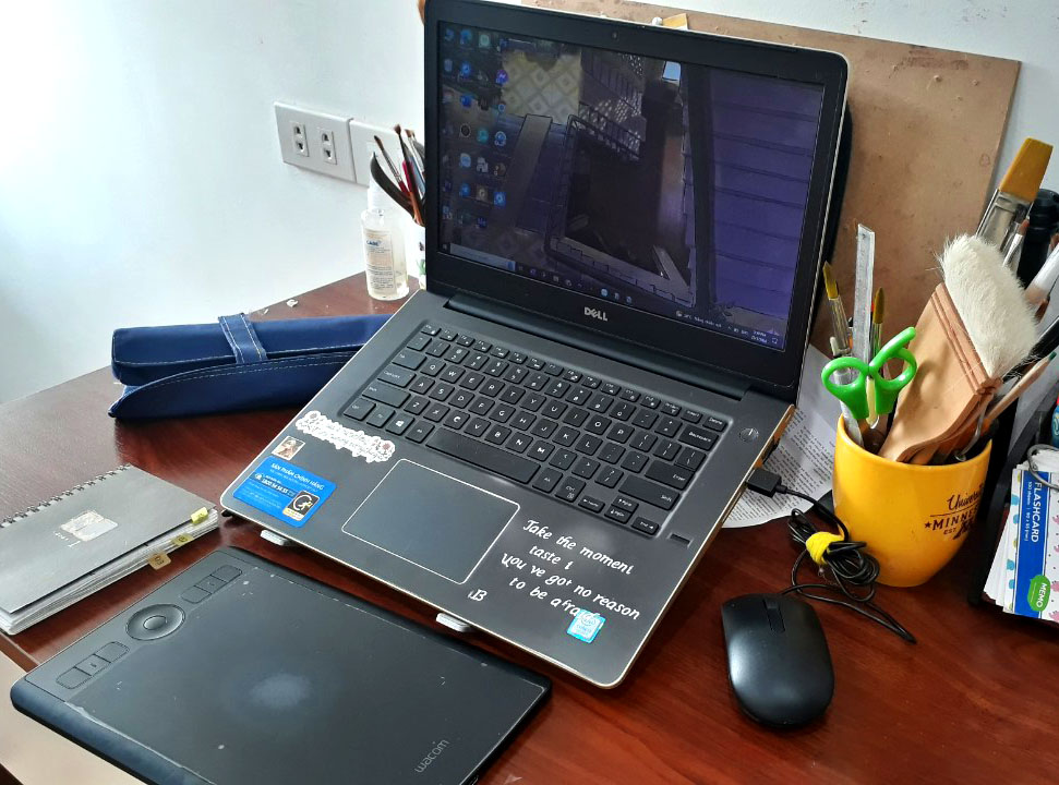
Digital tools
A medium-sized Wacom and a laptop. Most of my digital brushes are made from Kyle Webster – I’m a big fan of textured brushes, namely ink and watercolor brushes.
I don’t think there’s a must to acquire expensive laptop or tablets to start painting digitally since I don’t know what direction to head. Gaming or animation certainly needs high-quality tools, but illustration works can be done with a normal laptop. I believe in starting small and growing big later.
As you can see, I use a diverse range of tools to create arts, which is also a joyful aspect of being an artist. I hope to be able to experience more materials, tools and topics – if you are interested in these things, subscribe to my blog or connect with me on social media!
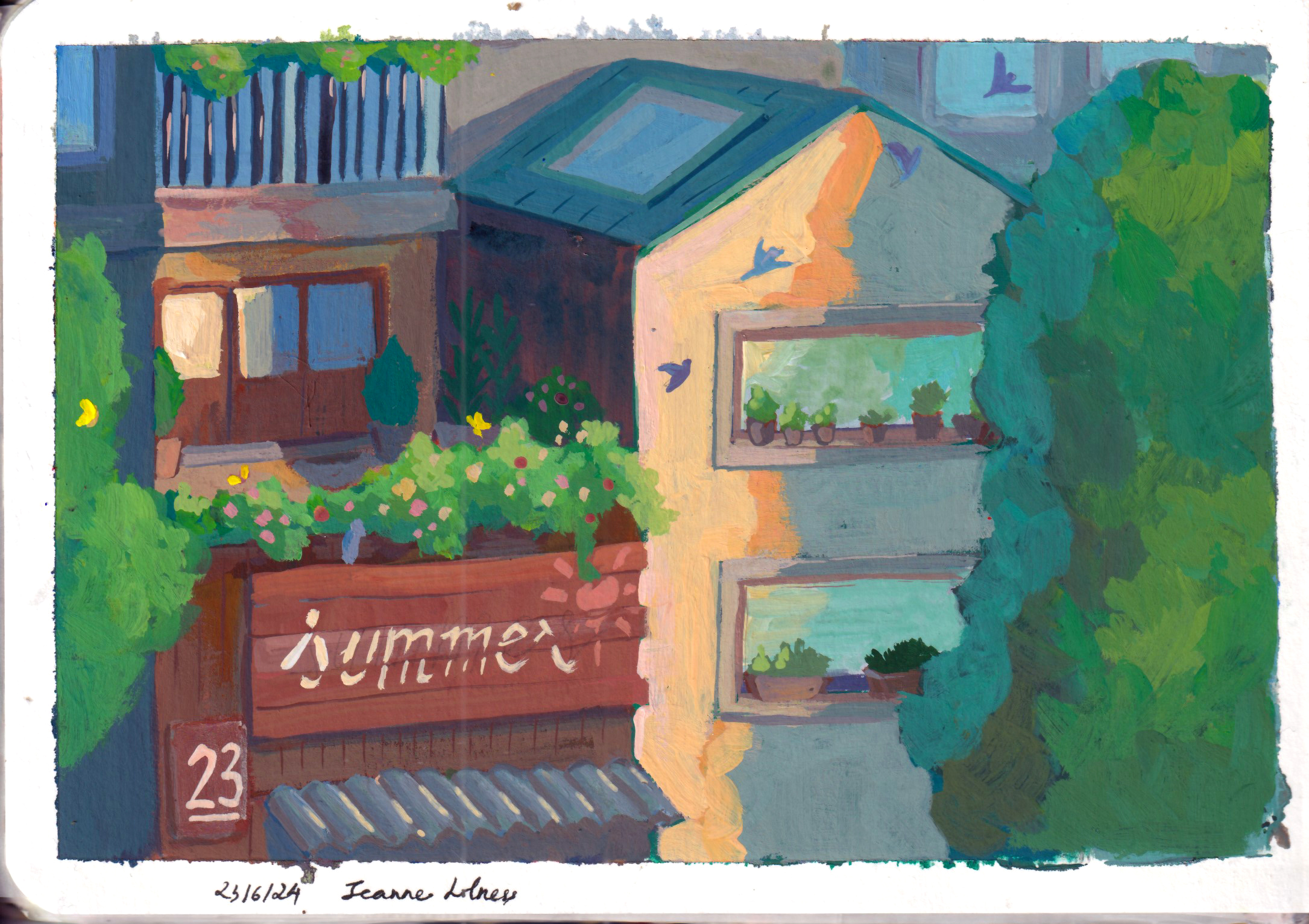
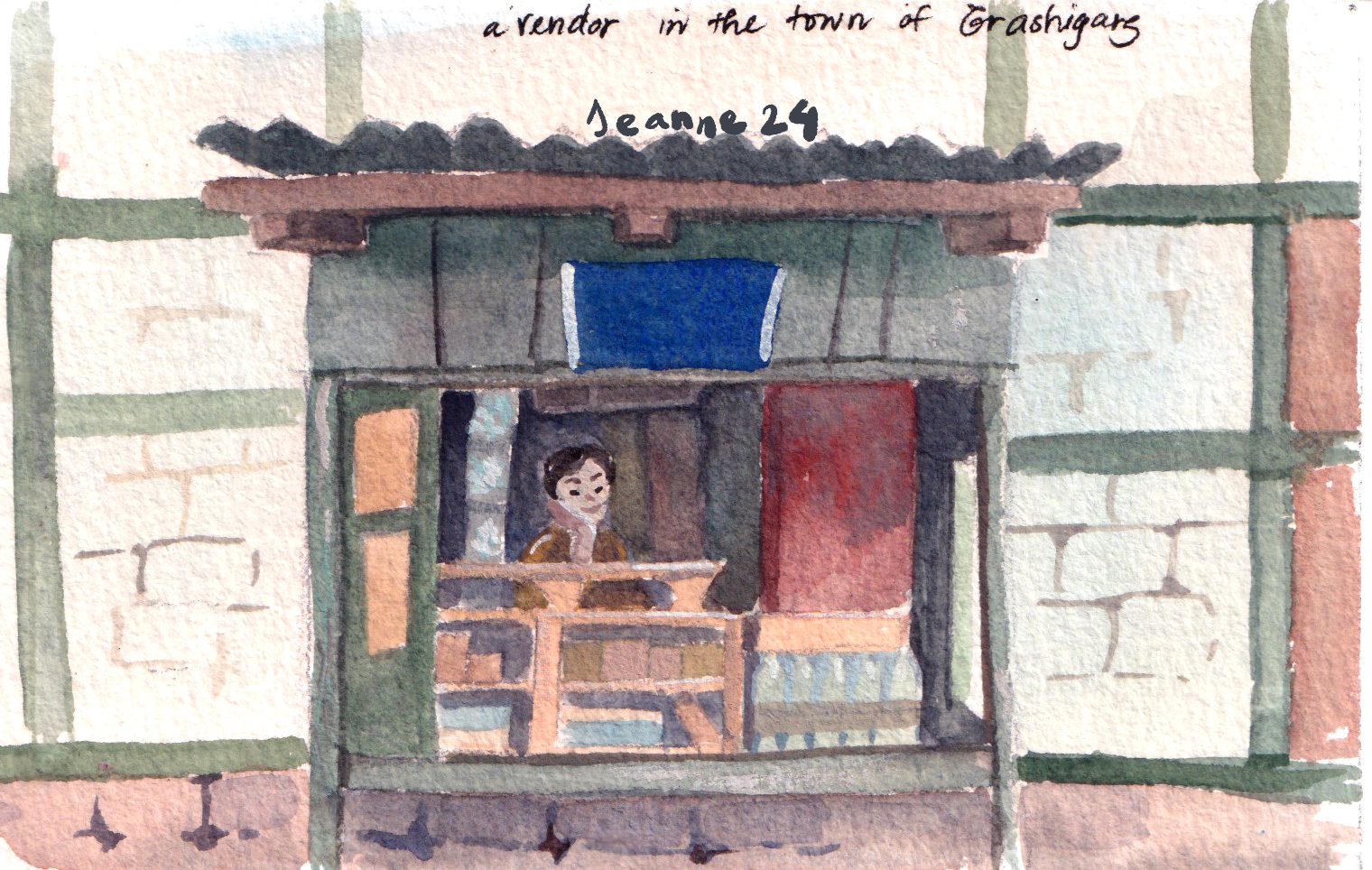
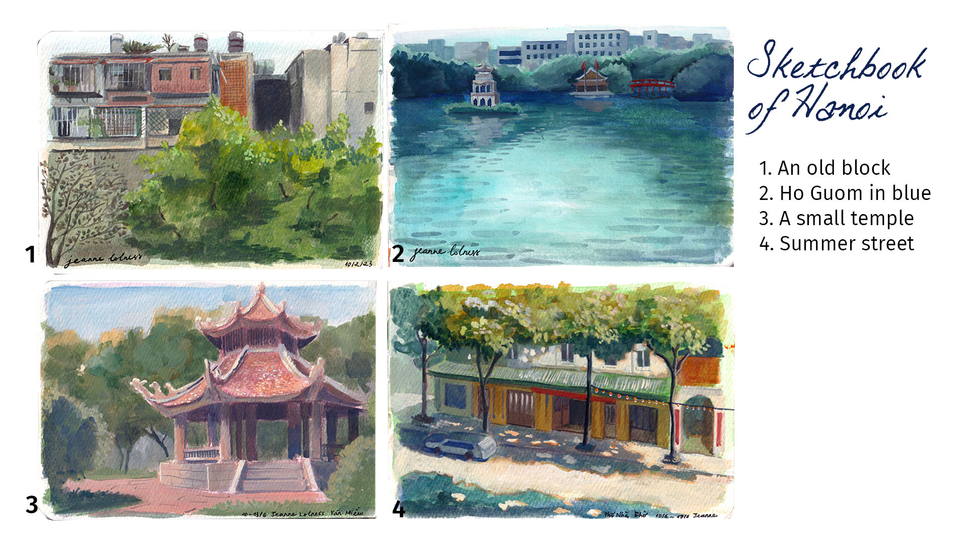
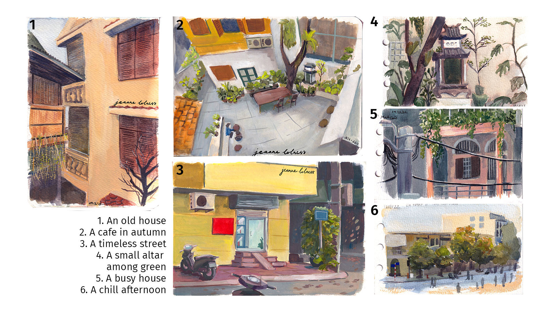
Growing up in Hanoi, I have an affection to every cornet of this city. Especially those are less known with tourists, because these places feel more authentic to me. When sitting in a cafe painting these scenes, I feel like capturing a moment of this city, a moment that will be gone with unavoidable modern development.
That’s why I tend to chose old houses or historic structures, so that theirs stories can live on through my paintings.
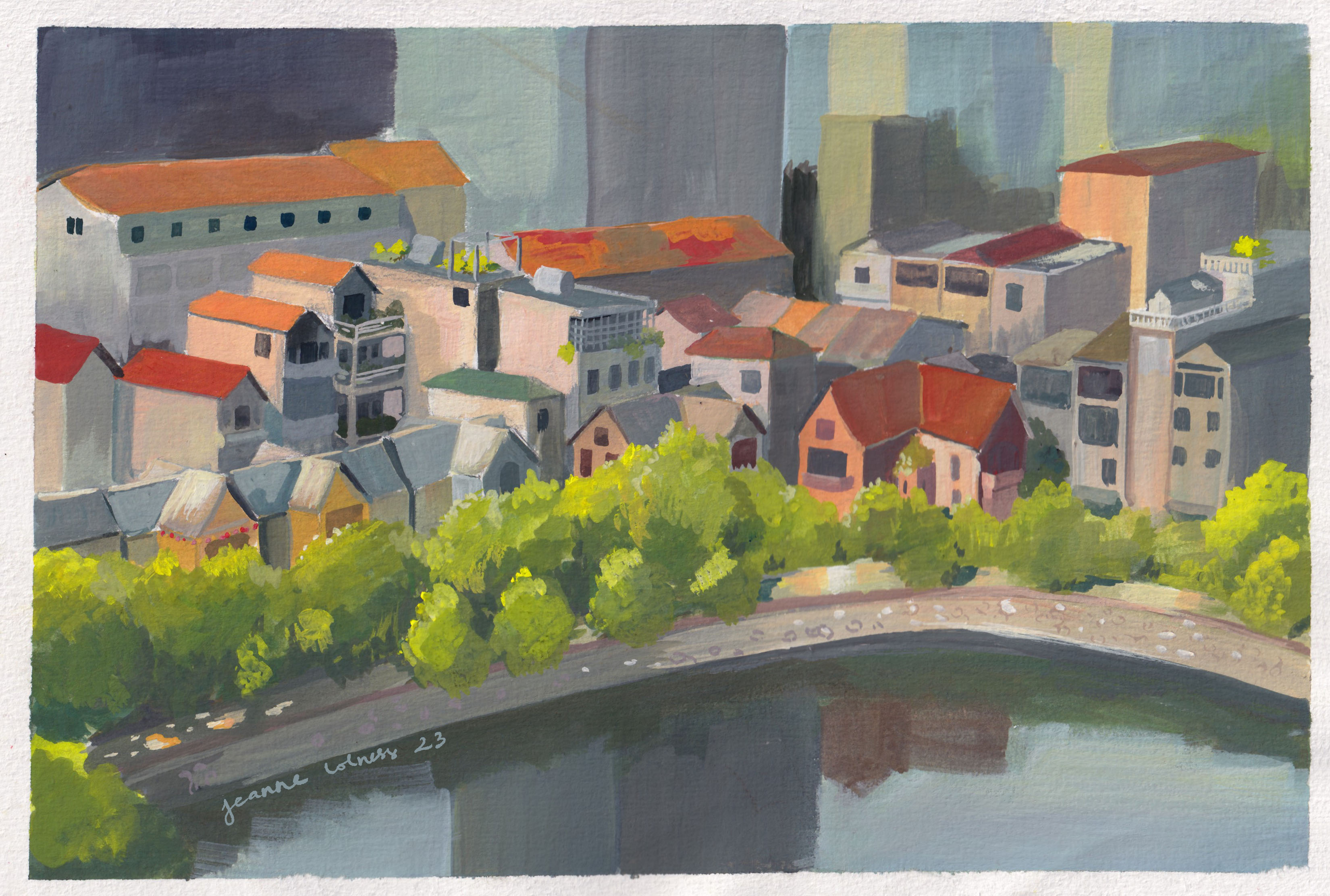
Below is my favorite painting of 2023 – this captures idyllically the area I grew up in, a very ordinary area with no tourist attractions. I’ve walked pass these houses hundreds and hundreds time.
I know that one day I will miss this scene dearly.
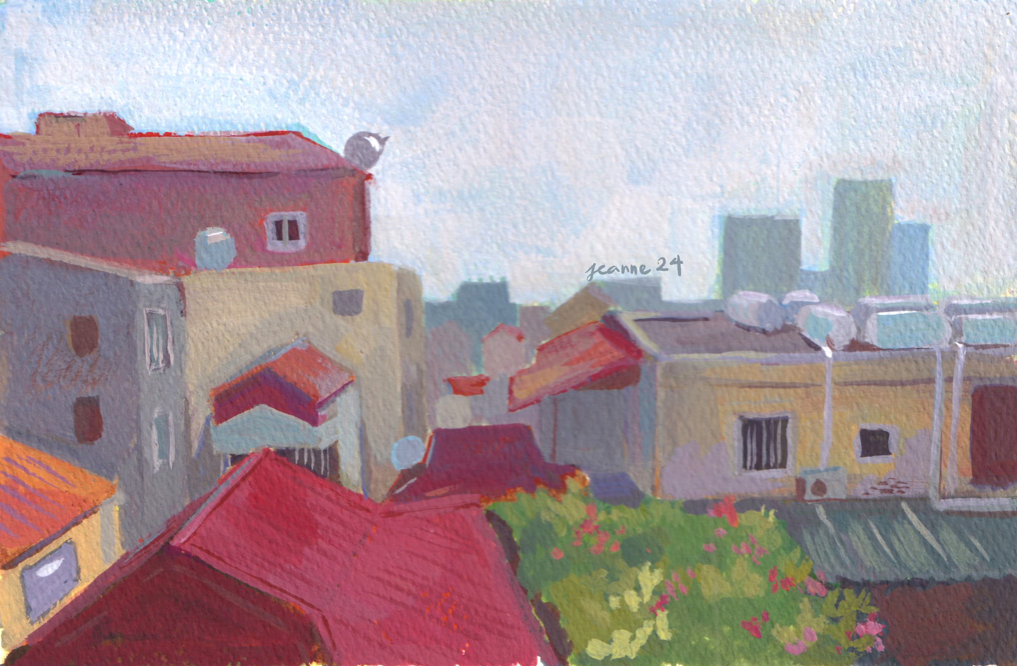
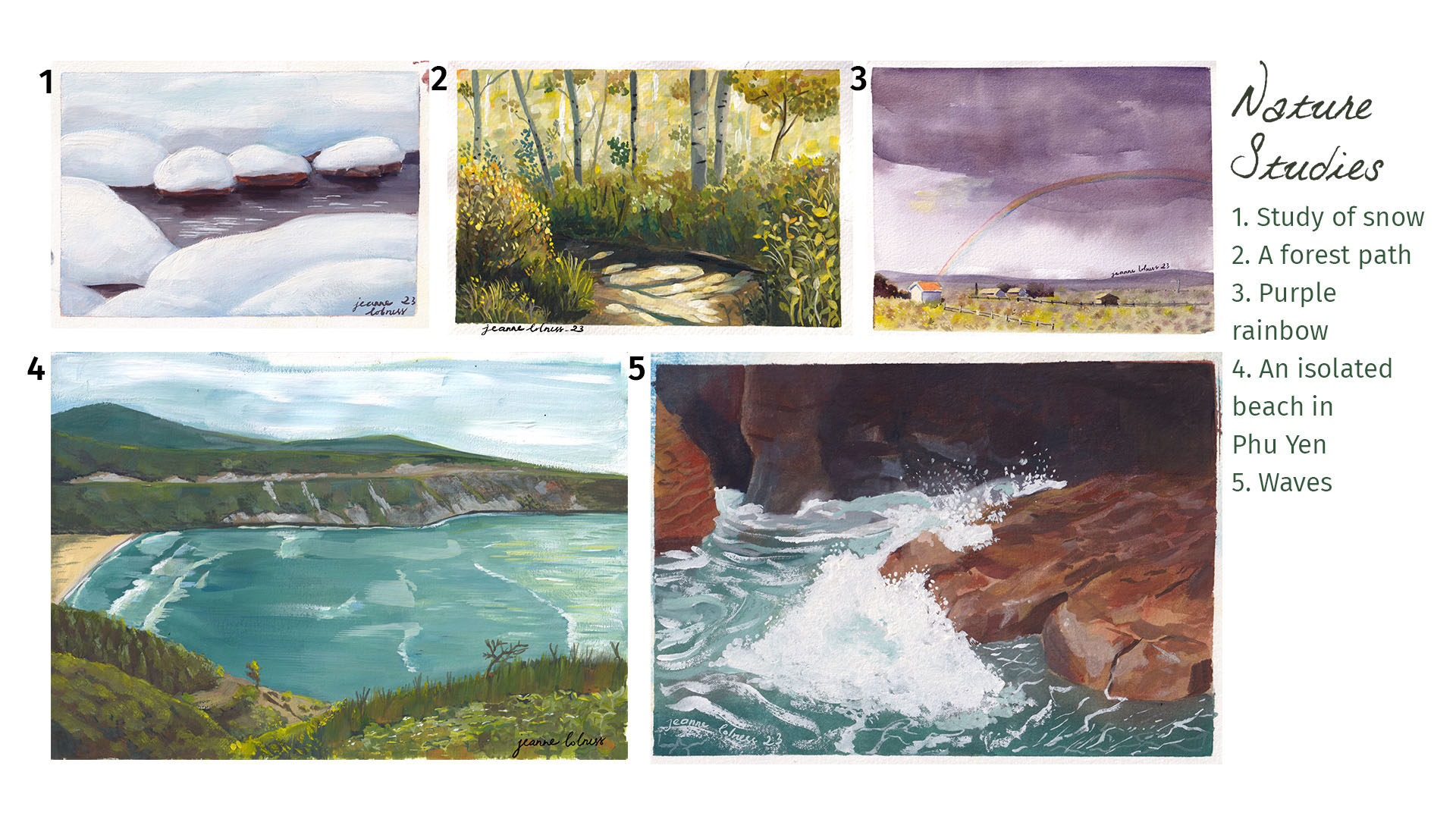
2. Studies of nature
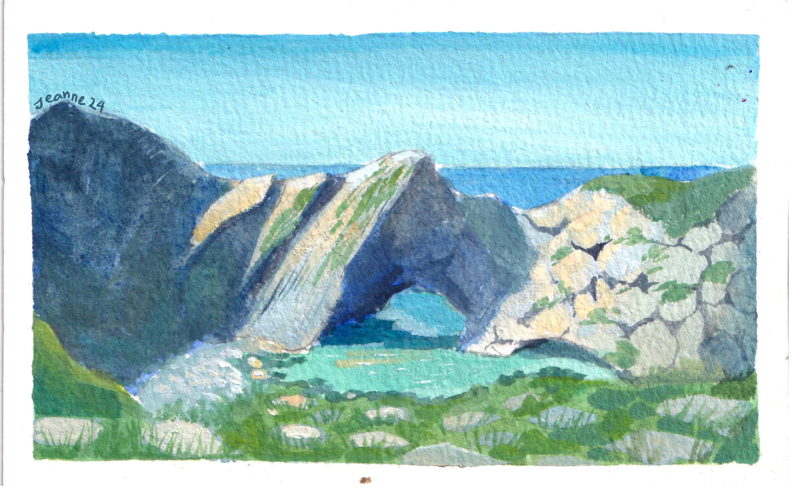
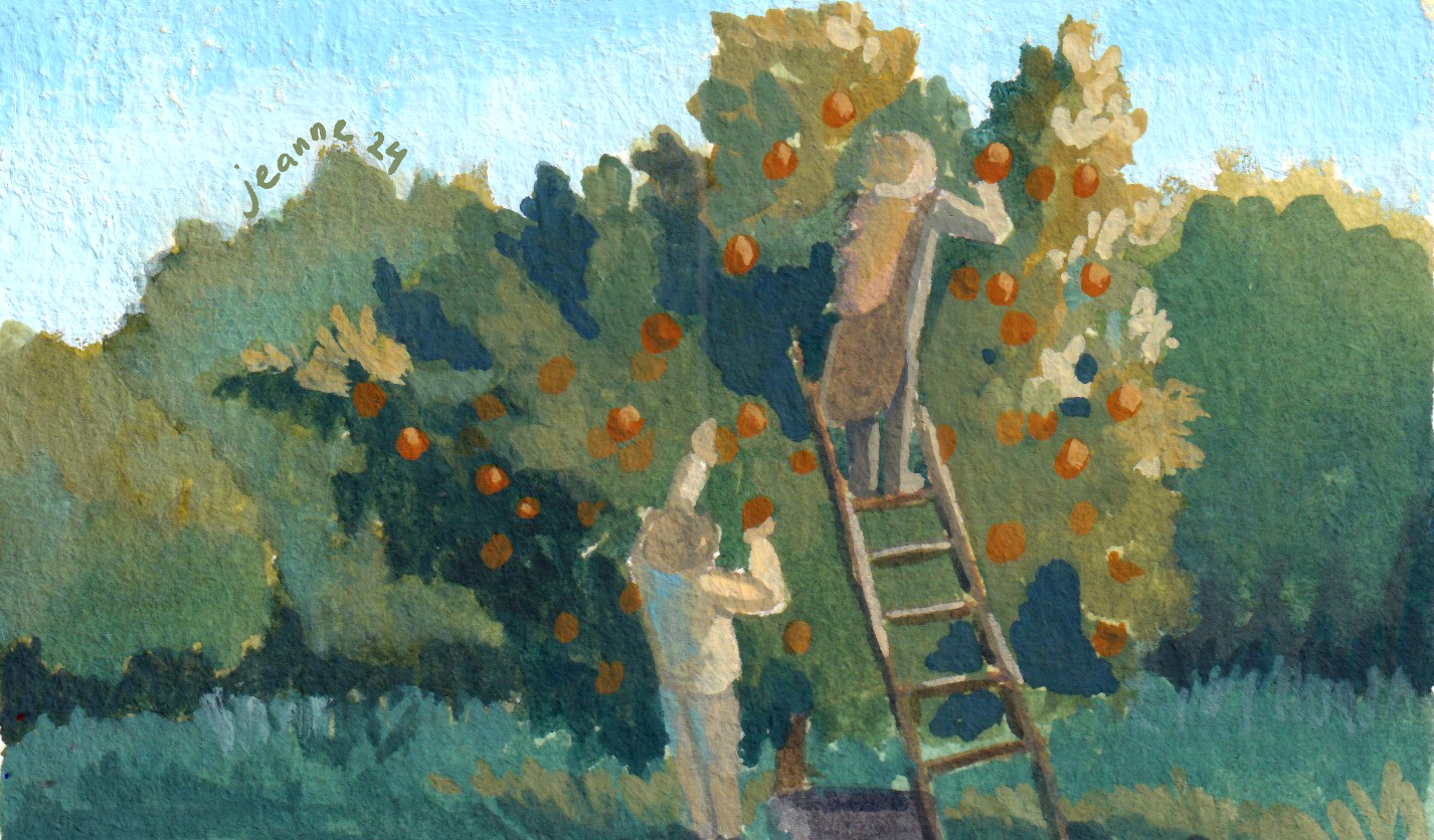
One big drawback of growing and living in a big city is that I rarely get to see a scene just full of nature. All these studies were based on photos.
I personally love scenes of tree and water, both allows me to play with color and reflection. Painting nature is also more liberating since it seems like I’m having a secondary experience with these scenes, an escape from my bustling city.
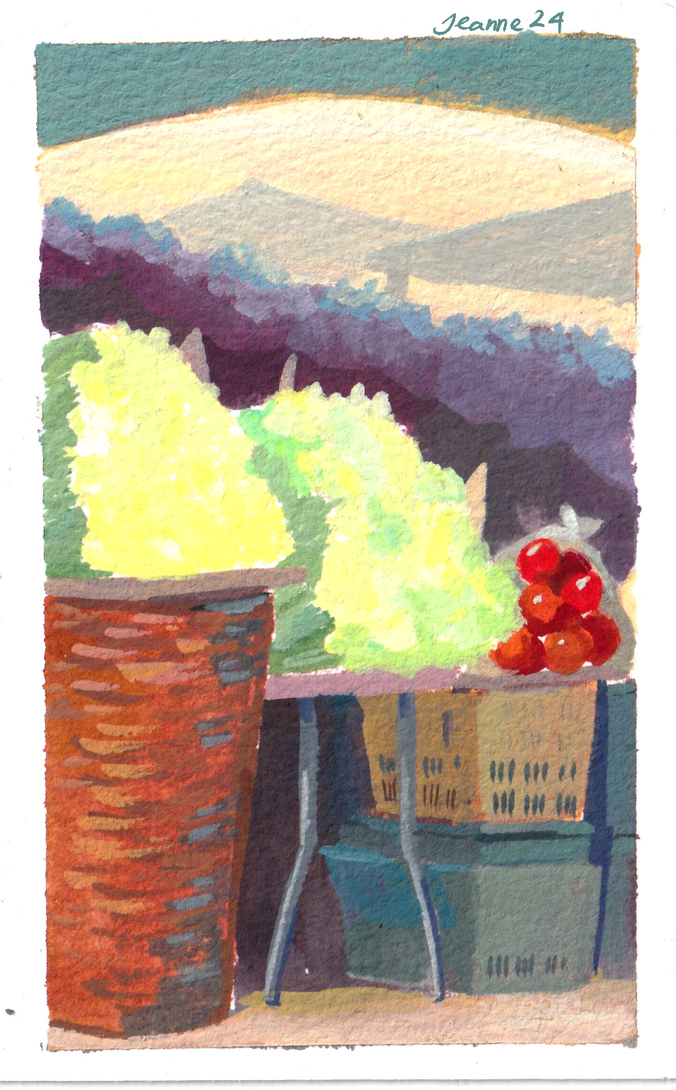
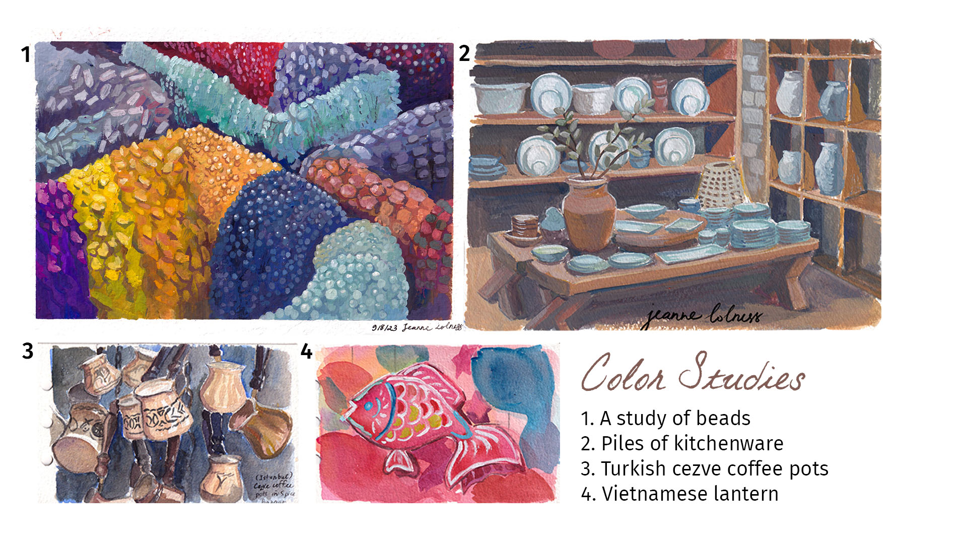
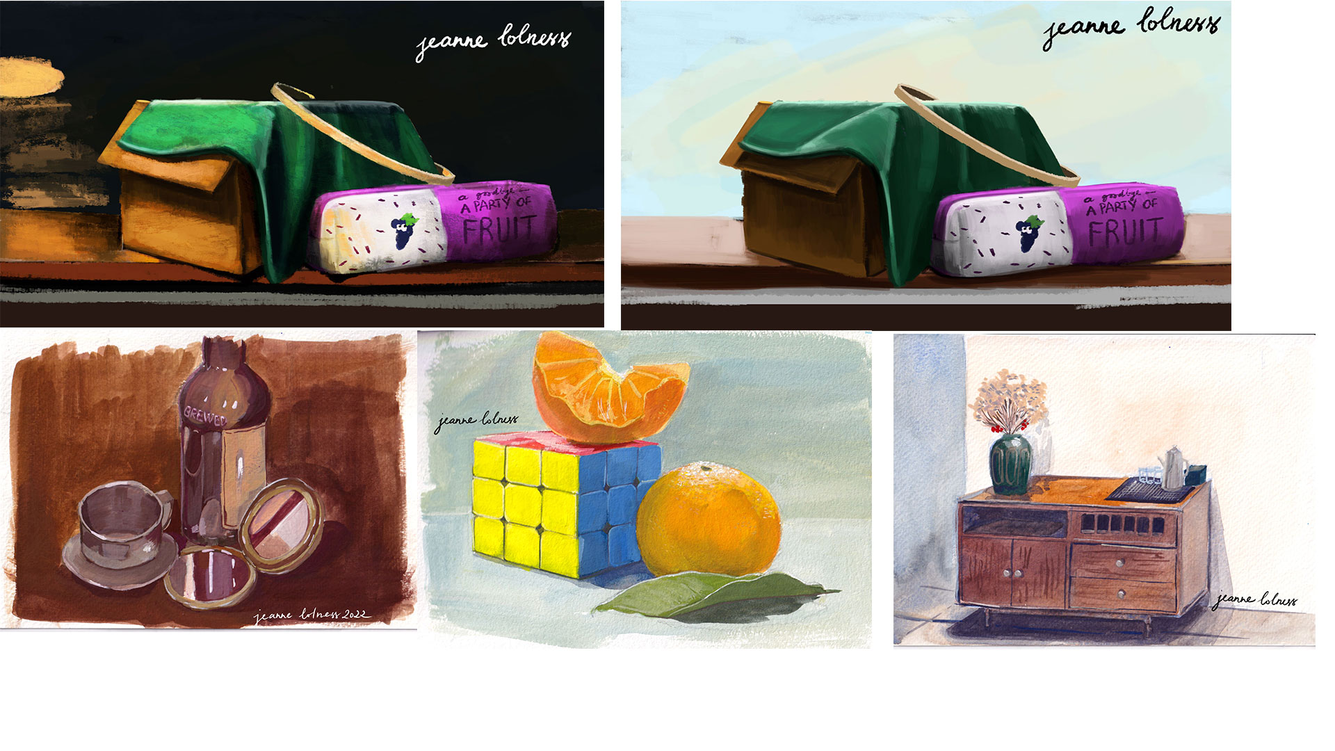
3. Studies of color
I find it still life studies useful but a bit boring, so I often paint scene with lots of similar objects to practice instead. These objects sitting together show contrast in colors and interesting negative space.
Painting traditionally (or trying to mimic traditional painting on digital tools) always excites me, I can’t control what will happen. Mixing color in a palette creates harmony in the painting that can’t be achieved in digital painting.
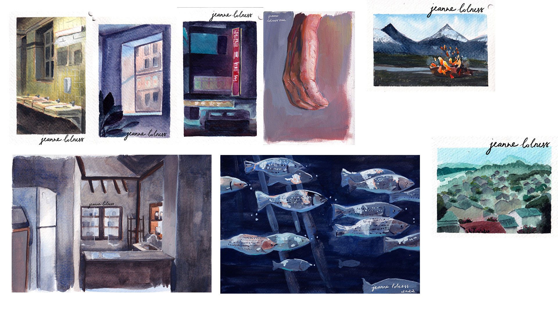
1. Color and Light studies
In these paintings below, I embraced on how the light reaches different surfaces in a wide range of situation.
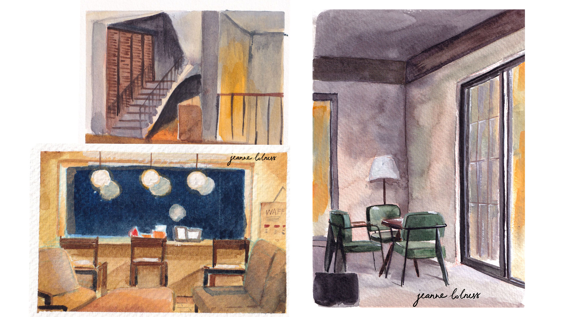
2. Cafe studies
I spent lots of time painting and working in cafes. I enjoy finding and keeping a favorite place for quiet alone time as well as exploring new gems in my city.
3. Still life studies
Still life studies are also part of learning about how color and light works. In these studies, I learned about the smallest reaction between different surfaces and objects.
I tried to set up objects myself using things in my home, but sometimes I do use images as references.