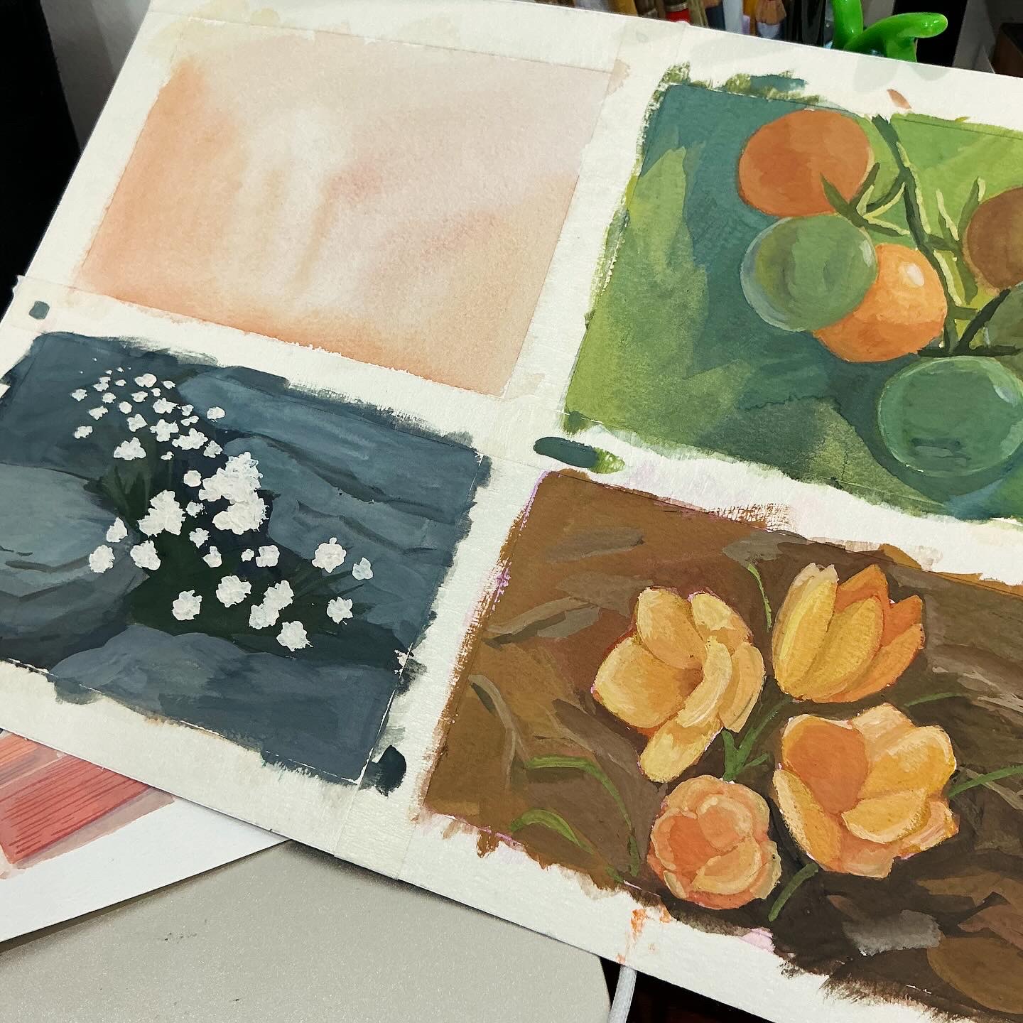
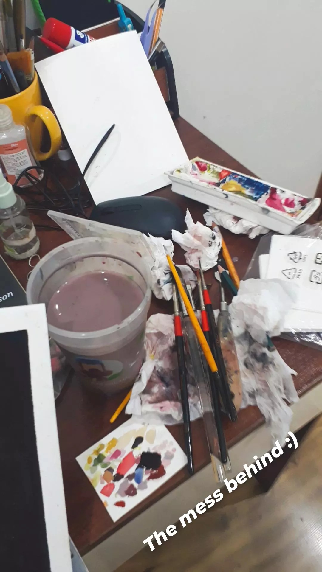
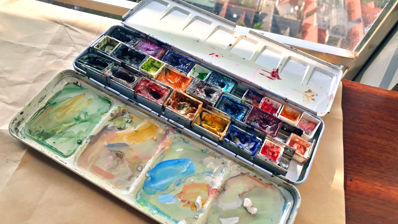
This is just a post to share all the mess behind polished paintings. You can see the underpainting, the half-done paintings, brushes thrown randomly on the desk, the palette almost falling off the desk.
Sometimes, the process means more to me rather than the final result. I enjoy painting fast and playing with colors, so the moment the painting is finished or rather I see that I can’t do anything more. It feels like waking up from a dream and I’ll need to wait until next night for another dream.
2024 saw me going up and down with painting, beginning with an intensive period of doing portraits and then a loose period of painting random things to find out: what do I want to paint? Some context: for the past 2-3 years, I have been allocating my efforts on the technical side rather than idea sites; since I often stuck by techniques. Sometimes, it was confusion while mixing colors, other times, it was problems about anatomy, perspective, etc.
My belief is that I would perfect my techniques or style to some point before thinking about what I want to express with my works. Well, it turns out that arts doesn’t work like that, and I get annoyed by endless practice and studying sessions.
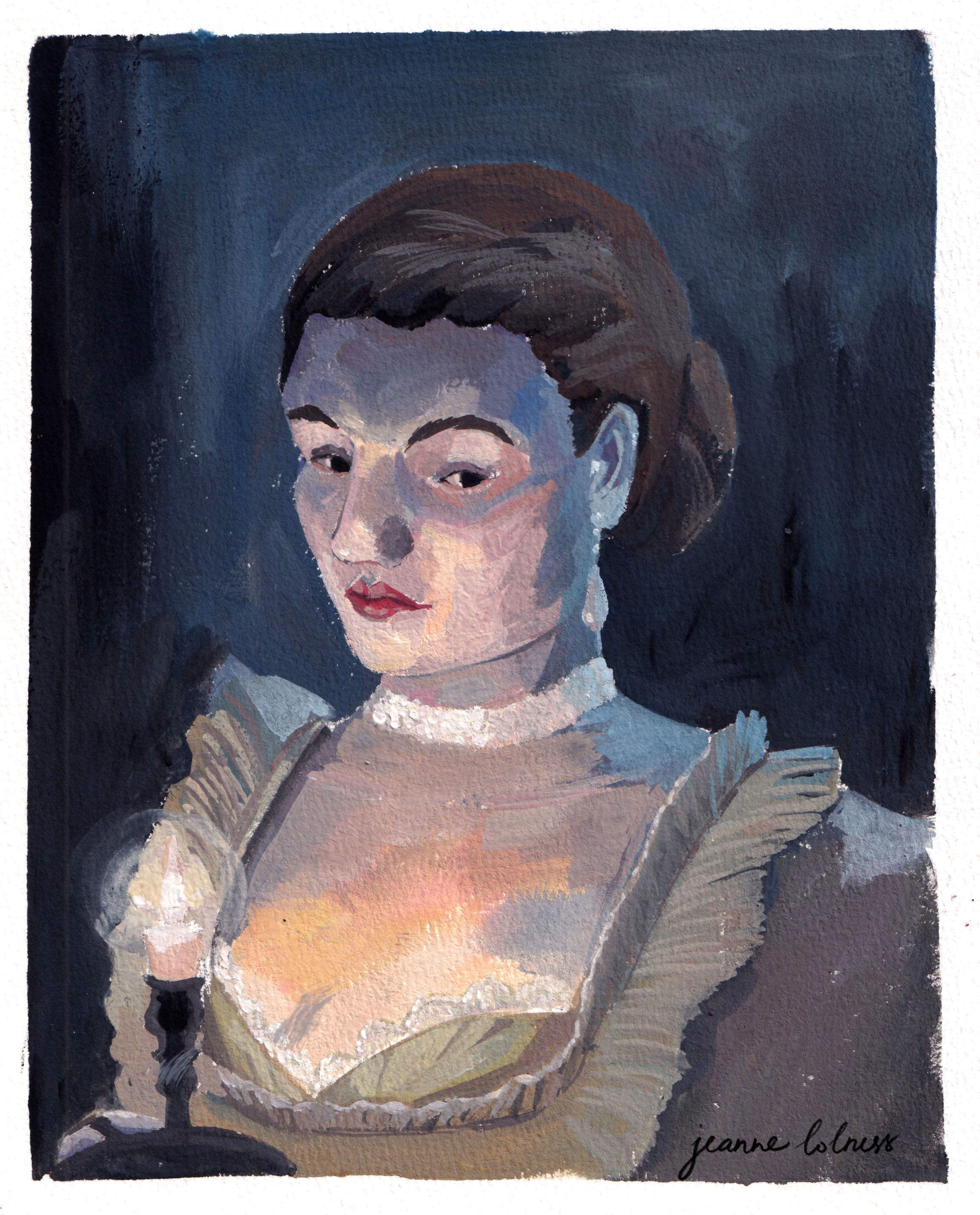
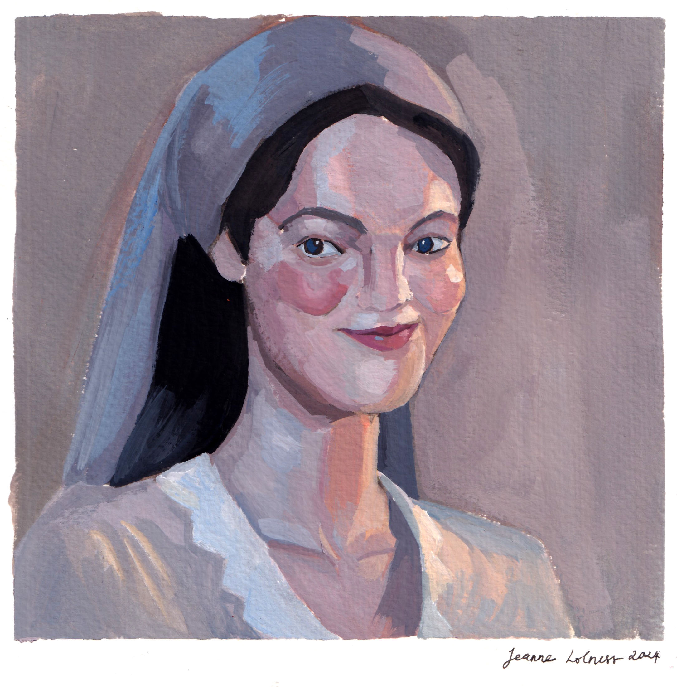
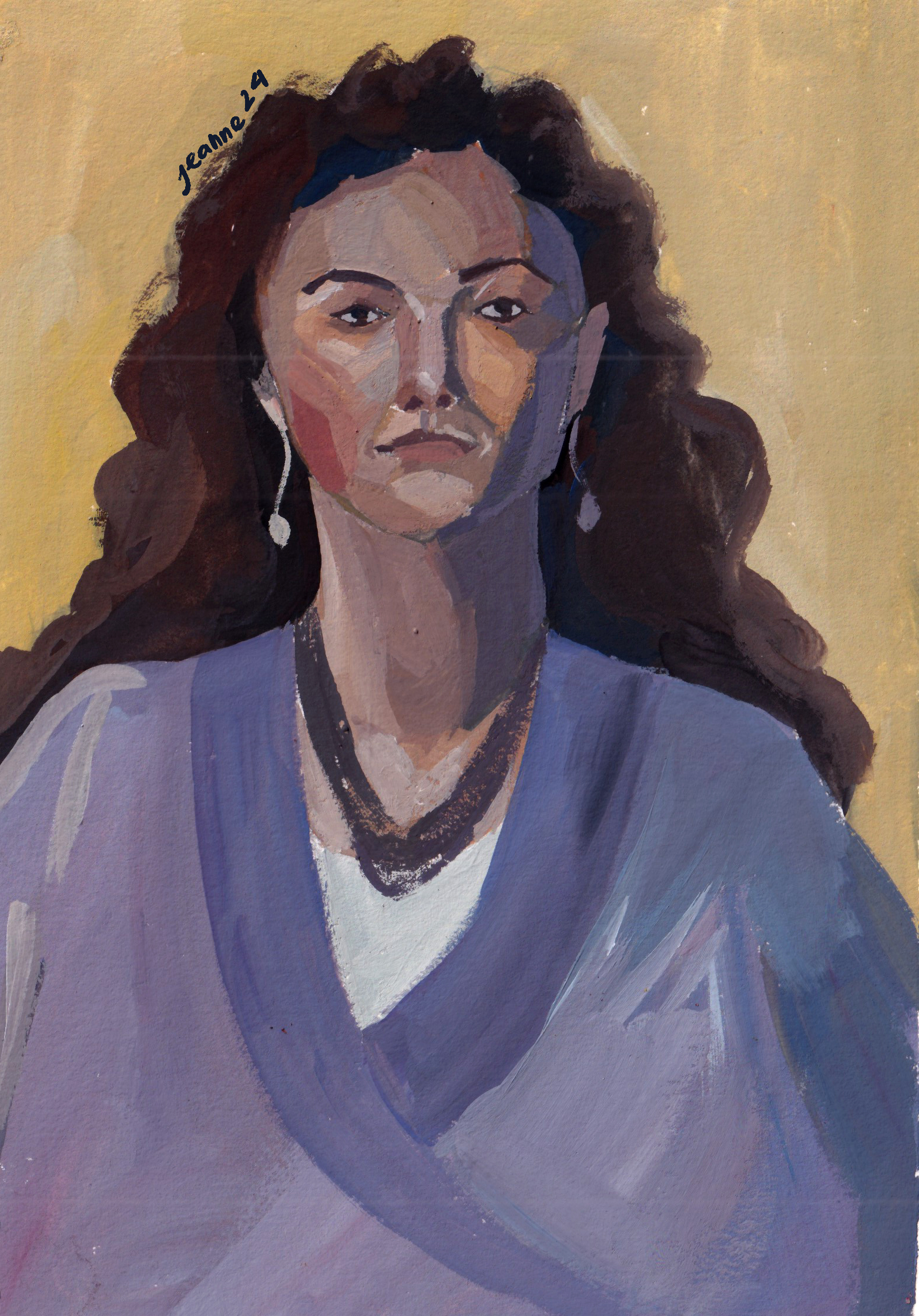
But let the story begin with the first few months. I was into learning about colors (again) and portraits. Portrait paintings were to recall my anatomical knowledge and to boost my color skills. Mixing skin tones is still something I need to work on.
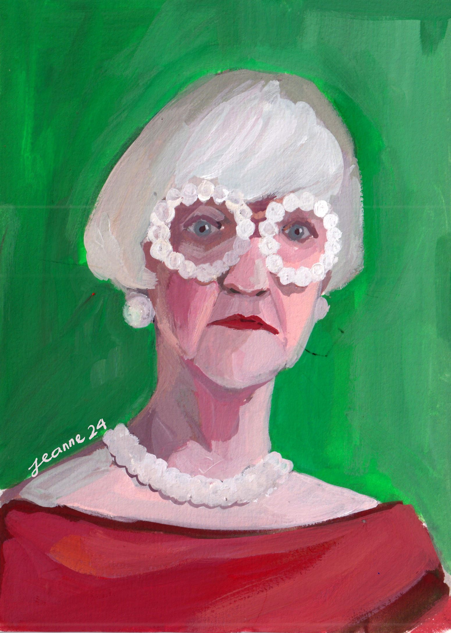
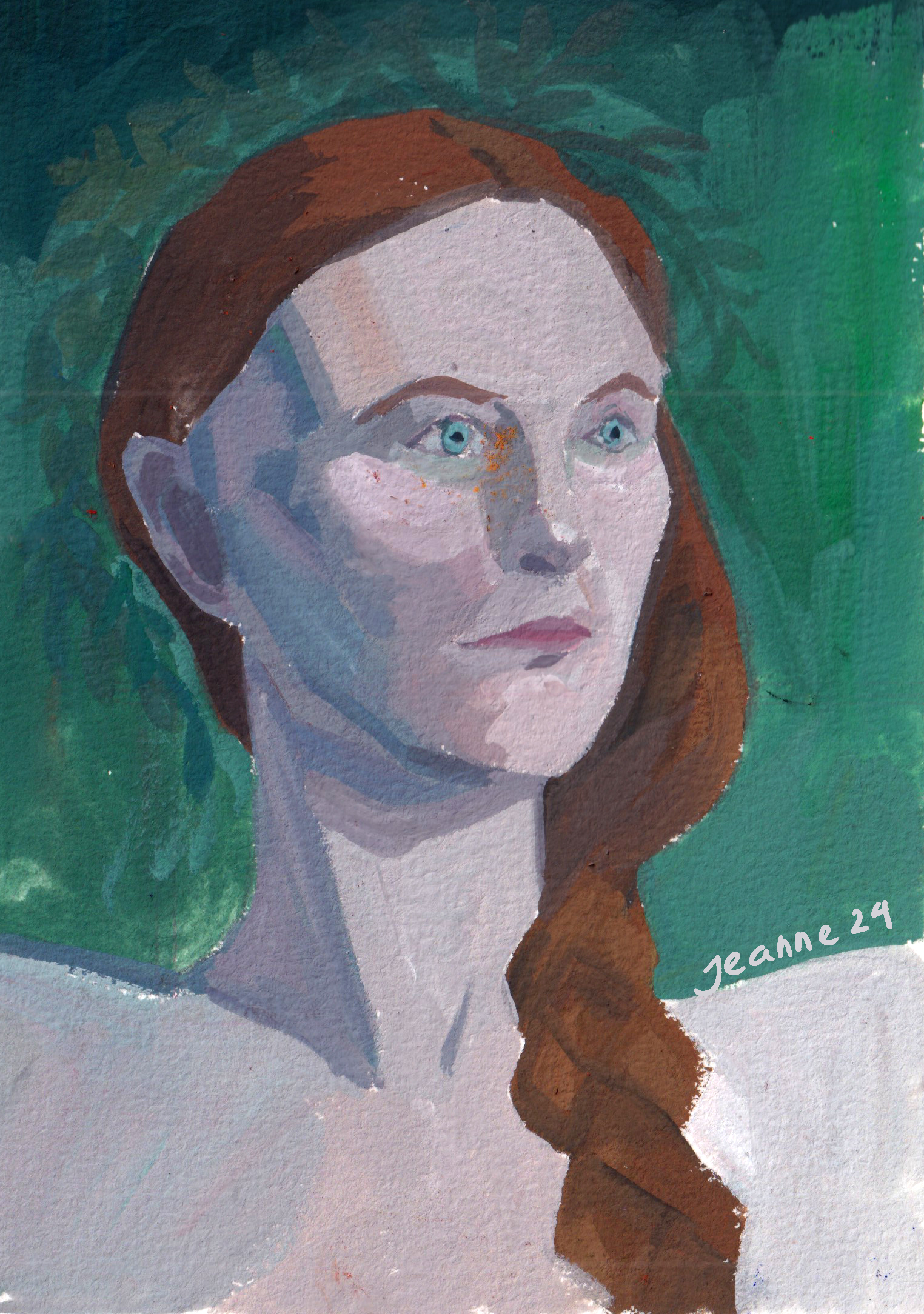
This is my favorite portrait of the whole year.
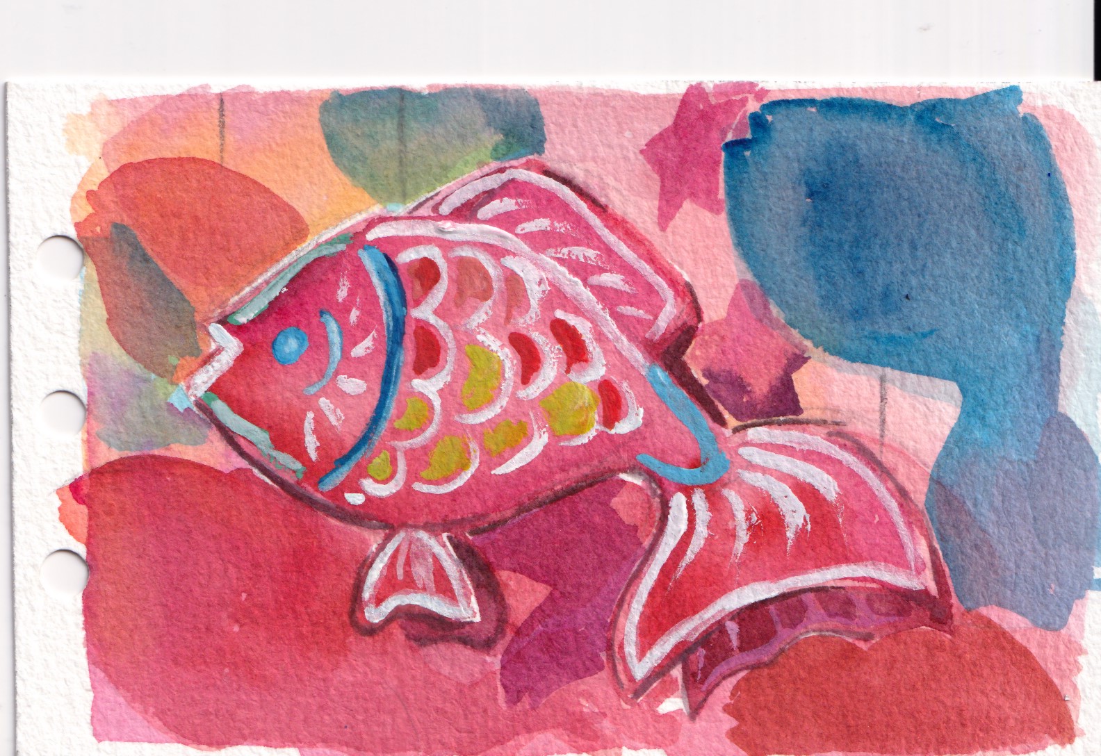
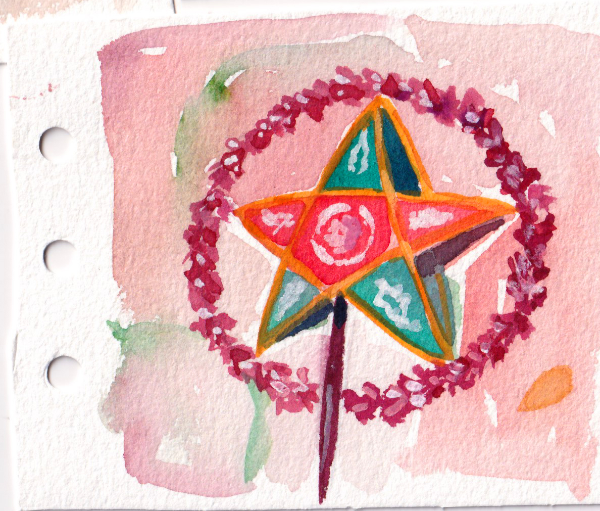
One big shift in my color usage is towards a brighter palette with bolder color choice. It possibly coincided with my switch to Holbein acrylic gouache, but also my slight change from just painting from dark to light or reverse to painting from the boldest color to neutral tones. It’s not an intentional thing, it’s more about keeping my palette organized so that I can avoid over mixing.
One thing I have been thinking about is how to add “life” into my paintings, or to be more specific, movement. My paintings use to have a nostalgia vibe, because I mostly painted the places I visited, the places that I met someone and talked with someone. The later paintings of 2024 has something else with bolder and brighter colors.
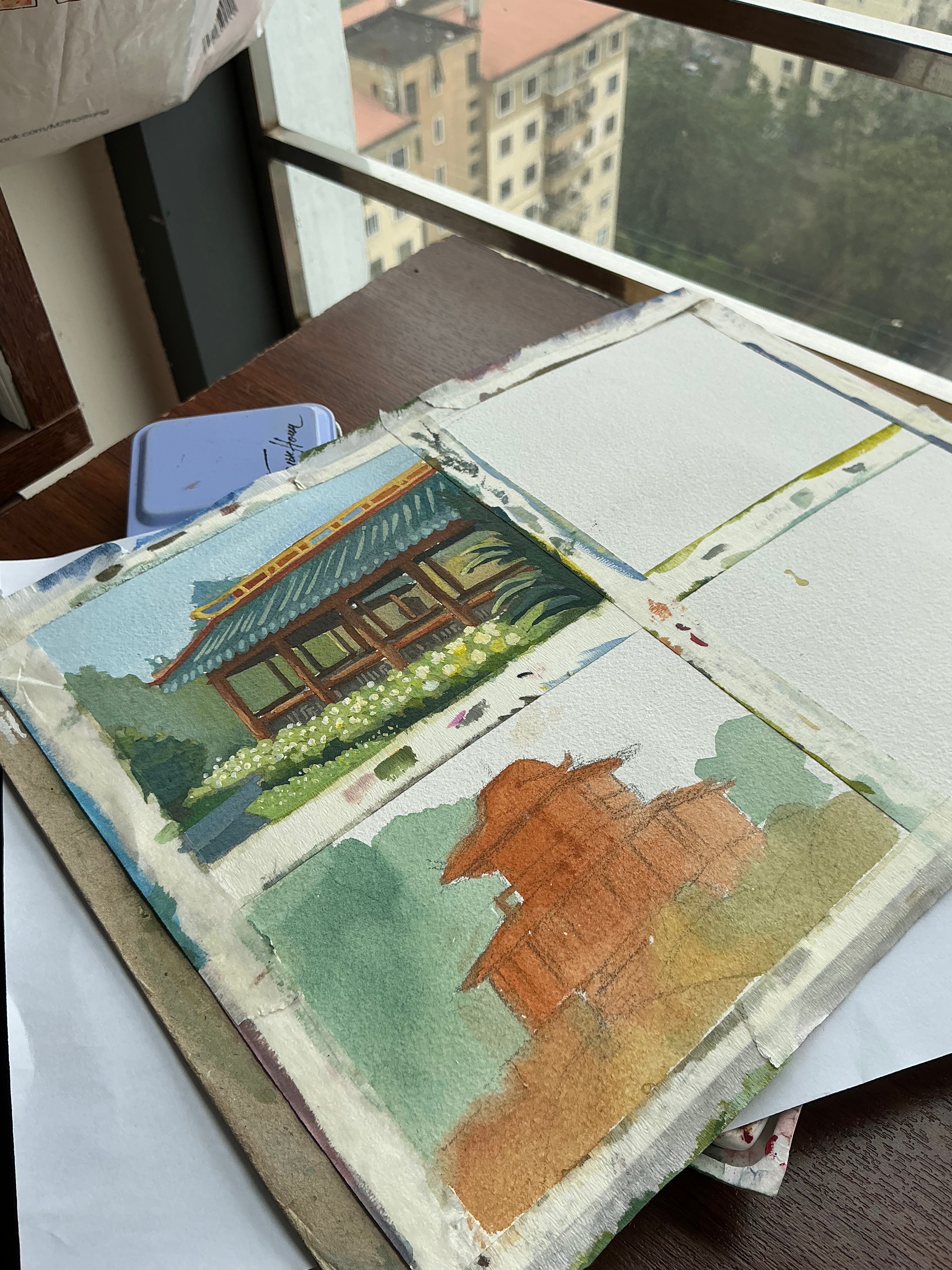
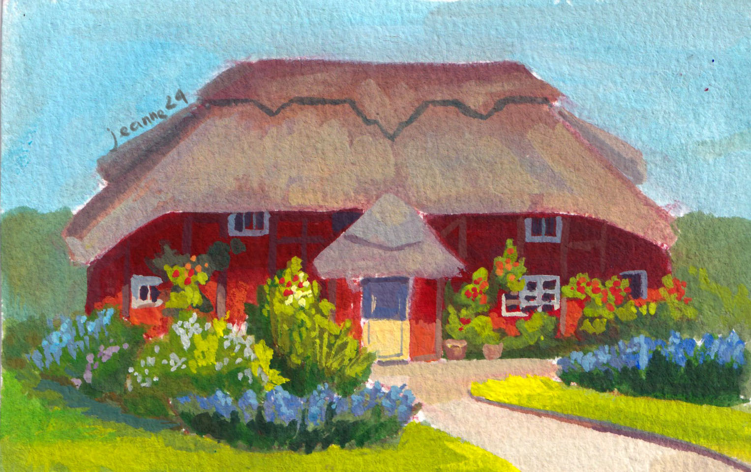
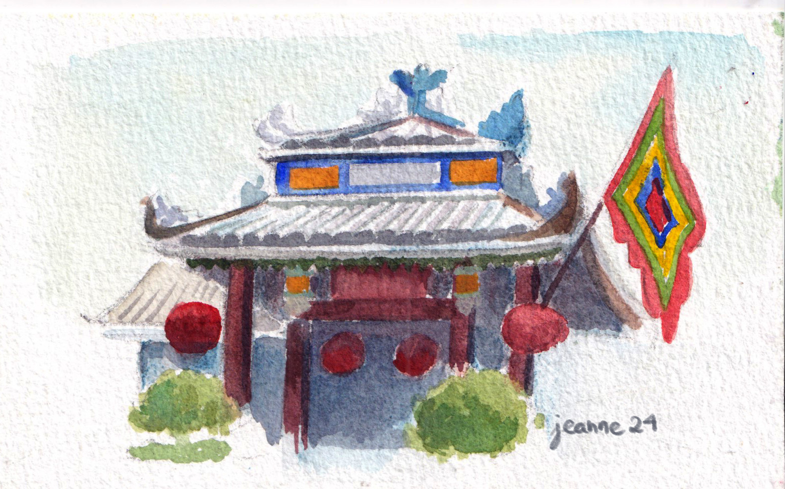
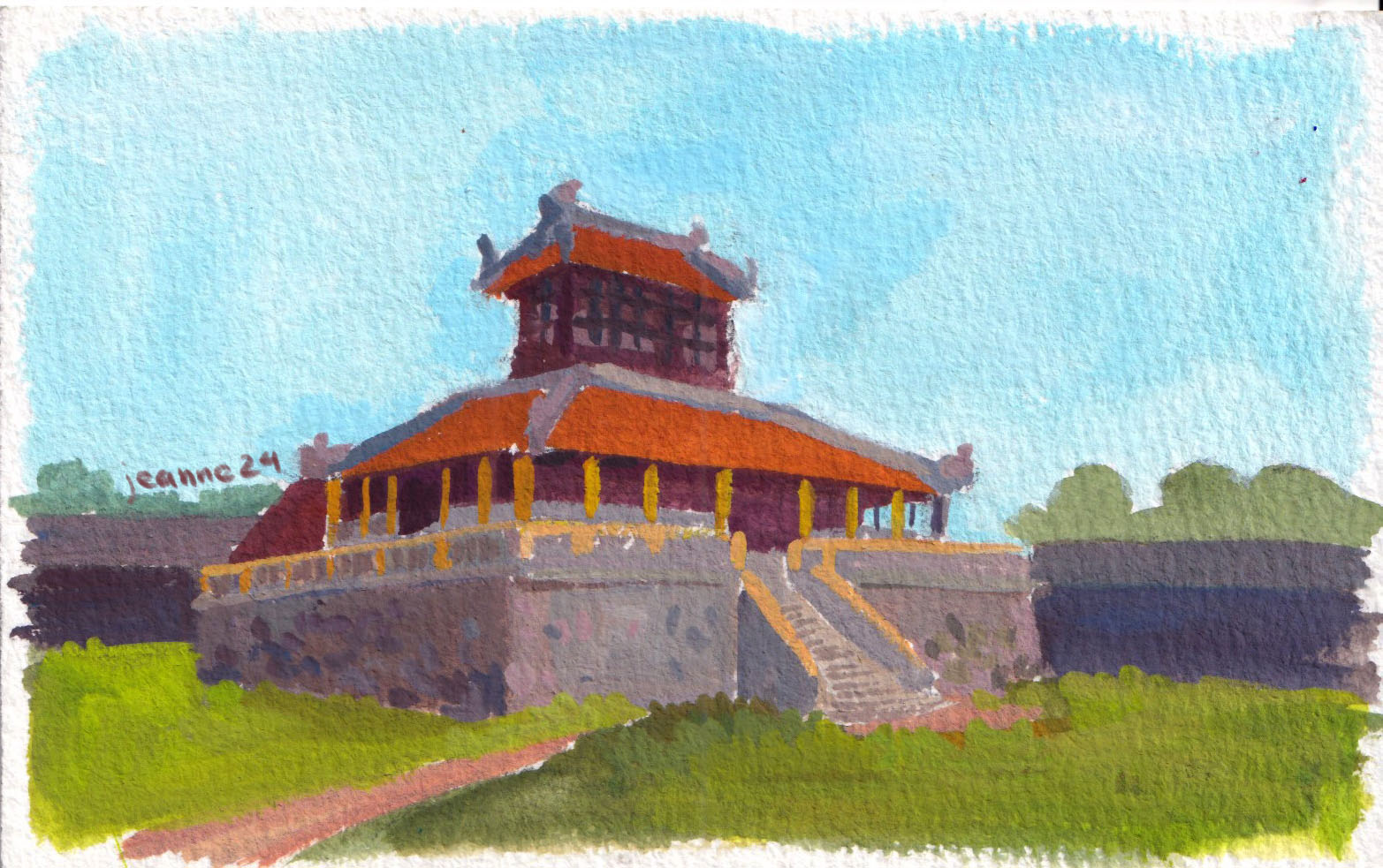
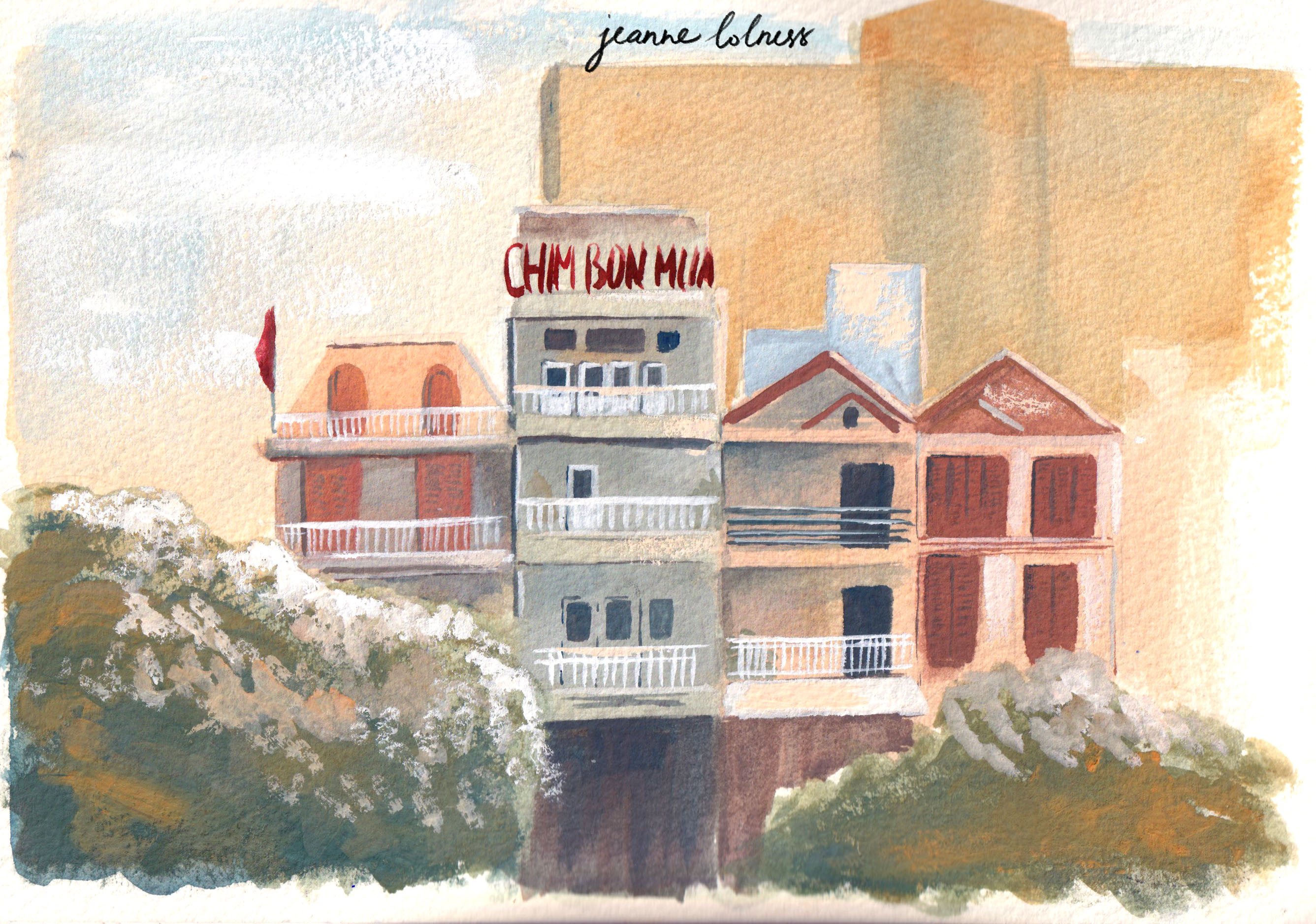
My summer trip to Quang Binh (Phong Nha), Hue, Da Nang (Hoi An) deepened my interest in painting traditional architecture. My only regret is that I should have taken many more reference images.
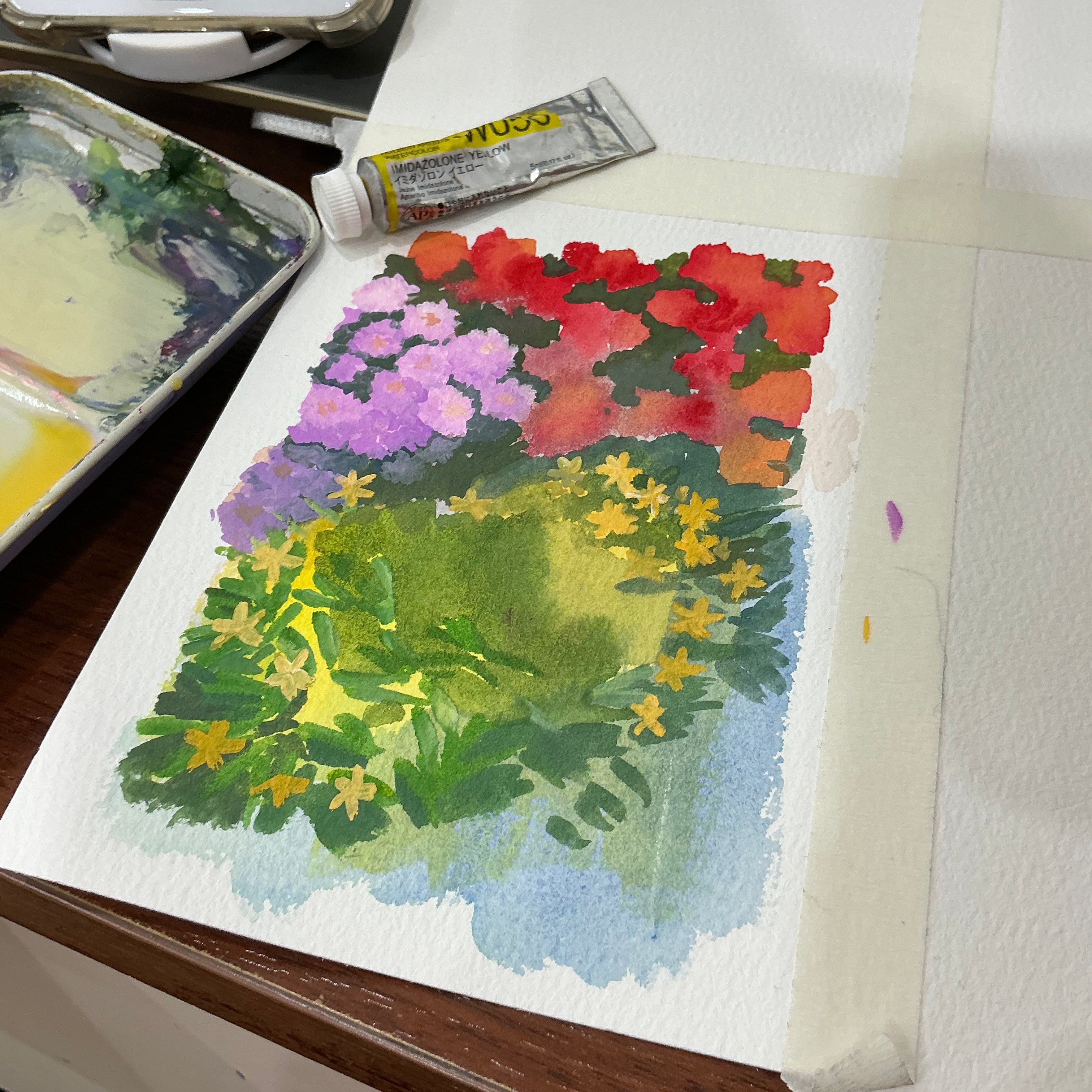
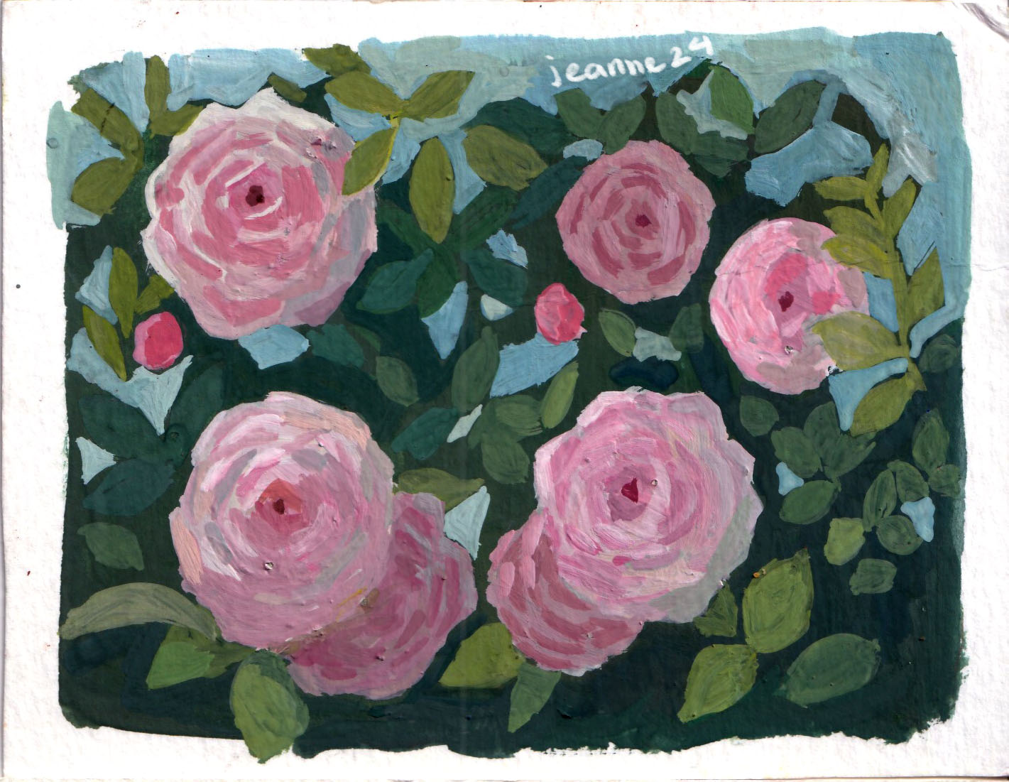
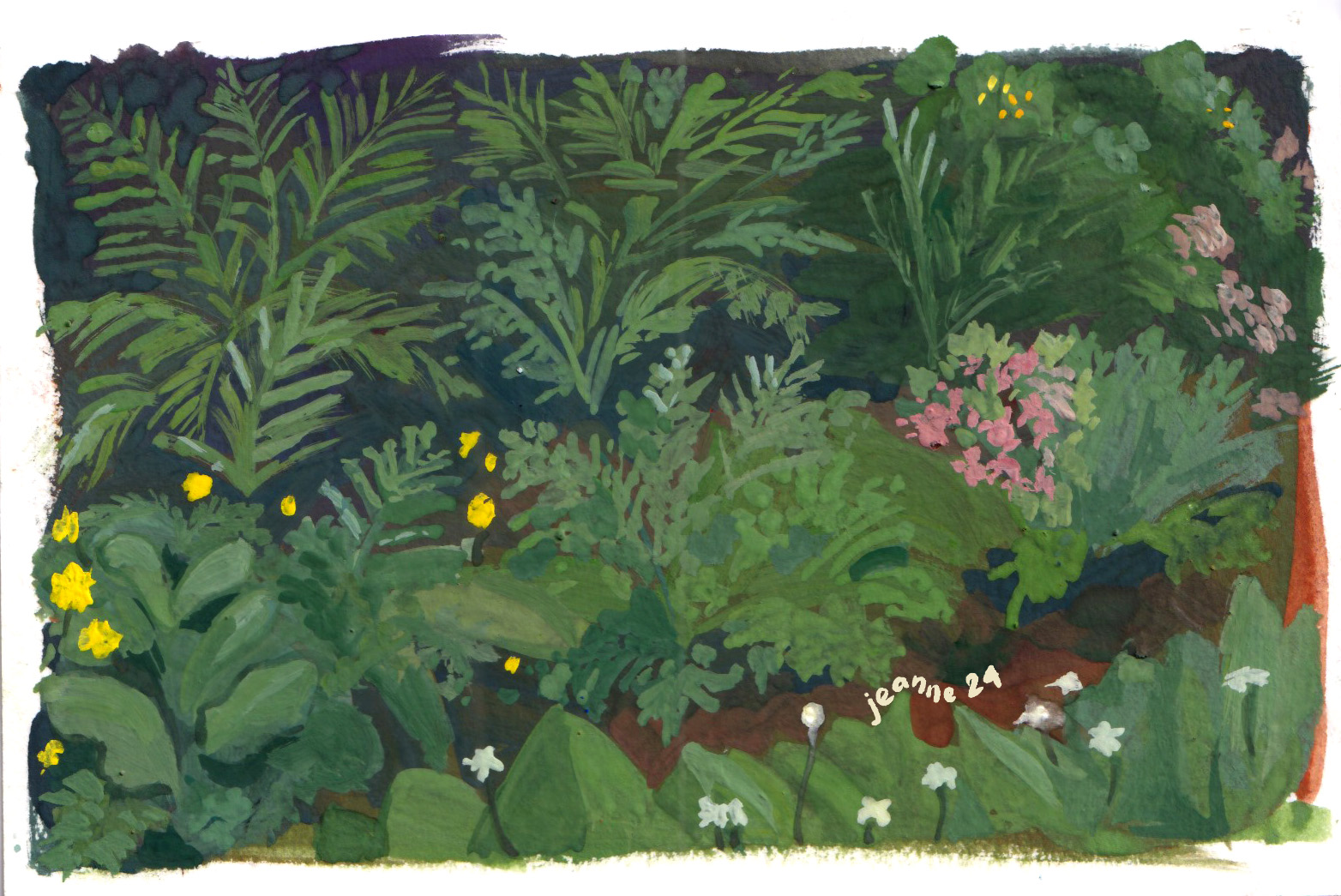
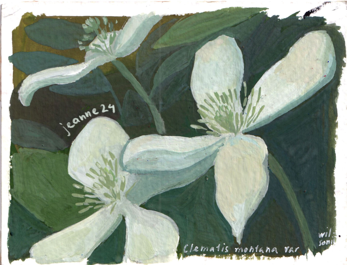
In the last months of 2024, I turned to painting nature, flowers and gardens in particular, as a method to relax. It’s also under the influence of writing about female artists, Rachel Ruysch, Élisabeth Vigée Le Brun, etc who use flowers as a subject and a recurring symbol of femininity. They allows me to work quickly with not-so-bad results, work freely wihout a reference image and can be used as gifts in rushed events.
Looking back, 2024 was a year of shifting perspectives—from focusing solely on technique to questioning how I want to express my ideas. While I haven’t found all the answers, I’ve discovered new directions, from bold color choices to the love for life and nature in my paintings.
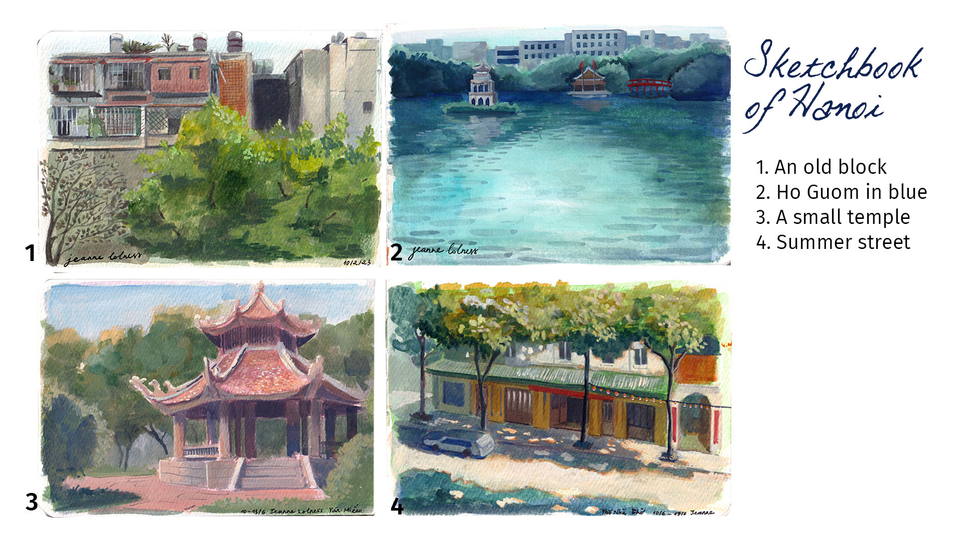
It all started when I watched videos by James Gurney. I was amazed by how much fun it looked to explore the world through an artist’s eyes, and how urban sketching could really improve my art skills. James went into detail about his process, from choosing materials to picking subjects and actually painting. His videos inspired me – a homebody by nature – to get outside and work on my observation and on-the-spot painting skills, instead of always sticking to my desk.
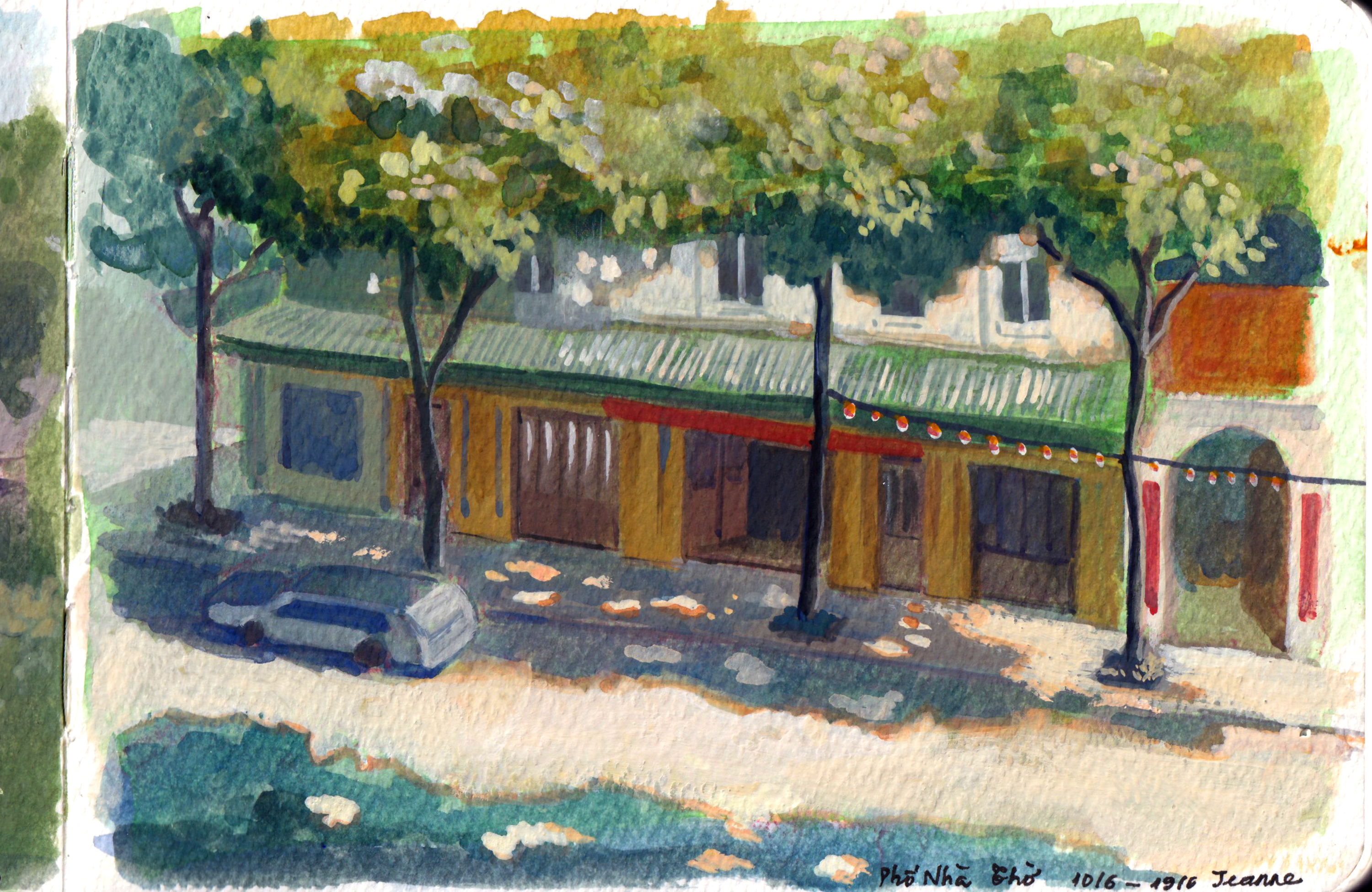
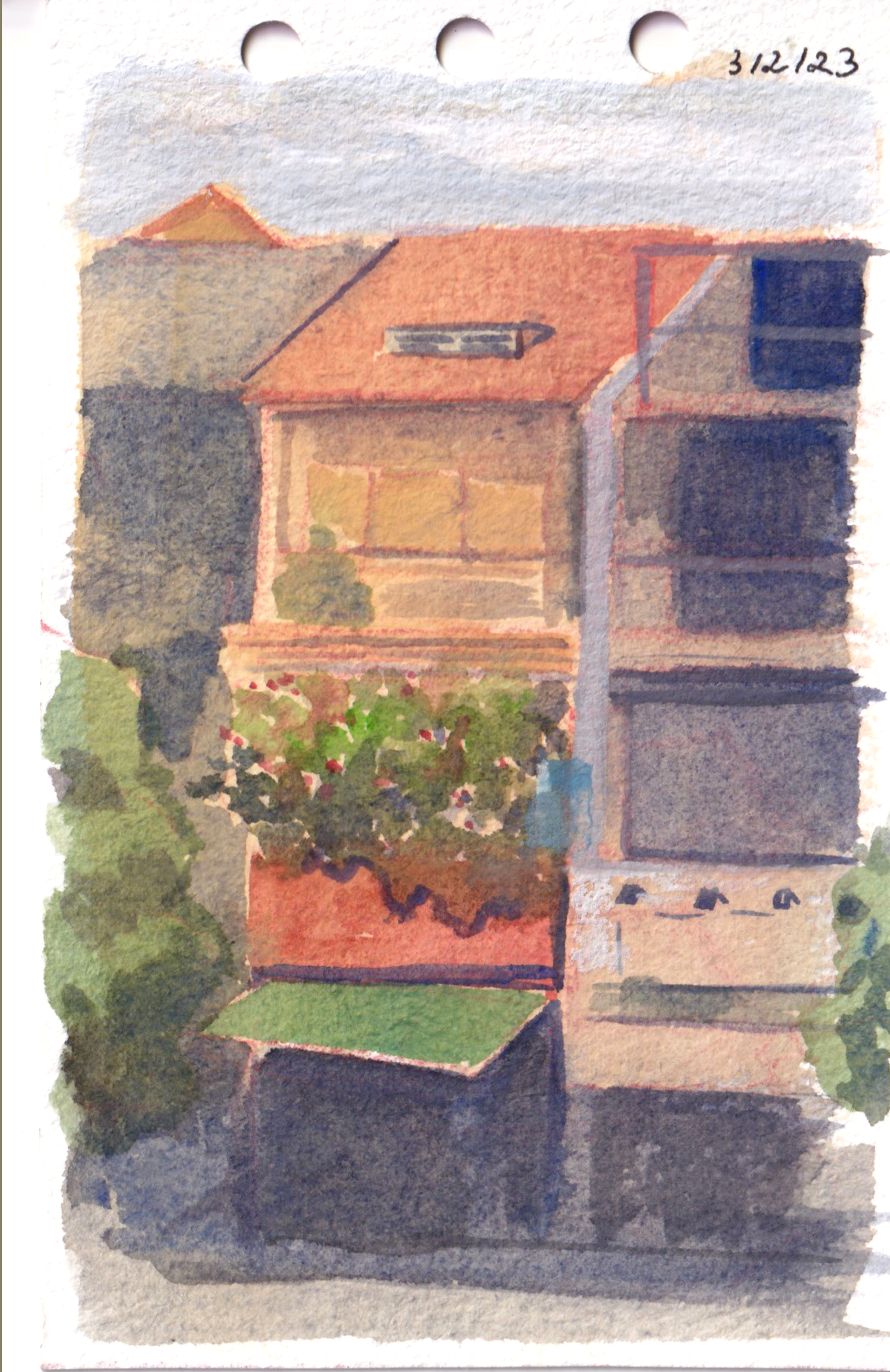
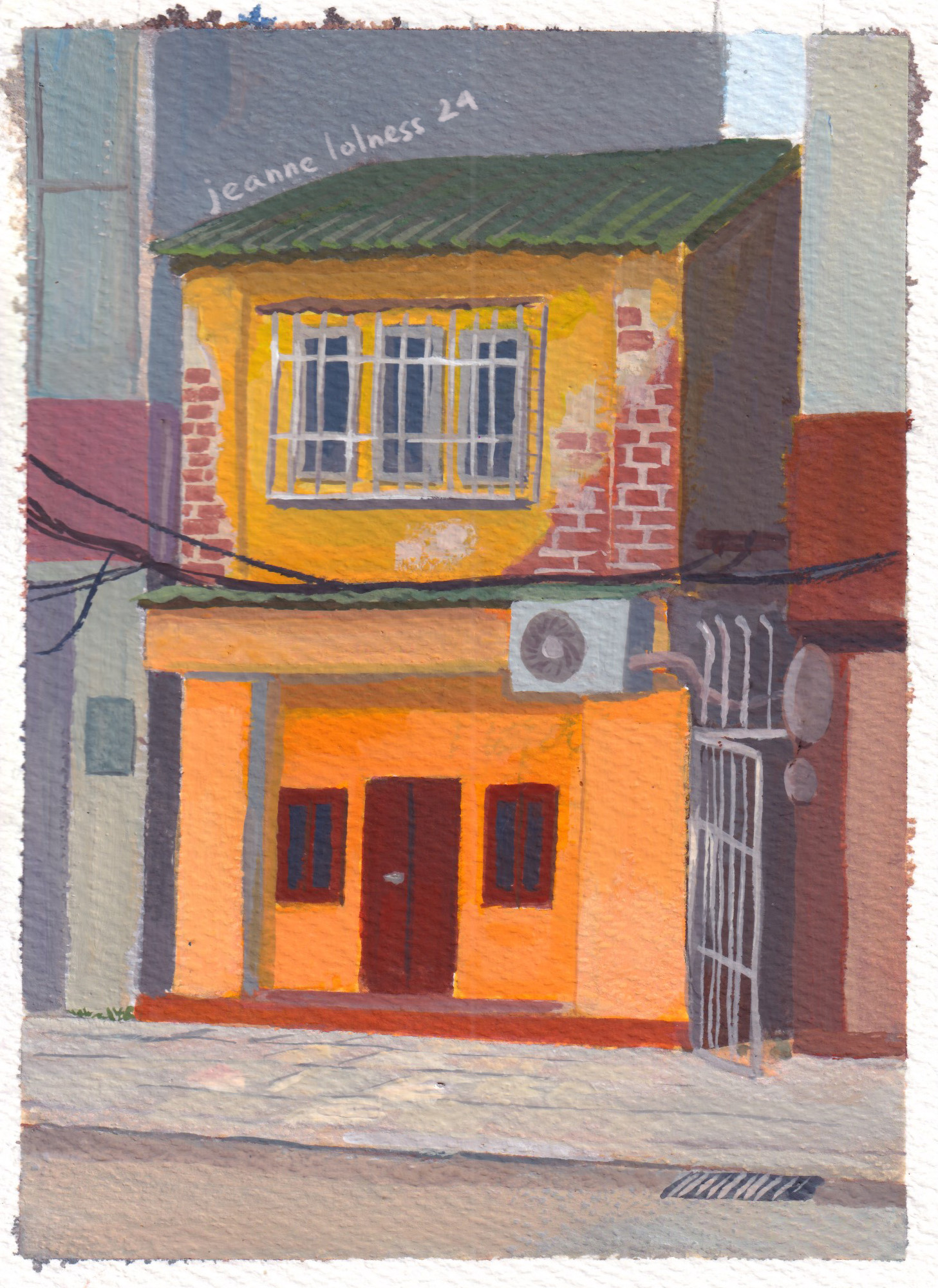
I grew up in Hanoi, where the streets are full of houses from all kinds of different eras. They’re old and diverse, definitely not your typical urban design, but perfect for painting.
I thought I knew all about these houses until I started sketching them. That’s when I began noticing details I’d never paid attention to before. Questions started popping up in my mind: Why does this window look strange? Is it uncomfortable living in these houses? And so on.
My Medium: Watercolor vs Gouache
I started with watercolor because it was the most convenient and readily available option. I could use pans or different sizes of boxes depending on where I was painting. It reminded me of the old-school watercolor techniques I admired.
Gouache, on the other hand, was messier for me at first. I had bought a set of bottles, which weren’t as portable as tubes for outdoor painting. It might sound like a small detail, but the difference in storage was significant—paints in tubes are far more convenient. Since paint tubes were first introduced in the early 19th century, around 1841, by American artist John G. Rand; it has got easier for artists to travel and work en plein air (outdoors), which became especially important during the rise of Impressionism.
Once I switched my gouache to tubes, it became my favorite medium. I enjoy painting opaquely, except when I have a specific idea that requires transparency. Gouache is more forgiving than watercolor, and it’s easier to define both large areas and fine details.
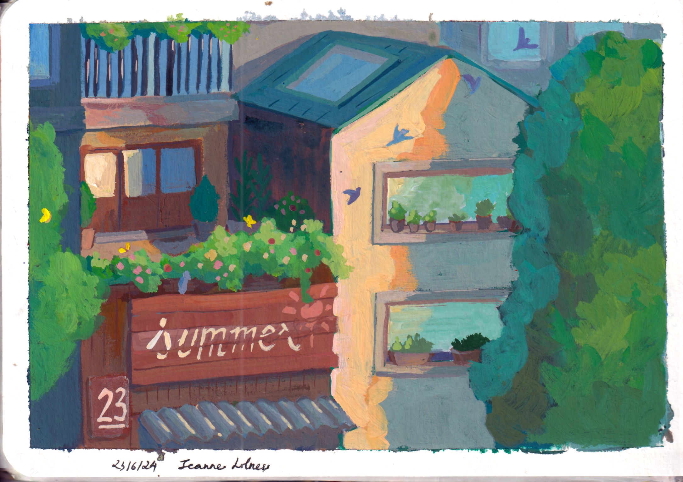
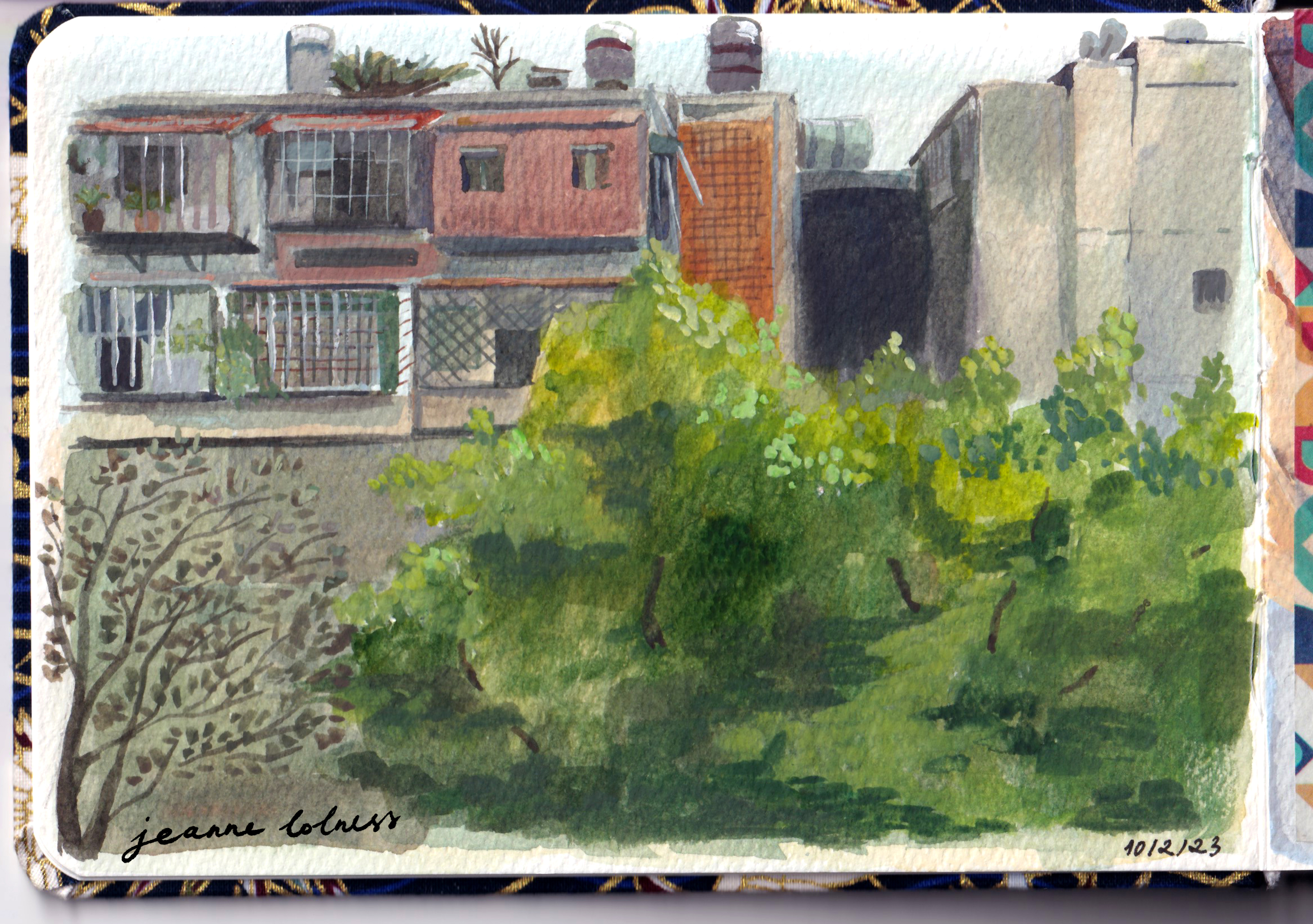
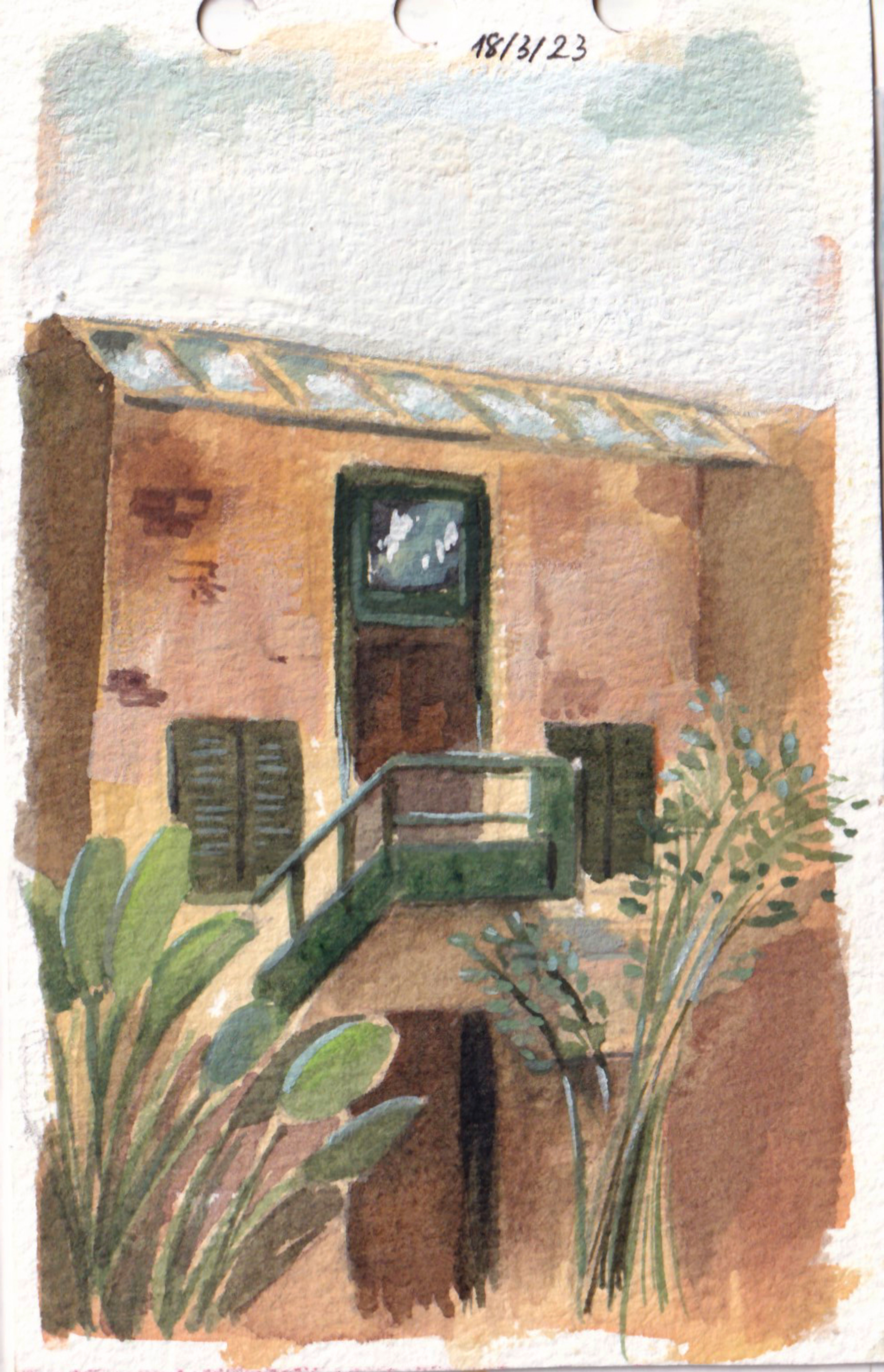
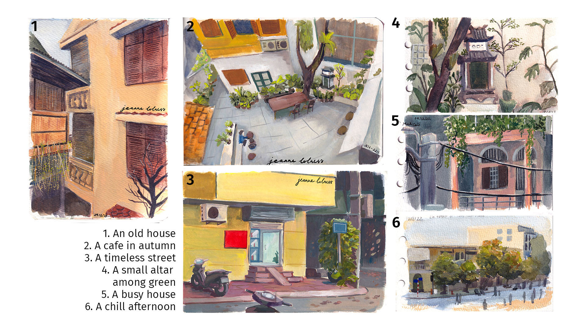
I started by painting my own neighborhood since I was already familiar with it from my daily life. It felt like a chance to rediscover my surroundings in a new way. I’m especially drawn to houses with plants, those that have a nostalgic vibe, or those that clearly show signs of someone’s life lived there.
For watercolor, there’s a wide range of pans available, which allows me to create a personalized palette. With the help of adhesive putty, I can make my own compact watercolor box to carry around. My favorite brush is the waterbrush, as it has a reservoir for water built into the handle, making it super convenient. Travel brushes are also great, though I’ve found that investing in good-quality brushes and a durable case is more worthwhile in the long run.
Hanoi’s streets stand out from other cities due to the rich history shaped by major influences from nations such as China, France, and the US. Tourist areas often showcase French architecture, which can be explored further in my blog about Hanoi, including detailed sketches of house facades.
Before the French Revolution, the architecture in Northern Vietnam was deeply influenced by Chinese culture. Buildings often featured intricate decorations, from the roof to the walls, with wooden, symmetric designs. This style can still be seen today in temples and other historical structures.
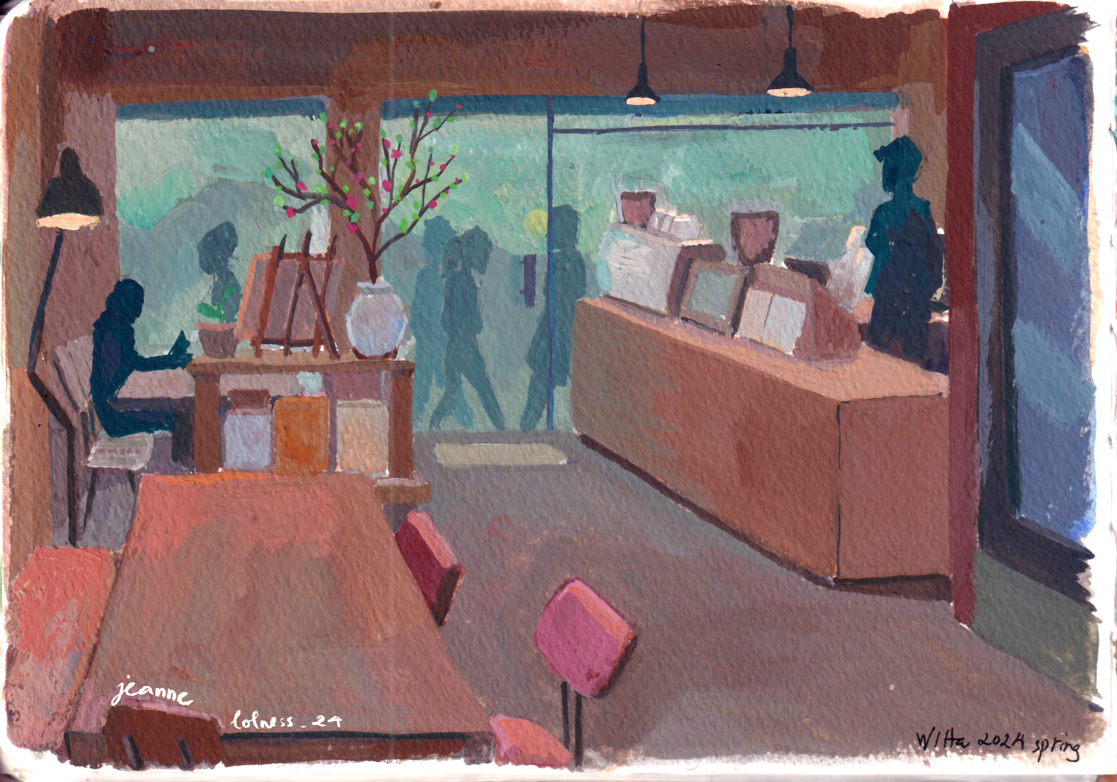
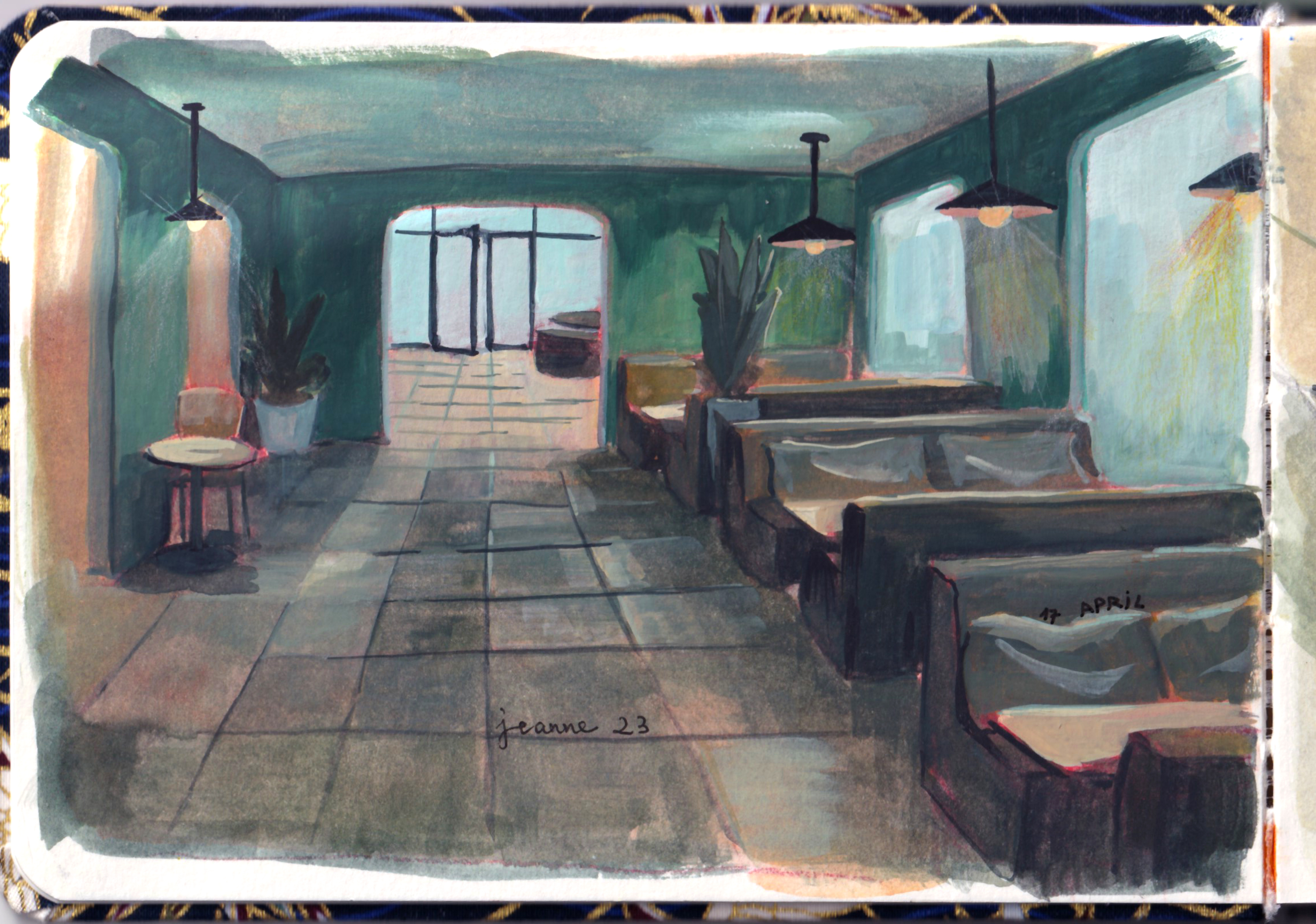
Hanoi’s vibrant coffee culture also provides ample opportunities for me to do studies. Many coffee shops are renovated from traditional architecture, while others embrace modern styles with clean lines and ambient lighting. Coffee shops in Hanoi serve as a melting pot for conversations, offering a perfect setting to observe and study people in real life.
To sum up
In wrapping up my journey of urban sketching in Hanoi, I’ve realized how much this experience has enriched my view of the city. Sketching outdoors has helped me capture the lively streets, stunning architecture, and everyday moments that often go unnoticed.
I encourage others to grab a sketchbook and explore their own surroundings. There are so many stories and details in our daily lives waiting to be captured. Each sketch not only reflects a scene but also our personal growth as artists. So, let’s keep sketching, observing, and enjoying the world around us!
I use daily life as my resource for sketching, naturally, Vietnamese culture is a recurring topic. Keep scrolling to be excited by my culture!
“ Áo Dài” (loosly translated to English: Long Dress) is the Vietnamese traditional attire now, in fact, it’s the result of an evolving history of costumes. The version of the Áo Dài commonly seen on Vietnamese streets today is a modern adaptation from the 20th century. Vietnamese traditional costumes are an extensive and fascinating topic, one that I’d love to explore in greater depth later.
Male versions: Left: A medieval soldier; Right: A groom
Female versions: Left: áo ngũ thân tay chẽn (a predecessor to Ao Dai); Right: Ao Dai (popular for daily wear in 20th century)
These little sketches were painted after I attended an event celebrating the history of Áo Dài in Hanoi, in which multiple versions were showcased.
Tết holiday (Lunar New Year) is the time to watch bustling streets, enjoy traditional cuisine and appreciate the beginning of a new year. Not every Asian country celebrate Lunar New Year the same way and equally important. Simply explained, Tết holiday for Vietnamese is on the same level of importance as Christmas holiday for Westerners, Chuseok for Korean, Songkran for Thais, Diwali for Indians or Ramadan for Muslims.
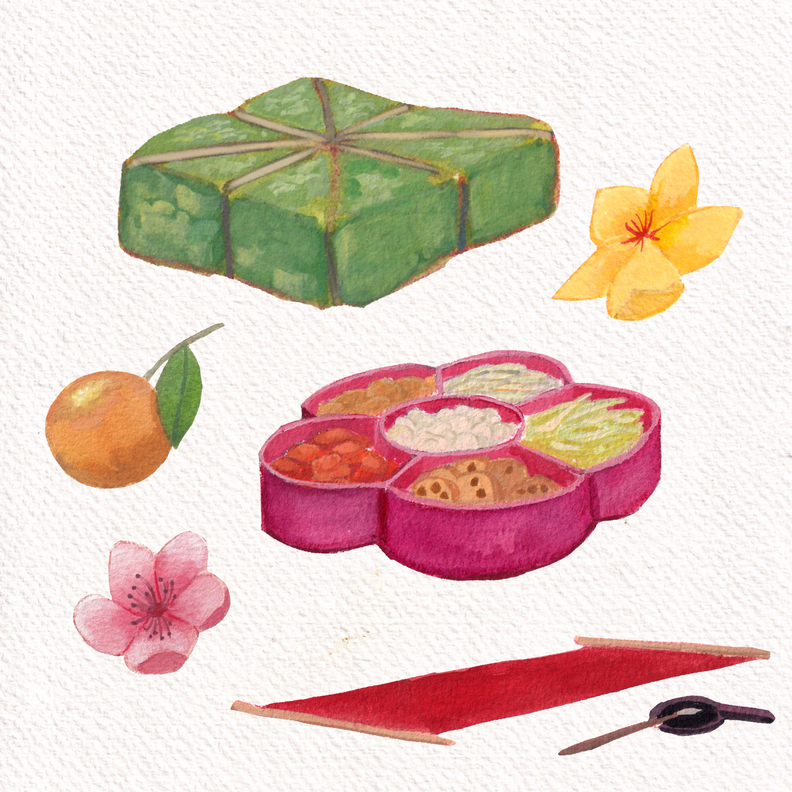
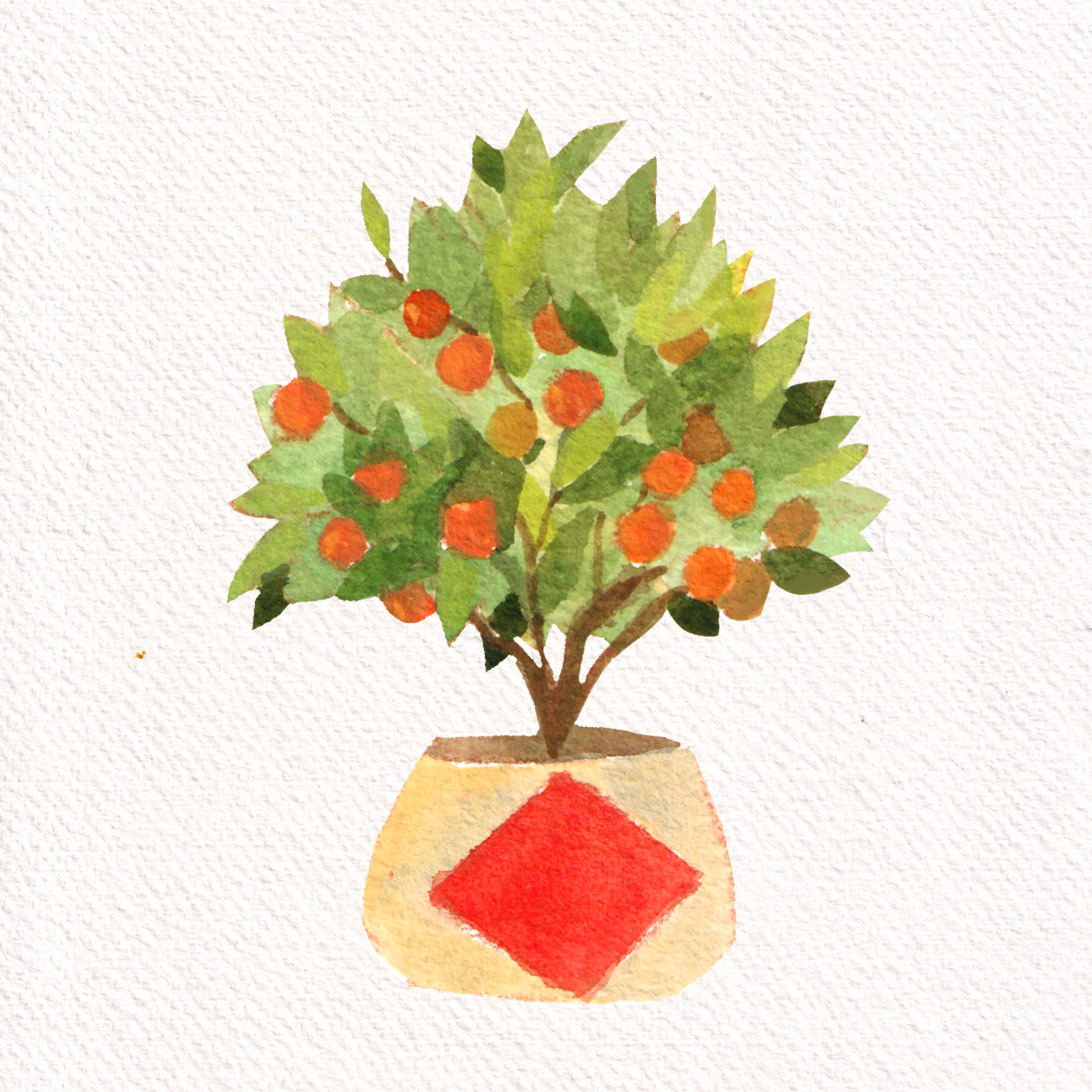
Bánh Chưng (sticky rice, pork, mung beans wrapped in Dong leaves) in green; Mứt (Candied Fruits) organized in traditional boxes; traditional calligraphy; Hoa Đào – Hoa Mai – Quất (3 types of essential plants for Tết)
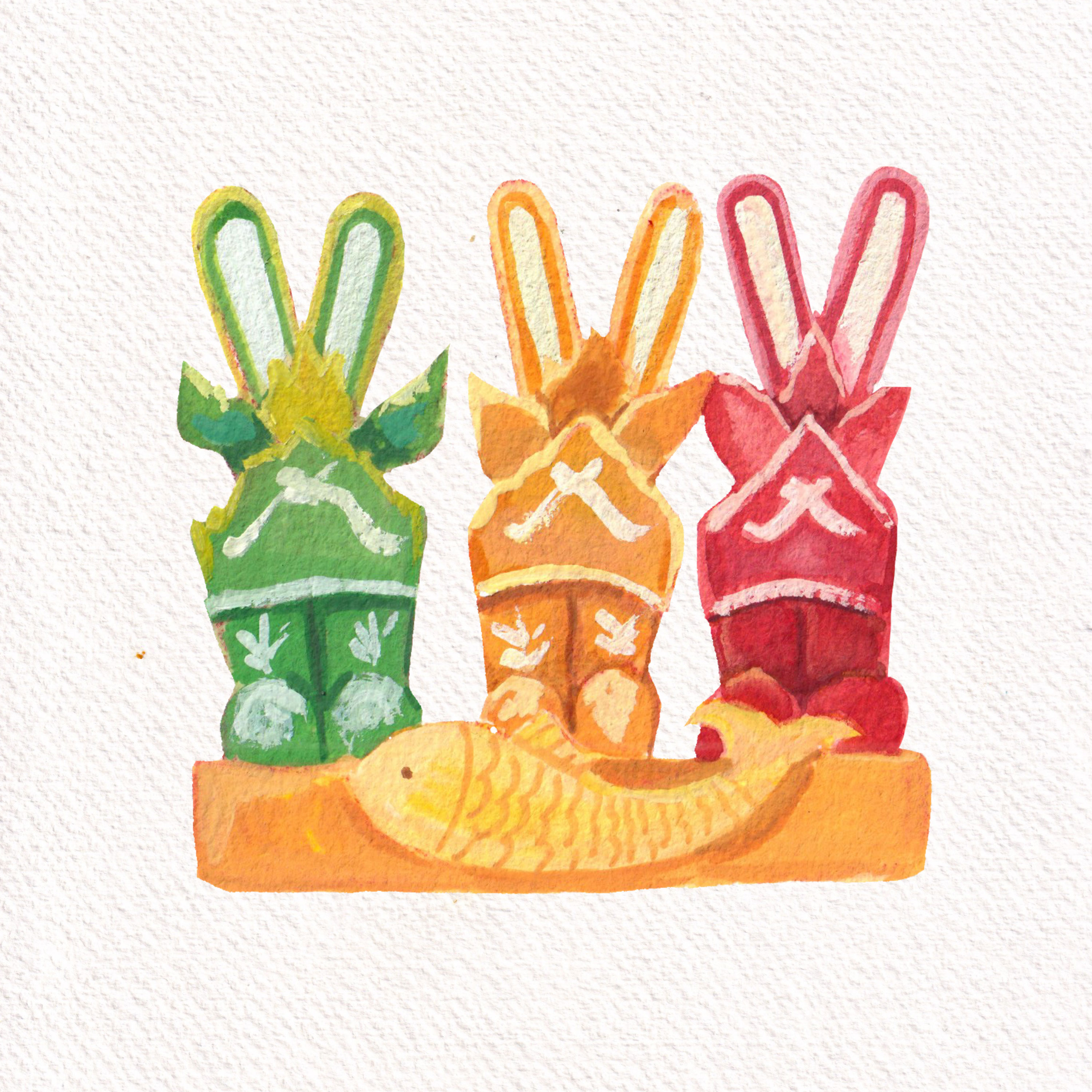
Joss paper models of boots and fishesA full plant Quất
Mid-Fall festival or Moon Festival (Tết Trung Thu/ Tết Trông Trăng) is another major holiday for Vietnamese. It takes place on the 15th day of the 8th lunar month, typically around September or October. Children are especially excited during this festival, as they carry colorful lanterns, traditional toys and participate in fun parades. Mooncakes, filled with lotus seed paste or red bean, are shared among family members and friends as a symbol of unity and prosperity.
As I think about the colorful and lively culture of Vietnam, I’m reminded of how our traditions come to life through art, festivals, and our clothing. The Áo Dài, with its deep history, isn’t just a beautiful outfit—it’s a link to our past. Festivals like Tết and the Mid-Fall Festival bring us together, sharing happiness, food, and a sense of community. Every sketch and note I make is a way to celebrate these special moments.
Blue is a primary color that often goes unnoticed in its significance. Yet, historically, it was one of the most expensive and revered hues. Ultramarine blue, in particular, was as valuable as gold because it was derived from finely ground lapis lazuli stones, sourced primarily from Afghanistan and transported to Europe. Its use can be traced back to the Indus Valley Civilization and then to the creation of the funeral mask of Tutankhamun.
For me, ultramarine blue is my favourite, though I rarely use it straight from the tube. A touch of blue in a mix lowers the value of colors without losing their vibrancy. It’s also my go-to for creating shadow tones. In this series, you’ll see paintings dominated by blue (both ultramarine and azure). From blue skies and seas to nocturnal scenes, portraits, and still life, this color is the centre.
A study from a master painting by Kalmykov Grigory Odysseevich – a Russian master in painting sea scenes
Egyptian blue, the first blue ever made, was produced in the third millennium BC in ancient Egypt. It was synthesized from silica, lime, copper and an alkali. Its blue color comes from a substance that is identical to a rare, naturally occurring mineral made of copper and silicate.
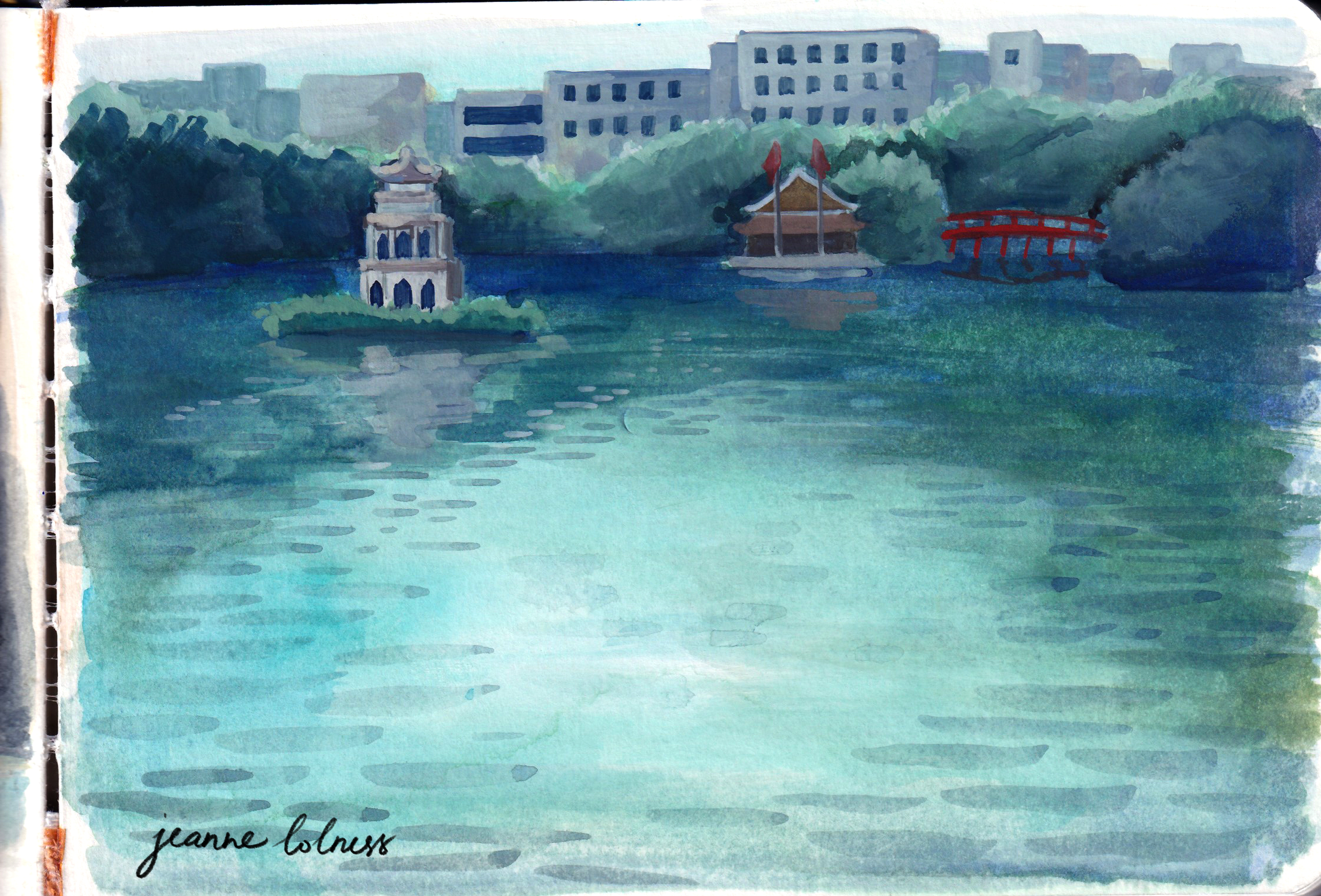
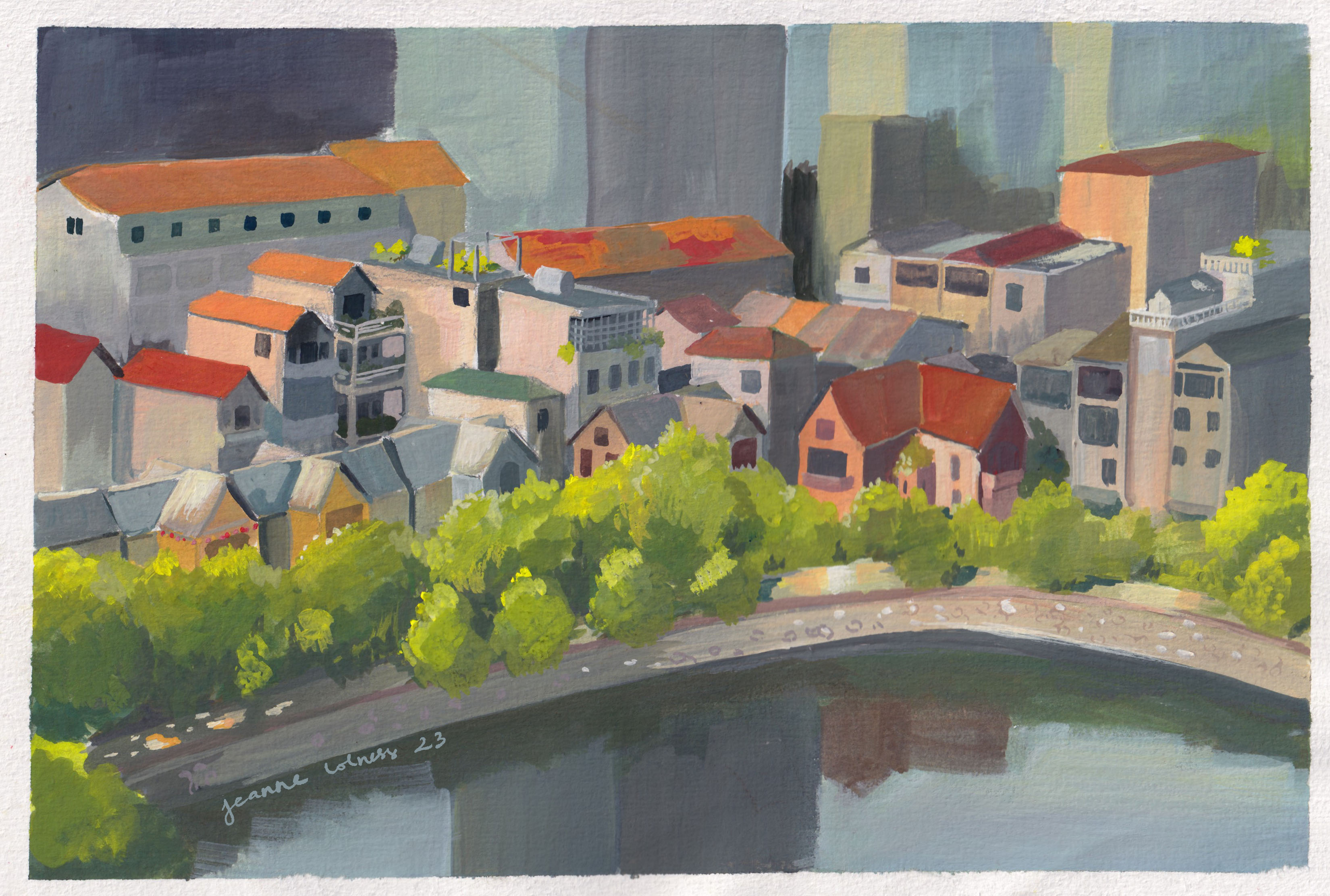
A painting of Hồ Gươm – a famous lake in Hanoi
Until 1700s, blue was mainly made from lapis lazuli and the related mineral ultramarine. In 1709, a big discovery happened when German chemist Johann Jacob Diesbach created Prussian blue. He accidentally made it while experimenting with dried blood and iron sulphides. At first, it was called Berliner Blau. By 1710, the French painter Antoine Watteau started using it, and later his student Nicolas Lancret did too. It quickly became popular for making wallpaper, and in the 1800s, French Impressionist artists also loved using it in their paintings.
Blue has a special meaning in many cultures around the world. In some places, it’s seen as a symbol of peace and calm, while in others, it represents strength and protection. Blue was chosen for the army in many countries, in fact the term ‘navy blue’ comes from Royal Navy adoption of blue informs for its officers. In the Torah, Israelites were instructed to add a blue thread, called tekhelet, to the fringes of their garments, made from dye extracted from a Mediterranean snail. This blue was seen as a symbol of God’s Glory, and meditating on it was believed to help connect with the divine, representing purity and the Throne of God.
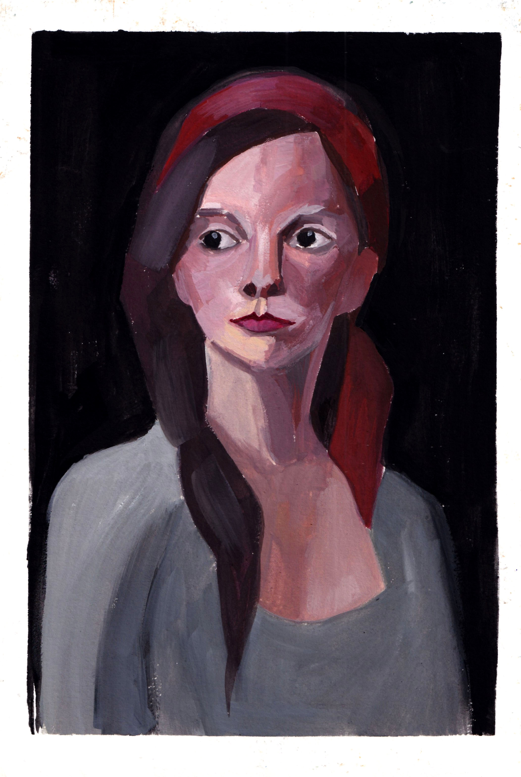
A portrait using ultramarine blue as the main color
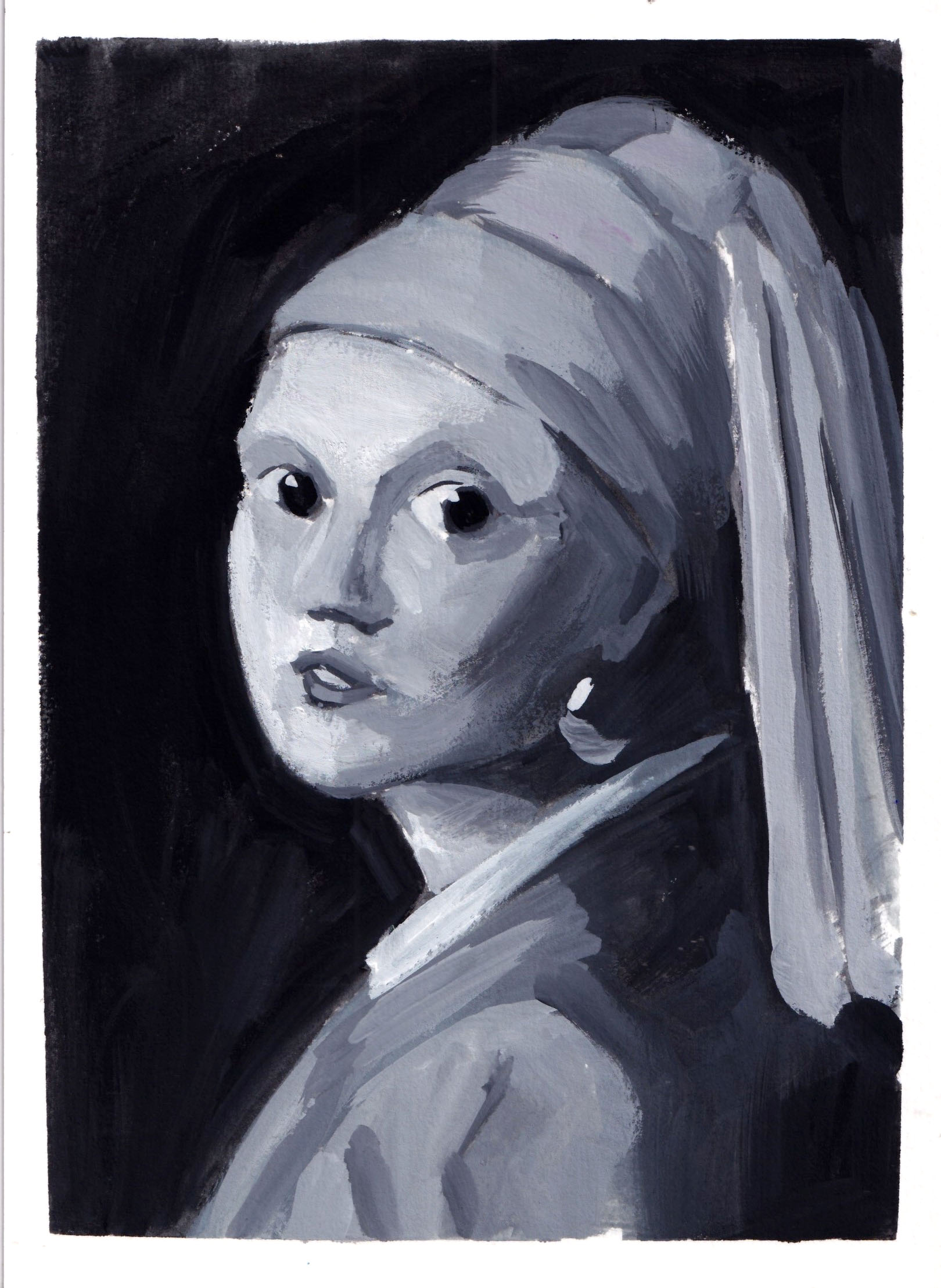
During the Dutch Golden Age, artists like Johannes Vermeer used blue to add depth and realism to their paintings, as seen in his famous “Girl with a Pearl Earring,” where the blue attire of the subject stands out beautifully against the background. Blue became an essential color for capturing both beauty and spirituality in art.
In the above portrait, I realized that blue can sometimes appear warmer than the skin tone, particularly when it’s saturated.
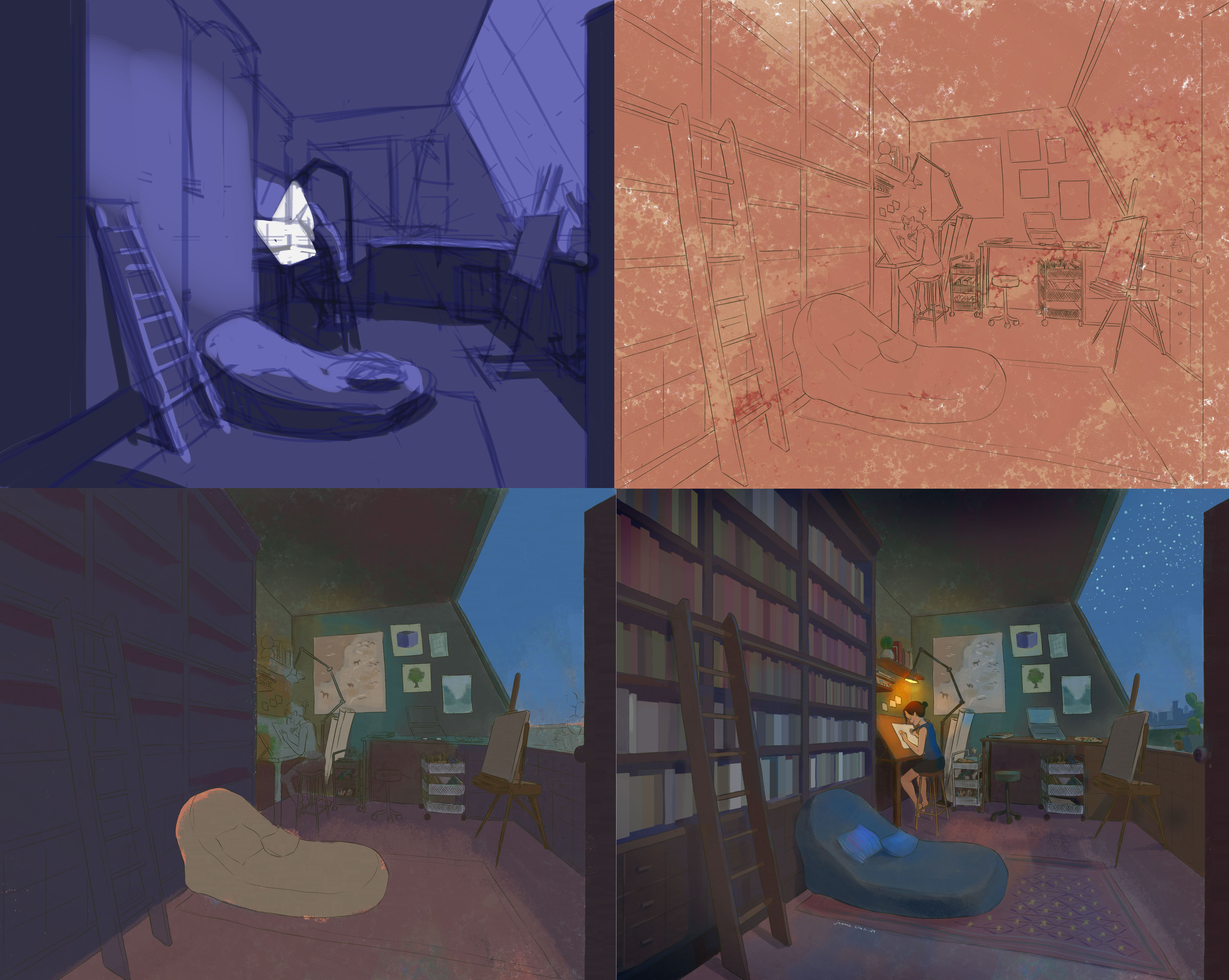
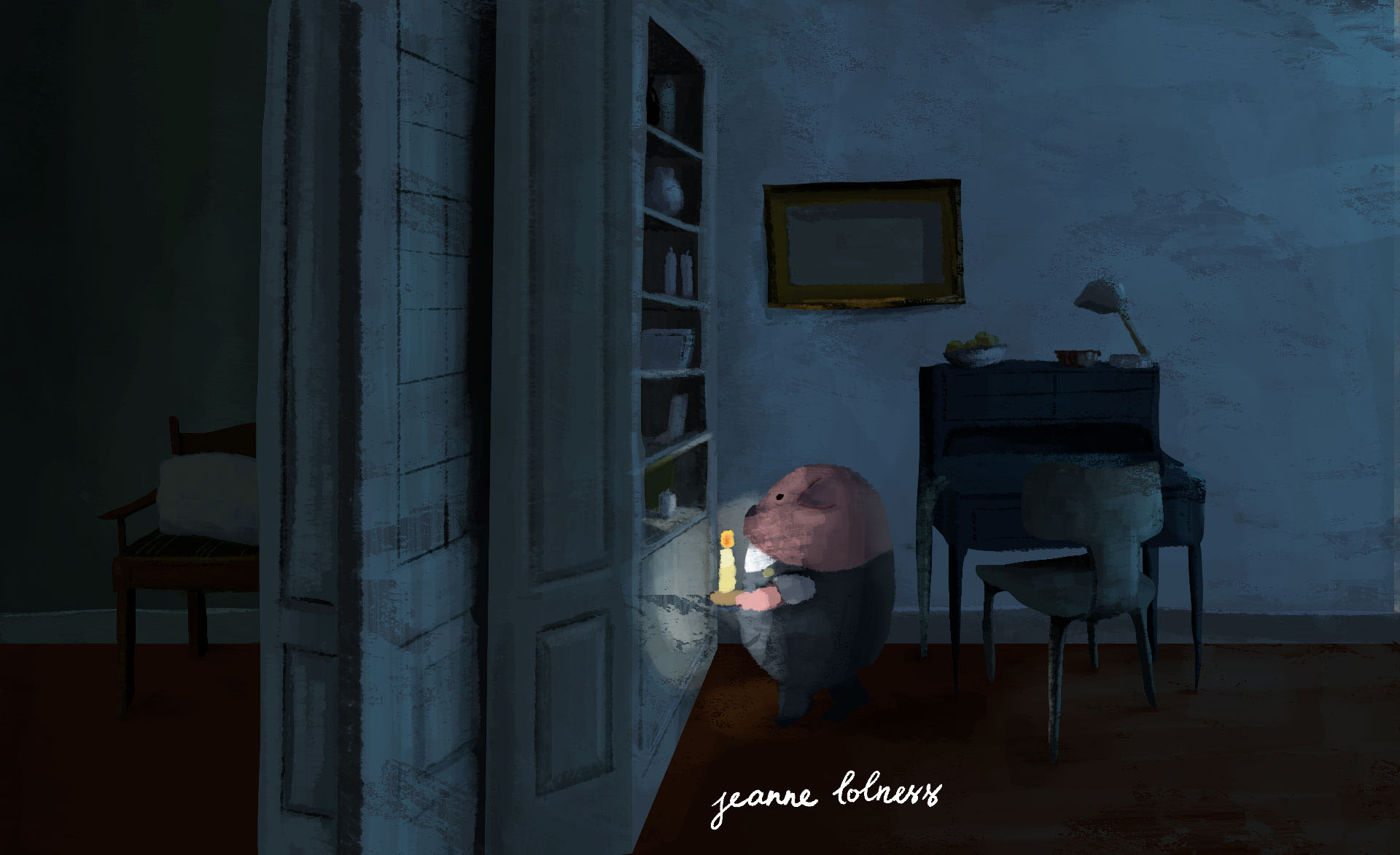
Above is a quick break-down of my digital painting of a night working in my dream studio. A tip I have learned is that you can use a warm underpainting to keep the blue “warm”. This is also true in real life observations: outside light often has a cool tone while interior objects, made of wood, are “warm”.
I use blue as the shadow here – it’s a real phenomenon in sunny days with clear blue sky
Soft blue often appears on the sky in sunny days due to a phenomenon called Rayleigh scattering. When sunlight enters Earth’s atmosphere, it is made up of different colors of light, each with a different wavelength. Blue light has shorter wavelengths and is scattered in all directions by the gases and particles in the air.
When painting blue sky in a sunny day, I often lay down a soft yellow first and use the same blue to create shadows. This shadow can be seen most clearly with a bright object such as white walls.
Similarly, the sea appears blue due to the way light interacts with water. Water absorbs colors with longer wavelengths, like red, orange, and yellow, more easily, while blue light with shorter wavelengths is scattered and reflected back to our eyes. This makes the sea look blue, especially when the water is deep.
Painting skies or seas is a chance to observe how different tones of blue go with each other to create movement and life.
I hope this collection helps you discover something new and exciting about this color!
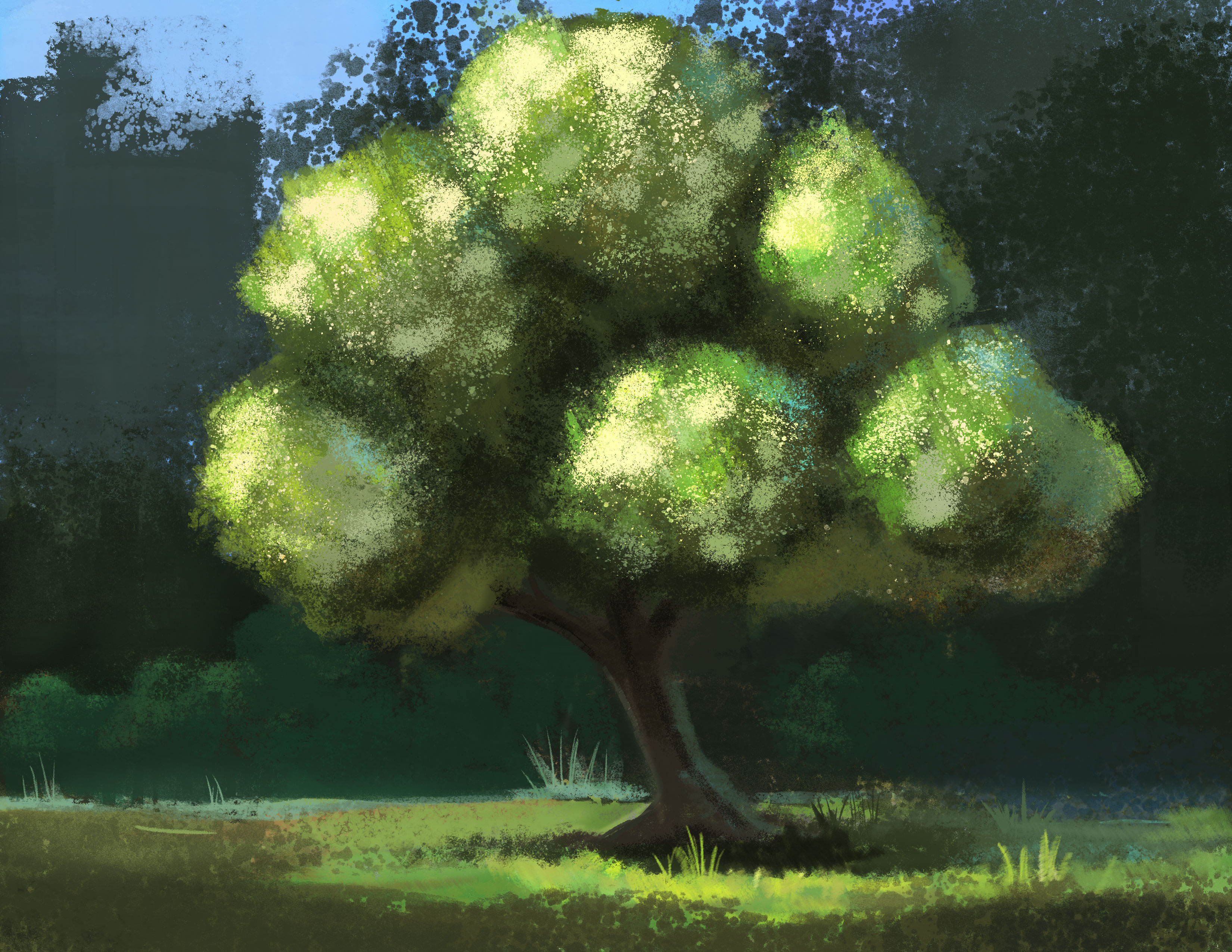
Welcome to my little collection of green colors. Green is hard to get it ‘right’ because the fresh paint from the tube always feel artificial. Green is often used to paint nature, especially trees. Trees, bushes, plants are not solid objects, they don’t have distinguished planes that we know for sure light is hitting on. They are made of thousands of leaves, each reflecting light in a different direction.
If nature is just a factor in the painting, I can rely on the texture of the paper to do the trick and just put a few layers for wide range of green tones.
Sometimes I try painting green in weird combinations. In this painting below, I try a combination of burnt sienna, green and purple – it turned out not good, but it was a fun experiment.
In this painting below, I actually use yellow and white more than green. Titanium white mixed yellow can create a cooler yellow suitable for the background.
In this sketch below, I use a few green paint (permanent green, leaf green) mixing with yellow, red, blue or brown sienna to create a wide range of tones so that I can imply that there are multiple types of plants.
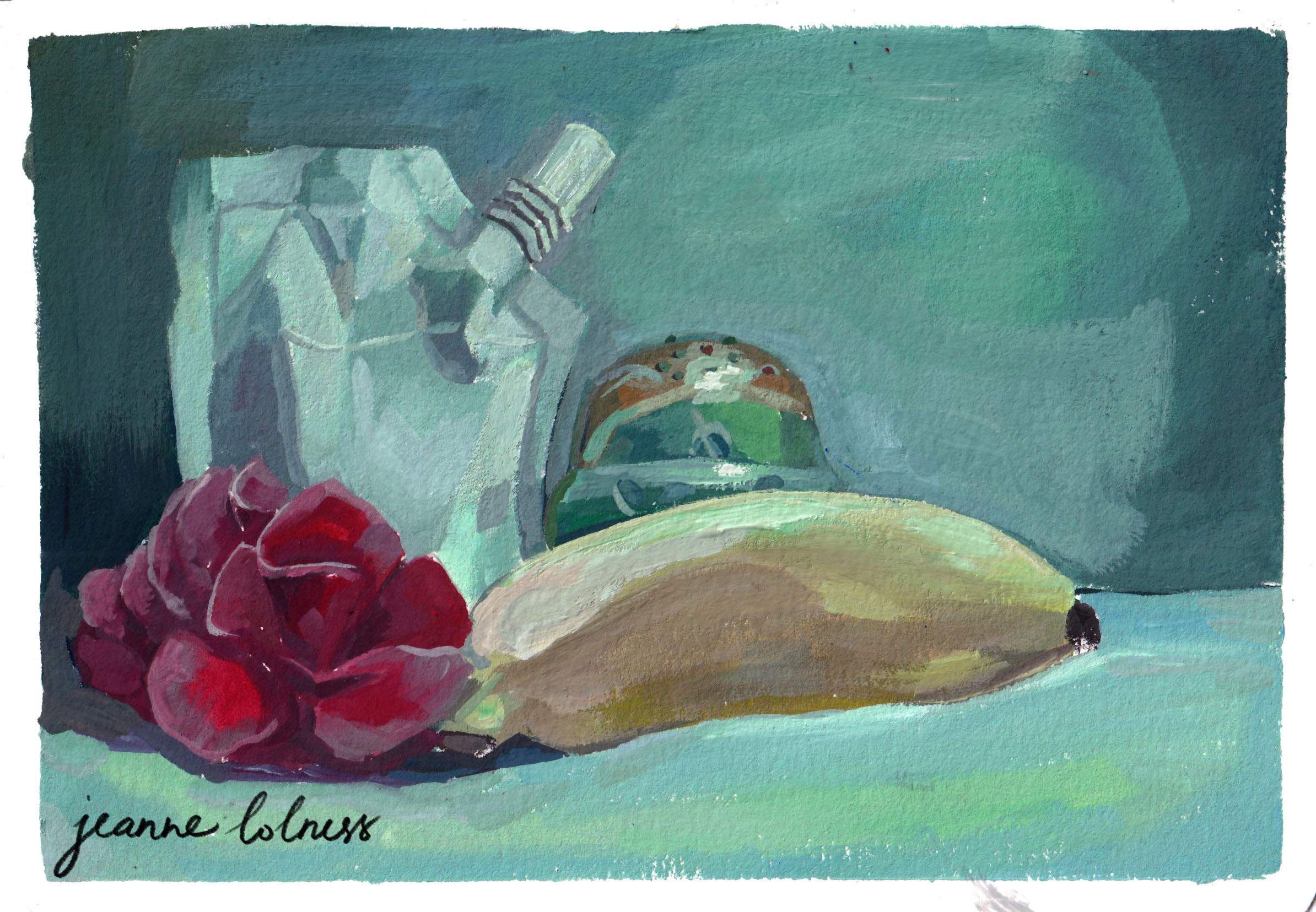
This is a fun experiment with green lighting over different objects. The green Russian doll and the white paint package have the most range of colors since they are made of reflective material. In contrast, the flower and banana tend to lose their saturation and doesn’t reflect as much.
In the painting below, I added ultramarine blue when I mixed the dark tones for the trees, so that the oranges can stand out more. I also add horizon blue to the background trees to differentiate the main one.
This one is to play with the green in the shadow and in highlight. The yellow house and the red roof made the process simpler with just three main basic color: yellow, blue, red.
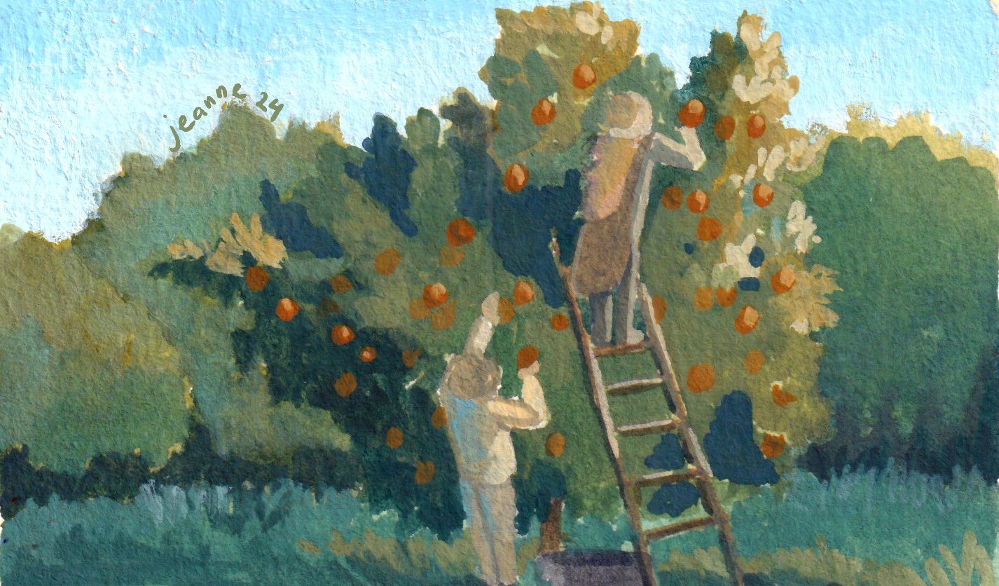
Here are a few pieces painting digitally. Apart from the highlight created by sunlight, other parts of the fruits have some blue since they are in the middle of branches and leaves.
I try to think of the trees as made of multiple balls and add scattered highlights to show the texture of the tree.
As we wrap up this collection of green-themed paintings, I hope you’ve enjoyed exploring the shades of green with me. There’s still room to explore with green in particular and expressing nature for me, see you again in another collection in the future!
Painting a full scene always feels overwhelming at first. When I lay out a big blank piece of paper or set up a canvas, I often imagine something is look back at me. Particularly when I was a beginner, I made the mistake of buying A3 paper stack to save and it was a bad choice. Some of my watercolor papers become buckled due to humidity and I had to get another stack.
It turned out that I overate myself and the simple solution is painting on a smaller size.
The case for a small painting
Starting with multiple thumbnail sketches actually saves much more time rather than going directly onto a big canvas. It helps capturing the idea at the rawest stage, then allowing me to explore different compositions, details and ideas. It works the same way as the outline for a book: you need to have a rough image of the end before starting with each chapter.
It also reduces the guilt of commitment: an idea may sound brilliant when it first comes into our head, but maybe not so when it is laid out on paper. It’s easier to give up a small sketch than a big painting. It doesn’t have to ‘good’, ‘excellent’ or ‘the masterpiece’; it can be anything attracting your attention.
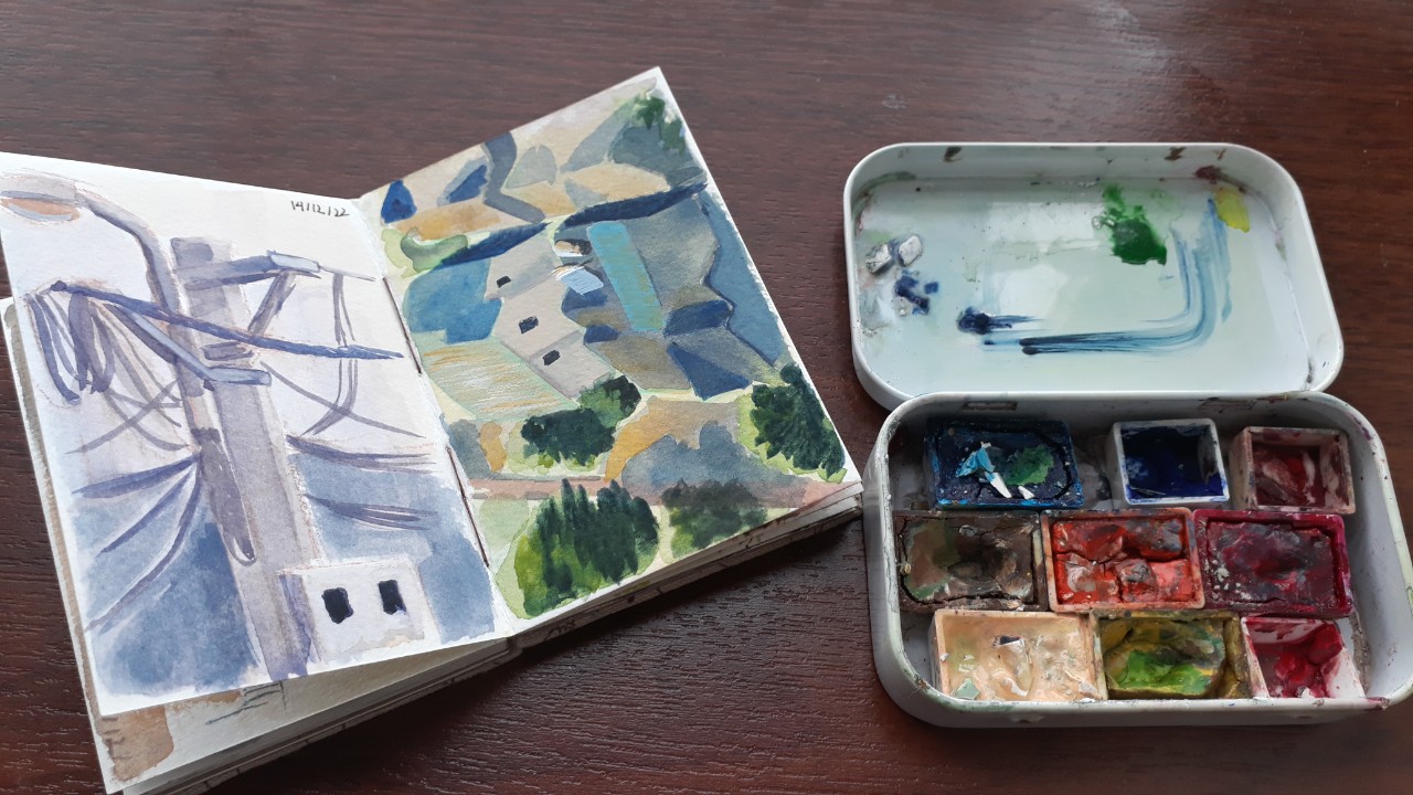
Small size sketchbooks work better when you try to paint outside as well. Pairing with watercolor, it becomes my essential kit whenever I go outside.
The mini sketchbook and mini palette I often carry around
One page from the above sketchbook
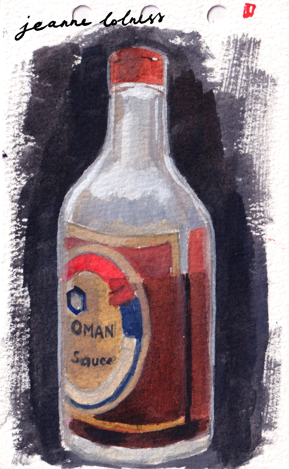
The size of the above sketch of my sauce bottle is 13 x 8cm. You can see a bit of the process here.
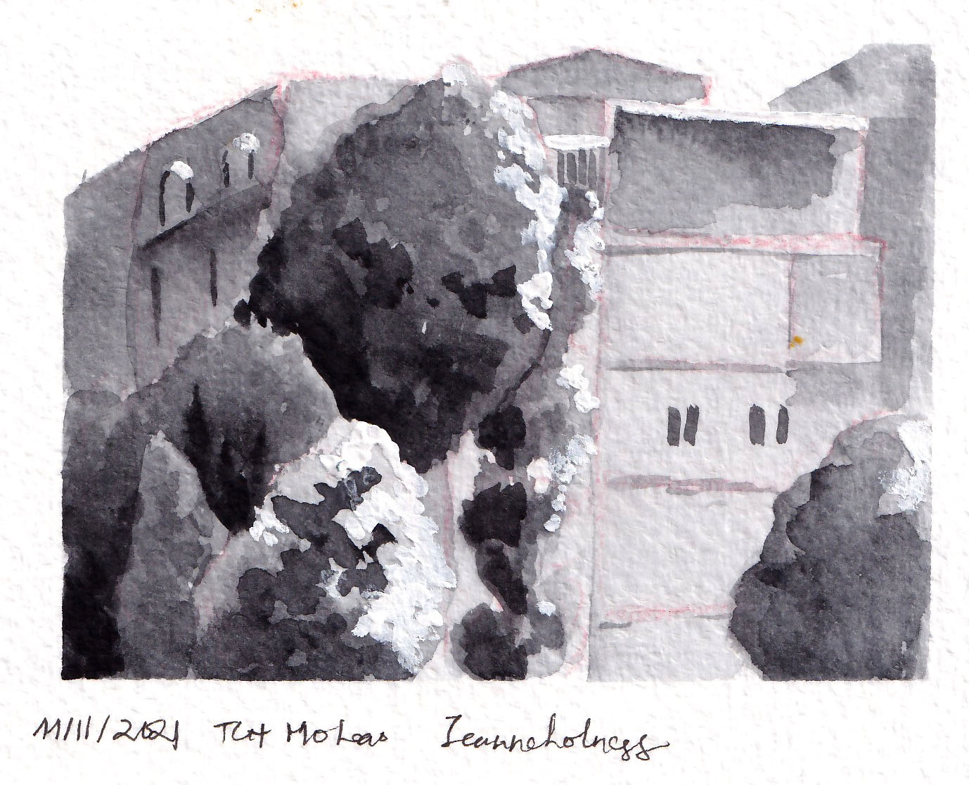
You don’t even need to use color for a thumbnail sketch: you can start with painting value scale first and then color later. When I started painting outdoors, I mostly painted in grayscale with black and white only. The above two are of the same view, with a 2-year gap in between.
Tips to work with small sketches
1. Experiment with the size
You can still buy a big paper stack, just cut them into different sizes to see how it feels to you. A6 size is my favorite size, it looks like a postcard and it fits with my A6 planner. I can just shove them in between the pages and I’m ready to go anytime anywhere.
2. Experiment with the tools
I found ink, dark pencils (6B – 8B) and watercolor more suitable for sketching small. But many artists prefer soft pencils, gouache and digital painting better.
3. Focus on the mass and perspective first
I layout a simple perspective and opt to the biggest mass in the composition. If you struggle with background and landscape illustration, learning to be comfortable with perspective first and trying to see the world in grid is my advice.
4. Break down process and have fun
It’s challenging to complete a full illustration, particularly a landscape one. That’s why I often divide it in parts. Of course, when the surge of excitement comes, just go with it ; but it’s unrealistic to be ecstatic everyday. I often have a few projects running over the same time to switch when I’m bored.
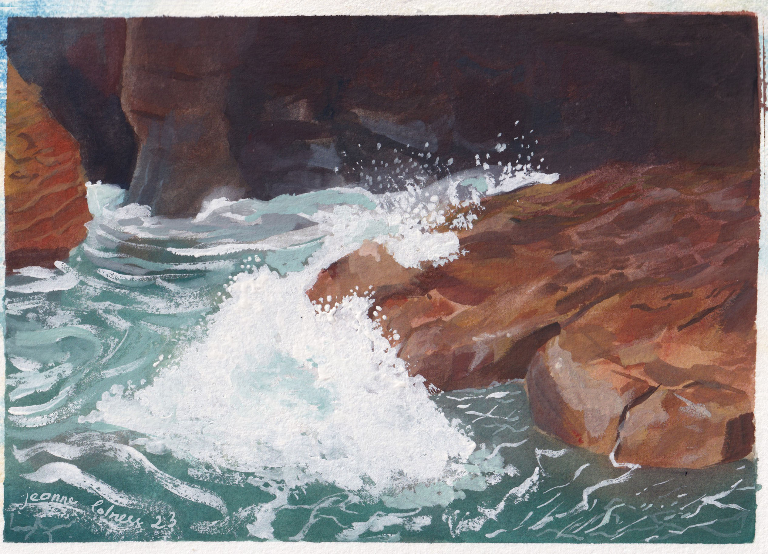
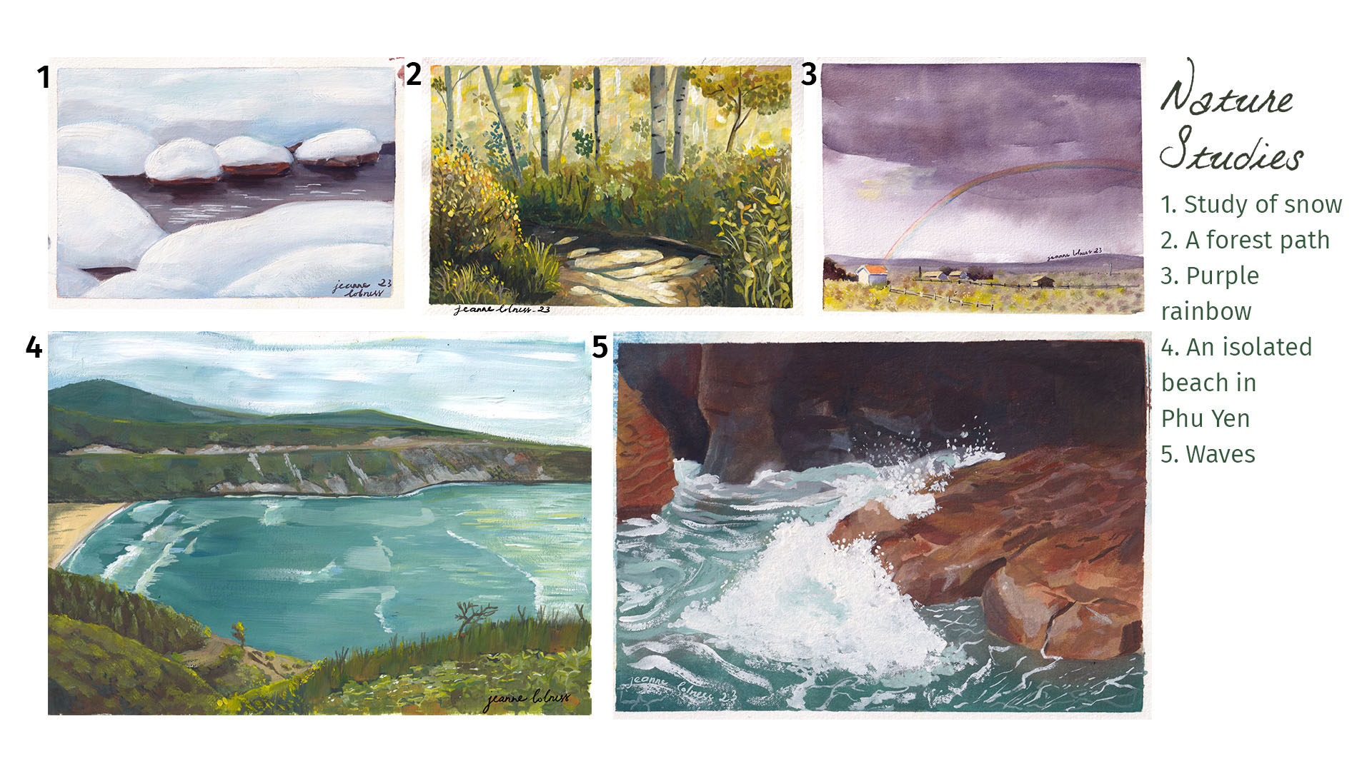
A painting capturing closely how waves crash with the rocks
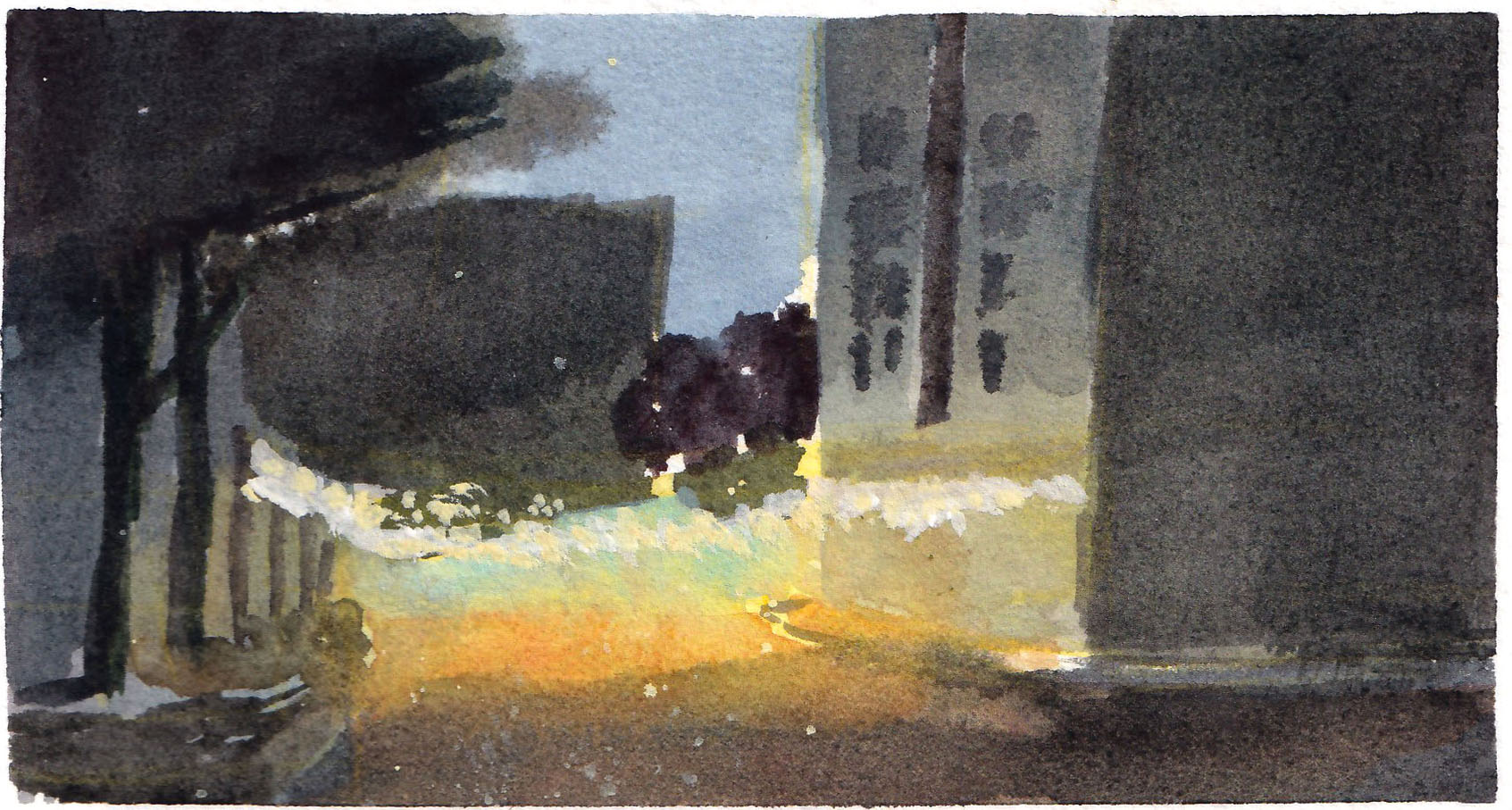
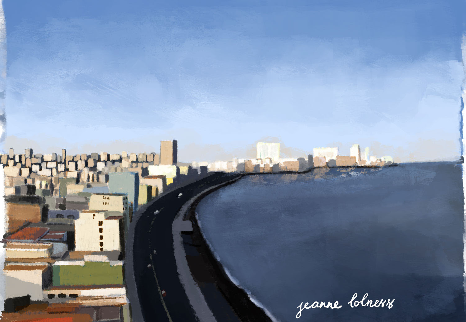
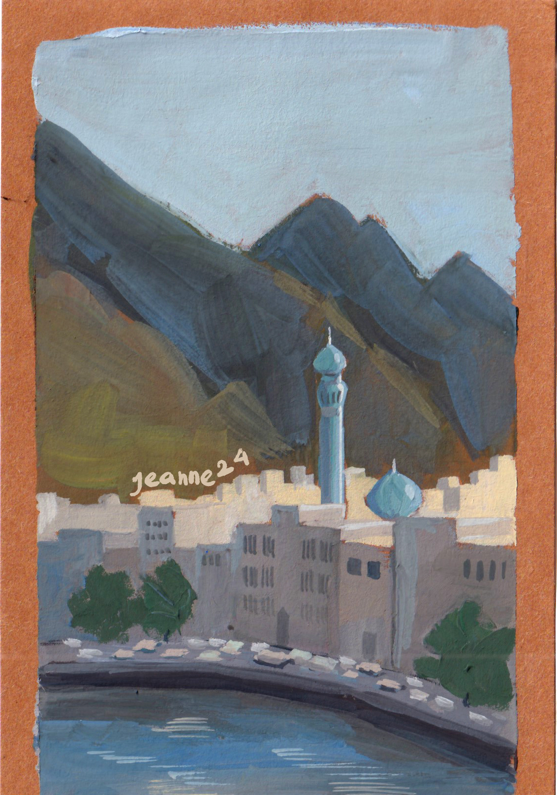
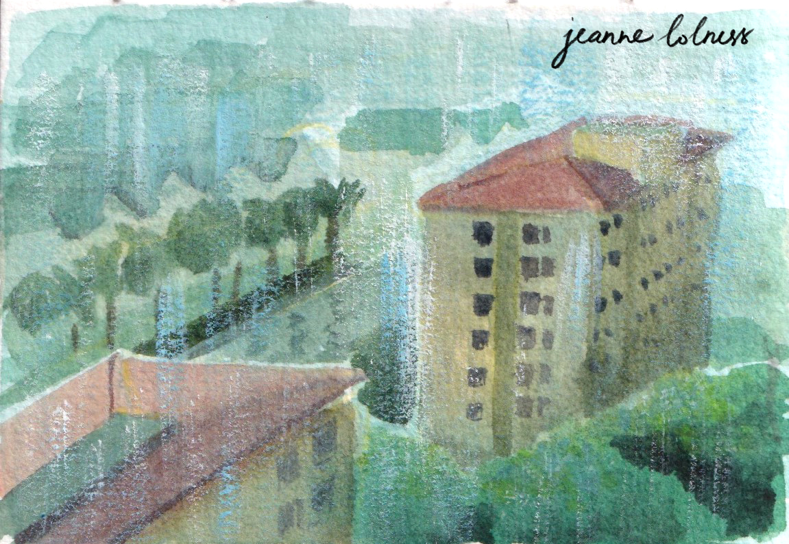
A painting of a view from my apartment
Above are some the largest painting I have ever done, roughly A4 size. It’s tough to paint big, but the joy of completing one big illustration is too great to miss!
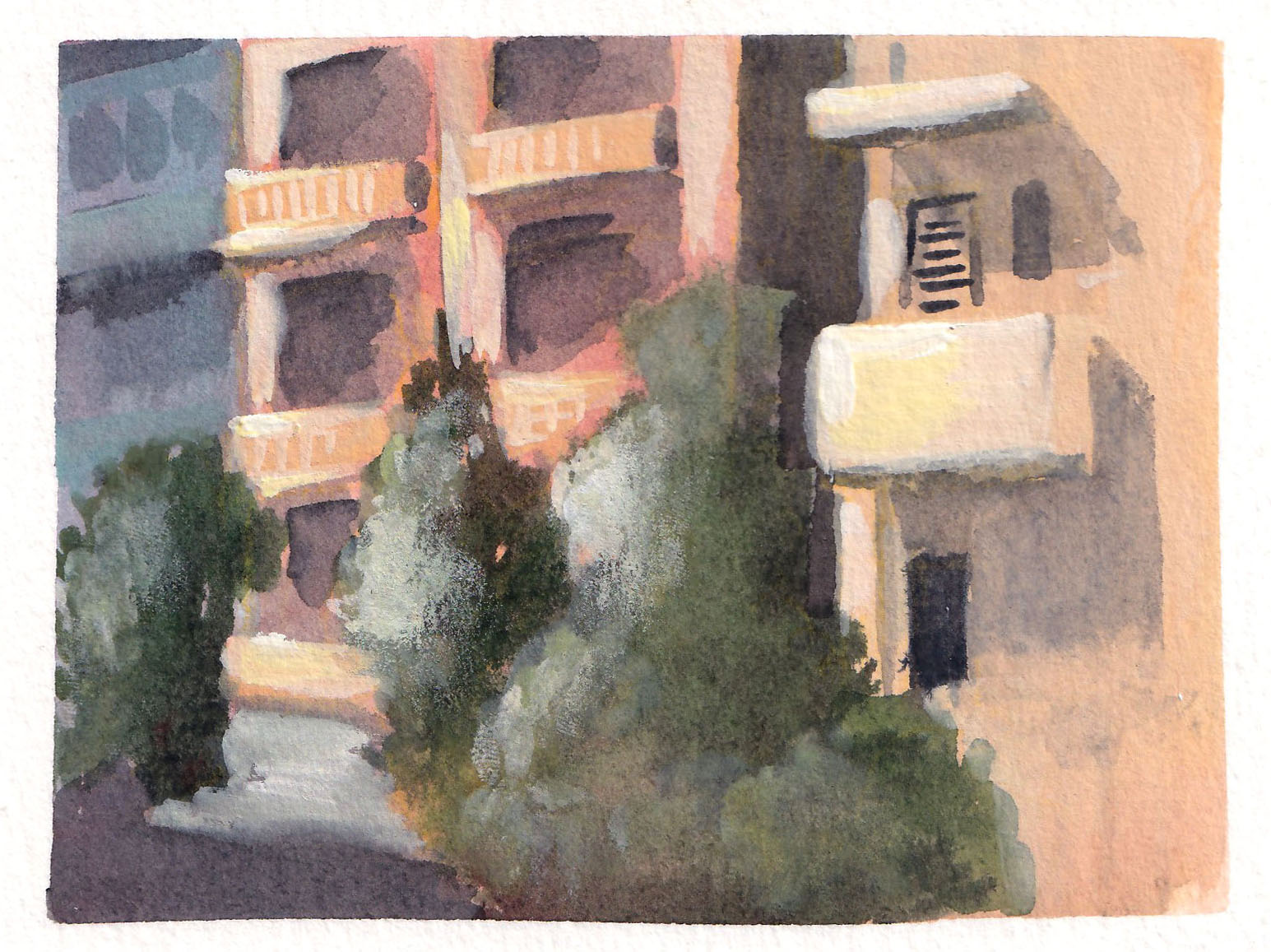
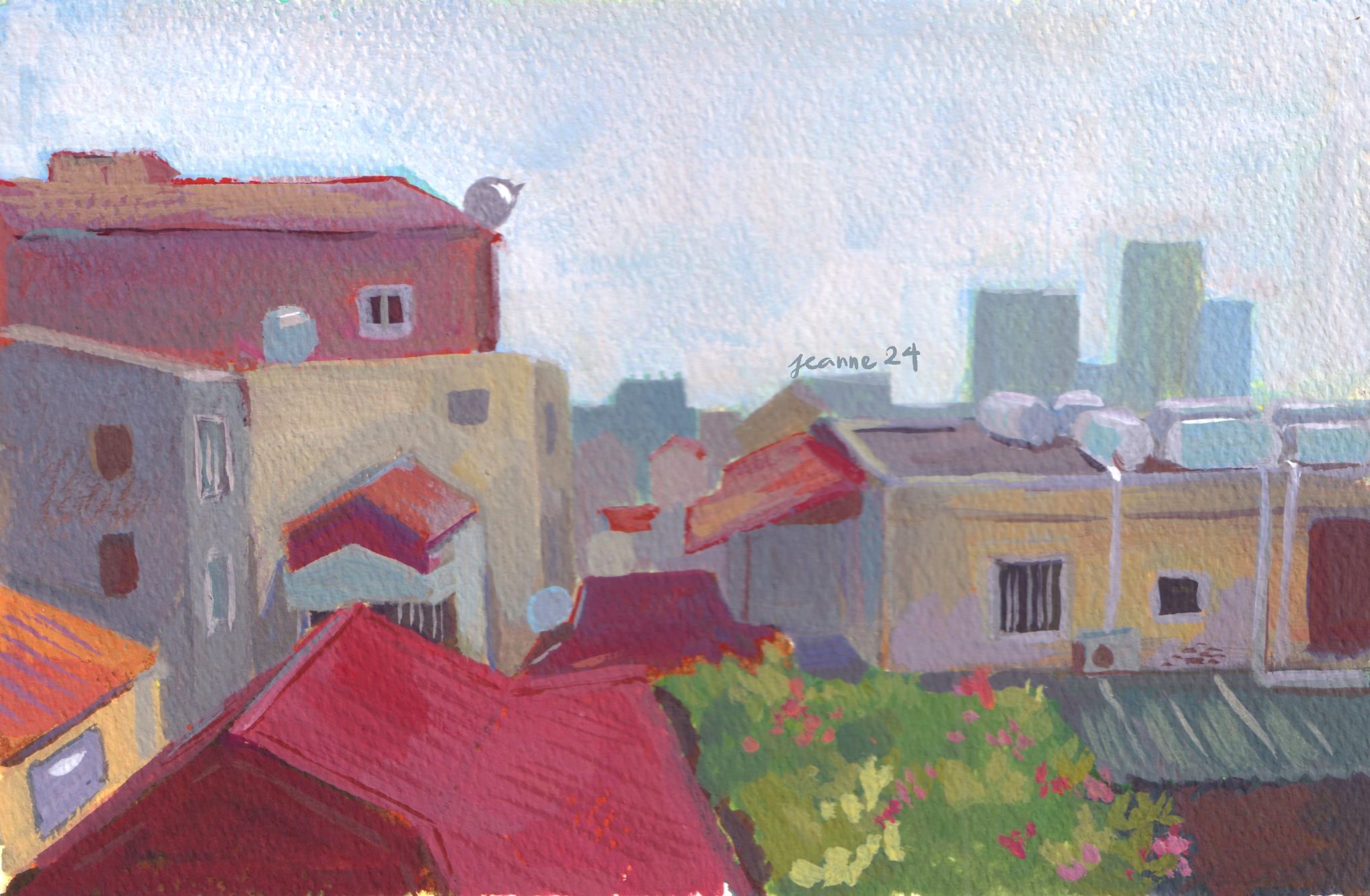
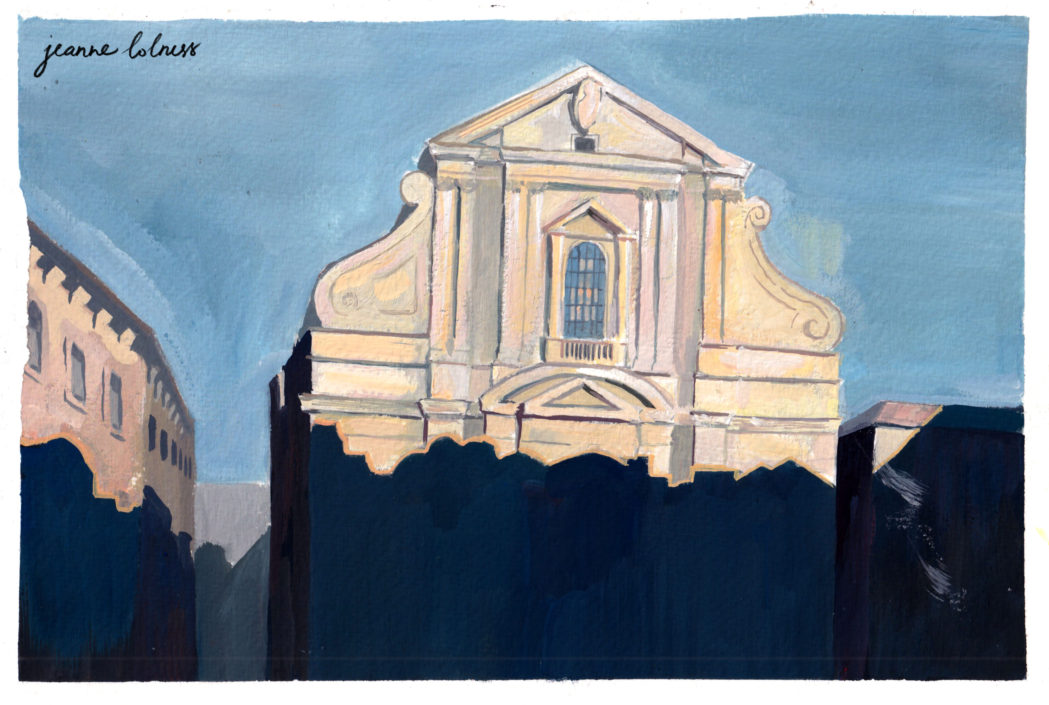
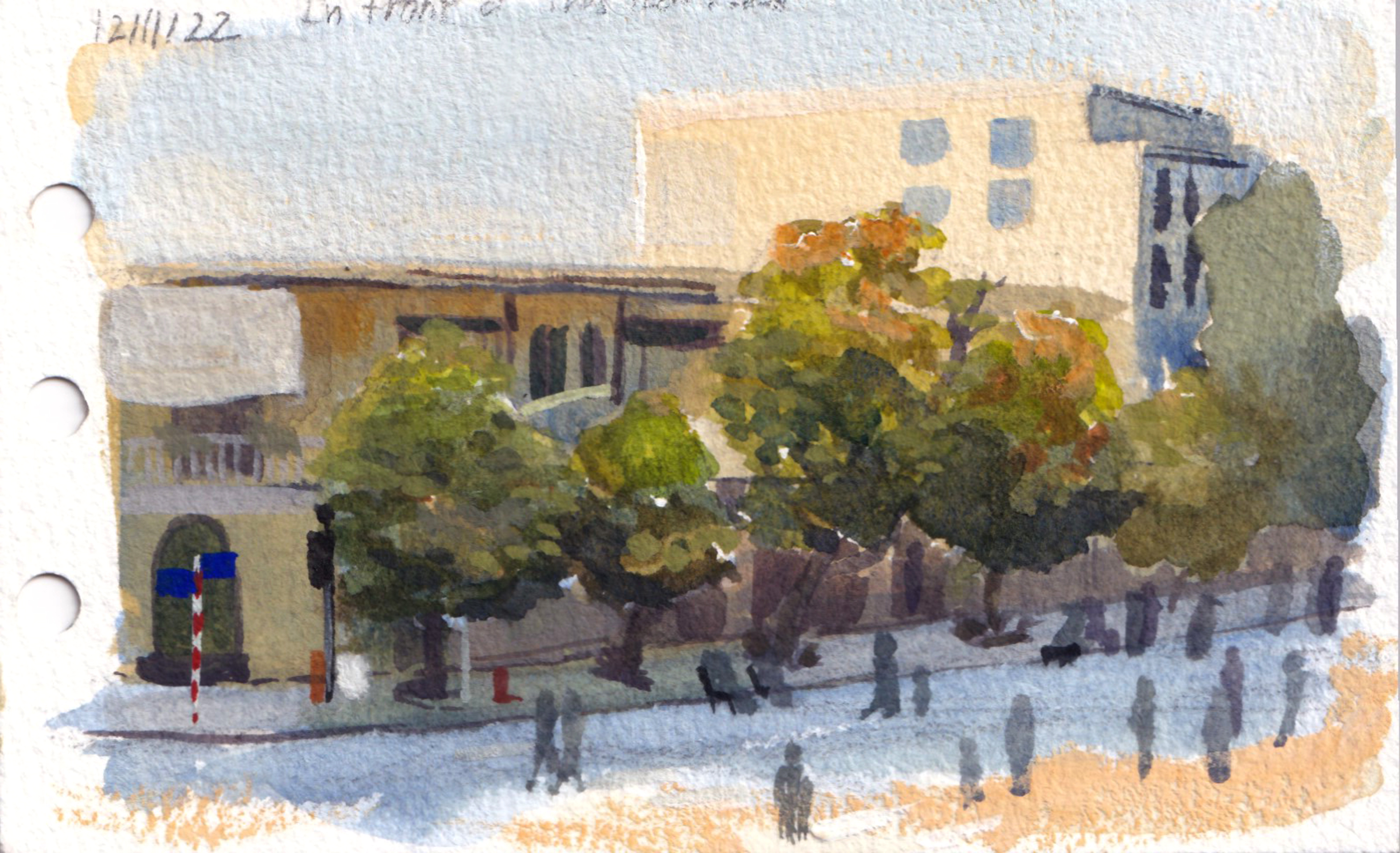
I spent most of my life in Hanoi. When I was a kid living in my grandparent’s house, I was surrounded by copies of Bùi Xuân Phái, a Vietnamese artist famous for painting Hanoi houses in the 20th century. It was probably the first seed in my affection for this city.
A rainy street
A typical Hanoi houseA summer streetA small house
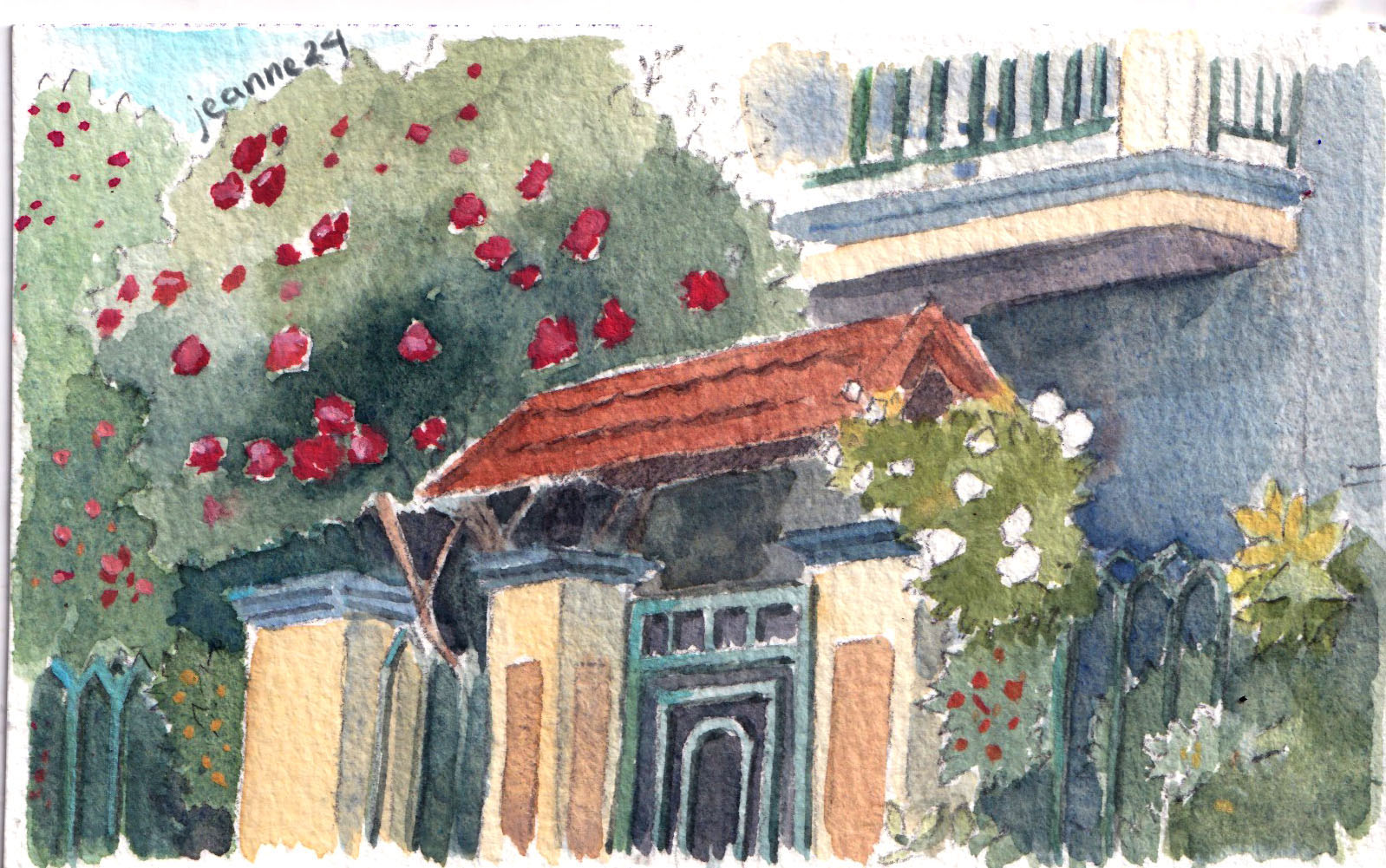
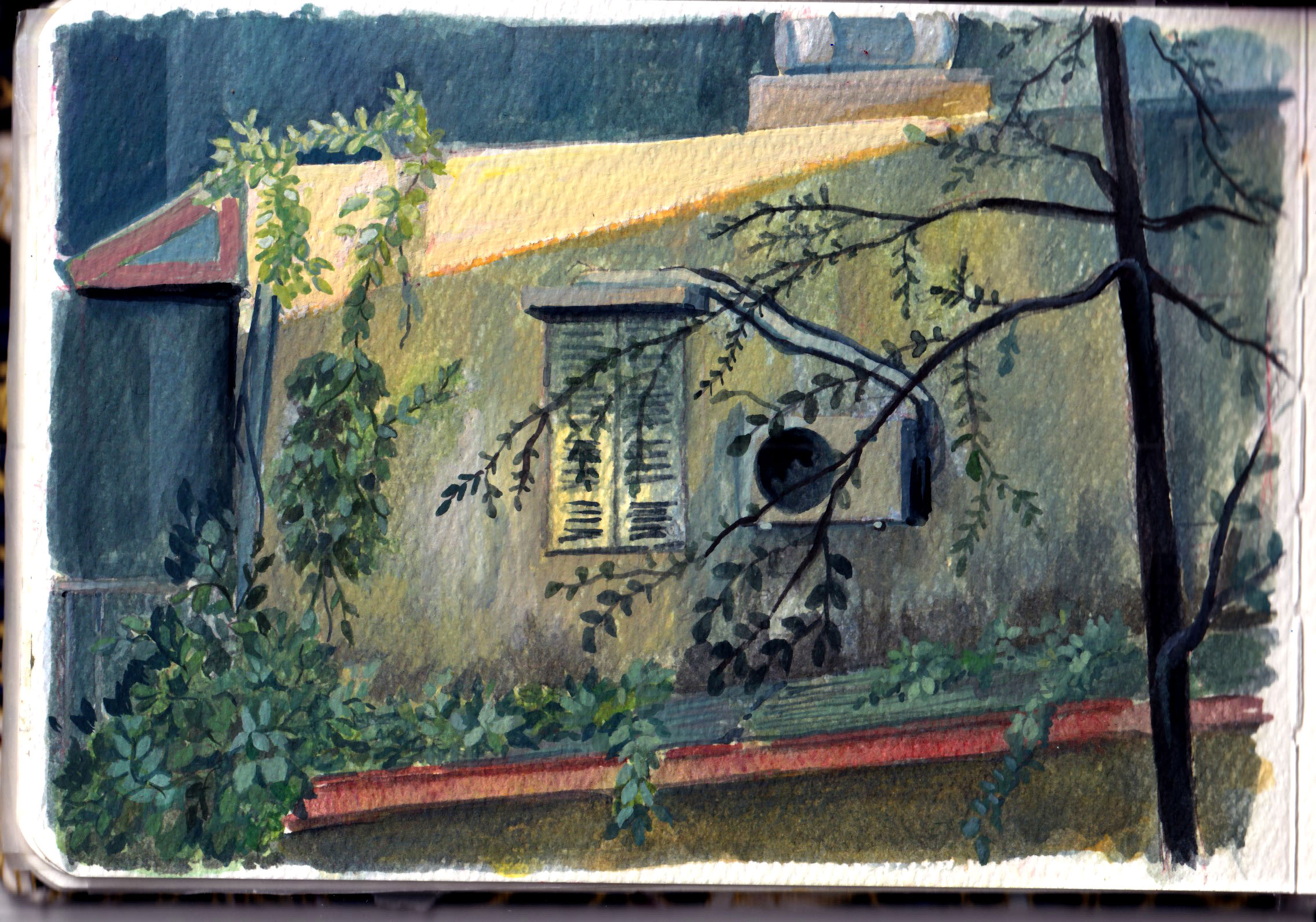
My affection goes to old houses, mostly those with cracks and weird innovations. They are the witnesses of Hanoi history and my own life. Now I live in a modern apartment with elevators, but I still remember running down the stairs full of plants pot, old furniture and and beehive coals.
Trang Tien Street
The street where I grew up
A silent corner in autumn
A street at noon
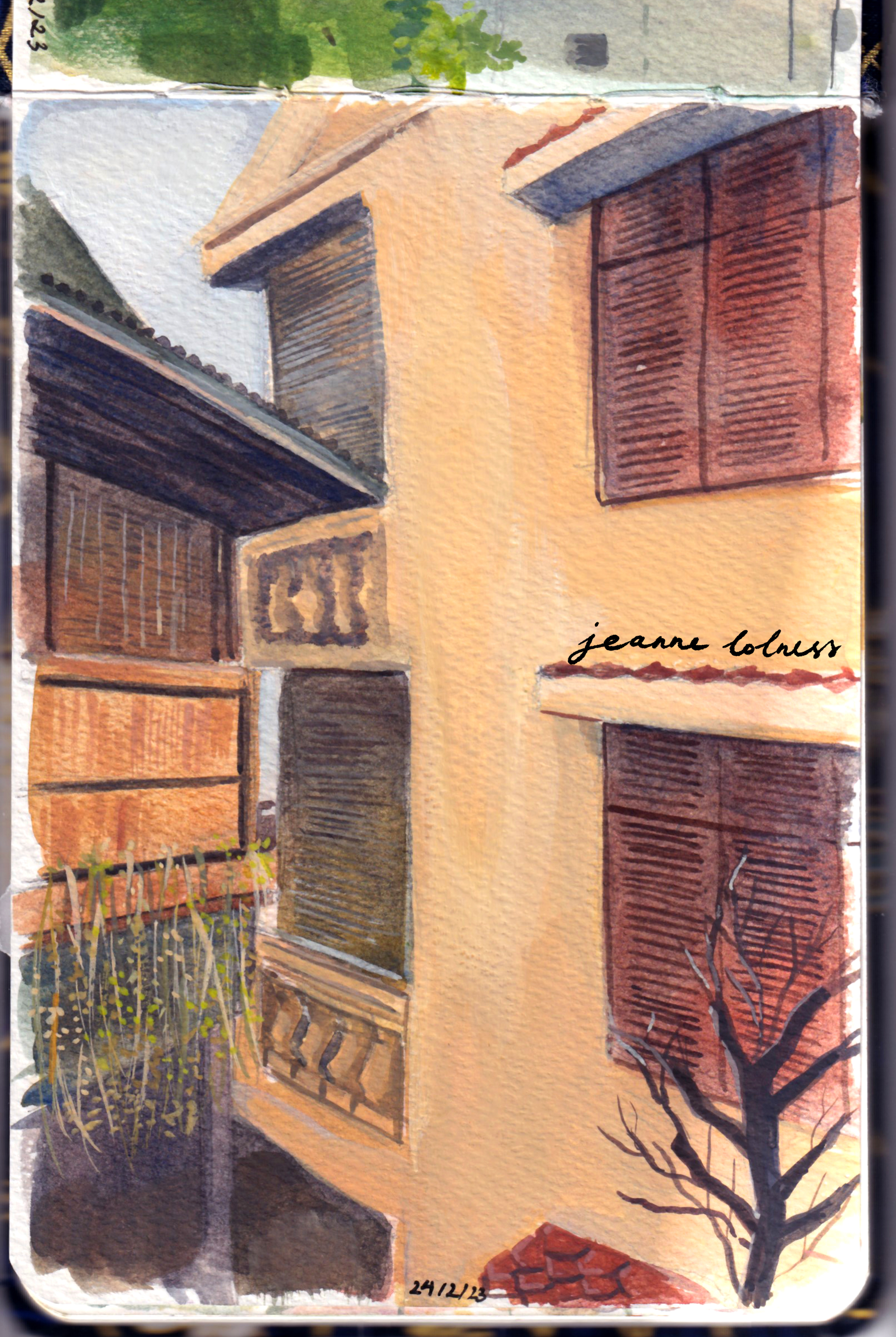
Many old houses in Hanoi are painted in yellow, which is a reminiscence of French colonization period. French often painted important buildings in yellow, and the reason is still unknown. It could have a symbolic meaning of an upper class, but yellow paint was also a cheap option at that time. Even after the war, there are still many houses and buildings painted in the similar yellow tones.
An old house covered in ivies
From my grandparent’s house window
I left my grandparent’s house when I was was ten. Many areas of the city are being upgraded with modern architecture, yet, the street where I grew up remained almost the same. I don’t know how long they will stay the same, but I’m grateful for that.
Luckily, even though old houses are being pulled down due to safety reasons, Hanoians don’t have less love for our history of architecture. There are cafes being built resembling houses from the last century, furniture being kept from generation to generation, exhibition showcasing how and why these houses were built and loved and artists incorporating elements from childhood into artworks.
If you ever come to visit Vietnam, let’s stop for a second to watch these small houses stacking next to each other on the streets. It’s possible that many generations have lived in these houses and new hopes are being created despite two wars, economic downturns and most recently, an international disease.
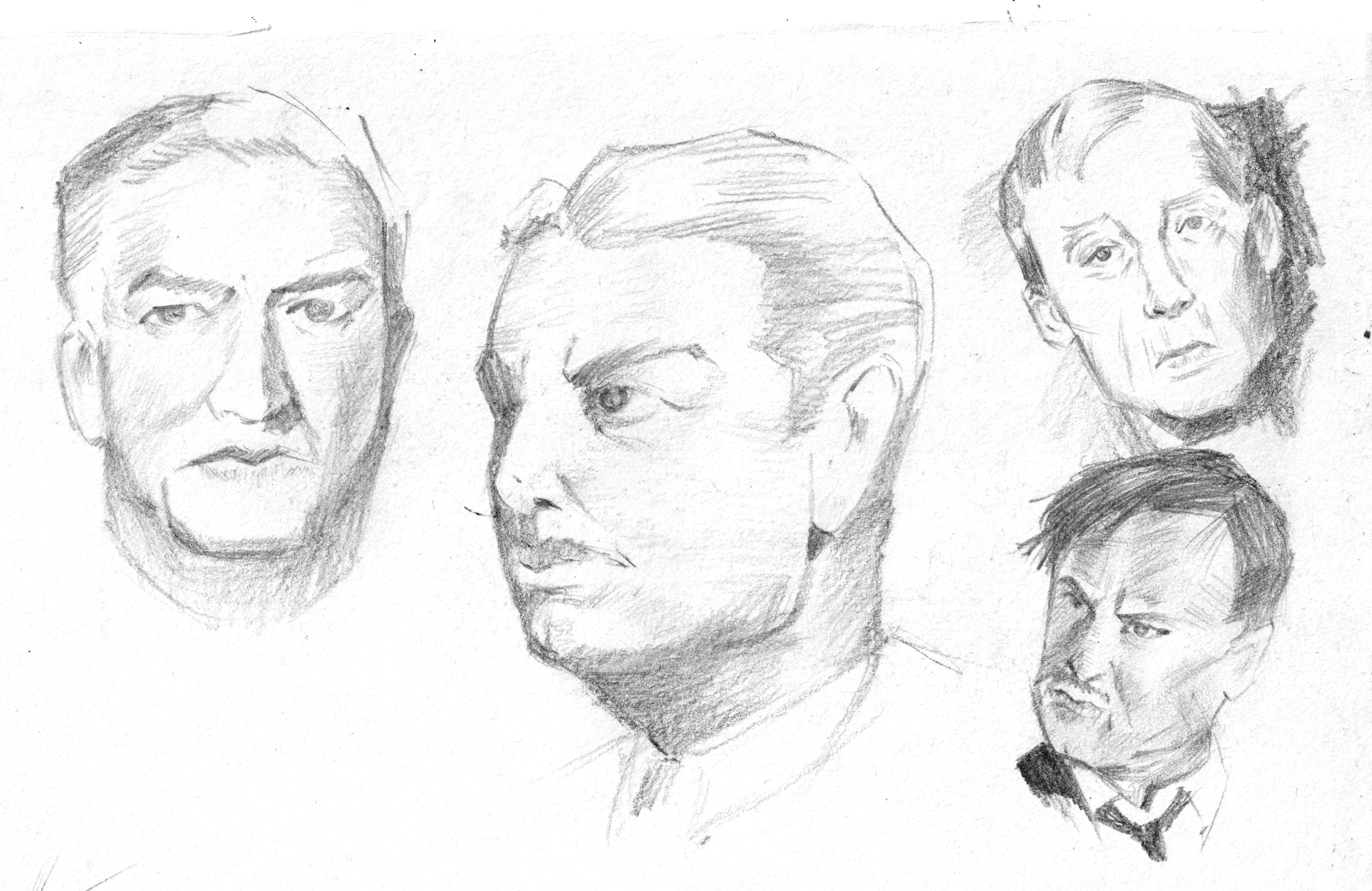
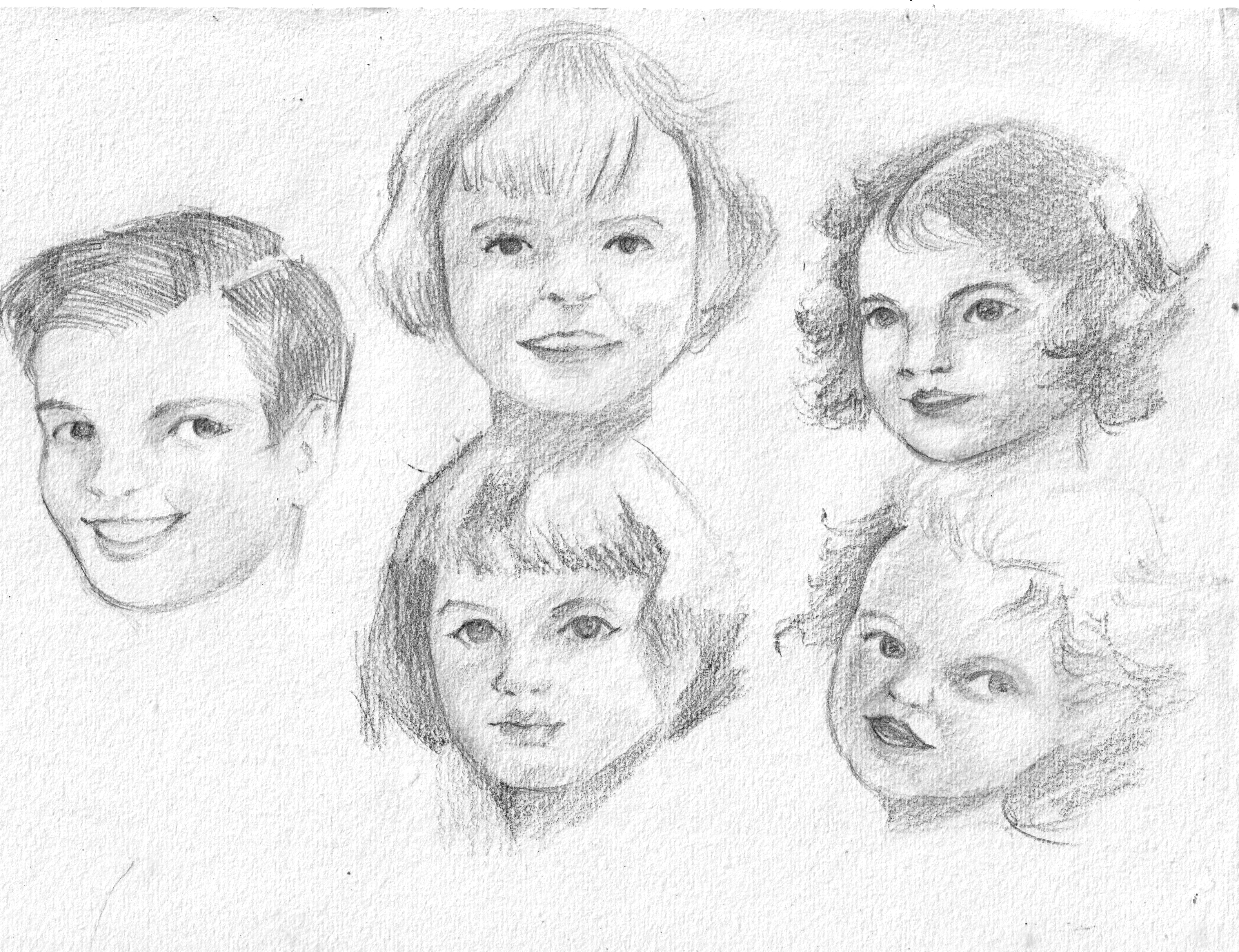
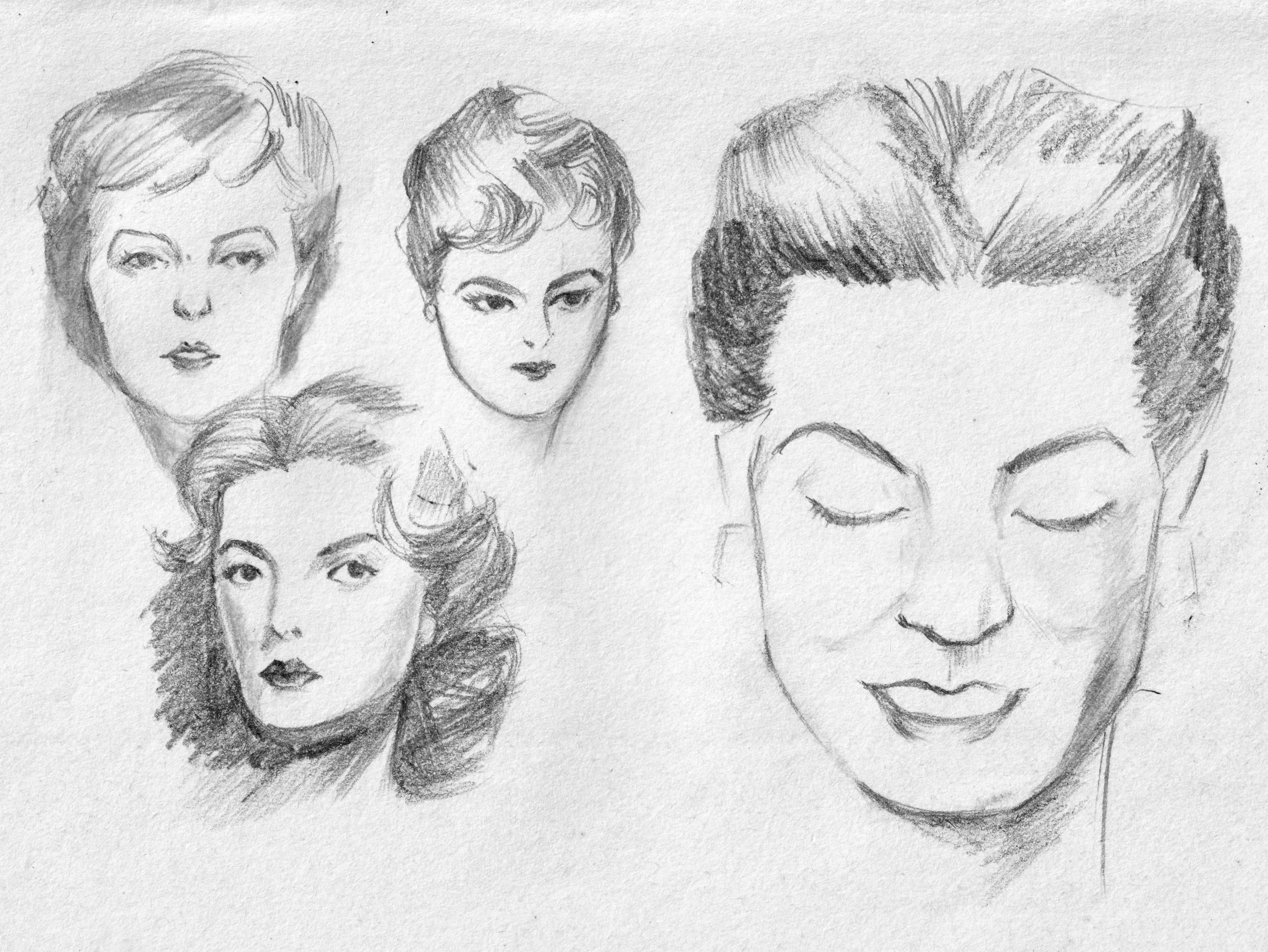
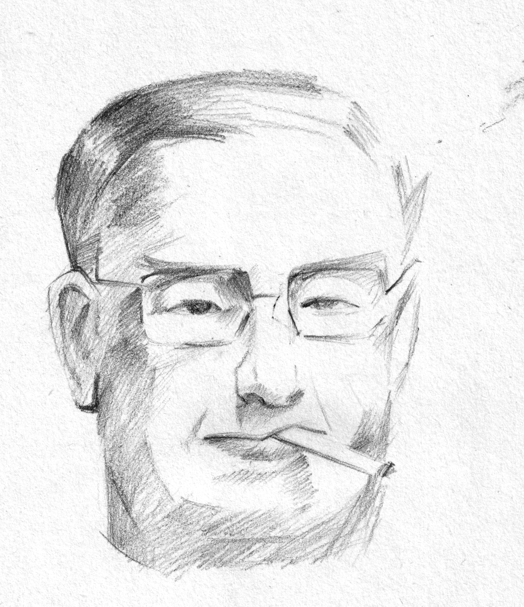
Human face is always a hard subject for me, since it’s easy to draw it ‘wrong’ and hard to fix it ‘right’. The annoying thing is even if I realize the face is ‘off balance’, sometimes I can’t point out which part need fixing or how should I re-draw it later.
That’s why it takes a long time for me to be able to draw a face that I can feel satisfied with.
My start
My first proper learning would be Proko’s drawing face videos, which is based on Andrew Loomis method. Later, I discovered Andrew Loomis wrote a whole series of books about arts, especially about figure drawings and portraits. The book I read, “Drawing the Face and Hands” was published in 1956, yet it’s still useful in learning the general structure of the face. The books were divided into male, female, teenager, kids and a small section at the end about hands. He often began with building the blocks first, then slowly adding features. The proportion of human face is similar among all people, yet, age and gender make the main difference.
I tried copying the sketches in the book
The only few drawbacks of the book are it don’t have any exercise or suggestion about practices and it was written in 50s language, which is lengthy and flattering for me. However, I can still feel the warmth and efforts of Andrew Loomis in his first few words opening the books “Now let’s get to work in earnest”.
The first course
Later, when I took the course “Deconstructed: Drawing People” by Viktor Kalvachev, he shared his method learned from a criminology professor to recognize faces based on basic shapes. Actually, you can see that section free on Schoolism channel.
Together, I found it easier to draw faces from images and came up with my own design for commissions.
A 60-day portrait painting challenge
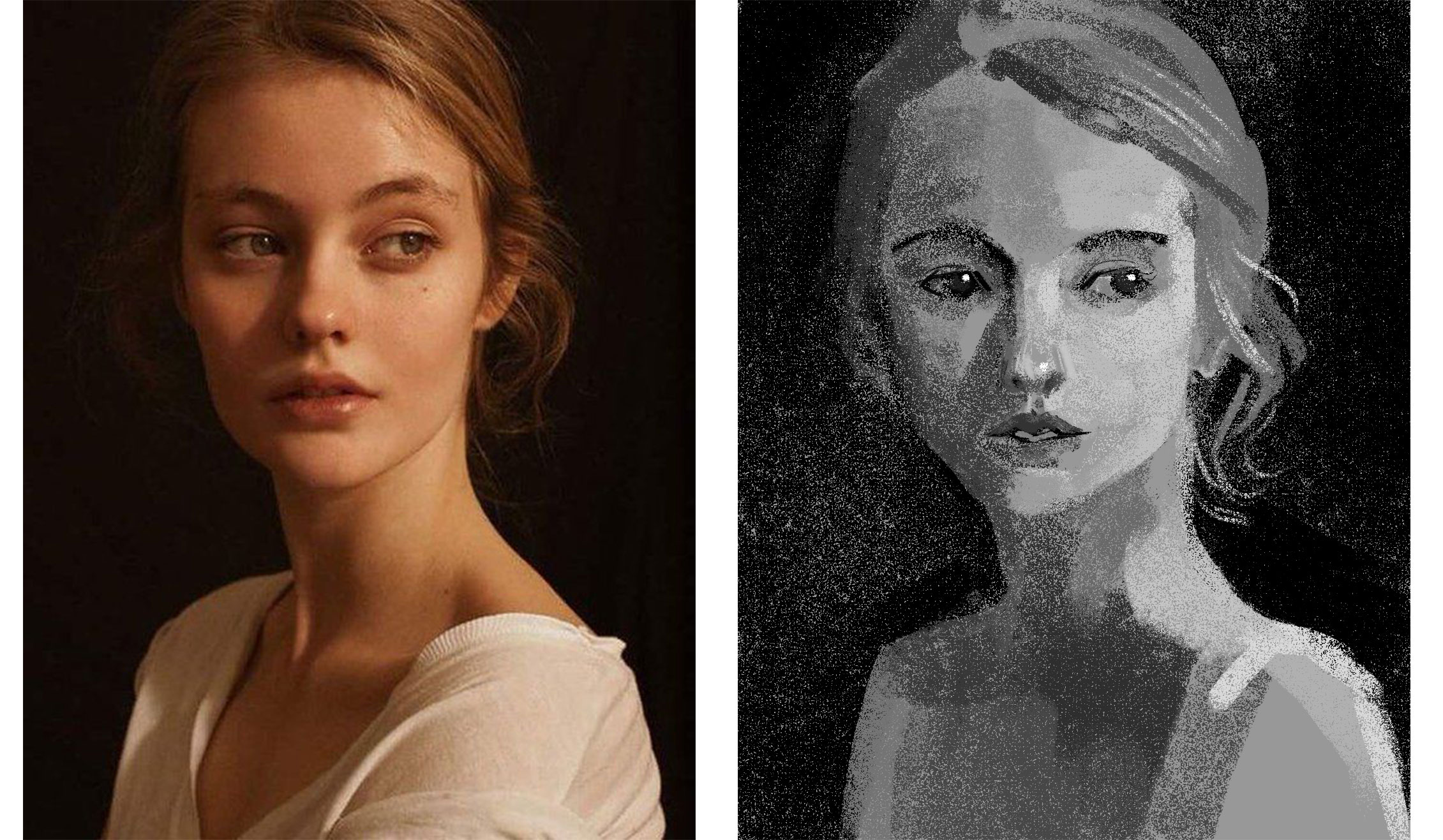
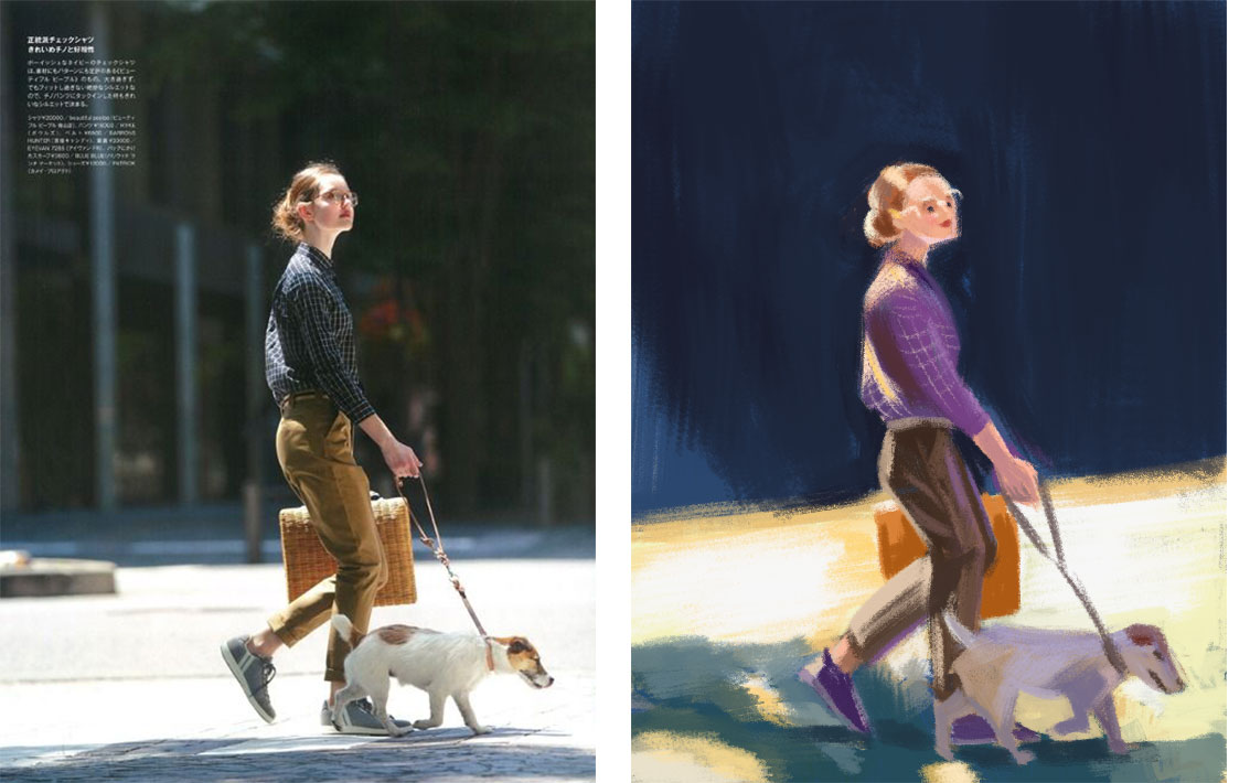
Feeling okay with my line drawing/sketch, I start to look for more ways to paint the face. There are realistic approach and stylish approach, color and lighting setup are also considered. I want a bit of fun so I try the Digital Painting Workout by Woulter Tulp (also a course on Schoolism). The course’s main purpose was to practice digital painting, yet the instructor prioritized portraits because they are subjects that can be tackled in 30 minutes or so. For each day in 2 months, I spared 30-40 minutes to paint an image based on the instructor’s guidance. Each painting focus on one goal only: value or color or rendering, etc.
The useful side of this workout is that it allows me to learn painting both way: realistically and stylishly. I learned that there’s endless possibilities about painting a person, the important point is to paint how I feel about the person.
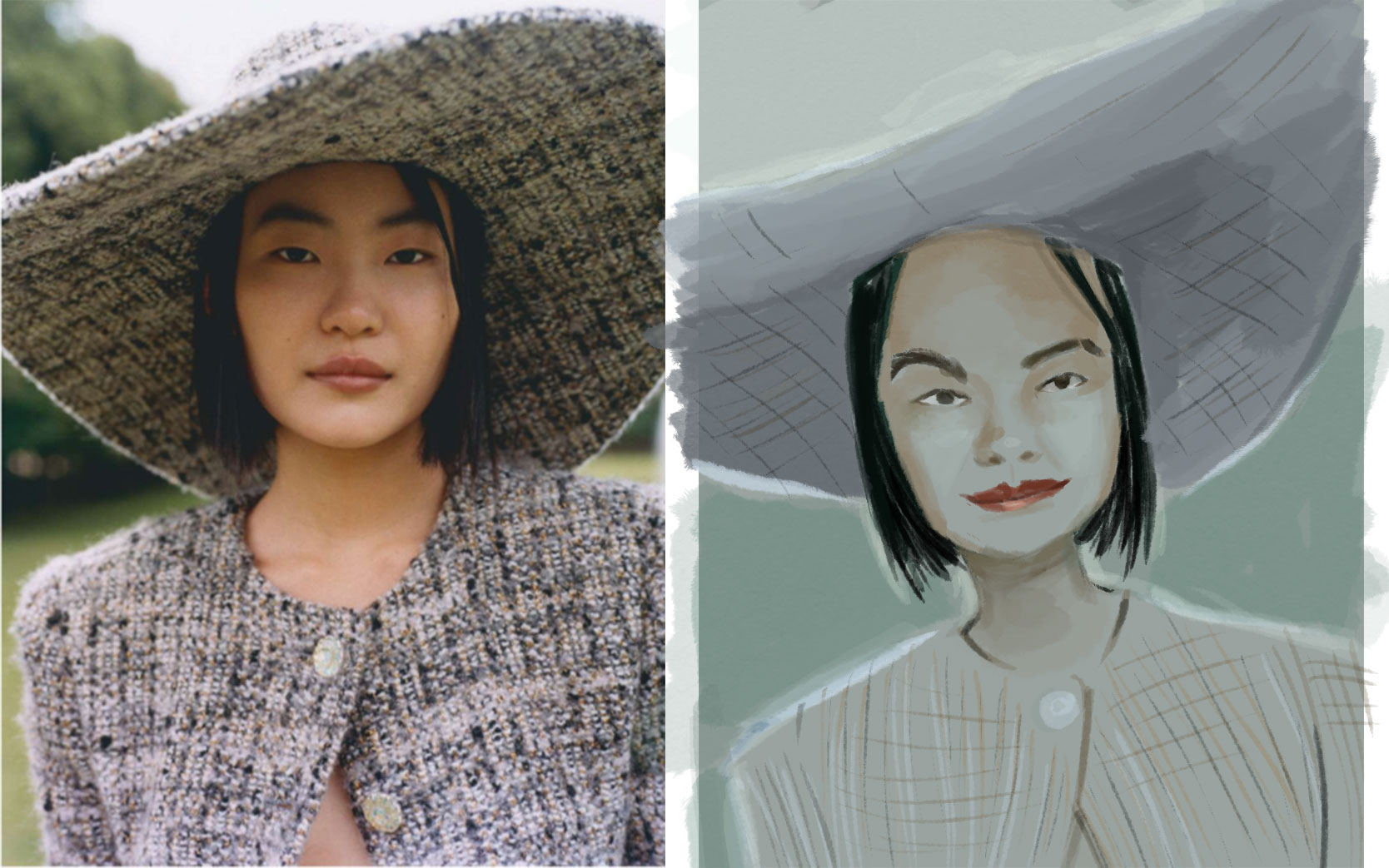
The most recent course I took is about color, and the subjects used were also portraits. This time I used gouache for the whole course, trying to mix color traditionally. The side effect of this course is that my portrait skill improved a lot as well.
Credit: @Lee Avision/ Trevillion ImageActress Pınar Deniz
Model: Jessica from Croquis CafePhotographs by Paolo Verzone, Egyptologist Monica Hanna, from National Geographic
These paintings aren’t used for commercial purposes, just for education and promotion only.
I aim to use realistically but not in order to copy the image exactly, the important is to paint how I feel about the model, how I think about her, what’s the real or the imagined story I could tell with her eyes, her skin, etc.
What’s next?
I want to learn more about human expressions and experiment with specific lighting, especially dramatic/ theatrical set up to tell a story. And I will need to revisit the face structure to keep my knowledge fresh, but with a different approach/method to keep the art as fun as I originally started it.
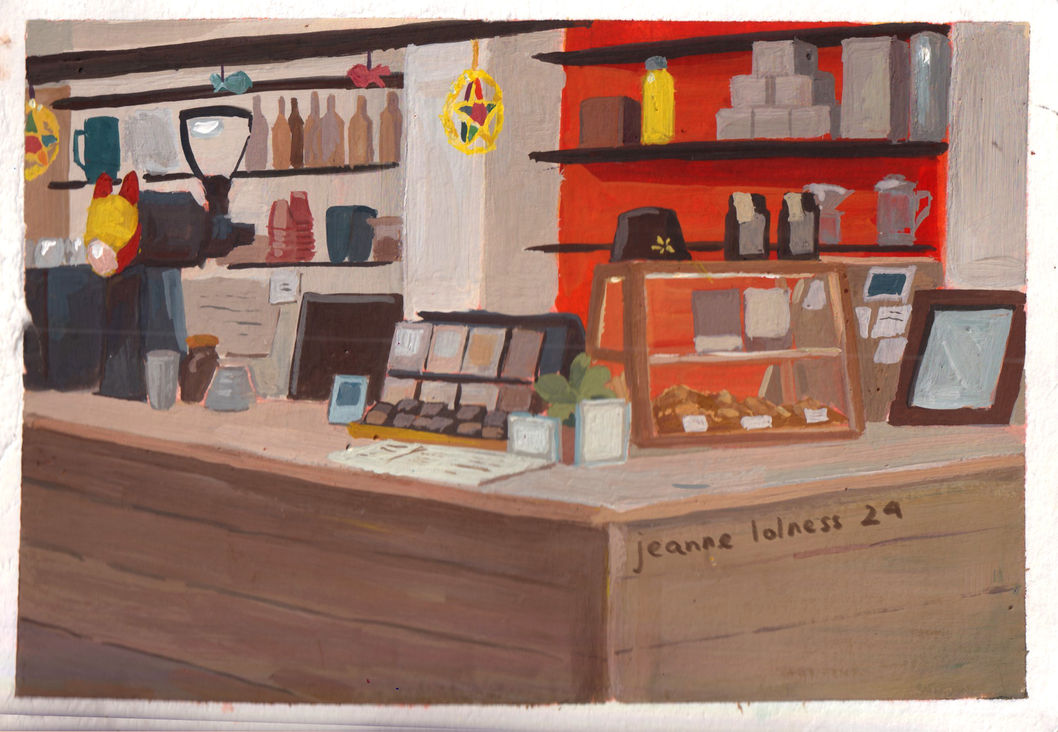
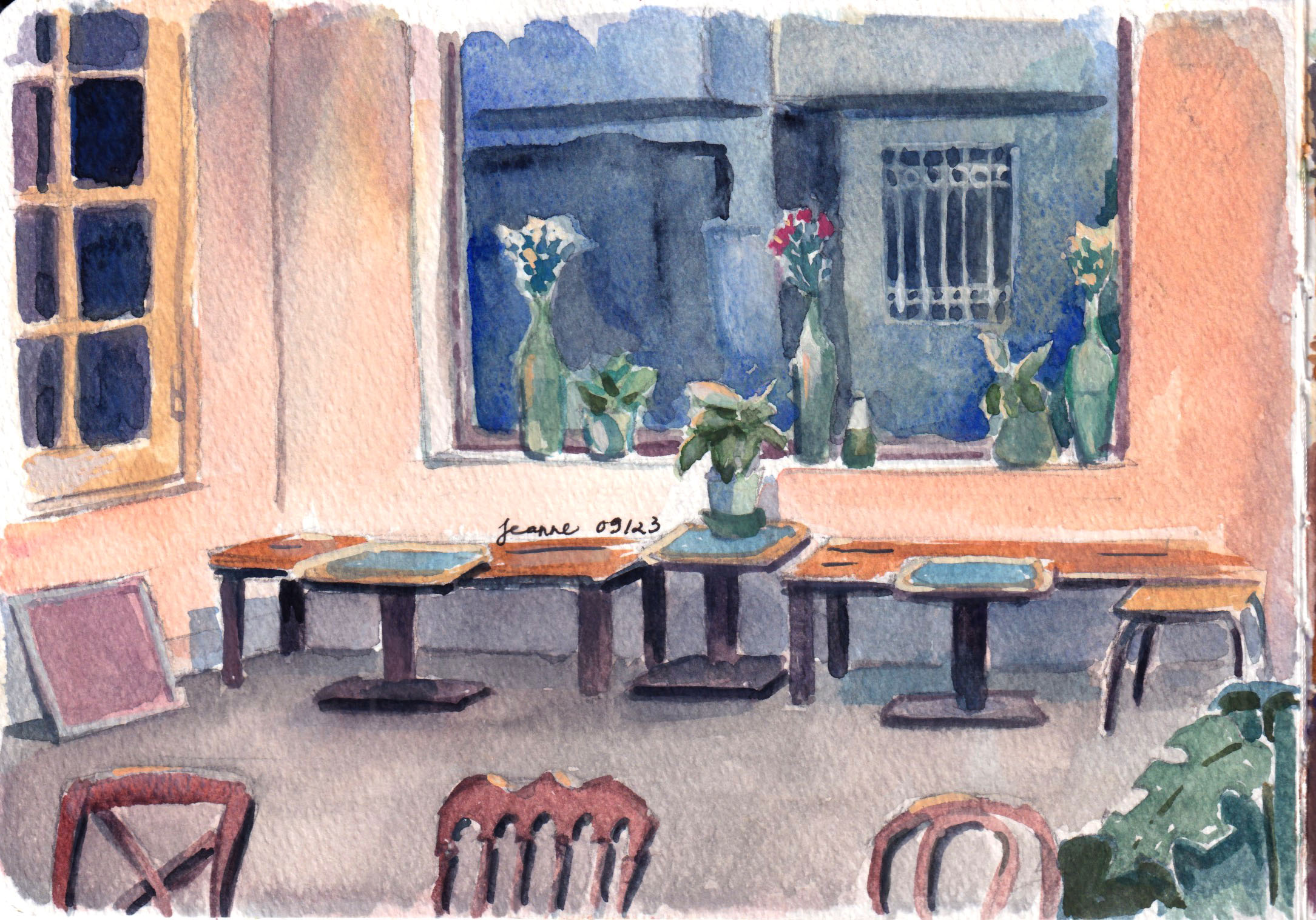
My grandparents are big fans of coffee, growing up with them, I always smelled coffee in the house. Though I didn’t take to drinking coffee until my twenty-something, the smell of coffee is something I associate with a shelter and a cozy place.
A winter dayA gray cafe
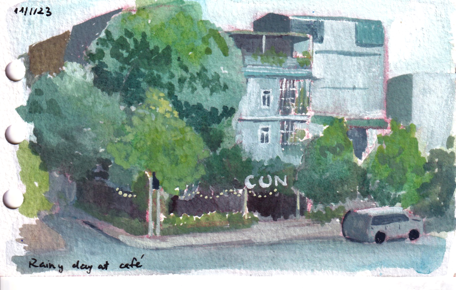
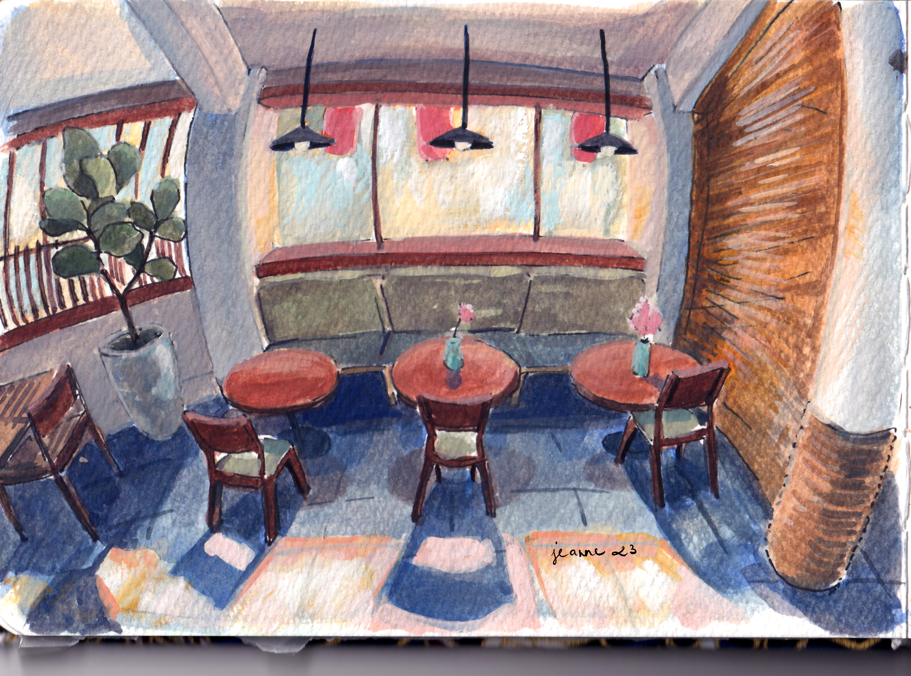
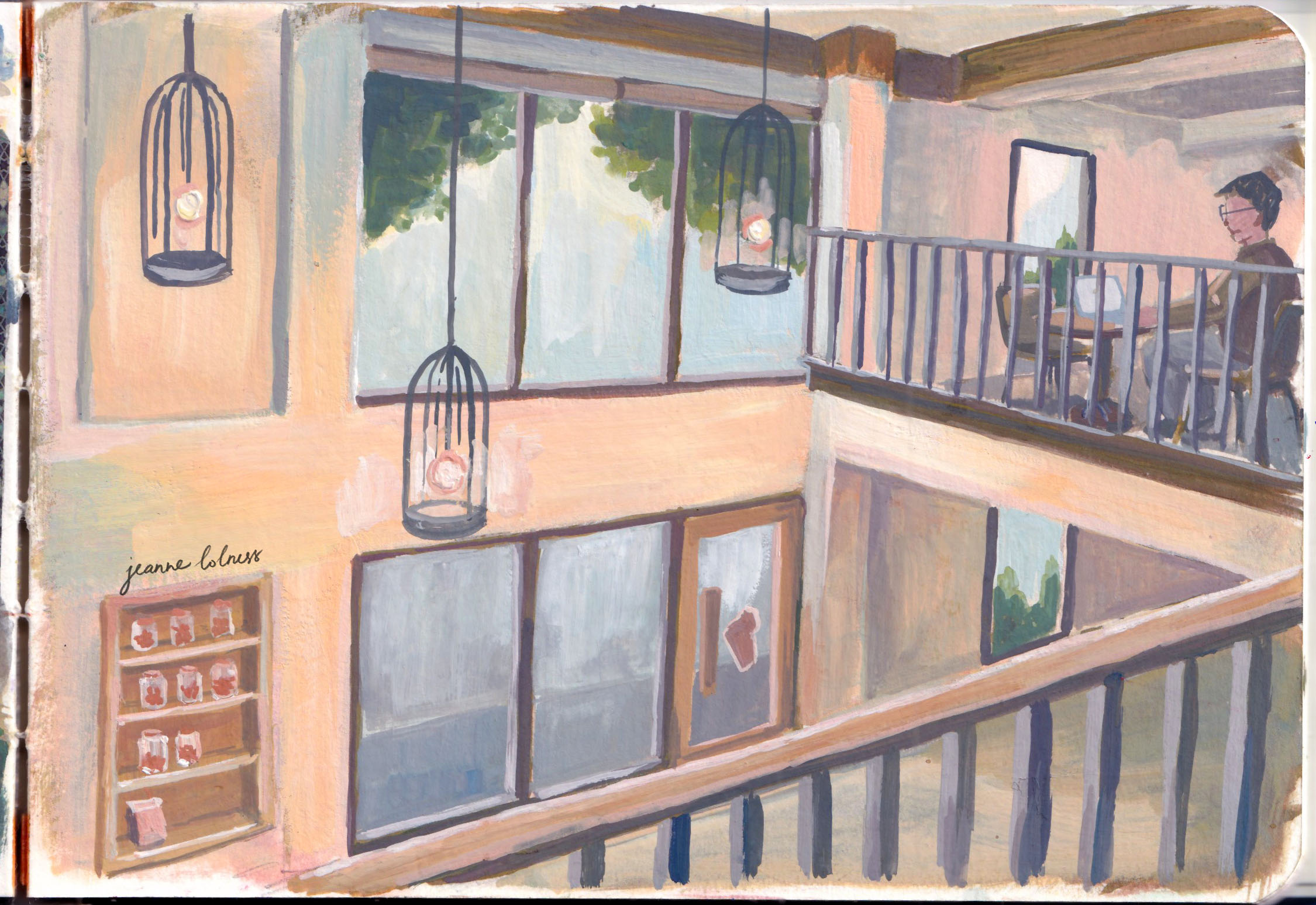
And there is a cafe for every single need of people in Vietnam, as long as I could specify how I feel and what I want. Most of the times, I prefer a quiet working cafe with a few floors, high desks and chairs, with bright lighting and lots of windows.
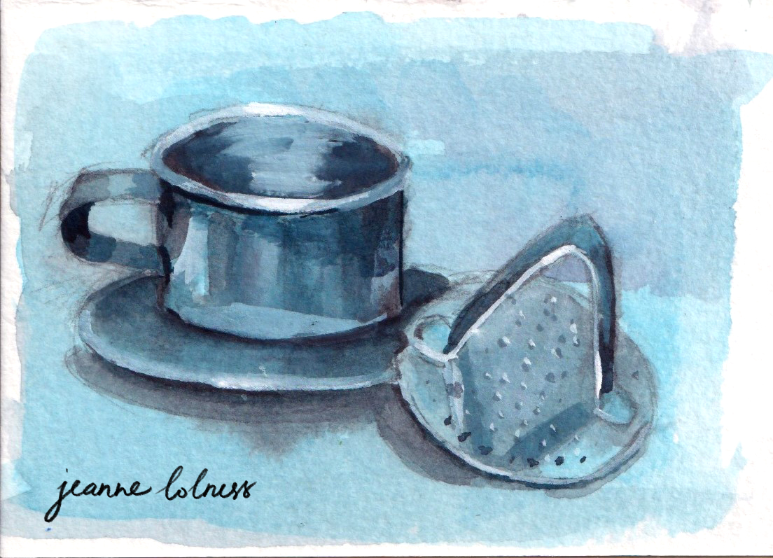
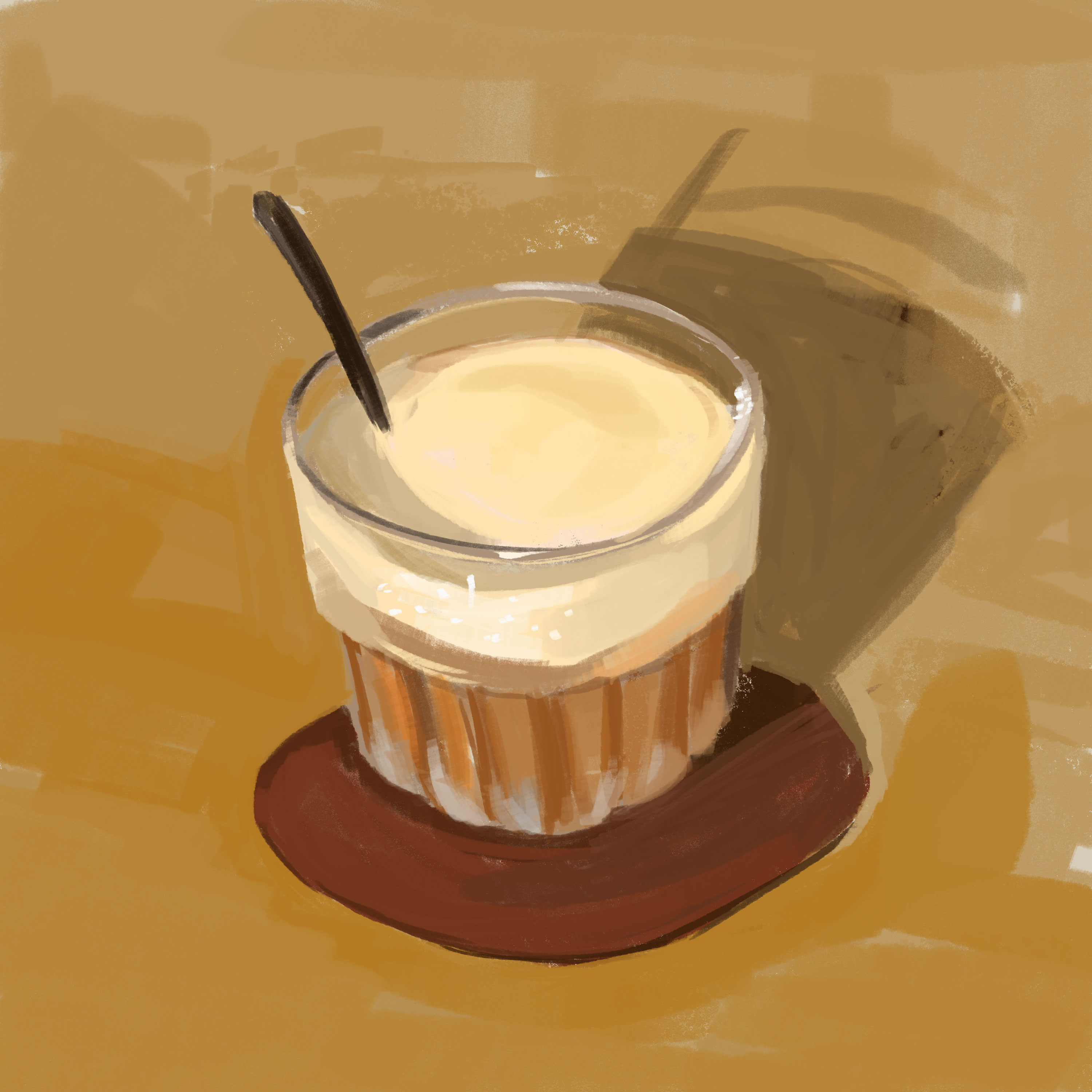
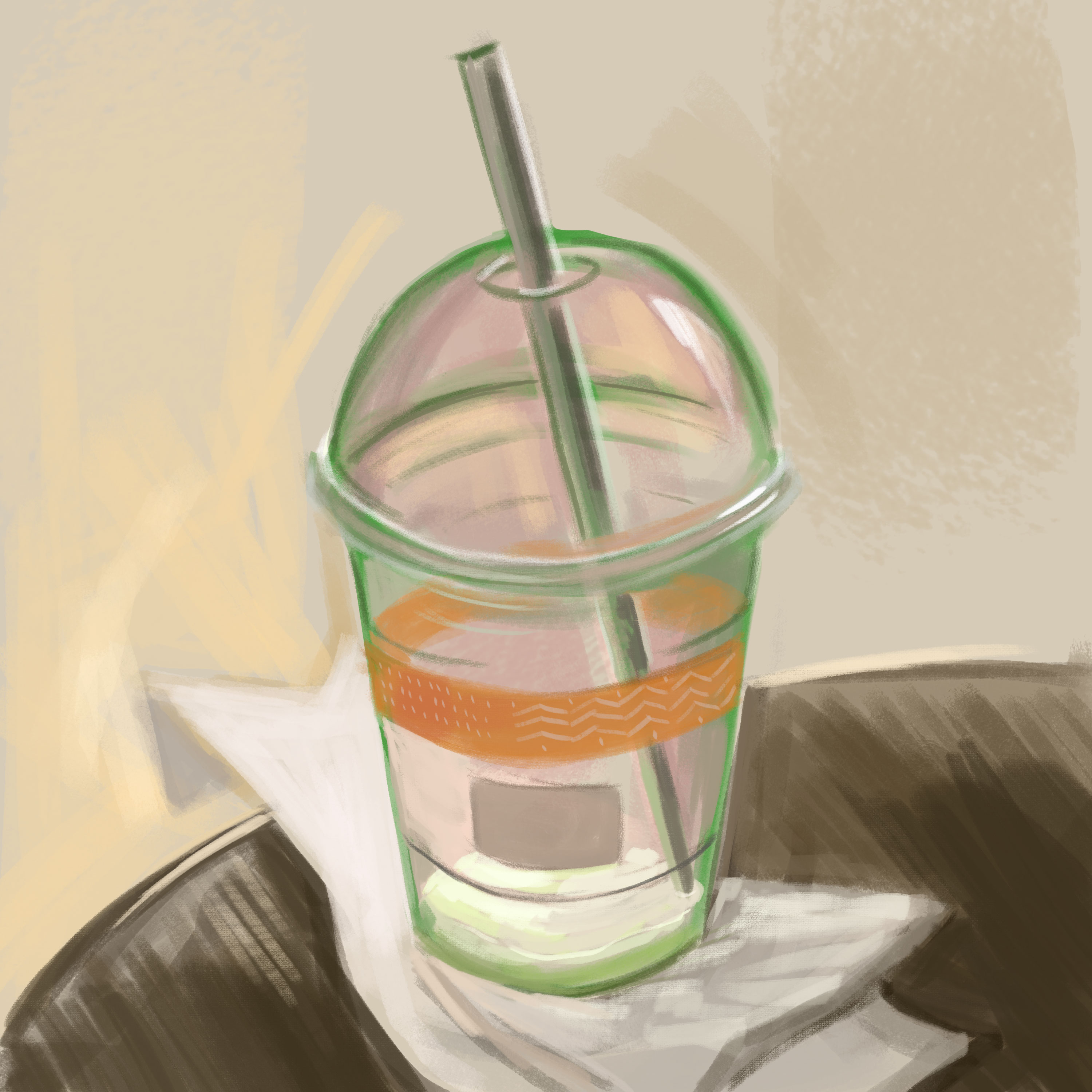
I like to do still life studies with coffee glasses and cups as well.
A modern asymmetric cafe
With the growth of social media and online reviewing, coffee shops start investing in interior design, good-quality chairs and tables. They become great subjects for me to paint as I observe how interior design affects how people talks and moves. Lovers meet, friends gather, strangers look at each other. All happens at a coffee shop.
A cafe with Tet decorTraditional Vietnamese coffee phin (filters)
What’s my favourite type of coffee? “Bac xiu”- coffee with lots of milk. It usually has a warm brown color due to the milk. It tastes moderately sweet with a strong aroma from Robusta coffee beans.
A lazy coffee at noon
I usually go to a coffee shop in the mornings, the silent period. Most people would just get a takeaway before rushing to their workplaces and for more than once, I’m the only customer sitting. I don’t mind the baristas taking their time to make my drink and sometimes they have time to bring the cup to the table for me even though they don’t have to.
A summer day
There are people in my life I label: ‘coffee people’. They are the ones I never talk with but know the faces, and they know mine. It’s weird I never find the attraction to start a conversation, but they become part of the coffee shop. If anyone creates a cafe theme theater stage, ‘coffee people’ must be there. They have no lines but they have to be there.
I went to coffee shops even on rainy days. It takes more efforts but it’s another kind of experience when it rains heavily outside and you are in the warm lighting indoors sipping a warm coffee cup. The coffee shops becomes a valid shelter.
Morning light in a cafe
There’s always a compelling collision of light at a cafe. Light shines through windows, light reflects from glasses and cups, polished coffee machine, light specially made to make you feel attracted to more coffee. We are put under the spell of designed space and light.
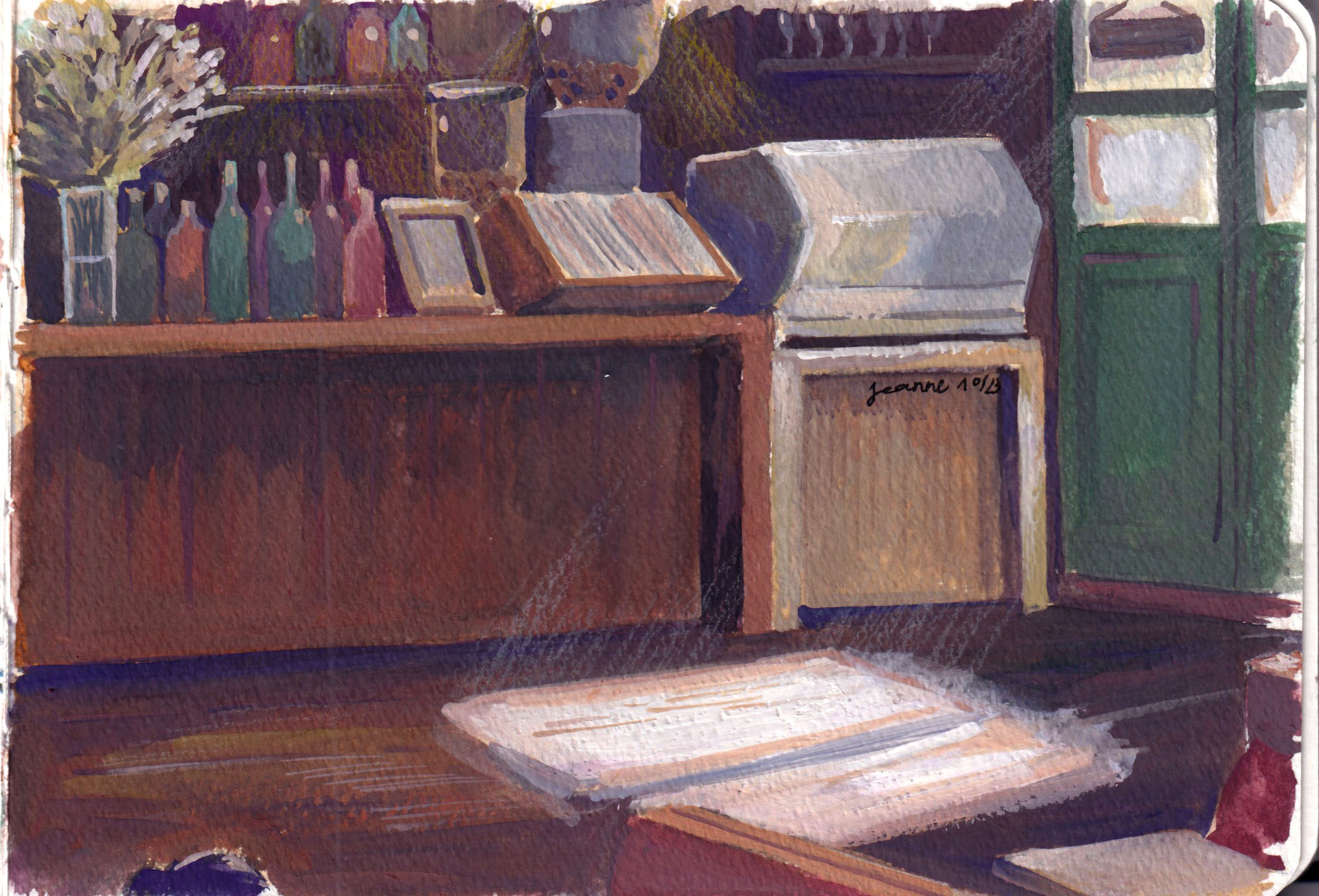
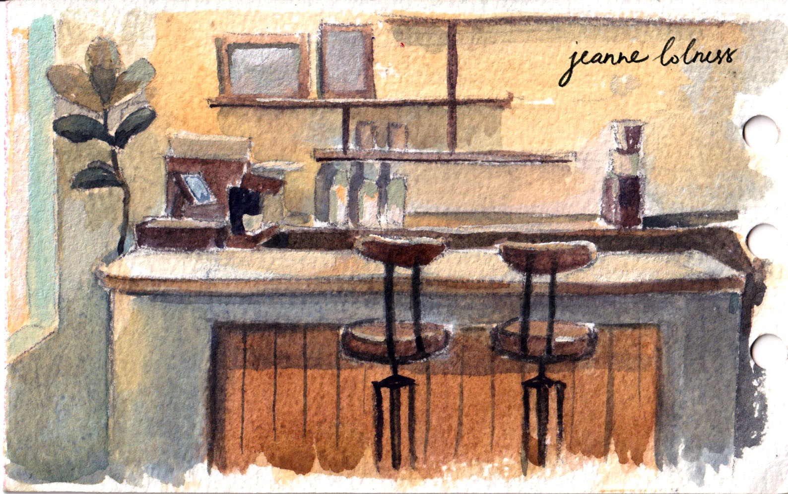
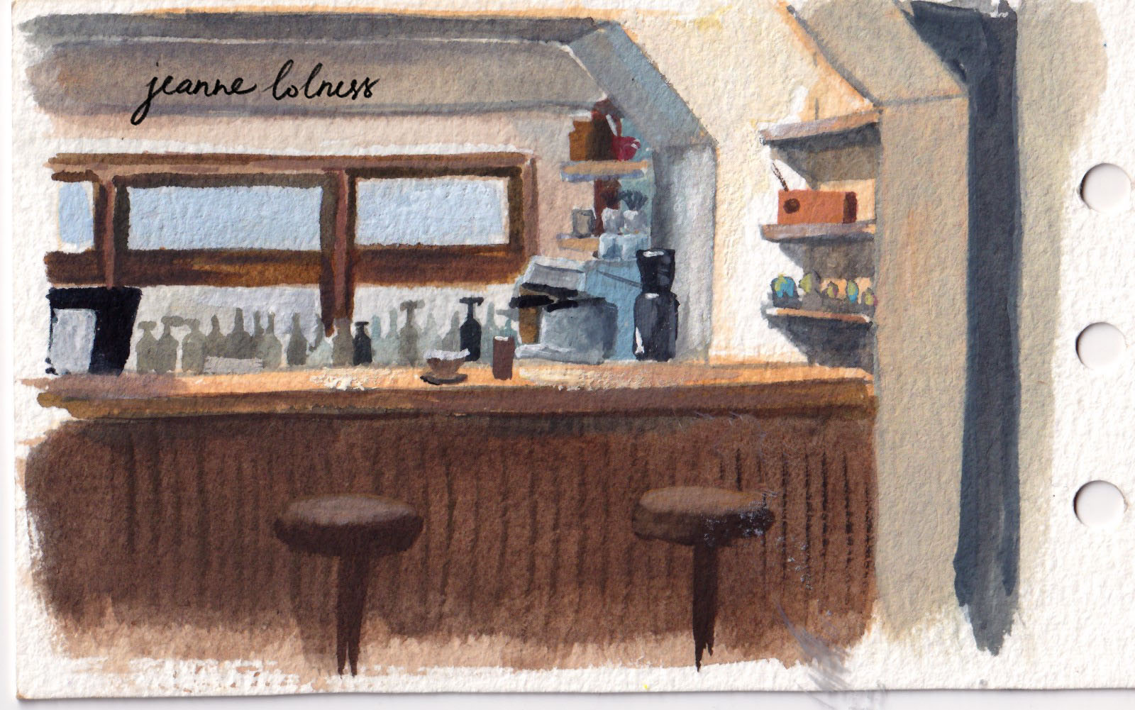
Coffee counters is a source of inspiration as well, with lots of objects and activities going around them. And the design may be similar but this counter just feels different from the other one.
Let’s take a break here and enjoy our first (or last) cup of coffee for today, shall we?
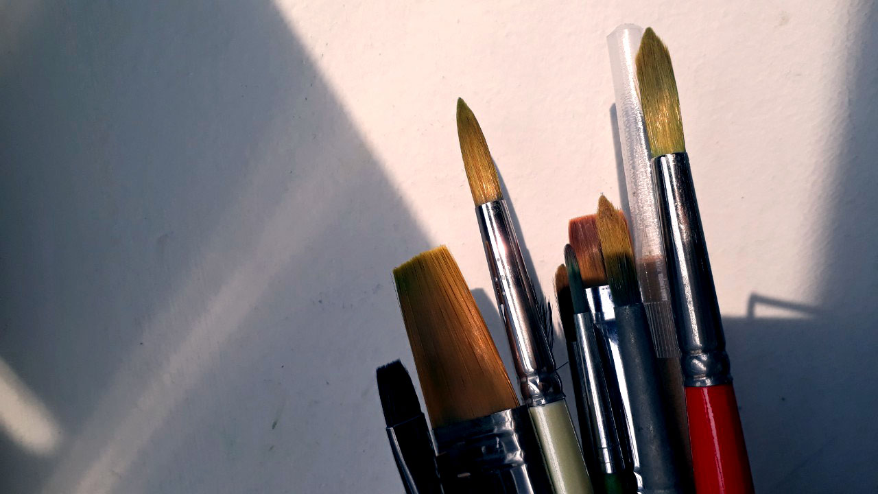
I’m a mixed media artist, I just have lots of tools, maybe not as much as a professional-trained artist, but enough to keep me messy.
Brushes
flat brushed introduced by James Gurney. I noticed for round brushes, the more expensive the brush, the better it feels. However, it’s not the same with flat short brushes; price difference doesn’t mean much.
Flat brushes are easier to control and lasts a bit longer than round brushes to me. The tips of round brushes often wear off after a few months, as early as 3 months, the bristles start getting spread out. Short flat brushes preserve their original tip for a longer time and the bristles stay together even with minimal care.
Watercolor
Japanese and Russian brands are the most affordable ones. Hayao Miyaki used Holbein – a pretty commonplace brand. His method is direct, simple and adventurous. Personally, I’m influenced by Nathan Fowkes and James Gurney method: mixing a bit of gouache with watercolor to fix the details that didn’t go as I want. Adding white gouache instead of diluting the color with water will create a smoother painterly effect, and white gouache saves me when I forgot or mixed up my plan with the highlights. I get a separate pack of white gouache from Himi, a brand famous for their jelly paints.
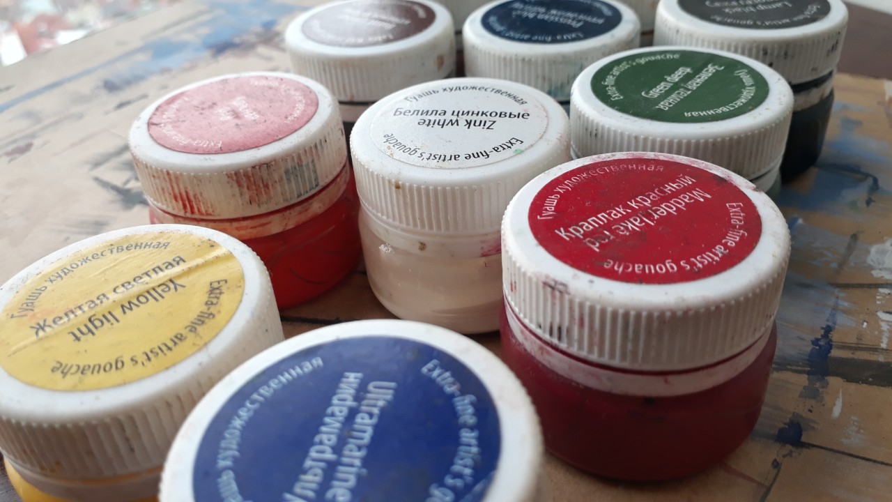
Gouache
I have used only one brand of gouache only, from Russia. It’s challenging at first because it doesn’t have color codes, which often shown on America, English and other western brands. Being an artist doesn’t mean I can spot color with my eyes, color codes are there to standardize among different brands.
Paper and Sketchbooks
I often purchase watercolor paper in a large pack and cut it into the sizes depending on my use. I often paint small, (size) from (size). I will use cold press paper for more texture, and hot press when I need a smooth surface.
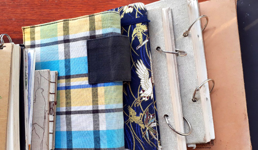
I like to have sketchbooks of different sizes, especially small to medium-sized to carry them around and sketch when I’m free.
I like to make my own sketchbooks so as to avoid the fear of ruining a fancy sketchbook. I only have one “fancy” sketchbook, and the progress of completing it is much slower than others. It’s the one used for social media promotion.
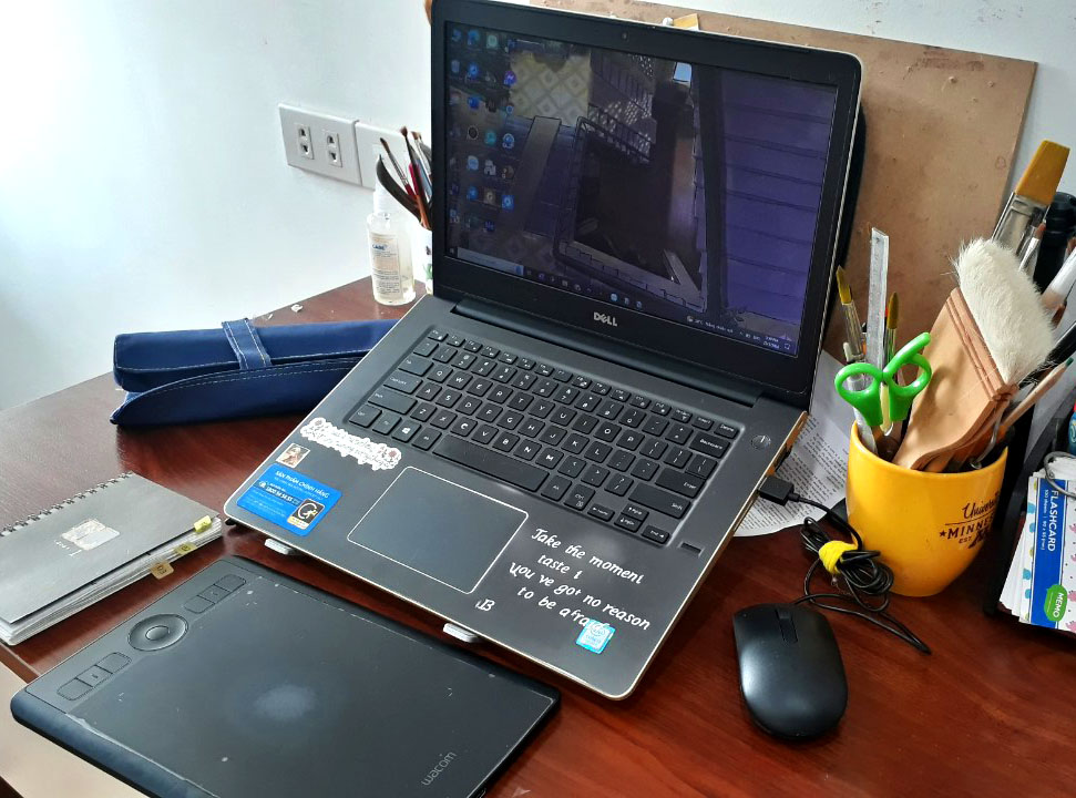
Digital tools
A medium-sized Wacom and a laptop. Most of my digital brushes are made from Kyle Webster – I’m a big fan of textured brushes, namely ink and watercolor brushes.
I don’t think there’s a must to acquire expensive laptop or tablets to start painting digitally since I don’t know what direction to head. Gaming or animation certainly needs high-quality tools, but illustration works can be done with a normal laptop. I believe in starting small and growing big later.
As you can see, I use a diverse range of tools to create arts, which is also a joyful aspect of being an artist. I hope to be able to experience more materials, tools and topics – if you are interested in these things, subscribe to my blog or connect with me on social media!
Growing up in Hanoi, I have an affection to every cornet of this city. Especially those are less known with tourists, because these places feel more authentic to me. When sitting in a cafe painting these scenes, I feel like capturing a moment of this city, a moment that will be gone with unavoidable modern development.
That’s why I tend to chose old houses or historic structures, so that theirs stories can live on through my paintings.
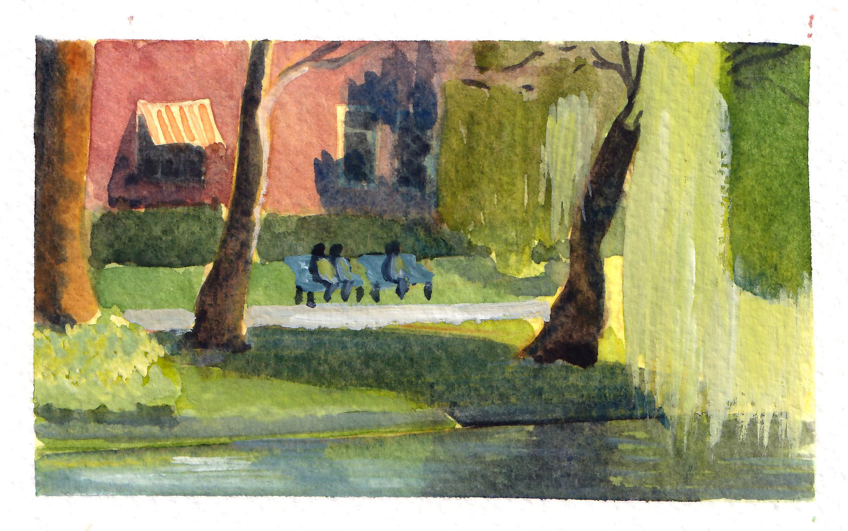
Below is my favorite painting of 2023 – this captures idyllically the area I grew up in, a very ordinary area with no tourist attractions. I’ve walked pass these houses hundreds and hundreds time.
I know that one day I will miss this scene dearly.
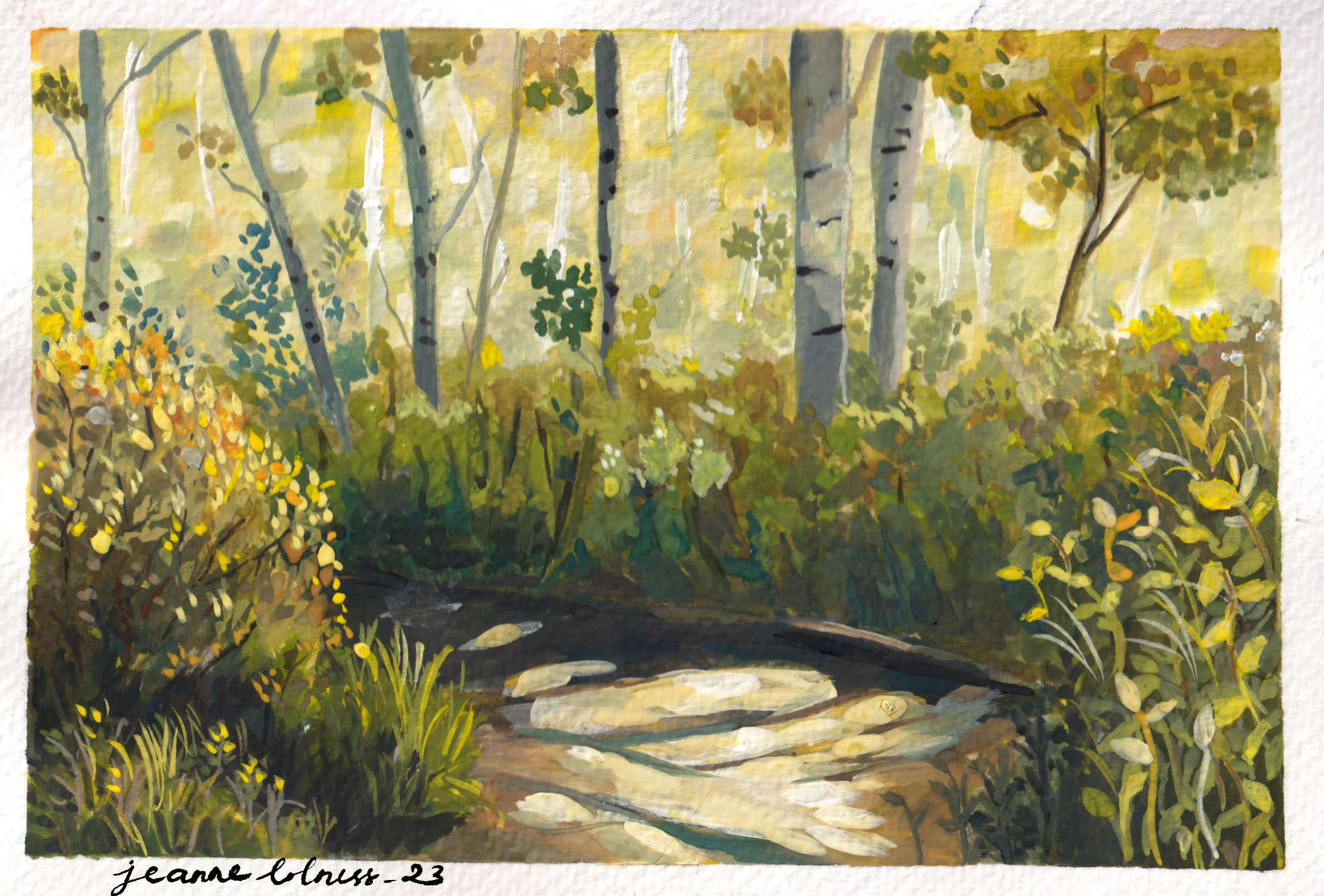
2. Studies of nature
One big drawback of growing and living in a big city is that I rarely get to see a scene just full of nature. All these studies were based on photos.
I personally love scenes of tree and water, both allows me to play with color and reflection. Painting nature is also more liberating since it seems like I’m having a secondary experience with these scenes, an escape from my bustling city.
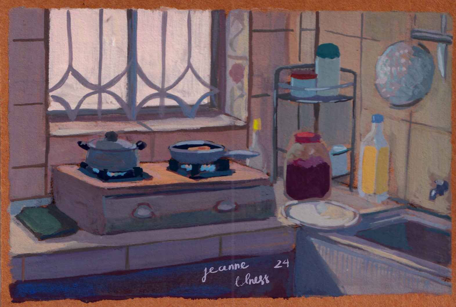
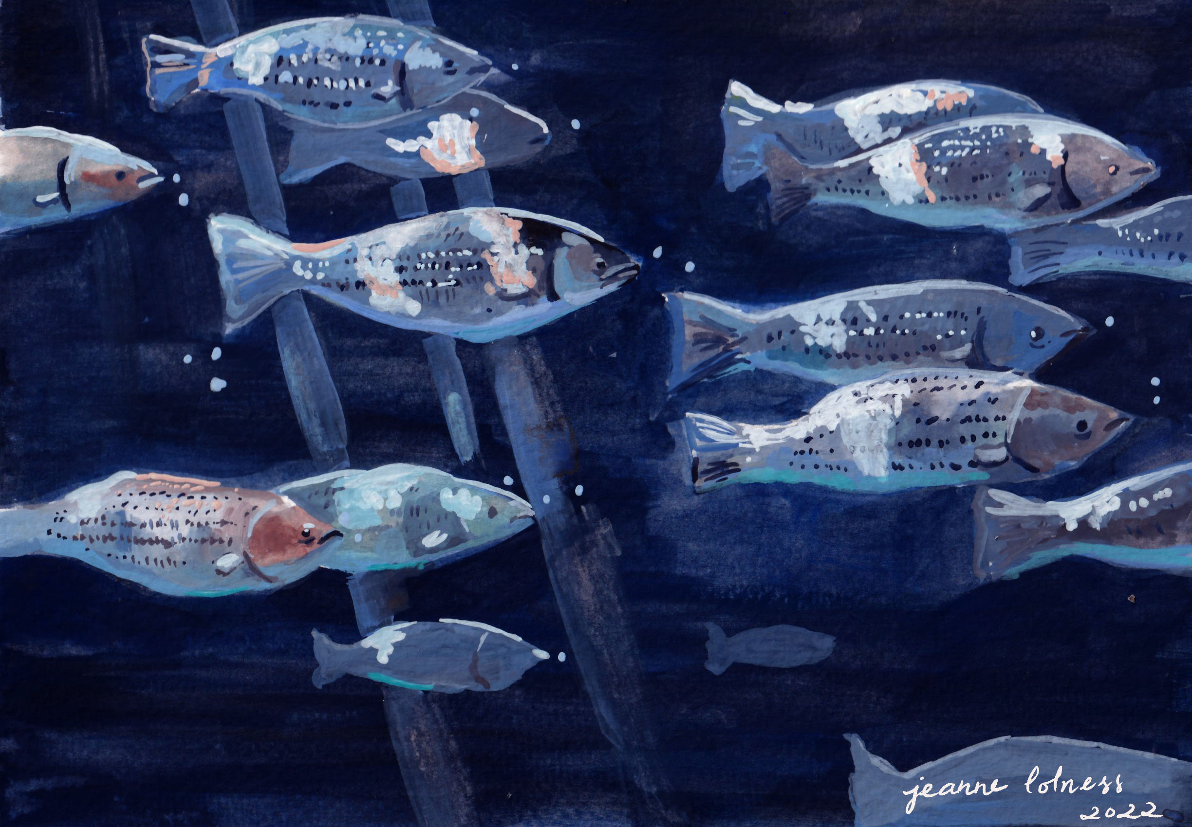
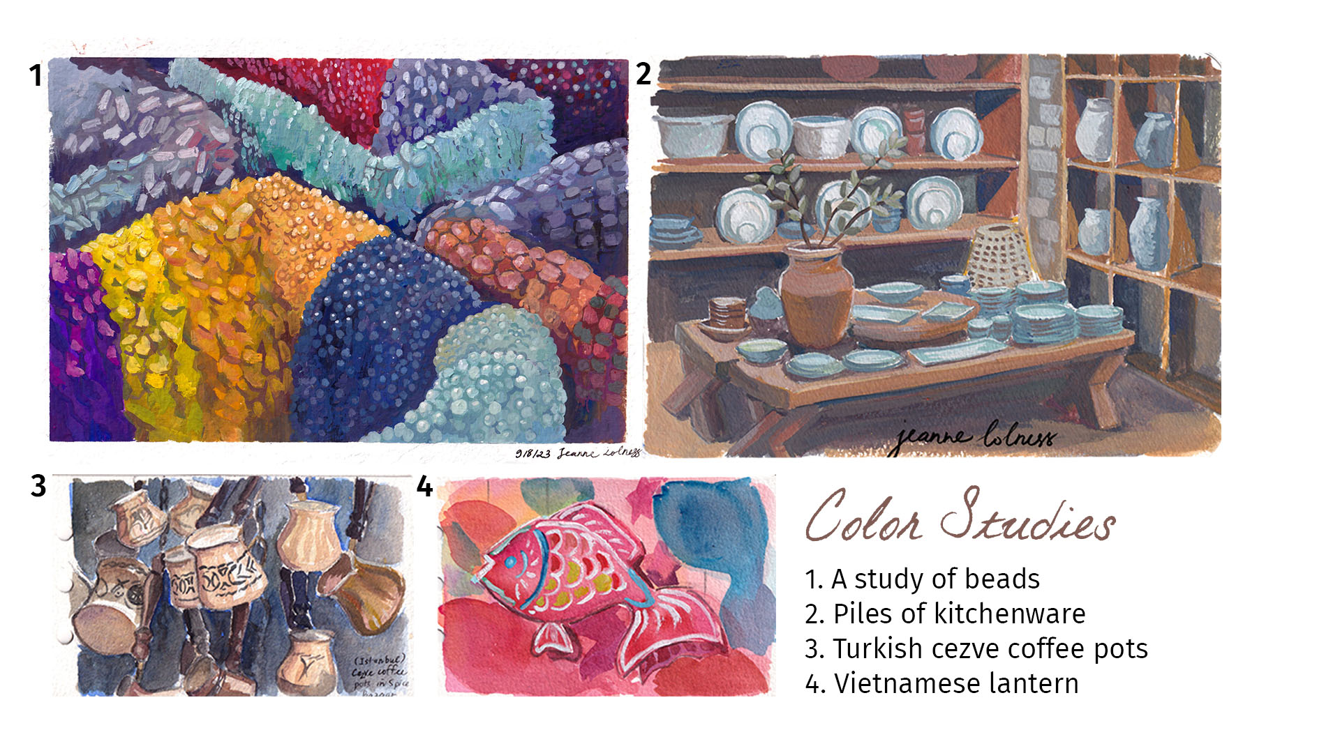
3. Studies of color
I find it still life studies useful but a bit boring, so I often paint scene with lots of similar objects to practice instead. These objects sitting together show contrast in colors and interesting negative space.