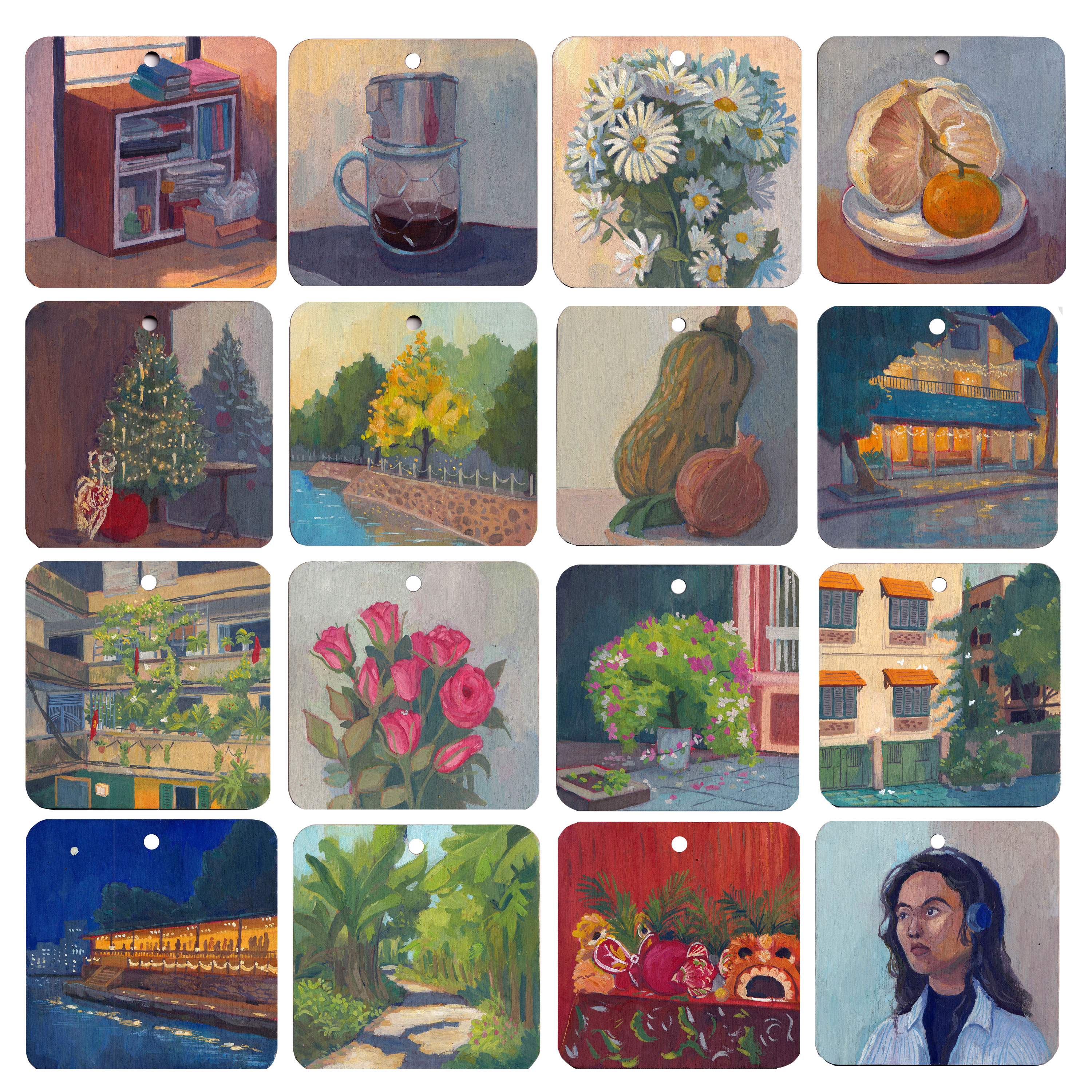
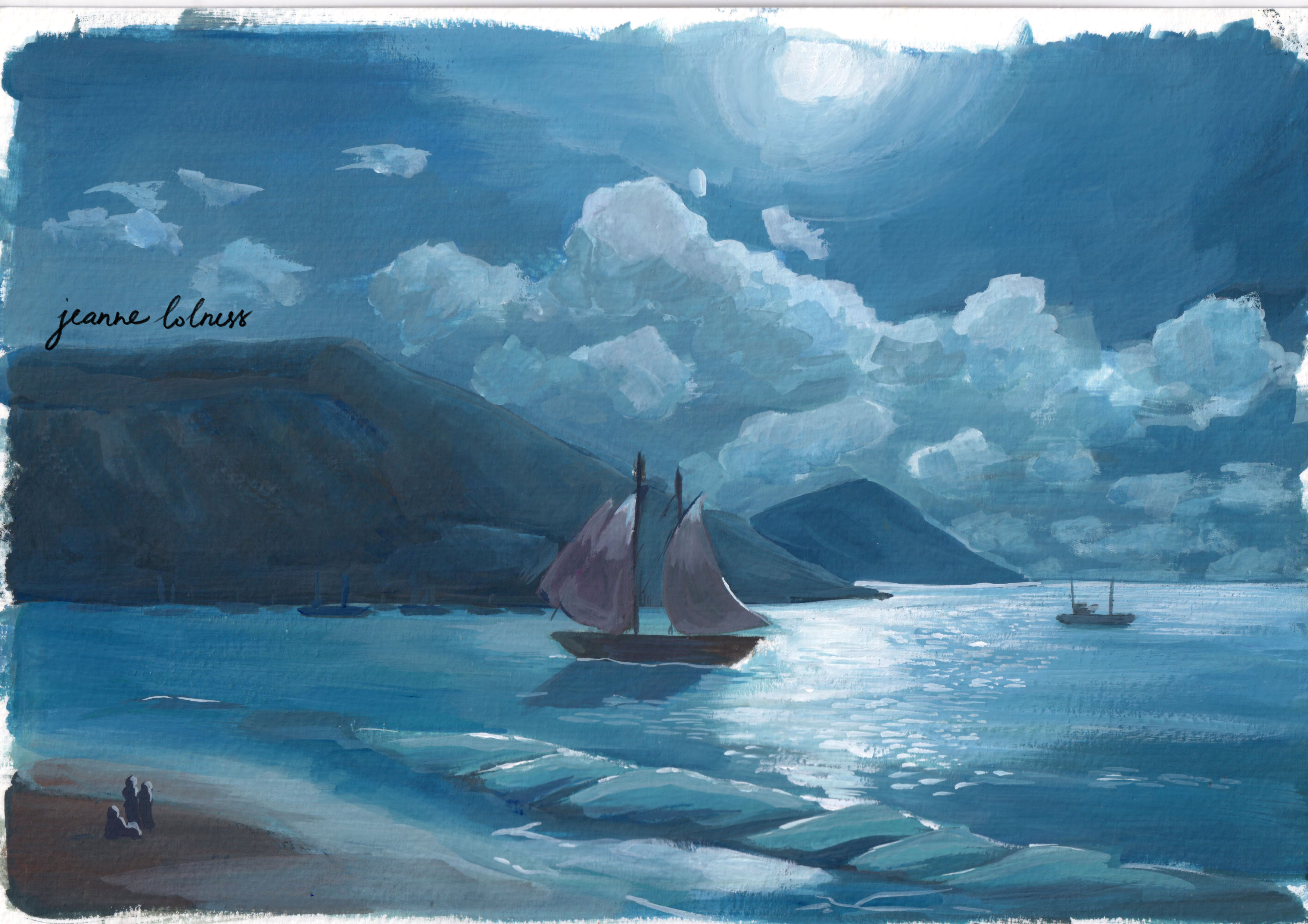
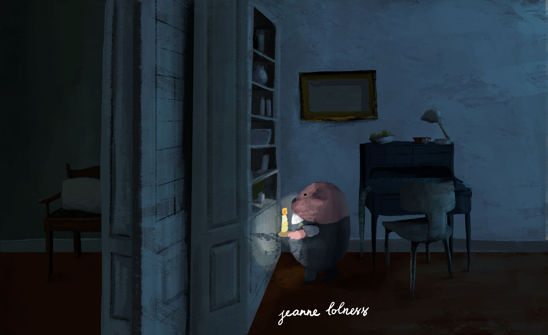
I usually update portfolio at the end of a year, as a way to look back on what I have done and celebrate small milestones in my artistic journey. However, 2025 was a tough year for me in every aspect so you are reading what should be posted 3 months ago.
This year I was under heavy influence of AI. The number of commissions has reduced by about 60%, and even though I had a backup plan, I still felt terrible with the whole world. Even though I believe arts cannot die here and there are still people making arts, I can’t help the anger rising in me when a client asked me: “Can you fix this AI-generated image for me?”.
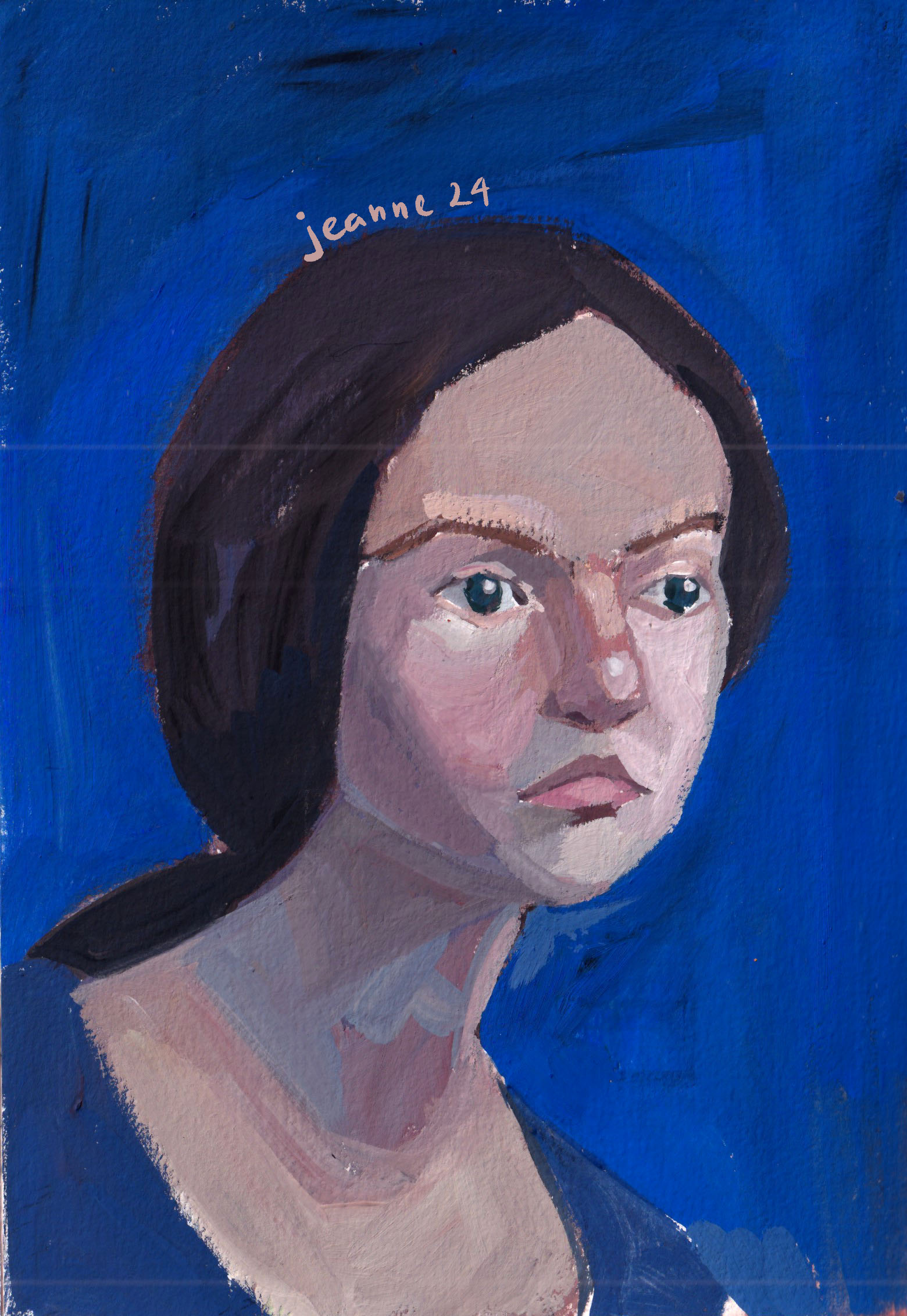
That’s possibly why my favourite pieces of the year are mostly hand drawn. Maybe in the dark moments of being invaded by vague feelings and fears, holding onto physical things comforts me and gives me hopes.
Anyway, life needs to go on and I need to keep painting. I do paint for a living, but I realize I must keep painting for me, or my sanity.
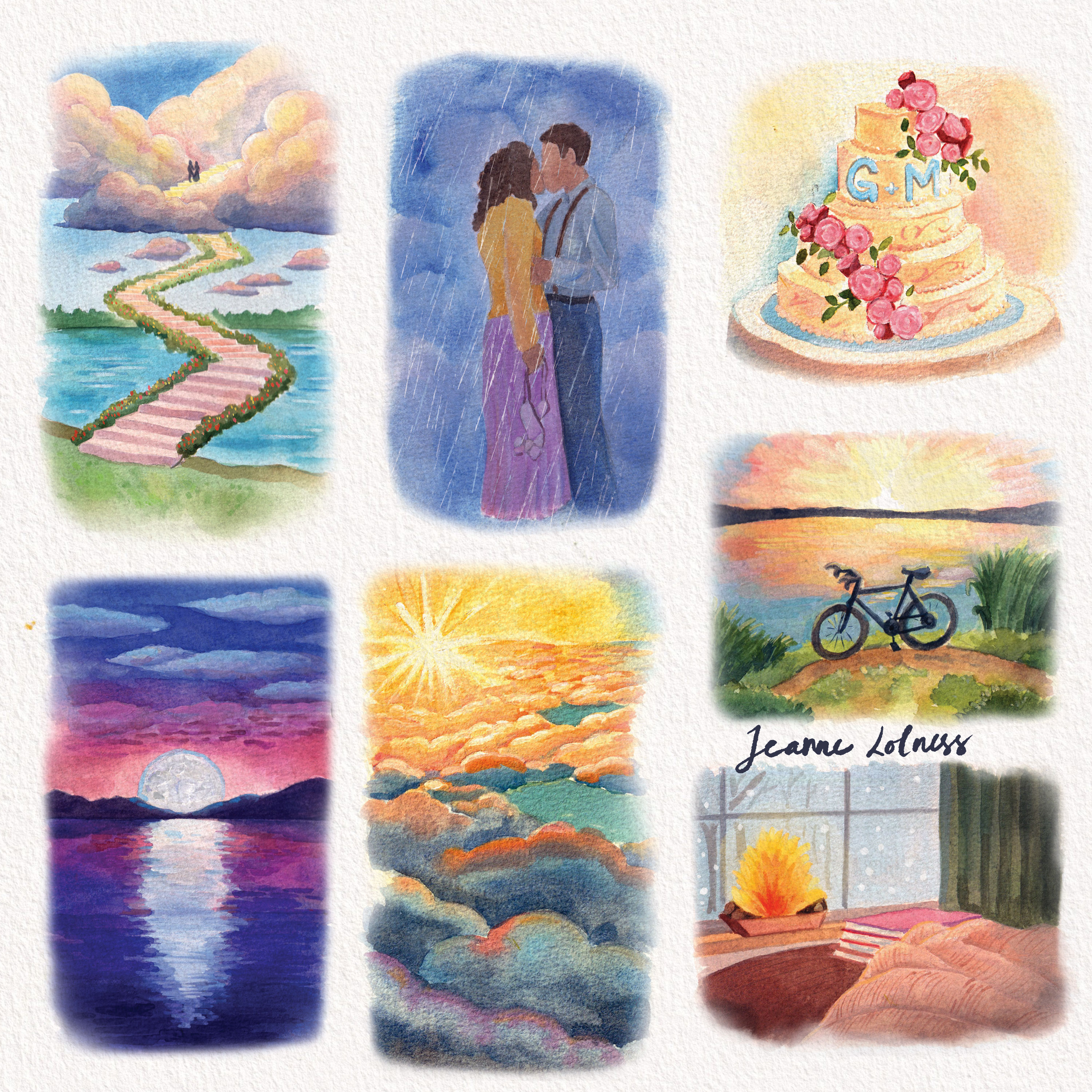
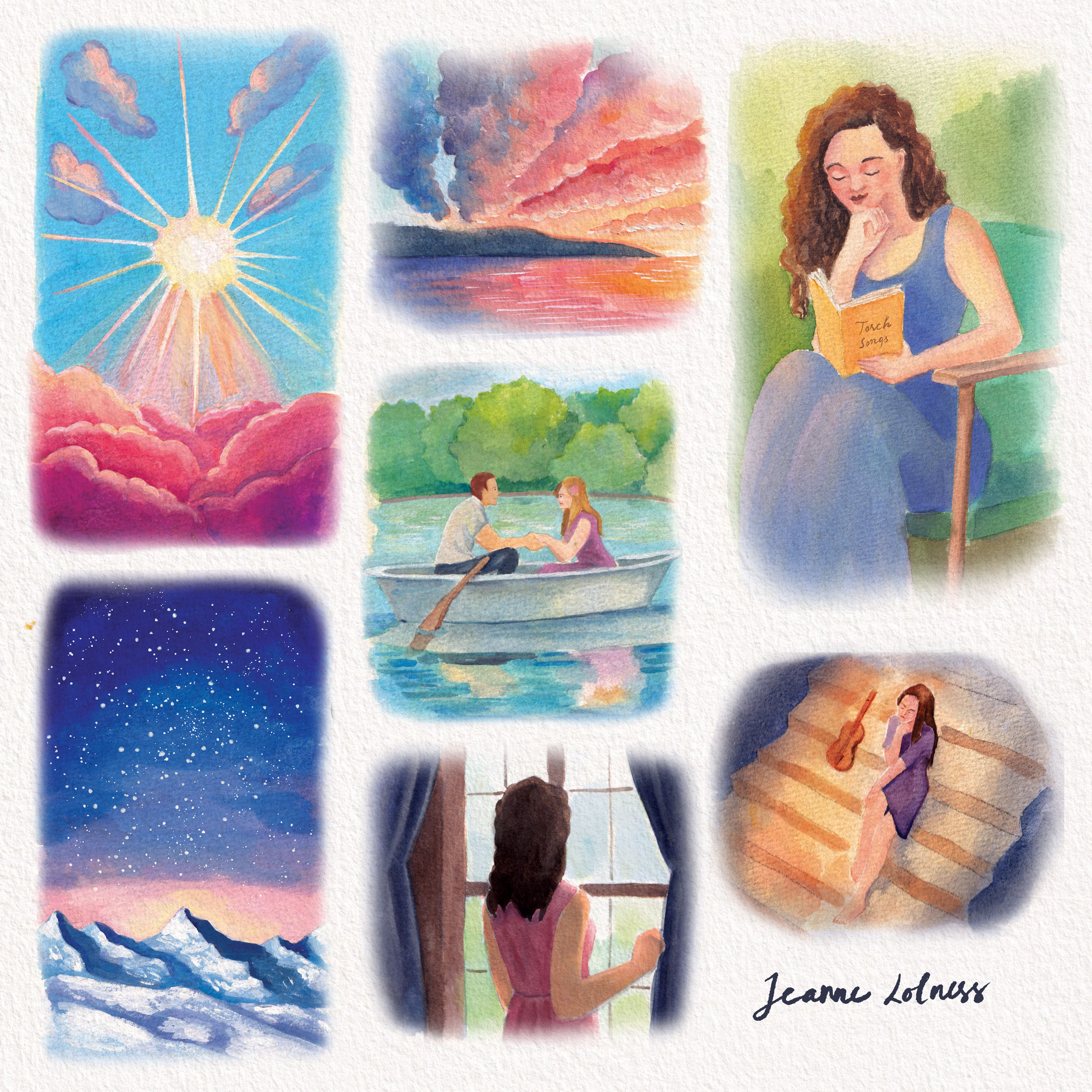
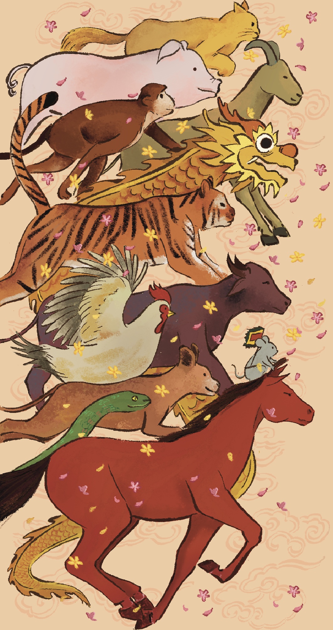
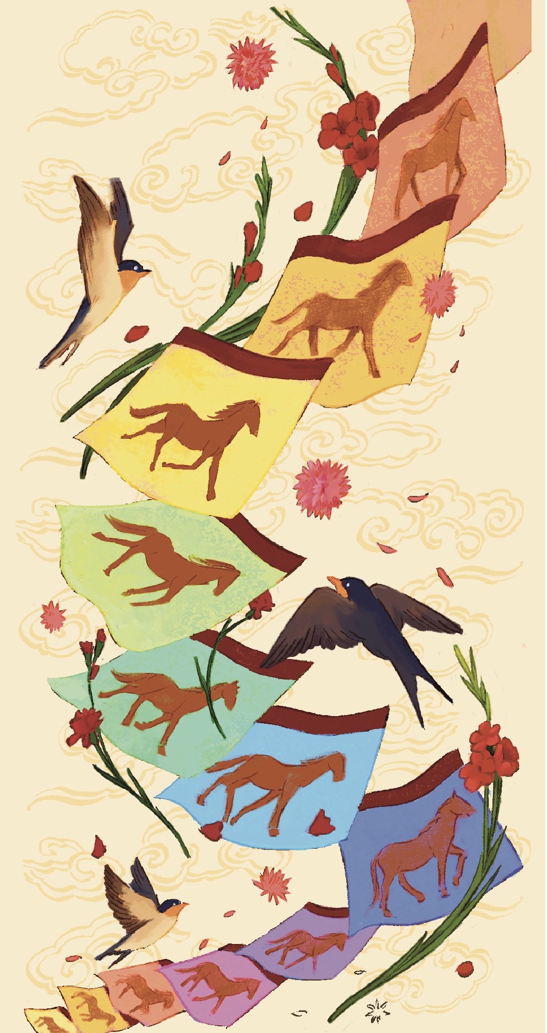
Poetry illustrations
This is the only series/ book project I worked in 2025. Or the only one that left any positive impressions. I got to paint a wide variety of subjects, mostly romantic vibe. The subjects were actually chosen before the project, so my main responsibility was coloring. I have no idea whether this book is published yet, all my clients seem to disappear mysteriously. These paintings are actually small, they are made to put together with poems. I completed the series bit by bit in 3 months or so, before I started my second job in June.
One thing I have decided this year is to slowly say goodbye with Fiverr account. This was a difficult decision although projects there didn’t interest me as before. Truth to be told, not all projects or commissions I got were my strengths or something I wanted to develop skills on, yet, at the time I believed I could stick together until something better came. My original plan was to build a strong website with other connects to keep the flow of work, but life needed me quicker than I thought. This project was possibly a nice goodbye to my 5-year freelance journey, which was also started with a poetry book.
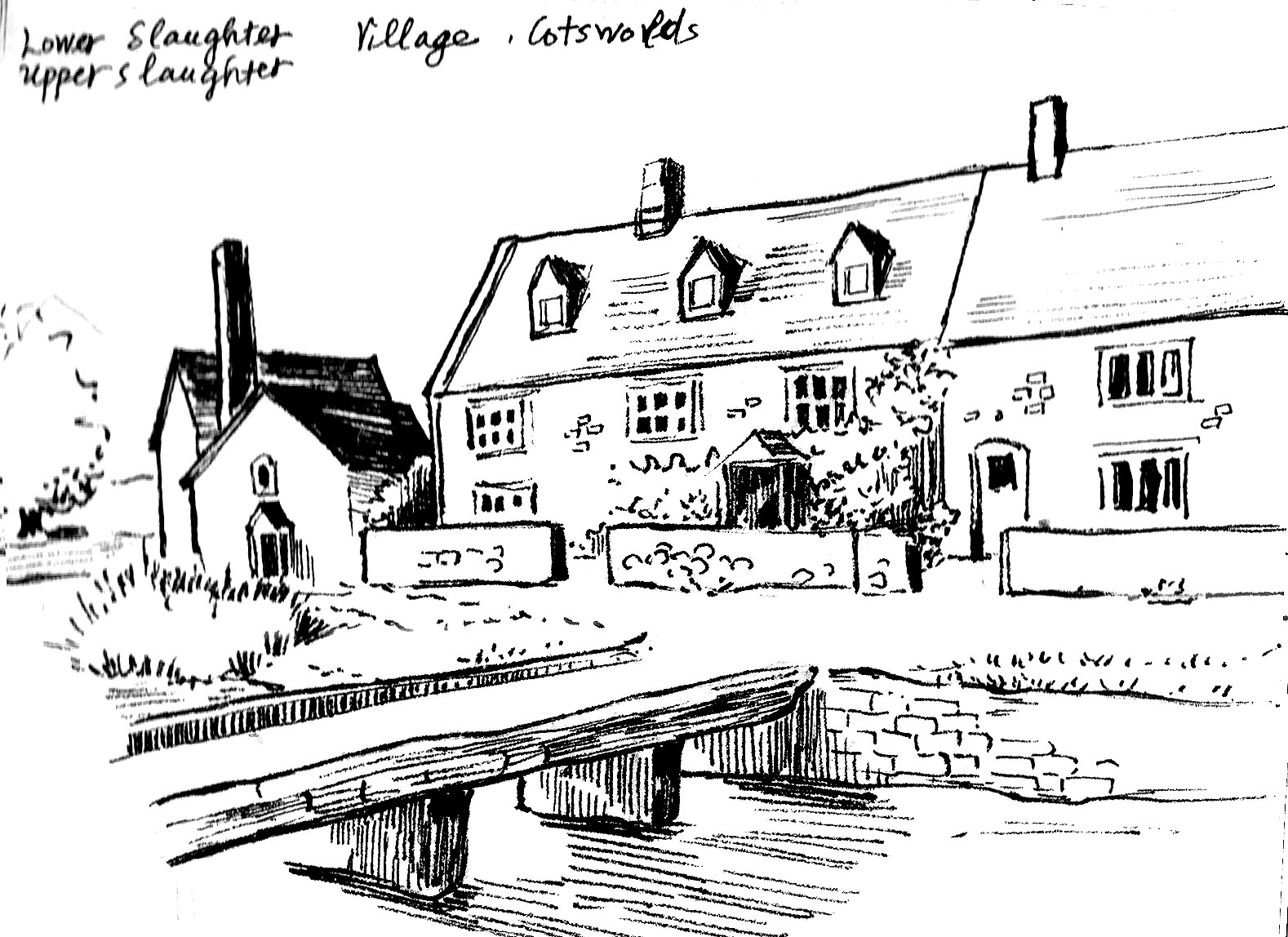
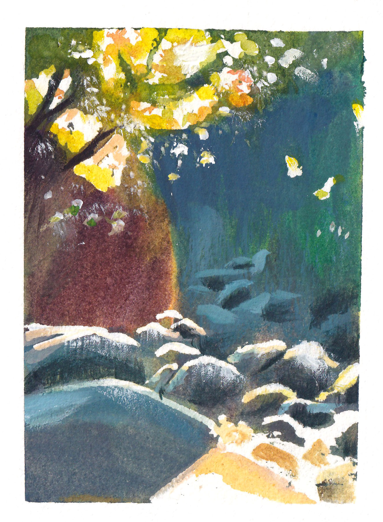
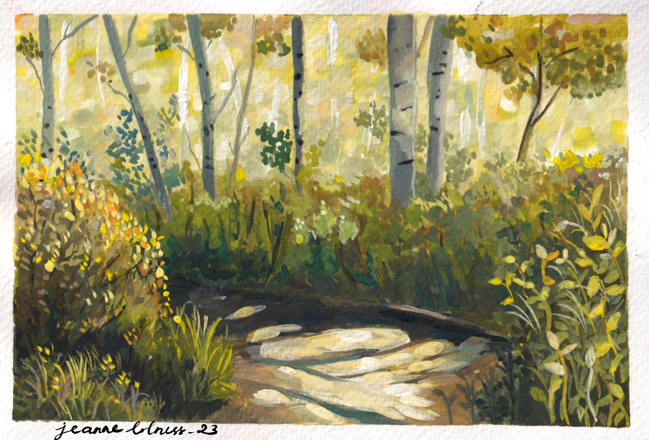
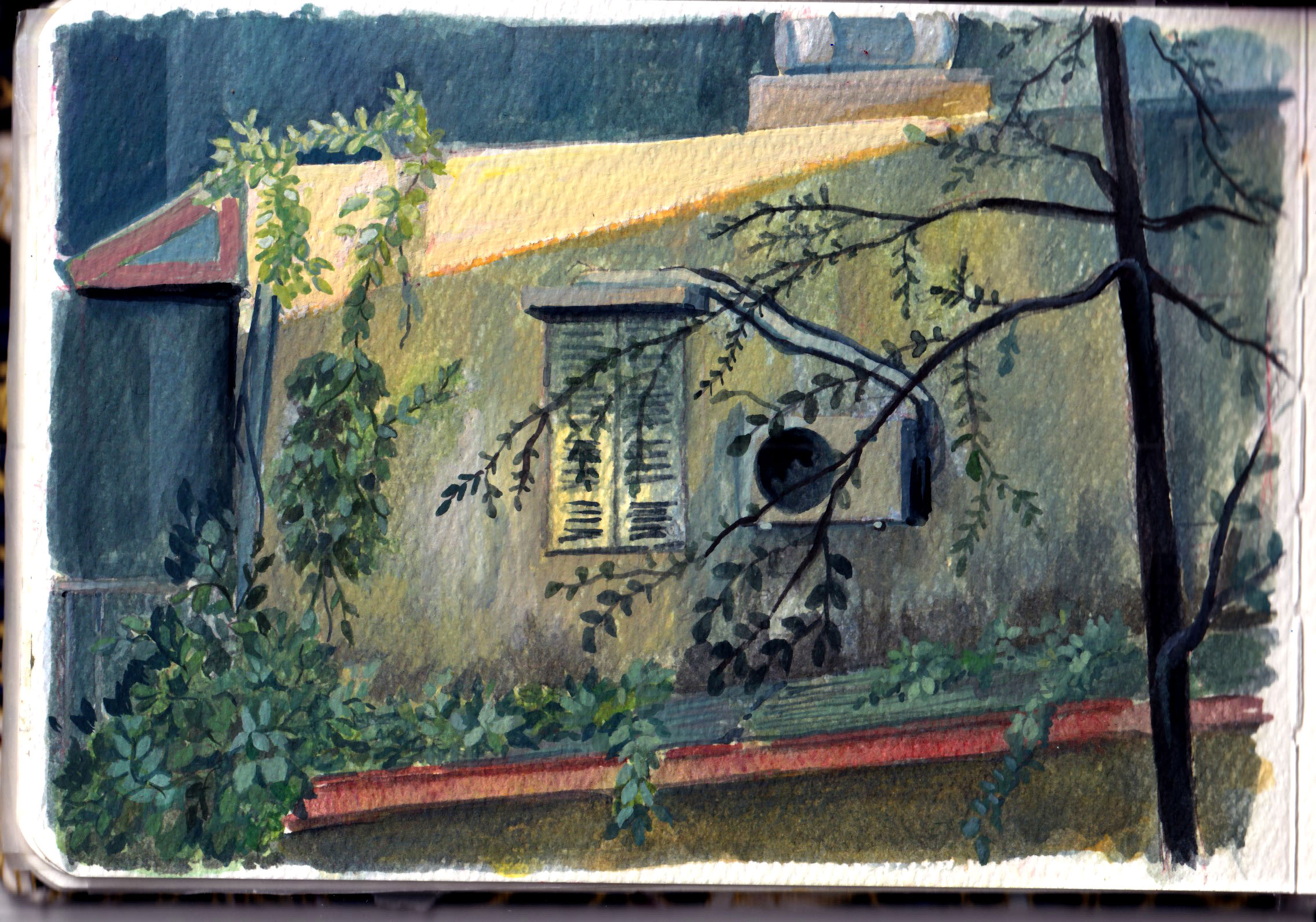
Painting old houses and nature
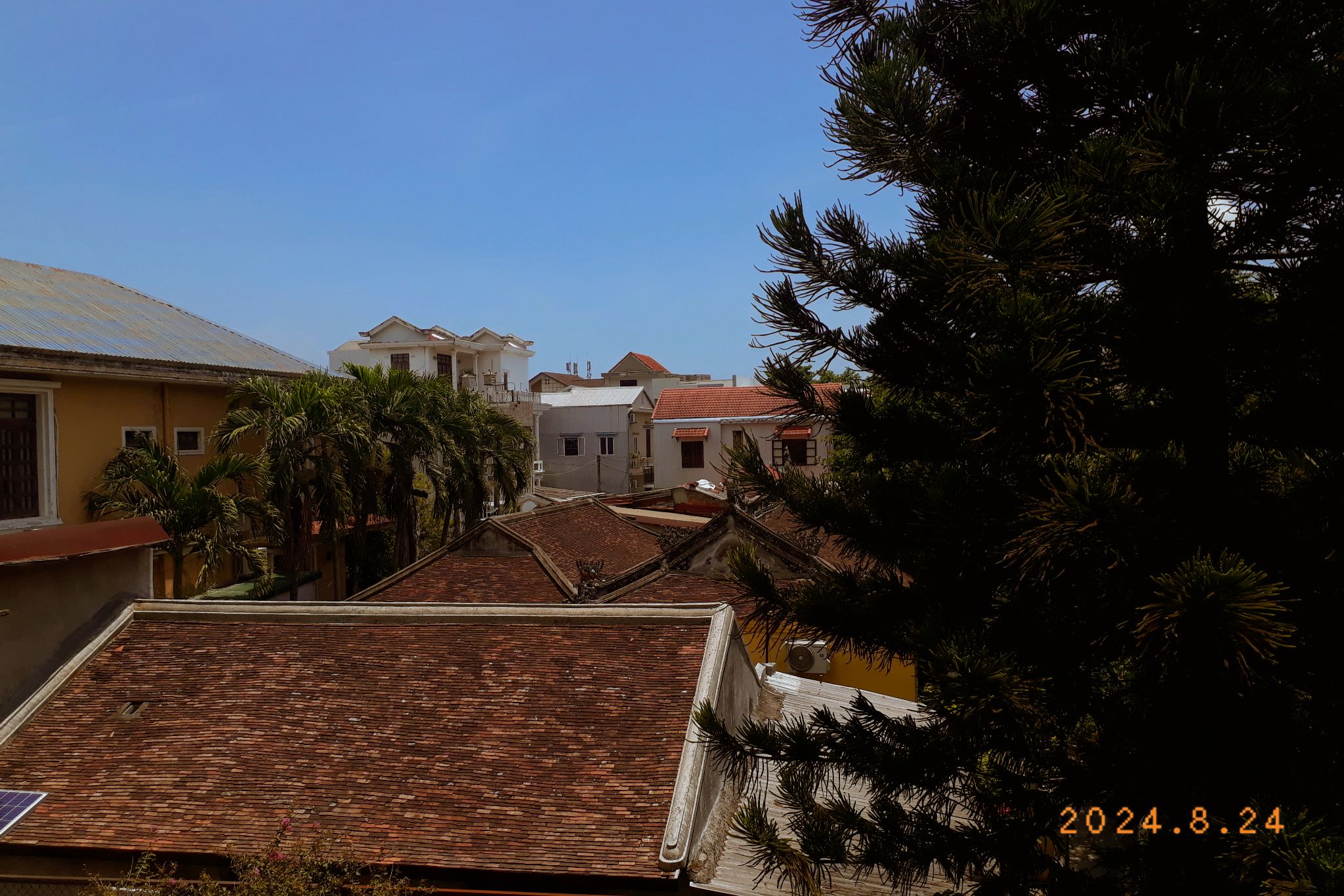
So far, you might have noticed that the tone of this post is pretty negative. I just can’t help it – my mental health went straight off the cliff this year. That’s why I didn’t learn anything new, despite having a list of new skills I want to add (animation, composition, anatomy, etc – I even set up an Excel sheet for the courses I wanted to take). This year I spent time just painting spontaneously, scrolling the images from old trips or old days – the good old days. I have a whole post for Huế , from my trip in 2004.
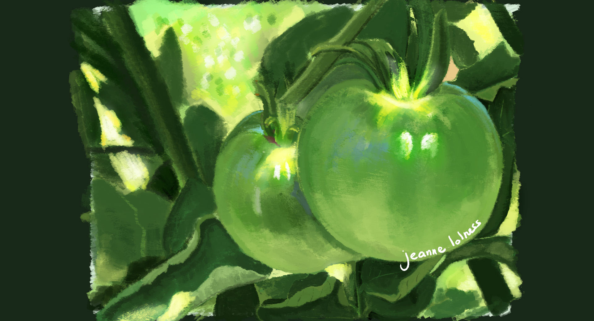
Another topic I love to pain is painting nature, flowers, grasses, etc. Touching grass does help with mentality 🙂
This low period makes me wonder a lot about what is my purpose in this career and how to sustain it in this world, even if AI does not steal my job. I wonder whether other occupations require as much the amount of mentality as being an artist. I wonder whether I’m trading my mental health for a dream job. Don’t get me wrong, painting is my favourite thing to do, and it’s the best way to appreciate life. It’s just that working as an artist requires much more than just making art, particularly working alone.
I feel like I should have known all of these things right from the start. Or I did such a good job of blinding myself because it felt so good making your childhood dream coming true?
Challenges
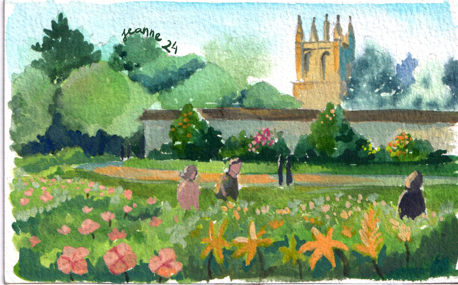
Another thing to keep me on track this year is doing challenges, 30 days of painting something by a rule. It aligns with my principle of “painting for the sake of painting” for 2026. It gave me a sense of purpose everyday or a kind of ritual when my days felt like falling apart.
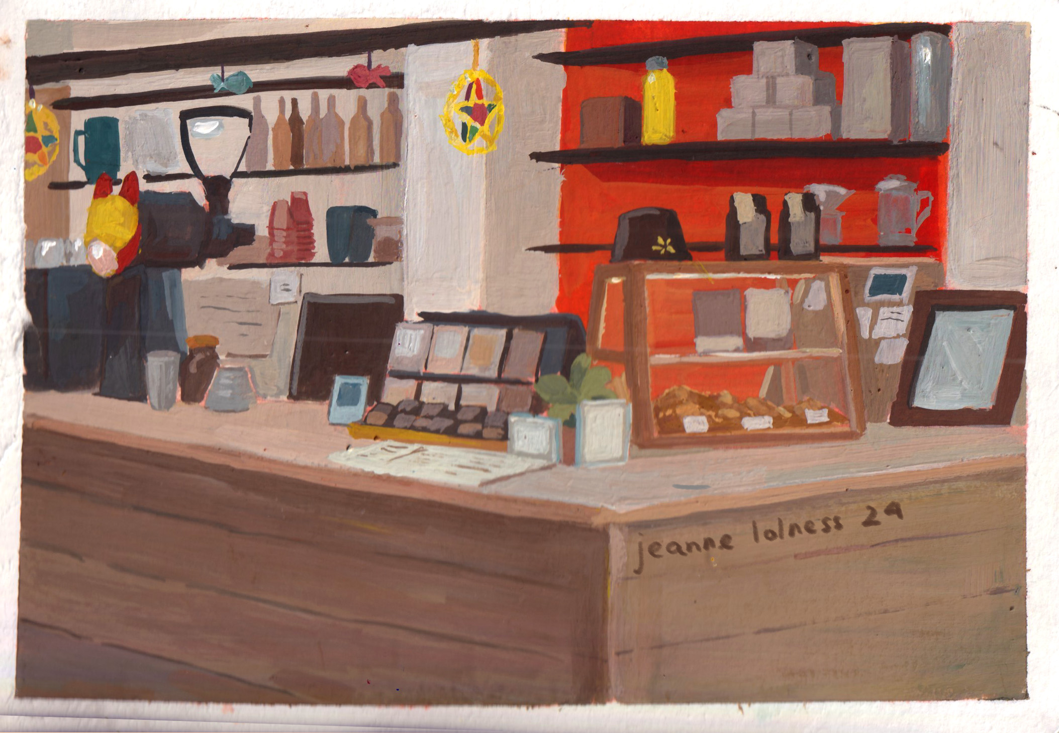
Art shop
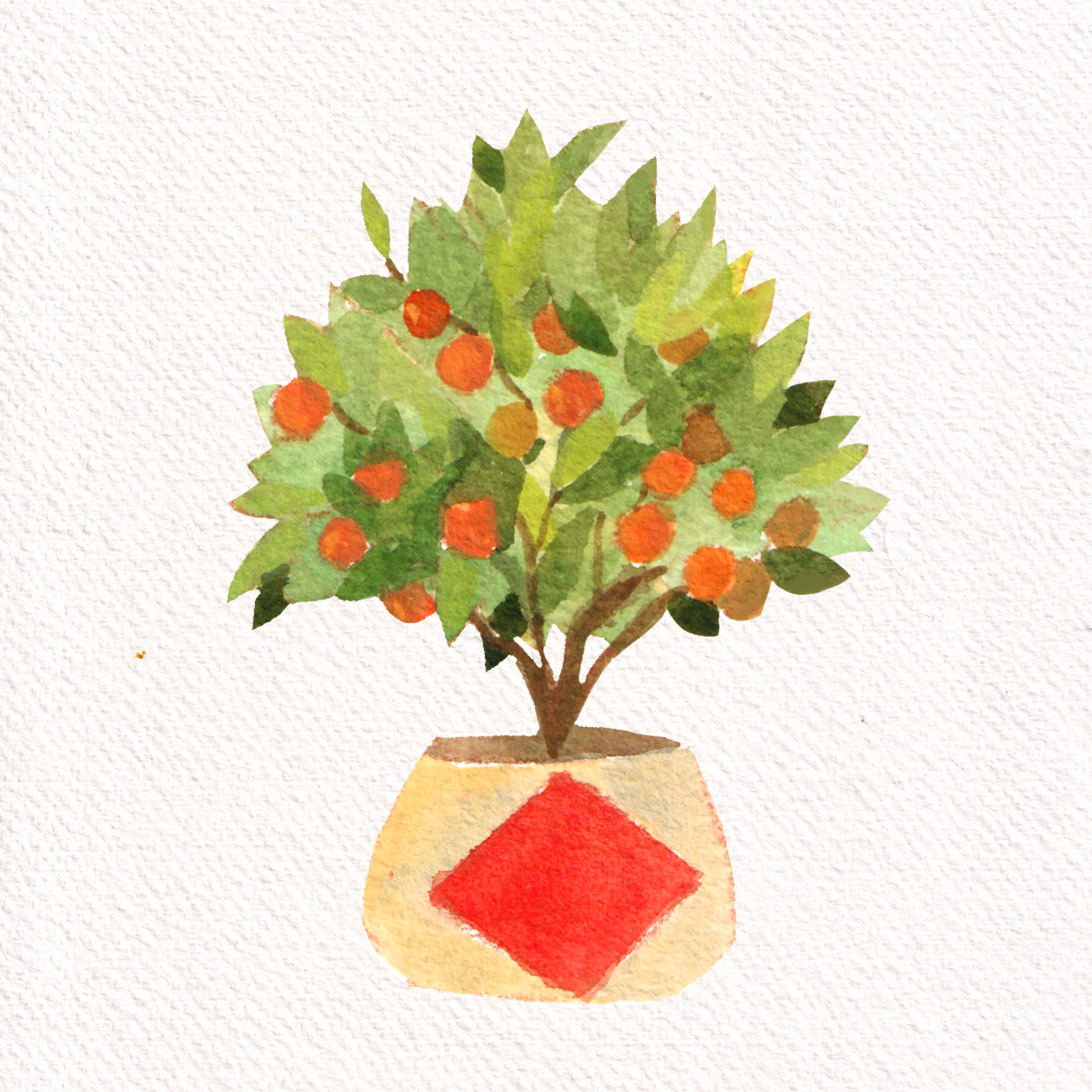
Lucky envelope for Vietnamese New Year
Anyway, with the support of friends, I made another effort of making a living on my arts by open a shop selling stationary in Vietnam. There’s a lot to learn about running a shop with physical products, and working with others over long distance. Again, I feel this is something I should have known and thought about before opening the shop. But operating this shop allows me to hold my digital arts in a physical form, which I rarely get to do. I hope to keep it running, even without profit, as a passion project.
After all, what’s now?
You may ask how’s everything after 2025. The answer is, well, I still paint and draw as much as I could. But I feel exhausted holding onto a career that means a lot to me and nothing to others (not including friends, of course). Maybe my beginner’s luck has run out, maybe I’m not as strong and hard-working as my expectation, maybe there’s a reason behind all of these struggles. Or maybe not 🙂 Honestly, I don’t know. I wish someone would tell me what to do, but deeply, I know I should solve this mess by myself. After all, I did make some beautiful things, show parts of my mind to the world and have some good times. All parties and all nightmares have an end.
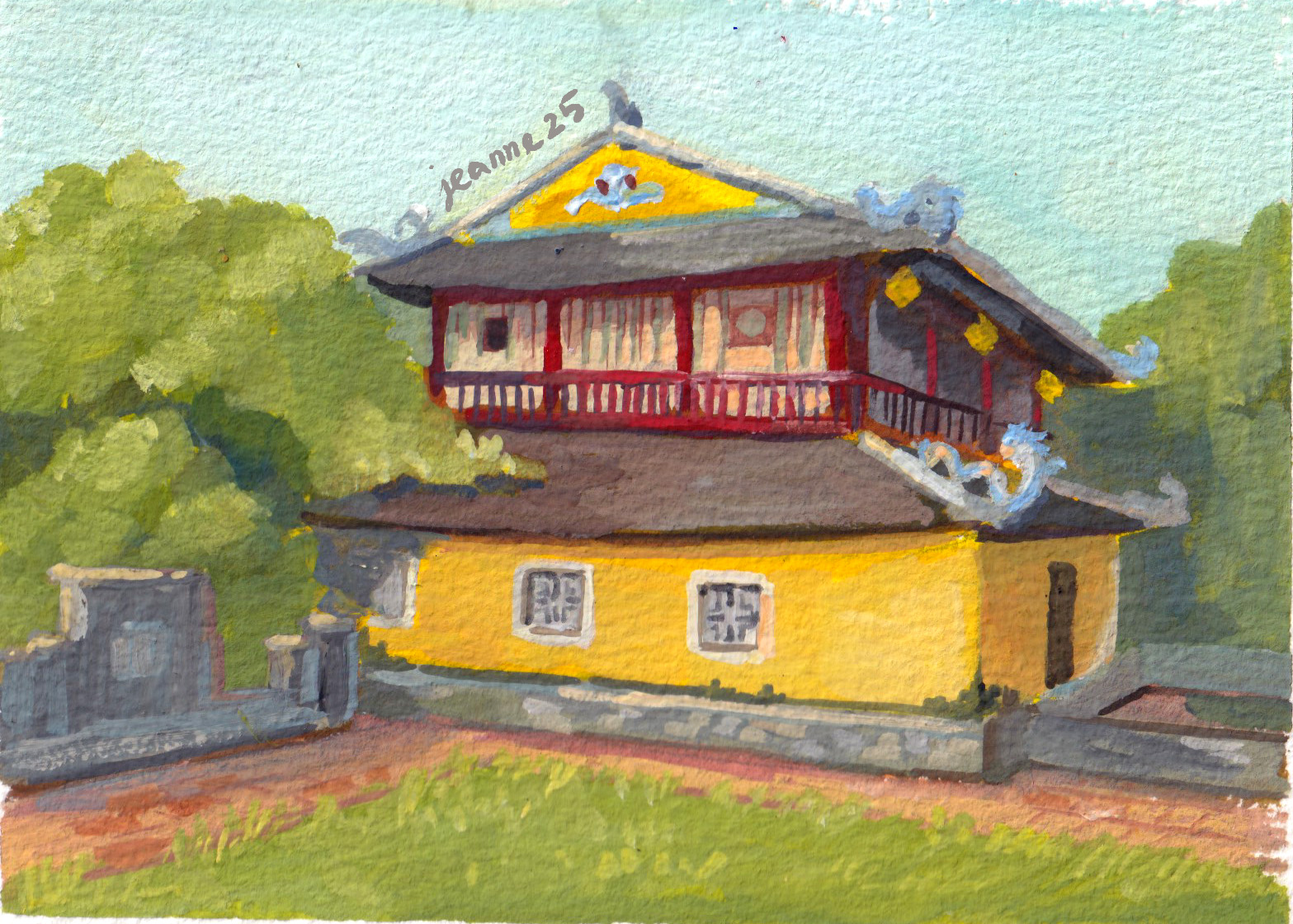
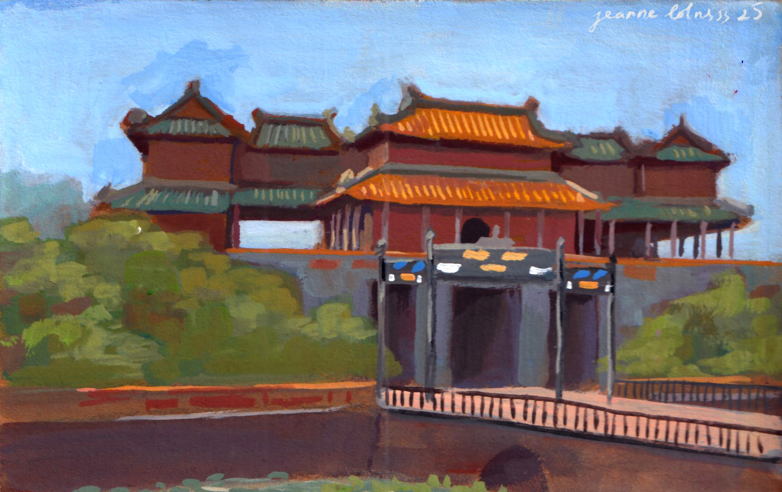
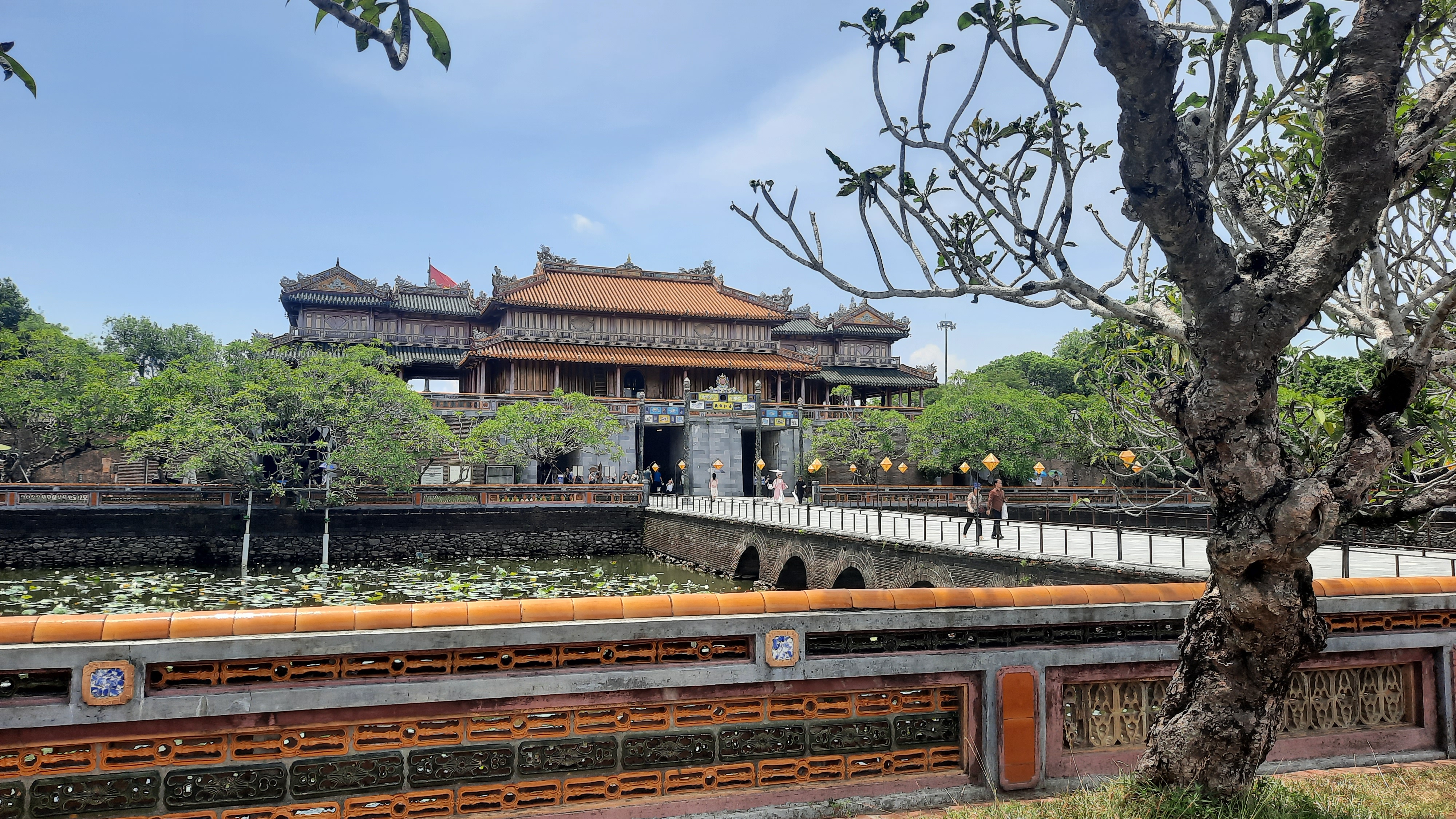
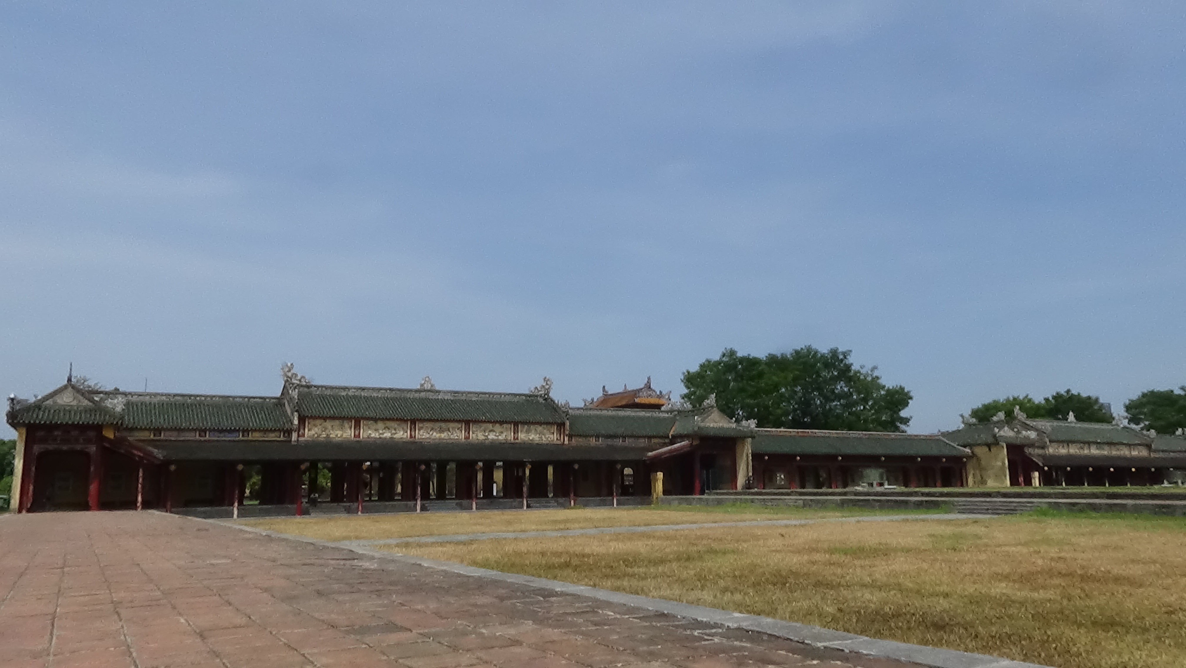
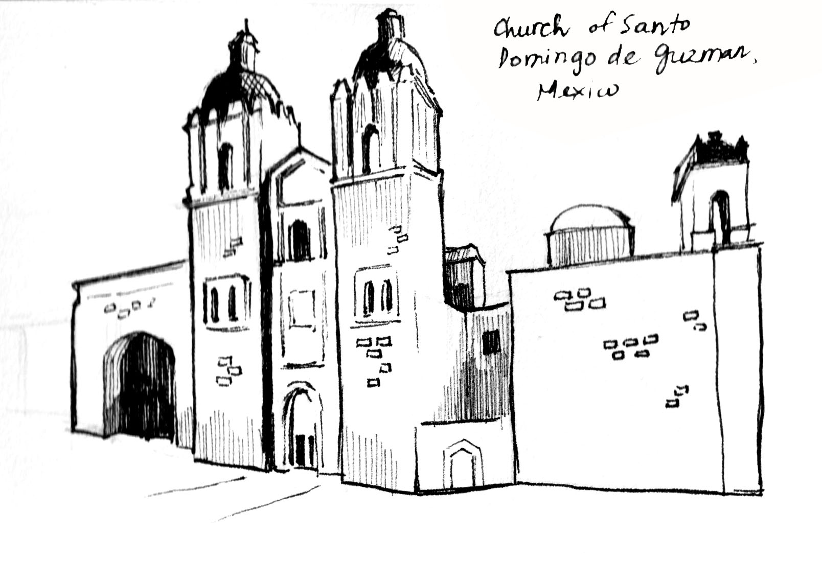
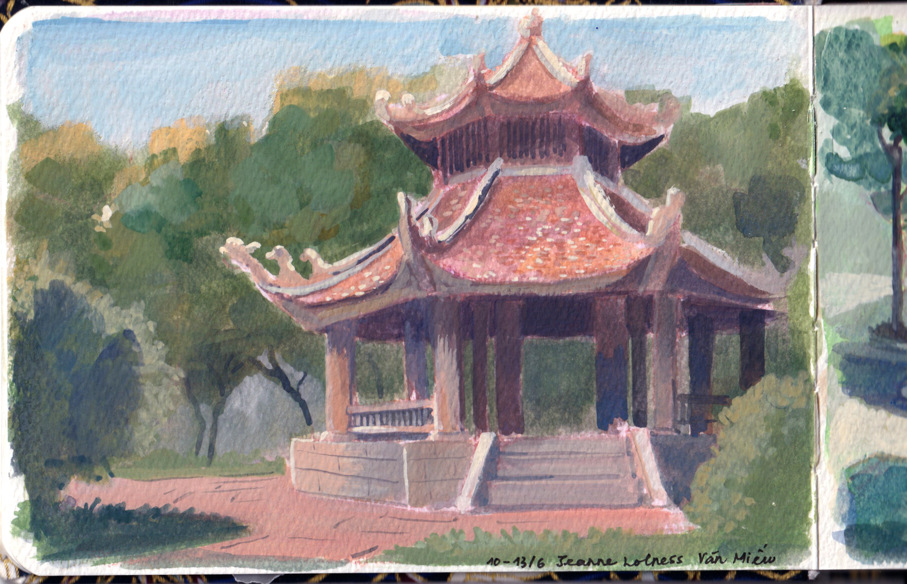
In the summer of 2024, I spent two sunny days exploring Huế – the place holding memories of a bygone era: Nguyễn dynasty. It was the final medieval dynasty before Vietnam became a colony of France and experienced warfare to the extreme in WW1, 2 and the Cold War.
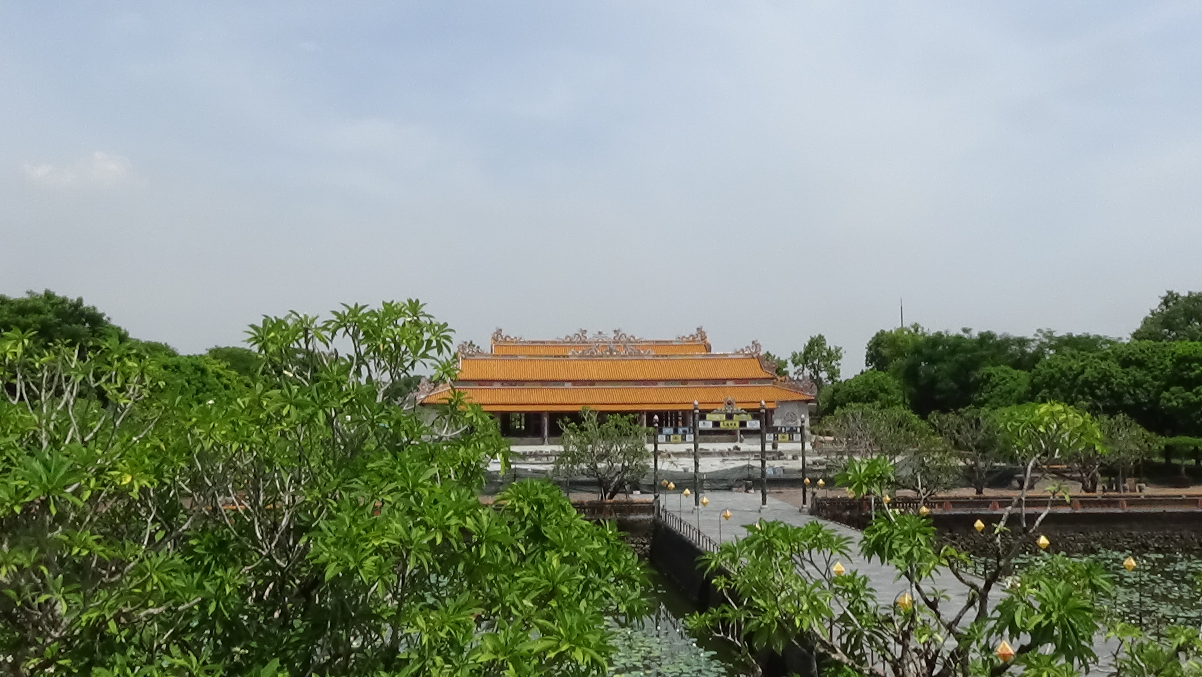
Despite bombings and destruction, Huế and the Imperial City still maintained a variety of structures and monuments with their intricate details.
I had been longing to visit Huế for a long time and finally I got to enjoy this little peaceful city.
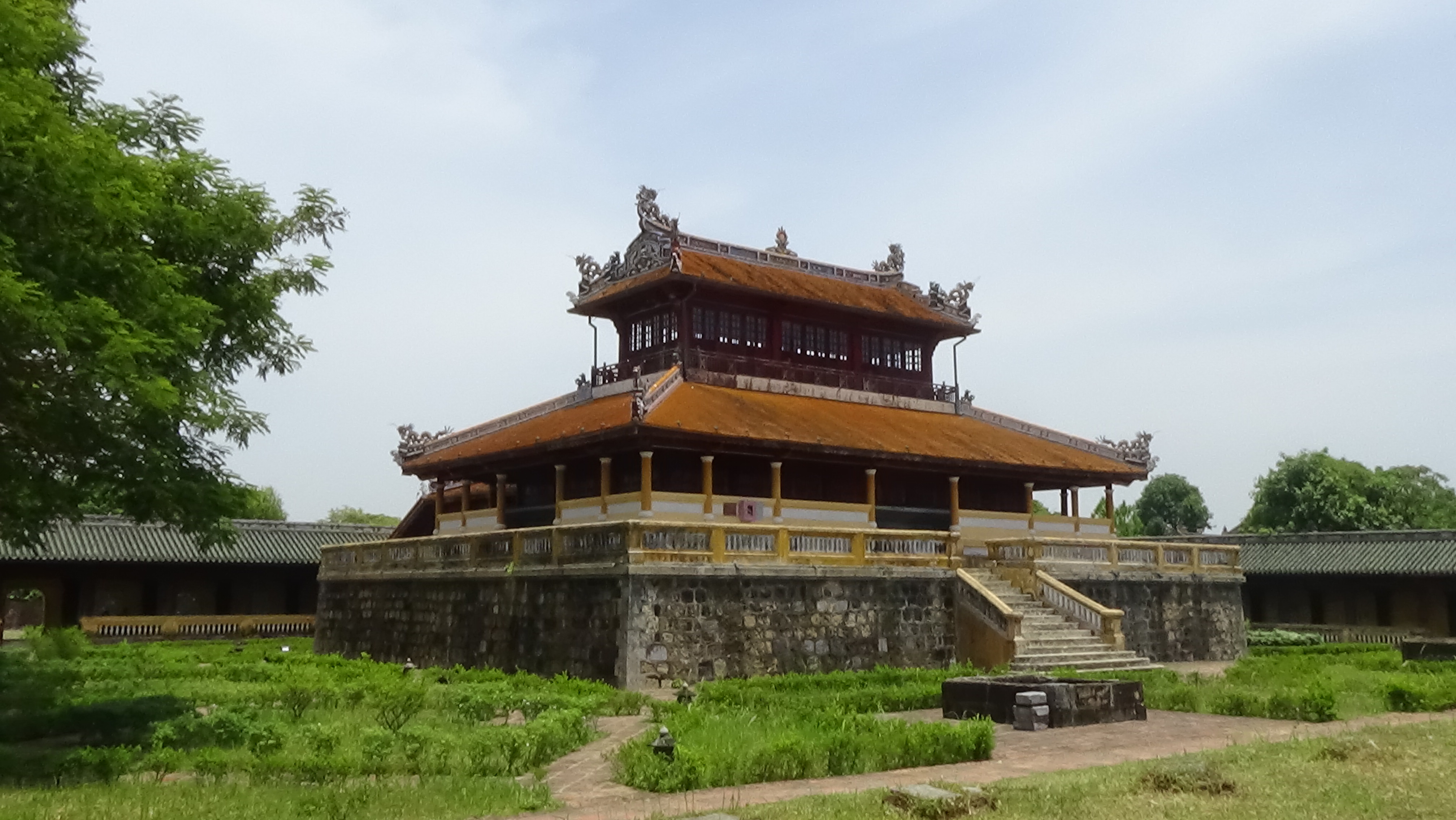
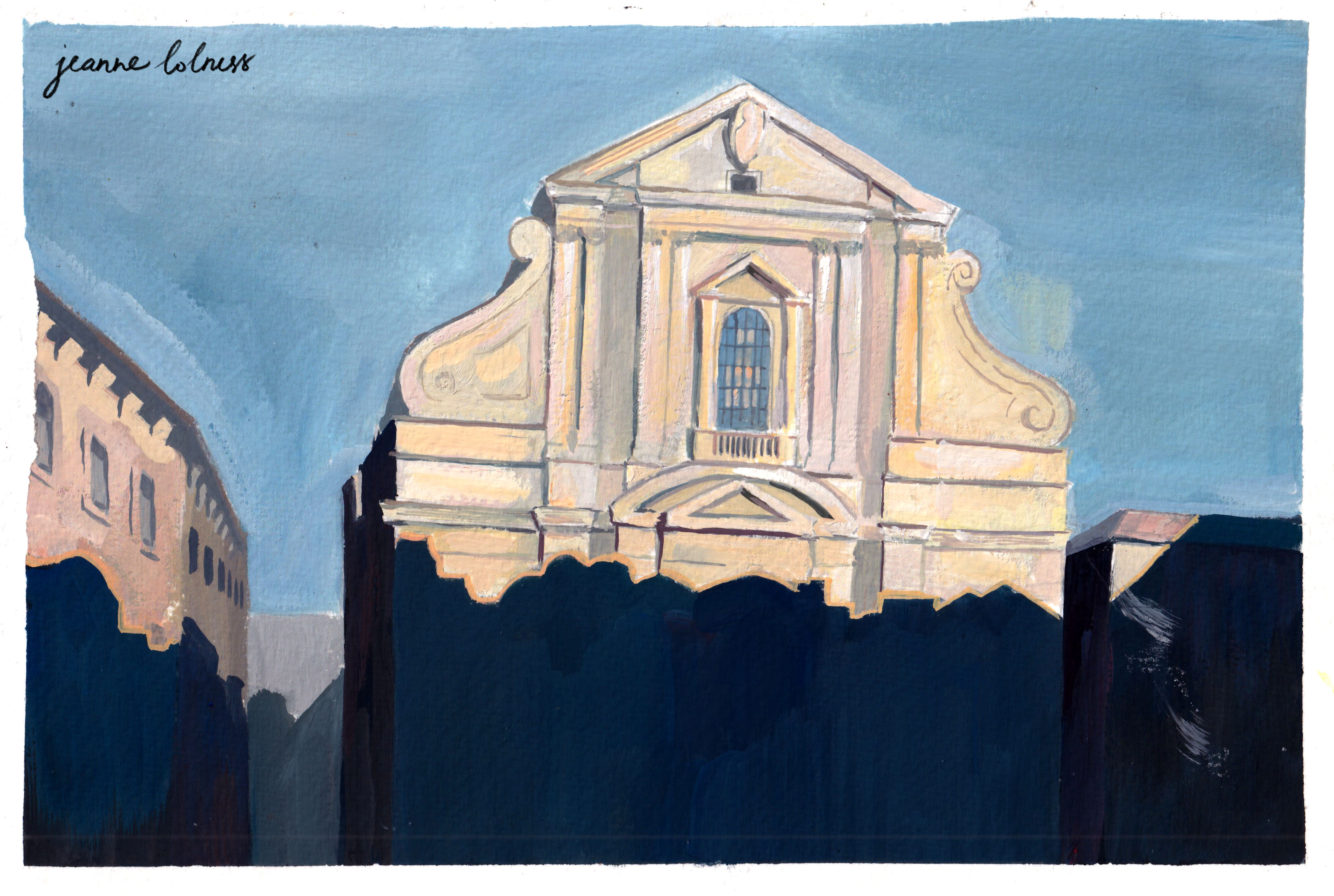
Nhật Thành Lâu Cổng Ngọ Môn
It was a sunny and hot day, and there were swarms of people visiting the citadel: foreigners, local people, Vietnamese travelers. The entrance (Cổng Ngọ Môn) was the most crowded spot, afterwards, people started wandering to different areas. It was understandable, because the entrance was built to impress anyone coming, foreshadowing normal people to pay respect to the king. My little painting can’t capture all the details of the entrance, many decorative elements were made by skilled craftsmen from all across Vietnam.
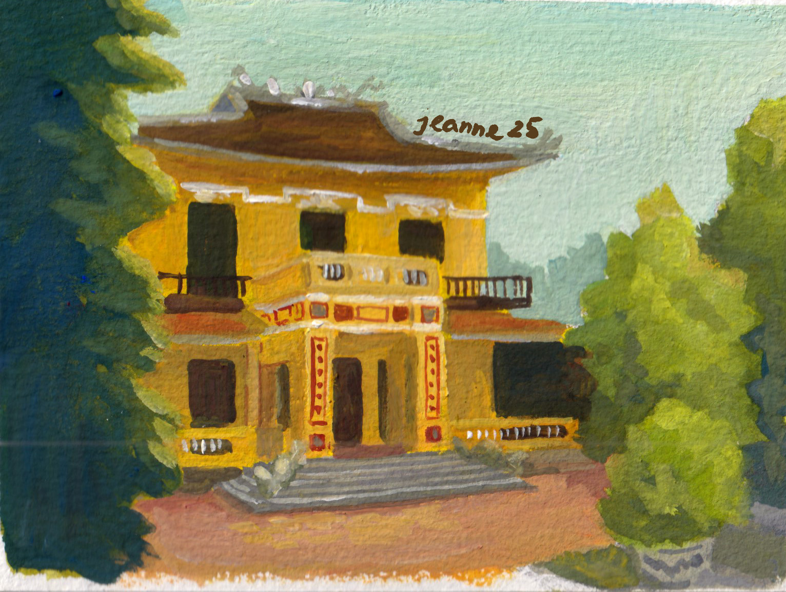
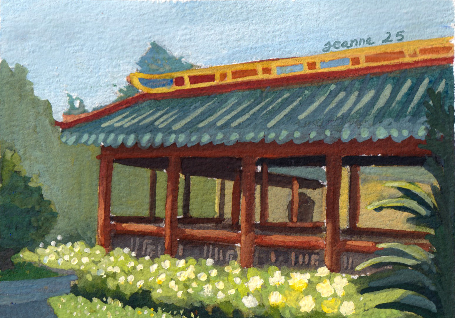
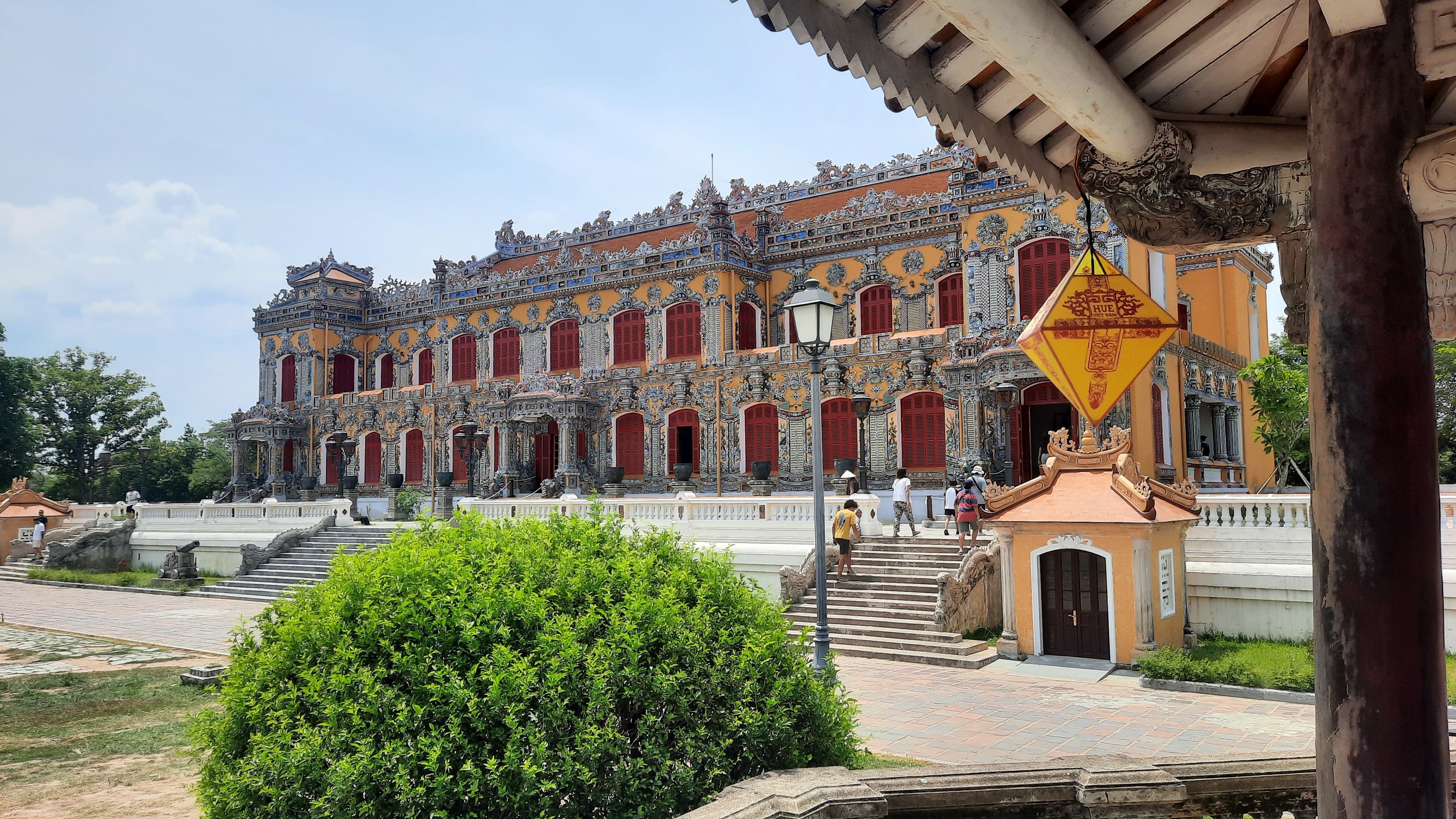
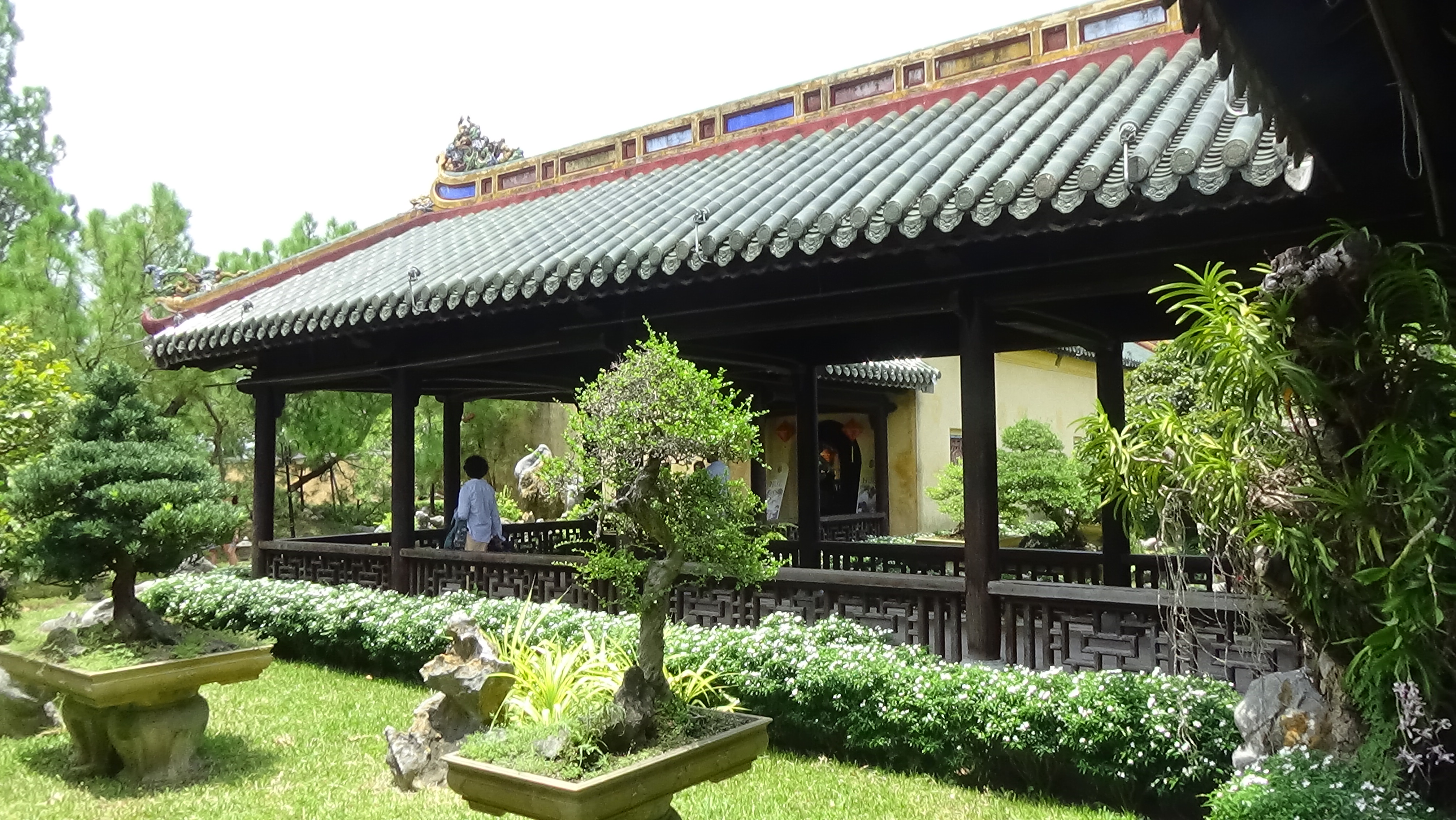
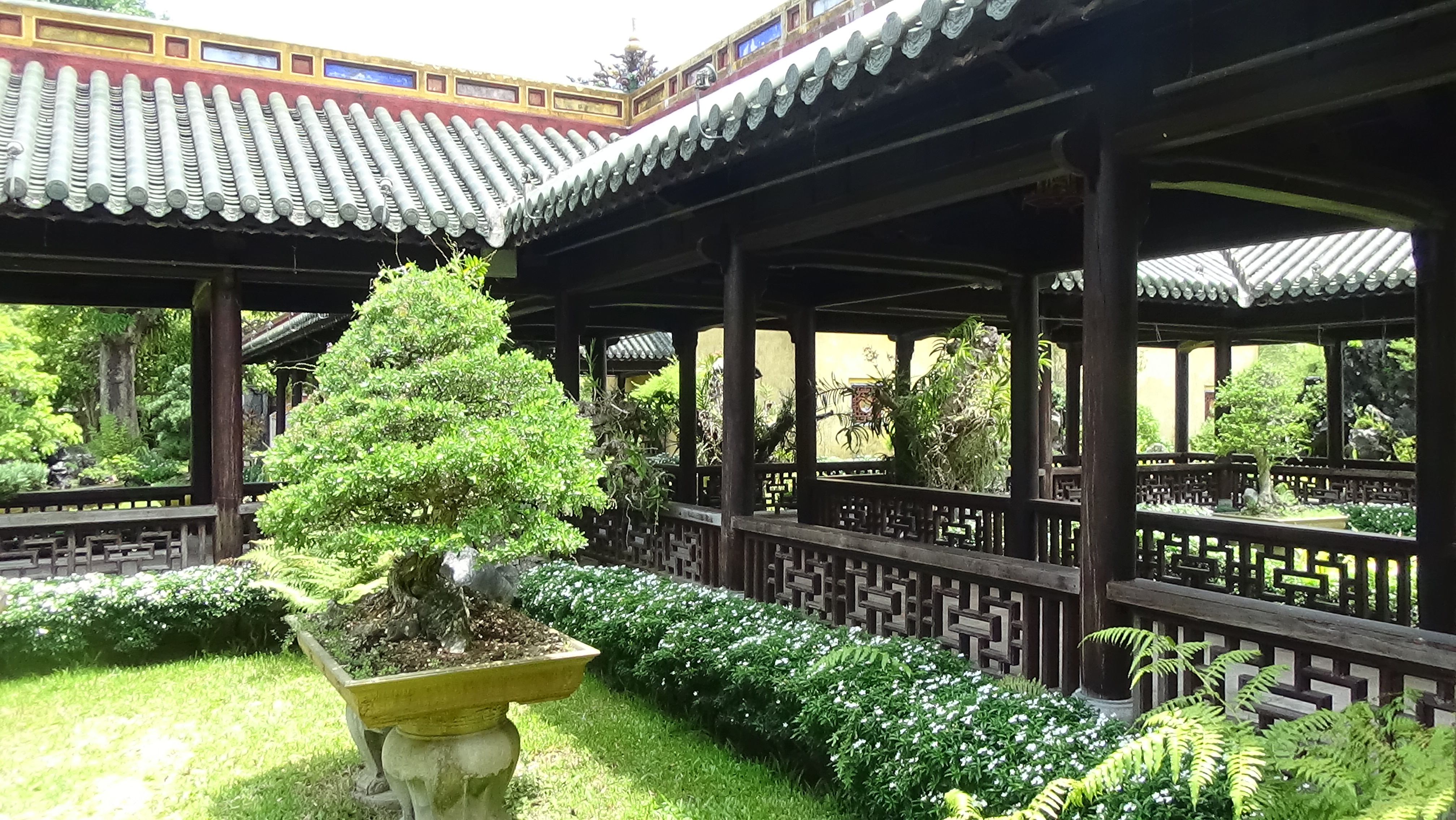
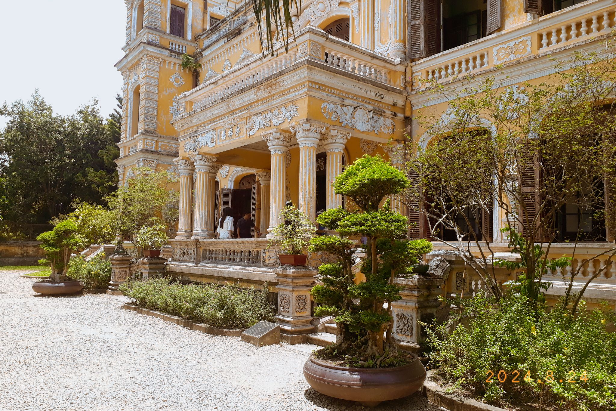
Phước Thọ Am Lầu Tịnh Minh
These two places (Phước Thọ Am, Lầu Tịnh Minh) were built much later, reflecting the changes coming from the outer world. Lầu Tịnh Minh was built in 1927, featuring a higher ceiling, a larger balcony and many other elements from Western, particularly French architecture; but still keeping the traditional roof and decorative tiles of Vietnam.
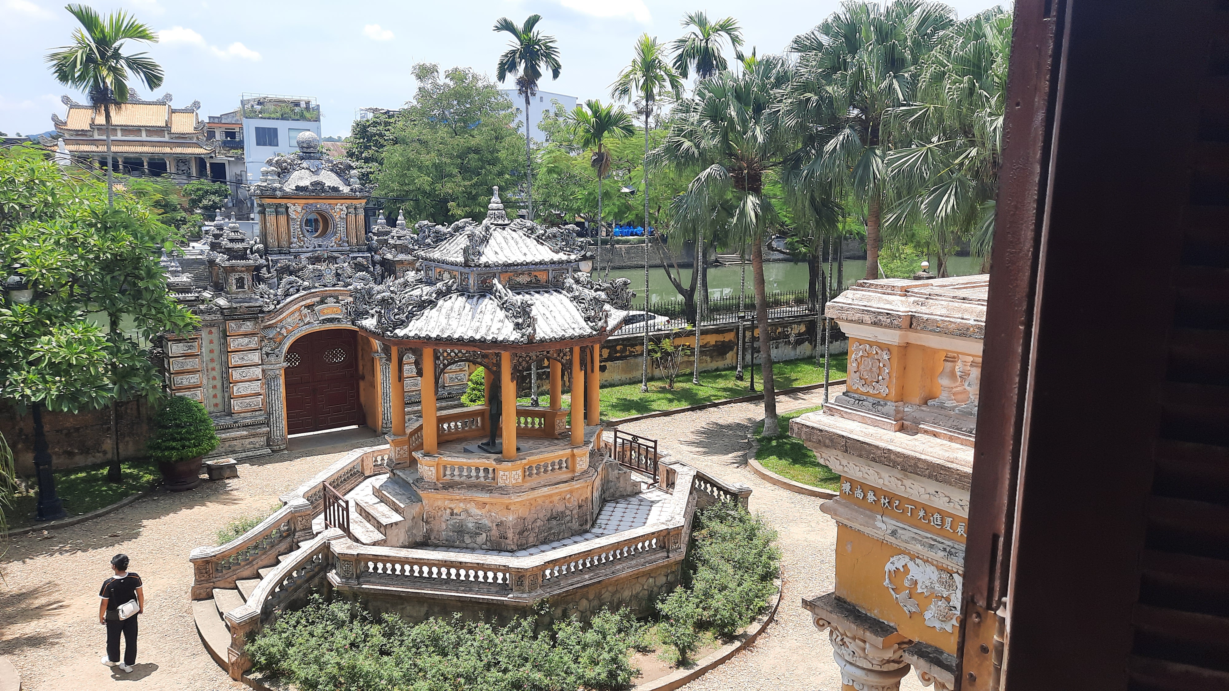
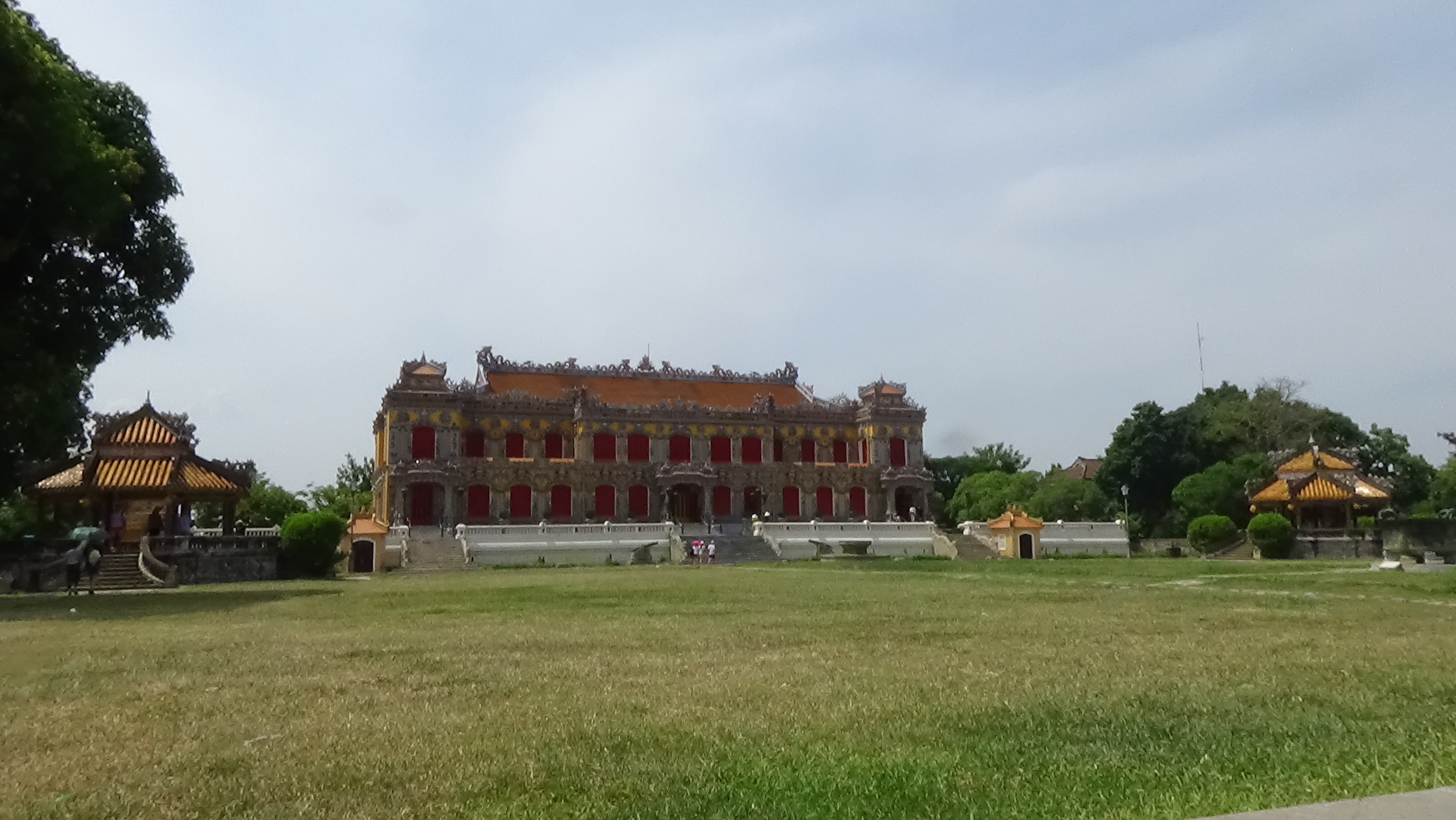
Vườn Thiệu PhươngLăng Minh Mạng
There are many places that I haven’t painted and I’m still excited to paint them, even after a year. There are still so many things I want to learn about Hue architecture and history.
You can use some of my images below to paint if you are interested in Vietnamese medieval architecture! Share with me if you can.
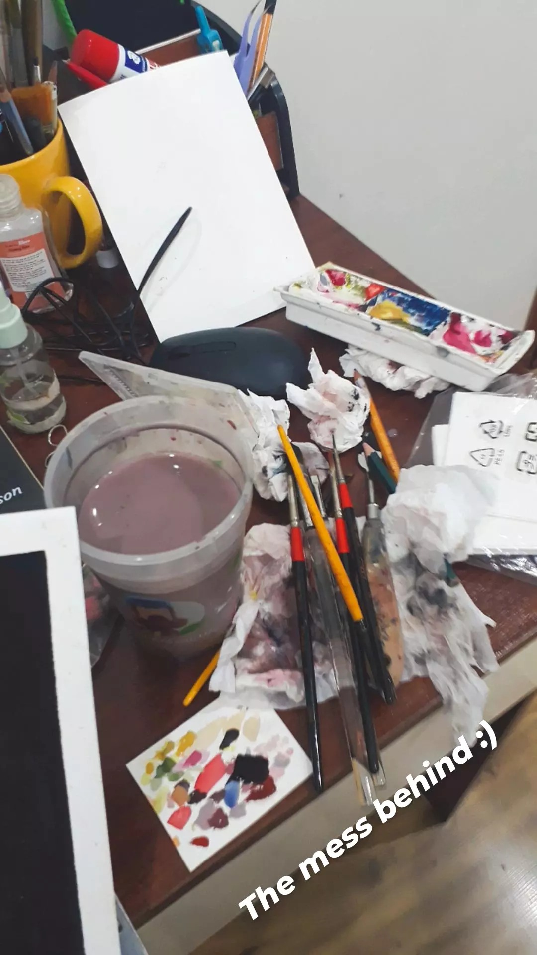
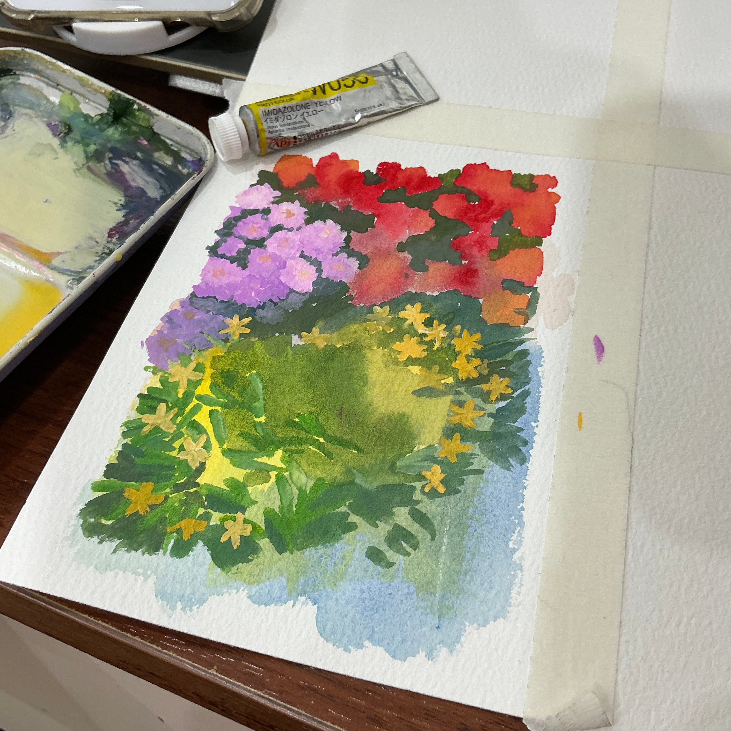
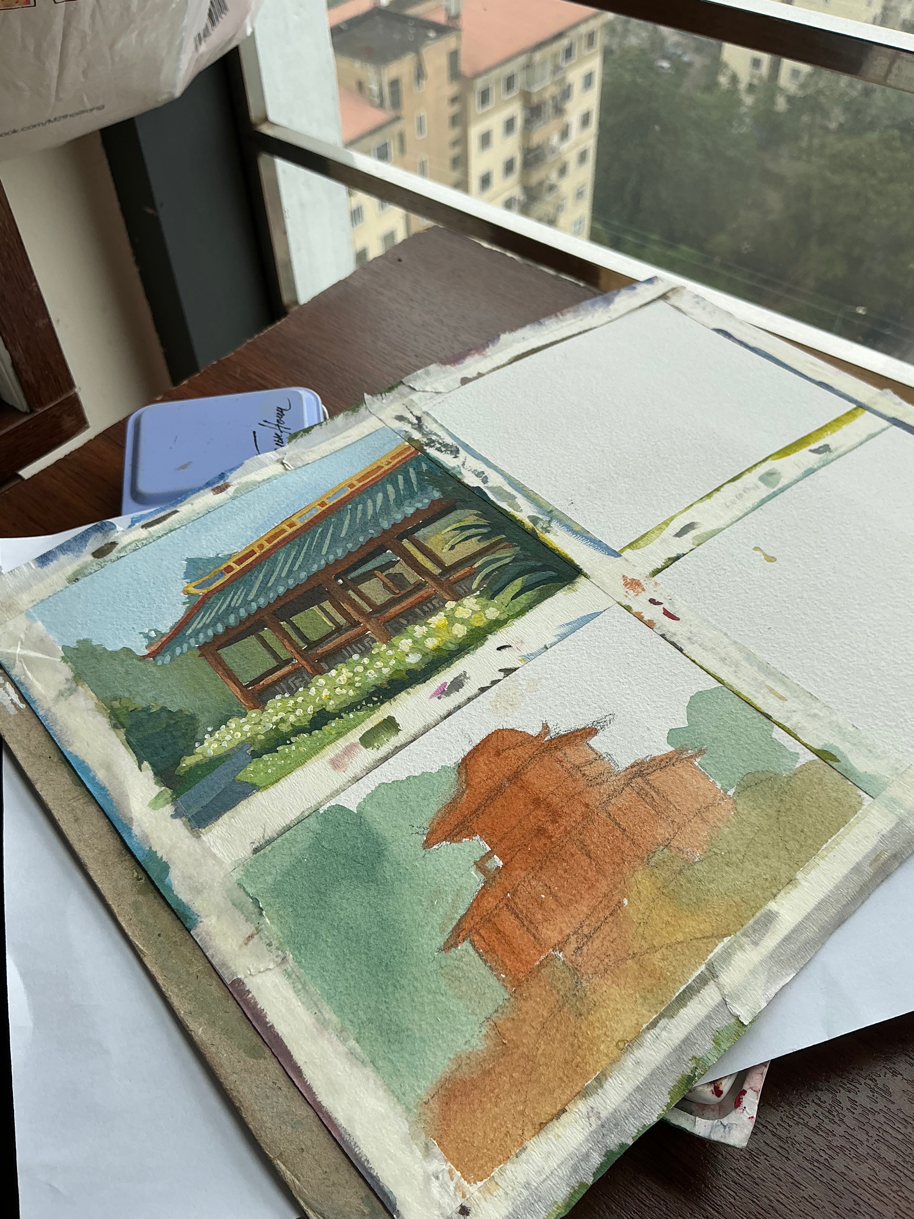
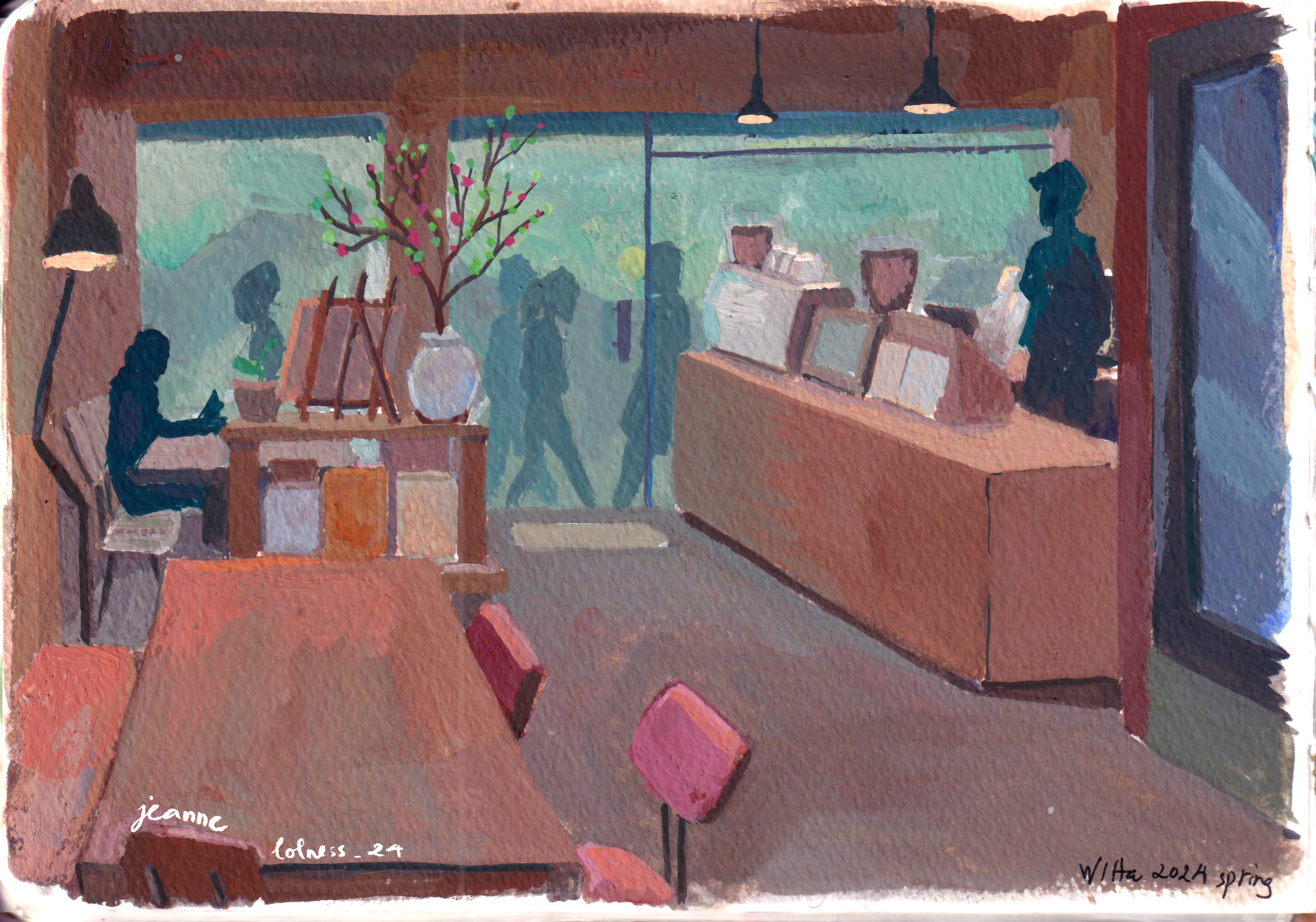
This is just a post to share all the mess behind polished paintings. You can see the underpainting, the half-done paintings, brushes thrown randomly on the desk, the palette almost falling off the desk.
Sometimes, the process means more to me rather than the final result. I enjoy painting fast and playing with colors, so the moment the painting is finished or rather I see that I can’t do anything more. It feels like waking up from a dream and I’ll need to wait until next night for another dream.
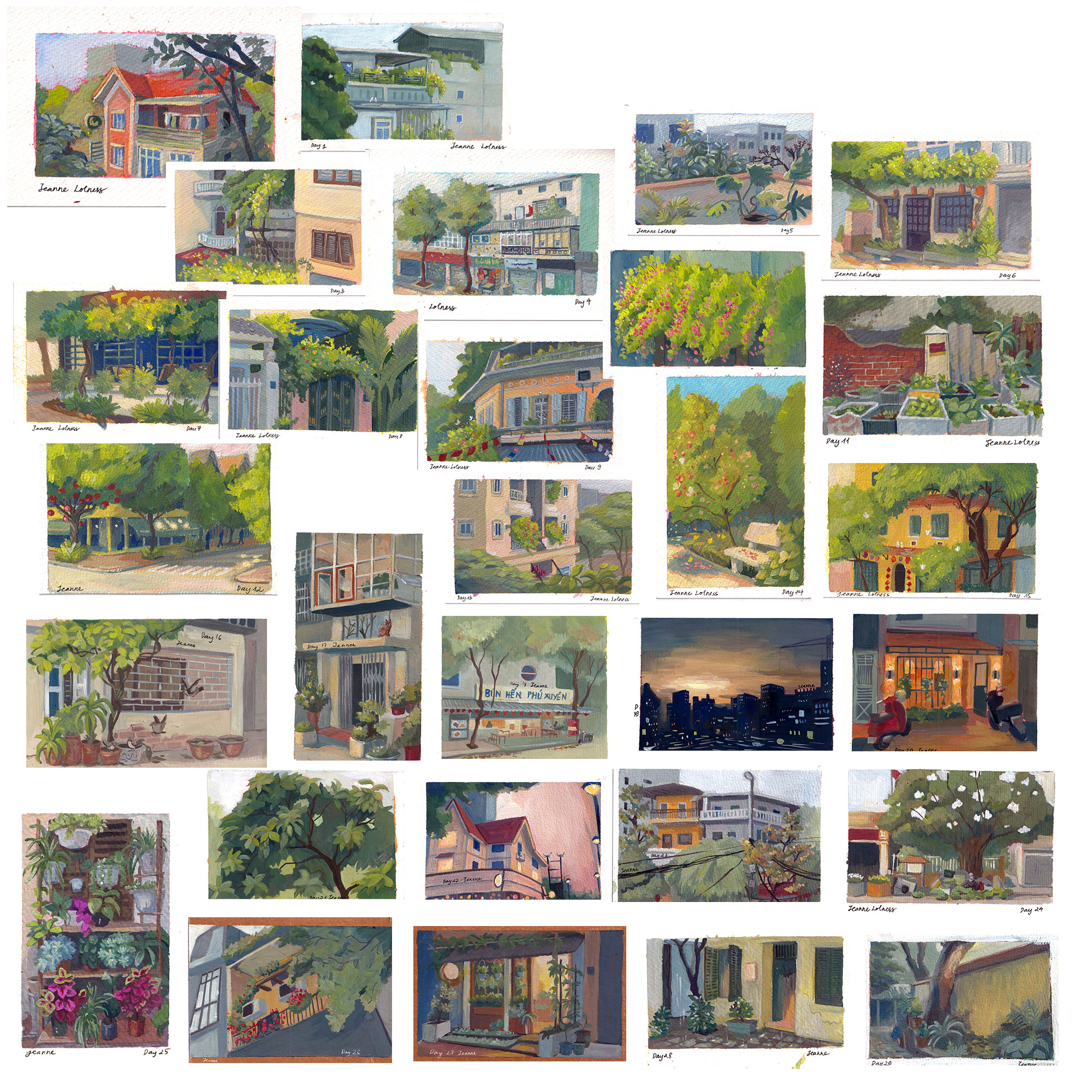
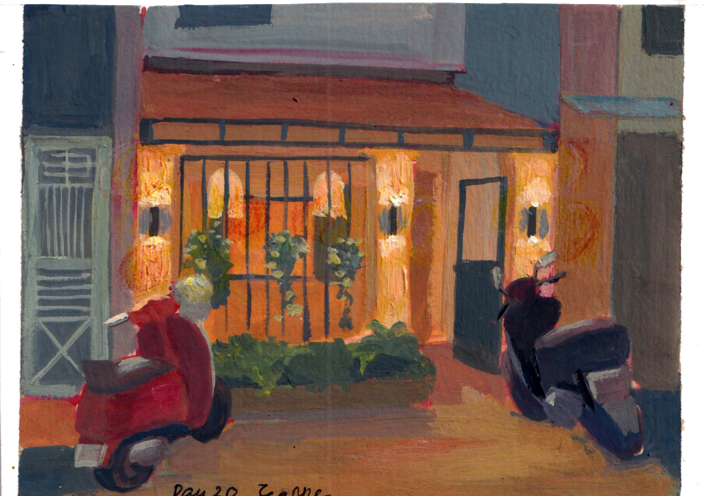
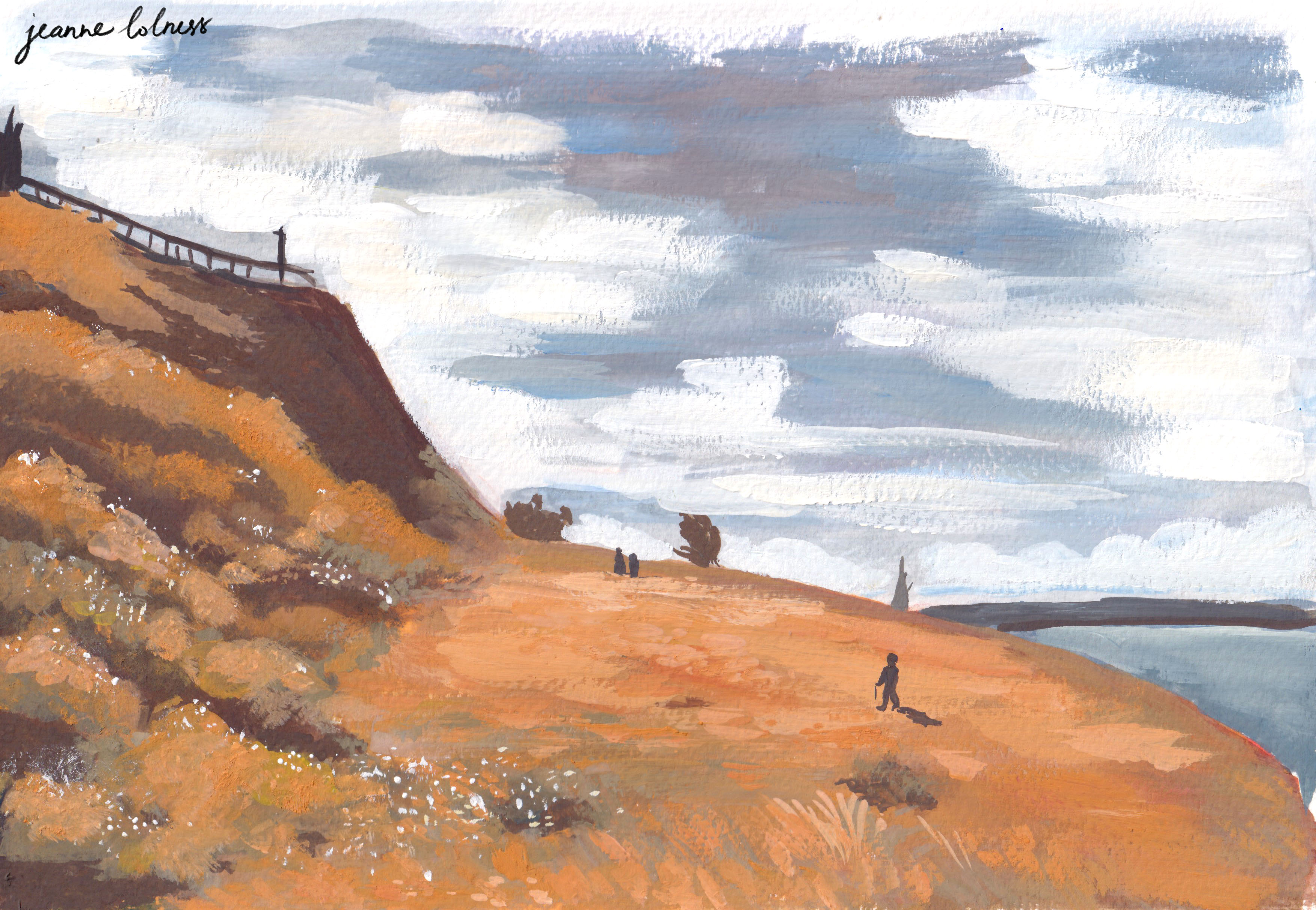
I have always wanted to join the Plein Air Challenge held by the Warrior Painters, but never found the time in the past years.
This year, I had more free time due to a sudden decline in commission requests, possibly due to the introduction of AI to Fiverr. Instead of jumping into a new course, I decided it’s time to join the challenge, or just tried to see how far I could go.
The challenge was a good distraction in this transitional period. Fiverr has “encouraged” creatives to allow AI to create free or cheaper artworks for users, which forced me to accept how sloppy my art career is. While I still managed to work with long-term clients or projects to support myself in this period, I felt an existential crisis slowly burning myself out. On some days, when waking up, I was hit by questions such as “What am I doing here? Are my goals realistic or achievable enough? Am I feeling and doing like this forever? …”. The challenge helped me refocus my attention, simply speaking, I know today I need to finish by #13 painting because today is 13th.
The challenge also introduced me to a few more talented background, concept and landscape painters. Some are Giacomo Sardelli , Lex , Ferrari Duanghathai, and more; it ignites a bit of hope in me about posting arts online. I have always struggled to stick to a regular schedule of posting; and now that I’ve accepted it, I just post whatever I’m ready to. I also got featured on Warrior Painters page and story a few times, which helps my audience grows a bit.
This challenge also motivates me to appreciate small things, both physically and mentally. A quiet morning, a few hours focus in a distracted day, a tree coming up with new leaves, a cool summer breeze, a small commission, a regular client ordering little comics. In the days that I’m haunted by big questions about career and life, these little things keep me grounded. I tried to simplify everything, from declutter my art corner to relationships in my life.
I tried to simplify my tools as well, I used the same set of brushes and only four main colors: red, yellow, blue and white. I use a portable palette recycled from a plastic package of some electronic devices, which already has some grayish and brownish paints left. They help create the neutral gray parts of all paintings.
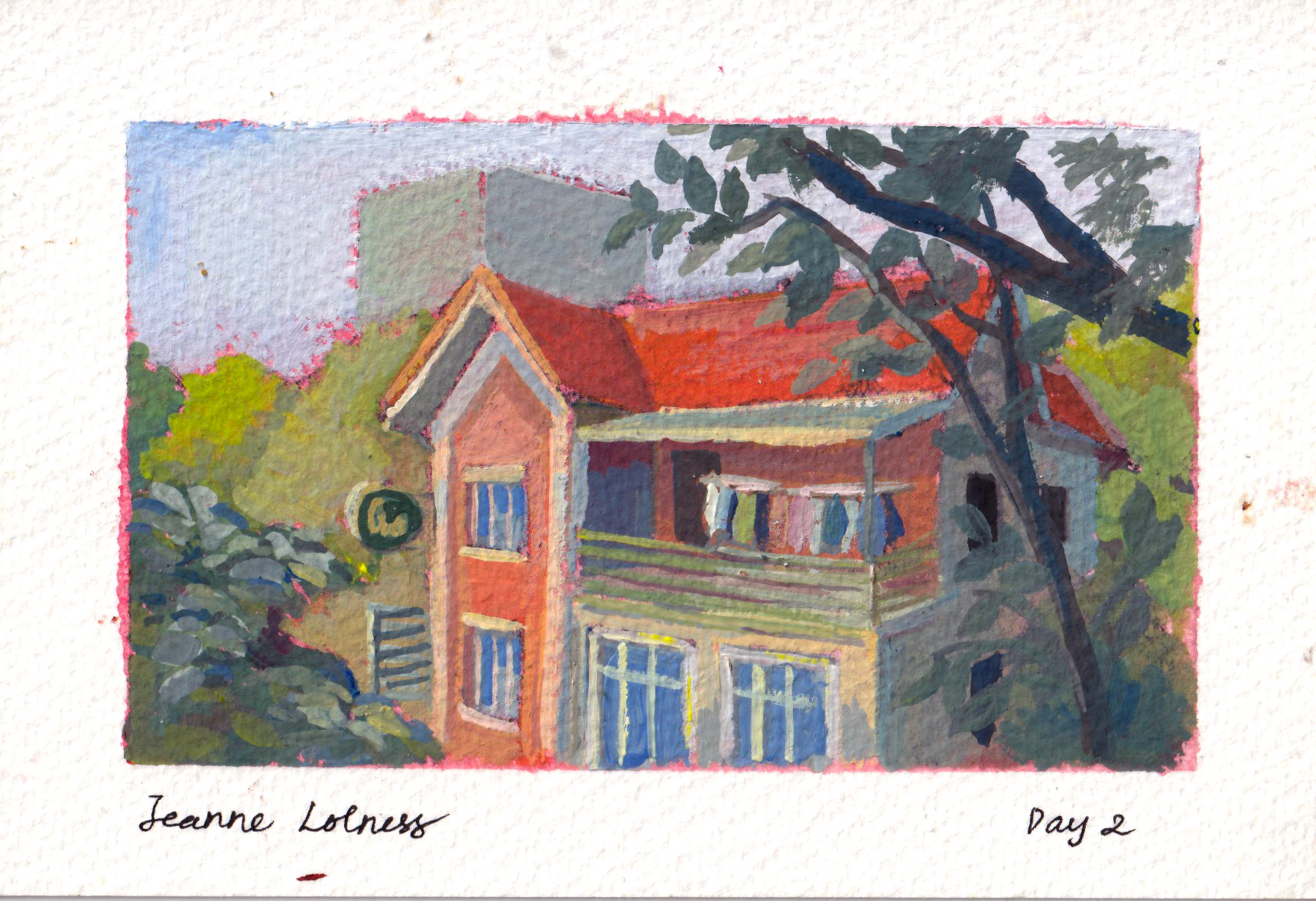
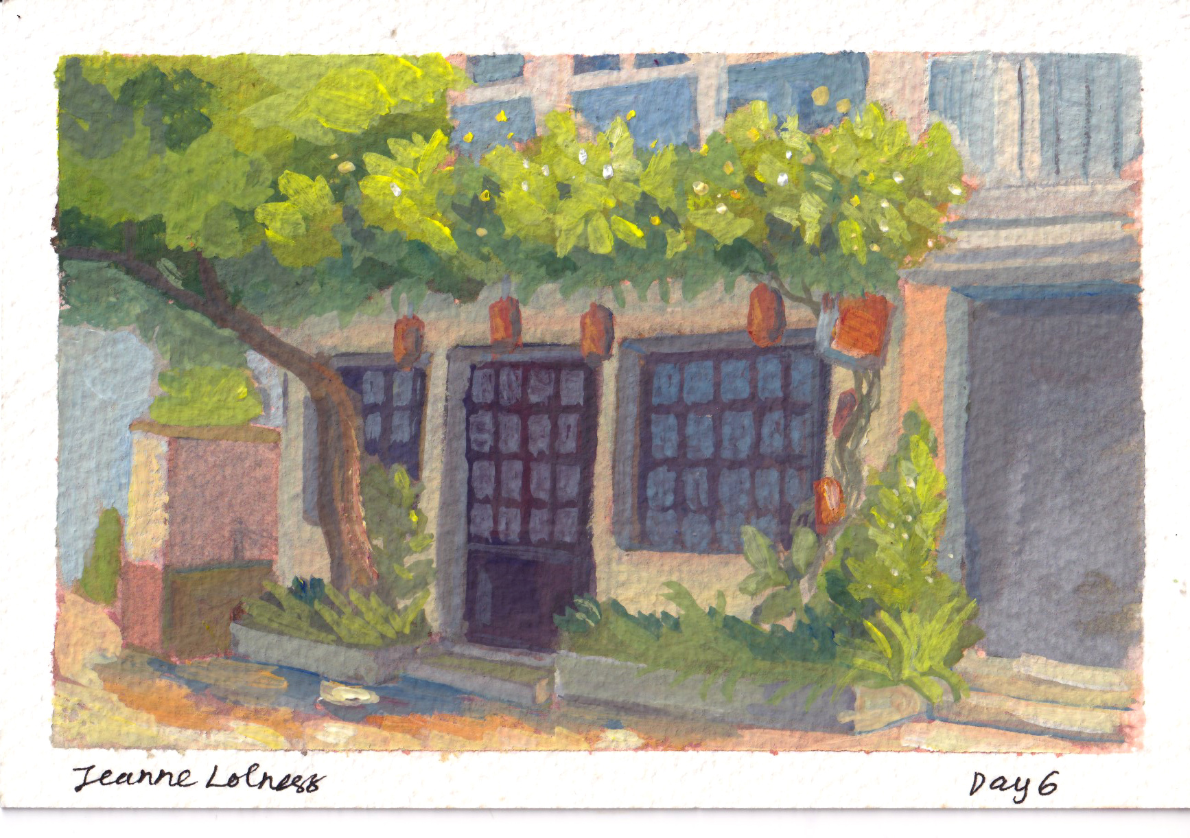
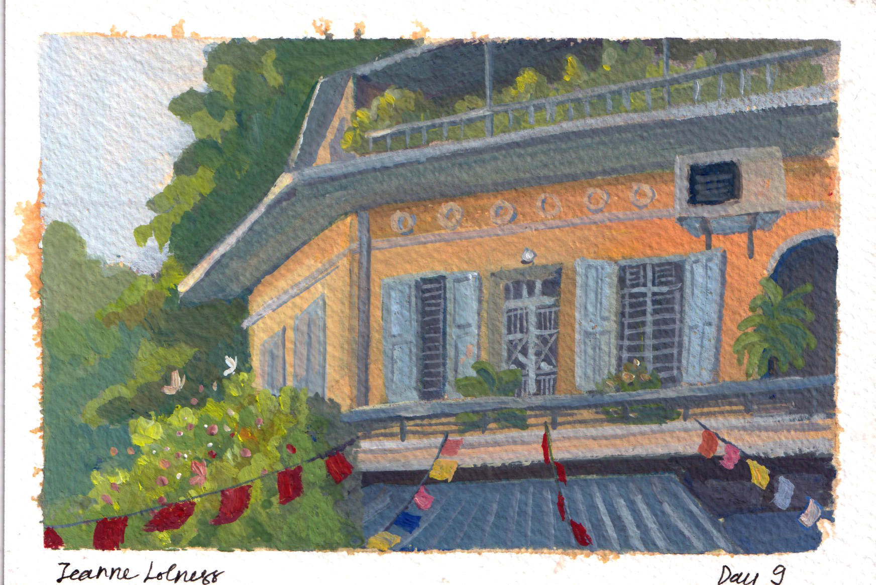
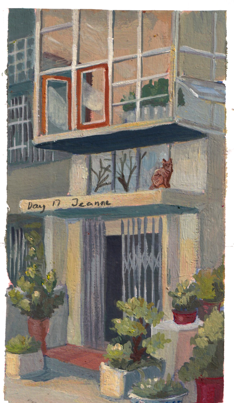
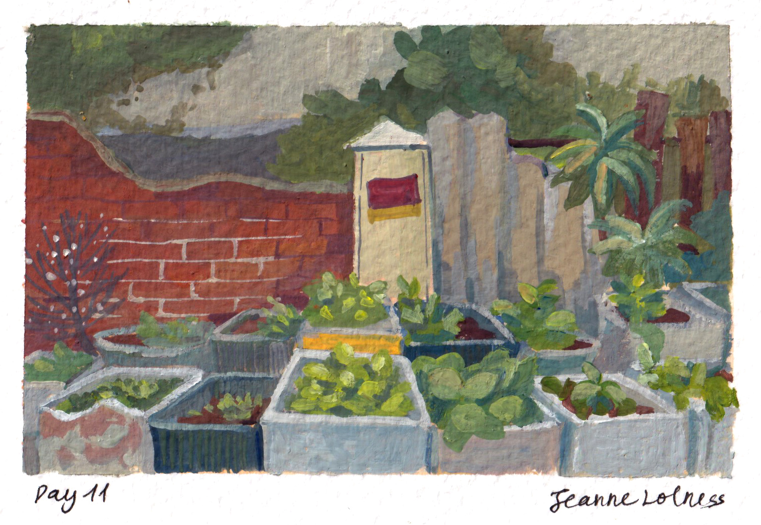
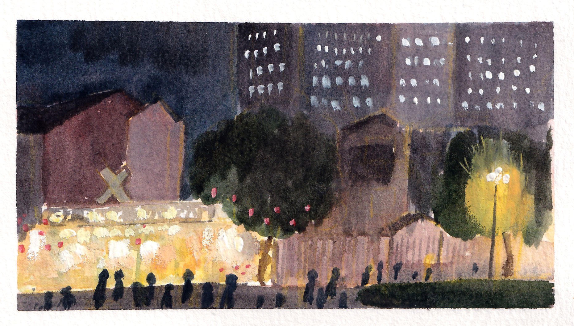
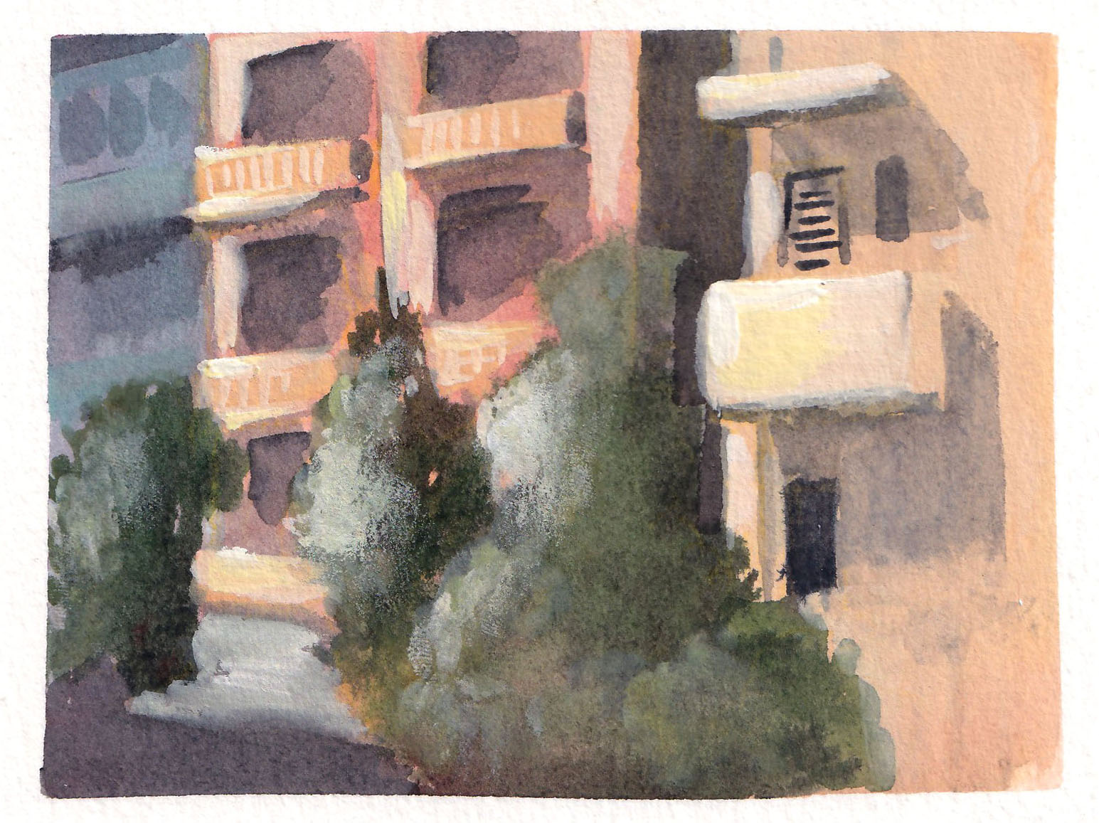
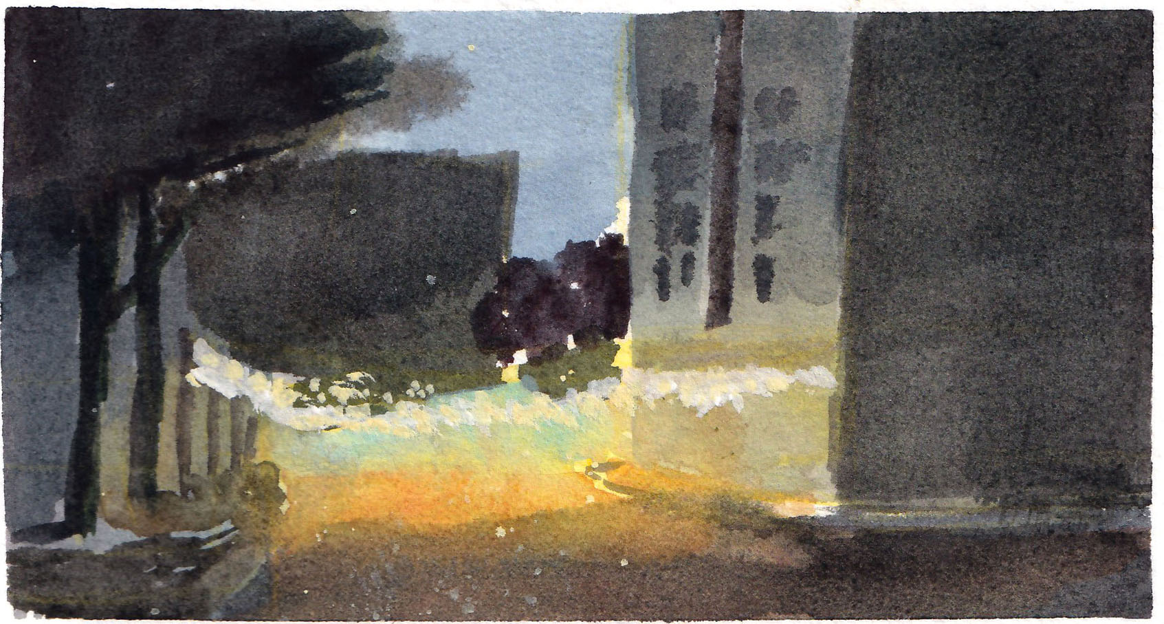
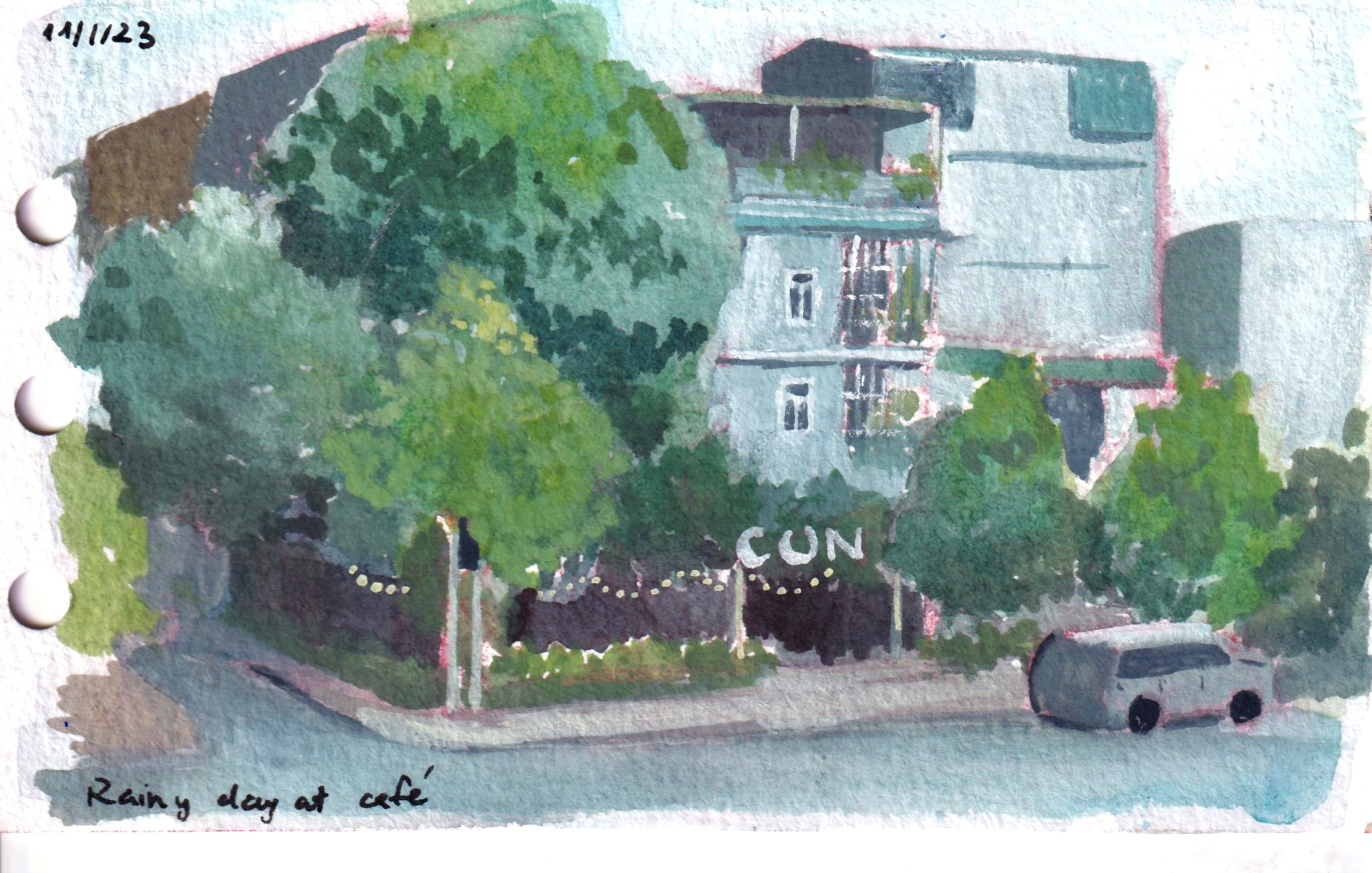
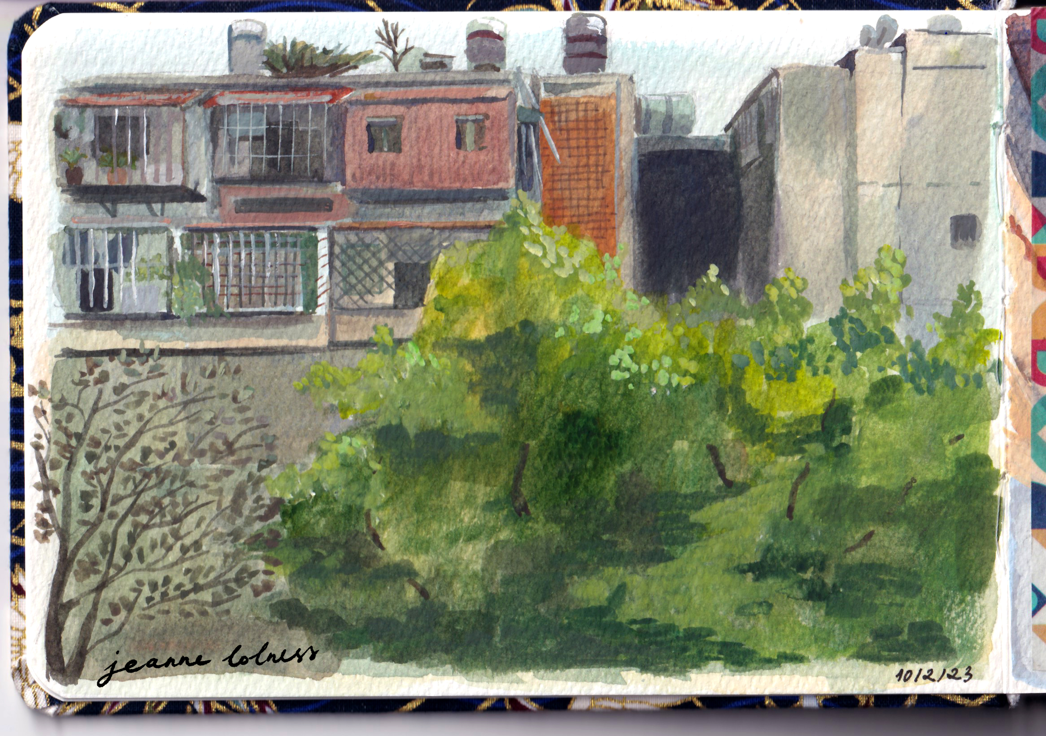
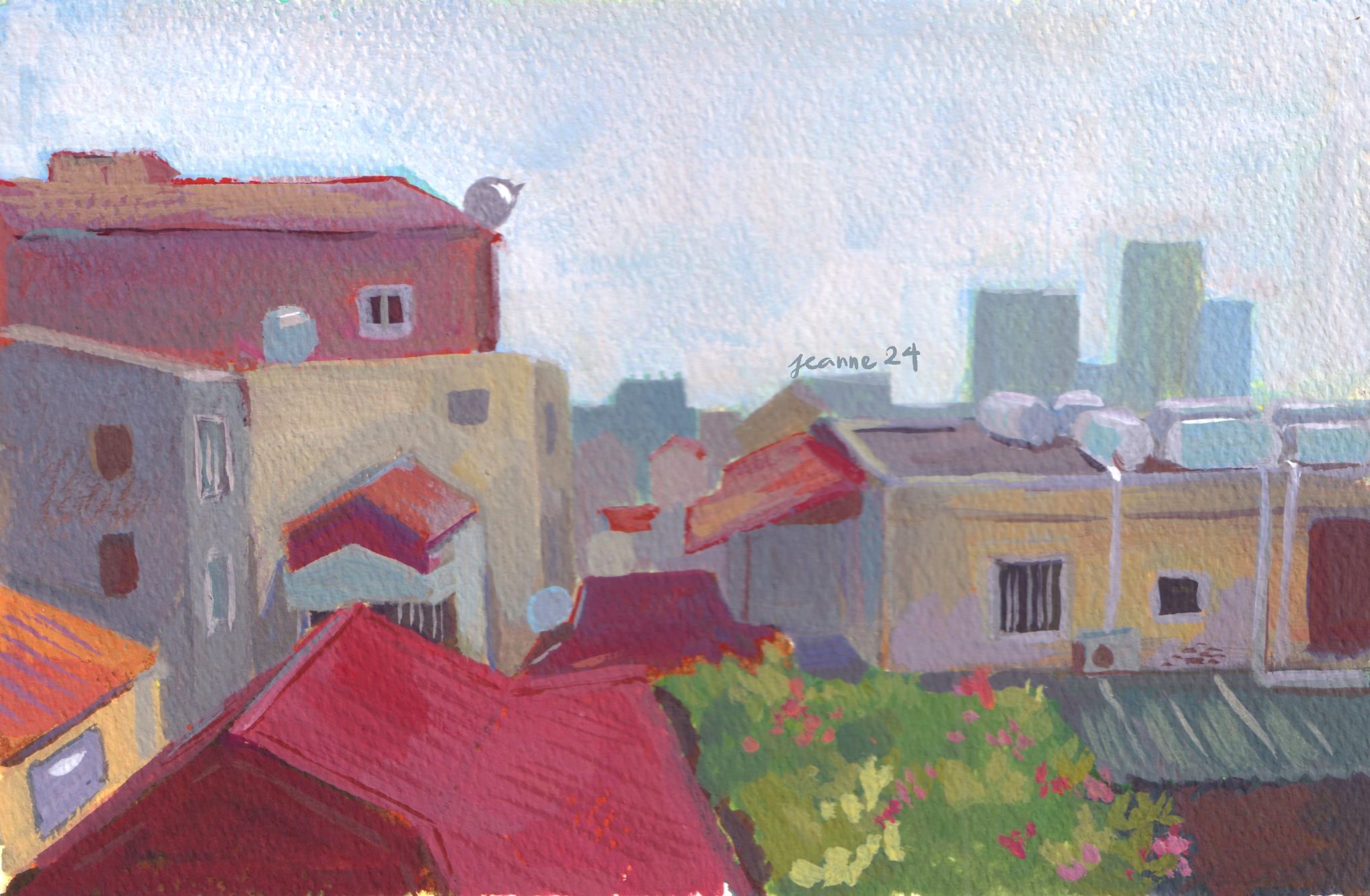
My original plan was to use this to motivate me to go out of my neighborhood, but in the end, I painted mostly houses in my area. I already have a collection of references taken by me during my weekly run. Painting from photo references taken on my own doesn’t lure me into copying the image, because I know the limits of my own photos and already have my own impression of the place.
And in the end, I have a lot of works to share and talk about, 29 paintings. I realize I have worked much faster, since my landscape sketchbook has only about 10 pages left and I began it 2 years ago. Along with reading about Mary Cassatt, I found more hope in myself and an art career, motivation to stay resilient and patient. Of course, I’m still at loss visualizing what kind of career I truly want, but there’s one thing I know for sure: I want to draw and paint everyday.
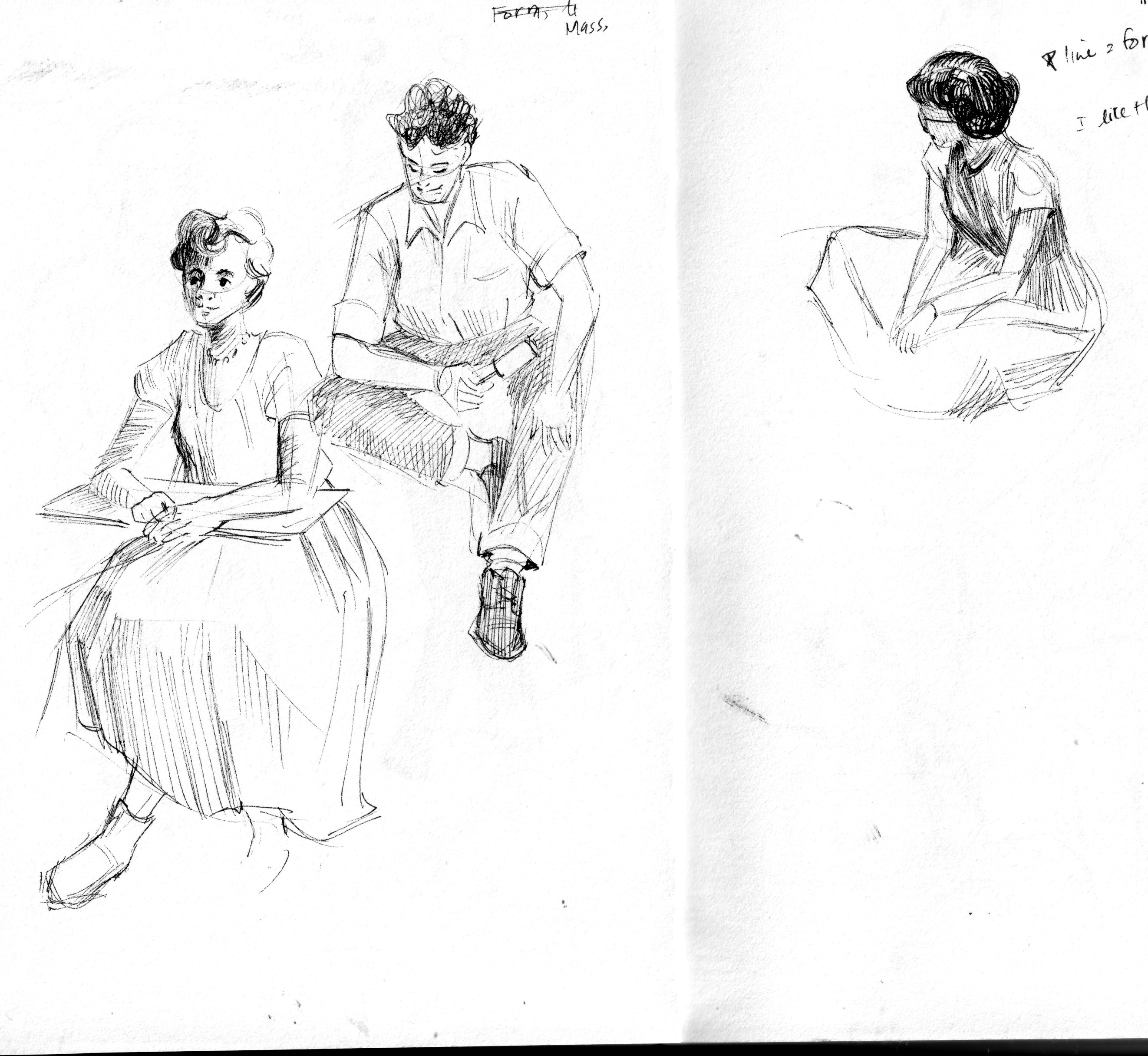
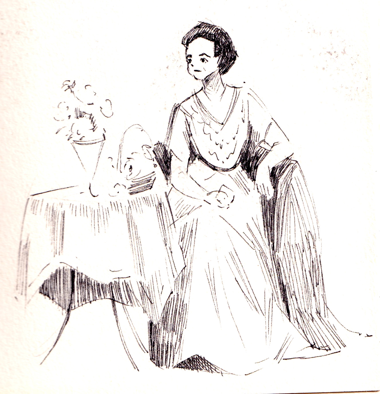
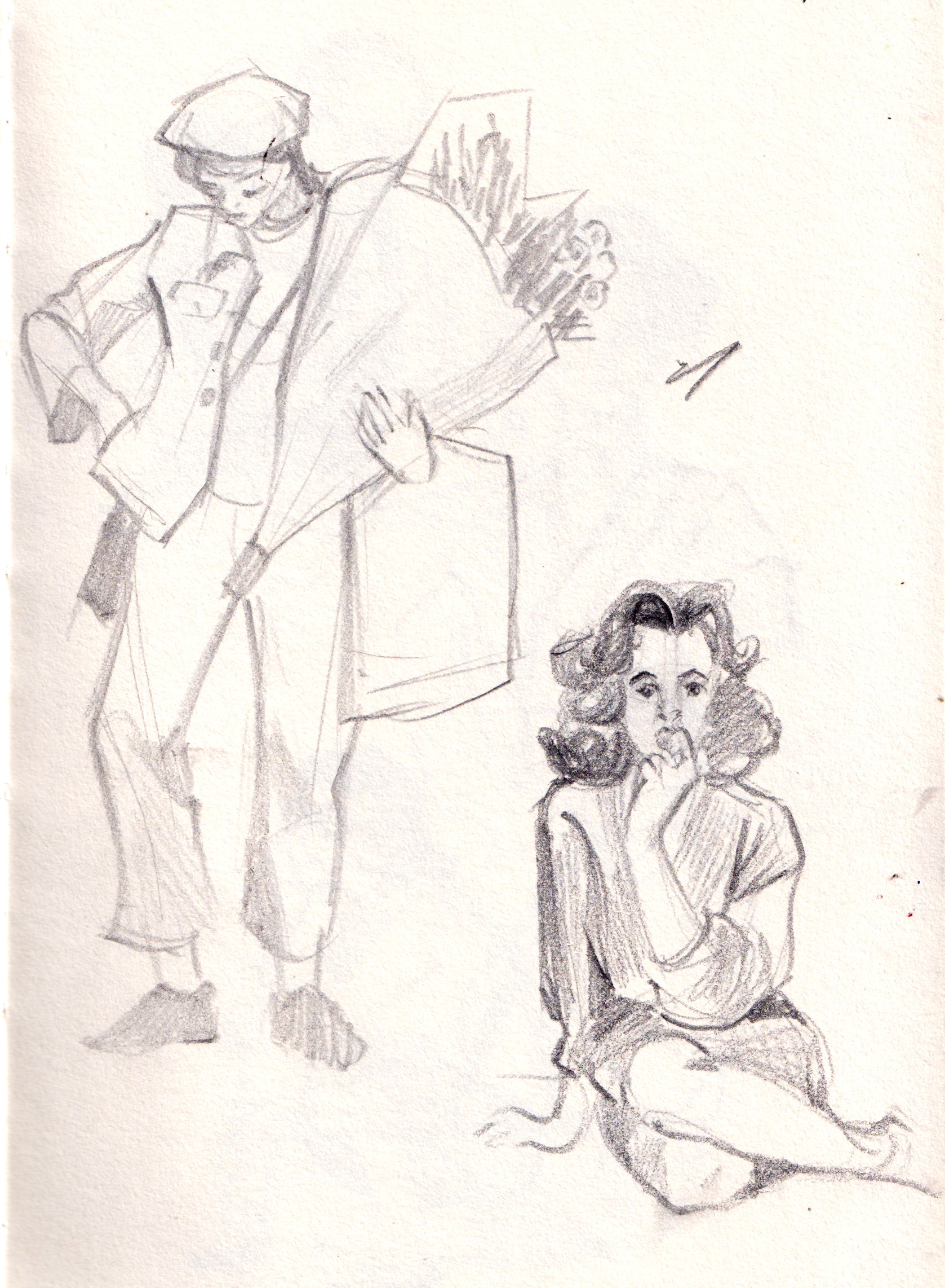
I tried my best to stay consistent with filling in sketchbooks, daily sketching for practicing techniques, as well as, … keeping me sane from my turbulent life. Here comes some of the best pages in my sketchbook in 2024.
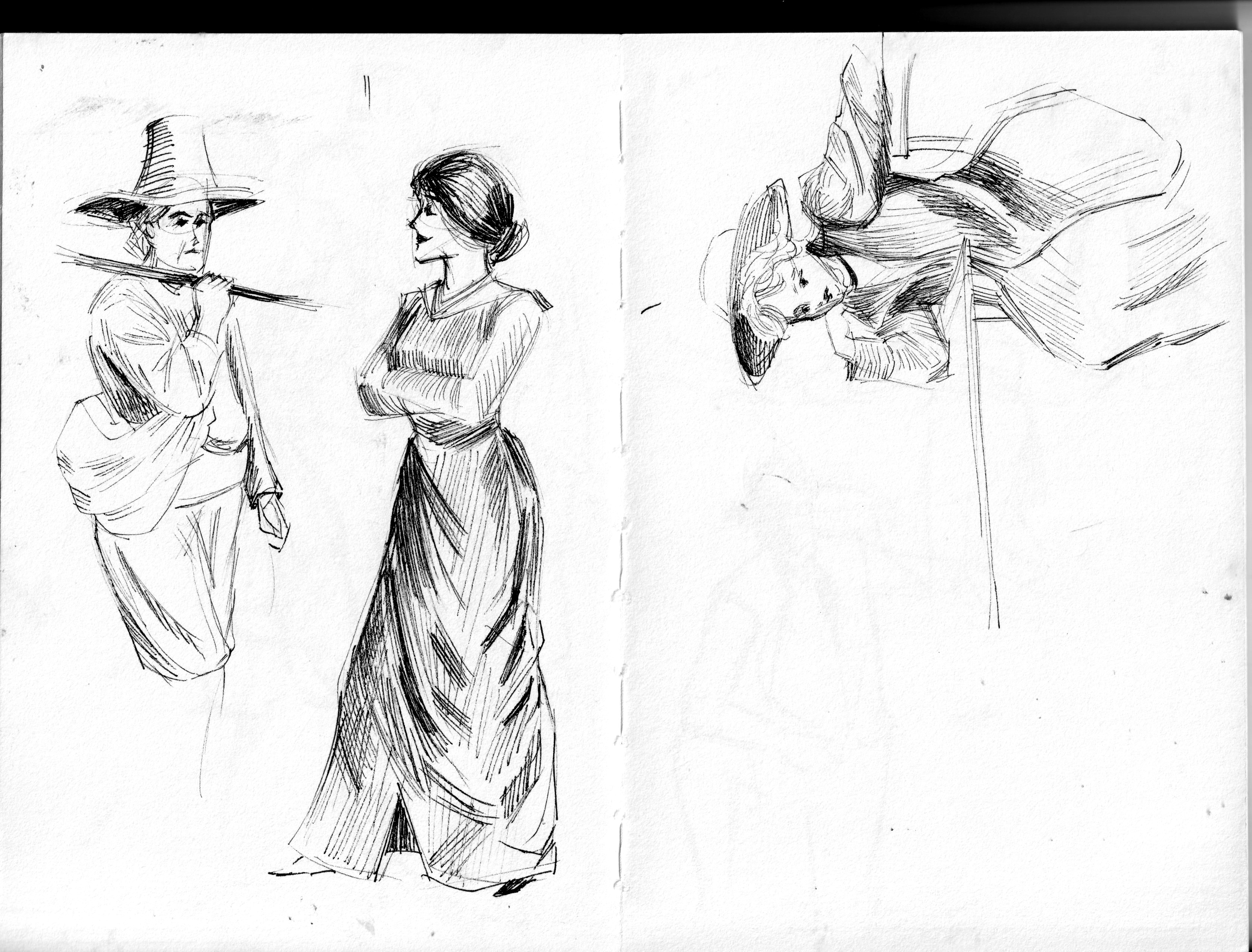
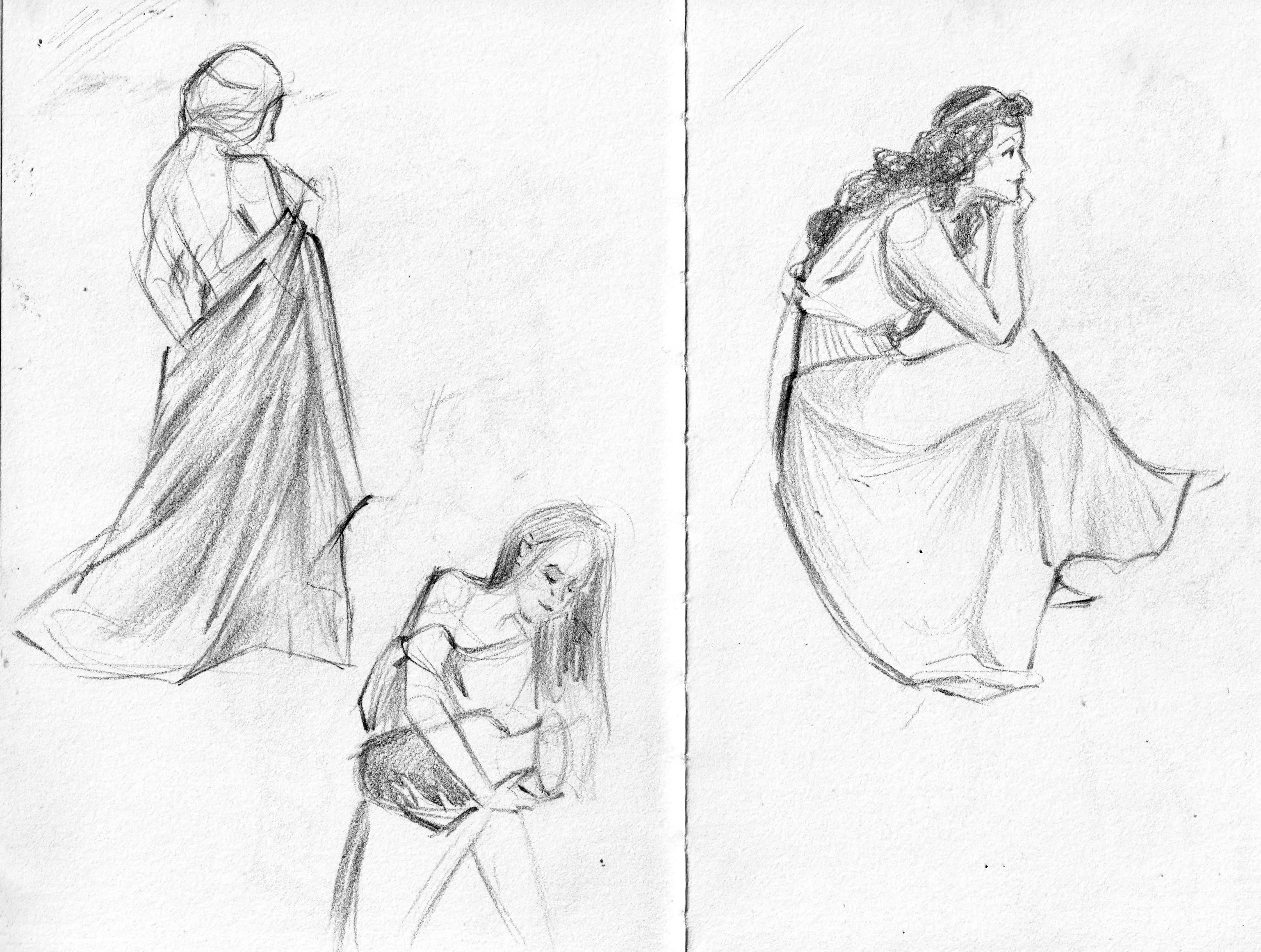
I found joy in learning to sketch costumes, starting with historical dresses and gowns from history since they were layered or made of different textiles allowing movements to be subtly depicted. Or maybe I’m biased towards modern fashion, particularly mass-produced and fast fashion.
These sketches are copies of works by Charles Dana Gibson, who created the “Gibson Girl” – an iconic representation of American woman in 20th century. His sketches were lively, comical yet with a sense of reality, I find him a great source to learn sketch costumes.
Together with new interest in costumes, I still find sketch houses, churches, etc basically everything architecture relaxing. Perspective used to be a huge obstacle, but but I get loose with it now, just eyeball every detail. Of course, for professional works, I still create a perspective grid to make sure things fall in their places; but with sketching, I think it’s better to distort, twist and play with it.
Mostly of my sketches are done with black and purple ink, but I’m slowly get familiar with all medium as well. With that being said, ink forces me to think and plan in my head before letting the ink reach the paper, because, whatever mistakes I make, the marks will stay permanent on the paper.
I’m still figuring things out, still experimenting with different mediums, and still making plenty of mistakes , but that’s part of the fun. So, here’s to more sketchbooks, more messy lines, and more moments of getting lost in drawing.
Copying old masters is a practicing method that always sparks controversy.
Selling copies of old masters used to a profitable niche in art. In England, early eighteenth century, a number of artists used to work as professional copyist. Francis Harding is an artist famous for copying Italian painter Giovanni Paolo Panini.
Back then till today, copying old masters’ artworks is still a recognized way to practice in European academies. Jean-Auguste-Dominique Ingres, which today is known for his painting La Grande Odalisque, learned by copying the prints available in his family. In Chinese, copying works from previous artist is the sixth principle in the list of principles introduced by Xie He in his book “Classified Record of Painters of Former Times”, which later become standards for artist training and critic.
Today, many museums organize copying sessions for artist to copy paintings to improve their techniques or to pay homage to the masters. Some famous names include Lourve: copying has been allowed since 1793 and Met with their Copyist Program.
From a personal view point, I believe copying is simply a tool which can be use for both right and wrong purposes.
1. Copying is a relaxed yet effective method to practice
I have found copying is a good warm up exercise before getting to work on commissions and professional works.
Study of Rembrandt’s and Botticelli’s
Copying as a warm-up exercise should focus on one purpose only: composition or anatomy or color, etc. These studies can be quickly done in 30 minutes to 1 hour. The exercise is relaxing since the masters has already figured out what and how to paint the focus, lighting setup and color. It’s similar to doing an experiment or research, with all other conditions controlled, focus on one element to understand how to work it out.
2. Copying simultaneously from tutorials
Tutorials are great sources to learn, particularly if you find an artist you admire and want to get inspired. Some artists can explain cohesively their progress in terms of both techniques and ideas; but some not. When watching how their hands hold, move their brush and trying to mimic them at the same time, I feel a lot of my questions and difficulties get cleared up.
Study from Nathan FowkesStudy from Nathan Fowkes
Above are copies I did when I studies a paid course from Nathan Fowkes, but there are a lot of free tutorials on Youtube: James Gurney , Matthew White , etc.
3. Copying also helps with rendering and brushstrokes
Study of “Taking a Walk on the Cliffs of Sainte-Adresse” by Claude Monet Study of “Off the coast near Yalta by moonlight” by Ivan Konstantinovich Aivazovsky
One important element affecting how an audience views a painting is the brushstrokes. Some artists, namely the Impressionists, kept their canvas textured while others, Vermeer for example, preferred a smooth painting. Both types will require specific technical skills. Observing closely the old masters’ pieces or watching tutorials/ live sessions helps me understand how an artist move their brush, their hand and what techniques I need to use to get a specific texture.
4 . When things get wrong
That being said, copying too much or without a purpose could harm an artist’s personal style. The reason why many format art teachers don’t like students copying manga or anime style because they feared of over-copying.
Especially in the age of social media, many inexperienced artists try to copy others with more followers. It’s not their fault entirely, especially social media can appear to help artists live on their passion.
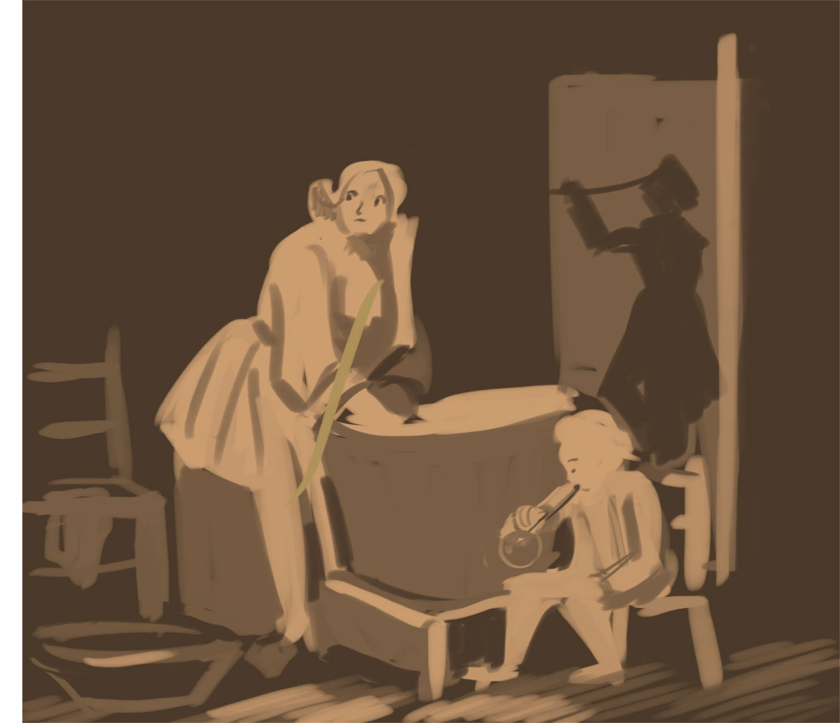
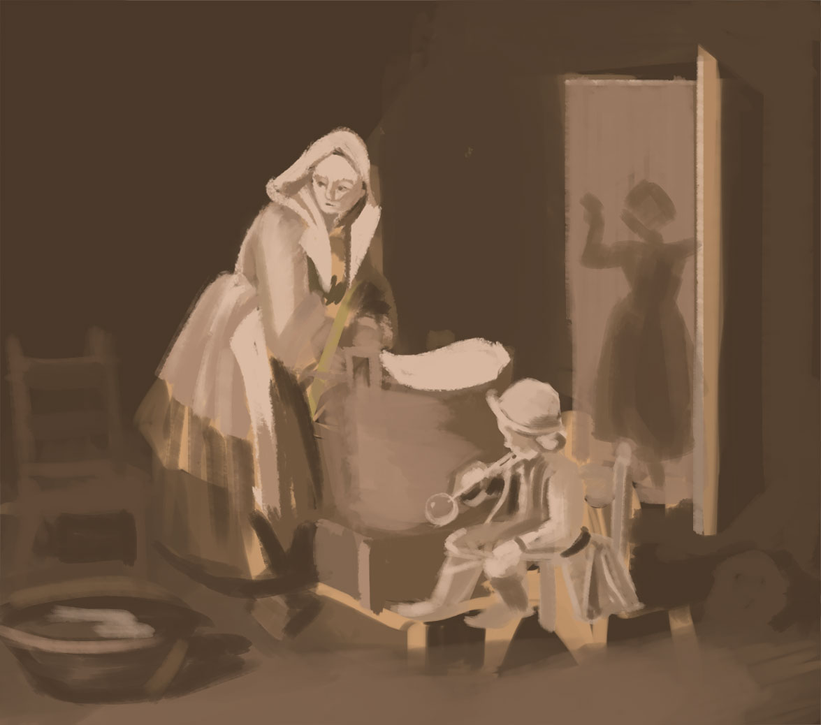
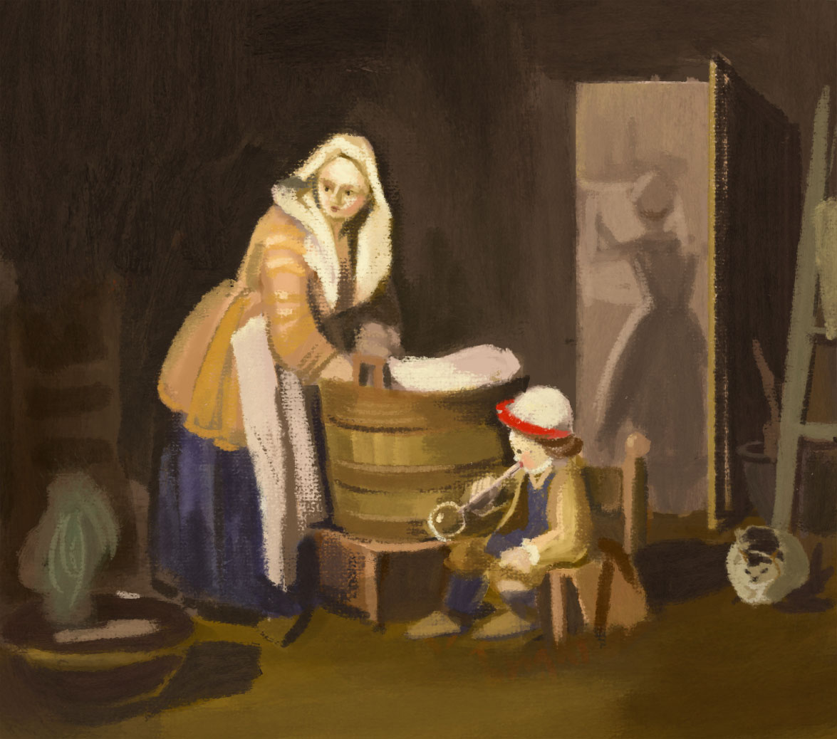
Study of “The Laundress” by Jean Baptiste
Conclusion
In the end, copying old masters is a double-edged sword. When done with clear intent—whether to study composition, color, or technique—it can be an invaluable learning tool. However, over-reliance on copying without personal exploration may hinder artistic growth. As Austin Kleon wrote in Steal Like an Artist, “All creative work builds on what came before.”; being artists, we should learn from the past while continuously developing our own unique voices.
It all started when I watched videos by James Gurney. I was amazed by how much fun it looked to explore the world through an artist’s eyes, and how urban sketching could really improve my art skills. James went into detail about his process, from choosing materials to picking subjects and actually painting. His videos inspired me – a homebody by nature – to get outside and work on my observation and on-the-spot painting skills, instead of always sticking to my desk.
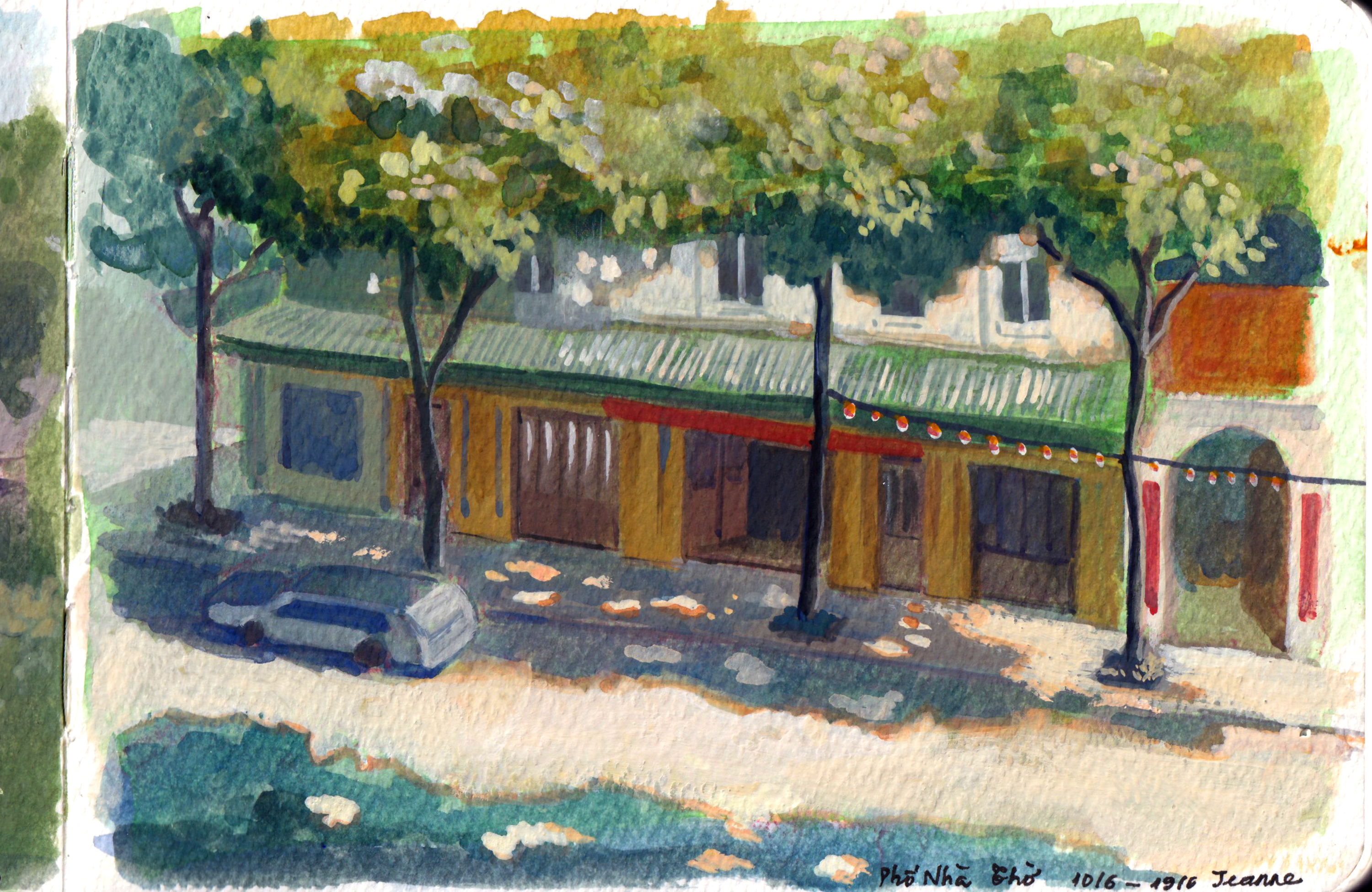
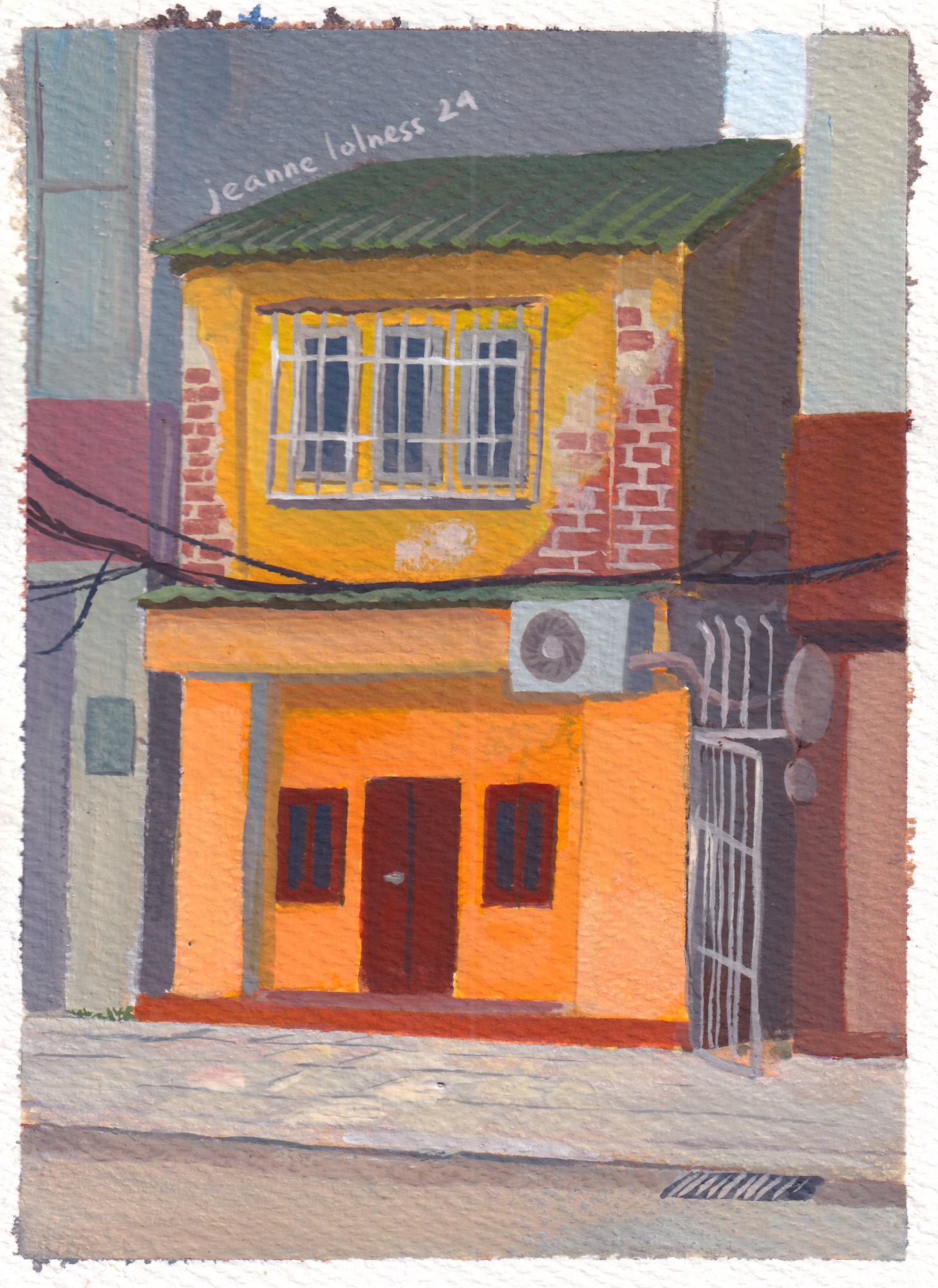
I grew up in Hanoi, where the streets are full of houses from all kinds of different eras. They’re old and diverse, definitely not your typical urban design, but perfect for painting.
I thought I knew all about these houses until I started sketching them. That’s when I began noticing details I’d never paid attention to before. Questions started popping up in my mind: Why does this window look strange? Is it uncomfortable living in these houses? And so on.
My Medium: Watercolor vs Gouache
I started with watercolor because it was the most convenient and readily available option. I could use pans or different sizes of boxes depending on where I was painting. It reminded me of the old-school watercolor techniques I admired.
Gouache, on the other hand, was messier for me at first. I had bought a set of bottles, which weren’t as portable as tubes for outdoor painting. It might sound like a small detail, but the difference in storage was significant—paints in tubes are far more convenient. Since paint tubes were first introduced in the early 19th century, around 1841, by American artist John G. Rand; it has got easier for artists to travel and work en plein air (outdoors), which became especially important during the rise of Impressionism.
Once I switched my gouache to tubes, it became my favorite medium. I enjoy painting opaquely, except when I have a specific idea that requires transparency. Gouache is more forgiving than watercolor, and it’s easier to define both large areas and fine details.
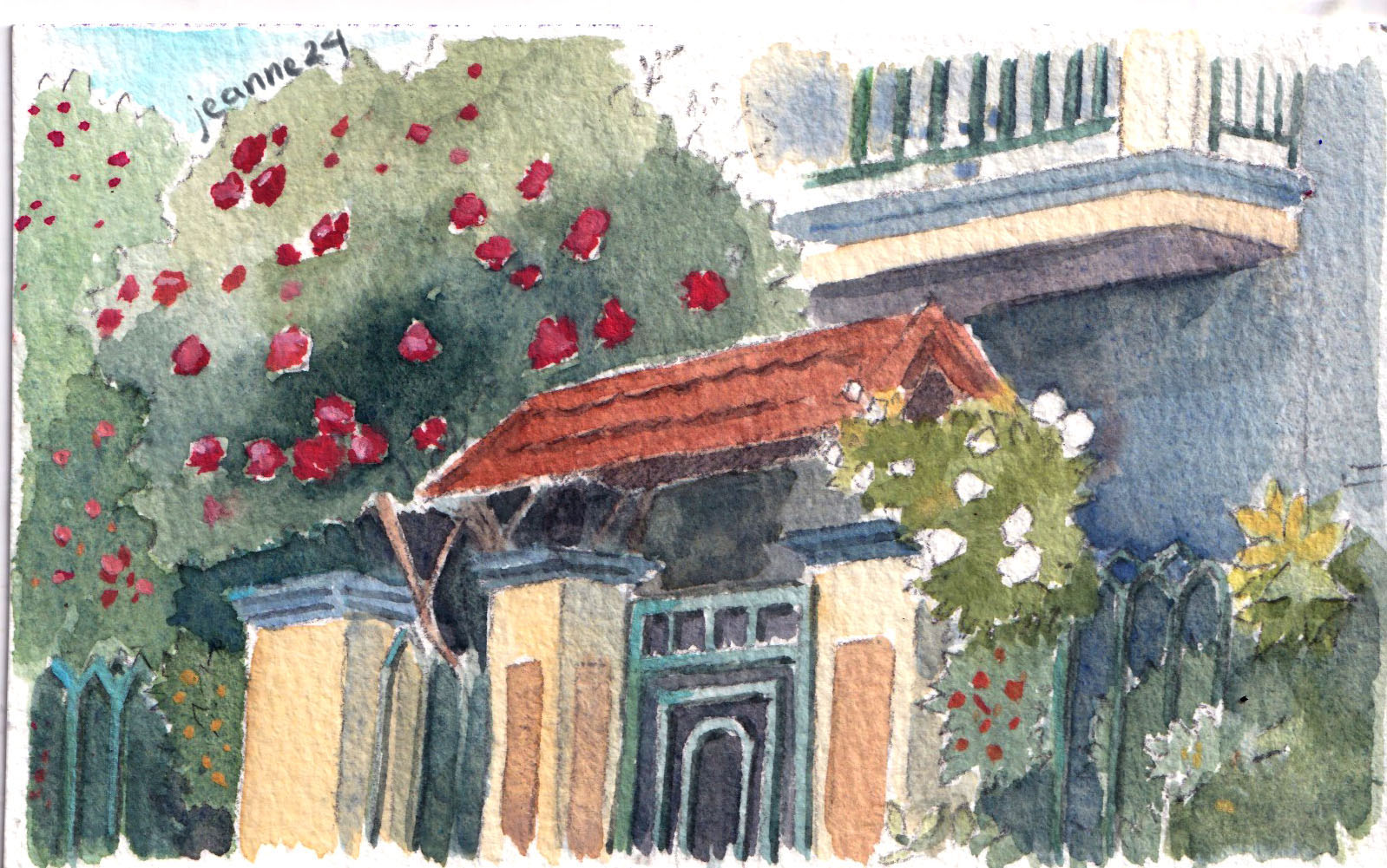
I started by painting my own neighborhood since I was already familiar with it from my daily life. It felt like a chance to rediscover my surroundings in a new way. I’m especially drawn to houses with plants, those that have a nostalgic vibe, or those that clearly show signs of someone’s life lived there.
For watercolor, there’s a wide range of pans available, which allows me to create a personalized palette. With the help of adhesive putty, I can make my own compact watercolor box to carry around. My favorite brush is the waterbrush, as it has a reservoir for water built into the handle, making it super convenient. Travel brushes are also great, though I’ve found that investing in good-quality brushes and a durable case is more worthwhile in the long run.
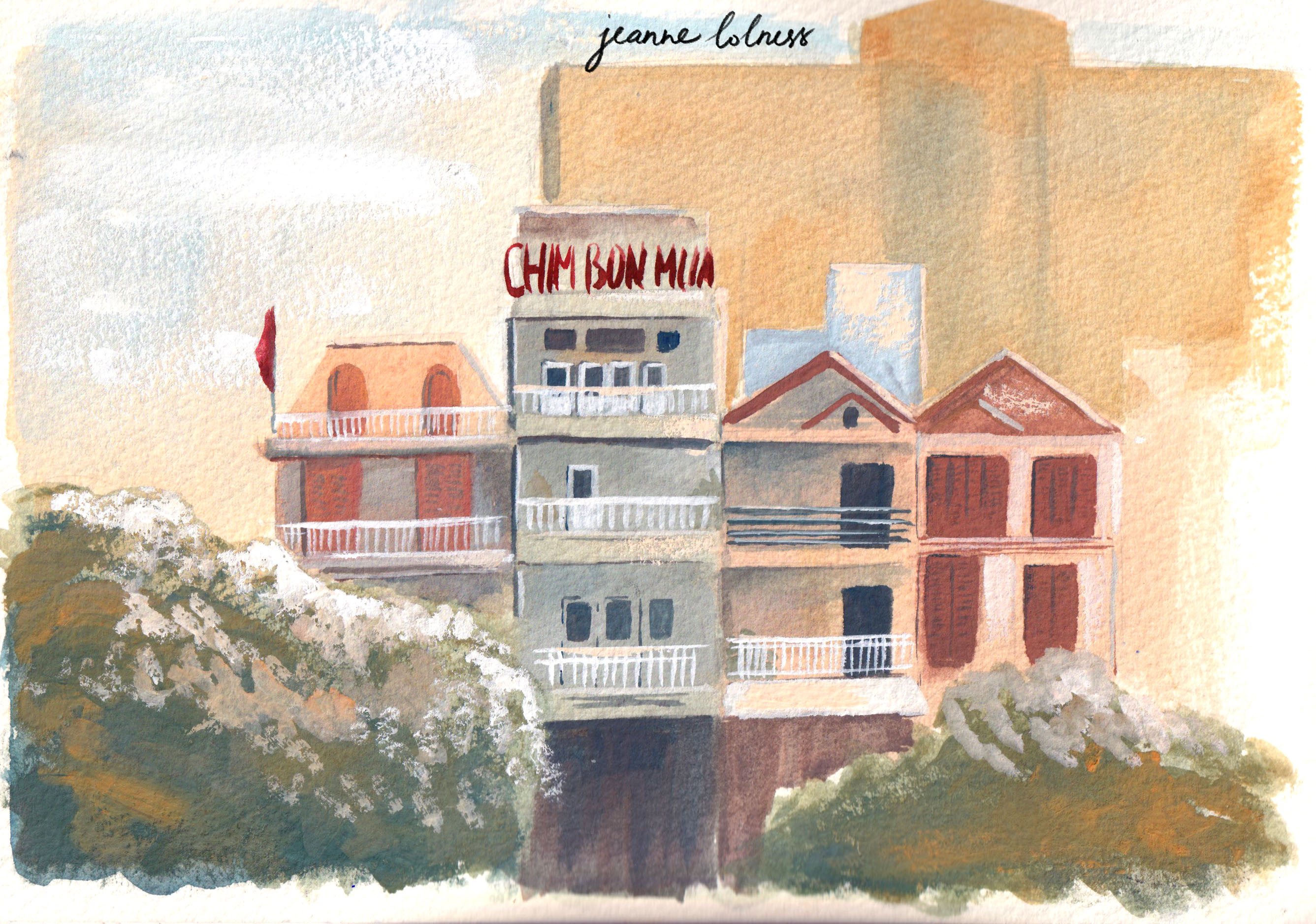
Hanoi’s streets stand out from other cities due to the rich history shaped by major influences from nations such as China, France, and the US. Tourist areas often showcase French architecture, which can be explored further in my blog about Hanoi, including detailed sketches of house facades.
Before the French Revolution, the architecture in Northern Vietnam was deeply influenced by Chinese culture. Buildings often featured intricate decorations, from the roof to the walls, with wooden, symmetric designs. This style can still be seen today in temples and other historical structures.
Hanoi’s vibrant coffee culture also provides ample opportunities for me to do studies. Many coffee shops are renovated from traditional architecture, while others embrace modern styles with clean lines and ambient lighting. Coffee shops in Hanoi serve as a melting pot for conversations, offering a perfect setting to observe and study people in real life.
To sum up
In wrapping up my journey of urban sketching in Hanoi, I’ve realized how much this experience has enriched my view of the city. Sketching outdoors has helped me capture the lively streets, stunning architecture, and everyday moments that often go unnoticed.
I encourage others to grab a sketchbook and explore their own surroundings. There are so many stories and details in our daily lives waiting to be captured. Each sketch not only reflects a scene but also our personal growth as artists. So, let’s keep sketching, observing, and enjoying the world around us!
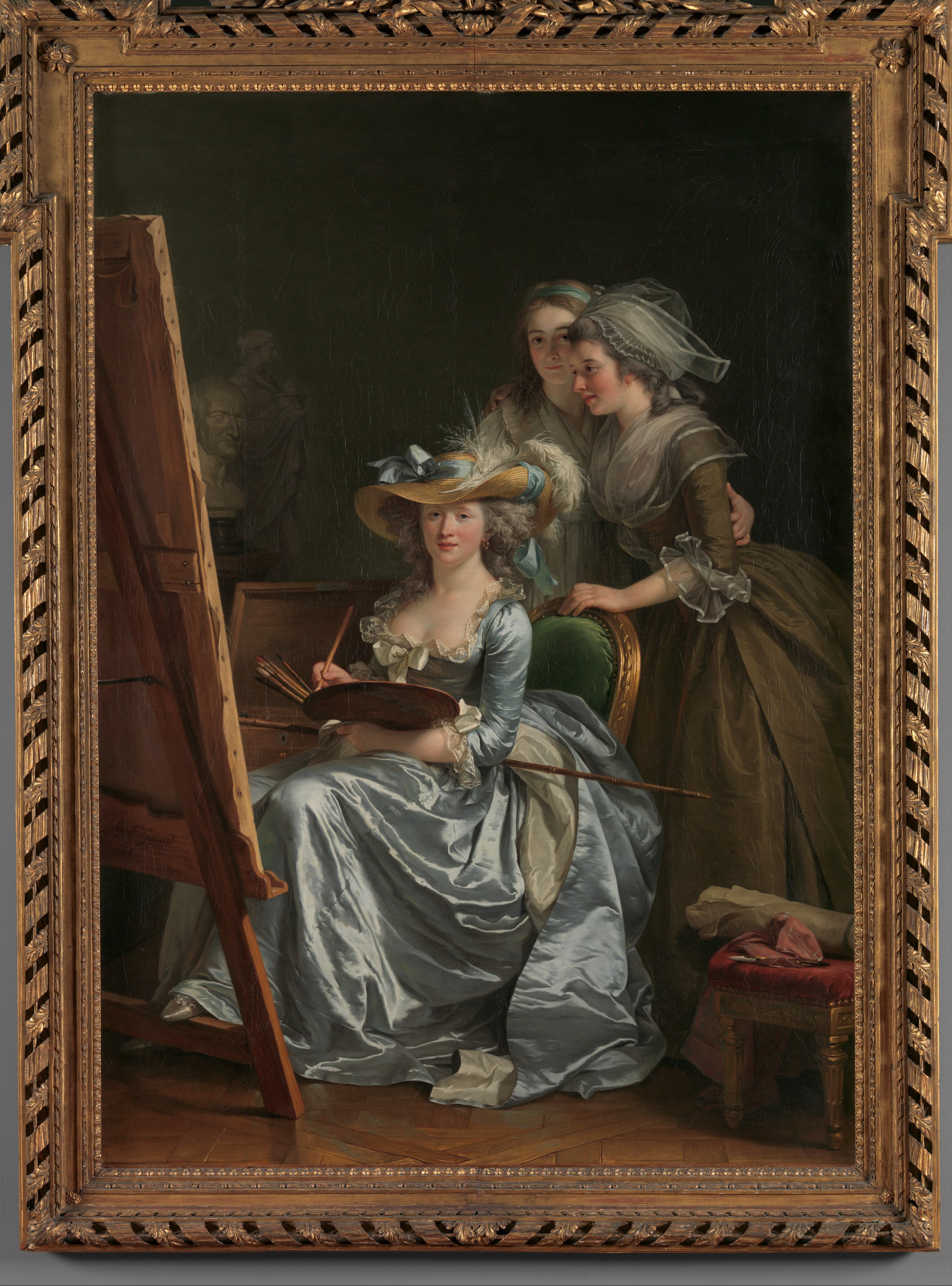
If you have read my blog about Élisabeth Vigée Le Brun, chances are that you enjoy this article about Adélaïde Labille-Guiard – a fellow female artist. They are two of only four females accepted into the Academy in 1783. Critics at the time liked to portray them as contemporary rivals, since they had many in common. However, there is no solid evidence of rivalry or friendship, since formal history often doesn’t take relationships and feelings into account. One concrete fact is that both female artists have supreme talents and suffered from male jealousy to political fluctuations in 18th century.
A calculated career
Adélaïde didn’t have any artistic family background, she was one of eight children born to a Paris shopkeeper. Despite that, she turned to artists in her neighborhood, first painting miniatures with Francois-Ele Vincent, then working with pastel taught by Maurice Quentin de La Tour and then Francoi Andre Vincent (son of Francois – Elie). She worked her way up the academia art world gradually, from joining the Academia de Saint Luc, exhibiting at the Salon de la Correspondance and finally the Academia Royale de Peinture et de Sculpture. While Vigee-Le Brun was preferred by the Queen, Adelaide painted King Louis XVI’s aunts, Mesdames Adelaide and Victoire along with a wider range of topic.
Marie Adélaïde de France, Known as Madame Adélaïde; pastel on blue paper mounted on canvas; 28.74 x 23.14 in (730 x588 mm)
However, she couldn’t have planned for the French revolution. She welcomed the Revolution and supported with ‘“patriotic donations”. However, the subjects of her previous portraits became the liabilities, attracting criticism from men and even danger. The post-revolutionary successor to the Academy decided to exclude woman from the art world. The Directory of the Department of Paris required Labille-Guiard to hand over an enormous group portrait, commissioned by the king’s brother to burned. She saught refuge in the countryside and only returned to Paris in 1795 and die in 1803. If there was anything from the Revolution benefiting her, she was able to divorce her husband, Louis Nicholas Guiard and married her rumored to be lover and teacher, Andre Vincent in 1800. (Auricchio (2009))
Madame Elisabeth de France (1764–1794), Pastel on blue paper, seven sheets joined, laid down on canvas, Oval, 31 x 25 3/4 in. (78.7 x 65.4 cm.)
A feminist
Despite her formal education and training, she was greeted with controversy and rumors. Vincent, who was rumored to be her lover at the time, was said to have ‘touches up’ Labille-Guiard – an offend towards both her paintings and personal life. (more: “His love makes your talent. Love dies and talent falls”). More ridiculous tales including her 2000 lovers were only stopped after her appealing to a well-placed patron, who was possibly the wife of the director of the Batiments du roy. She was outraged, of course: “One must expect to have one’s talent ripped apart”. (McPhee (2021))
Portrait of François-André Vincent, pastel, 23.81x 19.6 in (65×50 cm)
In the argument in the Academy on contributing to the regeneration of the nation, she was the only woman, naturally attracting criticism. (Auricchio (2009)) She proposed increasing numbers of women being admitted to the Academy, but was rejected. Despite the term revolutionary with his name, Jacques Louis David, emphasized: “The rewards destined for artists cannot be without danger for woman [since art requires] long and hard study … incompatible with the modest virtues of their sex”. (McPhee (2021))
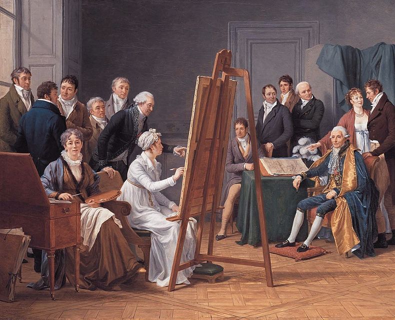
She had always dreamt of establishing a school for female artists, which can be seen in her most important work “Self-Portrait with Two Pupils”. Besides her foremost position as her prestigious artist for the royal family, she expressed herself as the educator and supporter for female artists. One of the students shown was Marie Gabrielle Capet, her favorite students and another talented artist. Both shared the dream of a school for female artists and lived together even after the marriage to Vincent. After A’s death, Capet kept taking care of Vincent.
Atelier of Madame Vincent, 1808. Painting of Adélaïde Labille-Guiard painted in 1808 by her pupil Marie Capet.
An educator
Self-Portrait with Two Pupils, Marie Gabrielle Capet and Marie Marguerite Carreaux de Rosemond , 1785 Oil on canvas; 83 x 59 1/2 in. (210.8 x 151.1 cm)
In the painting “Self-Portrait with Two Pupils,” she chose to show herself in a fashionable dress and a straw hat, not quite the style expected in an artist’s studio. Let’s not forget that she grew up with fabrics around, and she tended to indulge in the latest fashion in her works. She appeared to be wearing robes à l’anglaise, “fitted close to the waist in the front and back.”(Fashion History Timeline (Klopfer, n.d.)) She dressed herself in the latest fashion of a low plunging neckline and revealing bust line, which is similar to Vigee Lebrun’s portrait of Marie Antoinette. Along with two other females who dressed completely distinguished form each other, the purpose of dress choice was possibly to showcase her expertise in rendering cloth, especially the latest fashion in society.
Her silk dress’s pastel blue color also reflected the characteristics of the Rococo style. She was over 30 years old, married, and had been working for more than 10 years when the painting was made.
In the portrait, she and one of her students, Marie Marguerite Carreaux, smiled and looked directly at the audience, while Marie Gabrielle Capet was staring at the canvas. Carreaux was possibly wearing a chemise dress, which was usually seen with the straw hat outside rather than inside a studio. Capet, on the other hand, was dressed in what resembled the attire of a female artist working in her environment. Her lighting rendering skill was shown here, with Capet’s youthful face was softly lit, while Carreaux was almost entirely in the dark. (Fashion History Timeline (Klopfer, n.d.))
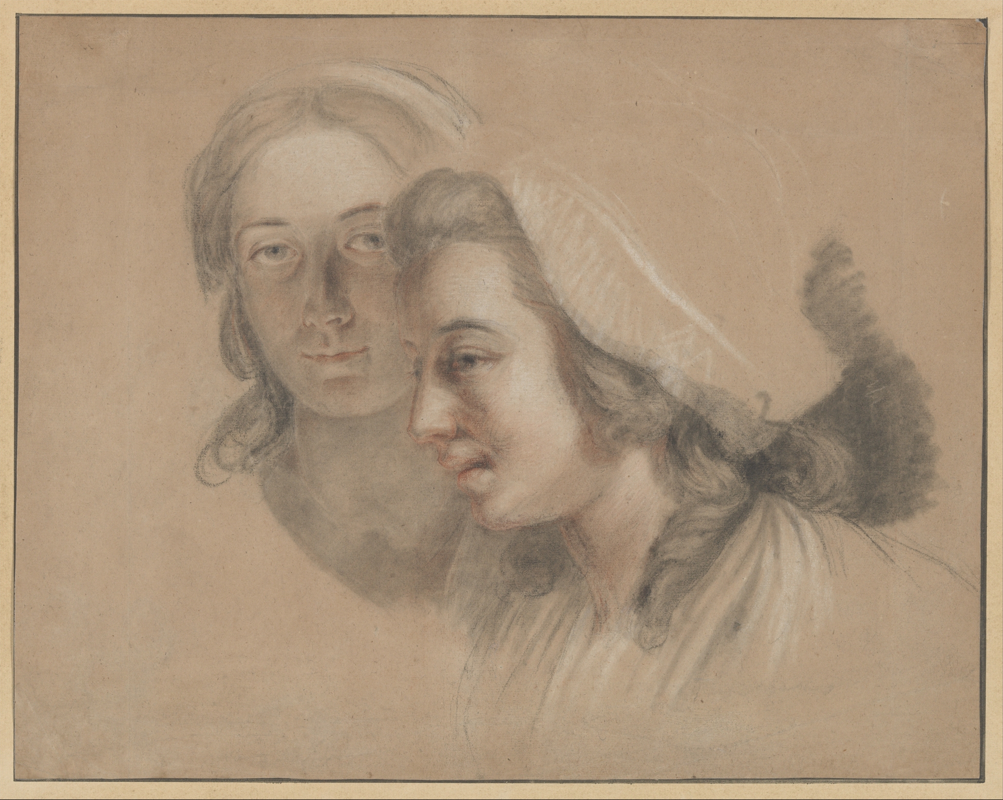
Marie Gabrielle Capet and Marie Marguerite Carreaux de Rosemond sketch, Black chalk with stumping, red and white chalks on beige paper
One notable thing is the straw hat, an object didn’t go well with any dresses or the indoors studio. Pairing a formal fashionable dress with a straw hat could indicate that Adélaïde didn’t see herself as completely belonging to the fancy world of the royals. In fact, her dress was the only ‘fancy’ thing in a simple studio.
Compared to other portraits by her and a self-portrait by her contemporary, Vigee Le Brun, she didn’t include any flowers but chose to include a sculpture of a vestal virgin and a bust of their father. This could reflect her modesty and indicate that her final goal was to attain the same status as the males in the Academy who painted historical scenes—the most important genre at the time.
The stick she is holding supports this notion; it was more likely that she was working on a grand scene rather than portraits and still lifes, which were more suitable for females. This was a bold goal for a woman, but with her students present, she likely aimed to push more female artists into the limelight alongside her own achievements.
In the end
Adélaïde Labille-Guiard’s dream didn’t come true, there was no art school for female artists nor there were more females in the Academy. Nevertheless, her life and work embody resilience, talent, and a progressive vision for women in the arts. Despite facing societal prejudice, political upheaval, and personal challenges, she carved out a place for herself in the male-dominated art world. Her advocacy for female artists, exemplified in her iconic Self-Portrait with Two Pupils, highlights her dedication to empowering women and redefining their roles in artistic academia. Labille-Guiard’s legacy serves as an enduring reminder of the barriers she broke and the paths she paved for future generations of women in art.
I use daily life as my resource for sketching, naturally, Vietnamese culture is a recurring topic. Keep scrolling to be excited by my culture!
“ Áo Dài” (loosly translated to English: Long Dress) is the Vietnamese traditional attire now, in fact, it’s the result of an evolving history of costumes. The version of the Áo Dài commonly seen on Vietnamese streets today is a modern adaptation from the 20th century. Vietnamese traditional costumes are an extensive and fascinating topic, one that I’d love to explore in greater depth later.
Male versions: Left: A medieval soldier; Right: A groom
Female versions: Left: áo ngũ thân tay chẽn (a predecessor to Ao Dai); Right: Ao Dai (popular for daily wear in 20th century)
These little sketches were painted after I attended an event celebrating the history of Áo Dài in Hanoi, in which multiple versions were showcased.
Tết holiday (Lunar New Year) is the time to watch bustling streets, enjoy traditional cuisine and appreciate the beginning of a new year. Not every Asian country celebrate Lunar New Year the same way and equally important. Simply explained, Tết holiday for Vietnamese is on the same level of importance as Christmas holiday for Westerners, Chuseok for Korean, Songkran for Thais, Diwali for Indians or Ramadan for Muslims.
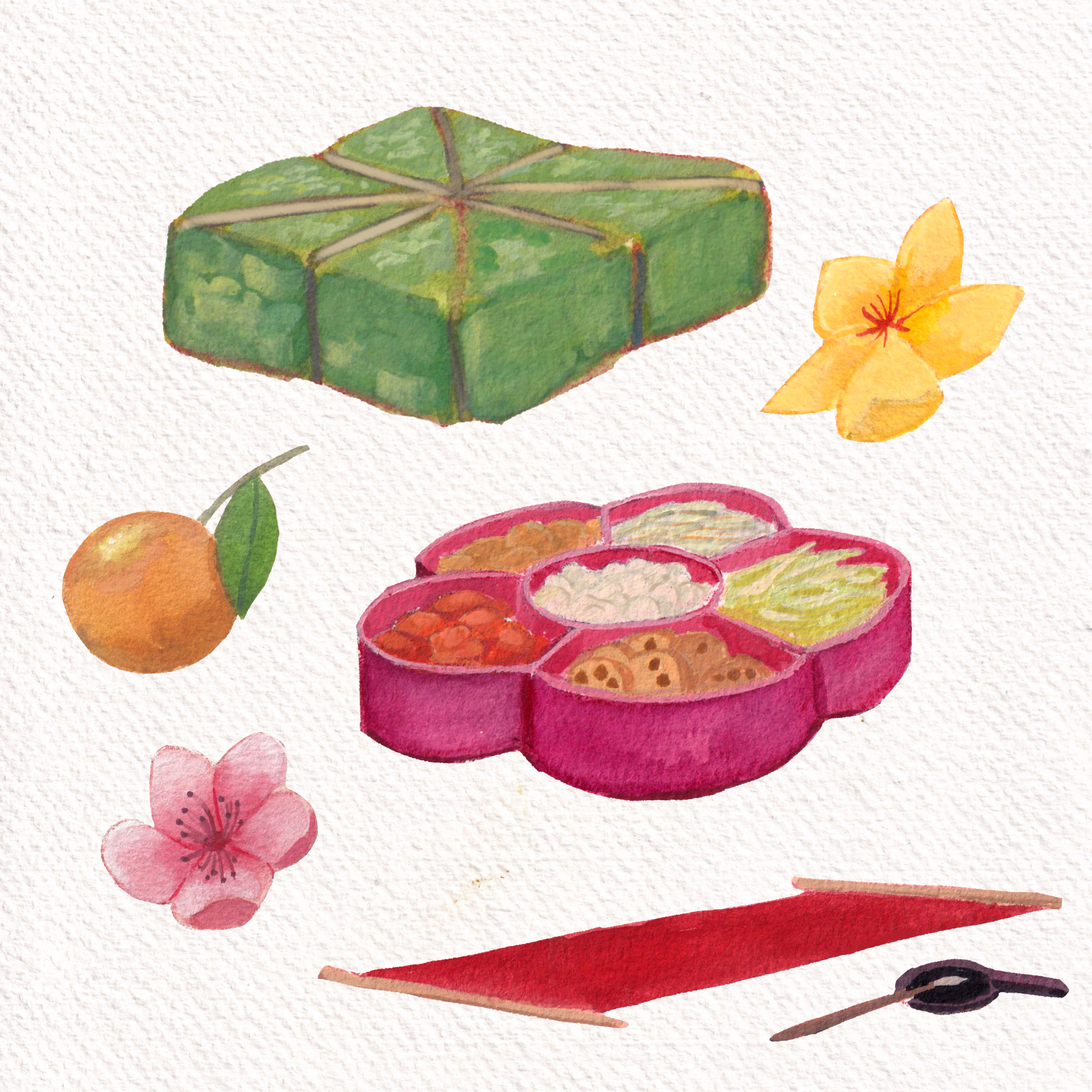
Bánh Chưng (sticky rice, pork, mung beans wrapped in Dong leaves) in green; Mứt (Candied Fruits) organized in traditional boxes; traditional calligraphy; Hoa Đào – Hoa Mai – Quất (3 types of essential plants for Tết)
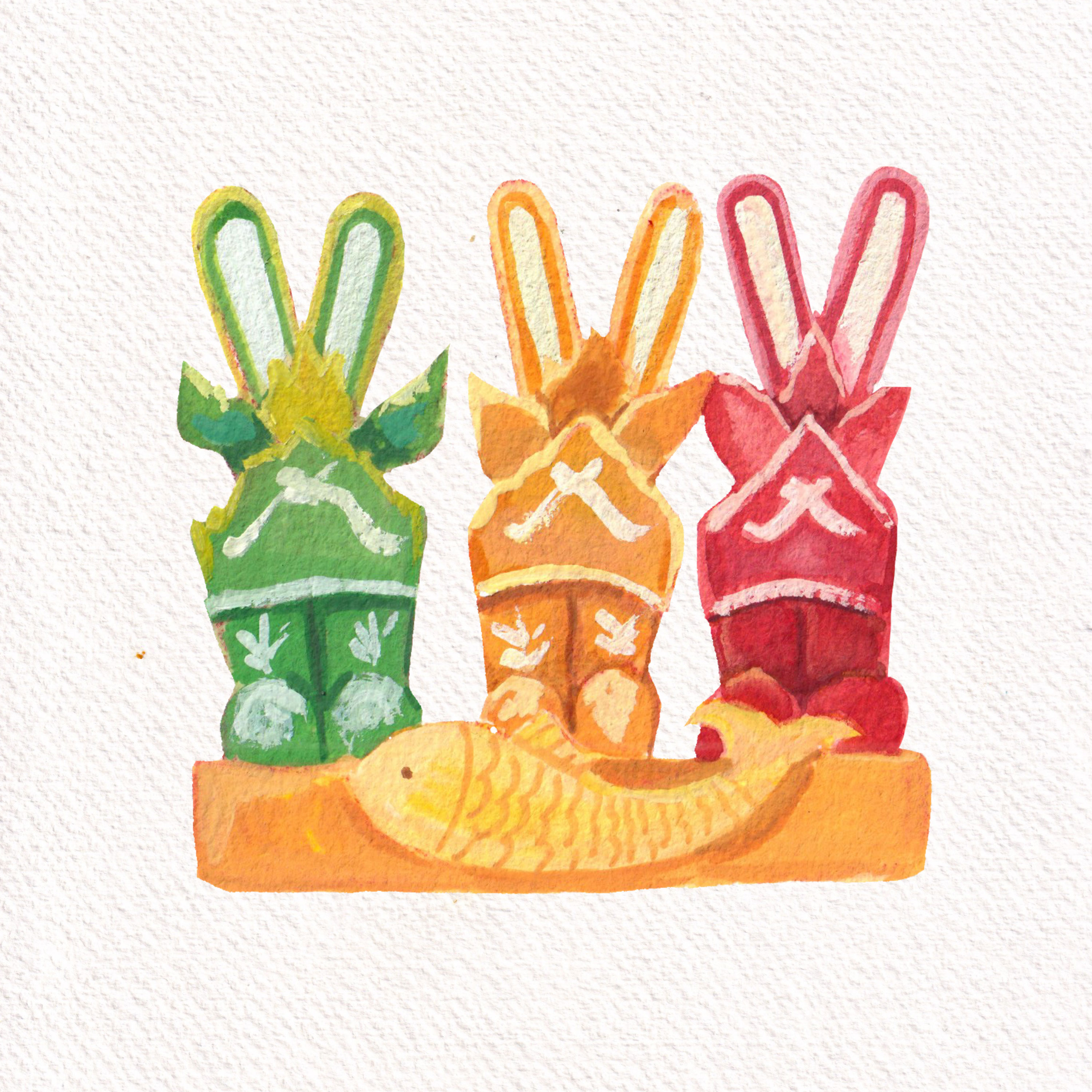
Joss paper models of boots and fishesA full plant Quất
Mid-Fall festival or Moon Festival (Tết Trung Thu/ Tết Trông Trăng) is another major holiday for Vietnamese. It takes place on the 15th day of the 8th lunar month, typically around September or October. Children are especially excited during this festival, as they carry colorful lanterns, traditional toys and participate in fun parades. Mooncakes, filled with lotus seed paste or red bean, are shared among family members and friends as a symbol of unity and prosperity.
As I think about the colorful and lively culture of Vietnam, I’m reminded of how our traditions come to life through art, festivals, and our clothing. The Áo Dài, with its deep history, isn’t just a beautiful outfit—it’s a link to our past. Festivals like Tết and the Mid-Fall Festival bring us together, sharing happiness, food, and a sense of community. Every sketch and note I make is a way to celebrate these special moments.
Blue is a primary color that often goes unnoticed in its significance. Yet, historically, it was one of the most expensive and revered hues. Ultramarine blue, in particular, was as valuable as gold because it was derived from finely ground lapis lazuli stones, sourced primarily from Afghanistan and transported to Europe. Its use can be traced back to the Indus Valley Civilization and then to the creation of the funeral mask of Tutankhamun.
For me, ultramarine blue is my favourite, though I rarely use it straight from the tube. A touch of blue in a mix lowers the value of colors without losing their vibrancy. It’s also my go-to for creating shadow tones. In this series, you’ll see paintings dominated by blue (both ultramarine and azure). From blue skies and seas to nocturnal scenes, portraits, and still life, this color is the centre.
A study from a master painting by Kalmykov Grigory Odysseevich – a Russian master in painting sea scenes
Egyptian blue, the first blue ever made, was produced in the third millennium BC in ancient Egypt. It was synthesized from silica, lime, copper and an alkali. Its blue color comes from a substance that is identical to a rare, naturally occurring mineral made of copper and silicate.
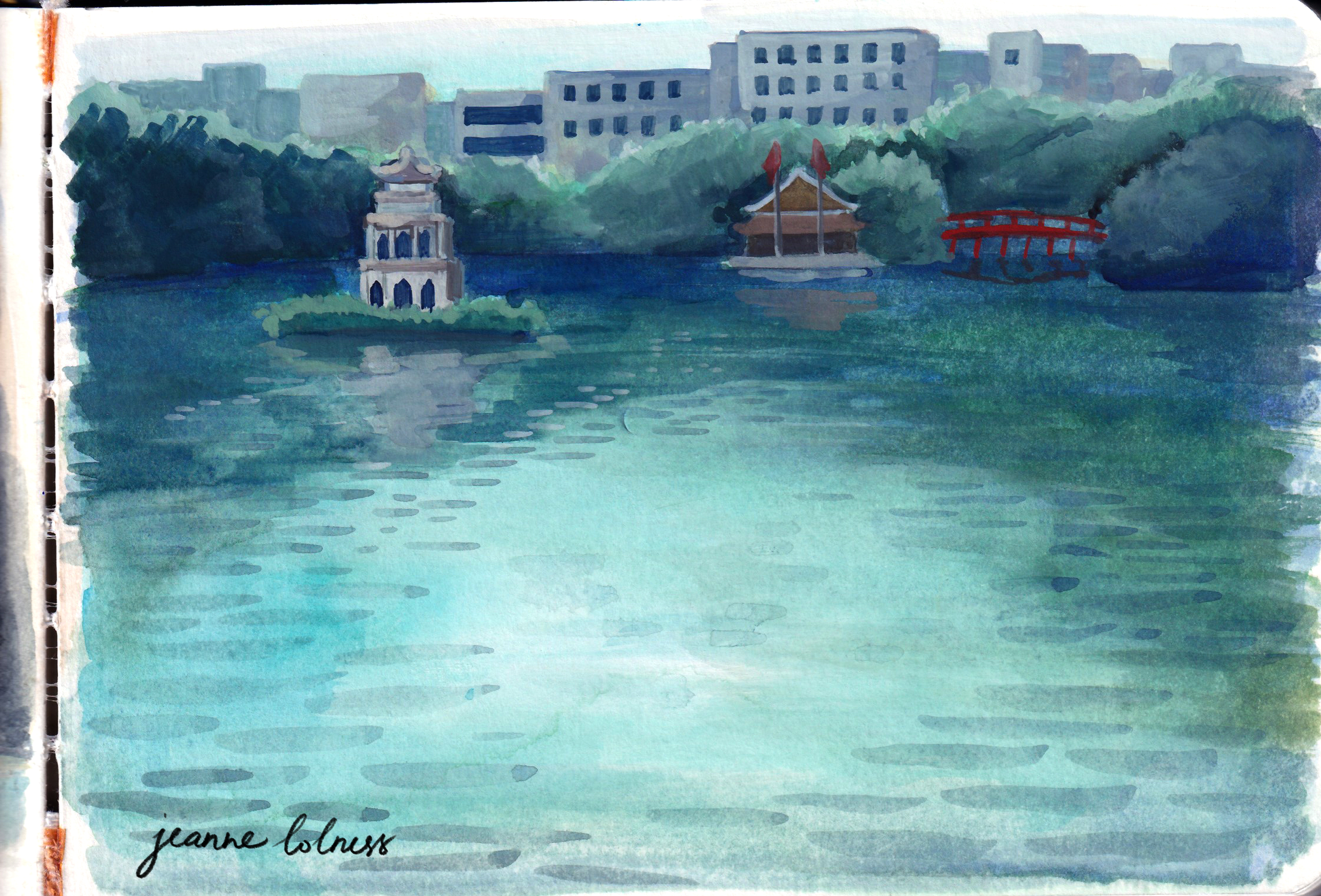
A painting of Hồ Gươm – a famous lake in Hanoi
Until 1700s, blue was mainly made from lapis lazuli and the related mineral ultramarine. In 1709, a big discovery happened when German chemist Johann Jacob Diesbach created Prussian blue. He accidentally made it while experimenting with dried blood and iron sulphides. At first, it was called Berliner Blau. By 1710, the French painter Antoine Watteau started using it, and later his student Nicolas Lancret did too. It quickly became popular for making wallpaper, and in the 1800s, French Impressionist artists also loved using it in their paintings.
Blue has a special meaning in many cultures around the world. In some places, it’s seen as a symbol of peace and calm, while in others, it represents strength and protection. Blue was chosen for the army in many countries, in fact the term ‘navy blue’ comes from Royal Navy adoption of blue informs for its officers. In the Torah, Israelites were instructed to add a blue thread, called tekhelet, to the fringes of their garments, made from dye extracted from a Mediterranean snail. This blue was seen as a symbol of God’s Glory, and meditating on it was believed to help connect with the divine, representing purity and the Throne of God.
A portrait using ultramarine blue as the main color
During the Dutch Golden Age, artists like Johannes Vermeer used blue to add depth and realism to their paintings, as seen in his famous “Girl with a Pearl Earring,” where the blue attire of the subject stands out beautifully against the background. Blue became an essential color for capturing both beauty and spirituality in art.
In the above portrait, I realized that blue can sometimes appear warmer than the skin tone, particularly when it’s saturated.
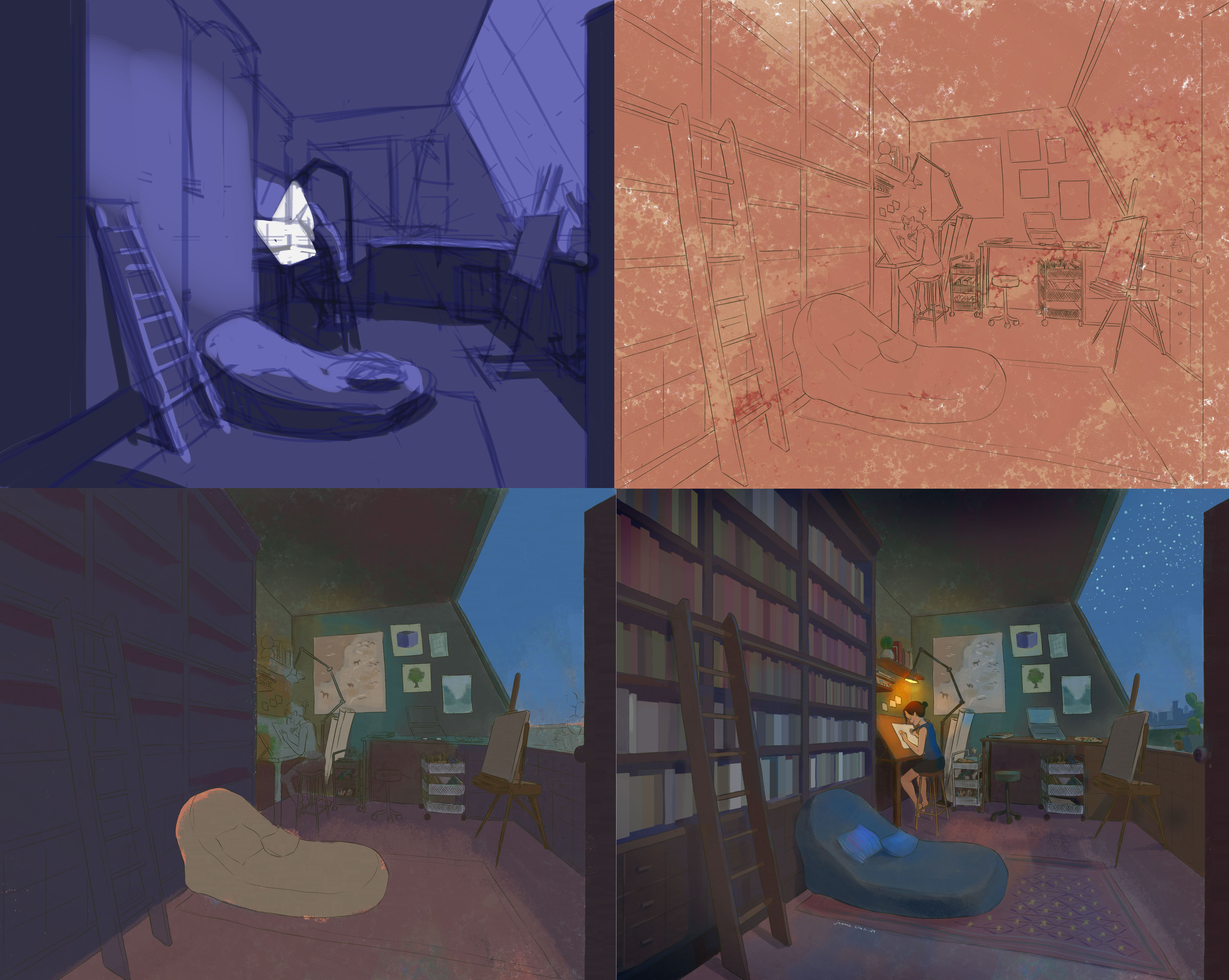
Above is a quick break-down of my digital painting of a night working in my dream studio. A tip I have learned is that you can use a warm underpainting to keep the blue “warm”. This is also true in real life observations: outside light often has a cool tone while interior objects, made of wood, are “warm”.
I use blue as the shadow here – it’s a real phenomenon in sunny days with clear blue sky
Soft blue often appears on the sky in sunny days due to a phenomenon called Rayleigh scattering. When sunlight enters Earth’s atmosphere, it is made up of different colors of light, each with a different wavelength. Blue light has shorter wavelengths and is scattered in all directions by the gases and particles in the air.
When painting blue sky in a sunny day, I often lay down a soft yellow first and use the same blue to create shadows. This shadow can be seen most clearly with a bright object such as white walls.
Similarly, the sea appears blue due to the way light interacts with water. Water absorbs colors with longer wavelengths, like red, orange, and yellow, more easily, while blue light with shorter wavelengths is scattered and reflected back to our eyes. This makes the sea look blue, especially when the water is deep.
Painting skies or seas is a chance to observe how different tones of blue go with each other to create movement and life.
I hope this collection helps you discover something new and exciting about this color!
I’m pretty sure you have seen her works somewhere, the blooming flowers painting with a brownish tone background. If you tried searching her name on any search engine, tons of flower paintings will show up – don’t be surprised, because she actually left a legacy of about 250 still life paintings.
Family background: A genius born in a supportive environment
Rachel Ruysch, born in Amsterdam, is the daughter of Antony Fredericus, Professor of Anatomy, and Maria, daughter of an architect Pieter Post. Her talent was discovered from early age and her father let her study under Willem van Aelst, a talented painter of flowers in Delft. She quickly surpassed her teacher, and her talent became known in the highest circles. She was invited to German Courts before she was of middle age. She became the first female artist to enter artist society in The Hague in 1701.
In her personal life: she got married with Juriaen Pool (1666-1745), an excellent painter of portraits and a colleague in the Court Paintership of the Elector Palatine in 1693. She must have a happy marriage with him, since they had ten kids together and she was fully supported by her husband to keep painting with her maiden name.
While we can’t deny her talent and hard work, it’s important to note that her success is powered by other males in a patriarchy: her father and her husband. Her father is a renowned scientist specializing in anatomy and botany, and also an amateur painter. His cabinet, a huge collection of anatomical collection, attracted visitors from all over Europe, including Tsar Peter the Great. His collection was one of the earliest fluid-preserved specimens, making he himself an interest subject to study from the point of view of a scientist as well. He himself was featured in painting by Jan van Neck. (Dam, n.d)
Van Neck, J. (1683). The Anatomy Lesson of Dr. Frederik Ruysch [Oil on canvas].
As an artistic person, Frederick Ruysch added a touch of decorative to his preservation, making his specimens an art collection to an extent. He was obsessed with the concept of ‘vanitas’ – the transcience of life and death. ‘Vanitas’ – Latin for ‘vanity’, means pointlessness and futility of pleasure, ambition and all worldly desires (Dam, n.d). This topic is explored by artists during Baroque period, belonging to allegorical art (arts representing a higher ideal). Frederick probably passed on his interest to Rachel while she helped him with his collection; not to mention, she had access to the greatest library of reference for flowers, plants and insects. In addition, she has other family members interested in arts: her grandfather was an architect, his brother and uncle also drew and painted well. Less is known about her husband, Juriaen Pool; however, his love and support for her can be seen in his painting of the family. He is a court painter, a portraitist and a printmaker.
Pool, J., & Ruysch, R. (1716). Family portrait with flower still life in the making [Painting].
The only version from online resources is monochrome, but it’s obvious on the left of the painting is a bouquet of flowers, a familiar subject in Rachel’s artworks. She was ‘in the spotlight’ of the painting, indicating his admiration for her. She also used her maiden name through her whole career and her husband was likely to support instead of eclipse her talent.
In 1750, the state honored Ruysch with the publication of Dichtlovers voor de uitmuntende schilderessen Mejufvrouwe Rachel Ruisch (‘Poems for the Excellent Painter Mistress Rachel Ruysch’) (The Art Story,n.d). This anthology, the first of its kind for a Dutch artist, featured poems by eleven contemporary poets and scholars who celebrated her life and work. Rachel Ruysch passed away later that year at the age of 85.
Analysis on her style: highly detailed and scientific based botanical painting
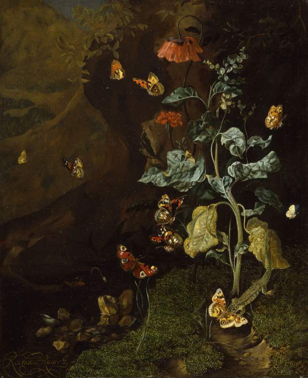
A still life with flowers, butterflies and a lizard in a dell: PD.87-1973 (The Fitzwilliam Museum, 2025). An early work.
One important detail is that the bouquets Rachel painted never existed, but an assortment of fruits, flowers and insects from the artist’s imagination. That showcases her adept understanding of nature, especially botany and anatomy of insects as well as compositional skills of arranging the details to attract the viewers. She put together flowers from different seasons as well as from overseas, which, somehow reflected the development of Dutch horticultural industry as well as international trade, not to mention the “Tulip Mania” – the first recorded economic bubbles (Smarthistory (n.d.) One more thing to notice is that she used asymmetrical composition, emphasizing the natural bloom and droop of the flower – this was an ‘informal’ choice compared to other contemporary painters.
Her process often started with main lines of a composition, then she rendered details with the goal of being as true-to-life as possible. Different texture, from the soft silky petals to the rough leaves, were accurately painted. Arts writer Alexxa Gotthardt highlights that Ruysch “swiftly gained a reputation across Amsterdam for the enchanting realism of the plants and insects in her paintings. Her works weren’t merely idealized depictions but subtly alluded to themes of mortality and the life cycle.” (The Art Story,n.d)
In early works, she often painted woodland scenes “sottobosco” (forest floor), being inspired from Otto Marseus van Schrieck, Abraham Mignon, and her teacher, Willem van Aelst (The Art Story,n.d). A special technique she learned from her master, Willem van Aelst, was imprinting. She sometimes used real moss and real butterfly wings as imprints in her early painting. The scenes were often dramatically lit – one feature that stayed consistent in all her paintings. Later, her style reflected more of Baroque art style – a movement against Mannerist style, an intricate and formulaic approach. She often painted a bouquet, depicting flowers at various stages of life, capturing their journey from vibrant bloom to graceful decay. They were paired with a wide range of insects and animals – she created an ecosystem in her painting.
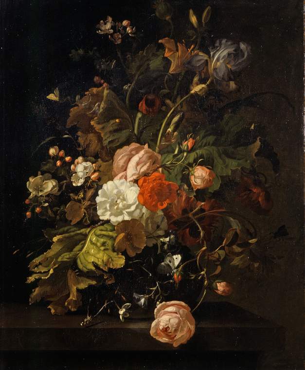
A vase of flowers (The Fitzwilliam Museum, 2025)
As she grew older, her compositions feature more open, expansive arrangements that fill the frame, evoking a rich sense of atmosphere and subtle humidity. She used bold diagonals and fluid curves to guide the viewer’s eye effortlessly across the composition. The central group of flowers were often the lightest and brightest, insects were arranged unexpectedly evoking a sense of curiosity in viewers.
Her paintings were often termed with ‘vanitas’ or ‘memento mori’ (Latin for ‘remember you must die’) since it was her father’s obsession. It’s a popular genre in Dutch during the seventeenth century, using still-life form to provoke thoughts about the fleeting life (Hibbitt, 2020). It’s the most common idea associated with her flowers painting, that all beauty fades and that all life, in the end, must die while celebrating the beauty of nature. Her painting may serve as a moral value to live thoughfully, prioritizing what truly matters over transient worldly matters.
References
Dam, A. (n.d). Death re-enlightened: Conservation of Frederik Ruysch’s wet anatomical preparations—The Rembrandts of fluid-preserved specimens [PDF]. ResearchGate. https://www.researchgate.net/publication/376812311
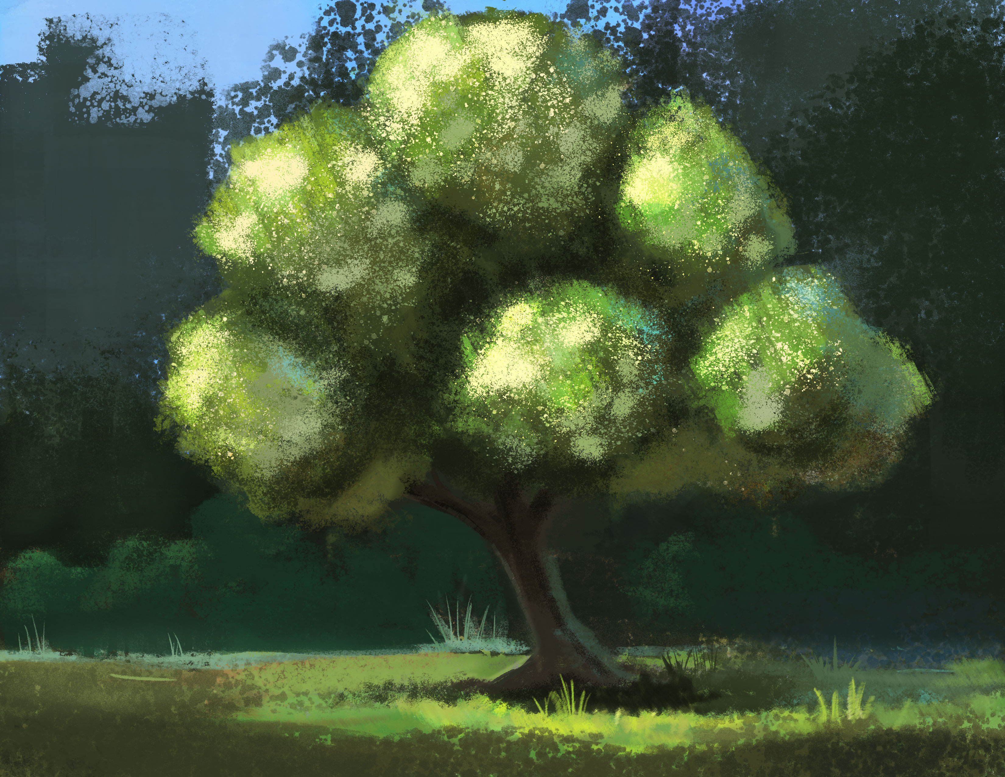
Welcome to my little collection of green colors. Green is hard to get it ‘right’ because the fresh paint from the tube always feel artificial. Green is often used to paint nature, especially trees. Trees, bushes, plants are not solid objects, they don’t have distinguished planes that we know for sure light is hitting on. They are made of thousands of leaves, each reflecting light in a different direction.
If nature is just a factor in the painting, I can rely on the texture of the paper to do the trick and just put a few layers for wide range of green tones.
Sometimes I try painting green in weird combinations. In this painting below, I try a combination of burnt sienna, green and purple – it turned out not good, but it was a fun experiment.
In this painting below, I actually use yellow and white more than green. Titanium white mixed yellow can create a cooler yellow suitable for the background.
In this sketch below, I use a few green paint (permanent green, leaf green) mixing with yellow, red, blue or brown sienna to create a wide range of tones so that I can imply that there are multiple types of plants.
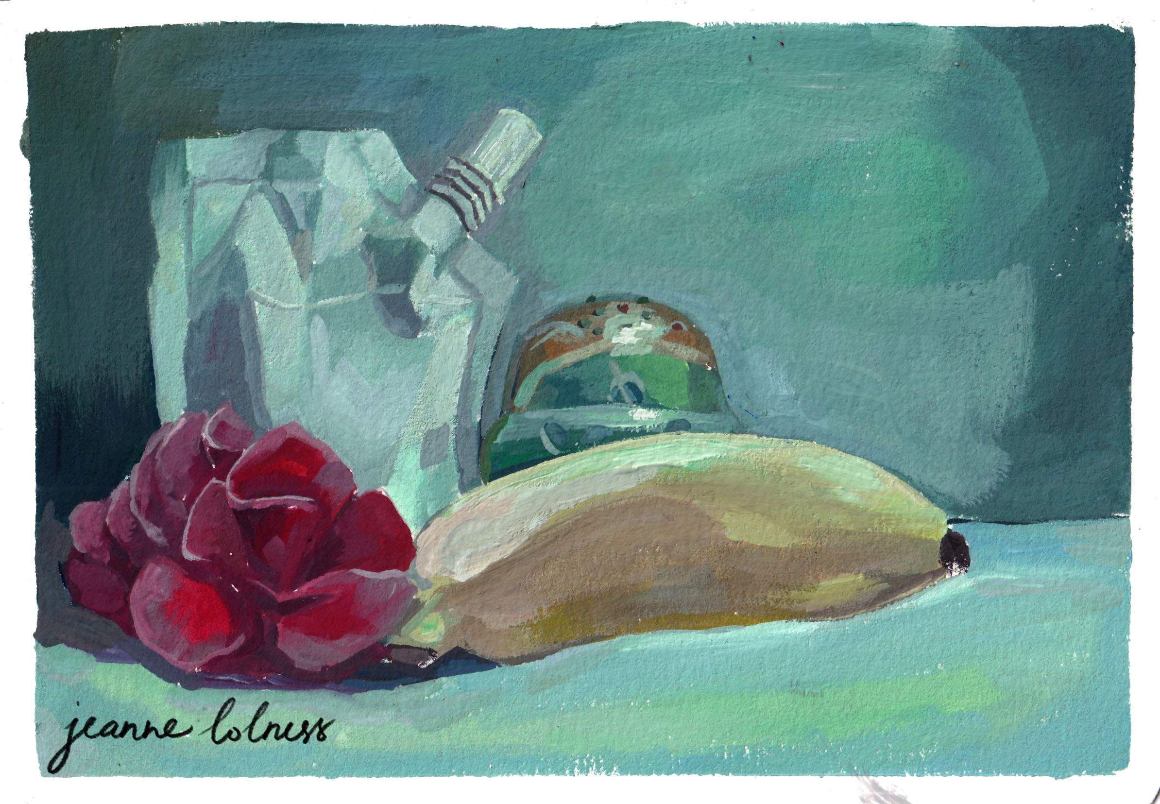
This is a fun experiment with green lighting over different objects. The green Russian doll and the white paint package have the most range of colors since they are made of reflective material. In contrast, the flower and banana tend to lose their saturation and doesn’t reflect as much.
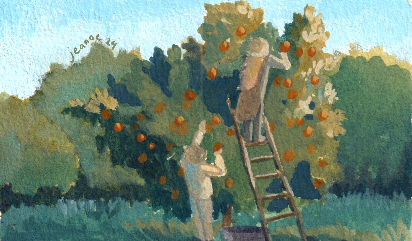
In the painting below, I added ultramarine blue when I mixed the dark tones for the trees, so that the oranges can stand out more. I also add horizon blue to the background trees to differentiate the main one.
This one is to play with the green in the shadow and in highlight. The yellow house and the red roof made the process simpler with just three main basic color: yellow, blue, red.
Here are a few pieces painting digitally. Apart from the highlight created by sunlight, other parts of the fruits have some blue since they are in the middle of branches and leaves.
I try to think of the trees as made of multiple balls and add scattered highlights to show the texture of the tree.
As we wrap up this collection of green-themed paintings, I hope you’ve enjoyed exploring the shades of green with me. There’s still room to explore with green in particular and expressing nature for me, see you again in another collection in the future!
It’s the time of the year when you look back over the past twelve months to see what you have accomplished. In retrospect, 2024 to me was struggle after struggle, from arts to personal life.
A year of failed and rejected projects
Overall this year I worked more on series rather than individual commissions, especially since the introduction of generative images in the first few months of the year. The new exciting AI interests people with an illusion of getting good artworks for free. However, the flow of personal commissions starts again from October, which is not so surprising to me at all. The basic brick of generative image is data, not creativity or emotion. Personal commissions do not only need likeness, but also personal touches and modifications from both the artist and the ones being portrayed.
Series illustrations does provide a better and more stable income than personal commissions. However, to prove that you are able to complete a large amount of work with consistency in quality, it takes much more efforts. Truthfully, I failed in a few significant chances that stays in my mind longer than I expect.
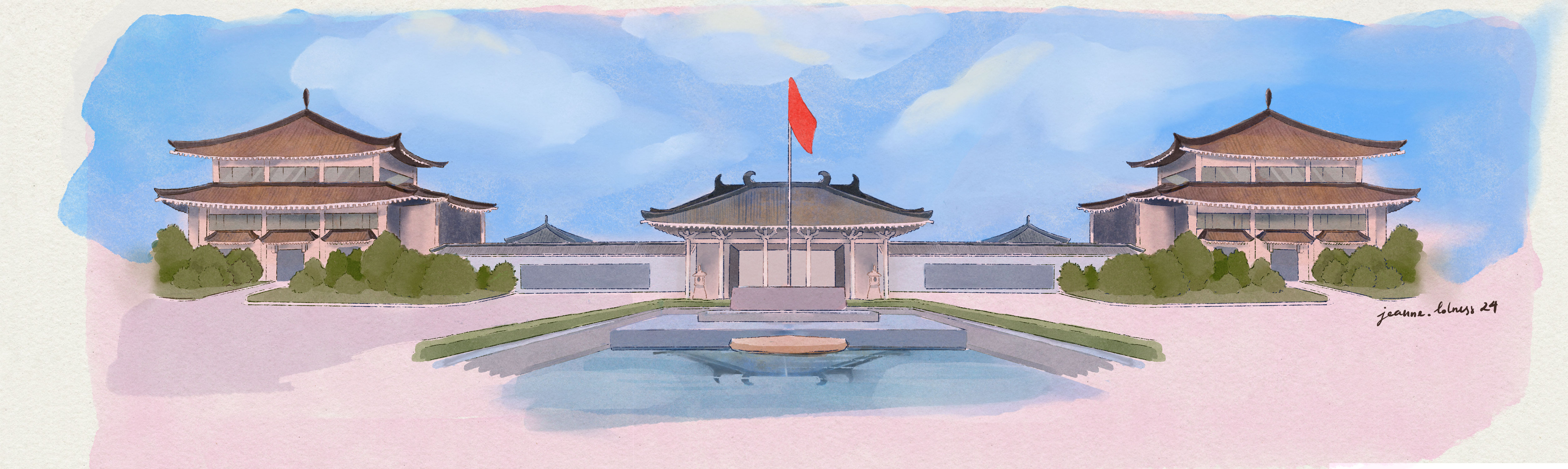
A rejected piece in a project for a Chinese museum
A year of stagnancy in learning
I also failed in my learning goals this year. It feels like I have arrived at the stagnant part of the learning curve. My self-set up curriculum started falling part in June, I felt stuck in learning Storyboard. After procrastinating for a month, I decided to drop this subject and maybe come back to it again. Other studying goals felt frozen, and I couldn’t see any improvements except from sketchbooks piling over in the corner of my room. I must have passed the exciting beginner phase of learning arts now, no subject seems completely new now. It’s now the phase of repetition and patience.
My whole system of working and studying became too much for me to handle at certain points. I set up a complex Notion dashboard in January, and after a period of complex projects requiring quick turnarounds, the whole system started crumbling. The daily to do list of Notion was unlimited, which gave me a false idea of my capability. Furthermore, I missed using papers, the idea of ticking done to a task and how my pen moved across the papers. I’m still using it as store some lists and resources for blogging, and happy to be back with my handmade A6 notebooks.
I forced myself to learn things I don’t really like, hoping to cultivate a new aspect in my arts. In the first few months, I learned animal anatomy and started reviewing human anatomy in the later part of the year. These new knowledge doesn’t show up right away in my paintings, even the personal pieces. It only came to the surface after a long time brewing, it started with my realization that my artworks lack spirits or liveliness. I’m starting with small animals and human silhouettes.
I started to feel the urge to add more details, every now and then when I looked back some old pieces, I felt I could have added more characters to the scene instead of going the easy way. Of course, this led to less paintings done and a major portion of each need to be done at home instead of at the place. Being a quantity person, I can’t help thinking “I’m doing less this year”.
I overworked this one – I kept changing and adding objects
A year of resilience
A few sentences I often tell myself this year is “hang in a bit more”, “I can tolerate this a bit more” and “be resilient”. These reminders come from a podcast story I hold close to my heart—the story of Abigail May Alcott Nieriker. She was the inspiration for the character Amy in Little Women, but her real-life journey is even more inspiring. Abigail didn’t give up her dream of becoming an artist to marry a wealthy man; instead, she achieved recognition by exhibiting her work (of a black female!) at the prestigious Salon in France. She did marry eventually, but it was for love and much later in her life. (Interestingly, Laurie was entirely fictional and not based on any real person.) Her story is a true testament to perseverance and determination. She is a hard-working artist, passionate painter and devoted educator -I deeply relate to her journey—I sympathize with her struggles, feel inspired by her resilience, and see her as a role model.
Another source of strength and motivation for me is literature. I read many novels by Kazuo Ishiguro this year: An Artist of the Floating World, Klara and the Sun, Never let me go (a re-read), and Annie Ernaux: A girl’s story, Shame, A Woman’s story. The most interesting novel is The Bathroom by Jean-Philippe Toussaint, weirdly writing about almost the same thing I wrote in my journal but in a more beautiful way. Here are a few passages that I love:
70) But when I thought more deeply, and after I hadfound the cause for all our distress, I wanted to discover its reason. I found out there was a valid one, which consists in the natural distress of our weakand mortal condition, and so miserable that nothing can console us, when we think it over (Pascal, Pensees).
49) Seated on the edge of the bathtub, I explained to Edmondsson that perhaps it was not very healthy, at age twenty-seven going on twenty-nine, to live more or less shut up in a bathtub. I ought to take some risk, I said, looking down and stroking the enamel of the bathtub, the risk of compromising the quietude of my abstract life for … I did not finish my sentence.
50) The next day, I left the bathroom.
Literature consoles me differently from social media or modern psychology. Instead of labelling, it just describes. It tells a story of thoughts, emotions and imaginations. How do I feel this year? I feel like a caterpillar slowly breaking my cocoon to realize that I’m still a caterpillar. At least, I’m still crawling forwards.


